#Downsampling
Explore tagged Tumblr posts
Visit Tumblr Blog
Explore Tumblr blogs with no restrictions, modern design and the best experience.
Last Seen Tumblr Blogs


Fun Fact
In Q3 of 2020, 31% of US users access the Tumblr app daily.
Text


[指宿@ibsukionsen] Micron pen on paper
#art#traditional#crosshatch#ibsukionsen#tumblr nukes a lot of detail with downsampling :(#arcitecture#i could post everything they make honestly its worth checking out for yourself
572 notes
·
View notes
Text
Liam's voice gives out during Live Forever; Noel takes over the vocals to finish out the song.
January 10th 1996 Music Centre Utrecht, Holland
source: [blonderazorblade] FLAC source: [guitars101 forums]
#downsampled to a smaller mp3 of course#oasis#friends tell friends to share sources#you and I are gonna live forever#live forever#1996#live forever is a love song
15 notes
·
View notes
Text
i spent so long trying to figure out how to make nice, crispy 8 bit snares for electro house. claps? ez, 909 preshift, make some noise and change the sample rate.
turns out im stupid the snares i wanted to make were just a fucking 808 snare w/ downsampling and bitcrushing lol
3 notes
·
View notes
Text
daily driveable Pentium 133 brainrot encroaches
#daemon.md#sillyposting#i'm not quite that bad yet#but i do think a dual core laptop from the late 00s should be able to browse the web#and do voip#and more games should have a potato mode that's considered during development#not only should your game render at a lower res w/ fewer polygons + entities onscreen + softer textures#but it should be an enjoyable experience#it shouldn't be unplayable or painful#and you still have the RTX 10 bajillion polygon 8k downsample megasimulation mode for people on beefy rigs
2 notes
·
View notes
Text
HI-FI RUSH IS FUCKING
AAAAWWWEEESSSOOOOOOMMMMEEEE
#girlchatter girlbox#using TSR downsampling my performance is GREAT#full 60fps and everything's on beat#absolutely kick ass game#it's so good#everything is so good#I love it so much
3 notes
·
View notes
Text
I just installed an old version of gshade, it takes way too long for the presets to load whenever I record jesus

#this is what I get for wanting to make a short movie lol#I downsample my game so it has to load every time I record the tiny scenic bits that I need#it loads almost instantly with gshade I’m so happy
2 notes
·
View notes
Text
♦ Memento Vivere ♦
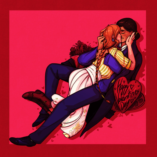
#sovenasart#art#artists on tumblr#digital art#Lancer#lancer pilot#lancer oc#lancer ttrpg#lancer rpg#Jeanne Moreau#Amor Amparo#Jeanne & Amor#Tumblr forced me to downsample this one severely#These two need a break smh#Maybe eventually I'll put them#in a campaign where they can just be happy together#But for now#They're backstory fodder for each other :y#Valentines#valentines day#gay#lesbian#sapphic#wlw
11 notes
·
View notes
Text
WebP is an open-source format designed by Google, a company with a lot to gain from making web stuff easier to host and download and who therefore put a lot of effort into making a smaller format. They have some studies at https://developers.google.com/speed/webp that suggest that for typical web-hosted images webp files are usually about 25% smaller than PNGs or JPEGs.
There's also a related WebM format for video and audio, which is also open-source (and royalty-free).
Oh my god. You guys. Listen!!!
.webp is fine.
The amount of misinformation I see going around about this totally benign image format is so bizarre. Particularly weird is how much it circulates among artists specifically. Listen. Look at me. Artist to artist: It's just a file format. It's not DRM, it wasn't invented to make your life inconvenient, and there is in fact software for opening it and converting it offline. Support for the format in image editing software is basically nonexistent, yes. That's because that isn't really what it's for. It's in the name: WEBP is for the web.
Speaking as an artist who maintains a website, WEBP is a godsend. That's because it lets you get way, way, way better quality than jpeg in a way, way smaller file. "But who likes JPEG anyway? The compression artifacts make my skin crawl!" Okay, cool: WEBP can also save lossless files just like PNG, except lossless WEBPs are (again) way, way, way smaller than PNGs. If you're an artist who wants control over how your art is presented to people online, if you want to really fine-tune the tradeoff between filesize and quality, WEBP is unquestionably the best format available right now. It is not even close.
It is a shame that offline support for the format is so spotty. But that's not WEBP's fault; WEBP is open source and the code for reading and writing them is freely available. We're just in a transitional period where the developers of your preferred image viewing/editing software haven't caught up yet.
#webp also supports animation#and is typically smaller than gifs#maybe 20% smaller if you use lossless webp#but like 65% smaller if you use lossy webp#which will lose some fine details but often not in a way that you would notice#and certainly in a better way than#say#downsampling the gif to fit a size constraint would#image formats#FOR COMPUTER SCIENCE!
829 notes
·
View notes
Text
FinalCD ~ Double Precision Downsampler
FinalCD is a double precision downsampler designed to convert high sampling rate audio to 16/44.1 for writing to a CD. There are two filter curves available – a gentle one for material with very little ultrasonic content, and a sharp one to handle other cases. www.sonicillusions.co.uk/finalcd
View On WordPress
0 notes
Text
My retro video game pet peeves:
No, sprite flicker on consoles like the NES didn't look like that. The NES ran at 60fps (and how it managed this on contemporary televisions which technically didn't support progressive scan is a fascinating piece of technical bugfuckery, if you have an afternoon to kill to read up on it), but YouTube downsamples all videos that are below a certain resolution to 30fps, which makes sprites that are flickering at 60fps look weird. The way that sprites sometimes seem to disappear entirely for long periods in NES gameplay footage on YouTube is also usually an artefact of this process – YouTube just happened to exclusively pick frames where the sprite in question is not visible when converting from 60fps to 30fps.
No, not all old-school pixel art was explicitly designed with "CRT fuzz" in mind. While this was often the case for games originally released for non-portable consoles, portable consoles have always had LCD screens (yes, even the original Game Boy!), so CRT fuzz simply wasn't a thing for them. Conversely, while desktop PCs of the era did use CRT monitors, from the mid 1980s onward, PC monitors typically used a variant CRT technology that had a much higher scan rate than contemporary CRT televisions in order to improve legibility of small text; such monitors had pixel sharpness comparable to that of modern LCD monitors, so CRT fuzz wasn't a thing for most PC games, either.
No, the textures on N64 and PS1 games weren't that bad. While these consoles were technically capable of resolutions up to 480p, this was very demanding for them, and rarely used outside of menus and cutscenes; actual gameplay output for games on these consoles typically ranged from 192p to 240p. The textures were of an appropriate size for the gameplay resolution. The whole "razor-sharp polygons with drab, muddy textures" look that pops up in a lot of retro media inspired by games of this era isn't imitating how such games look on their native hardware – it's imitating how they look when played on desktop PC emulators that have to stretch the textures all to hell in order to render them.
Like, I'm not saying these aren't valid aesthetic choices for modern retro games – particularly those that are trying to capture the experience of playing pirated console games on a janky PC emulator – but it's the spurious assertions of greater authenticity that often go with them that get my goat. If you want to slap a CRT filter on a Game Boy Advance title because you like the look of it, be my guest, but insisting that this is "how it was meant to be played" is simply false.
3K notes
·
View notes
Text
btw this is how the gabe voice effect is done.
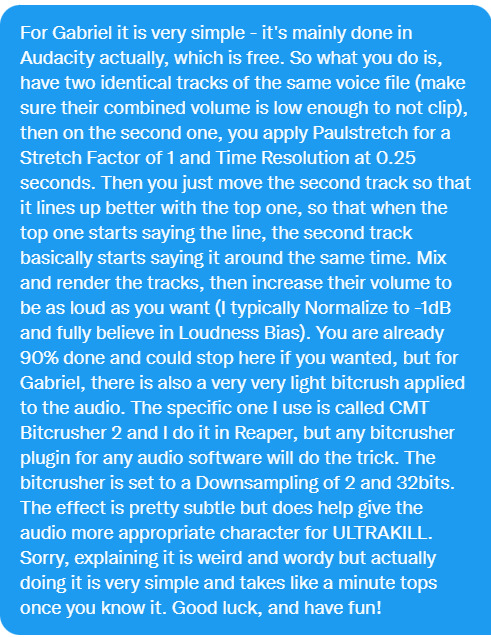
Source
Disclaimer that this is not 100% accurate but its close enough :]
The main effect is done in Audacity.
1. Get your audio and edit out any mistakes, pauses, sounds, etc. You want to leave some silent space at the beginning and end of the audio to accommodate the effect.
2. Duplicate this audio and place it on a separate track. Select the duplicate audio only. Under effect -> pitch and tempo -> Paulstretch, set a stretch factor of 1 and time resolution of .25 and click apply. Lower the volume of the stretched audio by around -2 dB.
3. Grab the stretched audio and move it to the right so that it starts at .1 to .15 seconds after the non-stretched audio. (Keep in mind this value is one that I've come up with on my own by trying to replicate it by ear. It is probably not perfect but it's close enough.)
4. Export this and re-import it in Audacity. Select the imported audio and under Effect -> Volume and Compression > Normalize, set "Normalize peak amplitude" to -1 dB.
5. Export the audio. You're done! You will probably have to reduce the volume though as it's usually too loud after the normalization.
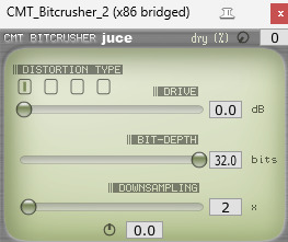
Extra steps in Reaper. Optional.
First you need to download reaper (Link to Reaper website) and install this VST. CMT-BitCrusher
Import the normalized audio.
2. Enable effects and select VST: CMT_Bitcrusher_2
3. Set downsampling to 2, this is the only setting you need to mess with. Pic below for reference.
4. You're done!
208 notes
·
View notes
Note
@difeisheng Thanks for the question in the tags!
I've been pondering the decision to have him wear the Alliance Leader robes in the special episode for ages, and here's the best theory I've come up with:
Di Feisheng had been in the middle of making an appearance as Jinyuan Alliance leader somewhere in an attempt to pull himself back together after months of non-stop searching for Li Lianhua when he got news (from Wuyan? Fang Duobing? who knows) that there was reason to believe he'd be at the beach, so he dropped everything to get there ASAP, not bothering to change first (and potentially also figuring that, if he found Li Lianhua alive, wedding red would be a fitting color).
I came up with this after having noticed that, the night before the scene on the beach, Di Feisheng is wearing the gray, maroon and gold dating-Xiangyi outfit, but has changed out of it the next day.
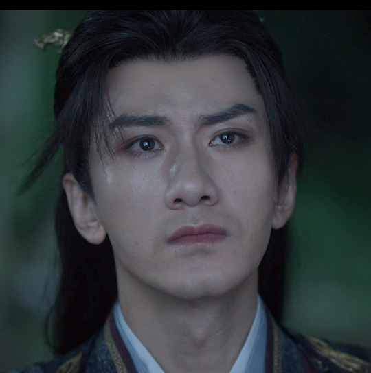
He's also not looking great in that scene: it looks to me like he's been crying (see the shiny patch near his eyes and cheek and the smudged eye makeup), and it also looks like he has some stubble forming, so he hasn't shaved in awhile.

He's definitely not looking like his usual, immaculately groomed and put together self. I wouldn't be surprised if he'd basically given up on as much sleep as he could (and we already know he doesn't sleep well in new places because of hypervigilence, and he's probably been traveling to a lot of new places in his attempt to find Li Lianhua).
All this to say, it makes sense to me that DFS, who excels at acting and playing roles to hide what he's really feeling, and who values his usually rigid control over his emotions, would try to feel more in control of the situation and his fear and grief at the idea of losing Li Lianhua by throwing himself into playing the role of Di Mengzhu for a day as a coping mechanism to try to pull himself together, hence making an Official Appearance in the alliance leader robes.
Thoughts on character and costume?
I really love how the respective characters have different colour palettes, silhouettes but in particular material/textures to their costuming. Fang Duobing is a little princess so he gets pale pastels, fancy ornamentation and transparent gauzy fabrics which I find so cute, he’s not just rich he’s *expensive* and *pretty* it’s pretty funny that he matches the actual princess in the red leaves mountain case
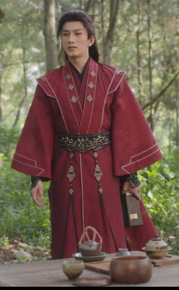
DFS gets your wide shoulder bad guy rich deep colours with thick layers and lots of metal detailing but it veers towards grand instead of pretty. Hot topic young DFS is leather and studs lmao. Brocade and fur & shit.
LLH is a linen boi and he almost never has any metal on him, we all know his natural material hair ornament meta etc. Interestingly, he does share some colour palette and fabric overlap with FDB, we se him with his tits out transparent outer layer sometimes. No structure all flowy silhouette
someone on here made a post abt their differing sleeve styles but I can’t find it!
I wanted to gush but also do u have any extra costume thoughts + how they relate to one another? You have a great knack for finding good photos of the show too 😅
Thanks for the ask, @lei-llustrations, and I'm so sorry it took me forever to respond! I had grand plans for a full essay analyzing DFS's costumes, and then I ran out of spoons for doing that. (The short version of the point I was going to prove is that his a-Fei outfits have elements of what seem to be his favorite details from his fancier alliance leader outfits, so it seemed like evidence of LLH trying to make up for making him be in disguise and without his power. I'm thinking of the maroon-red one with studs in the sleeves in particular, but there are echoes of his preferences in the other ones, too.)
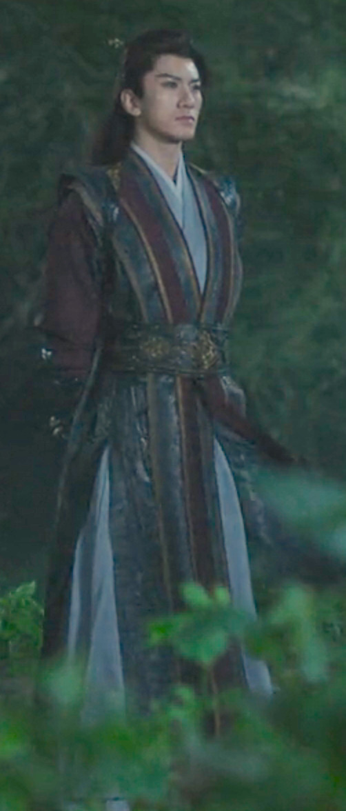
Since I'll never actually respond if I wait to put that meta together, here's a shorter one, with my thoughts on DFS's official Alliance Leader robes (screenshot taken from ep 40, when delivering the wangchuan flower).
LLH and FDB both call him Di mengzhu in the wangchuan flower scene, because he's clearly dressed in a way that makes this an Official Visit. I find it fascinating that he wears his alliance leader outfit instead of his grey, maroon, and gold outfit that he wears for non-alliance matters (aka. the wedding room outfit, which he also wears for such Xiangyi-related purposes as the reunion duel that doesn't happen and grieving for him in the middle of the night). After all, he's giving LLH a gift to save his life and issuing him a friendly anniversary honeymoon challenge, so you'd think that would call for his dating outfit, not his official garb.
BUT! What if he's using his official Alliance Leader regalia as a way of saying that not only a-Fei/Lao Di, but also Di Mengzhu and the Jinyuan Alliance want him to live? It's more than just essentially creating Peace Treaty version 2.0, and trying to get life back to what could have been if SGD and JLQ hadn't ruined everything: their people at peace, and the two of them meeting for friendly duels rather than death matches. Yes, only LLH and FDB are there to witness it, but by showing up in his Official Capacity, he's also correcting all the narratives about the enmity between himself and Li Xiangyi, and in giving him the flower, he's officially declaring that Di Mengzhu wants Li Lianhua to heal and have his strength and power back more than he wants to gain martial arts power himself.
This is a HUGE deal. DFS formed the Jinyuan Alliance as a way of climbing the ranks of the jianghu, because his goal was to gain strength so he'd never be helpless or forced to do someone's bidding again. And yet, he wears the outfit that symbolizes that striving and his place at the top of it to GIVE AWAY THE FLOWER THAT WOULD CEMENT HIS PLACE AT THE TOP OF THE JIANGHU. He wants Li Lianhua to not just live but also to regain the strength SGD and JLQ stole from him, which would mean that Li Xiangyi would quite possibly defeat him, and he would welcome that, because it's not about self-protection anymore: now, what he wants more than anything else, is for Li Xiangyi/Lianhua to live.
If that's not enough of an emotional gut punch, try this: Di Feisheng told Li Xiangyi at the start of the show that swordsmen shouldn't have weaknesses. Di Feisheng has only really had two "weaknesses" (vulnerabilities might be more accurate): his desiring the wangchuan flower (which led to SGD and JLQ incapacitating him) and Li Lianhua. It feels like a monumental shift to me that, at the end of the show, Di Feisheng hands one weakness to the man who is the other: essentially, he is announcing to the world that nothing is more important to him than Li Lianhua's recovery, and he doesn't care who knows it.
It also feels very pertinent that his official outfit is wedding red, and he's essentially showing up in his fanciest remaining outfit to offer Li Lianhua his heart on a platter priceless magical flower in a box the way someone might show up at the house of their beloved with boxes and boxes of betrothal gifts. Not that DFS explained that or LLH picked up on it, because that would involve better communication skills than either of them had.
#mysterious lotus casebook#mlc meta#costumes#Di Feisheng#Li Lianhua#reblogging for the additional costume details#Tumblr will probably downsample these images#I hope they're good enough resolution to see the details of his eyes and stubble#thanks for the question!
148 notes
·
View notes
Note
Computer q. For otherwise identical monitors, is a 4000:1 contrast ratio noticeably better from 1000:1? I don't mean for fancy art but like if I'm watching a movie, could I see the difference in a dark scene? I looked into oled's, but those are expensive and I think the way I use my stuff would cause burn in.
I hope you don't mind, but I got carried away and answered pretty much every computer monitor question anyone has ever had. And since this turned into a whole thing, I thought I'd share it for everyone to benefit.
For a computer monitor I would say the most important aspect is actually the viewing angle. This is how far off-axis you can look at the monitor before the image degrades.
We sit very close to our displays and at that distance, even a change in height in your chair can affect the image. Move a little bit left or right and a cheap display could completely wash out and look terrible. And if you get a display that is 27" or above, even if you sit dead center, the edges of the screen will appear dark and washed out with a bad viewing angle.
The two best display technologies to get a good viewing angle are IPS (in-plane switching) and OLED. If you are interested in a display without these technologies, be sure it has a decent viewing angle. You can read more about viewing angles here and here.
IPS has very little concern for burn-in, but it is still a concern with OLED. In recent years OLED has greatly improved and image retention and burn-in can be avoided with regular maintenance. Displays will have pixel shift features and noise modes that work out all the pixels evenly. You can run these features every once in a while to prevent burn-in. You can also play special anti-burn-in videos on YouTube (full screen) to exercise the pixels to uniformity.
So if you don't mind the hassle, you can manage an OLED with low risk.
That said, OLED was almost exclusively for TVs and has only recently been introduced for computer displays. The current options are quite large and fairly expensive, as you alluded to. So if you are trying to stay within a budget, it might be best to seek out an IPS display.
Another consideration is resolution. Everyone is obsessed with everything being 4K now. But I think increasing the resolution brings diminishing returns with regard to increased detail you can actually notice. So if you don't mind going with a 1440p monitor (about 2.5K), you can save some money on resolution and get higher quality in more noticeable areas. Personally, I feel 1440p gives you a nice, noticeable bump in detail over 1080p. Whereas going from 1440p to 4K (2160p) is less noticeable unless you have very good vision.
Another benefit to 1440p is that video games are much easier to run on high quality settings with a reasonable GPU. And you can use technologies like super sampling (Nvidia calls this DLSS) to increase the detail you may lose from not going 4K.
The only concern I'd have with not going 4K is if you edit 4K video. It will be difficult to do a pixel level analysis of your footage otherwise. But other than that, you can still watch 4K content on a 1440p monitor and because it is being downsampled, you will still notice a nice bump in detail.
So if you don't have a reason to get a 4K display, I think 1440p is worth considering.
The next concern would be color. Or color gamut. This is how many colors the display can accurately reproduce. If you don't do any art or video color grading, you'll at least want something that does 95 to 100% of sRGB. That is the color space the entire internet uses. And if you are going to be watching HDR movies, you might want a display with a decent percentage of the P3 color space as well. Doesn't need to be 100%, but the higher the better. And for those who do art, a good percentage of Adobe RGB is recommended.
Also, many manufacturers offer displays that come pre-calibrated from the factory. If color accuracy is important, I would seek out one of these displays with a Delta E rating of 3 or less (lower is better).
A newer factor in displays is peak brightness. This is measured in "nits." In standard dynamic range (SDR), video only needed to reach 100 nits. Most HDR content is mastered to reach 1000 nits. In the future, that number will be 4000. And if micro LED technology ever becomes affordable, we may go up to 10,000 nits. But almost everything is around 1000 at the moment, so that is a good number to shoot for.
HOWEVER, because HDR is tone mapped (the brightness of your display is factored in and the content is adjusted accordingly), you can still get some benefits of HDR, even if you cannot do the full 1000 nits.
All monitors can do 100 nits for SDR content. But with more things being displayed in HDR, having more nits will give you a better experience. This does not mean your display will blind you. Usually bright stuff only takes up a small portion of the screen. But having more nits allows highlights to really pop and feel immersive. A lightsaber might actually feel hot and dangerous on a bright enough screen.
Computer displays are often rated as HDR400 or HDR600 or HDR1000 based on their nits. The HDR400 isn't great for HDR content. If you can do 600 or above within your budget, you'll get a better experience. If you are going to watch movies, this may be a feature you prioritize.
I know you mentioned contrast ratio, but I'm afraid that is a little complicated to answer. It can depend on other aspects of the monitor and the viewing environment. So I'll try to give you the info you need to figure out if the display you select will suit your needs.
Manufacturers can use tricks to fudge their contrast ratio in product descriptions, so it is best to go to an independent review website like RTINGS to see what they measured. (They do good TV and monitor reviews too.) You'll see that OLED displays are said to have "infinite" contrast ratio, due to being able to turn off pixels completely. Which means it is probably time to move to a new metric because that gives very little info on the dynamic range of the display (the difference between the darkest and brightest thing it can show).
You definitely want a decent contrast ratio for your display, but this can be subjective. If you have a nice bright screen, your brain may feel the contrast is fantastic, even if the actual darkest black point of the monitor isn't great. If something is really bright, then dark things will *seem* darker by comparison. And if you are viewing in a dark environment, the contrast will look even better. So this is where seeking out a professional reviewer's experience of the monitor can be helpful. One monitor's 4000:1 ratio might be a different experience than another with the same measurement.
Because TVs are generally larger and can have more backlighting zones, they can get decent black levels without OLED. But smaller computer displays have more difficulty in reasonable price ranges. So manage your black level expectations if you go with an affordable IPS display. They can get bright, but they aren't great at blacks like OLED. I'm afraid that is just a limitation of the tech. In fact, getting a brighter display might be preferable to a better contrast ratio. And it will be easier to see if you are in a bright environment.
Most IPS displays are going to be between 1000:1 and 5000:1 and while it does make a difference, if you sit it next to an old plasma or an OLED, you're going to be disappointed. So I would not make contrast ratio a super high priority with IPS, because non-OLED computer displays just aren't going to give you inky blacks. I would say 2000:1 or better is going to give you a decent experience. But, again, I would seek out reviews rather than trust the official product specs when it comes to the quality of the blacks.
And one final consideration you may want to factor in is the refresh rate. This is mostly for gaming. Most displays will give you at least 60 Hz or 60 "refreshes" per second. Gamers tend to like 120 Hz or higher. This won't affect movie watching very much as nearly everything except Gemini Man is 24 fps.
TLDR overview...
Get an IPS or OLED display for a good viewing angle. I personally feel this is the most important feature.
Choose a resolution. 1440p can allow you to increase quality in other areas to maximize your budget. Only get 4K if you have a legit reason or you have fighter pilot vision.
Color gamut or number of colors. Try to get 100% of sRGB for web content, 90% or above of Adobe RGB for art/photography, and 90% or above of P3 for HDR movies and video editing.
If color accuracy is important, look for pre-calibrated displays that have a Delta E of 3 or less. (Lower is better)
HDR brightness. If you want to experience good HDR, you'll want the brightest screen possible (measured in nits). HDR600 or HDR1000 are great. If you don't care about HDR, then don't worry about the rating.
Contrast ratio and black levels. It's going to be meh on pretty much anything but OLED. 2000:1 or better is a good goal to shoot for, but be sure to check independent reviews for the subjective experience of the black levels. Dark viewing environments help too.
Refresh rate. 60 Hz is fine for most things. Gamers prefer 120 Hz or faster. And if you are a competitive gamer, you may want to seek out more info on "variable refresh rate" and "pixel response time."
Pick the variables above that seem most important to you and then seek out a display that does those things decently within your budget.
78 notes
·
View notes
Text
the barely breathing angel trapped inside my phone, once a great messenger of god, is now always in the palm of my hand. its voice is forced through tinny downsampled audio processing, choking out the words "you have no new messages at this time," on behalf of its new owner - my voicemail
5 notes
·
View notes
Text
youtube
Was watching Sean Seanson's "Bad PS1 Games" video, and when he gets to The Simpsons Wrestling, he mentions how some of the game's visuals were forced on the developers by Fox executives and how it killed performance. A lightbulb went on over my head: Duckstation, a very nice Playstation emulator, can fix (or at least help) both of these things. You can overclock the PS1 for potentially higher framerates and use downsampling to smooth out rough edges without boosting the resolution and ruining the aesthetic.
So... here's The Simpsons Wrestling with both of those turned on. It surprisingly has no problem hitting 60fps, and, well, reveals a game that was kind of programmed with a poor framerate in mind, because now at 250% CPU overclock it kinda becomes unplayably fast.
19 notes
·
View notes
Video
youtube
multiLayer Resolution Experiments . Trying to replicate datamoshing, which involves dropping iframes from video codecs to get glitches, has led me to another kind of multilayer approach with #processing. Today's excerpt does not use a shader but uses something called PGraphics to give me two layers: a "frozen" background and an active difference mask. I then started to downsample or make each of those layers either downsampled or "normal." I bet this sounds or reads like gibberish.....but to me it's notes on magic. One day I think this will lead to something. These videos are still silent.....I feel like soon I will need to speak or at least provide a noisy soundtrack. For now , consider this video proof of life.
3 notes
·
View notes