#Step By Step Tutorials
Explore tagged Tumblr posts
Visit Tumblr Blog
Explore Tumblr blogs with no restrictions, modern design and the best experience.
Last Seen Tumblr Blogs


Fun Fact
Tumblr posted its first advertisements in May 2012 and subsequently earned $13M in revenue.
Text
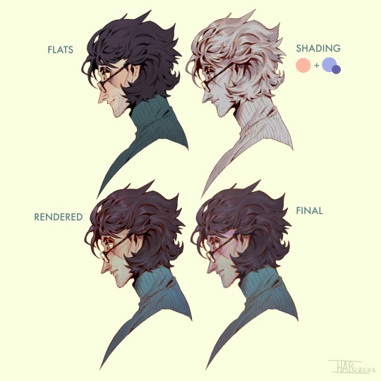
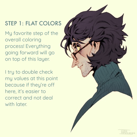
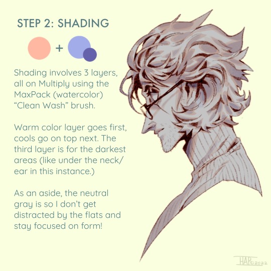
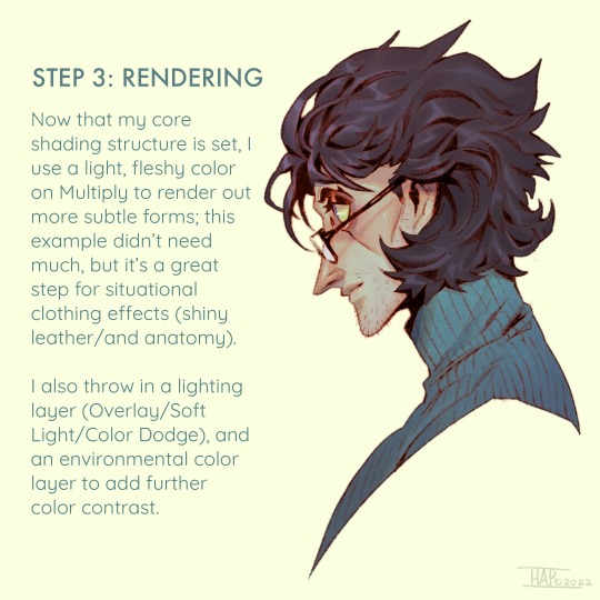
Rendering step-by-step (2022)
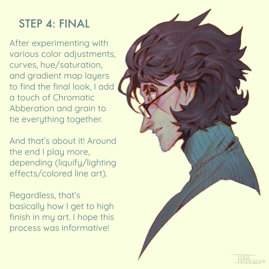
#kodasea#own art#2022 art#digital artwork#procreate art#art#artists on tumblr#art tutorial#step by step#shading tutorial#rendering tutorial#drawing tutorial#cold case crew#own character#cold case detective#lawrence#Still follow this basically! Although recently I've been playing with inching back the realism in the light logic/shadows a bit
4K notes
·
View notes
Text
Step by Step Guide to Admission Granting in the Samarth Portal
Step by Step Guide to Admission Granting in the Samarth Portal. Admission in Samarth Portal. Instructions in Assamese and English. www.assam.samarth.ac.in. Student Admission Granting Process for the Provincialized, Non-Provincialized and Private Colleges. সামাৰ্থ পৰ্টেলত নামভৰ্তি নিৰ্দেশনাত কলেজৰ পৰ্টেলত নামভৰ্তি পৰিচালনাৰ বাবে এটা পদ্ধতিৰ বিশদ বিৱৰণ দিয়া হৈছে: 1. লগইন আৰু ডেচব’ৰ্ড…

View On WordPress
#Assam Government Services#Assam State Higher Education Admission Portal#College Admission in Assam#Four Year Under Graduate Program FYUGP#Gauhati University#National Educational Program -NEP 2020#Samarth Assam Online Admission#SAMARTH Project Govt of India#Step by Step Tutorials
0 notes
Text
https://programmingfields.com/use-redux-react-redux-in-react-js-with-example
#How to use Redux#React Redux in React JS with Example#reducer in react#what is redux in react js#Step By Step Tutorials
0 notes
Note
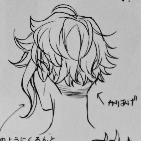
Any tips on drawing bakugou's and kirishima's hair? I saw a tutorial on drawing deku's hair, it was wonderful. (thank you in advance❤️)
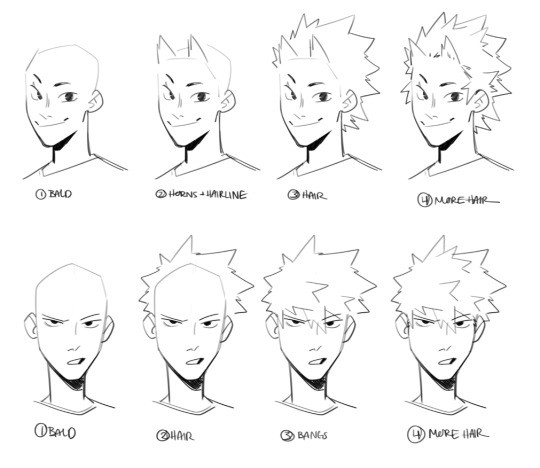
they have very similar spiky shapes in their hair
I made more stuff on bakugou's hair here :) but it's like two years old now lol
#ask#doodles#art tips#every tutorial I do it a little ���step one draw a circle step two draw the rest”#but like... it's just lines idk how to break it up more than that
698 notes
·
View notes
Text
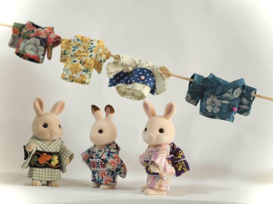
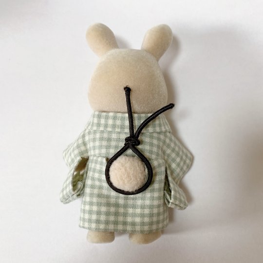
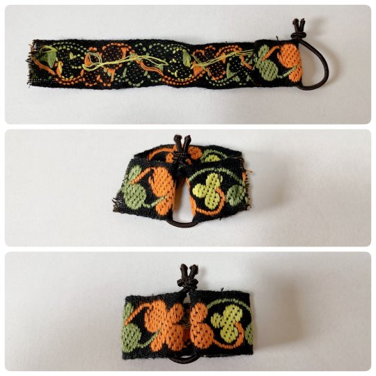
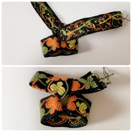
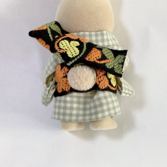
To complete past diy kimono dressing for Sylvanians Families/Calico Critters I shared before (see 1 / 2), here is a new step by step by @haluchobin to create cute easy to put on obi :
Tie a thin elastic into a loose loop around the tail
Slip both ends of a ribbon through the loop and sew into place
Tie another ribbon around the elastic covering the knot. Style it into a bow, you can try to mimic real musubi if you want
Put on the finished obi and enjoy!
#japan#art#craft#sylvanian families#doll#figurine#doll clothes#sylvanian family clothes#diy#step by step#tutorial#kimono#obi#着物#帯
1K notes
·
View notes
Text


Hj really knows how to get on hwa’s last nerve talking about being over his beloved abura soba gekdhdjd
#seonghwa#park seonghwa#hongjoong#kim hongjoong#matz#ateez#his beady angry eyes immediately enflamed with offense fhdkdhdkbddkndjd#how this came right after his step by step tutorial to make the perf bowl too bahahahaha#he does NOT play when it comes to his abura soba
694 notes
·
View notes
Text
Alrighty, let's tackle the second part of this request!
Here's a tuto on how to draw the nightmare that is Azul's hair!
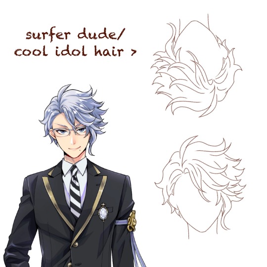
First, a few observations.
Contrary to other characters like Jamil, Riddle, or Sebek, Azul's hair doesn't immediately tell you everything about his personality. For someone as calculating and (trying to be) mature as Azul, you'd expect his hair to be slick and and each strand to be at it's proper place.
It's the contrary here. Azul has wavy, almost curly hair that is completely all over the place.
It's because that's his own struggle that is shown here. Azul has always fought against himself, being his octopus nature, his weight, or even his hair that won't stick down. That boy is just cursed to forever have something about himself that doesn't fit his aesthetic.
(Personally whenever I look at Azul upside down, I really feel like it'd be the kind of hair for a cool extroverted guy in an Idol gacha game)
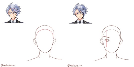
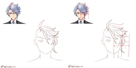
Step 1. Hairline
Azul has a simple round hairline so simply draw an arch.
Step 2. Hair root
Azul's hair all comes from a point right above the left side of his left iris, so I would suggest you draw Azul's face (and even glasses) first.
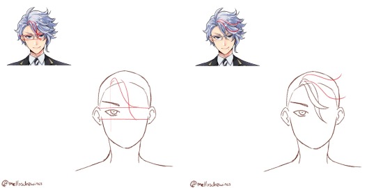
Step 3. Bangs
Azul has two strands that fall between his eyes, just a bit to the right. Start from the root point you placed earlier, and draw two wavy lines intersecting. The first will stop at the upper rim of his glasses, above his right iris area. The second will stop at the lower rim of his glasses, below his right iris area.
All of Azul's hair will be made with soft waves that fork back up, so train yourself to do that move flowingly. You're not done using it.
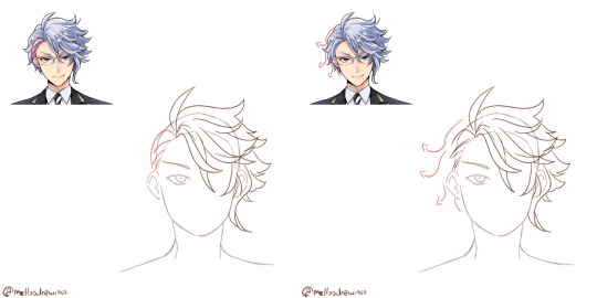
Step 4. Front hair 1
There are two strands that seem closer to us and frame the other bangs, so let's draw them first. In my example I drew the lower strand a bit too high, it should come right above Azul's right eye. The upper one thought will almost be horizontal. Both of those will reach the area above the right ear.
Once more, waves.
Step 5. Front hair 2
Now the two strands between the last two. They will go further than the ear.
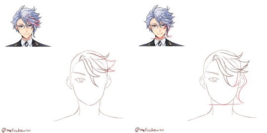
Step 6. Side strand
Azul's tentacle-like strand. It is composed by the only strand of hair that forks towards his face, instead of outward. It goes around the eye and reaches lower than the middle strand.
The second part is the actual tentacle. It hides the ear entirely and reaches down to Azul's chin level.
Still, always a wave that forks outward.
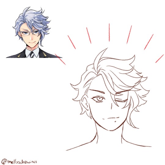
Step 7. Ahoge
Yup. "Mature" and calculating Azul has an ahoge. That might be the only part of his hair that does indeed reflect his personality. Azul can be quite immature and stupid at times. (For those who don't know, "ahoge" literally means "stupid hair" and it's usually used on stupid or immature characters)
Simply make it start at the root point. It's about the size of Azul's hairline to eyes, but globally just make it go up above where the rest of his hair would go.
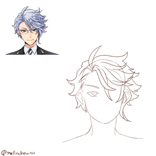
Step 8. Right side
That is the part that people (even Yana if we trust the notes she made) struggle with. There is a volume here that can't be too fluffy or not big enough. It's actually just the size of half his face. Put your mark and do your best to fill it without going further.
From there, draw about 4 or 5 waves. Connecting each tip should make an arch, with the further point being the strands at Azul's eye level.
Step 9. Behind the ear
The only part of Azul's hair that is well groomed is those few strands of hair, that look like they were pushed behind his ear. This is also the only part (alongside the ahoge) that isn't made using a wave.
Step 10. Left side
And we're back to drawing waves, this time forking left. There is about 3 waves to do. These strands won't be as fluffy as the right side, sticking closer to the skull, but still add some volume. Wavy/curly hair just can't stick to the skull (I'd know it *sigh*)
Step 11. Details
Time to check your proportions, add a few lines within the strands, add more lines at the roots to show that his hair go from here.
Finished!
So. Idol!Azul when? (One day. One day I'll do that Housewarden Idol AU)
(Last note: he does have an undercut. I'll forever go crazy about Azul of all people having a fuckboi (/affectionate) haircut)
(Official pic from the Magical Archives)
#this one got long#but I spent so much time dissecting Azul's chara design#have I told you dissecting and analyzing character designs wa my fav pasttime?#mello's drawings#twisted wonderland#twst#azul ashengrotto#my art#ask me anything#analysis#art tips#step by step#tutorial#tuto#drawing tutorial
447 notes
·
View notes
Text


Here are some painting tips, as promised. I hope they will help beginner artists!
Composition
Position of characters on the sheet
Choose the location of your character to be beneficial to the appearance of the art in general, you can accentuate the important places where the viewer should look first by using perspective and composition.
Tone sketch
Set the lights based on references, but adjust to your own, favourable lighting.
Contrasts come in many forms. Contrast in color (warm and cold), values (dark and light), shapes soft and hard, straight and curve, etc.
Less is better. Work on the details of the most important part of your work while cutting down everything else. If you do strong detail in one place, don't forget to add looser detail in another so the viewer's eye can rest. For example: If you are detailing a portrait, don't detail the background as much. Next to a place of high detail, there should be a place of low detail so that the picture does not look overloaded.
All in all, you can twist and break perspective, anatomy and shapes to convey your idea better. No rules are made of steel, they should support your imagination, not restrict it
Anatomy
Break down objects into simple shapes to arrange them in space.
Check references! plasticity comes first, then structure (muscles are important, but proportions and line of movement come first).
Take a photo of yourself, you will be able to understand how to perform your pose naturally. Color/light.
Light is part of the composition, put it in a way that highlights the important things. Air perspective
General rules of composition. From the general to the particular, first prepare the general scene, correctly place contrasts and accents, make everything important in contrast, and take the unimportant into an aerial perspective. (aerial perspective, or atmospheric perspective, refers to the technique of creating an illusion of depth by depicting distant objects as paler, less detailed, and usually bluer than near objects.)
When all the points are ready we can start working out the details.
When all the details are finished again it's back to the overall picture, looking at it from a distance. Check if the accents you wanted to draw attention to are working. They should have the highest contrast. Check if the contrast is not created by objects on the edges, where you don't want the viewer to pay attention. For example, if you are painting a portrait then the focus should be on the face and not on the details of the clothes or details in the background. (You can always convert the image to black and white and check the contrast)
Save the stages of your work to check against the initial idea and see what things have changed for better or worse!
#digital art#art tips#beginner artist#small artist#digital artist#art advice#art tutorial#art guide#step by step#drawing basics
760 notes
·
View notes
Note
How do you draw the bodies? I know you made a tutorial on how to draw the helms, but I’ve just gotten into transformers and I’m struggling with the mechs😭
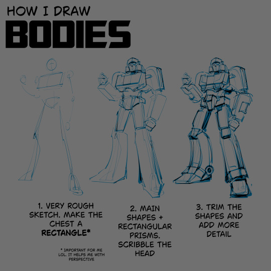
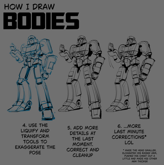
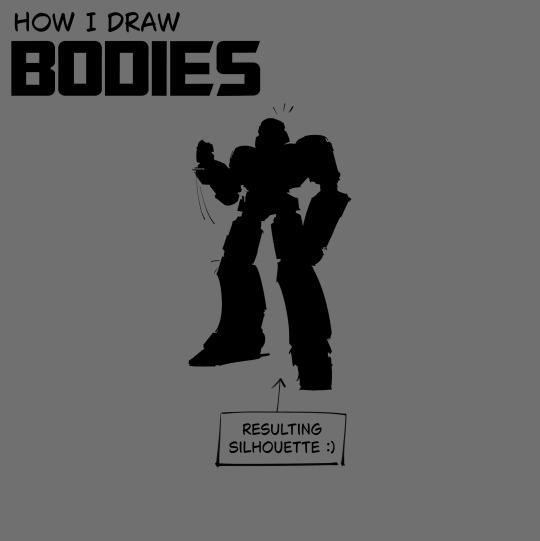
i made this in advance LOL hope it helps
#.txt#tutorial#note that i doodle the pose first and scavenge for references later. in case it matters#also sometimes i don't even get to step 6 LOL i stop at 3 and get right into coloring and rendering#i figure out the details and do corrections as i go. but that's for the stuff that doesn't require lineart#for the lined stuff i have to be more intricate. mistakes are more obvious then. at least imo#but i can cover them up in black fill most of the time mwahahahahhah
553 notes
·
View notes
Text
Of course this had to happen today. Nanami’s tie just had to act up today. What even is today? Your anniversary with Kento, of course! He dressed up all nice and planned a beautiful day for you and him, but his tie won’t tie correctly and the reservation will end soon if you don’t arrive on time.
He fiddles with the tie once more and attempts to untie the knot that somehow formed, but for some damned reason, it doesn’t work. It’s a little too late for him to completely change outfits, and he almost humors the thought of leaving without his outfit complete.
Luckily, you finally come into the room in your gorgeous outfit and see his struggles. You giggle and your footsteps echo through the room as you approach your husband.
“Tie issues?”
“Yes. I don’t know how it knotted up like this,” he sighs and runs a hand through his hair. “We’ll be late to dinner.”
“No, we won’t, I already started the car. All we have to do is fix this tie and go out to eat, we’ll be there exactly the time you planned. Punctual just how you like.”
Saying things like that reminds Kento why he fell for you. You always knew what he was thinking or knew what he needed. He never knew how you did it, but one day you had stolen his heart.
Perhaps it was your sweet smile. Or maybe your actions. Maybe it was the way you bantered with Gojo and never let him get to you. Whatever the deciding factor was, Kento loves you. A lot.
Your hands deftly work the part of the tie he’s having trouble with and untie the knot. You then lift his collar and start tying it. He watches you wrap the wide end of his tie around the narrow end, then move it through the loop you created. You then push it through the knot you created and pull the narrow end to make the tie the correct tightness and fix his collar. He sighs in relief and kisses your hand.
“Let’s go now, yeah?” He mutters against your hand.
“Mhm.”
You grin and take his hand, walking to the car, feeling his wedding ring against your fingers. The radio happens to play the song you two consider “your song”, and you hum along while he silently drives and admires your voice. You arrive at the restaurant right when you said you would, punctual as he likes. You sit at the table and order your food and drinks. When it arrives, he raises his glass to you with a small smile.
“To another amazing year with you, and many more to follow.”
“Indeed.”
You clink your glasses and drink, the rest of the night goes without a problem and you two return home to watch your favorite movie, after changing out of the clothes from dinner. You fall asleep against his shoulder and he chuckles quietly, rubbing your back and carefully lifting you into his arms. He carries you to bed and carefully unties his tie before joining you in bed. He hopes there truly are many more years to come.
Masterlist
#watched a step by step tutorial on how to tie a tie for this#i’m trying so hard to get out of my slump guys :(#jjk#jujutsu kaisen#jjk nanami#jujutsu kaisen nanami#kento nanami#nanami kento#kento nanami x reader#nanami kento x reader#kento fluff#nanami fluff#nanami x reader
469 notes
·
View notes
Text
How to draw Manga/Anime heads in the rev1999 style!


it's not a rendering tutorial and just the construction of the female head for rev1999(and other anime art style really)
the images have alt text!
I highly recommend practicing by trying to replicate the heads in the wallpapers they provide with this method:
1. draw in the guidelines on the image itself(yes,basically tracing,bare with me)
2. hide the construction and draw the same guidelines beside the image
3. compare to the first construction lines
4. now,with the mistakes in mind,hide both the constructions and the image and try to replicate the constructions from memory
repeat 3-4 until satisfied
you should be able to remember how to draw the heads even without reference after doing this a bunch of times! ヽ(o^▽^o)ノ
#the next tutorial might be about the rendering#or the male heads#really depends on my mood ngl#also this is kinda a sequel to the eye tutorial :D#reverse 1999#rev1999#r1999#art#art tutorial#tutorial#anime#manga#anime head#manga head#head construction#step by step#art guide#guide#step by step guide#art style#art style analysis#digital art#illustration#kaalaa baunaa#tooth fairy#jessica#godofart
159 notes
·
View notes
Text


boykingscourt can GIF???
#and no before you say it kaz did NOT help me every step of the way I only asked them like three questions#I am not tech savvy and wanted to feel accomplished and try it on my own (following a tutorial)#(but thank you kaz <3)#and yeah this scene has been done a million times but whatever ain't a crime#sam winchester#supernatural#spn#spn 1x01#spnedit#boykingsgifs#<- working tag
133 notes
·
View notes
Text

Various Log Cabin Quilt Blocks
#quilting#briar rose quilts#bedding#shopping#sewing#quilters of tumblr#decor#gifts#crafts#holiday#quilt#quilt pattern#quiltblr#quilt tutorial#textile art#quilting as art#embroidery#fabric arts#art quilt#weaving#log cabin blocks#log cabin quilt#courthouse steps#courthouse steps quilt
81 notes
·
View notes
Text
#How to Send Email Using Mailgun in Laravel 8#laravel mailgun#mailgun with laravel#mailgun laravel#A Comprehensive Guide#Step By Step Tutorials
0 notes
Text
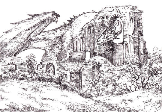
I've been asked a few times now, if these kinds of illustrations are traditional or digital. it's both <: The inks are traditional, made with 03 or 05 micron pen.
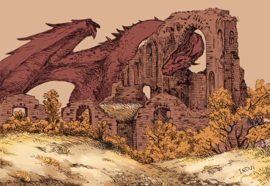
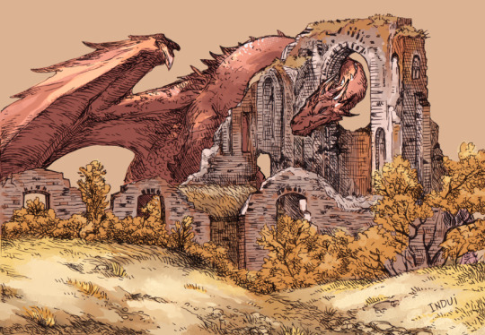
Then I take it to Clip Studio. Paint-bucket and basic brushes are used for big blocks of color and some preliminary details.
Brushes: Dense Watercolor, Transparent Watercolor, India Ink Darker Bleed, Bit Husky, G-pen, Milli Pen, Cross hatching texture brush. Blend: Running Color On Fiber
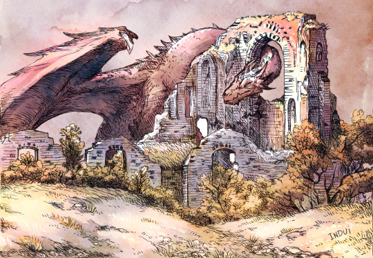
Somewhere in there, I'll pick up a free-to-use watercolor texture and set it on overlay, to see how it meshes with the values I already sketched in. I'll finish up the rest of the smaller details/values with the same above brushes. And voila.
Hope that's helpful <:
#art#art tutorial#dragon#I really enjoy this method because I find inking traditionally more fun than doing it digitally#And meanwhile#I find coloring digitally very fun and fast#Getting a pleasing result very efficiently has been super rewarding to me with this style#it's why I've been doing it so much lately#step-by-step#dragons#dragon art
1K notes
·
View notes
Note
Wouldst thou ever consider publishing a video box record of thine artistic algorithm so that a lowly mortal may learn?
Many people ask about speedpaints and content like this. Right now we're not making videos (yet!), but we publish such step-by-steps of some illustrations each month on our P@tre0n. Not only gif format, but also each stage separately + PSD versions of our files. Plus, sometimes small tutorials about the drawing process
Recordings will be coming soon. This is in our plans. Just our drawing process is a bit wild and a lot of things change in the process, even in the final.. especially with effects :’)
Our work usually always starts with a few sketches, with or without color (depends on how complex the piece is), and then a lineart > rendering parts > adding details > finalizing
Here you can see how Astarion's face changes throughout the process… We didn't like something all the time
407 notes
·
View notes