#building a practice
Text
When it comes to my spiritual practice, I’d rather be inconsistent but sincere than consistent but empty.
2K notes
·
View notes
Note
Rowling isn't denying holocaust. She just pointed out that burning of transgender health books is a lie as that form of cosmetic surgery didn't exist. But of course you knew that already, didn't you?
I was thinking I'd probably see one of you! You're wrong :) Let's review the history a bit, shall we?
In this case, what we're talking about is the Institut für Sexualwissenschaft, or in English, The Institute of Sexology. This Institute was founded and headed by a gay Jewish sexologist named Magnus Hirschfeld. It was founded in July of 1919 as the first sexology research clinic in the world, and was run as a private, non-profit clinic. Hirschfeld and the researchers who worked there would give out consultations, medical advice, and even treatments for free to their poorer clientele, as well as give thousands of lectures and build a unique library full of books on gender, sexuality, and eroticism. Of course, being a gay man, Hirschfeld focused a lot on the gay community and proving that homosexuality was natural and could not be "cured".
Hirschfeld was unique in his time because he believed that nobody's gender was either one or the other. Rather, he contended that everyone is a mixture of both male and female, with every individual having their own unique mix of traits.
This leads into the Institute's work with transgender patients. Hirschfeld was actually the one to coin the term "transsexual" in 1923, though this word didn't become popular phrasing until 30 years later when Harry Benjamin began expanding his research (I'll just be shortening it to trans for this brief overview.) For the Institute, their revolutionary work with gay men eventually began to attract other members of the LGBTA+, including of course trans people.
Contrary to what Anon says, sex reassignment surgery was first tested in 1912. It'd already being used on humans throughout Europe during the 1920's by the time a doctor at the Institute named Ludwig Levy-Lenz began performing it on patients in 1931. Hirschfeld was at first opposed, but he came around quickly because it lowered the rate of suicide among their trans patients. Not only was reassignment performed at the Institute, but both facial feminization and facial masculization surgery were also done.
The Institute employed some of these patients, gave them therapy to help with other issues, even gave some of the mentioned surgeries for free to this who could not afford it! They spoke out on their behalf to the public, even getting Berlin police to help them create "transvestite passes" to allow people to dress however they wanted without the threat of being arrested. They worked together to fight the law, including trying to strike down Paragraph 175, which made it illegal to be homosexual. The picture below is from their holiday party, Magnus Hirschfeld being the gentleman on the right with the fabulous mustache. Many of the other people in this photo are transgender.
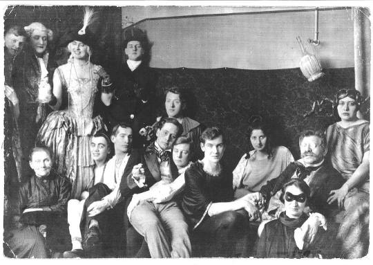
[Image ID: A black and white photo of a group of people. Some are smiling at the camera, others have serious expressions. Either way, they all seem to be happy. On the right side, an older gentleman in glasses- Magnus Hirschfeld- is sitting. He has short hair and a bushy mustache. He is resting one hand on the shoulder of the person in front of him. His other hand is being held by a person to his left. Another person to his right is holding his shoulder.]
There was always push back against the Institute, especially from conservatives who saw all of this as a bad thing. But conservatism can't stop progress without destroying it. They weren't willing to go that far for a good while. It all ended in March of 1933, when a new Chancellor was elected. The Nazis did not like homosexuals for several reasons. Chief among them, we break the boundaries of "normal" society. Shortly after the election, on May 6th, the book burnings began. The Jewish, gay, and obviously liberal Magnus Hirschfeld and his library of boundary-breaking literature was one of the very first targets. Thankfully, Hirschfeld was spared by virtue of being in Paris at the time (he would die in 1935, before the Nazis were able to invade France). His library wasn't so lucky.
This famous picture of the book burnings was taken after the Institute of Sexology had been raided. That's their books. Literature on so much about sexuality, eroticism, and gender, yes including their new work on trans people. This is the trans community's Alexandria. We're incredibly lucky that enough of it survived for Harry Benjamin and everyone who came after him was able to build on the Institute's work.
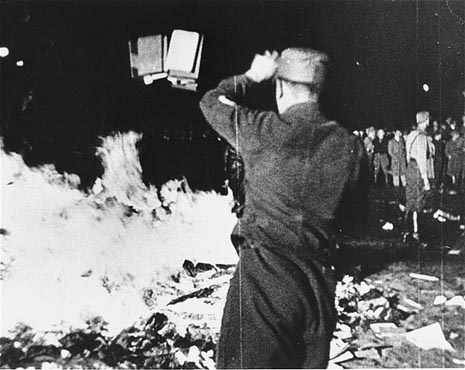
[Image ID: A black and white photo of the May Nazi book burning of the Institute of Sexology's library. A soldier, back facing the camera, is throwing a stack of books into the fire. In the background of the right side, a crowd is watching.]
As the Holocaust went on, the homosexuals of Germany became a targeted group. This did include transgender people, no matter what you say. To deny this reality is Holocaust denial. JK Rowling and everyone else who tries to pretend like this isn't reality is participating in that evil. You're agreeing with the Nazis.
But of course, you knew that already, didn't you?
Edit: Added image IDs. I apologize to those using screen readers for forgetting them. Please reblog this version instead.
#transgender#trans history#transsexual#transphobia#Magnus Hirschfeld#holocaust#holocaust denial#book burning#j.k. rowling#jk rowling#just in case you missed what i mean by all this: go fuck yourself anon :)#trans people have always existed#and we will always exist#if you really wanna pick a fight with me over well-documented history then you better bring in some sources to back your shit#queer history#queer#lgbt+#lgbta+#lgbt#lgbt history#edit: i finally got around to those damn image IDs. i am so very sorry for totally forgetting that's my bimbo moment of the month#also real quick i thought about adding an image of the actual building but the only one i can find has a Nazi parade in front of it#it was taken the day of the book burning raid and honestly if i were to include it then i'd add it to the first few paragraphs#and i think the story's better told when you uphold the hope Magnus Hirschfeld and all the researchers he worked with had#also keeps being brought up: yes Hirschfeld was a eugenicist. it was a popular belief set that was only discredited after WW2#Hirschfeld died in 1935. he literally didn't live long enough to see science turn against those beliefs and practices#considering how he changed his mind on transitions i like to think he would've changed his mind on eugenics too if he'd lived
17K notes
·
View notes
Text

loved impy's new building!
#his building abilities have completely skyrocketed this season#its very cool to see#anyways im back to my practicing#impulsesv#hermitcraft#hermitcraft fanart#hermitcraft season 10#my art
3K notes
·
View notes
Text

Sharing tomorrows.
#did this for class#got to talk about trigun world-building heheh#practicing bg#alexxuun#trigun#trigun maximum#trigun fanart#vashwood#vash the stampede#nicholas d. wolfwood
2K notes
·
View notes
Text
OUGHH joel’s base is so pretty!!!!!
#hermitcraft#smallishbeans#im like actually obsessed with it#makes me want to practice drawing buildings i want to draw this
1K notes
·
View notes
Text
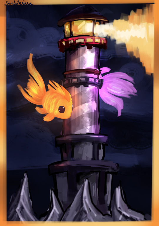
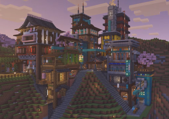
im incredibly obsessed w gems lighthouse btw!
#geminitay#geminitay fanart#hermitcraft#hermitcraft season 10#hermitcraft fanart#strels art#2024 strel art#i promised myself id actually draw structures n backgrounds this year and hwat better way to practice than drawing hc bases/structures#mostly this is me having fun w brushes and attempting structures#anyway yea gems lighthouse is soo cool and im so so excited for her builds this season
1K notes
·
View notes
Note
I have a maybe silly question, but uh. How do I become a more interesting person? I have a horrible habit of staying home and not going out and doing things. How do I not do that? This feels very goofy as a thing to ask, but you appear to have an interesting life, therefore making you a reliable source. Do with this what you will, and please say hi to your creatures! Here is my mischief goblin Jammer for your troubles:

It may seem backwards, but...don't try to be interesting, try to be interested.
Find things you find engaging, and then find ways to pursue them. It's best if you can find some kind of group or community that also does the thing you want to try--if you're struggling to find things you like, then just start trying things local to you. You've probably got a local birdwatching group, or a sewing circle, or a community theater, or a historical society, or a comic shop that does game nights, or a group of regulars volunteering at an animal shelter, or stained glass classes, or a makerspace, or any number of little communities that are out there. Try them! The first meeting will be the worst. And if you hate it, you don't have to keep at it, and trying will give you a fun story. Sooner or later you will land on something you like and then...keep turning up.
And if you're not finding things local and in person, then just take up whatever strikes your fancy at home. If you could be incredible at any three hobbies, what would they be? What's stopping you from starting those hobbies? You're going to fail at them when you start but you're already failing at them now by not starting, so what do you have to lose?
Here's the thing: nobody wants to talk with someone who's just singing their own victories. The best stories are the ones where we tried something new and different and silly and strange and maybe messed it up, but had fun. And the best stories are shared--ask other people about the things they're into, be interested and engaged and maybe see if they're open to teaching you a little, if their interests seem fun to you. It's not about being interesting, it's about sharing passion.
So find the things you're passionate about, and keep at them even after you've failed, and the rest will follow.
And pet your cat, he's doing his job so well!
#look yeah i know a lot of the time the thing that keeps us from being incredible at our dream hobbies is time or money or resources#but almost always you can say okay: what's the small scale version of this that's achievable? what's a starting point?#you don't have to build a whole pottery studio but could you get some polymer clay to put in the oven#you know? There's scale to almost anything#so start the things you wish you were. you don't begin a master#you begin. and the rest is just failing until you don't fail anymore.#i dont think of myself as an interesting person necessarily so take it with a grain of salt. but boy am i interested in practically anythin#also its 2 am and coherency has suffered#kiss that cat!
855 notes
·
View notes
Text
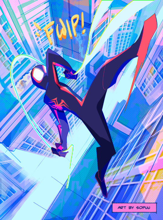
new ps5 game made me watch spiderverse again and i’ve been obsessed about both for a good month now
insomniac miles version and bg only under cut!
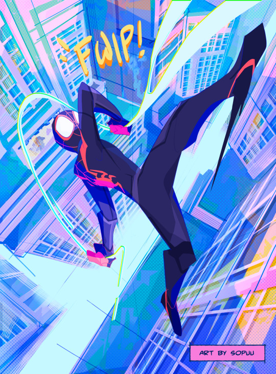

#originally this was drawn for insomniac miles but spiderverse miles fits the piece better#sooo i did both fjkdkd#i still need to draw the spot sometime#also wanted to practice buildings bc they scare me and i don’t want that!!#spiderverse#spider man#insomniac spider man#marvel’s spider man#miles morales#spiderverse fanart#good soup
1K notes
·
View notes
Text
✨🪐Astrology observations🪐✨
These observations are all based off my own personal experience and are mostly generic - don't take it to heart if you disagree <3
🪐 No one seems to fully understand how Aquarius Moons work, including Aquarius Moons themselves.
🪐 I love how heavy Mars influence shows up in people's physical appearance! I’ve always noticed that people with a lot of mars dominance in their chart have a big forehead and/or a widows peak, as well as rosy cheeks or a naturally reddish/pinkish undertone to their skin.
🪐 Undeveloped Virgo and Sagittarius placements absolutely do not give a fuck about your feelings. They can be extremely self centred I've noticed to almost a dangerous detriment.
🪐 A lot of people give Scorpio women the Mean Girl rep, but honestly I think that title should be lent to Virgo women too 😭 They tend to have this hangup about perfection, and I think when undeveloped it shows more as an aversion to anything 'weird' or against the status quo.

🪐 Cardinal Mars signs (that's Aries, Cancer, Libra, Capricorn) reallyyyyy can't hide their dislike for things 😅 people, food, celebrities, whatever. If they don't announce it verbally then you can at least tell by their face lmao.
(I once had to put on my ~emergency socks~ when I was wearing heels on a night out, and every time someone came up to me to tell me how nice my outfit looked I would say thanks and then just not stop yapping about how the socks were not originally apart of the outfit 😭 I couldn't let people think I approved of socks and sandals alksjdgfsjdh)
🪐 Scorpio placements can dish it but can't take it. Cancer placements will sneakily dish it under the guise of a joke and then start crying if you try to dish it back.
🪐 People with Leo Moon tend to 'perform' their activism a lot. That's not to say that they don't practice what they preach, but I think when they do speak up their image has something to do with it
🪐 If you were born under a Mercury Retrograde it might feel like you were destined to be misunderstood no matter how well articulated you are 🙃 I don't think it's a problem with yourself as much as it is with the people you encounter through your life though. Your biggest 'ops' might be people who are very particular and specific about word choice - think Gemini and Virgo Placements (if you are a Gemini/Virgo yourself, this may manifest for you as harbouring some self-hatred or significant self-consciousness).
🪐 Pisces want very badly to be carefree, but a lot of the time they severely struggle getting over their need for outside validation. Being carefree is also a trait they might find attractive in other people.

#I've been building on this post for monthssssss 😭 not even joking#astro community#astro observations#astrology#zodiac signs#zodiac#aries#taurus#gemini#cancer#leo#virgo#libra#scorpio#sagittarius#capricorn#aquarius#pisces#(also to everyone who sent me a tarot ask - i plan on answering them tomorrow evening!)#(big thanks to everyone who sent me a question i appreciate the practice x)
643 notes
·
View notes
Photo
They’re definitely not lost.
#iz#invader zim#iz fanart#invader zim fanart#some background practice#what do buildings even look like???#my art
3K notes
·
View notes
Text
bdubs' greenhouse
#building with bdoubleo#bdoubleo100#my art#aaaaaghhh this is one of these drawings that im not really satisfied with but also idk how to do it better#its for practice i guess
1K notes
·
View notes
Text

waking up at noon
754 notes
·
View notes
Text
why Aurora's art is genius
It's break for me, and I've been meaning to sit down and read the Aurora webcomic (https://comicaurora.com/, @comicaurora on Tumblr) for quite a bit. So I did that over the last few days.
And… y'know. I can't actually say "I should've read this earlier," because otherwise I would've been up at 2:30-3am when I had responsibilities in the morning and I couldn't have properly enjoyed it, but. Holy shit guys THIS COMIC.
I intended to just do a generalized "hello this is all the things I love about this story," and I wrote a paragraph or two about art style. …and then another. And another. And I realized I needed to actually reference things so I would stop being too vague. I was reading the comic on my tablet or phone, because I wanted to stay curled up in my chair, but I type at a big monitor and so I saw more details… aaaaaand it turned into its own giant-ass post.
SO. Enjoy a few thousand words of me nerding out about this insanely cool art style and how fucking gorgeous this comic is? (There are screenshots, I promise it isn't just a wall of text.) In my defense, I just spent two semesters in graphic design classes focusing on the Adobe Suite, so… I get to be a nerd about pretty things…???
All positive feedback btw! No downers here. <3
---
I cannot emphasize enough how much I love the beautiful, simple stylistic method of drawing characters and figures. It is absolutely stunning and effortless and utterly graceful—it is so hard to capture the sheer beauty and fluidity of the human form in such a fashion. Even a simple outline of a character feels dynamic! It's gorgeous!
Though I do have a love-hate relationship with this, because my artistic side looks at that lovely simplicity, goes "I CAN DO THAT!" and then I sit down and go to the paper and realize that no, in fact, I cannot do that yet, because that simplicity is born of a hell of a lot of practice and understanding of bodies and actually is really hard to do. It's a very developed style that only looks simple because the artist knows what they're doing. The human body is hard to pull off, and this comic does so beautifully and makes it look effortless.
Also: line weight line weight line weight. It's especially important in simplified shapes and figures like this, and hoo boy is it used excellently. It's especially apparent the newer the pages get—I love watching that improvement over time—but with simpler figures and lines, you get nice light lines to emphasize both smaller details, like in the draping of clothing and the curls of hair—which, hello, yes—and thicker lines to emphasize bigger and more important details and silhouettes. It's the sort of thing that's essential to most illustrations, but I wanted to make a note of it because it's so vital to this art style.
THE USE OF LAYER BLENDING MODES OH MY GODS. (...uhhh, apologies to the people who don't know what that means, it's a digital art program thing? This article explains it for beginners.)
Bear with me, I just finished my second Photoshop course, I spent months and months working on projects with this shit so I see the genius use of Screen and/or its siblings (of which there are many—if I say "Screen" here, assume I mean the entire umbrella of Screen blending modes and possibly Overlay) and go nuts, but seriously it's so clever and also fucking gorgeous:
Firstly: the use of screened-on sound effect words over an action? A "CRACK" written over a branch and then put on Screen in glowy green so that it's subtle enough that it doesn't disrupt the visual flow, but still sticks out enough to make itself heard? Little "scritches" that are transparent where they're laid on without outlines to emphasize the sound without disrupting the underlying image? FUCK YES. I haven't seen this done literally anywhere else—granted, I haven't read a massive amount of comics, but I've read enough—and it is so clever and I adore it. Examples:


Secondly: The beautiful lighting effects. The curling leaves, all the magic, the various glowing eyes, the fog, the way it's all so vividly colored but doesn't burn your eyeballs out—a balance that's way harder to achieve than you'd think—and the soft glows around them, eeeee it's so pretty so pretty SO PRETTY. Not sure if some of these are Outer/Inner Glow/Shadow layer effects or if it's entirely hand-drawn, but major kudos either way; I can see the beautiful use of blending modes and I SALUTE YOUR GENIUS.
I keep looking at some of this stuff and go "is that a layer effect or is it done by hand?" Because you can make some similar things with the Satin layer effect in Photoshop (I don't know if other programs have this? I'm gonna have to find out since I won't have access to PS for much longer ;-;) that resembles some of the swirly inner bits on some of the lit effects, but I'm not sure if it is that or not. Or you could mask over textures? There's... many ways to do it.
If done by hand: oh my gods the patience, how. If done with layer effects: really clever work that knows how to stop said effects from looking wonky, because ugh those things get temperamental. If done with a layer of texture that's been masked over: very, very good masking work. No matter the method, pretty shimmers and swirly bits inside the bigger pretty swirls!
Next: The way color contrast is used! I will never be over the glowy green-on-black Primordial Life vibes when Alinua gets dropped into that… unconscious space?? with Life, for example, and the sharp contrast of vines and crack and branches and leaves against pitch black is just visually stunning. The way the roots sink into the ground and the three-dimensional sensation of it is particularly badass here:

Friggin. How does this imply depth like that. HOW. IT'S SO FREAKING COOL.
A huge point here is also color language and use! Everybody has their own particular shade, generally matching their eyes, magic, and personality, and I adore how this is used to make it clear who's talking or who's doing an action. That was especially apparent to me with Dainix and Falst in the caves—their colors are both fairly warm, but quite distinct, and I love how this clarifies who's doing what in panels with a lot of action from both of them. There is a particular bit that stuck out to me, so I dug up the panels (see this page and the following one https://comicaurora.com/aurora/1-20-30/):

(Gods it looks even prettier now that I put it against a plain background. Also, appreciation to Falst for managing a bridal-carry midair, damn.)
The way that their colors MERGE here! And the immense attention to detail in doing so—Dainix is higher up than Falst is in the first panel, so Dainix's orange fades into Falst's orange at the base. The next panel has gold up top and orange on bottom; we can't really tell in that panel where each of them are, but that's carried over to the next panel—

—where we now see that Falst's position is raised above Dainix's due to the way he's carrying him. (Points for continuity!) And, of course, we see the little "huffs" flowing from orange to yellow over their heads (where Dainix's head is higher than Falst's) to merge the sound of their breathing, which is absurdly clever because it emphasizes to the viewer how we hear two sets of huffing overlaying each other, not one. Absolutely brilliant.
(A few other notes of appreciation to that panel: beautiful glows around them, the sparks, the jagged silhouette of the spider legs, the lovely colors that have no right to make the area around a spider corpse that pretty, the excellent texturing on the cave walls plus perspective, the way Falst's movements imply Dainix's hefty weight, the natural posing of the characters, their on-point expressions that convey exactly how fuckin terrifying everything is right now, the slight glows to their eyes, and also they're just handsome boys <3)
Next up: Rain!!!! So well done! It's subtle enough that it never ever disrupts the impact of the focal point, but evident enough you can tell! And more importantly: THE MIST OFF THE CHARACTERS. Rain does this irl, it has that little vapor that comes off you and makes that little misty effect that plays with lighting, it's so cool-looking and here it's used to such pretty effect!
One of the panel captions says something about it blurring out all the injuries on the characters but like THAT AIN'T TOO BIG OF A PROBLEM when it gets across the environmental vibes, and also that'd be how it would look in real life too so like… outside viewer's angle is the same as the characters', mostly? my point is: that's the environment!!! that's the vibes, that's the feel! It gets it across and it does so in the most pretty way possible!
And another thing re: rain, the use of it to establish perspective, particularly in panels like this—

—where we can tell we're looking down at Tynan due to the perspective on the rain and where it's pointing. Excellent. (Also, kudos for looking down and emphasizing how Tynan's losing his advantage—lovely use of visual storytelling.)
Additionally, the misting here:

We see it most heavily in the leftmost panel, where it's quite foggy as you would expect in a rainstorm, especially in an environment with a lot of heat, but it's also lightly powdered on in the following two panels and tends to follow light sources, which makes complete sense given how light bounces off particles in the air.
A major point of strength in these too is a thorough understanding of lighting, like rim lighting, the various hues and shades, and an intricate understanding of how light bounces off surfaces even when they're in shadow (we'll see a faint glow in spots where characters are half in shadow, but that's how it would work in real life, because of how light bounces around).
Bringing some of these points together: the fluidity of the lines in magic, and the way simple glowing lines are used to emphasize motion and the magic itself, is deeply clever. I'm basically pulling at random from panels and there's definitely even better examples, but here's one (see this page https://comicaurora.com/aurora/1-16-33/):

First panel, listed in numbers because these build on each other:
The tension of the lines in Tess's magic here. This works on a couple levels: first, the way she's holding her fists, as if she's pulling a rope taut.
The way there's one primary line, emphasizing the rope feeling, accompanied by smaller ones.
The additional lines starbursting around her hands, to indicate the energy crackling in her hands and how she's doing a good bit more than just holding it. (That combined with the fists suggests some tension to the magic, too.) Also the variations in brightness, a feature you'll find in actual lightning. :D Additional kudos for how the lightning sparks and breaks off the metal of the sword.
A handful of miscellaneous notes on the second panel:
The reflection of the flames in Erin's typically dark blue eyes (which bears a remarkable resemblance to Dainix, incidentally—almost a thematic sort of parallel given Erin's using the same magic Dainix specializes in?)
The flowing of fabric in the wind and associated variation in the lineart
The way Erin's tattoos interact with the fire he's pulling to his hand
The way the rain overlays some of the fainter areas of fire (attention! to! detail! hell yeah!)
I could go on. I won't because this is a lot of writing already.
Third panel gets paragraphs, not bullets:
Erin's giant-ass "FWOOM" of fire there, and the way the outline of the word is puffy-edged and gradated to feel almost three-dimensional, plus once again using Screen or a variation on it so that the stars show up in the background. All this against that stunning plume of fire, which ripples and sparks so gorgeously, and the ending "om" of the onomatopoeia is emphasized incredibly brightly against that, adding to the punch of it and making the plume feel even brighter.
Also, once again, rain helping establish perspective, especially in how it's very angular in the left side of the panel and then slowly becomes more like a point to the right to indicate it's falling directly down on the viewer. Add in the bright, beautiful glow effects, fainter but no less important black lines beneath them to emphasize the sky and smoke and the like, and the stunningly beautiful lighting and gradated glows surrounding Erin plus the lightning jagging up at him from below, and you get one hell of an impactful panel right there. (And there is definitely more in there I could break down, this is just a lot already.)
And in general: The colors in this? Incredible. The blues and purples and oranges and golds compliment so well, and it's all so rich.
Like, seriously, just throughout the whole comic, the use of gradients, blending modes, color balance and hues, all the things, all the things, it makes for the most beautiful effects and glows and such a rich environment. There's a very distinct style to this comic in its simplified backgrounds (which I recognize are done partly because it's way easier and also backgrounds are so time-consuming dear gods but lemme say this) and vivid, smoothly drawn characters; the simplicity lets them come to the front and gives room for those beautiful, richly saturated focal points, letting the stylized designs of the magic and characters shine. The use of distinct silhouettes is insanely good. Honestly, complex backgrounds might run the risk of making everything too visually busy in this case. It's just, augh, so GORGEOUS.
Another bit, take a look at this page (https://comicaurora.com/aurora/1-15-28/):

It's not quite as evident here as it is in the next page, but this one does some other fun things so I'm grabbing it. Points:
Once again, using different colors to represent different character actions. The "WHAM" of Kendal hitting the ground is caused by Dainix's force, so it's orange (and kudos for doubling the word over to add a shake effect). But we see blue layered underneath, which could be an environmental choice, but might also be because it's Kendal, whose color is blue.
And speaking off, take a look at the right-most panel on top, where Kendal grabs the spear: his motion is, again, illustrated in bright blue, versus the atmospheric screened-on orange lines that point toward him around the whole panel (I'm sure these have a name, I think they might be more of a manga thing though and the only experience I have in manga is reading a bit of Fullmetal Alchemist). Those lines emphasize the weight of the spear being shoved at him, and their color tells us Dainix is responsible for it.
One of my all-time favorite effects in this comic is the way cracks manifest across Dainix's body to represent when he starts to lose control; it is utterly gorgeous and wonderfully thematic. These are more evident in the page before and after this one, but you get a decent idea here. I love the way they glow softly, the way the fire juuuust flickers through at the start and then becomes more evident over time, and the cracks feel so realistic, like his skin is made of pottery. Additional points for how fire begins to creep into his hair.
A small detail that's generally consistent across the comic, but which I want to make note of here because you can see it pretty well: Kendal's eyes glow about the same as the jewel in his sword, mirroring his connection to said sword and calling back to how the jewel became Vash's eye temporarily and thus was once Kendal's eye. You can always see this connection (though there might be some spots where this also changes in a symbolic manner; I went through it quickly on the first time around, so I'll pay more attention when I inevitably reread this), where Kendal's always got that little shine of blue in his eyes the same as the jewel. It's a beautiful visual parallel that encourages the reader to subconsciously link them together, especially since the lines used to illustrate character movements typically mirror their eye color. It's an extension of Kendal.
Did I mention how ABSOLUTELY BEAUTIFUL the colors in this are?
Also, the mythological/legend-type scenes are illustrated in familiar style often used for that type of story, a simple and heavily symbolic two-dimensional cave-painting-like look. They are absolutely beautiful on many levels, employing simple, lovely gradients, slightly rougher and thicker lineart that is nonetheless smoothly beautiful, and working with clear silhouettes (a major strength of this art style, but also a strength in the comic overall). But in particular, I wanted to call attention to a particular thing (see this page https://comicaurora.com/aurora/1-12-4/):

The flowing symbolic lineart surrounding each character. This is actually quite consistent across characters—see also Life's typical lines and how they curl:

What's particularly interesting here is how these symbols are often similar, but not the same. Vash's lines are always smooth, clean curls, often playing off each other and echoing one another like ripples in a pond. You'd think they'd look too similar to Life's—but they don't. Life's curl like vines, and they remain connected; where one curve might echo another but exist entirely detached from each other in Vash's, Life's lines still remain wound together, because vines are continuous and don't float around. :P
Tahraim's are less continuous, often breaking up with significantly smaller bits and pieces floating around like—of course—sparks, and come to sharper points. These are also constants: we see the vines repeated over and over in Alinua's dreams of Life, and the echoing ripples of Vash are consistent wherever we encounter him. Kendal's dream of the ghost citizens of the city of Vash in the last few chapters is filled with these rippling, echoing patterns, to beautiful effect (https://comicaurora.com/aurora/1-20-14/):

They ripple and spiral, often in long, sinuous curves, with smooth elegance. It reminds me a great deal of images of space and sine waves and the like. This establishes a definite feel to these different characters and their magic. And the thing is, that's not something that had to be done—the colors are good at emphasizing who's who. But it was done, and it adds a whole other dimension to the story. Whenever you're in a deity's domain, you know whose it is no matter the color.
Regarding that shape language, I wanted to make another note, too—Vash is sometimes described as chaotic and doing what he likes, which is interesting to me, because smooth, elegant curves and the color blue aren't generally associated with chaos. So while Vash might behave like that on the surface, I'm guessing he's got a lot more going on underneath; he's probably much more intentional in his actions than you'd think at a glance, and he is certainly quite caring with his city. The other thing is that this suits Kendal perfectly. He's a paragon character; he is kind, virtuous, and self-sacrificing, and often we see him aiming to calm others and keep them safe. Blue is such a good color for him. There is… probably more to this, but I'm not deep enough in yet to say.
And here's the thing: I'm only scratching the surface. There is so much more here I'm not covering (color palettes! outfits! character design! environment! the deities! so much more!) and a lot more I can't cover, because I don't have the experience; this is me as a hobbyist artist who happened to take a couple design classes because I wanted to. The art style to this comic is so clever and creative and beautiful, though, I just had to go off about it. <3
...brownie points for getting all the way down here? Have a cookie.
#aurora comic#aurora webcomic#comicaurora#art analysis#...I hope those are the right tags???#new fandom new tagging practices to learn ig#much thanks for something to read while I try to rest my wrists. carpal tunnel BAD. (ignore that I wrote this I've got braces ok it's fine)#anyway! I HAVE. MANY MORE THOUGHTS. ON THE STORY ITSELF. THIS LOVELY STORY#also a collection of reactions to a chunk of the comic before I hit the point where I was too busy reading to write anything down#idk how to format those tho#...yeet them into one post...???#eh I usually don't go off this much these days but this seems like a smaller tight-knit fandom so... might as well help build it?#and I have a little more time thanks to break so#oh yes also shoutout to my insanely awesome professor for teaching me all the technical stuff from this he is LOVELY#made an incredibly complex program into something comprehensible <3#synapse talks
761 notes
·
View notes
Text


#--/ art#--/ story#ava the dark lord#⬇⬇⬇ context in the tags ⬇⬇⬇#alan becker#animator vs animation#animation vs minecraft#ava the chosen one#it is done !! ok ill give y'all the intro context synopsis now#the story goes that way way way way before Showdown cho and dark used to sneak into abandoned-looking buildings in the city at night#and one such target they stumble upon happens to be a storage room containing artifacts from Minecraft#the most interesting being the beds.#on this particular outing cho and dark were returning from other shenanigans and could use a place to rest. perfect!#dark belly-flops onto the right bed (scooting them out of alignment) and strikes a pose.#while chosen is shoving them back together again... oh. he's already asleep? ...???#!!! the beds draw you in if you get too close!#so what was supposed to be half an hour at most rest turned into the whole night. they skedaddled and forgot about the freaky beds.#until. a certain someone goes and dies :333#you get it now ! ! !#it was dark diesn't ALL ALONG-#yeah and then for extra spice i threw in that the hooded stick King meets with during his episode to buy a command block...#...happens to own that storage room.#thus and so begins more brand new shenanigans with dark interacting with this shady rando. i call em seafoam#i highly extremely doubt there's a tag for seafoam . . . wiki calls them only 'hooded stick figure'#anyhow. behind the scenes this was also a practice of drawing things in 3D... keeping on model... and composition for storytelling#and i learned some things about how Whiteboard works too :o i. didn't know about the fill tool. it is cool#yayaya!! so that's been in my head for a while.#thx for reading <3 <3 ill be posting some close-up shots of this and other things i put on the whiteboard later#Minecraft bed
287 notes
·
View notes
Text

It's the Cosmic Pillar of Creation, Skizz
195 notes
·
View notes
Text

The way most people talk about climate change we are led to believe we all have an equal part in creating the capitalist nightmare we live in, but that’s a lie. The unsustainable and extractive nature of capitalism grew directly from the ideological and material foundations of European colonization. We cannot hold the entire human species responsible for that. It’s victim blaming.
The vast majority of waste is produced by the same people and institutions who hold power. Fighting for our planet, the health of our land, our food, our homes, our communities, is where the fight against capitalism and white supremacy collide. Any fight for environmental justice must also be a fight for racial justice because BI&POC are the ones who disproportionately bear the weight of climate change.
White Settler Colonialism Is Destroying the Planet, Not Poor BI&POC
Don’t believe the Malthusian and eco-fascist myth that there are too many people on the planet to care for. This is a lie peddled by capitalists, eugenicists, and people who advocate for genocide. We know that every landbase has its limit for how much life it can support (indigenous peoples have been saying this for hundreds of years), but “overpopulation” rhetoric is overwhelmingly used as a means to enforce colonial hierarchies where wealthy white people can maintain lives of access and privilege while poor BI&POC barely survive.
Instead of telling poor BI&POC to have less children or to stop wanting better lives, we should build a movement to fight climate change which centers racial justice, abolishes capitalism, and forces wealthy, predominately white populations to stop hoarding resources.
Here are some Earth Day facts for tomorrow so you don’t fall for the lies:
Just 100 companies are responsible for 71% of global emissions. (Source: the Guardian)
Black communities are exposed to 56% more pollution than is caused by their consumption. For Latinx communities, it is 63%. (Source: American Journal of Public Health)
97% of waste produced in the United States is corporate waste. 80% of businesses are owned & operated by white people. (Source: “The Story of Stuff” & US News)
Indigenous peoples make up less than 5% of the planet’s human population, yet they are protecting 80% of its biodiversity. (Source: National Geographic)
The world’s richest 10% produce half of carbon emissions while the poorest half contribute only 10%. (Source: Oxfam)
The world’s wealthiest 16% use 80% of the planet’s natural resources. (Source: CNN)
We are not all equally “responsible.” White settler colonialism and capitalism are destroying the planet, not poor BI&POC.
#climate change#climate crisis#white supremism#community building#practical anarchy#practical anarchism#anarchist society#practical#revolution#anarchism#daily posts#communism#anti capitalist#anti capitalism#late stage capitalism#organization#grassroots#grass roots#anarchists#libraries#leftism#social issues#economy#economics#climate#ecology#anarchy works#environmentalism#environment#solarpunk
149 notes
·
View notes
Last Seen Blogs

marls-mckinnons-archive-blog
Here lies 'Marlene Vivienne McKinnon'
pjo-tsc-trc-otherthingstoo
I'd live and die for moments that we stole

jais-lil-ponies
Jai’s Lil Ponies

fabbistik
S.S. LAZIO!

jasacatering
Monggo Catering