#css image shadow
Explore tagged Tumblr posts
Visit Tumblr Blog
Explore Tumblr blogs with no restrictions, modern design and the best experience.
Last Seen Tumblr Blogs


Fun Fact
China blocked Tumblr because of pornography and censorship problems in 2013.
Text
Getting Creative With HTML Dialog
New Post has been published on https://thedigitalinsider.com/getting-creative-with-html-dialog/
Getting Creative With HTML Dialog
Like ’em or loath ’em, whether you’re showing an alert, a message, or a newsletter signup, dialogue boxes draw attention to a particular piece of content without sending someone to a different page. In the past, dialogues relied on a mix of divisions, ARIA, and JavaScript. But the HTML dialog element has made them more accessible and style-able in countless ways.
So, how can you take dialogue box design beyond the generic look of frameworks and templates? How can you style them to reflect a brand’s visual identity and help to tell its stories? Here’s how I do it in CSS using ::backdrop, backdrop-filter, and animations.
Design by Andy Clarke, Stuff & Nonsense. Mike Worth’s website will launch in June 2025, but you can see examples from this article on CodePen.
I mentioned before that Emmy-award-winning game composer Mike Worth hired me to create a highly graphical design. Mike loves ’90s animation, and he challenged me to find ways to incorporate its retro style without making a pastiche. However, I also needed to achieve that retro feel while maintaining accessibility, performance, responsiveness, and semantics.
A brief overview of dialog and ::backdrop
Let’s run through a quick refresher.
Note: While I mostly refer to “dialogue boxes” throughout, the HTML element is spelt dialog.
dialog is an HTML element designed for implementing modal and non-modal dialogue boxes in products and website interfaces. It comes with built-in functionality, including closing a box using the keyboard Esc key, focus trapping to keep it inside the box, show and hide methods, and a ::backdrop pseudo-element for styling a box’s overlay.
The HTML markup is just what you might expect:
<dialog> <h2>Keep me informed</h2> <!-- ... --> <button>Close</button> </dialog>
This type of dialogue box is hidden by default, but adding the open attribute makes it visible when the page loads:
<dialog open> <h2>Keep me informed</h2> <!-- ... --> <button>Close</button> </dialog>
I can’t imagine too many applications for non-modals which are open by default, so ordinarily I need a button which opens a dialogue box:
<dialog> <!-- ... --> </dialog> <button>Keep me informed</button>
Plus a little bit of JavaScript, which opens the modal:
const dialog = document.querySelector("dialog"); const showButton = document.querySelector("dialog + button"); showButton.addEventListener("click", () => dialog.showModal(); );
Closing a dialogue box also requires JavaScript:
const closeButton = document.querySelector("dialog button"); closeButton.addEventListener("click", () => dialog.close(); );
Unless the box contains a form using method="dialog", which allows it to close automatically on submit without JavaScript:
<dialog> <form method="dialog"> <button>Submit</button> </form> </dialog>
The dialog element was developed to be accessible out of the box. It traps focus, supports the Esc key, and behaves like a proper modal. But to help screen readers announce dialogue boxes properly, you’ll want to add an aria-labelledby attribute. This tells assistive technology where to find the dialogue box’s title so it can be read aloud when the modal opens.
<dialog aria-labelledby="dialog-title"> <h2 id="dialog-title">Keep me informed</h2> <!-- ... --> </dialog>
Most tutorials I’ve seen include very little styling for dialog and ::backdrop, which might explain why so many dialogue boxes have little more than border radii and a box-shadow applied.
Out-of-the-box dialogue designs
I believe that every element in a design — no matter how small or infrequently seen — is an opportunity to present a brand and tell a story about its products or services. I know there are moments during someone’s journey through a design where paying special attention to design can make their experience more memorable.
Dialogue boxes are just one of those moments, and Mike Worth’s design offers plenty of opportunities to reflect his brand or connect directly to someone’s place in Mike’s story. That might be by styling a newsletter sign-up dialogue to match the scrolls in his news section.
Mike Worth concept design, designed by Andy Clarke, Stuff & Nonsense.
Or making the form modal on his error pages look like a comic-book speech balloon.
Mike Worth concept design, designed by Andy Clarke, Stuff & Nonsense.
dialog in action
Mike’s drop-down navigation menu looks like an ancient stone tablet.
Mike Worth, designed by Andy Clarke, Stuff & Nonsense.
I wanted to extend this look to his dialogue boxes with a three-dimensional tablet and a jungle leaf-filled backdrop.
Mike Worth, designed by Andy Clarke, Stuff & Nonsense.
This dialog contains a newsletter sign-up form with an email input and a submit button:
<dialog> <h2>Keep me informed</h2> <form> <label for="email" data-visibility="hidden">Email address</label> <input type="email" id="email" required> <button>Submit</button> </form> <button>x</button> </dialog>
I started by applying dimensions to the dialog and adding the SVG stone tablet background image:
dialog width: 420px; height: 480px; background-color: transparent; background-image: url("dialog.svg"); background-repeat: no-repeat; background-size: contain;
Then, I added the leafy green background image to the dialogue box’s generated backdrop using the ::backdrop pseudo element selector:
dialog::backdrop background-image: url("backdrop.svg"); background-size: cover;
Mike Worth, designed by Andy Clarke, Stuff & Nonsense.
I needed to make it clear to anyone filling in Mike’s form that their email address is in a valid format. So I combined :has and :valid CSS pseudo-class selectors to change the color of the submit button from grey to green:
dialog:has(input:valid) button background-color: #7e8943; color: #fff;
I also wanted this interaction to reflect Mike’s fun personality. So, I also changed the dialog background image and applied a rubberband animation to the box when someone inputs a valid email address:
dialog:has(input:valid) background-image: url("dialog-valid.svg"); animation: rubberBand 0.82s cubic-bezier(0.36, 0.07, 0.19, 0.97) both; @keyframes rubberBand from transform: scale3d(1, 1, 1); 30% transform: scale3d(1.25, 0.75, 1); 40% transform: scale3d(0.75, 1.25, 1); 50% transform: scale3d(1.15, 0.85, 1); 65% transform: scale3d(0.95, 1.05, 1); 75% transform: scale3d(1.05, 0.95, 1); to transform: scale3d(1, 1, 1);
Tip: Daniel Eden’s Animate.css library is a fabulous source of “Just-add-water CSS animations” like the rubberband I used for this dialogue box.
Changing how an element looks when it contains a valid input is a fabulous way to add interactions that are, at the same time, fun and valuable for the user.
Mike Worth, designed by Andy Clarke, Stuff & Nonsense.
That combination of :has and :valid selectors can even be extended to the ::backdrop pseudo-class, to change the backdrop’s background image:
dialog:has(input:valid)::backdrop background-image: url("backdrop-valid.svg");
Try it for yourself:
Conclusion
We often think of dialogue boxes as functional elements, as necessary interruptions, but nothing more. But when you treat them as opportunities for expression, even the smallest parts of a design can help shape a product or website’s personality.
The HTML dialog element, with its built-in behaviours and styling potential, opens up opportunities for branding and creative storytelling. There’s no reason a dialogue box can’t be as distinctive as the rest of your design.
Andy Clarke
Often referred to as one of the pioneers of web design, Andy Clarke has been instrumental in pushing the boundaries of web design and is known for his creative and visually stunning designs. His work has inspired countless designers to explore the full potential of product and website design.
Andy’s written several industry-leading books, including ‘Transcending CSS,’ ‘Hardboiled Web Design,’ and ‘Art Direction for the Web.’ He’s also worked with businesses of all sizes and industries to achieve their goals through design.
Visit Andy’s studio, Stuff & Nonsense, and check out his Contract Killer, the popular web design contract template trusted by thousands of web designers and developers.
#:has#2025#Accessibility#ADD#amp#animation#animations#applications#aria#Art#Article#Articles#Assistive technology#attention#background#background-image#book#Books#border#box#box-shadow#Branding#change#Color#content#CSS#css animations#data#Design#designers
1 note
·
View note
Text
Raspberry Delight


The css for the buttons is from a skin made by @ao3commentoftheday with the colors changed to make them more pink.
The pink icons were made by @zerafinacss
@zerafinacss also has pink stat icons that look really good with this skin. It would replace the language/words/chapters ect. with some cute pink icons.
If you want this skin, the code is under here!
First, you have to put these codes into the wizard.

After you save that, you just copy and paste this code:
#header .logo {
background-image: url("https://images.squidge.org/images/2024/03/30/AO3_imageset_pink.png");
background-size: 250px 1044px;
padding: 42px 0 0 60px;
width: 0 !important;
height: 0 !important;
background-position: -140px -749.6px;
}
#header ul.primary,
#header h2 {
box-shadow: none;
}
.required-tags .rating-notrated,
.required-tags .rating-general-audience,
.required-tags .rating-explicit,
.required-tags .rating-mature,
.required-tags .rating-teen,
.required-tags .category-femslash,
.required-tags .category-gen,
.required-tags .category-slash,
.required-tags .category-none,
.required-tags .category-het,
.required-tags .category-multi,
.required-tags .category-other,
.required-tags .complete-no,
.required-tags .complete-yes,
.required-tags .warning-yes,
.required-tags .warning-no,
.required-tags .warning-choosenotto,
.required-tags .external-work,
.status .private .text,
.status .public,
.status .hidden,
.status .rec,
.status .count,
.index .skins .icon,
.index .mystery .icon,
.index .tag .icon,
.index .tagset .icon,
.comment .icon .anonymous,
.comment .icon .visitor,
.abbreviated .icon .visitor,
.abbreviated .icon .anonymous,
.skins .primary .icon,
.admin .primary .icon,
.tagset .primary .icon,
.tag .primary .icon,
a.rss span,
p.kudos,
#symbols-key dl img,
#bookmark-symbols-key img,
img[src$="/images/skins/iconsets/default/icon_user.png"],
img[src$="/images/skins/iconsets/default/icon_collection.png"],
img[src$="/images/lockblue.png"] {
background-image: url("https://images.squidge.org/images/2024/03/30/AO3_imageset_pink.png");
background-size: 200px 835px;
}
#symbols-key dl img,
#bookmark-symbols-key img {
width: 0 !important;
height: 0 !important;
padding: 25px 0 0 25px;
}
img[src$="/images/skins/iconsets/default/rating-notrated.png"],
img[src$="/images/skins/iconsets/default/category-none.png"],
img[src$="/images/skins/iconsets/default/warning-no.png"] {
background-position: -150px 0px;
}
img[src$="/images/skins/iconsets/default/rating-general-audience.png"] {
background-position: -50px -25px;
}
img[src$="/images/skins/iconsets/default/rating-teen.png"] {
background-position: 0px -25px;
}
img[src$="/images/skins/iconsets/default/rating-mature.png"] {
background-position: -75px -25px;
}
img[src$="/images/skins/iconsets/default/rating-explicit.png"] {
background-position: -25px -25px;
}
img[src$="/images/skins/iconsets/default/category-femslash.png"] {
background-position: -25px 0px;
}
img[src$="/images/skins/iconsets/default/category-het.png"] {
background-position: -75px 0px;
}
img[src$="/images/skins/iconsets/default/category-gen.png"] {
background-position: -50px 0px;
}
img[src$="/images/skins/iconsets/default/category-multi.png"] {
background-position: -100px 0px;
}
img[src$="/images/skins/iconsets/default/category-other.png"] {
background-position: -125px 0px;
}
img[src$="/images/skins/iconsets/default/warning-choosenotto.png"] {
background-position: -125px -25px;
}
img[src$="/images/skins/iconsets/default/warning-yes.png"] {
background-position: -150px -25px;
}
img[src$="/images/skins/iconsets/default/warning-external-work.png"] {
background-position: -75px -50px;
}
img[src$="/images/skins/iconsets/default/complete-no.png"] {
background-position: -100px -25px;
}
img[src$="/images/skins/iconsets/default/complete-yes.png"] {
background-position: -175px -25px;
}
img[src$="/images/skins/iconsets/default/bookmark-rec.png"] {
background-position: -100px -50px;
}
img[src$="/images/skins/iconsets/default/bookmark-public.png"] {
background-position: -125px -50px;
}
img[src$="/images/skins/iconsets/default/bookmark-private.png"] {
background-position: -175px -50px;
}
img[src$="/images/skins/iconsets/default/bookmark-hidden.png"] {
background-position: -150px -50px;
}
img[src$="/images/skins/iconsets/default/icon_user.png"],
img[src$="/images/skins/iconsets/default/icon_collection.png"],
img[src$="/images/lockblue.png"] {
width: 0 !important;
height: 0 !important;
}
img[src$="/images/skins/iconsets/default/icon_user.png"] {
padding: 100px 0 0 100px;
background-position: 0px -75px;
}
.index:not(.comment) .abbreviated img[src$="/images/skins/iconsets/default/icon_user.png"] {
padding: 75px 0 0 75px;
background-position: 0px -375px;
}
.index:not(.comment) img[src$="/images/skins/iconsets/default/icon_user.png"] {
padding: 55px 0 0 55px;
background-position: 0px -525px;
}
#greeting img[src$="/images/skins/iconsets/default/icon_user.png"] {
padding: 1.786em 0 0 1.786em;
background-position: 0 -19px;
background-size: 201% !important;
}
img[src$="/images/skins/iconsets/default/icon_collection.png"] {
padding: 100px 0 0 100px;
background-position: -100px -175px;
}
.index img[src$="/images/skins/iconsets/default/icon_collection.png"] {
padding: 55px 0 0 55px;
background-position: -55px -525px;
}
img[src$="/images/lockblue.png"] {
padding: 15px 0 0 15px;
background-position: -155px -305px;
}
button,
.actions a,
.actions a:link,
.action,
legend .action:link,
input[type="submit"],
.actions a:visited,
.actions li label,
a.action.modal-closer {
color: #FCF5ED;
background: #A0153E;
border: 1px solid #A0153E;
box-shadow: none;
}
button:hover,
.actions a:hover,
.action:hover,
input[type="submit"]:hover {
color: #00224D;
background: #ff2071 !important;
border: 1px solid #ff2071;
box-shadow: none;
}
.actions li .current,
.current,
#dashboard .current {
color: #FCF5ED;
background: #ff2071;
border: 1px solid #ff2071;
box-shadow: none;
}
dl.meta {
border: 1px solid #a0153e;
}
.wrapper {
box-shadow: 1px 1px 5px #a0153e;
}
.actions input:focus {
border-top: 1px solid #a0153e;
border-left: 1px solid #a0153e;
box-shadow: none;
}
#dashboard .secondary {
background: #ff2071;
box-shadow: inset 2px 2px 5px #a0153e;
}
.alert .userstuff {
background: #ff91ba;
border-color: #ffd6e6;
color: #8a0035;
}
.qtip-content,
.notice:not(.required),
.comment_notice,
.kudos_notice,
ul.notes,
.caution,
.notice a {
color: #fcb6d1;
}
.notice,
.comment_notice,
.kudos_notice,
ul.notes,
.caution,
.error,
.comment_error,
.kudos_error,
.alert.flash {
background: #a0153e;
border: 1px solid #ff91ba;
}
.required,
.error,
.alert.flash {
color: #fcc2d8;
}
button:hover,
.actions a:hover,
.action:hover,
input[type="submit"]:hover {
color: #4f001b;
}
.comment img[src$="/images/skins/iconsets/default/icon_user.png"] {
padding: 55px 0 0 55px !important;
background-position: 0px -525px !important;
}
^ If you only read on desktop, this last bit is unnecessary. It fixes the blank profile pics from being too big on mobile, but in doing so, it does keep the pics small on desktop
EDIT: If you have any problems with the tags on mobile, go to media and select: "max screen and (max-width: 42 em)" and it should fix it!
2K notes
·
View notes
Text
========================================================
[tutorial: build your own neocities/nekoweb page]
========================================================
a beginner's guide for making your very own home on the indie web—retro, personal, weird, and 100% yours.
this ain’t an average wix, squarespace, or tiktok aesthetic.
we’re talking full html/css with soul and attitude.
[ prerequisites ]
------------------
> an idea
> basic text editor (vscode, notepad++, or even notepad)
> account on https://neocities.org or https://nekoweb.org
> some gifs or tiles you love (dig deep or make your own)
> optional: image host or gif repo (or self-host everything)
[ feeling overwhelmed? read this. ]
-----------------------------------
you do *not* need to know everything.
html is not a mountain. it's a garden.
you plant one tag. then another. then a style. then a button.
you can build your site piece by piece.
and every piece is a portal to somewhere personal.
you are allowed to make broken pages.
you are allowed to use templates.
you are allowed to start over as many times as you want.
this is *your* world. you control the weird.
[ step 1: create an account ]
-----------------------------
> neocities: https://neocities.org
> nekoweb: https://nekoweb.org
register a name, log in, and enter your file manager.
this is where you upload your files and see your site live.
[ step 2: your first file - index.html ]
----------------------------------------
make a new file: `index.html`
basic starter:
<html>
<head>
<title>my weird little corner</title>
<link rel="stylesheet" href="style.css">
</head>
<body>
<h1>welcome to the void</h1>
<p>this is my page. it’s strange. like me.</p>
<img src="mygif.gif">
</body>
</html>
> upload to the dashboard
> boom. you’re live at
https://yoursite.neocities.org
or https://nekoweb.org/u/yoursite
[ step 3: add a style sheet - style.css ]
-----------------------------------------
create a file called `style.css` and upload it.
here’s some nostalgic magic:
body {
background: url('tile.gif');
color: lime;
font-family: "Courier New", monospace;
text-shadow: 1px 1px 0 black;
}
img {
image-rendering: pixelated;
}
marquee {
font-size: 20px;
color: magenta;
}
link it in your html and the vibes activate.
[ step 4: decorate it like a haunted usb ]
------------------------------------------
> use <marquee> for chaos scrolls
> embed gifs from https://gifcities.org/
> steal buttons from https://cyber.dabamos.de/88x31/
> set up a guestbook at https://www.smartgb.com/
> loop audio with <audio autoplay loop>
> add fake errors, 90s web lore, random link lists
[ step 5: resources, themes, and comfort ]
------------------------------------------
> templates & layouts: https://numbpilled-themes.tumblr.com
> glitchy gifs & buttons: https://glitchcat.neocities.org/resources
> layout builder: https://sadgrl.online/projects/layout-builder/
> free tiled backgrounds: https://backgrounds.neocities.org/
> beginner html intro: https://www.w3schools.com/html/
> pixel fonts & cyber assets: https://fontstruct.com/
remember:
you don't need to know js. you don't need to be a coder.
you just need a mood, a direction, a dream.
the html will follow.
[ bonus concept: shrine pages ]
-------------------------------
> a page just for one character you love
> a room to house digital fragments of your identity
> embed quotes, music, images like altars
> call it shrine.html and link it from your homepage
[ closing mantra ]
------------------
you are not here to be optimized.
you are not a brand.
you are a ghost inside the machine,
carving your initials into the silicon void.
welcome to Your website.
========================================================
#webcore#old web graphics#neocities#web graphics#carrd graphics#carrd resources#rentry decor#rentry graphics#carrd moodboard#carrd inspo#neopets#indie#indie web#early web#webdevelopment#web development#web resources#web design#old internet#old web#oldweb#nekoweb#transparent gif#tiny pixels#pixel gif#moodboard#tutorial#html page#html theme#htmlcoding
434 notes
·
View notes
Text

ao3 skin that i made!! (copy code under "keep reading")
it's a messy combination of pieces of code from other people's skins and my own changes
the header image is NOT MINE! it is "Pattern Galaxy Space Planets Vibrant Linear Universe" by Arncil on Redbubble, which i just used as an example for an image you could use!
here are some of the skins that i can remember using as part of this, but i've been building it for years so forgive me if i forget some:
Shortening long tag fields by Xparrot (on ao3)
Slim Shaded by AO3 (on ao3)
Lily Garden by tealtiam (on Tumblr)
AO3 Tag category coloring! by ao3css (on Tumblr)
come back here to my tips or leave a comment if you need some help customizing the code!
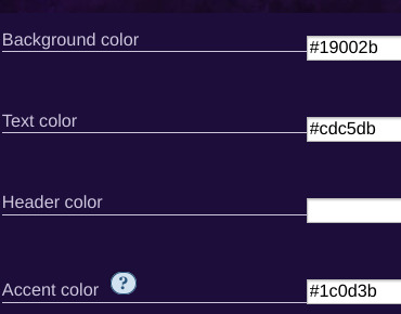
Background color: #26303C
Text color: #CBC6C3
Header color: #46626D
Accent color: #993F33
steps to create a new skin using this code:
log into ao3 account
go to dashboard >> skins
click "create site skin"
make sure TYPE is "site skin"
add a unique title
copy all code below
paste into field 'CSS'
click on "use wizard" at the top
copy and paste the four colors written above into their corresponding boxes
click SUBMIT
click USE
how to customize this skin:
FONT SIZE: at the very top of the code, change the "90%" to be bigger or smaller to change the font size within a fic
MAIN COLORS: to change the main colors, select "use wizard" when editing the skin and replace any of the four hex codes under "Background color:", "Text color:", "Header color:", and "Accent color:"
SECONDARY COLORS: find all hex codes within the code and change those numbers as you like! i changed all colors to match with the color palette of the header photo that i chose to make it feel cohesive
TAG COLORS: towards the end, the "relationship", "character", and "freeform" tags alternate three colors to make them easy to separate. in this skin they are all very similar, so you can change those to be whatever colors you like!
HEADER PHOTO: find the link towards the end of the code right before the warning tags and replace it with a link to any photo you like! it loops, so you don't have to worry about sizing or anything
FONT: i'm unsure how exactly to do this, but the in-fic font is currently set to Georgia Serif, so i suppose just go find that and replace it with your preferred font!
BORDER STYLES: wherever you see the code "border-style:", replace the word that comes after it with one of these options: none, solid, dashed, dotted, double, groove, ridge, inset, outset, or hidden
WARNING TAGS: at the very end of the code is a list of words or phrases that, when they appear in the tags of a fic, are highlighted in a contrasting color so that they are easy to avoid if necessary. you can add or remove those tags however you like, or change the warning color!
COPY AND PASTE ALL CODE BELOW
#workskin { font-size: 90%; } li.blurb .tags { max-height: 7.5em; overflow-y: auto; } #header { min-height: 0; } #header a, #header fieldset, #header ul.primary, #header ul.primary .current { border: 0; background: 0; } h1 a img { height: 50px; border: 0; } #header .landmark { clear: none; } #header ul.primary { background: rgba(0,0,0,0.65); border-bottom: 1px solid rgba(0,0,0,0.75); } #header ul.primary, #header ul.primary .current, ul.primary.actions a, #header ul.primary .current { color: #CBC6C3; } #header ul.primary .current, #header #search input, #header #search input:focus { background: rgba(0,0,0,0.25); color: #CBC6C3; box-shadow: inset 0 0 3px #131A2A; border-color: #131A2A; } .actions, .actions input { text-transform: lowercase; } blockquote.userstuff { font-family: "Mido", "AUdimat", "Ostrich Sans Rounded","Lucida Grande", sans-serif !important; position: relative; background: rgba(0,0,0,0.1); padding: 2%; border: 1px solid rgba(0,0,0,0.15); box-shadow: 0 0 2px rgba(0,0,0,0.4); } blockquote.userstuff:after { content: "\201D"; right: 0; top: auto; left: auto; } body, .userstuff { font-family: Mido, Georgia, serif; } .heading, .userstuff h3, .userstuff h4 { font-family: "CabinSketch", Georgia,serif; } #main .heading { color: #CBC6C3; } #inner .group, #inner .heading, fieldset, .verbose legend, table, table th, col.name, span.unread, span.replied { outline: none; background: transparent; border-color: #131A2A; border-style: double; box-shadow: none; border-radius: 2em; border-bottom-right-radius: 0; border-top-left-radius: 0; } #inner .group .group .group, col.name { border-style: double; border-color: #CBC6C3; box-shadow: 0 0 2px #000; } #inner .bookmark .user.module, #inner .wrapper { border: 0; border-radius: 0; border-top: 3px double #bbb; box-shadow: none; } .filters { font-size: 90%; } .toggled form, .dynamic form, .secondary, .dropdown { background: #fff url("/images/skins/textures/tiles/white-handmade-paper.jpg"); } a.tag, a.tag:visited, a.tag:link { display: inline-block; padding: 1px 3px; margin: 2px 0px; border: 2px solid #46626D; border-radius: 5px; } .commas li:after { content: ""; } h5.fandoms.heading { color: transparent; } .favorite a.tag { border: none; } .tags li.relationships:nth-of-type(3n+1) a.tag { background-color: #1d3954; } .tags li.relationships:nth-of-type(3n+2) a.tag { background-color: #264663; } .tags li.relationships:nth-of-type(3n+3) a.tag { background-color: #305475; } .tags li.characters:nth-of-type(3n+1) a.tag { background-color: #214154; } .tags li.characters:nth-of-type(3n+2) a.tag { background-color: #294c61; } .tags li.characters:nth-of-type(3n+3) a.tag { background-color: #31576e; } .tags li.freeforms:nth-of-type(3n+1) a.tag { background-color: #234e54; } .tags li.freeforms:nth-of-type(3n+2) a.tag { background-color: #2a585e; } .tags li.freeforms:nth-of-type(3n+3) a.tag { background-color: #316269; } .tags li.freeforms a.tag:hover, .tags li.characters a.tag:hover, .tags li.relationships a.tag:hover { background-color: #26303C; color: white; } #header .logo { display: none; } #header ul.primary { box-shadow: none; padding-top: 30px; padding-bottom: 30px; background: #FCC191 url(https://i.pinimg.com/564x/8c/bc/ae/8cbcae1760dc88ae8730566337a5d2eb.jpg); background-attachment: fixed; } li.blurb a.tag[href*="suicid"], [href*="suicide"], [href*="Suicide"], [href*="rape"], [href*="Rape"], [href*="consentual"], [href*="Consentual"], [href*="non-con"], [href*="consent issues"], [href*="Kidnapping"], [href*="kidnapping"], [href*="Canibalism"], [href*="cannibalism"], [href*="Cannibalism"], [href*="Dove"], [href*="dead dove do not eat"], [href*="murder"], [href*="Murder"], [href*="harm"], [href*="self harm"], [href*="Harm"], [href*="Torture"], [href*="abduction"], [href*="asphyxiation"], [href*="blood"], [href*="Blood"], [href*="death"], [href*="Death"], [href*="gore"], [href*="Gore"], [href*="incest"], [href*="Incest"], [href*="trauma"], [href*="Trauma"], [href*="torture"] { color: #000000; font-weight: bold; background-color: #993F33; }
1K notes
·
View notes
Text
learned something interesting trying to make pets reappear on their lookups
.contentModuleContent img {display: none;}
^ short answer, this line was to blame for CSS hiding the pet image. I wrote my own PL code so my fault. it was intended to hide the customization rating stars and some other cruft. Pretty quick to fix, no need to remove the above line.
#pet_anim img {display:block;}
But...... that means the pet is an image separate from their customization items? You can manipulate the size and margins, but it gets off center really easily. how about transform
#pet_anim img {display:block; transform: rotate(180deg) scale(2)}

it doesn't save because [whatever neopets reason here]. how about filter? people used to go nuts grayscaling their shops back in the late 00s...
#pet_anim img {display:block; filter: grayscale(0.8) drop-shadow(3px 2px 30px #ff0000) hue-rotate(210deg)};
and this one does save!
it's lookup CSS so it doesn't generated into the images on userlookups/forums but on their lookup your pet can glow (or radiate darkness) or be grayscale or inverted idk.
Also clothing may or may not share the pet layer so prepare for a scare if doing it on customized pets. maybe you'll make something better looking


#neopets#petlookups are the only places you can use transition and [target=] properties too#someone with design skill can make good w that
159 notes
·
View notes
Note
how'd you set your tumblr to evil shadow skull theme dude that's awesome
( i use a thingy on xkit that makes peoples themes go onto their posts as well )
22 notes
·
View notes
Text

Well no, it’s Thursday, but I wanted to share some wips anyway- better late than never, right? 😅
Thank you for the tags @fiend-for-culture @thewholelemon 🥰 I had planned on catching up on everyone’s posts last night, but thought to myself “I’ll just doodle for half an hour before bed, as a treat” and when I next looked up it was 4 hours later.
Three WIPs for your viewing pleasure


1. My dang website
I’ve been updating my portfolio for what feels like a century, though my calender insists it’s only been a week. Working on my website is always something I find really hard— not for lack of technical ability but because I am riddled with self doubt when it comes to presenting my work professionally. I’ve still got a bit to tweak since Squarespace has some irritating limitations, so I’m going to have to add some custom CSS code for things like the drop down menu (why is it so squished up?? Let me edit the spacing!!) and the odd choices in default line height for all my headings (ironically this is the spacing I’d like for my drop down menu, but it looks ridiculous with the main text). Wild to me that you can only edit the headings as a whole, and not set individual line height preferences for h1/h2/h3 etc. So I will persist while also hating every second of it.
Wips 2 and 3 under the cut! Also cw for the lack of clothing in my 3rd wip artwork (this is the sketch I lost 4 hours to last night because reading rote is killing me)


2. Heartstone Town Concept Art
I shared the first image of this a few weeks ago, but I’m posting it again so you can compare it to the latest version and see my progress. I haven’t had much time to work on it since the last time I shared it, but I’ve added a few layers of shadow and I’ve mostly figured out the colour palette now, so the houses in the foreground are more or less complete. Having added the ‘Scenes & Settings’ page to my website, I’m pleased to be adding to this part of my portfolio more. I have other settings planned and I’m excited to explore those when this one is done.
3. On my Fitzloved BS
As mentioned, I set about doing an indulgent but brief doodle last night as a reward for working on my website all day. Then I found a great pose reference and I thought ‘what if Fitz and the Fool?!?’ and suddenly it was 4 hours later and this had happened. (Honestly I probably spent like 2 hours purely on Beloved’s feet and nipple placement… and I’m still not sure about it). I’d like to add colour and maybe a background— I’m picturing this being a kind of post Fool’s Fate au where they go back to Fitz’s cabin, vaguely fitting in with @tragediegh’s OCACD fic, but I also love the distinct colouring of Fitz’s white hair streak and the Fool when he’s golden, so I may end up setting it around the Fool’s Errand cabin era instead. Either way, they are cosy on the rug by the fire, not confusing love with plumbing.

I never know whether to add tags when I’m late for a thing.. but just to say hi and I hope you’re having a good week:
@youarenevertooold @iamamythologicalcreature @alexalexinii @cattocavo @that-disabled-princess
@orange-peony @cutestkilla @rimeswithpurple @larkral @best--dress
@scribble-tier @theimpossibledemon @artsyunderstudy @raenestee @thewholelemon
@nightimedreamersworld @itriednottothinkaboutit @you-remind-me-of-the-babe @angelsfalling16
@the-beard-of-edward-teach @monbons @katatsumuli @fiend-for-culture
@aristocratic-otter @snowbazdaily @argumentativeantitheticalg @lovelyladzzzz @nausikaaa
#wip Wednesday#it’s actually Thursday but what even is time anyway#sneaking fan art into my professional portfolio and website#rote spoilers#fools errand#fools fate#but also fool’s date?#love and plumbing#fitzloved#fitzchivalry farseer#lord golden#still not okay about these books
18 notes
·
View notes
Text

Day 2 - 100 Days CSS Challenge
Welcome to day 2 of 100 days of css challenge, where we will be together getting a given image result into reality by code.
We already know the drill since we did the first challenge, now let's get right into the different steps:
First step : Screenshot the image and get its color palette

No crazy color palette here, we only have two colors
White
This shade of green: #3FAF82
To make things more organized and get used to coding in an organized way, even if not doing it here wouldn't make any difference because we only have two colors, in more complex projects we would have a lot, we will define our colors at the beginning of our CSS code (well, only the green in this case):
:root { --main-green: #3FAF82; }
And this is how we'll use it whenever we want:
color: var(--main-green);
Second step : Identify the image elements
What elements do I have?
Three lines: line1, line 2, and line 3. I'll add them to my HTML starter template, again I'll leave the frame and center there:
<div class="frame"> <div class="center"> <div class="line-1 line"></div> <div class="line-2 line"></div> <div class="line-3 line"></div> </div> </div>
Third step : Bring them to life with CSS
Applying the background color
Only one line should be changed in the CSS code already added to .frame class:
background: var(--main-green);
So this is what we have going on for now :

Creating the lines
Now let's create our lines; if you noticed I gave each one two classes line-number and then line. I'll use the line class to give them all the common properties they have such as the color, height, width, position, border-radius, and shadow. And then I'll use the line-number to move them wherever I want using the left, top, right, bottom properties of an absolutely positioned element in CSS.
Let's start by creating all of them:
.line { left: -45px; position: absolute; height: 9px; width: 100px; background: white; border-radius: 10px; box-shadow: 2px 2px 5px rgba(0, 0, 0, 0.2); }
And just like this you'll see this in the browser:

You only see one line because the three are overlapping each other, and that's why we'll move each one of them exactly where we want using this:
.line-3 { top: 22px; } .line-1 { top: -22px; }
Now our static menu is ready:

Creating and analyzing the animations
As of observing, we can see that:
Line one goes down to line 2
Line three goes up to line 2
THEN line 2 disappears
THEN lines 1 and rotate to create the X
line-one-goes-down animation
This is my line-one code in the static version:
.line-1 { top: -22px; }
What I'm trying to do here is simply a movement translated by changing top from -22px to it becoming 0px:
@keyframes line-one-goes-down { 0% { top: -22px; } 100% { top: 0px; } }
line-three-goes-up animation
Again, I'm trying to go from top being 22px to it being 0px:
@keyframes line-three-goes-up { 0% { top: 22px; } 100% { top: 0px; } }
line-two-disappear animation
Making disappear simply means turning its opacity and width to 0:
@keyframes line-two-disappear { 0% { opacity: 1; width: 100px; } 100% { opacity: 0; width: 0px; } }
I'm gonna apply these animations and see what happens , before I create the rotation animations
.center.active .line-1 { animation: line-one-goes-down 0.5s forwards; } .center.active .line-2 { animation: line-two-disappear 0.5s forwards; } .center.active .line-3 { animation: line-three-goes-up 0.5s forwards; }
forwards means that the element will stay in the final state after the animation and not return to its original state.
This is what applying those three animations looks like:
Last but not least : let's Create the X
We only have to animations left for this: rotate-line-1 and rotate-line-2. Let's create them:
@keyframes rotate-line-1 { 0% { transform: rotate(0deg); } 100% { transform: rotate(45deg); } } @keyframes rotate-line-2 { 0% { transform: rotate(0deg); } 100% { transform: rotate(-45deg); } }
And that is my friends how we finished this challenge!
Happy coding, and see you tomorrow for Day 3!
#100dayscssChallenge#codeblr#code#css#html#javascript#java development company#python#studyblr#progblr#programming#comp sci#web design#web developers#web development#website design#webdev#website#tech#html css#learn to code
18 notes
·
View notes
Note
Hiya Kate I am on your website (pr0n.stream) and I've been having some trouble getting the CSS on my profile page to work. Would you mind helping me figure out what I'm doing wrong? If not, that's totally ok
This is the code I use to replace the background on my own page.
body{
background-image: url("media/bibleblack.gif");
background-repeat: repeat;
background-size: 638px 480px;
}
.container{
background-color:rgb(20,24,28);
box-shadow: 0px 0px 0px 10px rgb(20,24,28);
}
Hopefully that helps as a starting point.
It just inserts whatever you enter as regular css, so you can check the page source to see what's already there and then google css tutorials or examples to see how to modify it.
11 notes
·
View notes
Text
More QoL and UI Fixes and Updates
The Santae Team has been burning the candle at both ends (not literally!) to keep providing you all with QoL updates. The list of items to process grows steadily shorter as we are nearly halfway through this scheduled time of UI improvement. We are excited to share what new fixes have been implemented, and wonder if you may have already found some of them before this news post was released.
We again, thank all of you for your time and energy as you detailed the fixes you feel were most important for Santae going forward, we honestly could not ask more of our Beta Community.
The newest QoL and UI fixes and improvements are:
> The search feature header menu now has updated styling to match the header menus across site.
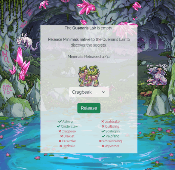
> A Dragon Minimal Checklist has been added to the Quenaris Lair. This check list will update live as you release the minimals into the lair.
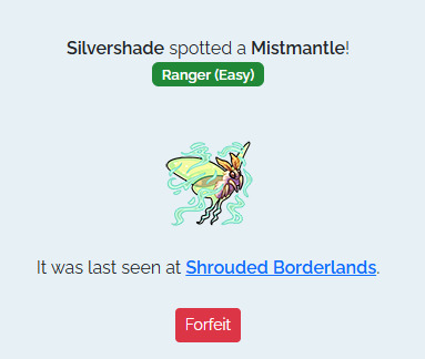
> Silvershade now links to the described land area the minimal you are seeking out is in. For example, if the minimal is in Shadow Veil Pass it will hyperlink that location. You will still need explore that region by checking the sub locations to find the minimal, but this should make your herding experience smoother.
> Users now have the ability to forfeit herding at Silvershade without needing to go find the minimal first.
> The Herding Difficulty is also displayed on the herding page for your active herding quarry:
> Similar to Fishing and Berry Picking, There is now a link on the Herding page to Minimal Menagerie to allow you to buy Tracker Treats with ease.
QoL Updates Continue
Our behind-the-scenes frenzy of Quality of Life and User Interface improvements continues with several more new updates today! This newest update has exciting news in store for our creative community of coders and designers,
Each of the changes below have been enabled for Pet Profiles, User Profiles and User shops!
> Additional CSS properties have been whitelisted, including assorted background-* properties.
> Additional CSS selectors have been enabled too, allowing more complex designs.
> Images are now allowed in CSS!
And that's not all -- we have a few additional improvements to announce to various shops, as well as the Create-a-Pet page:
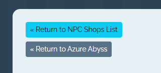
> NPC Shops now have a "Return to <location name>" button
> Multiple purchases can now be made from the Cash/Dust Shop (limit 100 per purchase)

> The Create-a-pet page now shows your total pets / pet slots whilst on cooldown.

> All of the gathering Locations are now updated to v4, which means you can use Scout Mixtures on them as the Abyssal Lake and Forgotten Cave. You can collect your currently gathering pets from the old versions of the gathering pages, which is viewable on the the Gathering List. We are aware that this has removed the Gathering Pool Lists, which are a favorite feature of our community, and will be working towards restoring them soon.
We hope you enjoy these latest updates! And the entire Santae Team would like to thank you all again for your patience and support as we continue to build Santae to be the best it can be. By sharing the fixes you wanted most, bringing bugs to our attention, and simply exploring Santae -- you're helping to make our Beta Test a big success! With Love & Gratitude, ~The Santae Team
7 notes
·
View notes
Note
pi!!! please reupload the full css for your dark and glowy ao3 site skin i beg! i saw it and immediately was like that's the prettiest thing ever :0
code under the cut
#header { background-image: url("https://cdn.pixabay.com/photo/2022/10/19/16/56/fireflies-7533056_1280.jpg"); background-repeat: no-repeat; background-size: cover; background-position: center center; background-color: #152623; }
#header .heading { height: 15em; }
#header .primary { background: #0d1d1f; box-shadow: 0px 0px 15px #f9f6ce; }
#header .logo, #header .heading sup { visibility: hidden; }
#header .heading a { color: #152623; text-shadow: 0px 0px 15px #f9f6ce; }
.event .userstuff { background: #425e50; border: 1px solid #f9f6ce; }
#outer.wrapper { background: #0d1d1f; color: #f9f6ce; }
#main a { color: #8c9b76; }
#greeting a.dropdown-toggle, #header .actions a { color: #f9f6ce !important; text-shadow: 0px 0px 3px #152623; }
#greeting .menu, #header .dropdown .menu, #header .dropdown:hover a { background: #0d1d1f; box-shadow: 0px 0px 15px #f9f6ce; }
span.submit.actions input.button { display: none; }
#greeting img.icon { display: none; }
#header #search .text, .search [role="tooltip"] { background: #0d1d1f; box-shadow: 0px 0px 15px #f9f6ce; color: #f9f6ce !important; border: 1px solid #0d1d1f; }
form.search input[type=text], form.search input[type=submit], .autocomplete div.dropdown ul { background: #0d1d1f !important; border: none; box-shadow: 0px 0px 15px #f9f6ce; color: #f9f6ce; display: block; }
#header #search .text { width: 7em; }
.notice, .comment_notice, .kudos_notice, ul.notes, .caution, .error, .comment_error, .kudos_error, .alert.flash { background: #f9f6ce; box-shadow: 0px 0px 15px #f9f6ce !important; color: #0d1d1f; border: none; }
.notice a, .comment_notice a, .kudos_notice a, ul.notes a, .caution a, .error a, .comment_error a, .kudos_error a, .alert.flash a { color: #506957; font-weight: bold; }
.splash .module h3 { color: #f9f6ce; border-bottom: 2px solid #f9f6ce; }
.splash .favorite li:nth-of-type(2n+1) a { background: #f9f6ce; box-shadow: 0px 0px 15px #f9f6ce; color: #0d1d1f; font-weight: bold; font-variant: small-caps; }
.splash .favorite li:nth-of-type(2n+2) a { color: #f9f6ce; font-weight: bold; font-variant: small-caps; font-size: 110%; }
.splash .favorite li:nth-of-type(2n+1) a:hover, .splash .favorite li:nth-of-type(2n+2) a:hover { color: #f9f6ce; font-weight: bold; font-variant: small-caps; background: #425e50; }
#footer { background: #425e50; color: #f9f6ce; border-top: 3px solid #f9f6ce; box-shadow: 0px 0px 15px #f9f6ce; }
#footer a, #footer .heading { color: #f9f6ce; }
.actions a, .actions a:focus, .actions input:focus, .action:focus, .actions li input, .actions li input[type="submit"], input[type="submit"], .actions li label, ul.navigation.actions li a, .action:link, .actions a:link { background: #425e50; border: 1px solid #f9f6ce; color: #f9f6ce; box-shadow: 0px 0px 15px #f9f6ce; border-radius: 5px; }
.current, #dashboard .current { background: #f9f6ce !important; color: #0d1d1f !important; box-shadow: 0px 0px 15px #f9f6ce !important; border-radius: 5px; }
#dashboard.own { border-top: 5px solid #f9f6ce; border-bottom: 5px solid #f9f6ce; box-shadow: 0px 0px 15px #f9f6ce; }
#dashboard a:hover { background: #0d1d1f; box-shadow: 0px 0px 15px #f9f6ce; }
#dashboard a { color: #f9f6ce; }
dl.meta { border: 1px solid #f9f6ce; box-shadow: 0px 0px 15px #f9f6ce; }
.listbox .index { background: #0d1d1f; }
.listbox, fieldset fieldset.listbox { background: #f9f6ce; box-shadow: 0px 0px 15px #f9f6ce; }
form dl, fieldset, fieldset fieldset, fieldset fieldset fieldset, fieldset fieldset dl dl, dd.hideme, form blockquote.userstuff, input, select, select:focus, textarea, span.symbol.question, .own { background: #0d1d1f !important; color: #f9f6ce !important; border: 1px solid #f9f6ce; box-shadow: 0px 0px 15px #f9f6ce; }
.autocomplete li.added, .post .meta dd ul li.added, label, label.required { color: #f9f6ce; }
span.delete { background: #f9f6ce; box-shadow: 0px 0px 15px #f9f6ce; }
span.delete a { color: #0d1d1f !important; font-weight: bold; }
.ui-sortable li, .dynamic form, div.dynamic { background: #0d1d1f; border: 1px solid #f9f6ce; }
.dropdown { background: #0d1d1f; }
form.verbose legend, .verbose form legend { background: #f9f6ce; color: #0d1d1f; box-shadow: 0px 0px 15px #f9f6ce; }
li.blurb { border: 1px solid #f9f6ce; box-shadow: 0px 0px 15px #f9f6ce; }
.draft { background: #0d1d1f; color: #f9f6ce; border: 2px dashed #f9f6ce; box-shadow: 0px 0px 15px #f9f6ce; }
.draft .wrapper { background: #0d1d1f; border: 1px solid #f9f6ce; }
#header h2 { background: #f9f6ce !important; color: #0d1d1f; box-shadow: 0px 0px 15px #f9f6ce; }
#stat_chart svg rect:first-of-type { opacity: 60%; }
#stat_chart g[clip-path^=url] > g:nth-of-type(2) rect, #stat_chart svg g:nth-of-type(2) > g rect:last-of-type, #stat_chart g[clip-path^=url] > g:nth-of-type(2) rect:first-of-type { filter: hue-rotate(140deg); opacity: 80% !important; }
.statistics .index li:nth-of-type(2n) { background: #0d1d1f; border: 1px solid #f9f6ce; }
.reading h4.viewed, dl.index dd, table, th, dt.child { background: #0d1d1f; }
#modal, span.replied { background: #0d1d1f; color: #f9f6ce; border: 2px solid #f9f6ce; box-shadow: 0px 0px 15px #f9f6ce; }
h4.heading.byline { background: #f9f6ce; color: #0d1d1f; }
li.comment { border: 1px solid #f9f6ce; }
.comment div.icon { border-bottom: 5px solid #f9f6ce; box-shadow: 0px 0px 15px #f9f6ce; }
.thread .even { background: #425e50; }
.unread { background: #0d1d1f; border: 5px dashed #f9f6ce !important; }
span.unread { background: #f9f6ce; color: #0d1d1f; }
span.indicator::before { box-shadow: 0px 0px 15px #f9f6ce; }
.warnings .tag, .work .warning a.tag, dd.warning.tags a { border: 1px solid #f9f6ce; border-radius: 5px; background: #f9f6ce; padding-left: 2px; padding-right: 2px; box-shadow: 0px 0px 10px #f9f6ce; }
.relationships .tag, .work .relationships a.tag, dd.relationship.tags a { background: none; color: #f9f6ce !important; font-weight: bold; text-shadow: 0px 0px 15px #f9f6ce; }
.filters .expander { background: url("https://64.media.tumblr.com/3c89981f933f9f57157d6dcec6fd85a7/94c6737c6db9ad60-e5/s1280x1920/f7557e617a5439c506721bd326580a0cb4c1f8d8.png") left center no-repeat; color: #f9f6ce !important; font-weight: bold; }
.filters .expanded .expander { background: url("https://64.media.tumblr.com/dab095a2fd9387bc1e0c57747ba6b13f/94c6737c6db9ad60-ad/s1280x1920/c1a4e14e0565cdcac5d3e20bebac3ab440f2d607.png") left center no-repeat; }
8 notes
·
View notes
Note
Hey! I just started using Stereo & am loving it, but with the background image I inserted, it's kind of hard to read the blog title/bio text. Is there a way to alter the code to include some kind of text box (box shadow? higlight? not sure the proper word, I've been browsing around code sites) to add some visual contrast?
Hey! I'm glad you do!
You could give the sidebar a background color:
aside { background: green; }
Or try something like text-shadow: https://developer.mozilla.org/en-US/docs/Web/CSS/text-shadow
3 notes
·
View notes
Text
Macaque Site Skin Thing (yippee!)
────────────────────────────────────────────
Notes:
The CSS is mostly mishmashed from other codes and therefore is not perfect, there a places where the site retains its white accents or boxes and can be quite jarring when scrolling in a dark purple background to then suddenly be met with splashes of bright white
I personally wouldn't read works with this, it's mostly for the aesthetic and was not made with comfortable reading in mind (oof)
Wizard Settings/Code Stuff is REQUIRED alongside the CSS because without it the skin looks... kind awful.
────────────────────────────────────────────
CSS:
p.kudos { background: url("https://i.imgur.com/JmZWnGX.png"); background-repeat: no-repeat; }
.listbox, fieldset, fieldset dl dl, fieldset fieldset fieldset, fieldset fieldset dl dl, dd.hideme, form blockquote.userstuff, .dynamic form { background: url("https://i.imgur.com/xoHN0lj.jpeg"); background-repeat: repeat; border: 4px solid #fff; box-shadow: none; }
header h1.heading a::before {
content: url("https://i.imgur.com/9NaliS0.png"); visibility: visible; }
search .button,
header .logo {
display: none; }
header .heading a,
greeting img.icon {
visibility: hidden; }
outer {
background: linear-gradient(90deg, rgba(24, 12, 41,.9) 0%, rgba(16, 7, 28,1) 100%); }
header h1 sup,
header .button,
header .landmark,
header .logo {
display: none; }
inner.wrapper {
margin: 0em 4%; }
header .heading {
height: 20em; }
header {
background-color: #ffffff; background-image: url("https://i.imgur.com/1jqr3CI.png"); background-repeat: no-repeat; background-position: center center; background-size: cover; border-bottom: 2px solid #fff; }
header .heading a {
color: #fff; padding-left: 0em; }
header .primary {
background: none; box-shadow: none; }
greeting {
background: none; margin-right: 0em; position: absolute; right: 0em; top: 0em; }
header .primary li:not(.search),
header .primary li a,
greeting li,
greeting li a {
color: #FFF !important; background: #850900; border-top-left-radius: 2%; }
header .primary li:not(.search),
greeting li {
border: 1px solid #372457; }
.warnings .tag, .work .warning a.tag { background: #06000f; border: 1px solid #06000f; border-radius: 5px; color: #dbc2ed !important; padding-left: .5em; padding-right: .5em; }
.relationships .tag, .work .relationships a.tag { background: #0b0121; border: 1px solid #0b0121; border-radius: 5px; color: #dbc2ed !important; font-weight: bold; padding-left: .5em; padding-right: .5em; }
.characters .tag, .work .characters a.tag { background: #220c4a; border: 1px solid #220c4a; border-radius: 5px; color: #dbc2ed !important; font-weight: bold; padding-left: .5em; padding-right: .5em; }
────────────────────────────────────────────
Wizard Stuff:
────────────────────────────────────────────
1 note
·
View note
Text
The Essentials of Flat Icons: Characteristics and Usage in Modern Design
Icon Design: Common Questions Answered
1. What is a UI icon?
A UI icon is a small graphical symbol used in user interfaces to represent a function, action, or concept. Icons help users quickly identify features or tools, enhancing usability and navigation within software applications or websites. They can be simple images or complex illustrations, often designed to communicate meaning intuitively without relying on text.
2. How do I make my icons smaller than 100%?
To make your icons smaller than 100%, you can adjust their size using CSS. Set the `width` and `height` properties to a percentage less than 100% (e.g., `width: 80%; height: auto;`). If you're using a graphic design tool, look for sizing options and input a smaller percentage or specific pixel dimensions.
3. What is a flat icon?
A flat icon is a graphic design element characterized by a minimalist style, using simple shapes, bold colors, and a lack of three-dimensional effects like shadows or gradients. This design approach emphasizes clarity and ease of recognition, making flat icons popular in user interfaces, applications, and branding, as they convey information quickly and effectively without unnecessary detail.
4. What are program icons?
Program icons are small graphic symbols that represent software applications on a computer or device. They provide a visual way to identify and access programs quickly. Icons often reflect the program's function or branding, making it easier for users to navigate their systems and launch applications with a single click.
5. What is the link rel shortcut icon?
The link rel shortcut icon, often referred to as the favicon, is a small image associated with a website. It appears in the browser tab, bookmarks, and address bar, helping users identify the site quickly. It's defined in HTML using the `<link rel="shortcut icon" href="path/to/icon.ico">` tag, typically in the site's header.

Visit: VS Website See: VS Portfolio
2 notes
·
View notes
Text
Weekly News for Designers № 727 - Fixing CLS Problems, CSS One-Line Upgrades, Future Roles for Designers
New Post has been published on https://thedigitalinsider.com/weekly-news-for-designers-%e2%84%96-727-fixing-cls-problems-css-one-line-upgrades-future-roles-for-designers/
Weekly News for Designers № 727 - Fixing CLS Problems, CSS One-Line Upgrades, Future Roles for Designers
Happy Birthday, Macintosh Forty years ago, Apple introduced the world to the Macintosh computer.
Free Instagram Story Templates A collection of Instagram Story templates for Photoshop, Figma, Sketch, After Effects, Premiere Pro, and Final Cut Pro.
12 Modern CSS One-Line Upgrades Learn about the CSS properties to enhance your projects, reduce technical debt, eliminate JavaScript, and improve the UX.
The Diagram that Shows the Value of Great UX
Fading Content Using Transparent Gradients in CSS Here are two methods for achieving text content fading with CSS. One uses mask-image and the other background-clip.
Top Logo Stinger Premiere Pro Templates We share a collection of logo stinger templates for Premiere Pro that stand out with their style, functionality, and ease of use.
Five Future Roles for Designers Jorge Arango shares five possible future careers for designers in our now AI-driven world.
CSS Blurry Shimmer Effect Learn how to create a CSS blurring effect, but not with box-shadow.
The CSS Snippets Every Developer Should Know Discover the CSS snippets that every front-end developer should know about in 2024.
What’s the Environmental Impact of Your Website? Eric examines the relationship between the web and the planet and shows how to measure your website’s impact.
Git and GitHub Essentials If you’re new to Git or GitHub, this extensive beginner’s guide of the most common commands is for you.
Fixing Cumulative Layout Shift Problems
The Most Underused CSS Media Queries: hover & any-hover Learn how to use the hover and any-hover media queries for responsive design and better experiences on all devices.
Improve Your Logo Design Skills Melinda Livsey shares how she improved her logo design skills by studying the work of Paul Rand and Saul Bass.
#2024#After Effects#ai#amp#apple#background#background-clip#bass#birthday#box#box-shadow#Careers#computer#content#CSS#CSS Snippets#Design#Designer News#designers#Developer#devices#effects#Environmental#environmental impact#figma#Future#git#github#gradients#hover
2 notes
·
View notes
Text
/ramb


the tab title for the blank version reads "Where could this be?", and the lit up version reads "Welcome to the Green Room!" the three doors in this room can be clicked on and lead to various other pages, which i won't describe here in detail as they were already accessible in the original version of the site.
the addition for this version of the site is that the bar in the center is now clickable. it leads to /romb, which is one of the strangest pages in this addition.
more under the cut again!
/romb

this page begins with an image of a pair of double doors. for those unfamiliar, every dark room seen so far in the game is entered through a pair of double doors. i don't believe we've seen this specific doorway anywhere in the game though as of yet. the tab title reads "No one will shed a tear for him."

the mention of a Crystal seems to heavily imply the Shadow Crystals, indicating this may be text seen before or after fighting a secret boss in chapter 3 or 4. clicking on the black text plays a warbly sound effect.
so this seems to be a dead end, right?

during the time in between the page loading, a 96x96 black square floats in the shape of an infinity symbol around the center of the screen. clicking on this square briefly changes the tab title to the text "You can never defeat us!!! Let's rumble." before redirecting to the next page.
/chapter3

this page simply reads "Not applicable." the tab title is an ellipsis "..." however, we can find more on this page by checking the page's css.

this "But..." is being rendered at 120% left, meaning it's pushed off the screen. by changing this to a value like 80%, we can see it on the page.
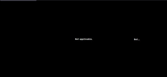
this text seems to indicate that other content can be found on other chapter pages.
/chapter1
this page simply reads "Not applicable." the tab title is once again an ellipsis "..." there is no hidden "but" in the code this time.
/chapter2

this page reads "Applicable." the tab title is once again an ellipsis "..."
/chapter4

this page starts as a black screen. after waiting on it for a minute, a tiny red square will fade in in the middle. this square is clickable. the tab title is the same. clicking on this square leads to /chapter4/message.
/chapter5

this page contains the numbers "2" "4" and "5" in various sizes.

highlighting the text reveals a "1" at an even smaller font than the 4, and a "3" as big as the "2". both of these are in black text when not highlighted. the tab title reads "back"
clicking on the 2 leads to assets/audio/d.mp3. the 3 leads to assets/audio/ma.mp3, and the 5 leads to assets/audio/h.mp3. the 4 redirects back to the /chapter4 page.
(unfortunate note: tumblr is being stupid and won't let me add the audio files now, because while editing this post i exceeded my daily audio upload limit. it also won't let me add back the uploads i already made which got deleted when i edited a draft. tomorrow i will edit this with mp3s, for now just click on the above links to hear!)
d.mp3 is a clip of crashing drums, with 2 synthesized chords playing under them. apparently this plays on the snowgrave route with berdly, lending some significant evidence to the idea that the size of these numbers may relate to how much players choices matter/how much "weird route" potential is in each chapter
ma.mp3 is the warbling effect that plays when clicking on the black sections in the text on /romb.
h.mp3 is a melody played on a synthetic harpsichord(?). none of these audio files are more than 5 or 6 seconds long.
/chapter4/message
this page seems to contain the same graphic as /chapter4, starting completely black and fading in a small red square. this time, however, clicking on the square reloads the page with slightly different content.

highlighting the text with ctrl+a reveals a few black squares below the red dot. these link to either assets/audio/e.mp3 or assets/audio/m.mp3.
e.mp3 is a rumbling sound that cuts off halfway through the file. m.mp3 begins halfway through, and seems to be the second half of the sound effect.
these 3 rows of black squares form the shape of a qwerty keyboard. by noting only the letters that link to m instead of e, you can find the text
these letters, when unscrambled, read "thank you".
T Y U O
A H K
N
/chapter4/thankyou
NOTE: at the time of writing, this page has already been changed! you can view the original version on web archive.

this page contains two rectangles which, upon investigation, are text entry fields. the tab title reads "How long did it take her to smile?"
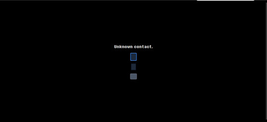
entering anything in the first field causes the text "Unknown contact." to appear. this seemingly implies that this field is used for entering contact information. putting a valid email address causes this text to disappear.

the bottom rectangle is a submit button. entering an email address and leaving the second text field empty causes the text "She never smiled?" to appear. this implies that the field can be filled in with a number answering the question in the tab title ("How long did it take her to smile?")

entering a number and submitting causes the text entry boxes to disappear, replaced only with the text "Thank you."
this seems to imply that the next step may be emailed to those who completed this part of the puzzle, possibly relating to the number entered. i will update if that happens! as of this morning, the text entry box is gone, and the site reads "Thank you" for all visitors.
GOOD MORNING! here is my attempt to recap everything we've found so far on deltarune.com
for those unaware, last night toby released a new newsletter giving information about deltarune's release date. he also released a clip of an alternate ending for the sweepstakes for if silence would've been chosen instead of freedom. (for those even MORE unaware, the spamton sweepstakes were a 2022 2-day event raising money for a charity where all sorts of hidden pages were shown on the DR website.
now, my (and many other people's) immediate reaction to seeing this, as well as this passage in the newsletter,
was that surely the site had been updated with some new content. and it has, a lot of it! and so this is my attempt to document everything so far.
/sweepstakes/silence/
youtube
this page features this short video revealing the alternate ending for the sweepstakes. in it, spamton a. spamton is simply wiped out of existence. not that exciting, but fun to see!

the page also includes a barren version of the main /sweepstakes website, with all the text deleted.
HOWEVER! at the bottom of this page, we can see two links. both of these lead to pages already found in the ORIGINAL run of the sweepstakes.
the rest of this will be under the cut, to avoid spoilers for those interested in exploring the site themselves.
/code

this page is accessible by clicking on the purple square. it was originally found from the main sweepstakes page, on the listing for noelles "fur-thentic cardboard box" from chapter 2. this link leads to the /catpetterz page of noelle's blog, which explains how the Cat Petterz 2 breeding system works. it ends in "Until one day..." which leads to /egg, continuing the story on the previous page. the link at end of /egg brings you to /code, which links back to /egg.
nothing seems to be actually changed on this version of the site, and it only serves as a way to get you back onto /egg.
/egg
this page has all the same text as the 2022 version of the site did, with one exception: the text "secret cats" is now a link! this link leads to /rain.
/rain
this page is an as of yet unseen post from noelle's blog. she describes the experience of staying home from school because of the rain, and a friend coming over to play cat petters. this friend is called "she," making it unlikely to be kris, and as this story takes place in her childhood, it's unlikely to be susie. the postscript says that her friend came over because "she thought that means that I was going to pet HER," which makes me think it might've been catti? if anyone else has any theories, let me know.
the rest of the page discovers another one of noelle's strange cat petters glitches. her "guide to the rarities of different cats" includes "blue ora (aura?)," "rock & roll," and "angle wing" and "super holy angle wing" are listed at 0% and 00000% respectively. another addition to the pile of mysterious connections between noelle and angel symbolism....
she also describes finding a cat that "lowered the amounts of point she had," making her die immediately. the MOST significant thing on this page by far though is a link to "try it yourself," which leads to a simulation of the cat petters minigame she described.
/rarecats

this page links to a cat collecting minigame. one of these green dancing cats will bounce around the screen like the DVD logo, and clicking on it gives an amount of points. the tab title simply displays the number of points so far.
cat-001.gif
this cat gives 10 points. it's probably the "normal" cat that noelle describes.
cat-002.gif

this cat gives 50 points. it's probably the "blue ora" cat that noelle describes.
cat-005.gif

this cat gives 250 points, and plays a guitar chord instead of the sparkling sounds that clicking the other 2 does. it's probably the "rock & roll" cat that noelle describes.
cat-006.gif

this cat gives 1000 points, and plays a very dramatic musical flourish. it also causes a window sprite to briefly appear before disappearing, as seen below.

this sprite links to the /windows page when clicked on. this cat is probably the "ANGLE WING!!!!" cat that noelle describes.
cat-007.gif

this cat gives 3000, and also generates a window sprite linking to the /windows page. it plays a more extended musical flourish as well. it is probably the "SUPER HOLY ANGlE WING!!!!" cat that noelle describes.
other cats
cat-003.gif
this cat looks like a yellow version of the "blue ora" cat. i don't think there's a way to get this cat in the game.
cat-004.gif
this cat looks like the "rock & roll" cat without the flame effect. i don't think there's a way to get this cat in the game.
cat-008.gif
this cat seems to be an even more powered version of the other two angel cats. it may be possible to get in game with even smaller odds, but since noelle's page only lists 2 "angle cats" i think it's unlikely.
cat-009.gif

this is a png of the yellow and pink smile that appears in spamton's basement. the inclusion of it here suggests to me that it is in fact some kind of "cheshire cat" character/allusion, like people have theorized before!
/windows

this page is simply the stained glass window sprite from /rarecats looped over and over. the tab title reads "Are you forgetting something?" each of these links to a page with the words "forest" "grow" "lost" "the" "where" and "would," in seemingly random order. an example of a few of these are
/wherewouldforestlostgrowthe /thegrowlostwouldforestwhere /thewheregrowwouldforestlost /growwherethelostforestwould
only one of these actually leads anywhere, the rest all lead to the "dogcheck" page which is the default for broken links on deltarune.com.
/lostwheretheforestwouldgrow

this page contains an image of a tree, overlayed with an edited version of the water image that seems to be a recurring motif in deltarune, used most recently in "jockington grows the beard". clicking on it plays a solemn piano chord. after clicking a few times, it instead links to /window. the tab title reads "ROOTS."
/window

this page contains the same repeating stained glass windows as /window did. the tab title once again reads "Are you forgetting something?" this time, each links to page with the letters "cdeehhilnooprrt", in seemingly random order. an example of a few of these are
/lonpecrrohedhit /pdolhehrnriceto /ecrorltipendhoh /creohnptredilho
once again, only one of them leads anywhere.
/thepoorchildren
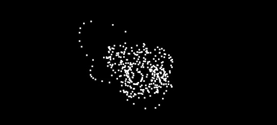
this page is another black screen. this time, you have the ability to draw with the mouse. clicking creates a trail of white squares. the tab title reads "Therapy".

drawing in the middle of the image for around a minute causes a sprite of the "egg room" tree to slowly fade in.

after drawing for a bit, the tree will move to the front and become clickable. clicking on this just returns you to the /egg page mentioned earlier.
as far as i can see, this is everything to be found on the "noelle's blog" side of updates, the ones accessible from the purple square. unfortunately, tumblr has a limit for how many images i can include in a post, so the stuff from the other link i will include in a reblog! be sure to check it out, it's where stuff gets REALLY crazy!
857 notes
·
View notes