#css gradient effect
Explore tagged Tumblr posts
Visit Tumblr Blog
Explore Tumblr blogs with no restrictions, modern design and the best experience.
Last Seen Tumblr Blogs


Fun Fact
25% of US internet users with an annual income of $80-100K use Tumblr.
Text

How to add Gradient Background Overlay
#gradient background overlay#css gradient#html css#divinector#css#html#css3#code#webdesign#frontenddevelopment#css gradient effect#css tricks#css effects#learn to code
1 note
·
View note
Text

CSS Gradient Background Overlay
#css gradient background overlay#codenewbies#html css#frontenddevelopment#html5 css3#css tricks#css effects#css gradient effect#css#webdesign#code
1 note
·
View note
Text

CSS Gradient Text Animation
#css gradient text animation#css animation#css text animation#css text effects#html css#frontend#css#html#css3#learn to code#code#css animation examples#css animation tutorial#css animation snippets#css tricks#frontenddevelopment
2 notes
·
View notes
Text

EMPIRE - MULTIMUSE MUSE PAGE !!!
This page is completely free. Please support me and my work by liking or reblogging this post.
[ INFORMATION ]
THIS CODE IS 100% JAVASCRIPT FREE!!!
This code comes with tabs which allows you to give each muse a separate page. Therefore, you can add as many muses as you want.
The theme is very responsive and doesn’t need much editing!
All colors and effects are easy editable. Not many colors are needed.
The gradient effect over the picture can be removed, it can be turned into one picture, it can be turned into a gray filter or any filter can be entirely removed
The pictures are 250 x 280 in size but they resize automatically if your chosen picture is too small or too big.
The size of the muse picture is also editable and changeable.
The picture can also be removed completely without any editing in the CSS part.
The code offers 2 main links (Home and Ask) but also three free individual links. As well as space for hidden information of your choice.
The main box with detailed information can be edited and designed to your liking. Possible options and variations can be found in the code.
[ GUIDELINES ]
Do not claim as your own.
Do not remove the credit!
Do not use as a base code or take parts of this code for your theme.
Feel free to edit as much as you want!
Editing help and tutorials on how to edit the tabs can be found in the code. A tutorial page is linked there.
Click the SOURCE LINK to be redirected to the preview and the code!
#indie theme#free theme#multimuse page theme#muse page#muse page theme#rph#indie rp#rpc#indie rph#rp theme#page theme
598 notes
·
View notes
Text

🧡 Tuesday Tips #3 🧡
Your website is more than just a collection of pages—it’s your digital home. It should reflect you, your interests, and your personality. But with so many sites out there, how do you make yours stand out?
Here are 25 ways to make your website feel more personal, unique, and personalized to you!
........................................................................................................
🎨 Design & Aesthetics
1. Custom Color Palette – Pick colors that resonate with your personality and aesthetic.
2. Unique Typography Choices – Use a mix of fonts that match your vibe.
3. Handwritten or Doodle Elements – Add personal sketches or notes.
4. Custom Cursor – Let visitors use a fun, themed cursor on your site.
5. Personalized Favicon – A tiny but powerful detail that makes your site feel complete.
6. Themed Layouts for Different Pages – Make each page visually distinct but cohesive.
7. Custom Backgrounds – Textures, gradients, or even a personal photograph.
8. Retro or Experimental CSS Styles – Go wild with unique styles that make your site stand out.
9. Create a Custom Hand-Drawn Logo – Instead of a standard logo, try sketching one yourself for a unique touch.
10. Add Subtle Animations – Small hover effects, background animations, or cursor trails can bring your site to life.
11. Play With Layering Elements – Overlap images, text, and shapes for a more dynamic look.
12. Design a Personalized Loading Screen – A custom loading animation or message adds a fun detail visitors will remember.
13. Add Your Own Handwriting as a Font – Convert your handwriting into a web font for a truly personal touch.
14. Design a Seasonal Theme Switcher – Let visitors toggle between different seasonal or mood-based color palettes.
........................................................................................................
📜 Content & Personality
15. Create a Behind-the-Scenes Page – Show how your website was built, share your thought process, or include fun bloopers.
16. Add a "The Making Of" Section – Share drafts, sketches, or early concepts behind your creative works.
17. Include a Personal Dictionary of Words You Love – A list of favorite words, phrases, or slang you frequently use.
18. Design a "Things That Make Me Happy" Page – A simple, uplifting page filled with personal joys.
19. Show Your Progress on a Learning Goal – Track and share your journey in learning a new skill, language, or hobby.
........................................................................................................
💾 Interactivity & Engagement
20. Add a Clickable Mood Indicator – Let visitors see your current mood with an emoji or phrase that changes over time.
21. Create a Dynamic Banner That Updates Automatically – Display different messages depending on the time of day or special occasions.
22. Add a "What I'm Listening To" Widget – A live-updating display of your current favorite song or playlist.
23. Embed a Poll or Voting Feature – Let visitors vote on fun topics or help you make creative decisions.
24. Introduce a Mini Personality Quiz – Something quirky like “Which of my favorite books/movies are you?”
25. Make an "Ask Me Anything" Page – An interactive page where visitors can submit questions for you to answer.
Closing: Make It Yours!
Your website should be you in digital form—fun, unique, and engaging. Whether you add just one or all 25 ideas, the most important thing is to have fun and make it your own.
If you try any of these ideas, let me know—I’d love to see what you create!
-----------------------------------------------------------------
Want to help the Small Web movement grow?
Join us on other platforms. ♥
FB Page & Group:
facebook.com/thesmallweb
facebook.com/groups/thesmallweb
Twitter/X:
x.com/smallweblove
Tumblr Community:
tumblr.com/communities/thesmallweb
Mastodon:
indieweb.social/@thesmallweb
#small web#indie web#web revival#old web#blog#neocities#2000s web#decentralized social media#decentralizedfuture#old internet#decentralization
17 notes
·
View notes
Note
mobile browsers can still run javascript. and if you can run javascript you can literally redesign the entire front end. what do you think is happening with things like custom forum structure, popup/inline member profiles, and custom member lists? don't blame the software because your scriptkiddie ass only knows how to pick hexadecimal colors from a gradient and look up CSS on w3c. // When you want your site to take fifty years to load //
maybe on a nokia or blackberry from 2006, it does. if you have any smartphone from the last decade, js is actually super light, unless your code is horrendously optimized and querying way more than it should be, which is a skill issue. you can also tell the browser to cache your javascript so it only needs to load once, and voila, your site is slow, at most, one (1) time.
you don't even need to jscript the entire mobile layout either. you can create a mobile-friendly layout just with css variables to render a mobile-compatible version of the skin on the desktop version when the viewport is sufficiently small.
there's honestly so many ways to make a responsive, mobile-friendly skin on jcink that anyone who says it's "impossible" is just telling on themselves. the fact that we have alleged jcink "coders" claiming it can't be done just shows the effect of what happens when everyone gatekeeps codes, tells on people for "being inspired" by vague aesthetics, and turns around to try and make a quick buck whenever they so much as produce something moderately presentable (no matter how fucked up the back-end is). and worse, any hint of criticism of them is labeled as bullying or dogpiling, and coders are zealously defended by random stans even when the source code is a sloppy pile of spaghetti.
seriously, if anyone thinks that making front-ends compatible with small viewports is nonviable, when there's a billion tips and tutorials online, i would hate to see what you guys think about SEO, which actually is a maze of jealously guarded secrets and a bunch of placebo-coded technowitchcraft and is genuinely hindered by jcink's 20-year-old forum architecture.
.
6 notes
·
View notes
Text

CSS Gradient Text Generator is a CSS code generation tool that helps developers and designers create visually appealing colorful gradient text effects. It allows you to apply gradient colors to text elements effortlessly.
#CSS Gradient Text Generator#CSS Code Generator#Gradient Text Generator#free online tools#online tools#web tools#online web tools#free web tools#online tool#a.tools
2 notes
·
View notes
Text
The Essentials of Flat Icons: Characteristics and Usage in Modern Design
Icon Design: Common Questions Answered
1. What is a UI icon?
A UI icon is a small graphical symbol used in user interfaces to represent a function, action, or concept. Icons help users quickly identify features or tools, enhancing usability and navigation within software applications or websites. They can be simple images or complex illustrations, often designed to communicate meaning intuitively without relying on text.
2. How do I make my icons smaller than 100%?
To make your icons smaller than 100%, you can adjust their size using CSS. Set the `width` and `height` properties to a percentage less than 100% (e.g., `width: 80%; height: auto;`). If you're using a graphic design tool, look for sizing options and input a smaller percentage or specific pixel dimensions.
3. What is a flat icon?
A flat icon is a graphic design element characterized by a minimalist style, using simple shapes, bold colors, and a lack of three-dimensional effects like shadows or gradients. This design approach emphasizes clarity and ease of recognition, making flat icons popular in user interfaces, applications, and branding, as they convey information quickly and effectively without unnecessary detail.
4. What are program icons?
Program icons are small graphic symbols that represent software applications on a computer or device. They provide a visual way to identify and access programs quickly. Icons often reflect the program's function or branding, making it easier for users to navigate their systems and launch applications with a single click.
5. What is the link rel shortcut icon?
The link rel shortcut icon, often referred to as the favicon, is a small image associated with a website. It appears in the browser tab, bookmarks, and address bar, helping users identify the site quickly. It's defined in HTML using the `<link rel="shortcut icon" href="path/to/icon.ico">` tag, typically in the site's header.

Visit: VS Website See: VS Portfolio
2 notes
·
View notes
Text
Requiem (Interactive Fiction Devlog #5)
(See my previous posts here.)
Over the weekend I spent some time adding polish and, I suppose, **pizzazz** to my game. I want the combat and interactions to feel good and be highly readable even when the game wants you to click through everything pretty quickly, not necessarily needing to read every bit of repetitive text every time.
So, here are some purely CSS- and HTML-based animations I added in...
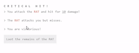
We've got two things to show off on this image.
First, you can see that the Critical HIT! text does a neat spin effect on a slight delay. It's very readable, and just feels a bit more rewarding when you get it.
Second, the loot page has been updated so that the currency and additional items slide in on a slight delay from each other.
They're small changes, to be sure, but I think the interface all that more enjoyable.
I also took that silly Evangelion reference from last week and kicked it up a notch - with this nice, subtle CSS gradient effect. I love little touches like this that just make the game feel better.
And yes, this will change colors depending on which theme you have selected.
----
That's it for today! More coming soon. If you're interested in alpha testing, drop me a line. I'll be looking for folks in the next months or so.
#interactive fiction#twine#twine game#if wip#interactive fiction game#game development#twine wip#groggy requiem
4 notes
·
View notes
Text

CSS Gradient Background Animation
#css gradient animation#html css animation#html css#divinector#frontenddevelopment#html#css#css3#css animation examples#css animation tutorial#css gradient#gradient animation css#css tricks#cool css effects
1 note
·
View note
Text

Gradient Text Border Animation
#gradient text border animation#neon border animation#html css#codenewbies#frontenddevelopment#html5 css3#css animation examples#pure css animation#css animation tutorial#css#html css animation#pure css effects
5 notes
·
View notes
Text

CSS Gradient Text Stroke
#html css#css text stroke#css text effects#css#html#frontend#css3#neduzone#css tutorial#frontenddevelopment#css tricks#html5#css effects#css gradient#css gradients#gradient text stroke
4 notes
·
View notes
Text
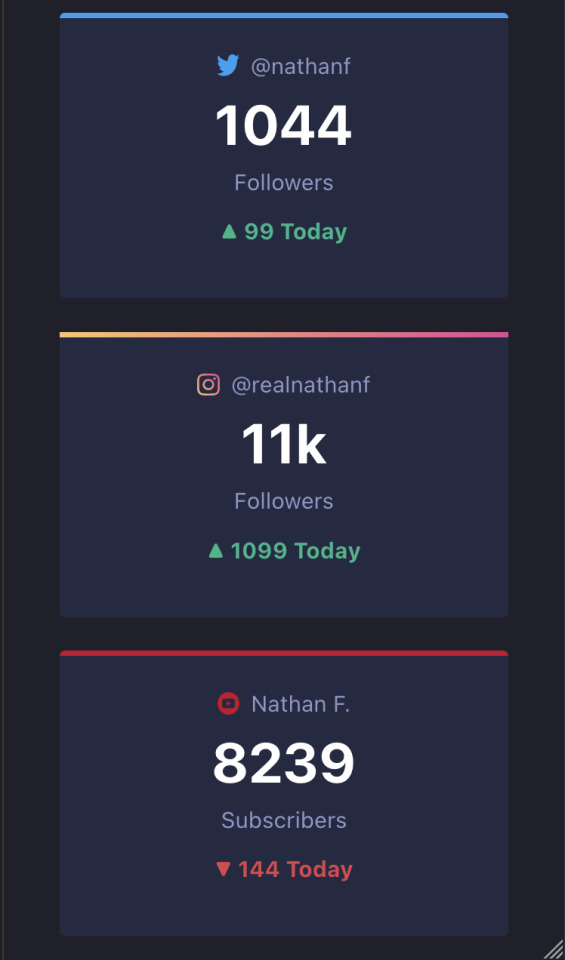
21/07/2023 || Day 55
Frontend Mentor Social Media Dashboard - Log # 2
Made some small progress on this today. I managed to get some stuff done, namely getting the different main social media cards to display:
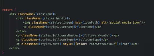
I also learned how to change the colour of an element depending on certain criteria. Yes, I already know how to do that in vanilla JS, but it's a little different with React. I can't just use "document.getElementById().style.color = myColor"; that will give an error due to the node not being rendered yet. So, I did some googling and saw that I can store the colour in a state, and then once the node is rendered I can change the state of the colour, like so:
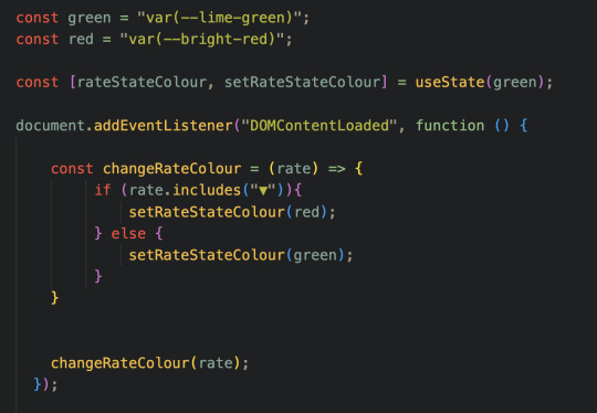
Then, when I'm actually calling the element, I can directly change the colour of that element with the in-tag style keyword (the last <p> tag, notice it has "style = { {color: rateStateColour} }:
All in all, this function will display the rate in green if the rate is positive, and red if negative, as denoted by the direction of the triangle (as we can see in the first image). This is also good because it's given me an idea of how to tackle switching between dark mode and light mode, but that's a later problem.
However, despite this progress, I'm currently struggling with CSS, more specifically with adding the border colours to the top border of each card. All the cards are fine except for the "instagram" card, and the only difference is that this colour is in fact a gradient. As a result, I can't use the border-top-color attribute, but instead have to use the border-image attribute. Now, this isn't normally a problem, except for the fact that the border-image attribute doesn't respond to the border-radius attribute. In other words, the edges for the border are straight where my border image is, while the other borders are round. You can see this in the first image in the "instagram" card. I've been doing some digging and it seems like I need to MacGyver it to work, so that'll be something for later.
Also, can a component itself not have a className? Does the component's className only take into effect inside the component's return statement? As in I have to wrap everything in my return statement with a div with that className, and only then will my CSS take into effect? It's weird, but it seems to be the case.
Anyways, that's it for today! Working with React is proving to be fun!
3 notes
·
View notes
Text

Well I have no chill and spent like 6 hours on this today in lieu of anything useful. Basically I wanted to play around with transparency, gradients, and blurs, and much more abstractly a feeling of being kind of shoved through the skin a little bit with the italics and the off center layout. Most of that time was messing with extremely minute styling details. On the one hand I should probably fkin quit it with that, but on the other hand with something as abstract as the idea I had for this, spotchecking the feel as accurately as I can feels important. That feeling of driving through the skin is proving harder to make consistent, but I'm enjoying it all the same. I feel good about the hero and the navigation (aside from restyling John's dropdowns), they're responsive all the way through, but I have a ways to go yet on the categories and the forums obviously. I'm not sure I like them, but I think I have to finish the forum row first to see if the vision is good or just silly. If I don't like it, I know what the fallback is going to be at least (blur gradients, so many overlapping gradients).
If you code, I only really did one thing that might be new, and included the code for that below the cut.
The only real problem I solved so far was how to make the blur gradient spread across the entirety of the page, not just the view. I wanted the hero to be very clear, and everything behind the forums and stats to be blurry af so I can overlay text on them reasonably. Here's a little code snippet if you want to do a gradient similar that traverses the whole page (and not just the view height!). Put this in some script tags on your board wrappers. This basically listens to the page loading, or if someone resizes the screen, and then sets the height of the element that has the gradient on it- in this case blur-gradient. window.addEventListener('resize', setBlurHeight); $(document).ready(setBlurHeight)
function setBlurHeight() { const siteHeight = $(document).height(); $(".blur-gradient").css("height", siteHeight); } And here's the blur-gradient css:
.blur-gradient { backdrop-filter: blur(20px); -webkit-mask: linear-gradient(180deg, transparent, black 50%); position: absolute; z-index: -2; width: 100%; top: 0; bottom: 0; } blur-gradient itself is just an empty div with that class. It obviously doesn't have to be a blur gradient- you should be able to use this for any effect which you want to extend the whole vertical range of the page.
1 note
·
View note
Text
Gemrud AI - Landing Page
Live Demo | Buy Now
A modern, responsive landing page for Gemrud AI - showcasing advanced artificial intelligence solutions for business

Features
Modern Design: Clean, professional interface with gradient accents
Dark/Light Mode: Toggle between themes with smooth transitions
Responsive Layout: Optimized for all device sizes
Interactive Elements: Smooth animations and hover effects
Modal System: Sign-in and sign-up modals with form validation
AI-Themed Visuals: Animated grid showcasing AI technologies

Technologies Used
HTML5: Semantic markup structure
CSS3: Modern styling with CSS Grid, Flexbox, and custom properties
JavaScript (ES6+): Interactive functionality and animations
Font Awesome: Icon library for UI elements
Google Fonts: Poppins and Montserrat typography

Interactive Elements
Smooth hover transitions
Animated loading states
Ripple click effects
Floating animations on AI grid
Theme Management
Dark/Light mode toggle
Theme preference persistence

Responsive Breakpoints
Desktop: 1200px and above
Tablet: 768px - 1199px
Mobile: Below 768px
Live Demo | Buy Now
#css#html#html css#htmlcoding#js#landing page#landing page builder#landing page design#landing pages#panel
0 notes
Text
What Is Cross-Browser Testing? A Complete Guide for Seamless Web Experiences

In today’s fast-evolving digital landscape, users access websites from a wide array of devices, operating systems, and browsers. From Chrome and Firefox to Safari and Edge—each browser interprets your website code slightly differently. This is where Cross Browser Testing becomes essential.
This blog dives deep into what cross browser testing is, why it matters, what features it covers, and how to do it effectively—ensuring your website delivers a consistent, bug-free experience across all platforms.
What is Cross Browser Testing?
Cross Browser Testing is a type of non-functional testing that verifies whether a web application functions and appears correctly across different web browsers, browser versions, and devices.
It helps developers and QA engineers ensure that:
The UI renders consistently
Core functionalities work correctly
There are no browser-specific bugs or issues
Cross browser testing is not just about aesthetics—it’s about ensuring usability, performance, and accessibility for all users, regardless of how they access your website.
Why is Cross Browser Testing Important?
If you’re only testing your website on Chrome, you’re missing the bigger picture.
Here’s why cross browser testing is crucial:
1. Diverse User Base
Your users might be on Chrome, Safari, Firefox, Edge, or Opera, and using different devices like desktops, tablets, or smartphones. Testing across these ensures everyone has a uniform experience.
2. Browser Rendering Engines Differ
Browsers like Chrome (Blink), Safari (WebKit), and Firefox (Gecko) interpret HTML, CSS, and JavaScript differently. Even a small deviation in rendering can lead to layout breakages or functionality issues.
3. Prevent Loss of Traffic and Conversions
A buggy checkout page on Safari or broken navigation on Firefox can significantly hurt conversion rates and user trust.
4. SEO and Accessibility
Search engines value user experience. Broken layouts or slow load times on certain browsers can negatively affect SEO performance and bounce rates.
What Features are Analyzed in a Cross Browser Test?
Here are the key features and areas evaluated during cross browser testing:
�� 1. Layout and Design Consistency
CSS rendering
Font sizes, spacing, padding
Media queries and responsiveness
Grid and flex layouts
✅ 2. JavaScript Functionality
Form validation
Dynamic content rendering (DOM updates)
Event handling
Navigation toggles
✅ 3. HTML5 and CSS3 Compatibility
Audio/video elements
Animations
Flexbox, grid, shadows, gradients
✅ 4. Third-Party Integrations
Plugins (chatbots, tracking tools)
Embedded maps or videos
Social sharing buttons
✅ 5. Performance and Speed
Load times across browsers
JavaScript execution speed
Rendering behavior
✅ 6. Security and Cookie Behavior
HTTPS redirection
Local storage and session cookies handling
How is Cross Browser Testing Done?
Cross browser testing can be performed manually or via automation tools. Here's a step-by-step guide:
Step 1: Define Your Browser Coverage
Choose browsers based on:
Your website’s Google Analytics browser report
Global browser usage statistics
Market demographics (e.g., Safari for iOS users)
Example Browser Matrix:

Read also: How Playwright Enhances Cross-Browser Testing Efficiency
Step 2: Set Up Your Test Environment
You can use:
Real Devices: For high accuracy
Emulators/Simulators: Quick tests for layout
Cloud Testing Platforms like:
BrowserStack
Sauce Labs
LambdaTest
CrossBrowserTesting.com
Step 3: Run Tests (Manual or Automated)
🔹 Manual Testing
Test scenarios using real devices and browsers, inspecting UI and performing tasks manually.
🔹 Automated Testing
Use frameworks like:
Selenium
Playwright
Cypress
TestCafe
Automation helps:
Reduce testing time
Run tests in parallel
Integrate with CI/CD pipelines
Step 4: Log and Fix Issues
Document browser-specific bugs, prioritize them, and retest after fixes.
Step 5: Continuous Cross Browser Testing
Use CI tools (Jenkins, GitHub Actions, GitLab CI) to schedule tests automatically on every build or code change.
Best Practices for Cross Browser Testing
✅ Always test on real user data (Google Analytics insights)
✅ Prioritize critical user flows first
✅ Automate repetitive tests, but don’t skip manual exploratory testing
✅ Regularly update browser versions in your testing matrix
✅ Perform regression testing after any major frontend update
Conclusion
Cross Browser Testing is not optional—it’s a necessity in today’s fragmented web ecosystem. Ensuring that your application works flawlessly across all major browsers not only boosts user experience and trust but also strengthens your brand’s credibility
As a leading Web application testing company, at Testrig Technologies, we specialize in comprehensive Cross Browser Testing Services that guarantee flawless digital experiences on any browser, device, or OS. Whether you're launching a new site or scaling an existing one, our QA experts are here to help.
0 notes