#gradient text stroke
Explore tagged Tumblr posts
Visit Tumblr Blog
Explore Tumblr blogs with no restrictions, modern design and the best experience.
Last Seen Tumblr Blogs


Fun Fact
The Tumblr app for Google Glass was released on May 16, 2013.
Text

CSS Gradient Text Stroke
#html css#css text stroke#css text effects#css#html#frontend#css3#neduzone#css tutorial#frontenddevelopment#css tricks#html5#css effects#css gradient#css gradients#gradient text stroke
4 notes
·
View notes
Text

artfight revenge for @saszor & @piratechaos !!
dividers made by @ eimogji !


#my art#described in alt text#toninho my oc#design notes!! while tony’s seat cushion looks impractical it’s actually a proper wheelchair cushion with a custom cover#john’s bolo tie is a moth to match the moth on tony’s shawl & his current hair dye matches tony’s hair from voids ref#john & bob have the same smile & eye gradient (idk how to word it)#one of tony’s hands isn’t making a proper peace sign bc void has nerve damage from a stroke. originally both hands were going to be peace-#-signs but i had a bad flair up for my nerve damage while drawing & decided tony gets that too#bob is taller than john but is crouching + leaning for the pic#artfight team stardust#artfight2024#ccartshare#artfight 2024#artfight#team star dust#teamstardust#art fight team stardust#art fight 2024#art fight#also i asked 3 diff discord servers for help picking colors for tony’s wizard outfit & got ghosted all 3 times 😭#art#digital art#artists on tumblr#illistration
124 notes
·
View notes
Text
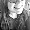
youidraw.com was lowkey a little disappointing
#bandit's doodles#grian#mumbo jumbo#waffle duo#is waffle duo even their duo name anymore#this must be some kind of sick joke right#Just for a bit in his video#Im calling it rn#It can't be permanent#waffle duo will live on forever#big fan of the grey hairs but the waffle man#think of the waffle#cue montage of all the waffle fun we've had over the seasons#now for the website#The setup looks great#looks professional#my expectations were high#They should not have been based on my last reviews#it had an eraser but it just didn't work?#whenever I tried to change the brush size it would just revert to the huge default??#It had that color picker thing with the gradient which was great#But whenever I tried to switch colors#the last brush stroke I did would change color#the selection tool was fine but when I tried to move things it was being so difficult#this might just be a mobile problem but still a problem#But there was this massive ad on the side of the screen so I didn't get the optimal canvas access#the stabilizer on the pencil was horrendous#that little 'no waffle :(' on mumbos head took like 8 tries for it to look legible in any way#Thats why I just used the text for grian which worked fine#actually 4/10 it looks good but works badly
23 notes
·
View notes
Text
20 days and we'll see his grabbable waist on the big screen
#i'm so ready it's all i can think about#i have to bash out a report rn and finding it very hard to concentrate#when the autistic urge to bask in rhrn excitement is so strong#5 days until i can move google scholar from its home in my bookmarks toolbar#and replace it with. actually who knows#jsfiddle gradient text code editor ksdhbckjd#maybe even google docs.........#BACK TO WORK. SORRY. LOGGING OUT#how am i supposed to focus on stroke rehabilitation when papa is imminently going to mummy thrust in hd#i should tag bc some people might be avoiding entirely actually.#the band ghost#rite here rite now
21 notes
·
View notes
Text
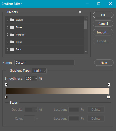
#workskin .rainbowStroke { -webkit-text-fill-color: black; background-image: -webkit-linear-gradient(-45deg,blue,magenta,red,orange,yellow,green,cyan); -webkit-background-clip: text; -webkit-text-stroke: 2px transparent; padding-left: 5px; margin-left: -5px; padding-right: 5px; margin-right: -5px;
}
edit: added four new lines to prevent bg clipping
spokeishere text (black text with rainbow stroke) if anyone wants it
idk if theres already a workskin that works just like/similar to this but i havent checked lol
breakdown of code for anyone too intimidated to play around with it (not an expert tho this is mainly just me listing down my conclusions after playing around with it, also written in a way thats assuming the reader knows fuckall about coding):
#workskin .rainbowStroke { -webkit-text-fill-color: black; background-image: -webkit-linear-gradient(-45deg,blue,magenta,red,orange,yellow,green,cyan); -webkit-background-clip: text; -webkit-text-stroke: 2px transparent; padding-left: 5px; margin-left: -5px; padding-right: 5px; margin-right: -5px;}
code name
> can be changed
> is what you use to define the code aka attach the properties to the actual text using text
text color
> webkit is what supports the existence of stroke hence why it's there and why you cant just use {color: black;}
> fill is what thickens the text, you can delete it but it makes the text harder to read
stroke colors aka the text outline
> deg is the way the colors are rotated, feel free to change the number and to make it positive or negative
what makes the stroke not just a square
> clipping for those of you unfamiliar with it just means it follows the shape of whats underneath it
stroke properties
> the px means pixels and indicates the size of the stroke
> transparent means it'll actually show whats underneath, it can be deleted but doing so will make the text moremuddy/desaturated
background overflow
> there to prevent the colors from being cut too short since nackground normally is almost the exact size of the text
> can be changed but will affect the colors, also having it too small will cause clipping
anything in black/white is code language properties, you cannot make anything without them
#writing#spokeishere#did this cause i wanted to try colorcoding in my fics but realized that spoke has a rainbow gradient thing going on#took me like 2 hours to get through all the technobabble and irrelevant info to find what i was actually looking for#https://stackoverflow.com/questions/61825324/css-gradient-text-with-opacity-and-gradient-text-stroke-outline#<---- shoutout to the guy from this question btw couldnt have done it without ya#https://stackoverflow.com/a/17756378#<------- also shout out this guy
6 notes
·
View notes
Text
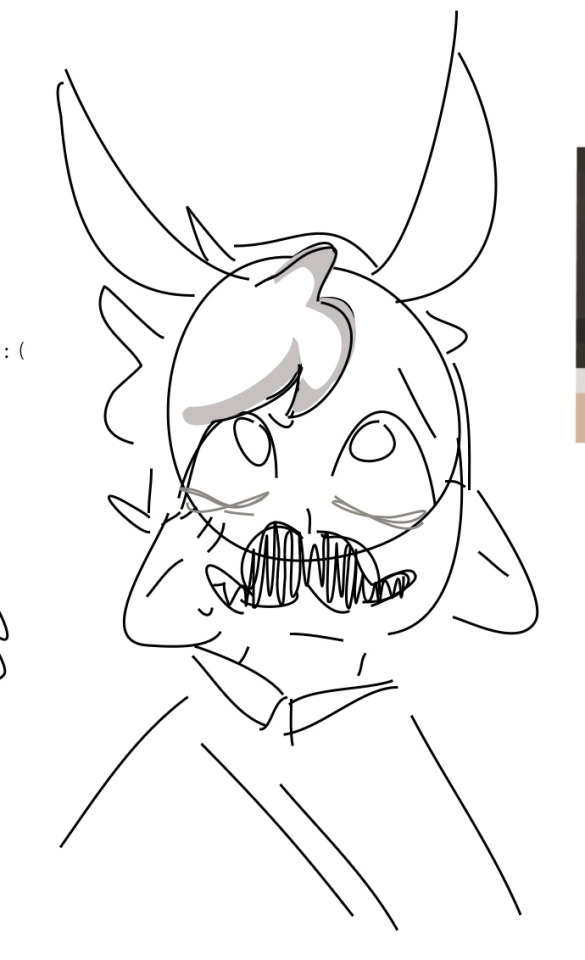
Help Gaza's Children!
Palestinian children experiencing this latest aggression are homeless and in need of food, drinks, clothes, and more during the harsh Gaza Strip winter.
Your donations will help save the lives of these children as they experience these harrowing circumstances, so please consider donating!
Please spread this donation link around. Any amount will go a long way in helping the children of Gaza, no donation amount is too little!
Donate here:
Reblogs are much appreciated!
[Image ID: a 16:9 image that reads in big serif letters "help gaza's children" with a subtitle in serif letters that reads "Donate for the relief of homeless, stricken Palestinian children experiencing harsh winter in Gaza to meet their needs like buying food, drinks, clothes, and more." There are two white paint strokes highlighting the title text with "gaza's children" in red whereas the rest of the text is black. The background of the image has two transparent olive branches in black line art and gradient of red, yellow, and green.]
#palestine#gaza#donation#free palestine#palestina#stand with palestine#end the occupation#end israel's genocide
6K notes
·
View notes
Text
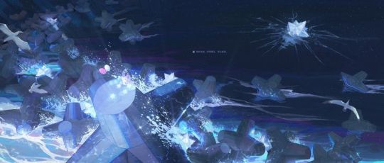
Crystal Skies
Viktor x Fem! Reader
In which, the skies remained you of the Hextech gem. But Viktor’s eyes are locked on you.
a/n: i forgot to make the little summary part gradient and cute! also this is kinda short cuz i wanted to go play dress to impress…
⊹ ˖────⊹ ˖
⊹ ˖────⊹ ˖
"You're still awake?" you called out softly, your voice breaking the stillness of the lab as the door creaked open. You stepped inside, the dim light casting long shadows across the room. Viktor sat hunched over his cluttered desk, absorbed in his work, his pen moving in smooth, deliberate strokes across the paper. He merely nodded in response, his eyes glued to the dense text he was composing.
You frowned slightly, concern etching your features, and approached him. "C'mon, Viktor," you urged gently, your tone echoing in the quiet space that was filled only with the faint scratching of his pen and the occasional rustle of parchment.
"I can't. I'm almost done," he replied, his voice barely above a whisper, still not breaking his concentration to glance at you. You sighed audibly, leaning against the edge of his desk, your eyes drifting over the sprawling documents littered with intricate diagrams and notes, before settling on the lone window. Through the glass, the night sky unveiled itself, a vast canvas of deep indigo strewn with shimmering stars. You noticed the clouds, soft and billowy, as they danced slowly with the wind.
"The sky looks just like the Hextech gem," you mused, tilting your head to capture the view better, the corners of your lips hinting at a smile. Viktor's attention momentarily shifted to the window, his brow arching slightly as he contemplated your words.
"I suppose they do," he murmured, his voice still low and contemplative, before returning to his meticulous writing, the pen gliding effortlessly across the paper.
"You have a unique imagination," he remarked without looking up, his focus firmly entrenched in his task.
"You say that quite often," you replied, keeping your gaze locked on the celestial display outside, enraptured by the beauty of the night.
Viktor let out a tired, weighed-down sigh. Finally leaning back in his chair, he glanced at you, the shadows under his eyes revealing his fatigue. "Did you need anything else?" he asked, his stern expression faltering just slightly as he met your gaze for the first time, his sharp features softened in the dim light.
"What if I said I needed you?" you teased, allowing a playful smirk to cross your face as you shifted to fully face him, raising an eyebrow in challenge. Viktor tensed visibly, his expression shifting to one of concern and confusion, brows knitting together tightly. "Don't say such things," he muttered, his eyes darting away from your gaze as if unwilling to confront the weight of your words.
You let out a soft chuckle, the sound light and carefree in contrast to Viktor’s solemn demeanor. "Just teasing," you reassured him, your attention returning to the wistful sight of the sky beyond the window.
He continued to watch you, an intense look in his eyes as he assessed your features illuminated by the soft glow of the lab’s lights. The warm light wrapped around you, creating an almost ethereal aura that made you appear otherworldly. His expression softened, though an unsettling mix of emotion battled within him. He glanced back at his desk, biting his tongue, unsure of how to process what was unfolding.
Just then, your voice broke the silence again, filled with excitement. "Did you see that?" you exclaimed, your eyes brightening as you watched the stars shimmering in waves as clouds floated by. "A shooting star!" you gasped, beaming with delight.
"Yeah…" Viktor replied, narrowing his eyes thoughtfully, though he hadn’t seen any shooting stars; his vision was solely fixated on you.
"Beautiful," he murmured almost absentmindedly, his voice thick with a mix of admiration and something deeper.
"I know, right?" you replied, enthusiasm radiating from you as you gazed adoringly at the window, missing the way Viktor's eyes traced your form, endlessly captivated by the light dancing in your eyes, his attention unwavering and utterly consumed by you.
#x you#oneshot#fluff#viktor x reader arcane#viktor league of legends#arcane viktor#viktor#viktor arcane#arcane#arcane x reader
452 notes
·
View notes
Text
hmmm therapeutic and fluffy waxplay with johnny.
you text johnny a single emoji: 🕯️. the shorthand carries the weight of your day, the tightness in your chest, and the fact you are one song away from losing it in the car. he doesn't reply. he doesn't need to. he knows the drill.
he moves through your apartment with a quiet, buzzing urgency, the same precision he'd use to sweep a floor in the field.
he queues your favorite playlist first. nudges the coffee table against the wall. lays out a blanket and pillow on the floor. he fetches your basket and peels off his shirt, already humming with anticipation as he stretches on the floor.
when you get home, it takes everything to step through the door. you keep your eyes down, unwilling to look at him yet. the stress of your day is eating you alive, and the last thing you want is to do is cry.
johnny understands this, though it's the worst, most difficult part for him—to let you pass untouched, retreating into the bedroom to change into comfortable clothes and take a moment for yourself.
while you prepare, he lies back on the blanket. he always chooses the side—tonight, he's on his back. he wants to watch you, assess, and work out everything going on in that head of yours. he stares at the ceiling, waiting, steadying himself.
when you reemerge, you drop to your knees beside him and light the tealight. you cover it with the holder, lay the spoon in its cradle to warm, and choose wax colors with care. he holds up five fingers: that's your limit for the evening. it's generous, but he can take the heat. literally.
months ago, this would've been unthinkable to him—shaving a patch of chest hair, lying there, and letting wax drip over his skin. but he always said he'd try anything once. and now, here he is, because this is your ritual, something built on trust and quiet experimentation.
the pain sharpens him and it makes him alive in a way that's safe. controlled. he's learned to crave it, but mostly, he's grown to crave the change in you. the way your focus softens as the wax falls, the careful way you press the stamps without letting them sear. never repeating the same one twice, just in case.
when you finish, he's grinning up at you despite the sweat matting his hair and the stinging bites on his chest. there's something wolfish in the way his grin matches the peace on your face—the drop in your shoulders, the relaxation of your jaw.
you gently pry the stamps free, balancing them on your thumb one by one to show him: coins of glittery, gradient wax embossed with tiny shapes. flowers, animals, moons, and suns.
by the time you're done, he's pitching a tent in his sweats, and he knows you'll both get to that, but for now, he lets you stroke your fingers over his pinkened skin. you're home. you're lighter. that's all that matters.
79 notes
·
View notes
Note
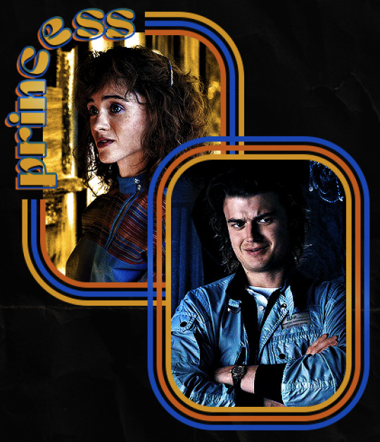
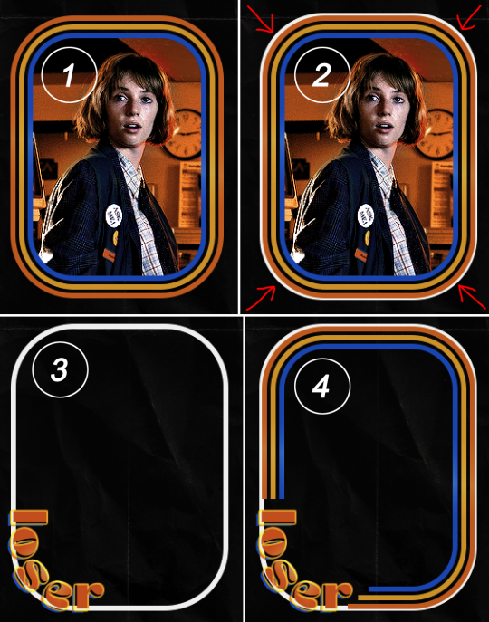
hello! I love your edits and I wanted to know, for the "Steve Robin and Nancy" Gif you posted.. How would I go about doing something like that? More specificly, the bottom two where it says "Height Difference" and where it labels them as "Princess, Jock and Loser"
Thank you! Sorry this took a while to answer. I finally had time to sit down and write this. Link to original post.
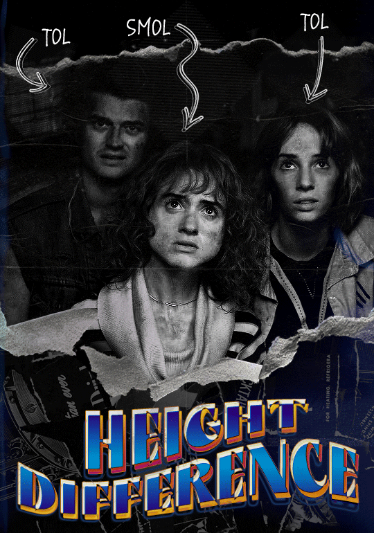

Quick notes: I'm using Photoshop 2021 on Mac and working in video timeline. Must have basic gifmaking skills and know how to use layer masks. This is primarily a gif layout and text tutorial.
Fonts used in first gif:
Pea Wolfe Tracks — link here
King & Queen — link here
Fonts used in second gif:
Kiera — link here
Post — link here
Ellianarelle's Path — link here
Heina's hurry — link here
I used a light leaks/film texture, ripped paper textures, folded paper textures, and transparent pngs (arrows + post-it notes + smiley face).
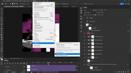
We'll start with this gif.
Make your gif! The gif here is 540x600px. I color and sharpen it to my liking. Go to image > canvas size > change height from 600 to 770px. I left the anchor in the middle, though it doesn't really matter.
I drag and drop my folded paper texture and change the layer order so it's under my gif. Then I change the blending mode on my gif to Screen so the texture shows through the gif, but I keep the texture at 100% Opacity and Fill.
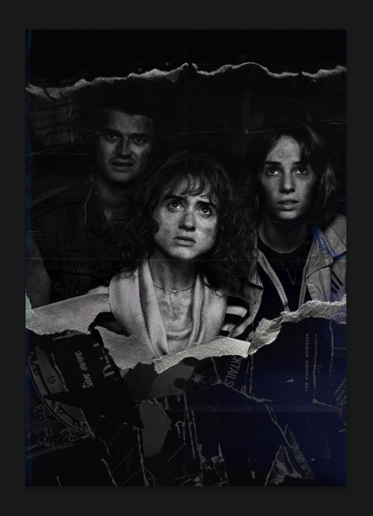
Now I move my gif around and add my ripped paper textures. I wanted to give it a sort of poster-like feel to it, so I made more room on the bottom for my main text and ended up with something like this. Blending mode is set to Lighten for the ripped paper textures.
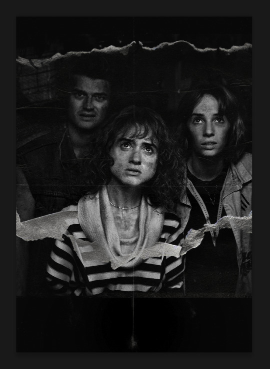
I then use layer masks to hide what I don't want shown and add my light leaks/film texture. Blending mode on light leaks/film texture set to Pin Light, Opacity: 50%, Fill: 70%.
I use Levels and Brightness/Contrast adjustment layers to darken the gif up a bit more, then I add a patterned paper texture. Blending mode for patterned paper texture set to Lighten, Opacity: 100%, Fill: 75%. Result:
Now on to the text!
I'm going to be honest here, a lot of this was clicking around until I settled on something I liked. There's three layers to create this text effect. The font used here is King & Queen.
For the first text layer, the font color is set to black (#000000), font size: 87 pt, leading: 80 pt, tracking: 25.
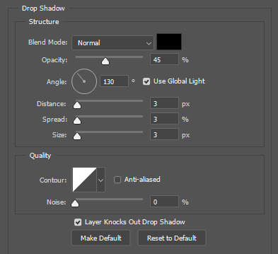
Layer styles used here are stroke and drop shadow.
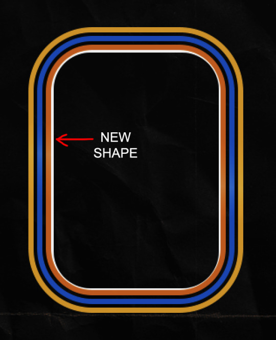
Text Layer 1
Stroke settings:
Size: 1px
Position: Outside
Blend Mode: Hard Light
Opacity: 40%
Overprint: unchecked
Fill Type: Color
Color: #5911ed
Drop Shadow settings:
Blend Mode: Difference
Color: #2d5ba8
Opacity: 85%
Angle: 70°
Use Global Light: checked
Distance: 7px
Spread: 0%
Size: 6px
Contour: Cone - Inverted
Anti-aliased: unchecked
Noise: 0%
Layer Knocks Out Drop Shadow: checked
Blending mode for text layer set to Overlay, Opacity: 100%, Fill: 85%.
Warp text settings:
Style: Wave
Horizontal: checked
Bend: +60%
Horizontal Distortion: +10%
Vertical Distortion: 0%
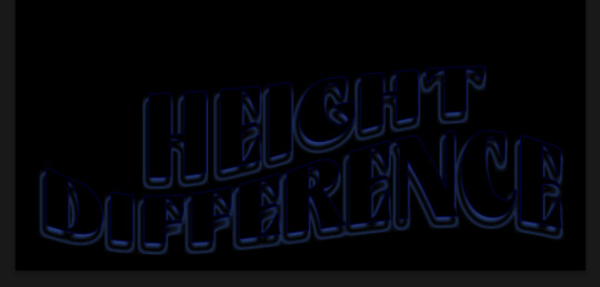
With all those settings applied, the first text layer looks like this:
Duplicate the layer, clear all layer styles, and change the color for the second text layer to white (#ffffff). All other text settings (including warp settings) should stay the same. The only layer style then applied to this text layer is stroke.
Text Layer 2
Stroke settings:
Size: 1px
Position: Outside
Blend Mode: Difference
Opacity: 100%
Overprint: unchecked
Fill Type: Color
Color: #d48f16

Blending mode for the second text layer is set to Difference, Opacity: 90%, Fill: 100%. Nudge the second text layer a bit so the first text layer is a little more visible or move to your liking.
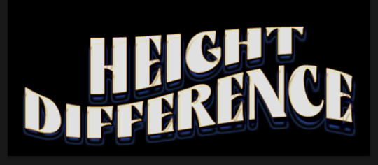
With both those layers active, it looks like this:
Duplicate the second text layer, clear layer styles, and change the color of this third text layer to a dark grey (#1a1919). Again, all other text (and warp) settings should stay the same.
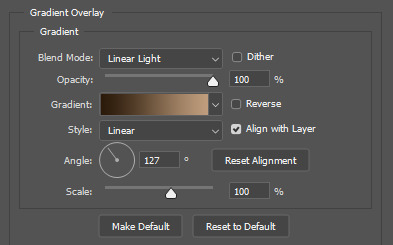
Layer styles applied to this layer are stroke and gradient overlay.
Text Layer 3
Stroke settings:
Size: 1px
Position: Outside
Blend Mode: Difference
Opacity: 100%
Overprint: unchecked
Fill Type: Color
Color: #d48f16
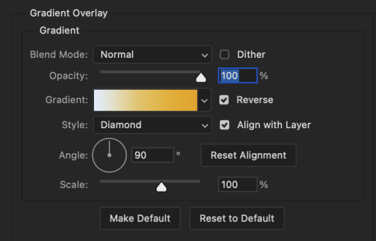
Gradient Overlay settings:
Blend Mode: Difference
Dither: unchecked
Opacity: 100%
Gradient: #cd3f00 > #ffdb5d
Reverse: unchecked
Style: Reflected
Align with Layer: checked
Angle: 90°
Scale: 100%

Blending mode for the third text layer set to Exclusion, Opacity: 100%, Fill: 100%. I also moved the third text layer around, down and to the right a few pixels to give it that 3-D Word Art effect.
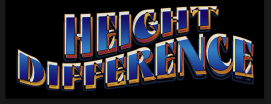
With all three text layers active:
Next are the arrows.
Take your transparent pngs and place them to your liking. Blending mode for these is set to Difference, Opacity: 100%, Fill: 100%.
Command + click on an arrow thumbnail to select all the pixels in that layer. This is why the image must be transparent!
With that selection made and on a new blank layer, right click the selection and click on stroke. Settings for that are width: 2px, color: white, location: center. Move that a couple of pixels over.
Do this for all arrows for a total of 6 layers for arrows. I group them together to keep my workspace clean, then I duplicate my arrows group with no further changes made to the second group to get what you see in the final gif.
Next is the smaller text. It's three separate text layers for each word, so I can move each of them around to my liking.
Font used is Pea Wolfe Tracks, font color: white (#ffffff), font size: 24 pt, leading: 6 pt, tracking: 25. Bold and italic options checked. I set the blending mode to Difference, Opacity: 100%, Fill: 100%.
And that's it! That concludes the tutorial for this gif!
Now on to this gif.
We'll start with the background gif. There are three separate gifs. You could make them one gif, but I wanted the option to order them differently if I needed to.
All gifs in the background are the size of the canvas: 540x770px. Color and sharpen to your liking, but keep them all black and white. To get the blurry effect go to filter > blur > guassian blur. Set radius to 7.0 pixels. Add this to all three gifs.
Then I add two folded paper textures. Blending mode for one set to Lighten, Opacity: 60%, Fill: 100%. The other set to Screen, Opacity: 70%, Fill: 90%.
I found this tutorial a while back for a halftone effect. They include links to the halftone pattern used here as well as textures and gradient maps not used here.
I'm only using the halftone pattern here.
Pattern fill settings:
Angle: 66°
Scale: 8%
Link with Layer: checked
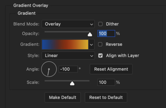
I also added a gradient overlay layer style to the halftone pattern which gives the gifs the color you see above.
Gradient Overlay settings:
Blend Mode: Overlay
Dither: unchecked
Opacity: 100%
Gradient: #0059ac > #a33600 > #e6b801
Reverse: unchecked
Style: Linear
Align with Layer: checked
Angle: -100°
Scale: 100%
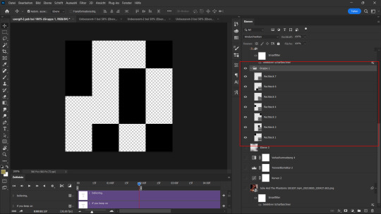
Now on to the square shapes with rounded corners. In the interest of keeping this tutorial short(er), I found this tutorial on youtube that explains how to make squares with rounded corners.
I set my stroke size to 6px, stroke color to white (#ffffff), and fill to no color. I don't use the stroke layer style to make the borders of the shape like in the video! I'm only linking the video to show how to curve corners with square shapes.
Note: Be sure you know how big or small you want these to be and how they're going to fit on your canvas in order to make all the shapes and edit them. It can be tedious to change the settings.
Duplicate and resize to your liking.
In this instance, I wanted to make three squares total, so I had to duplicate twice and resize until I had something I liked.
Settings for the shapes used here are:
Innermost shape: W: 200px, H: 280px, corners: 50px
Middle shape: W: 220px, H: 300px, corners: 60px
Outer shape: W: 240px, H: 320px, corners: 70px
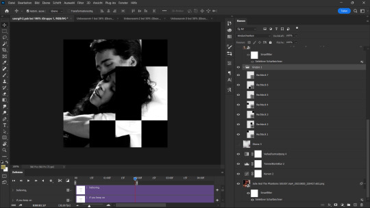
Once I have the size I want for all three shapes, I group them together to make a set and duplicate that group twice, then adjust each set on the canvas for my layout.
What the sets look like all together:
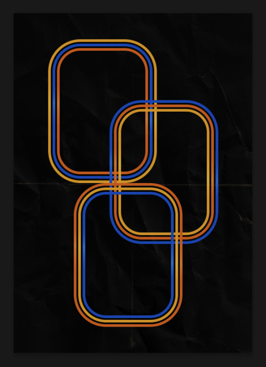
Colors used: orange #e47100, blue #0062d1, yellow #ecac00
To add color to the shapes, either change the color of the shape itself or use layer styles. I used layer styles.
Note: I didn't add the colors until the end after I knew what gifs went where and what color scheme I wanted, but I don't want to add more images than I need to here.
To keep this short, I found this tutorial on youtube that explains how to wrap text around a shape. However, I wanted the text to align on the outside where the white line is and not the green line (left image):
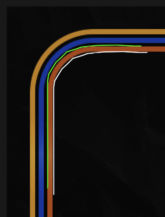
So I created another shape just inside the innermost square and used that as a path for my text (right image). Adjust the text to your liking until you have your text where you want it. Refer to the video tutorial if you need help moving the text along the path!
You don't need the shape path once you have your text where you want it, so use the layer visibility tool to hide it. You can hide your other shapes too so you can work with your text.
Do not delete your shape path!
I duplicate it once I start working with my "jock" text since all the sets are the same size. The "loser" text has to be worked a little differently, but we'll get to that later.
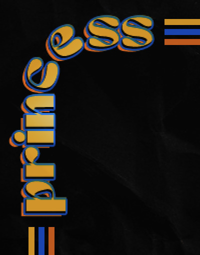
For the princess, jock, and loser text, there are two text layers to create the overall effect. For both layers, font used is Kiera, font color set to white (#ffffff), font size: 60 pt, blending mode set to Normal.
I added a gradient overlay layer style to the first text layer which I'll call the base layer. Opacity for this layer is 100%, Fill: 100%.
Base Layer
Gradient Overlay settings:
Blend Mode: Normal
Dither: unchecked
Opacity: 100%
Gradient: #f0b002 > #e7f0fd
Reverse: checked
Style: Diamond
Align with Layer: checked
Angle: 90°
Scale: 100%
The second text layer is your stroke and drop shadow layer. For this layer, opacity is set to 100%, Fill: 0%.
Stroke and Drop Shadow Layer
Stroke settings:
Size: 2px
Position: Outside
Blend Mode: Linear Light
Opacity: 100%
Overprint: unchecked
Fill Type: Color
Color: #0064cb
Drop Shadow settings:
Blend Mode: Difference
Color: #fb7c00
Opacity: 100%
Angle: 30°
Use Global Light: checked
Distance: 5px
Spread: 0%
Size: 0px
Contour: Linear
Anti-aliased: unchecked
Noise: 0%
Layer Knocks Out Drop Shadow: checked
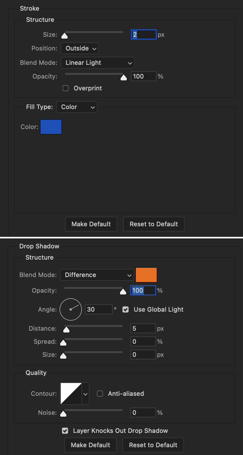
End result looks like this:

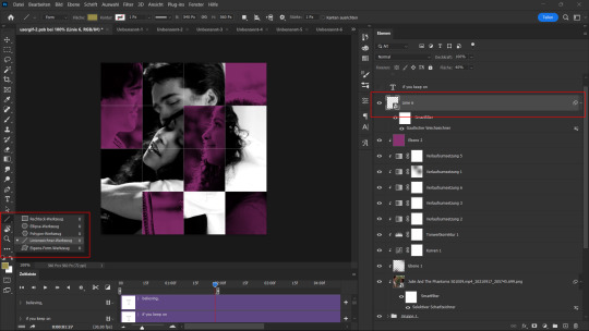
When I make my shapes visible again (minus the one I used as a path), I get this:
The shapes are clearly in the way of the text, whether they're above my shapes layer or under it. I use layer masks to hide what I want, so the text is legible. It looks cleaner this way and I wanted the text to be a part of the shape itself. I do that for each rounded square.
Now on to my smaller gifs. I like to crop, resize, sharpen, and color separately because my laptop and Photoshop would kill me if I tried to do it all on one canvas. I use the size of the middle shape for my gifs (220x300px), so I can have a little wiggle room when adjusting. I then use a layer mask to hide the parts of the gif that are outside of the shape.
A quick way to do this is to command + click on the thumbnail of the innermost square. With that selection made, I got to my gif layer and add a layer mask. Sometimes you need to invert it. Use command + i with the layer mask selected (not the gif) to invert the layer mask.
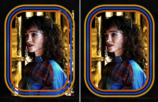
I repeat this process with my Steve and Robin gifs. I have to go back and forth with all the layer masks to hide parts of the gif/shapes I don't want for each set. It's kind of a long process, but not all that difficult. I label and group my layers together as I work to keep things clean and it helps me keep track of what I edited and what needs to be edited when it comes to things like this.
The picture below shows where I hid the bottom right corner of Nancy as well as the shapes that make up her set using layer masks. I also did this with the Steve and Robin sets, hiding the bottom left corner of Steve.

Similar text settings used for jock. The gradient overlay layer style for this base layer is different than that of princess because of the positioning of the text. Again, same as princess, two text layers are used here. Blending mode, opacity, and fill for both are the same as the princess text layers as mentioned before.
Base Layer
Gradient Overlay settings:
Blend Mode: Normal
Dither: unchecked
Opacity: 100%
Gradient: #007aec > move bottom middle dot to 80% > #e7f0fd
Reverse: checked
Style: Diamond
Align with Layer: checked
Angle: -140°
Scale: 100%
Stroke and Drop Shadow Layer
Stroke settings:
Size: 2px
Position: Outside
Blend Mode: Linear Light
Opacity: 100%
Overprint: unchecked
Fill Type: Color
Color: #a05700
Drop Shadow settings:
Blend Mode: Difference
Color: #ffba00
Opacity: 100%
Angle: 30°
Use Global Light: checked
Distance: 5px
Spread: 0%
Size: 0px
Contour: Linear
Anti-aliased: unchecked
Noise: 0%
Layer Knocks Out Drop Shadow: checked
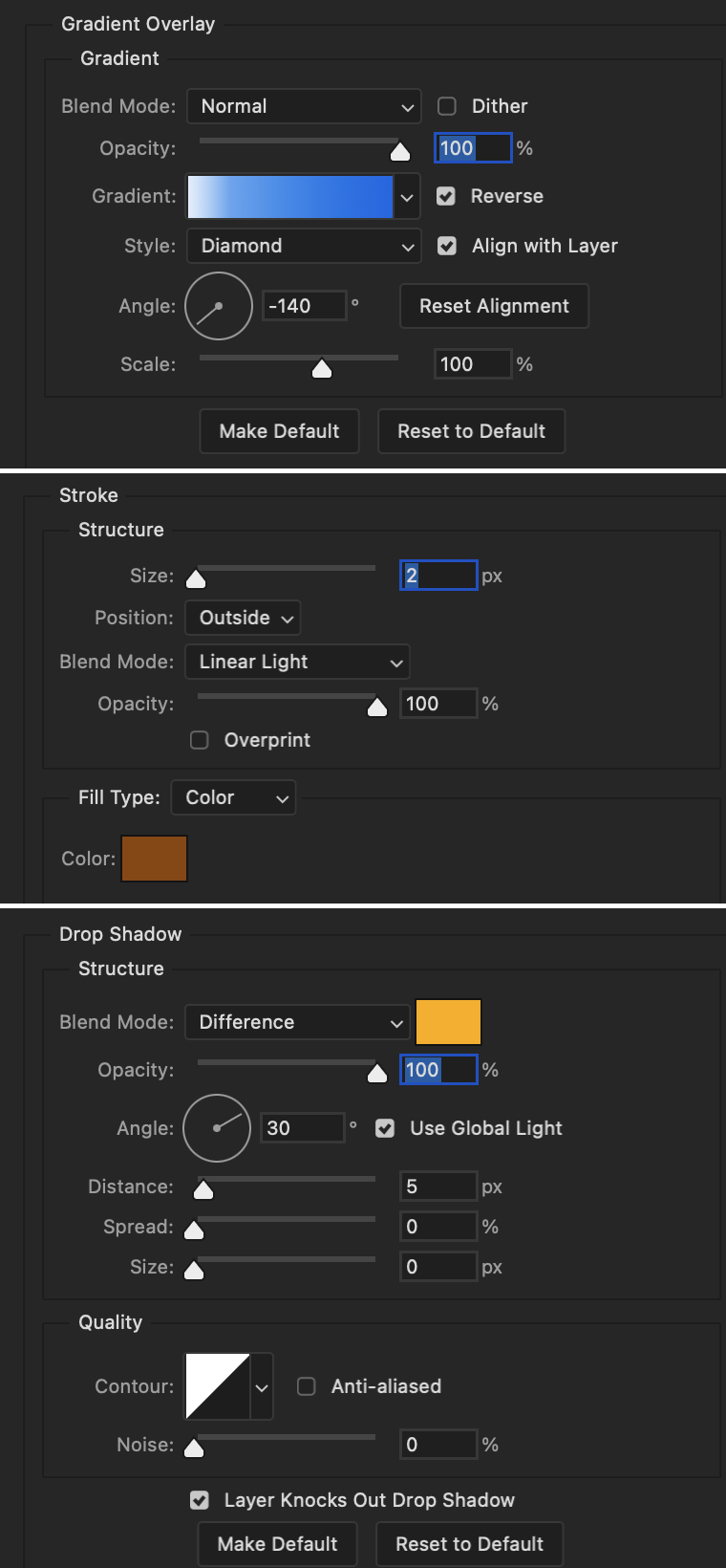
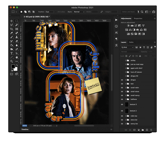
Image 1: We start with Robin.
Image 2: To make the loser text, I had to create a new path.
Image 3: I make it so the text is on the inside of the path instead of the outside. (Hint: Refer to video tutorial if you don't know how to do that.) I then adjusted the tracking between the letters in the word "loser" so they didn't look so squished together.
Image 4: Then I use layer masks to hide the parts of the shape I don't want shown.
You can then hide the path or delete it. You only need it if you want to adjust the placement of the text. I keep it (hidden) just in case.
Text settings for loser are just like those for princess. Blending mode, opacity, and fill are also the same.
Base Layer
Gradient Overlay settings:
Blend Mode: Normal
Dither: unchecked
Opacity: 100%
Gradient: #eb6400 > #e7f0fd
Reverse: checked
Style: Diamond
Align with Layer: checked
Angle: 90°
Scale: 100%
Stroke and Drop Shadow Layer
Stroke settings:
Size: 2px
Position: Outside
Blend Mode: Linear Light
Opacity: 100%
Overprint: unchecked
Fill Type: Color
Color: #e1a900
Drop Shadow settings:
Blend Mode: Difference
Color: #0068de
Opacity: 100%
Angle: 30°
Use Global Light: checked
Distance: 5px
Spread: 0%
Size: 0px
Contour: Linear
Anti-aliased: unchecked
Noise: 0%
Layer Knocks Out Drop Shadow: checked
Next are the post-it notes! This is probably the easiest part of making this gif. You just have to repeat this process for however many post-it notes you're making.
Image 1: To start, place your transparent post-it note where you want it. You can also rotate it if you'd like.
Image 2: Then create a text layer and write what you want. Font used here is Post. I wanted this text underlined to give emphasis, so I click on the underline option. I also adjusted the leading because I wanted more space between the word and the line. Rotate the text so it looks like it's written on the post-it note. Note: It looks better if you choose a font that looks handwritten.
Image 3: I wanted another line to give emphasis to the "Dingus!!" text and make it seem more handwritten. I use the line tool to create another line.
Image 4: Then I adjust that line to my liking.

Fonts used for notes: Post, Ellianarelle's Path, and Heina's hurry
Repeat this process for all post-it notes!
That finishes the tutorial! (And I hit the 30 image limit lol.) I hope this helps. If you have any further questions, feel free to send an ask or IM and I'll try to answer to the best of my ability.
Happy photoshopping!
#ask#pcocana#photoshop#photoshop tutorial#tutorials#*tutorials#userchibi#userbunneis#uservivaldi#userriel#userabs#usertiny#useralien#useraljoscha#userfanni#userraffa#tusermona#userbess#userrobin#userroza#quicklings#janielook#usernaureen#userrlorelei#tsusermels#tusermimi#userelio#usertj#userbarrow#usernolan
279 notes
·
View notes
Text
gif tutorial
i was asked to make a tutorial for this set i made, so let's get right into it!
first things first, i downloaded the music videos from youtube in 1080p using 4k video downloader. unfortunately, the quality of youtube videos always seems... not great, to put it simply. plus these music videos are from the 90s, so they've been upscaled to 1080p after the fact. all of this works against us, but i've definitely worked with videos of lesser quality than these, so at least there's that!
when i gif, i import video frames to layers rather than screencapping. this comes down to personal preference. after everything has loaded, i group all my layers together and set the frame delay to 0.05. i then cropped my gif to 540x500.
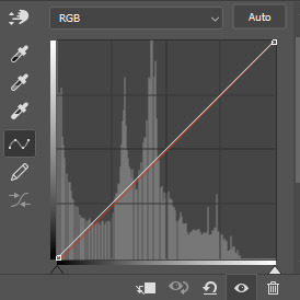
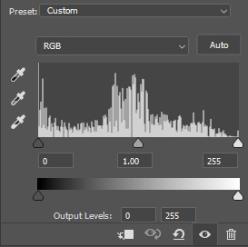
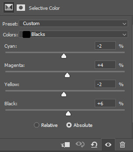
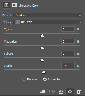
the next step in my process is sharpening. i did play around with my settings a bit given the quality of the footage and the dimensions of the gif. i compared both @hellboys low-quality video gif tutorial to my regular sharpening action and my vivid sharpening action and in this case, i preferred my normal vivid sharpening action. i used this tutorial to create the action for myself, and you can find other sharpening tutorials here. this action converts my frames to video timeline and applies sharpening.
once my gif is sharpened and i'm in timeline, i begin coloring. i wanted to simplify the amount of colors used in these gifs, again because of the video quality -- i knew it wasn't going to have the crispness i would normally like for my gifs. here are my coloring adjustment layers and their settings (not pictured: my first layer is a brightness/contrast layer set to screen) (explanation in alt text):

all of these layers and their settings will vary depending on your footage and its coloring (and obviously, feel free to make the gradient map whatever colors you like if you aren't going for this exact look).
pretty basic coloring, especially with just slapping a gradient map on top (my beloved), but at this point, i still didn't like the quality of the gif, so i added a couple textures/overlays.
i put the left one down first and set the blending mode to soft light and the opacity to 8%. depending on what look you're going for, you could increase or decrease the opacity or play around with different blending modes. i like using this texture with lower quality footage because even when it's sized up a bit, it adds some crispness and makes things feel more defined. for the second texture, i set it to overlay and 75% opacity. we love and respect film grain in this house.
now for the typography! sometimes i really enjoy typography and other times it's the bane of my existence for the sole reason of just how many fonts i have installed. anyway, here are the settings i used for this set:
make sure the color of your font is white and then set the blending mode to either difference or exclusion. i can almost never see a difference between the two, but for this set, i used exclusion. below are the blending options (double click on your text layer to bring up this menu or right click and select blending options).
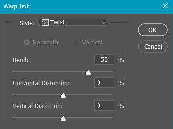
now we have to add the warp effect. with your text tool still selected, click this icon at the top of your screen:

from the dropdown menu, select twist. these were my settings, but feel free to play around with different warp options and their settings. the ones i use most often are flag, fish, and twist.
this last step is completely optional, but it's an effect i use in most of my sets with typography. duplicate your text layer (select the layer and ctrl+j), turn off the layer effects (click the eye icon next to effects), and set the blending mode to normal. right click on the layer and select rasterize type. right click on the layer icon itself and choose select pixels.
at this point, you should see the moving black and white dotted line showing that only your text is selected. then go to edit > stroke. here are the settings i almost exclusively use.
this is what your text should look like now:
using ctrl+T, move the layer off the canvas so you can't see any of the text anymore. you should be left with only your outline. click anywhere on your canvas to de-select the text we just moved. use ctrl+T again as well as your arrow keys to nudge the outline over to the left 2px and up 2px. this is personal preference as far as the positioning, but i almost never move it any other way. you can leave it like this, which i sometimes do, or you can set the blending mode to soft light like i did for a more subtle effect.
and that's it! rinse and repeat for each gif in your set or use a different warp effect on each gif to switch it up! if you have any questions about this tutorial or would like me to make one for anything else, please feel free to ask any time!
#gif tutorial#my tutorials#gifmakerresource#completeresources#dailyresources#chaoticresources#userdavid#coloring tutorial#typography tutorial#tutorial#photoshop tutorial
272 notes
·
View notes
Note
Could make a tutorial for creating subtitles on Photoshop for beginners! Thank you so much, continue the amazing work!
thank you nonny! i'm glad my tutorials are helping at least one person.
creating subtitles is quick and easy. i'll go over simple subtitles, and also making subtitles appear partway through a gif. once you know how to make them i recommend saving an action for it, for your most common gif sizes, that way you can just press one button and then type in your subtitles.
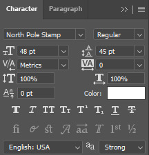
Font Overview
it's good to have a go-to font. i use Calibri Bold Italic, but any clean, simple print font can work
these are my font settings below. quick rundown of each option
A- this your font family B- this is the specific font; light, regular, bold, italic etc. C- this is the font size D- this is the spacing between each row of text; it's default setting is [auto], which uses the built-in font spacing, but all fonts have different spacing and you could end up with a huge gap between rows. the spacing pt's also don't necessarily match up with the font size, so experiment to get the spacing you want E- this is the space between letters; if you think the letters are too close together then increase the number into the positives, if you think they're too far apart then decrease the number into the negatives F- this will "stretch" the letters sideways; not really used for basic subtitles G- this will stretch the letters up and down; not really used for basic subtitles H- this is your font colour
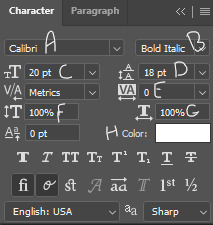
the setting above are my go-to for 540px gifs, though i occasionally adjust the font size between 18-22, and then also adjust the row spacing to match. for 268px gifs, i'll usually use a font size of 16px
Basic Subtitles
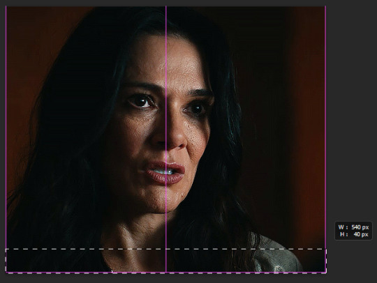
to make the subtitles, select the text tool the left hand toolbar, the icon that looks like a "T", and your cursor will turn to a text selector line in a dotted square. put your cursor at the bottom left of the gif; it doesn't have to be exactly on the corner, but so long as it's close the the edge of the canvas it will "lock on" to the corner.
click and drag to the right side of the gif, and up as big as you want the "text box". there will be a pop-up tell you the width and height of the box you're making. width should be the full width of the gif, and for the height i've set it to 40. the top of the text box will be the very top of the letters on the top row.
the size of the text box can always be adjusted later by clicking a side and dragging.
type your subtitle into the new text box, and then click anywhere outside the workspace (the canvas and the grey area behind it) to "exit" the text layer
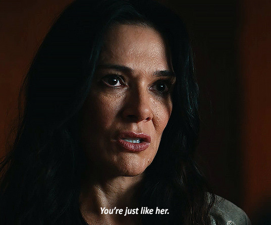
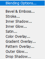
now the text looks pretty good here, because the parts of the gif under it are dark. but a different gif might be lighter, or you might be using a different text colour. to make sure the subtitle is visible and readable on any gif, you're going to go to the menu on the bottom right, with the text layer selected, and click the fx button. any option in the menu that appears will open the same box, just on a different option, i always just click blending options

the layer style box will open. all the options on the side are various effects that can be applied to the text. the ones with a plus sign will allow you to add multiple instances of that effect on the same text. the 2 we'll be using on the subtitles are stroke and drop shadow, so one at a time click on the row for both and a check-mark will appear in the box. you'll also see that effect labelled under the text layer
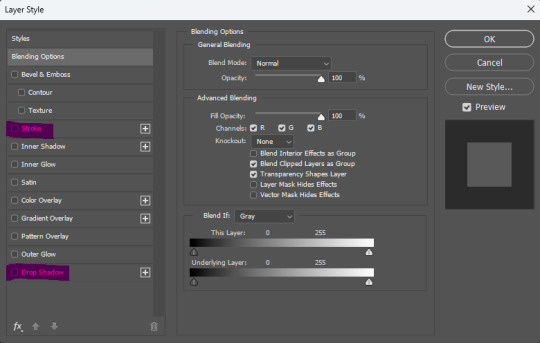
this is the menu for stroke. stroke is simply an outline of the text/object
A- this is the size of the stroke, the width of it B- position can be outside, inside, or centre. for subtitles it should always be on outside C- this changes the blend mode of the stroke, which will have essentially no effect if the stroke is black or white D- the opacity of the stroke E- you can have a stroke made of a solid colour, a gradient, or a pattern F- the colour of the stroke
this is the menu for drop shadow.
A- blend mode, again, doesn't do anything if the colour is black or white B- colour of the drop shadow C- the opacity of the drop shadow D- the angle of the shadow E- make sure this in unchecked, otherwise it can screw with the angle F- this is how far from the text the shadow will be G- this makes the edges of the shadow sharper or harder H- this makes the overall shadow sharper or harder
the options under "quality" i never adjust

click ok on the layer style box and you have your basic subtitles!

Fade In Subtitles
now maybe you have a slightly longer gif, where the character isn't speaking at the beginning of it and you want to time the subtitles with the speech. so we're going to use keyframes!
keyframes do various things, by setting two (or more) points on the gif, and the gif will automatically change between those two points, depending on which keyframe you use. (hopefully this will make more sense a little further down)
first play the gif a few times in the export preview window to see when the talking starts and then move the frame tracker (the red line) to 2-3 frames before the speaking begins, in this gif the character starts speaking at frame 50, so move the frame tracker to frame 48

when you click the arrow at the start of the layer, it opens a dropdown of the layer and gives various options to use keyframes on, depending on what kind of layer it is. clicking the little stopwatch will create the first keyframe
transform- this lets you change the size/orientation of the text opacity- this lets you change the opacity of the text style- this lets you change the layer style of the text text warp- this lets you animate the warping of the text
when you click the stopwatch, a keyframe will appear on the timeline on the frame selected, and next to the stopwatch two arrows with a keyframe point between them will appear. the arrows move you from one keyframe to the next, and the point between the arrows will add a keyframe on the selected layer, or remove the keyframe if there is already one there. if you click the stopwatch button again, it will remove all keyframes
while the tracker is on a frame that has a keyframe attached, anything you do that falls under that type of affect while on that frame will be recorded by the keyframe. on opacity there's only the one thing that will be recorded—opacity.
since we want the text layer to be invisible when the gif starts, turn the opacity down to 0, while on the frame with the first keyframe. now move the tracker to the frame where the speaking begins. add a new keyframe on frame 60 using the new keyframe button. then turn the opacity on the text layer back up to 100
now the text layer will go from 0 opacity to 100 opacity over between the 2 keyframe points, and gradually appear as the character begins talking. if the timing isn't quite right, you can click and drag the keyframe points along the timeline.

A Few Random Notes
some people use white for an entire gifset, even if more than one person is speaking, and some people use different colours to show who is speaking. you can have set colours for speaker #2, #3, etc. but when possible, i like to use the eyedropper to select a pixel colour for the other speaker that is already in the gif, but not prominent where the subtitles will show, so i don't add a colour that wasn't already present, and reduce the number of colours in the gif itself
if the subtitle is long enough to go on two lines (or more) try and cut it to be somewhat even i.e. don't have the top line stretch from side to side, and the bottom line only had 1 or 2 words; if there's a comma or semi-colon in the text, splitting it there as a natural gap/pause
if there are two people speaking in 1 gif, and you want to show their dialogue at the same time, you can put the two different speakers on separate lines of the same text box, highlight one of them, and change only that colour
#cleo gets mail#anonymous#tutorial#gif tutorial#typography tutorial#photoshop tutorial#gifmakerresource#completeresources#*tutorials
28 notes
·
View notes
Note
What is your creation process? :3c
hey, thanks for the inquiry! i've been meaning to make a post like this for some time now. NOTE: this will only cover how i make my blinkies. if you want me to go in depth about how i make stamps, please send another ask! i just think they're kind of self explanatory in comparison >_>
MY BLINKIE MAKING PROCESS
for this demonstration, i will make this graphic of Acht Mizuta from Splatoon 3. it's free to use btw:
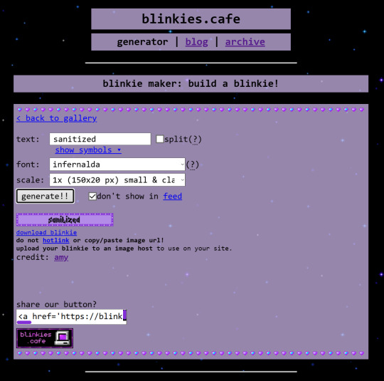
i make my graphics in Krita, which is great for editing pixel art, but does not have an option to disable font antialiasing. this leads me to generate my pixel text through external online services, but i usually generate it on blinkies.cafe and get an editable template to go along with it. my go-to is the simple purple template, since it has a simple palette and the text has its own color so i can put it in a separate layer easier.
i import it as a single frame that i will animate later. usually what i do first is cut+paste the inner content of the blinkie into a separate layer:
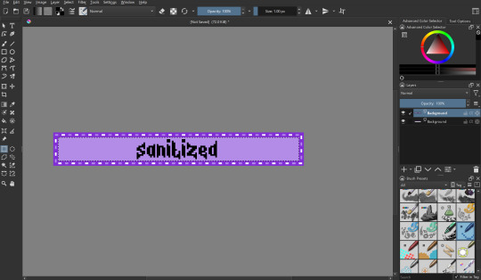
then i remove the background with a fill erase on the third mode, and move it around as i see fit. i put it in a separate layer before this so it's easier to color and add things like outlines.

let's import graphics! usually i find a transparent png and overlay it onto the background, but in this case i'm using a full background, so it needs to be prepared:

(source: splatoon 3 side order locker reward banner)
i import the image into a new file with the same resolution as the blinkie. i edit it to have a wider resolution so it fits better:
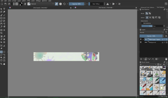
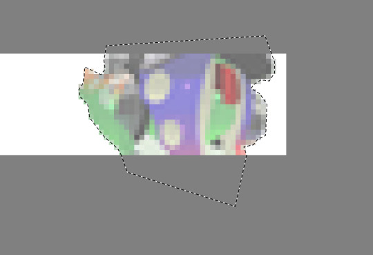
i use a lasso tool to put acht in a separate layer (so they stick out of the frame)
i import the two layers into the original file with the text. though i feel the images could use a little color grading...
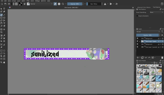
at this point i begin to mess around with the layout a little, trying to match the original "sanitized" theme i had in mind. i also do color grading on the render of acht and change out the background. now we're getting somewhere! i also color the text at this point to be a nice gradient green.
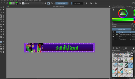
let's color the outer part of the blinkie! i thought i would make the border a transparent black, with the lights being neon green and a dark magenta respectively.
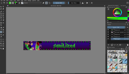
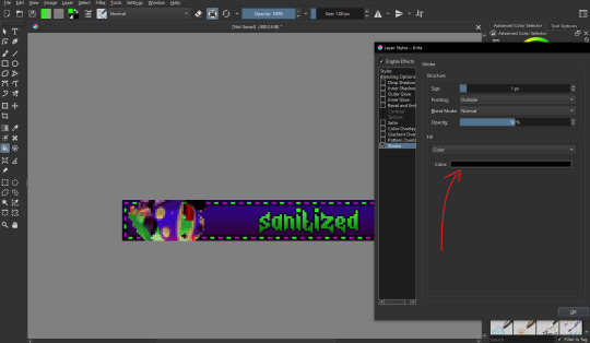
i also want to make the text have a nice little border around it, so i put a stroke filter on the text layer with the following settings. these usually change depending on graphic but the thickness is always 1px (any more and it gets antialiasing)
that's it for designing the blinkie, now it's time to animate it! i do this internally in krita, since it has an animation feature:

i make a new frame for the animation and change the colors and positions around. i also set up my clip settings - ending at frame 1 (2 frames - frame 0 and frame 1) at 6fps.

that's pretty much it! the gif is ready to export, just make sure you export it in the right format and don't accidentally compress it or make it too big.
the gif is ready!! wahoo!! i hope this was somewhat enlightening, i'm not the best at explaining stuff but i tried to go in depth as much as i could
#dj's commentary#pixels garage#web graphics#blinkies#dedf1sh#acht mizuta#acht splatoon#blinkies.cafe#tutorial
20 notes
·
View notes
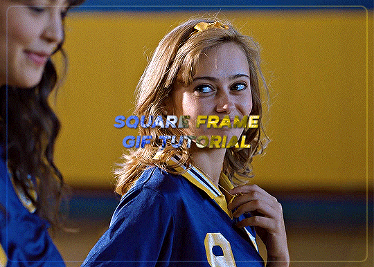
Note
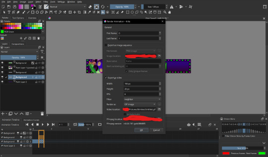
How do you get that square frame on some of your gifs? Is it a template?
Hi I'm assuming you mean like in the first and last gifs of this set?
I don't use a template I just manually draw the rectangle/square in. It's super easy and only a few steps (see below for the cut)
Start with your gif, colour it as you'd like for your set. For this example I'm going with a blue and yellow :)

Right click on the rectangle tool and select "rounded rectangle tool" from the drop down list. (you can use the normal rectangle, but I prefer the rounded corners personally)

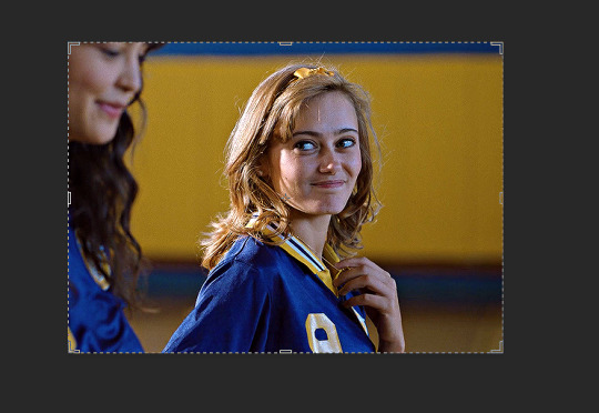
use the cursor to draw from the top corner to the bottom corner, you'll get an outline something like the below screencap.
When you finish drawing a rectangle will show up

Change the settings in the above tool bar to match how you'd like your outline. Always change it so there is no fill

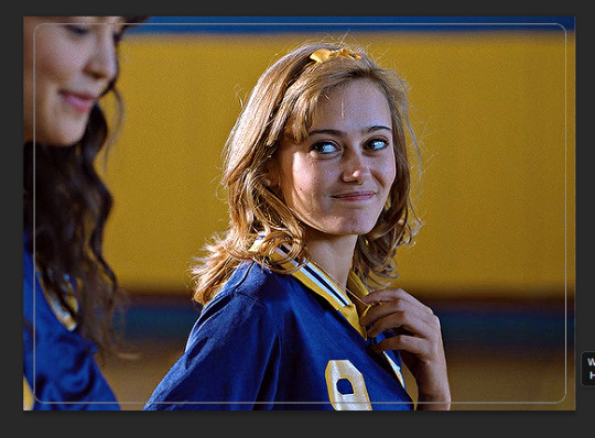
I have changed my stroke to be a blue and yellow gradient

This gives the below result

I think this is a little too strong, so I adjusted the stroke to 2
I also would like it to blend in a bit more with the gif so I changed the blend mode to screen. I also adjusted the angle of the gradient from 90 to 28
To make it a bit softer still, I'm also going to adjust the opacity of the rectange layer to about 30 which gets us the below result

One last step, is because I didn't draw it perfectly in center I align the layer to the center of the gif by pressing ctrl + a to select the whole canvas (should give the below selection lines)
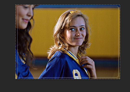
then click over to the move tool

then press the highlighted option

then press this option
this just shifts the layer to be centered
press ctrl+d to clear your selection
this gives the following result

Last step is to make sure your rectangle layer is the same length as your gif. You just either drag the layer to match the bottom gif layer (or you could also just adjust the gray gif slider instead)

and now all you need to do is add text and other effects as needed :)
#asks#ps help#usergif#allresources#resources#yeahps#completeresources#resourcemarket#dailyresources#tutorials#photoshop tutorial#*mine#i hope this is what you were after#also i wanted to take some more screencaps but computer wasn't cooperating so hope it makes sense :)
18 notes
·
View notes
Text
Thank you!
A big thank you to everyone who got a copy of Mostly (h)Armless! I think that for an obscure little fancomic it did really well! About 30 copies have gone where none can ever take them away again. I've also finally received my own version and I am happy about the quality.
I've now unpublished it but turns out you can never entirely take a book off the store once published. You can't edit it to be something else either. (which is what I had hoped to do, I have a bunch of unpublished original comics lying around). So it's just kinda going to sit there for all eternity, unavailable for sale. I sincerely hope it won't give me problems later on.
Anyway, if anyone is curious about one day printing their own comics, here are a few things I have noticed that I will definitely remember for my future printing endeavors:
Most glow and blending effects like Lighten, Color dodge, Hard Light, Linear dodge (add), etc don't look that nice in print despite looking awesome in digital.
Make your line art thick enough.
soft shading looks bad, cell shading looks good. (But it's better to fully fill shapes with a contrasting color rather than doing fancy lighting.)
Consider shading in black rather than color. (optional)
Details and soft lines are usually lost and a waste of time (Mostly in case of a colored book. Black and white may be different)
Keep panels spaced far enough apart.
Draw big panels. Small panels aren't as nice to look at and the eyes are naturally drawn to the larger panels.
Gradients don't look very nice either. Unless they have a light color.
Vintage comic textures and effects actually looks nicer in print than digital (which surprised me).
In dark scenes, rim lights are essential to make the character pop out. M(h)A would've looked like ass if I hadn't added those.
Stay away from the borders of your page, especially the left and right ones. Not just for the text but for the drawings too.
Keep track of which side of your page will be closest to the spine, keep a distance from that side especially. Because your book will be folded and part of the page will be hidden (the thicker your book, the more will be lost).
fancy panel compositions are cooler in digital...
contrast contrast contrast...
Don't be afraid to use pure black a lot.
Don't be afraid to use white a lot.
The 3D shake effect is also not that cool on print. But looks gorgeous on digital.
To myself… keep the font size consistent…
If text is outside a text bubble, it should have a high contrast stroke
Text should always be high contrast in general.
Motion blur is really cool in digital but not so much on print.
Keep black silhouettes black, avoid adding any kind of subtle glow or texture.
Text bubbles can have color but they should be light (again high contrast) watch out for saturated green or blue or red. Test in greyscale. Contrast should be more than 70%.
Line art should not be colored. Keep it black for print.
Hard borders are better than soft borders. On everything.
white panel borders are better than black panel borders.
But white borders with a black stroke are probably the best (cause more contrast).
Again light colors are better than dark colors. To do dark scenes it might be better to just use black and contrast with a lighter color.
Line art perfection is not that interesting, especially in regards to hard surface shapes like robots. (Might be personal taste though. I enjoyed looking at robots with messier line art more than those where I did perfect brush strokes.)
Beware dark blue and purple...
Compositions and colors of both the left and right page should always fit together. I think I did that pretty well here at least.
If possible make your total amount of comic pages devisable by 4. (so 24 pages total, or 28, or 96, you get the idea) not including the cover and back. Or else add a little extra drawing to fill the remaining pages.
I think that's about everything I can see based on my own print. I'm sure that a fair few of the things that I found looking worse in print than digital could be resolved by just being... better at converting your files. There's the whole CMYK color mode thing but in my personal experience that has been such a pain to work with, and each time my prints looked worse attempting to convert the file rather than had I just left it in RBG and let the printer do the guessing work for me.
So if you're like me and you're hopeless at this technical mumbo jumbo printing stuff, I think just avoiding the things I mentioned while drawing should get you well under way to having a nice print. The most important thing to remember is that digital and physical media are two entirely different beasts and if you are interested in getting your comics printed it's easier to adapt your workflow to that from the start rather than going back and altering. A lot of the mistakes I made here are rookie ones and I should have known better. But it's very easy to get lost in the process once you've started. I hope to improve my next print significantly. Once I can make RBG look good, I might try CMYK again.... Maybe. Potentially. No.
Hope these tips can be of service to somebody. They'll be a useful archive for myself in any case. If anyone wants me to elaborate more on a specific point, I'm happy to explain.
42 notes
·
View notes
Note
Hello!! First your Tumblr and edits are so gorgeous! Second I was wondering if you were willing to share how you did the second gif of this edit please? Have a great day! (Or night)
https://www.tumblr.com/thereigning-lorelai/713794704750362624/usergif-1-year-celebrationshuffle-challenge?source=share
hi nonny, thanks for the nice words! really appreciated. ♥️ so, you're looking for this grid effect:

you're starting off with two gifs. i'd recommend choosing scenes that are not too close up because otherwise they'll overlap too much and you won't be able to delete enough parts to make the most of this effect.
so, here's my base gif that i just did in black and white with some minor purple brush strokes set to screen:

i then chose my second gif and coloured it with a purple gradient map and a purple colour fill set to multiply. the colouring of the gifs is entirely up to you and what you think looks best. so here's my second gif, still without the grid:
this is where the fun part starts - the grid layout. i created that with a new guide layout. this is a super neat tool in photoshop that helps you align shapes or selections on your image. the guide lines basically float over it and help you set up symmetric shapes or layouts. you can define how many columns and rows you want to have and then photoshop creates the guide layout for you. for this gif i chose 4 columns and 4 rows:

with this set up, i started creating the rectangles to make the purple gif visible on top of the black and white one. this is my final layout for my shapes:
you can move around the shapes to your liking and what works best with your gifs. i didn't want to cover too much of my base gif but also tried to make their faces in the top gif all be in the gif as much as possible.
this step is just a lot of moving around your shapes and seeing what looks good tbh.
i then grouped my shapes and clipped my top gif (including all layers for the colouring) to my shapes group:

looking good so far. the only thing missing are the lines for the grid. this is where your guide layout comes in again. i just reopened it and then traced the guide lines with my line tool to create the white grid overlay:
(for editing purposes i turned all of the line layers into a single smart object at the end. this is why you only see one layer for all the lines in this screenshot.)
finally, i used a gaussian blur (0,5 px radius, 100% fill for the filter, 40% fill for the overall layer) on the smart layer to make the lines a little bit smoother and softer looking. this is totally optional and again, up to what looks best to you.
added some text et voilà:
#asks#kind nonnies#usergif#*tutorial#hope this helps nonny#if you have any further questions just let me know#i'm not the best at explaining especially because i think my way won't be the most efficient or even logical#but that's how i did it and i think it's fairly easy to achieve
364 notes
·
View notes
Text
Text Effects Masterpost:
I've been meaning to do this for a minute now, but I wanted to share some resources of different font tutorials I've used throughout! This won't be a tutorial as to how I apply things but I could definitely stitch a video into this post if that would help!
☆ I do use DaFont to find all of my fonts! Sometimes the videos I do watch will suggest new fonts as well! I also do all of my text effects in photoshop!
☆ Spoon Graphics, ThaZero and PANTER are usually my go-to's! They offer easy, quick and most of all, free tutorials!
☆ Some fave videos:
Gradient Blur and Glowing Effect
3D Chrome for Beginners
Glowing Text - Strange Lights
Smoke Melted Effect
Motion Blurred Effect
☆ (This is gonna be a run on lmao) If you select the fx button after typing in your text, select stroke, change the color to gradient and pick a color you like, change the blending mode to any of these four options, you get a really cool outline effect! Crusty photos below:


20 notes
·
View notes