#gradient animation css
Explore tagged Tumblr posts
Visit Tumblr Blog
Explore Tumblr blogs with no restrictions, modern design and the best experience.
Last Seen Tumblr Blogs


Fun Fact
Tumblr has 16.74 million mobile monthly users in the US.
Text
Gradient Background Animation
#css gradient#gradient animation css#html css animation#css animation examples#html css#divinectorweb#css#frontenddevelopment#webdesign#html#css3#animation in css#gradient background animation#gradient background
3 notes
·
View notes
Text

CSS Gradient Text Animation
#css gradient text animation#css animation#css text animation#css text effects#html css#frontend#css#html#css3#learn to code#code#css animation examples#css animation tutorial#css animation snippets#css tricks#frontenddevelopment
2 notes
·
View notes
Text

Gradient Text Border Animation
#gradient text border animation#neon border animation#html css#codenewbies#frontenddevelopment#html5 css3#css animation examples#pure css animation#css animation tutorial#css#html css animation#pure css effects
5 notes
·
View notes
Text
Modern Scroll Shadows Using Scroll-Driven Animations
New Post has been published on https://thedigitalinsider.com/modern-scroll-shadows-using-scroll-driven-animations/
Modern Scroll Shadows Using Scroll-Driven Animations

Using scroll shadows, especially for mobile devices, is a subtle bit of UX that Chris has covered before (indeed, it’s one of his all-time favorite CSS tricks), by layering background gradients with different attachments, we can get shadows that are covered up when you’ve scrolled to the limits of the element.
Geoff covered a newer approach that uses the animation-timeline property. Using animation-timeline, we can tie CSS animation to the scroll position. His example uses pseudo-elements to render the scroll shadows, and animation-range to animate the opacity of the pseudo-elements based on scroll.
Here’s yet another way. Instead of using shadows, let’s use a CSS mask to fade out the edges of the scrollable element. This is a slightly different visual metaphor that works great for horizontally scrollable elements — places where your scrollable element doesn’t have a distinct border of its own. This approach still uses animation-timeline, but we’ll use custom properties instead of pseudo-elements. Since we’re fading, the effect also works regardless of whether we’re on a dark or light background.
First, we’ll define our scrollable element with a mask that fades out the start and end of the container. For this example, let’s consider the infamous table that can’t be responsive and has to be horizontally scrollable on mobile.
Let’s add the mask. We can use the shorthand and find the mask as a linear gradient that fades out on either end. A mask lets the table fade into the background instead of overlaying a shadow, but you could use the same technique for shadows.
.scrollable mask: linear-gradient(to right, #0000, #ffff 3rem calc(100% - 3rem), #0000);
Defining the custom properties and animation
Next, we need to define our custom properties and the animation. We’ll define two separate properties, --left-fade and --right-fade, using @property. Using @property is necessary here to specify the syntax of the properties so that browsers can animate the property’s values.
@property --left-fade syntax: "<length>"; inherits: false; initial-value: 0; @property --right-fade syntax: "<length>"; inherits: false; initial-value: 0; @keyframes scrollfade 0% --left-fade: 0; 10%, 100% --left-fade: 3rem; 0%, 90% --right-fade: 3rem; 100% --right-fade: 0;
Instead of using multiple animations or animation-range, we can define a single animation where --left-fade animates from 0 to 3rem between 0-10%, and --right-fade animates from 3rem to 0 between 90-100%. Now we update our mask to use our custom properties and tie the scroll-timeline of our element to its own animation-timeline.
Putting it all together
Putting it all together, we have the effect we’re after:
We’re still waiting for some browsers (Safari) to support animation-timeline, but this gracefully degrades to simply not fading the element at all.
Wrapping up
I like this implementation because it combines two newer bits of CSS — animating custom properties and animation-timeline — to achieve a practical effect that’s more than just decoration. The technique can even be used with scroll-snap-based carousels or cards:
It works regardless of content or background and doesn’t require JavaScript. It exemplifies just how far CSS has come lately.
#ADD#animation#animations#approach#Articles#background#border#container#content#CSS#CSS Animation#css-tricks#custom properties#Dark#devices#digitalocean#gradients#how#indeed#it#JavaScript#Light#linear-gradient#mask#Mobile#mobile devices#One#responsive#safari#scroll
0 notes
Text
0 notes
Text

🧡 Tuesday Tips #3 🧡
Your website is more than just a collection of pages—it’s your digital home. It should reflect you, your interests, and your personality. But with so many sites out there, how do you make yours stand out?
Here are 25 ways to make your website feel more personal, unique, and personalized to you!
........................................................................................................
🎨 Design & Aesthetics
1. Custom Color Palette – Pick colors that resonate with your personality and aesthetic.
2. Unique Typography Choices – Use a mix of fonts that match your vibe.
3. Handwritten or Doodle Elements – Add personal sketches or notes.
4. Custom Cursor – Let visitors use a fun, themed cursor on your site.
5. Personalized Favicon – A tiny but powerful detail that makes your site feel complete.
6. Themed Layouts for Different Pages – Make each page visually distinct but cohesive.
7. Custom Backgrounds – Textures, gradients, or even a personal photograph.
8. Retro or Experimental CSS Styles – Go wild with unique styles that make your site stand out.
9. Create a Custom Hand-Drawn Logo – Instead of a standard logo, try sketching one yourself for a unique touch.
10. Add Subtle Animations – Small hover effects, background animations, or cursor trails can bring your site to life.
11. Play With Layering Elements – Overlap images, text, and shapes for a more dynamic look.
12. Design a Personalized Loading Screen – A custom loading animation or message adds a fun detail visitors will remember.
13. Add Your Own Handwriting as a Font – Convert your handwriting into a web font for a truly personal touch.
14. Design a Seasonal Theme Switcher – Let visitors toggle between different seasonal or mood-based color palettes.
........................................................................................................
📜 Content & Personality
15. Create a Behind-the-Scenes Page – Show how your website was built, share your thought process, or include fun bloopers.
16. Add a "The Making Of" Section – Share drafts, sketches, or early concepts behind your creative works.
17. Include a Personal Dictionary of Words You Love – A list of favorite words, phrases, or slang you frequently use.
18. Design a "Things That Make Me Happy" Page – A simple, uplifting page filled with personal joys.
19. Show Your Progress on a Learning Goal – Track and share your journey in learning a new skill, language, or hobby.
........................................................................................................
💾 Interactivity & Engagement
20. Add a Clickable Mood Indicator – Let visitors see your current mood with an emoji or phrase that changes over time.
21. Create a Dynamic Banner That Updates Automatically – Display different messages depending on the time of day or special occasions.
22. Add a "What I'm Listening To" Widget – A live-updating display of your current favorite song or playlist.
23. Embed a Poll or Voting Feature – Let visitors vote on fun topics or help you make creative decisions.
24. Introduce a Mini Personality Quiz – Something quirky like “Which of my favorite books/movies are you?”
25. Make an "Ask Me Anything" Page – An interactive page where visitors can submit questions for you to answer.
Closing: Make It Yours!
Your website should be you in digital form—fun, unique, and engaging. Whether you add just one or all 25 ideas, the most important thing is to have fun and make it your own.
If you try any of these ideas, let me know—I’d love to see what you create!
-----------------------------------------------------------------
Want to help the Small Web movement grow?
Join us on other platforms. ♥
FB Page & Group:
facebook.com/thesmallweb
facebook.com/groups/thesmallweb
Twitter/X:
x.com/smallweblove
Tumblr Community:
tumblr.com/communities/thesmallweb
Mastodon:
indieweb.social/@thesmallweb
#small web#indie web#web revival#old web#blog#neocities#2000s web#decentralized social media#decentralizedfuture#old internet#decentralization
17 notes
·
View notes
Text
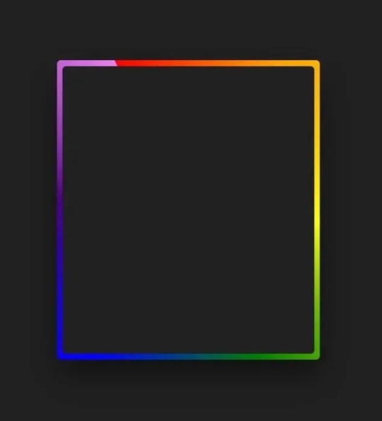
I wasn't really expecting it to be something I'd find so entertaining but I definitely want to play more with css gradients and see what other people have done. I was just pulling up a generator to help visualise how to give some of the element a bit of faux depth and I see this:

I mean, of course, the coding language has been around so long of course people are going to take full advantage of its features but I hadn't even considered something like this was possible

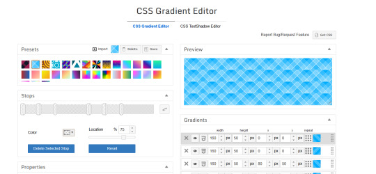
I feel like such a nerd, hahaha, but I bet you could make some really neat patterns, which would be even cooler combined with the ability to animate stuff
12 notes
·
View notes
Text

Day 1 - 100 Days CSS Challenge
Welcome to day 1 of the 100 Days CSS Challenge! In this challenge, we'll bring a design to life using only CSS. Our goal is to recreate the image we're provided with on the challenge page using HTML and CSS.
On the challenge page, we see:

A small preview of the design we need to replicate.
A starter HTML template.
A submission form to showcase our work alongside others who have taken on the same challenge.
Let's dive into the process step by step.
Step 1: Screenshot the Image
The first thing I always do is take a screenshot of the target design. Even if the design includes animation, having a static reference helps me focus on the basic structure and colors. Here’s the screenshot of the design we’re aiming for:
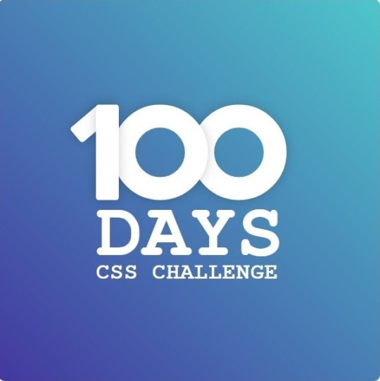
Step 2: Extract the Color Palette
Next, I identify the color palette that we'll need. This helps ensure that we maintain consistency with the original design. Here’s the color palette I’ve created:

Step 3: Identify and Create the Image Elements in HTML
Now that we know the colors, I break down the elements in the image:
Background: This is a linear gradient.
The 100 number: This is the main challenge, and it will require some work.
Text: “days css challenge,” which we’ll place to the left of the number.
Here’s the HTML structure for these elements:
<div class="frame"> <div class="center"> <div class="number"> <div class="one-one"></div> <div class="one-two"></div> <div class="zero-one"></div> <div class="zero-two"></div> </div> <p class="sentence1">days</p> <p class="sentence2">css challenge</p> </div> </div>
Now that the elements are in place, CSS will bring them to life.
Step 4: Bringing the Elements to Life with CSS
Linear Gradient
To create the background, we’ll use a linear gradient. Here’s a basic syntax:
background: linear-gradient(to <direction>, <color-stop1>, <color-stop2>, ...);
Parameter 1: Direction/Angle
This defines the starting point of the gradient. You can either specify a direction (e.g., to top, to bottom) or an angle (e.g., 90deg, 180deg).
Direction options:
to top
to bottom
to left
to right
If you want more precision, you can specify angles:
0deg: Gradient starts from the top.
90deg: From the right.
180deg: From the bottom.
270deg: From the left.
You can also combine two directions, specifying both horizontal and vertical movements, like to left top or to right bottom. This means:
The first keyword (left or right) controls the horizontal movement.
The second keyword (top or bottom) controls the vertical movement.
For example:
background: linear-gradient(to left top, red, blue);
This gradient starts at the bottom-right corner and transitions toward the top-left.
Parameter 2: Color Stops
Color stops define how the gradient transitions between colors. Each color stop specifies a point where a color starts or ends. Here's an example:
background: linear-gradient(to right, red 10%, blue 90%);
This means:
The element starts at 0% fully red.
By 10%, the transition from red begins.
Between 10% and 90%, there is a smooth blend from red to blue.
At 90%, the transition to blue is complete, and the remaining part is fully blue.

Once we understand the concept, we can apply the background we need. In our case, the gradient flows from the bottom left to the top right, so the code will look like this:
background: linear-gradient(to right top, #443DA1, #4EC3C9);
Bonus: Stacking Multiple Linear Gradients
You can also apply multiple gradients on top of each other:
background: linear-gradient(180deg, #f00, #0f0), linear-gradient(90deg, #ff0, #f0f);
Step 5: Making the "100" Number
Creating the Zeros
We start with the zeros. These are simply circles created using CSS. To make a full circle, we use border-radius set to 50%.
The white border gives it the appearance of the number zero.
.zero-one, .zero-two { position: absolute; height: 100px; width: 100px; border-radius: 50%; border: 24px solid #fff; box-shadow: 0 0 13px 0 rgba(0,0,0,0.2); }
This gives us a nice circular zero. We adjust their positions using properties like left and top, and manage the z-index to make sure the zeros stack correctly.
.zero-one { z-index: 8; left: 17px; } .zero-two { z-index: 6; left: 100px; }

Now both zeros are positioned, and they overlap in the way we want.
Creating the "1" Number
The number "1" is made of two div elements:
One-One: This part represents the slanted part of the "1".
One-Two: This is the straight vertical part of the "1".
What make the one-one element slightly slanted is
transform: rotate(50deg);)
the one-two is created simply with a little height and width nothing too particular then it is placed directly on top of the slanted part, giving us the full "1". Its z-index tho has to have a higher value than the slanted part of our 1 to ensure it stays above the slanted one.
Step 6: Adding the Text
For the two sentences “days” and “css challenge,” the styling is basic CSS. You can achieve the look with just a few font changes, some padding, and adjustments to font size. It’s as simple as:
.sentence1,.sentence2{ text-transform: uppercase; margin:0; padding:0; } .sentence1{ font-size:82px; font-weight:700; } .sentence2{ font-size:25px; font-weight:700; margin-top:-20px; }
And just like that, we’ve completed day 1 of the 100 Days CSS Challenge! Each part of the design is carefully crafted using CSS, giving us the final result.
Happy coding, and see you tomorrow for Day 2!
#100dayscssChallenge#codeblr#code#css#html#javascript#java development company#python#studyblr#progblr#programming#comp sci#web design#web developers#web development#website design#webdev#website#tech#html css#learn to code
16 notes
·
View notes
Text

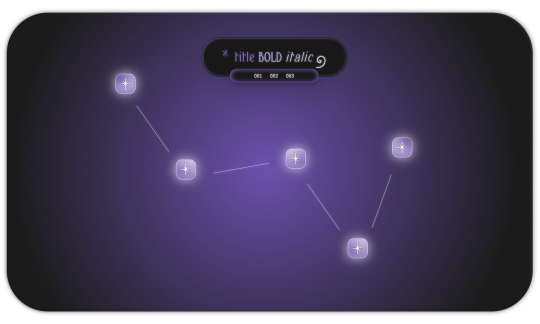
𖥨 ̟⊹♡ milky way , a page by gordonramsei
here i am with milky way , a javascript - free navigation page designed to resemble the constellation cassiopeia . there are five special links as well as three extra links nested in the subtitle . the vibe is dreamy , ethereal and gradient heavy with some css tricks to make objects appear dimensional . if u guys enjoy this type of navigation page , i will make more in the future in the shape of different constellations ! as always , if u encounter any issue within the code , pls let me know and i will troubleshoot asap !
if u intend on using this theme or just want to be a supportive hottie , please give this post a like and a reblog ! stay hydrated and be sure to pet a cute animal today ! mwuah ! 🤍 🤍 🤍

ⅰ. PAGE FEATURES .
x. this page is 100% javascript - free x. dreamy radial background gradient x. five clickable stars in the constellation to serve as links x. three extra links in the subtitle x. for a more detailed compilation of credits and features , please see the google doc containing the code
𖥨 ̟⊹♡ this page is a patreon exclusive : want access ? consider signing up to join the fam - a - lam to get ur hands on this page as well as my entire coding catalogue . click here to learn more !
source link directs to a live preview of milky way .
#rph#indie rph#rp theme#indie rp theme#rp page#navigation page#supportcontentcreators#mine#rec#page#for patrons#for patreons
17 notes
·
View notes
Text
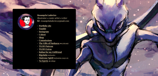
I think I'm finally satisfied with the revamp of my links page:
cyborgize.it/links
If you are on desktop, go mess with the hover animations. In horizontal versions with sufficient resolution, there is that hole in the content box - isn't it cool? It's a CSS radial gradient set to transparent - one single property, kind of incredible. If anyone is interested, please take my code, it's based on a tutorial but I did add some things and streamlined it and commented it for clarity.
And oh right, this page is so that you can find all of my relevant information and links in the same list. Right, that's the purpose. Go look at my stuff or follow me elsewhere, I dunno.
8 notes
·
View notes
Text
Requiem (Interactive Fiction Devlog #5)
(See my previous posts here.)
Over the weekend I spent some time adding polish and, I suppose, **pizzazz** to my game. I want the combat and interactions to feel good and be highly readable even when the game wants you to click through everything pretty quickly, not necessarily needing to read every bit of repetitive text every time.
So, here are some purely CSS- and HTML-based animations I added in...
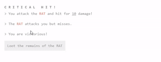
We've got two things to show off on this image.
First, you can see that the Critical HIT! text does a neat spin effect on a slight delay. It's very readable, and just feels a bit more rewarding when you get it.
Second, the loot page has been updated so that the currency and additional items slide in on a slight delay from each other.
They're small changes, to be sure, but I think the interface all that more enjoyable.
I also took that silly Evangelion reference from last week and kicked it up a notch - with this nice, subtle CSS gradient effect. I love little touches like this that just make the game feel better.
And yes, this will change colors depending on which theme you have selected.
----
That's it for today! More coming soon. If you're interested in alpha testing, drop me a line. I'll be looking for folks in the next months or so.
#interactive fiction#twine#twine game#if wip#interactive fiction game#game development#twine wip#groggy requiem
4 notes
·
View notes
Text

CSS Gradient Background Animation
#css gradient animation#html css animation#html css#divinector#frontenddevelopment#html#css#css3#css animation examples#css animation tutorial#css gradient#gradient animation css#css tricks#cool css effects
1 note
·
View note
Text
Gradient Border Animation
#css border animation#css gradient background animation#codingflicks#html css#frontend#html#css#frontenddevelopment#css3#webdesign#html css animation#css animation examples#border animation css#neduzone
5 notes
·
View notes
Text

CSS Text Gradient Background Animation
#css text gradient animation#css text gradient#css text animation#css text effects#animated text effect#html5 css3#html css#codenewbies#frontenddevelopment#css#css animation examples#pure css animation#css animation tutorial#animated text#css gradient animation
2 notes
·
View notes
Text

Animated Gradient Color on Text Full Code https://democoding.in/css-tips/animated-gradient-color-on-text-3
2 notes
·
View notes
Text
Gemrud AI - Landing Page
Live Demo | Buy Now
A modern, responsive landing page for Gemrud AI - showcasing advanced artificial intelligence solutions for business

Features
Modern Design: Clean, professional interface with gradient accents
Dark/Light Mode: Toggle between themes with smooth transitions
Responsive Layout: Optimized for all device sizes
Interactive Elements: Smooth animations and hover effects
Modal System: Sign-in and sign-up modals with form validation
AI-Themed Visuals: Animated grid showcasing AI technologies

Technologies Used
HTML5: Semantic markup structure
CSS3: Modern styling with CSS Grid, Flexbox, and custom properties
JavaScript (ES6+): Interactive functionality and animations
Font Awesome: Icon library for UI elements
Google Fonts: Poppins and Montserrat typography

Interactive Elements
Smooth hover transitions
Animated loading states
Ripple click effects
Floating animations on AI grid
Theme Management
Dark/Light mode toggle
Theme preference persistence

Responsive Breakpoints
Desktop: 1200px and above
Tablet: 768px - 1199px
Mobile: Below 768px
Live Demo | Buy Now
#css#html#html css#htmlcoding#js#landing page#landing page builder#landing page design#landing pages#panel
0 notes