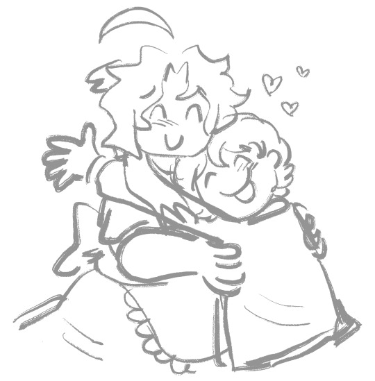
#for image references i mean specifically designed to be a reference for size
Text
i'm actually working on compiling a list of g/t resources - height and proportion calculators, image references to show scale, places where you can get hand or art references from giant tiny angles, things like that! if you have anything like that i could include, please send it my way! i'm trying to make the list as extensive as possible
#g/t#giant tiny#for image references i mean specifically designed to be a reference for size#not just a pic with an official scale but like. charts and labeled references and stuff\#i have all the calculators people sent me this morning and a few images i had saved in my blog#ive been working on this for like the last half hour. i want all my resources in one spot#plus.... every time anyone posts a calculator ppl go WILD. and theres SO MANY YALL#these are WONDERFUL resources and more people need to know abt them!!
118 notes
·
View notes
Text


Donut Co. Rugtastic Reset - Explosion of Oddity Edition P.1
(I was originally going to name this set "Racked with Randomness" instead of Explosion of Oddity, so any references in my cover photos mean these ones, just to be clear!!!!!!)
Has 55 Swatches
All english (sorry)
All of our CC can be found by typing " Donut " into the search bar!
Images in game - You can find bonus images on our tumblr > HERE
Most of my images have my reshade on - it changes the color minimally, so white may look a little off in photos, but in game it will look white/normal!! <3!
You can size them up and down using the bracket keys. [ ] <- these ones. I personally, use the tool mod to size my items up and down, and specifically with these if you are wanting them to be "perfectly sized" i would recommend you grab the tool mod by twistedmexi! If you would like to use it in build-buy mode, you'll need BBB!
~~~~~~~~~~~~~~~~~~~~~~~~~~~~~~~~~
Name: Donut Co. Rugtastic Reset - Explosion of Oddity Edition P.1
Buy Mode Description: Prepare for floors that detonate the ordinary! Kickstart your Rugtastic Reset with the Explosion of Oddity Edition, where the outlandish meets the adorable in a blast of color and design. Discover whimsical twists on familiar faces, astronauts chilling on vinyl space records, and retro throwbacks that ignite a wave of belly-aching nostalgia. With 55 eye-popping swatches, there's a rug-induced giggle for everyone. Get ready for a walk on the weird side... where the unexpected is always underfoot! After all, this is just the start of your Rugtastic Reset – stay tuned for even more delightfully strange designs to come!
(Works best if you use the bracket keys "[" + "]" to size up and down, or my personal preference of the tool mod!)
~~~~~~~~~~~~~~~~~~~~~
DOWNLOAD:
Patreon: https://www.patreon.com/posts/102628896?pr=true
Google Drive: https://drive.google.com/file/d/1AwbjXYP5ByE4xQyoJLCwDaGX9IKPepVN/view?usp=sharing
@alwaysfreecc
#sims#sims 4 maxis match#always free cc#sims 4 cc#patreon#noideabutsims#ts4#simblr#buildbuy#sims 4 custom content#ts4 custom content#ts4 gameplay#ts4cc#ts4 cc#ts4 cc free#sims 4 cc free#sims4 cc finds#sims cc free#cc finds#free cc#freecc#maxis match cc#the sims cc#cc#the sims 4#custom content
68 notes
·
View notes
Text
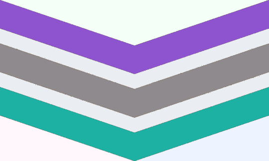
[Image ID: the Trinteri pride flag by Gent of Gender-Jargon. The Trinteri flags consists of three down-pointing chevrons of the same size, with negative space above, between and to the left and right bottom corner of the flag. The top negative space is very light green. The left-botton negative space is very light pink. The right-bottom negative space is very light blue. The chevrons from top to bottom are indigo, grey and teal with very very light grey space in between. ./. End ID]
Trinteri: a gender amidst the Gender Trinary; a gender that is centered in the middle of the Male-Female-Neutrois trinary.
[PT: Trinteri: a gender admist the Gender Trinary; a gender that is centered in the middle of the Male-Female-Neutrois trinary. ./. End PT]
Etymology
[PT: Etymology ./. End ID]
From Latin, "Tri-", a prefix meaning "Three" + "Inter" meaning "Between" + "-i", an English neologistic suffix indicating genderness. Literally "between the three". Coined by Gent (Gender-Jargon) (link) in March 2024.
Elaboration
[PT: Elaboration ./. End ID]
Trinteri was created as a result of this post (link) by @your-bigender-big-brother (link). The post posed the question, "what gender quality is right in the center of the trinary?". Most replied, including myself, neutrangity, while others cited epicenity or neutrœmmity, but the more I thought about it, the more I began to feel like these suggested designations were only approximate and didn't quite get to the root of the question.
As Stormy said emself in eir essay (link) ey wrote, the Gender Trinary contains qualities aside from masculinity, femininity and androgyny. Aside from these three, some others are effeminacy, femmulinity, epicenity, neutrommity, neutremmity, neutrœmmity, gynxemity, androxulinity, gyndroxity, neutrangity, tomboyishness and janegirlishness, to name a couple. This got me thinking, which lead me to coin Trinteri as a centrigender that includes the entire Gender Trinary.
Here is the graphic that Stormy included with eir question, which I edited to add Trinteri in the center for reference:
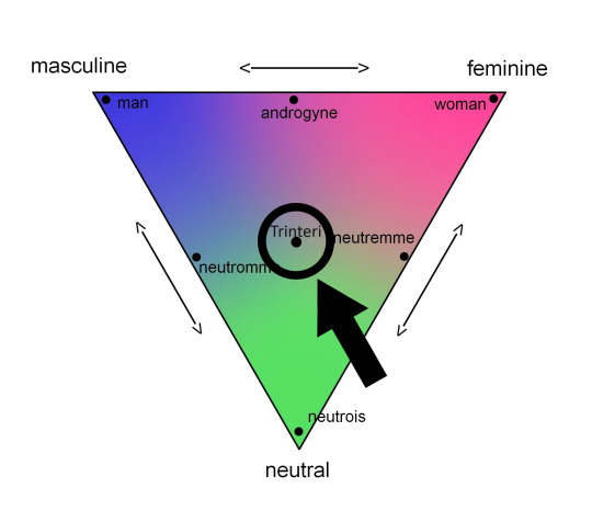
[Image Id: a graphical representation of the Gender Trinary. It is a down-pointing triangle with the left corner labeled "masculine", the right corner labeled "feminine" and the downward-facing point labeled "neutral". Between masculine and feminine, feminine and neutral and masculine and neutral are double-pointing arrows. In the left corner, there is a point labeled "Man". In the right corner, there is a point labeled "Woman". In the downward-facing point, there is a point labeled "Neutrois". Between "Man" and "Woman" is a point labeled "Androgyne". Between "Neutrois" and "Man" is a point labeled "Neutromme". Between "Neutrois" and "Woman" is a point labeled "Neutremme". In the very center, circled and pointed to by a large arrow is a point labeled "Trinteri", which is located at the very center of the diagram. ./. End ID]
I propose the term trinterinity to refer to the quality of gender that is located in the very center of the Gender Trinary. I would be very interested to hear about Stormy's thoughts on this post to see if ey agree, if I missed the mark or if ey have any other kind of feedback for me.
Trinteri is can be considered a midtrinary aporagender. Trinteri is:
a single, specific non-binary identity.
located in the very center of the Gender Trinary of Male-Female-Neutrois.
a centrigender of all trinary gender qualities.
[PT: a single, specific non-binary identity. located in the very center of the Gender Trinary of Male-Female-Neutrois. a centrigender of all trinary gender qualities. ./. End PT]
Trinteri is quite similar to, but distinct from Neutrangi, Neutrœmme and Epicene:
[PT: Trinteri is quite similar to, but distinct from Neutrangi, Neutroemme and Epicene: ./. End PT]
Neutrangi
[PT: Neutrangi ./. End PT]
Neutrangi and Trinteri are both in between Male, Female (rationalized as Androgyne) and Gender-Neutral, but Trinteri is also centered/in between all other trinary genders.
Neutrœmme
[PT: Neutroemme ./. End PT]
Neutrœmme and Trinteri are both in between Male, Female (rationalized as Femache) and Gender-Neutral, but is also centered/in between all other trinary genders.
Epicene
[PT: Epicene ./. End ID]
Epicene is a gender related to Male-Female indeterminance, having characteristics of both Maleness and Femaleness and/or having no characteristics indicative of Maleness or Femaleness. Epicene is a relatively complicated identity, as it can be considered masculine, feminine, androgynous, neutral and a sort of genderless all-in-one.
Both Trinteri and Epicene encompass experiences of masculinity, femininity, androgyny and neutrality, but Trinteri involves all other trinary identities as well. Trinteri is explicitly a centrigender, where as Epicene is generally considered not to be. Epicene is definitively indeterminate with regards to the Male-Female binary, but Trinteri may or may not be indeterminate in it's nature.
Pride Flag
[PT: Pride Flag ./. End PT]
The Trinteri pride flag was created by the coiner at the same time of the term (Gent, GJ, 3/24). The flag consists of three down-pointing chevrons of the same size, with negative space above, between chevrons and to the left and right bottom corner of the flag. The top negative space is very light green. The left-botton negative space is very light pink. The right-bottom negative space is very light blue. The chevrons from top to bottom are indigo, grey and teal with very light grey in between. The colors have the following meanings:
The very light-green negative space represents neutrinity.
The very light-pink negative space represents femininity.
The very light-blue negative space represents masculinity.
The purple chevron represents androgyny.
The grey chevron represents neutremmity.
The teal chevron represents neutrommity.
The very light grey negative space between the chevrons represents the center of the Gender Trinary.
[PT: The very light-green negative space represents neutrinity. The very light-pink negative space represents femininity. The very light-blue negative space represents masculinity. The purple chevron represents androgyny. The grey chevron represents neutremmity. The teal chevron represents neutrommity. The very light grey negative space between the chevrons represents the center of the Gender Trinary. ./. End PT]
#Trinteri#gender trinary#midtrinary#midtrin#mintringender#male#female#neutrois#aporagender#aporine#ain#aingender#centrigender#epicene#androgyne#neutromme#neutremme#neutroemme#trintingender#trintin#trinterine#term#pride flag#microlabel#made by gent#gender coining#coining post#mogai#mogaireal#mogai safe
44 notes
·
View notes
Note
Hi there - re: your stance on proshipping, doesn't Nu Carnival have elements in it that could be considered problematic? Aster fits pretty neatly into the 1000-year-old loli/shota trope, and consent in intimacy/H-scenes is sometimes rather dubious. Are these somehow not problematic things? And if they are problematic, doesn't continuing to play the game while acknowledging that basically constitute taking a proship stance toward it?
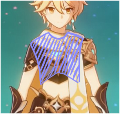
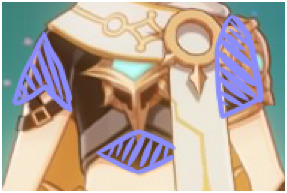
Alright. I'm not targeting this specifically at anon, but I am really sick and tired of Aster being called shota bait so I thought I'd put that to rest with a little anatomy lesson. Bit of a lengthy post ahead
I'm going to be using this image as a reference, since it lists all the measurements needed in making an anatomically accurate adult male. While the origin of the image is a little old, the measurements are still used today so I believe it can still be applied:

These are all those measurements applied to Aster. Specifically, his default sprite:
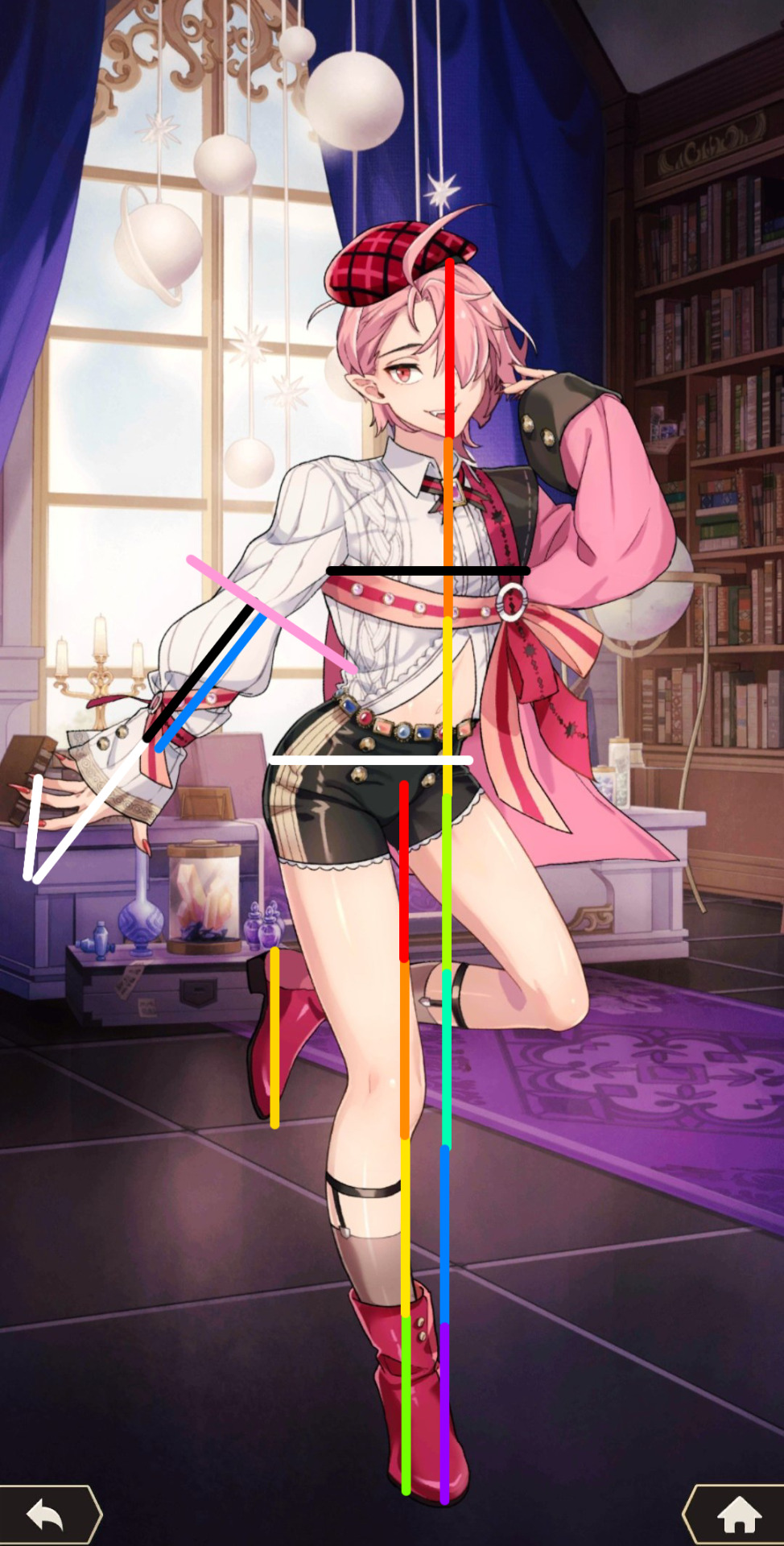
Woah. Seems like a lot, right? Let's go step by step, then. Or rather, list item by list item. Click on each image to see them in full. It's also important to note right off the bat that each line is EXACTLY THE SAME LENGTH, and each line is THE SIZE OF ASTER'S HEAD

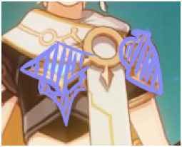
"An adult stands 7 to 8 heads tall" - Color coding each line to make things easier to see, if we count all those lines up from the top of his head (hat not included) to the bottom of his feet, we have 7 lines. 7 heads. Anatomically correct for an adult male

"The width of a man's chest (under the arms) is equal to the width of his hips" - Aster is standing at an angle so I can't give 100% exact measurements in this particular part, but he's close enough to be forward-facing that it's safe to assume his measurements line up. Even if they're not exactly the same, the difference in length between his chest and his hips are not apparent enough to say that his proportions are childlike rather than adultlike


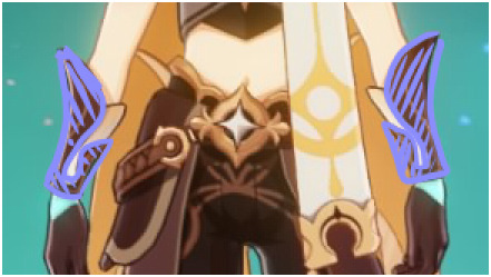
"The crease at the inside of the elbow will be near the waistline" - Seems to check out here too!

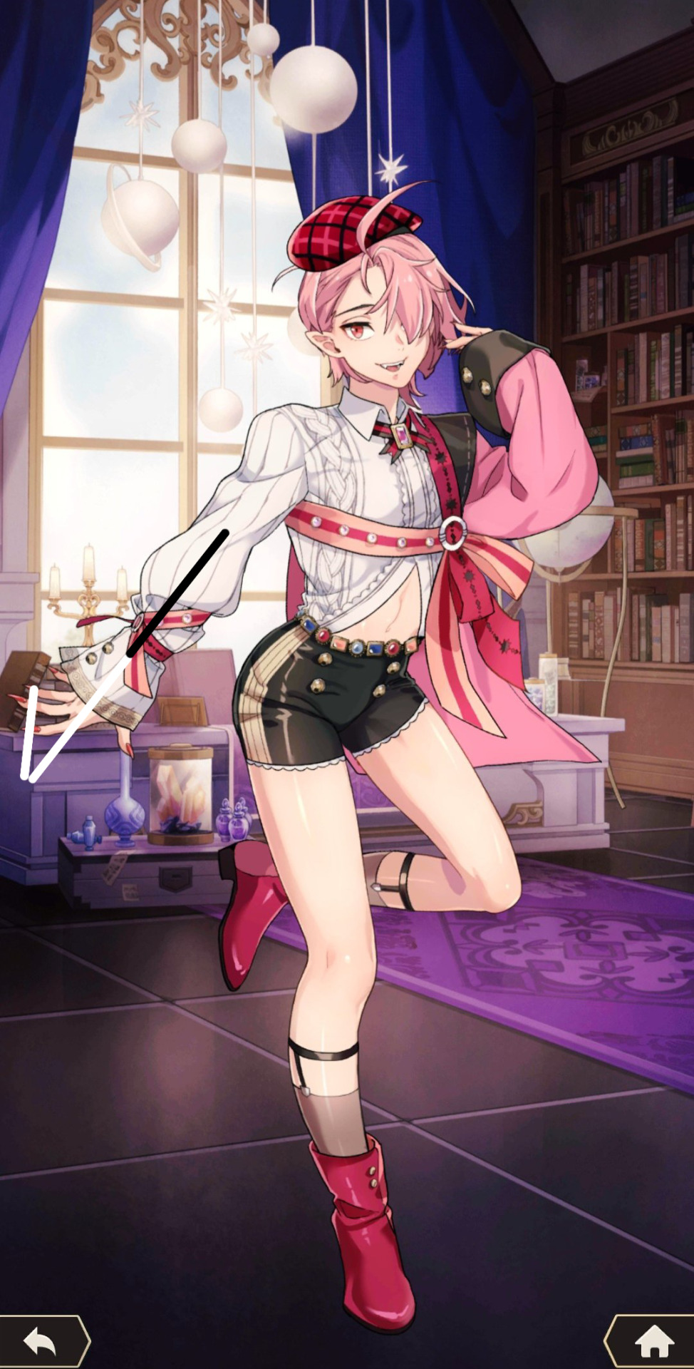
"The distance from the elbow to the finger tips is 2 heads" - Since Aster's hand is at an angle, I added a third little line to connect his finger tips to the tip of the other white line (which, bringing this up again, is the same length as his head.) Using a ruler to keep the lines perfectly straight, I was able to successfully connect the lines together, checking off this box as well
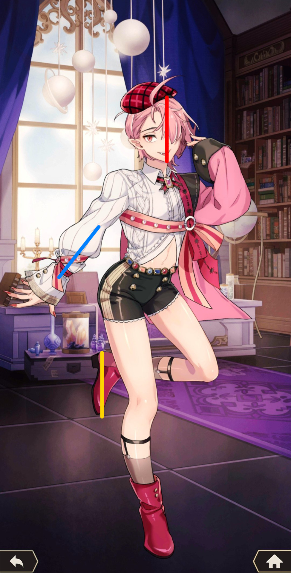
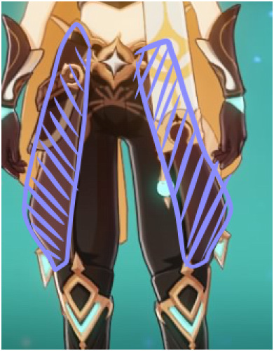
"The length of the head, the length of the inner forearm, and the length of the foot are equal" - These seem to match up as well, though his foot might be a liiiiiittle bit smaller

"The distance from the heel to the knee is 2 times the length of the foot (2 heads)" - If you look back at the reference image I'm using, "heel to knee" refers to the heel of the foot to the very beginning of the knee — meaning at the very very bottom. My measurements seem to match up to that as well... And that checks off all the boxes on the list
Conclusion:
Aster is proportionally correct for an adult male. He is just short. Short men exist.
On top of that, children are typically drawn with chubby, rounded features. Aside from his thighs and hips, Aster's design uses a lot of sharp lines to accentuate his features — such as a sharp jawline and sharp, slender fingers
One might argue that his voice is high pitched, so he must still be shota bait... But men can have high pitched voices too. Anyone can. Men are more likely to have deep voices, yes, but it's not a guarantee that all men will have deep voices
One also might argue that Aster is childish but... Is he really? Sure, he acts cutesy, but that's to get attention from people (especially Eiden.) That's really the only childish personality trait about him. Other than that, Aster is a natural leader. He's demanding, he's business-minded, and he's sly. Aster has no issue taking charge and giving instructions. After all, he's been the owner of the mansion ever since Huey left AND he's the owner of several businesses all throughout Klein. He spends most of his time working and doing business-related tasks. Hell, one of the things he complains about is how much work he has each day, but he knows it has to get done
"But he likes cute things!!!" You can be an adult and like cute things
Honestly, I see no reason why anyone would genuinely believe he's shota bait other than he's short, likes pink, and likes cute things. Those are all traits that can be seen in an adult. Traits that don't take away the fact that someone looks and acts like an adult
This isn't targeted at anon but tbh... People who insist Aster is shota bait are weird bro. Why are you so determined to say this is a sexualized child?
Side Note:
You mentioned that there are moments of dubious consent in some h scenes, and I agree. Especially with Edmond and Karu who are typical tsunderes, sometimes their scenes start off a little iffy. I am in no way saying that those moments are totally fine, but it is important to note that every single one of those scenes quickly escalates to them expressing their pleasure both physically AND verbally. They start the scenes aroused and okay with the idea of sex, but their tsundere nature can makes the consent come off as dubious — I get that. Though I don't recall ever seeing a scene were consent is explicitly ignored or consent is forced. Eiden is a very patient and understanding man, and he's shown that he will stop if his partner truly doesn't like what he's doing. So while the consent can be dubious at times, I wouldn't say it's entirely problematic
#forgive me if some of this doesn't make sense#i'm a little tired right now#but i'll be very happy to clear anything up or discuss something further if needed#i'm super passionate about this topic though#because i think it's fuckin stupid lmao#it's like adults can't be short or cutesy#i've seen that kind of bait before#and i really do not see it in Aster#i truly truly don't#nu carnival#nu: carnival#nu carnival aster
73 notes
·
View notes
Note
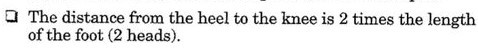
Can we mention and call attention to how their website looks now? They don't seem to check the final work at all. Some items like Gummy Eye, Shell Pot, and Inchsect are larger than the rest of the items, which makes them stick out of the line, which is just ugly.
Also now the images for forest and grassland locations have just a huge weight, which makes the foraging page take an unreasonable amount of time to load. Guys, I just want to make a couple clicks and go about my business again, why should I have to wait for the site to load because your images weigh so much?
And continuing with the artist thing. Items are drawn in different styles and it seems like the current owners don't think about how things end up looking at all. And I just don't understand why? I thought the new owners were more interested in the quality of the species, but it looks like I was wrong.
This all goes to show that the moderation doesn't seem to check at all how certain pages are displayed and working.
the item sizes thing i remember being way more egregious than this (or maybe it has to do with the fact im on mobile), but the funny thing about lorekeeper is that the size of items and awards and stuff is determined by the size of the image. im pretty sure you have to edit the css if you want the site to automatically resize the images.
the heavy images issue is also something ive noticed, they NEED to compress the images for the foraging locations because if it loads like shit now, imagine what itll be like when they all have insanely large image files to boot up when people just wanna do 3 clicks. its incredibly easy to compress images, you can do it right from your browser and usually theres no way to even tell the difference between a compressed image and a non-compressed (at least when its been resized like the foraging locations are). the same issue comes up with the items, inventories take forever to load now and i think the problem is because EVERY NEW ITEM IS ON A 1000x1000 CANVAS. for reference, lorekeeper recommends 100x100 for items. you do NOT need a canvas that big, and it shows they dont really know how to make items.
listen, i dont mean to hate on terra artists or whatever, just gonna point out examples
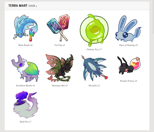
the problem with using such a big canvas for items is that you create a lot of tiny details that arent needed for an item icon. think of items in video games, you want to make something visually appealing and recognizable with as little detail as possible. the pincher potion, gummy eye, and silk wyrm are good examples of this, limited palettes, strong linework, and enough contrast/strong silhouette to be recognized from far away. i think the fur pop, shell pot, and moonfin are examples of how not to do items. the fur pop is too overly rendered, and the linework is very thin and small within the actual lollipop. the moonfin and shell pot both have small details (ie. the tassel on the moonfin’s arrow + the bits of fur on the shell pot) and the rendering issue from before. reminder that these are eventually going to be used as emojis on the discord, theyll be incredibly hard to read at such a small size plus incredibly unrecognizable to users familiar with the old items. in addition, the shell pot lacks direction in design, it reads more as an item that would grant a tail trait or a mist trait, not shell/exoskeleton. fallen tail, monstera bat, and horseshoe beetle also have these issues, but theyre similar enough to the old items that people will probably still recognize them.
like, look at these iconic items. they are so popular because theyre simple and recognizable from a distance, you can make them as big or as small as you want, you can see it from 10 feet away and still know what it is. THATS good item design.
i think this goes back to “mods hiring their friends,” you just pick people on a personal bias and dont consider the level of skill in making specific items because item design is not the same as making fully finished rendered art. it takes a different eye and you need to think of different principles than you would when making a full piece.
and heres the thing, that doesnt even necessarily mean the art is bad. the fur pop for example, has a very distinct and eye catching style; however, the issue is that theres no uniformity WHATSOEVER. these dont look like theyre all part of the same world, if all the items were done in the same gritty rendered style of the fur pop i would say its a great set, its the fact that you have some items that are incredibly simple, some that are “gritty,” and some that are just silly.
if nothing else, at the very least PLEASE make your canvas smaller and compress your images, youre making the site painful to use (and thats especially an issue when your site has so little functionality anyways)
6 notes
·
View notes
Note
I quite like swords, do you have any fun facts on them
(Axes are fine too)
Well, since I already did a whole post on Axes, which you can read here:
I might as well do my due diligence and info dump on my knowledge of swords so ... I should have expected this but here we go:
A Brief (lmao not at all) Overview of a Complicated Sword History
by an autistic trans girl demon
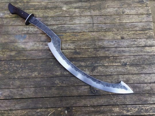
So before we get started, first we have to understand the categorization of swords. What we know as a "sword" is a general term from Old English deriving from the word "Sweord", meaning a "long bladed weapon with a handle and sometimes a hilt that is designed to stab, hew, cut, or slice; this means if it was clearly designed not to stab, hew, cut, or slice, and doesn't have an arbitrarily "long" blade, it's not a sword. Secondly, a lot of historical sources really only focus on swords as weapons, not tools, and thus we have an issue where tools that fall under the same description of swords won't typically be called swords but classified as "this other totally not a sword thing". Thirdly, swords were a slow development from daggers, which were classified loosely as double edged blades of a knifes size. If you're not following yet, this classification doesn't apply to all long-bladed creations and rarely do we get accounts of their use as tools because of this. That is, unless, you start looking at the few tools that became swords. And additionally, we have to remember that other cultures had definitions for tools, weapons, and items that crossed over or into what the English defined as a "sword" meaning that the "sword" category starts getting messy real quick. This simply isn't as clean as "wedge-on-a-stick" (axe) or "short sharp thing with handle" (knife). And rather than define what is a sword by it's common definition, it's actually better to look at what has become classified as a "sword" despite not quite meeting the definition initially defined as "a long double bladed weapon with a handle and sometimes a hilt" and those creations that should be classified as swords but aren't.
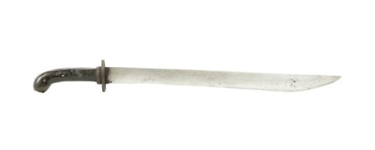
Which we begin the "sword-enough" category in China with the Dao. The above image is the Duan Dao. Dao are single edged long bladed weapons that showed up somewhere in 1600 to 1050 B.C. during the Shang Dynasty period but gained popularity as a cavalry sword much later. There are many types of Dao, each classified by their blade length, blade type, handle length, etc. and had strict requirements for construction. It was used like a sword, but only had one edge, so we called it a sword despite it's cousin the Dao phased out, the Jian, actually fitting the initial "sword" description perfectly.
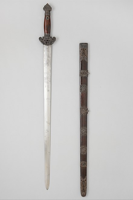
A version of a Jian for reference.
But I can hear it coming: isn't a Dao just a Sabre? And sure, the image I showed LOOKS like a Sabre, but thats because of the Dao's complex history and how it evolved over time. It at one time looked like this:
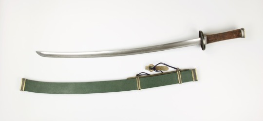
Which is a Wodao, a variant if the Dao that looked and often had very close similarities to another "shouldn't be a sword but is" creation from a different country. That is, the one edged blade known as ...
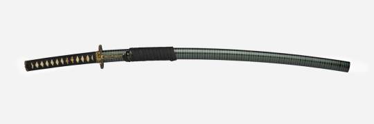
The Katana. But oh wait, this is actually part of a series! See out of all the "swords that shouldn't be swords" from Japan, the Katana has a shorter cousin, the Wakizashi, which is slightly smaller in blade and hilt, and the Tanto which should be a knife, but somehow squeezed itself in. All of these weapons have specific requirements to their construction to be called what they are from blade and tang length, to steel folding requirements, etc. but all have one thing in common: they've only got one edge. And next up from another edge of the world is ...
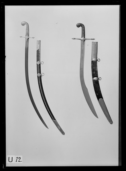
The Scimitar. A bastardization of the Persian word Shamshir, which is an entire classification of swords with curved blades that some Sabres, Dao, and at one point Katana's were all classified as. This category of one bladed swords is massive and includes weapons from North Africa to the Middle East to some areas in Europe. And is this rants segway into the tools category, starting with dancing swords. Now bear with me because I don't have a photo for this one; just a rant. While sword dancing began as training exercises for many cultures, it became entertainment and from it birthed a subcategory of unbladed swords that were flimsier, more flexible, and less likely to cut you. Unlike dancing with axes where the most that was done at best was a blunting of the blade, dancing swords aren't able to be resharpened to be weapons but are rather "tools" of entertainment. Despite not being bladed at all, or intended to stab, cut, hew, or slice, they look like swords and thats enough to call them swords. But want to know who doesn't get this treatment?
The Machete. Tanto gets to squeeze in on sword, but this is just a "long bladed knife". It's history is supposedly grounded in South America as a bush clearing and harvesting tool. But it's a tool, not a weapon, and thus in it's own class. Another familiar face stuck in it's own class is ...
The Sickle. Now theres MANY types of sickles, many sizes, several could be "swords" by the way we include one-bladed creations. But alas, it's not a weapon, thus not a sword, unless it IS a weapon in which it IS a sword, a "sickle sword" or ...
A Khopesh. But oh crap, a sickle that is a sword? A tool used both for combat, harvest, and a trade tool? Thats only 1/3 sword! What can we do to preserve our obviously pristine and infalliable "sword" categorization? Answer: call it "Sickle Shaped".
Look, I don't know how to end this besides saying that I do genuinely love swords. They've been coming of age gifts, presents for achievements, badges of honour, and in many cultures, like my ancestors, a symbol of love and unity. The very act of driving a sword deep into a pole to see how far it would go in as a "sign" of how long a marriage could last was part of some germanic/viking culture. Swords are awesome. But the classification and what we do and don't consider a sword is arbitrary, hypocritical, and stupid.
Go buy a sword for a loved one. The classification apparently doesn't matter so just make sure it looks "sword enough" and no one can argue with you.
#talisidekick#talisidekick things#swords#sword history#sword rant#not where I thought this was going but yeah: swords#trans#transgender#mtf#talisidekick rants
14 notes
·
View notes
Note
all ur dog-headed characters look amazing... whats ur secret
reference... but not too much!!!!!!
by which i mean i carefully study ref images of the specific breed i'm basing a design on, but i try to only nail a few specific details that really help with the breed identity, but then i try to back off and return to my normal level of stylization/shape exaggeration for the rest. if i follow ref too closely, especially with how stylized the way i draw anatomy is, it'll end up looking very pasted on — sometimes that's a bit of what i want, like dog with a gun from TVW, but usually you want things to be more cohesive than that.
what details to look for and adhere to from ref is gonna be really variable based on the animal you're stylizing, your goals for the character design, etc! off the top of my head, some consistent spots to make a dog Look Right are the angle of the forehead where it meets the snout, and the height/size of the eye ridge, as well as the angle of the end of the muzzle and the muzzle's height:length ratio; i think one reason these spots demand a lot of attention in ref is bc they're ones where it's easy to just Assume what they look like, and then before u know it you've drawn Generic Cartoon Dog instead of a specific one and it's hard to figure out why. (if i was at my comp i would draw some quick diagrams, maybe i'll come back and add them tomorrow — but rn i'm on my couch w a glass of vermut so i hope u can forgive my clumsy descriptions instead lol).
other bits i often find challenging on semi-realistic anthro characters: eyes and neck!! hitting the right scale on the eyes makes a big difference; you usually have to make them slightly larger to make the face look more humanoid, but it's easy to overshoot. the neck is tricky bc it has to do the heavy lifting of connecting an animal head to a human torso; i usually handle this by just leaning into it and making it brazenly fucked up looking instead of trying to hybridize too much, and also a bandanna or necklace hides a mountain of sins. (on this note, next time you watch 'the cat returns,' check out the cat designs, specifically characters who stand on two legs... they almost all have something around their necks, like ribbon bows or shirt collars! i'm convinced it's because of the neck problem.)
64 notes
·
View notes
Note
Hello aleeyenn! I'm the anon who requested and sent that message!
I had to make a whole account because I wanted to show you an image, but anons aren't allowed to do that, so I had to rewrite everything, so my apologies!
Also, my apologize if this is simply weird in general, I dunno if I should stick to Tumblr (since you did, you're the least active here) >.<
But I wanted to say, I'm incredibly happy and honored that my message meant so much to you! I'm really honored and soo hyped because you and your work really mean so much to me, as in your one of my biggest inspirations, so I was so excited to read that!! Thank you! Please keep drawing and creating. (Also, have you considered making full body refs for your gijinkas :o?)
I did want to gush and say why I love your Pin (and all your other gijinkas) and felt really seen. It's because of how unique and out of box the designs are that you rarely see with other designs, while still capturing the same personalities and aesthetic (and even shape sometimes) of the original characters.
But to be specific, thank you for making her super feminine and pretty, while keeping her punk side!!! >u<
Alot of other gijinkas design her in typical biker / rebel chick get up w/ a lot of metal spikes, which dose makes sense, because of her metal part on the top of her (and fits her tough leader role personality wise) a lot of also make her body type in an hourglass, which also makes since, since Irl pins are in those shapes.
But what I really appreciate about your design is that you went in the opposite direction! I love how you made Pin wear these big poofy clothes and aprons! It's not only an easy and unique way to reference the shape of an actual pin, but it highlights a side of her that I don't really see the fandom highlight all that often. Her love of baking, gardening, her being bit of caretaker and just an friendly and easy-going person. I also just love seeing blk and poc women just being so happy and being femmine, it's so rare to see that and makes me so happy.
But another small design choice that I can't over and that made me go over on the edge on the "omg she's literally me" train. Are her punk boots! I know it's there to show off how big and tall she is compared to her meow, but I really like the contrast! And still showing off a little of her and toughie side, that she doesn't mind getting dirty. I love you can show off that is a caring and soft person yet still commanding woman by just a design!
This means so much to me, because I didn't think I could consider myself part of the alt community, due to me being really femmine and plus sized, I thought I didn't really fit, but I think seeing your version of Pin made me realize that being "punk" means so many diffrent things, and I don't really have to be super thing and pale to order to be an part of that culture, and never realizing that I could be considered pretty
Also, I just love how you draw her with your version of Coiny, it's so adorable and again, it's amazing to see a happy plus sized girl being loved and adore by a guy, not be treated as joke., thank you so much
Thats all! My apologizes for going on lesbian and analytical mode on your inbox, I'm deeply sorry if I come across as weird, you probability were not thinking that hard or deep with your designs, but I just really admire of how all of them are breath of fresh air, I have known a specific person that looks exactly like one of designs in my family when I think about it!
I just want to say before I go, is that this what I specifically want to go out and cosplay as, as it's what totally made me single handedly self-confident that I could be pretty in the alt community when I so low on myself

I love this drawing of Pin so much, you have no ideal it meant so much, I know it's sound silly that a doodle affected me, but seriously, I thought I could never look fit in or look pretty in that aesthetic with my weight, interests, and skin
When I saw this and started really seeing myself in it, literally I went in my head "wow, if your Pin can look so beautiful in that, I guess I can!" and it somehow changed a lot of my perspective of me.
Thank you so much again aleeyenn! I'm currently getting started, thank you for making my entire year just by existing and drawing. Keep doing what you are doing and amazing work, and I hope you have an amazing new year!
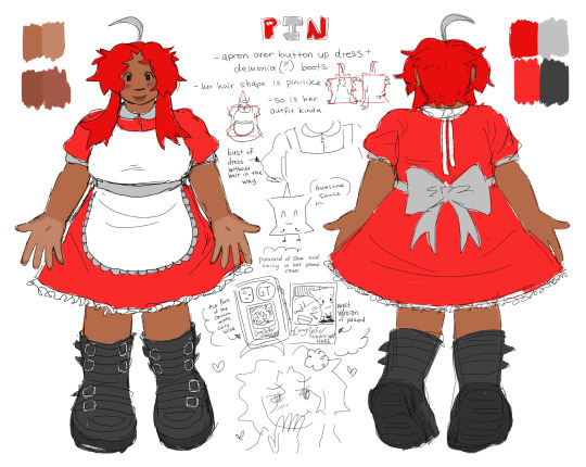

I WOULDVE ANSWERED THIS SOONER BUT I WANTED TO MAKE A REF FOR PIN FOR YOU! but GAAAHHHH nobody has ever said anything like that to me before and it MEANS SOOOOO MUCH I CANT EXPRESS IT 😭😭😭 when i make humanizations allllll i want is for them to make people feel represented and confident in themselves and MY DREAM CAME TRUE!!!im like. genuinely so happy that you said all that and really analyzed her because i actually put a lot of thought into some humanizations i make and she was one of them… i feel like with a bunch of pin gjinkas they either make her super feminine or super punk without an in between and i wanted to make an in between because it’s what she needs .. nobody like really acknowledges both parts of her i feel like a lot of everyone sees her as a shy anxious girl or rude and cold person because they focus mostly on pre split bfb and that irks me … because shes really not just an anxious person she is a leader and blah blah blah but i really wanted to push every aspect of her into a humanization to make her recognized as herself instead of someone she’s not … but no more rambling THANK YOU SOOO MUCH FOR YOUR KIND WORDS AND IM SO HAPPY MY ART MADE YOU FEEL THAT WAY 😢 you are so sweet and i’m literally over the moon that you like her that much and saw so much in her Like my design isn’t just a design it made someone more confident and accepting of themselves THATS SO CRAZY! thank you thank you thank you… i hope you enjoy these little drawings i whipped up i need to make more references anyway so this was a good head start… THANK HOUUUU and remember there’s nothing more powerful than embracing and being yourself and never stop doing that! YAYYYYY!
#tpot pin#ALSO THAT DRAWING…. ITS OLD ENOUGH TO BE EMBARRASSING#i remember making it i wanted to draw pin in an alt-ish outfit so i went on tt to look for one#i need to redraw it someday
65 notes
·
View notes
Text
DCRC Week #15

Guys pretend this post isn't slightly late I've had a reeeally long week making those fashion drawings and renovating my entire bedroom. Anyways it's time for PKNA #11: Urk everyone say Hi Urk cause we're gonna see him in a second!
(extra long and image heavy post warning)
I'm gonna be so fr I have a huge headache right now and there's a big crew of people redoing the carpet in my house and making really loud banging sounds. I can't take a nap because my entire bed has been deconstructed and my mattress is standing up against a wall. I'm hiding in the room we shoved all our things into and I have like 4 feet of living space total right now. I'm saying this as a disclaimer because I'm probably gonna be even less coherent than usual (somehow) but hopefully hearing the insane ramblings of a tired Puffy will only enhance the experience.

And here in the horrors of the duck universe we have a regular human man sitting next to a flesh-colored dog-nosed creature. Guys seriously why are all the dog people in the duckverse always skin colored like would it kill them to put in some variety... like some different dog breeds... nevermind the fact that 99% of the ducks are all pekins. I'M JUST SAYING. As a furry I think we need to ask for better. And by better I mean just make a poodle character or something idk change it up a bit

Ok not to immediately drag on with the same topic but this might be one of the scariest designs I've ever seen idk what it is about this weirdly big-armed dog man but I'm so viscerally uncomfortable looking at him. Like it's not just me right. He's scary.

Why is donald just flashing his ass at uno in this panel. mf YOU do something??


Bro is really just pointing to the tree like :0

Gay ass look. Why did they exchange glances like this.


Haha don't worry Donald we put the Raider away in jail and he totally can't escape now. Not like he did the first time anyways.

Hi Urk. No other commentary I just like this panel.

HE FUCKING KILLED LYLAAAAAwhy is her hand flesh colored in the last panel

I like that Lyla hitting the ground makes a TLANG sound cause she's made of metal

idk why it's so amusing to me but Urk just calling PK a "total buzz kill" is so like. like to me it's the equivalent of "get lost DUDE you're harshing my vibe MAN" do you get me

Alright. Listen. We're gonna have to address the elephant in the room here (or the elephant-sized duck anyways). Urk is a Native American, specifically meant to be a member of the real life Iroquois tribe. I am not Native American, nor am I particularly knowledgeable on the culture of any specific tribes, so I'm not going to pretend to be an expert here, but just so we're clear: referring to any member of America's native population as being "red" is generally a big no-no.

Urk is meant to come from a dimension with an alternative form of history, one where North America was never colonized and continued to develop under the rule of the many native tribes that once dotted the landscape (one that also got super advanced because of aliens or something but that bit is honestly not that important). Could this concept of an alternate history be an interesting one to explore in a DIFFERENT piece of media? Perhaps. Does this Italian-made Donald Duck comic do a particularly good job of handling the cultural representations here?... eh.
Again, this was made overseas, it's the 90s, representation in media wasn't exactly great back then. I've certainly seen a lot worse *cough* Darkwing Duck *wheeze* but I think there are aspects surrounding Urk's lore that could certainly be better as well. Like I said, I'm not a Native American, I'm not going to pretend I'm an expert on this topic, nor am I going to say anything in here is downright offensive (I don't think I have the right to do so) but I think it's a point that's worth bringing up because it's kind of hard to ignore when reading Urk-related stories (which there are a few of because he sticks around after this comic).
ANYWAYS with all that said. Back to saying stupid shit

UMMM I DUNNO ABOUT THAT ONE BRO

First of all, haha oops the Raider accidentally pulled this poor random guy into our dimension. SECOND OF ALL, I've seen multiple pieces of media now insist that the Raider is some kind of "predatory bird" like a hawk or an eagle but I REFUSE to believe this information. SORRY but he is a rooster and I am always going to see him as a rooster, I DON'T CARE WHAT CANON MEDIA SAYS!!! MF SAID "BUKHAWHAW" IN THE OFFICIAL ENGLISH DON'T THINK I FORGOT THAT!!! THAT'S A CHICKEN!!!!!

Lyla looks cute here hi Lyla

OK SHOUTOUT TO URK JUST SMASHING A WHOLE CAR WITH HIS BIG FUCKING FISTS. HOW DID HE DO THAT

Billy ain't ever gonna forget this for the rest of his life dawg 💀 have fun unpacking this one in therapy

how did the fucking creature develop racism oh my god

WHAT DID LYLA EVEN DO WRONG THIS TIME?? FUCK YOU TIME POLICE free my girl

Everyone say "Hi Urk" again because we're stuck with Urk now

Kinda thought PK was flipping a middle finger here for a split second
Ok Fangus Tales now. Say it with me "we love Fangus Tales" yayyy

what the fuck
yeah actually you know what of COURSE Angus hates dogs. he actually sucks so bad you guys

let him fallll I mean WOAH who said that


YEAH OK OF COURSE ANGUS PARTICIPATES IN ILLEGAL DOG RACING

Dog you have very poor taste in people I'm begging you to like anyone other than Angus Fangus
Ok that's it see you next week and by next week I mean probably within the next 24 hours because I really like the next comic
4 notes
·
View notes
Text
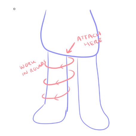
Erissa Cosplay Update 1:
Like the numpty that I am...I did not write down how I made the eye square, specifically the outer corners. This means I'll make another test square and work on the outer corners to strengthen up a little more.
Then, its the granny squares themselves. Even with working on smaller stitches, the eye still comes out huge. I did another test square using trebles or quads, either one its a ridiculously long stitch (i know for a fact on the outer corner i had to do 6 loops on the hook and pull through), and it created the most flimsiest square I have ever made but it was the same size as the eye square. So, because the Erissa colours are what they are, chunkier yarn is out of the question. I live in Australia and our yarn choices are...not great. Especially if I want to use wool or cotton rather than an acrylic blend. I'll try doubling up the yarn on itself and see how we go!
Now, I do have a yellow jumper that I can use. It is a turtleneck but it was originally a jumper dress so it's a lot more poofy. Looking at the reference photos I do want to smack the designers because I get it, cool angle but how in the FUCK do you make that? It is possible to crochet a jumper in fact I'm doing one right now using a faux knitting stitch. And I recon that is exactly what that stitch is on the character. The yarn weight is another thing it might be a very thick yarn but where do you find one in that colour? And also preferably affordable as I'd have to make a test...that or I make like a mini jumper for one of my stuffed teddies.
Now, the stuffie itself. It's definitely amiguri...which is something I don't have much reference for. If you google the stuffie, there is a pattern however...I think the pattern got taken down. You click the image and it's like the tumblr post never existed. Wild. I don't want to add the arms on separately if I can, I want to keep this thing as close to the design...
Which is funny since I'm turning the shorts into a skirt because shorts just make me feel weird.
So, that's where I'm at!
5 notes
·
View notes
Note
Hi !
I saw your Aether doll, and I was just wondering what's your process for the hair and the clothes? A friend's birthday is coming up (very) soon, and they really like Aether, so I'd love to know how to make this kind of stuff.
I think you're really talented! :)
Hi! Thank you for your kind words :)
My process is largely on a ‘trial and error’ basis, but I’ve done my best to make a guide for you (using Aether as an example, since you mentioned him specifically). Unfortunately right now all of my stuff is in storage due to unstable living conditions, so I hope you’ll forgive me for only being able to offer pre-existing photos and hand-drawn diagrams. When I get access to my stuff again, I might do a step-by-step process for hair (for Lumine, since she’s my current WIP) but that could be quite a while yet.
Stuck under a read more because this is gonna get long lol
I’ll start with clothes because I always leave hair til last.
The first thing I do is hoard as many references as I possibly can, from as many different angles as possible. These are the one I used for Aether (made myself because I couldn’t find any online that met my needs), though I did also sometimes log into my game and rotate him in the character menu haha
From here, the next step is to start dissecting the layers. Work from the base up, and break it down specifically into what you would make as a single piece, rather than say the shirt base AND the sleeves AND the decal. If that makes sense.
I don’t normally draw diagrams or anything like I will be for this, but if that helps you visualise it by all means do!
(I also tend to go really ham on the details because I’m a perfectionist, but please don’t torture yourself unless you really want to. Making things a little more simplistic is perfectly fine and valid.)
I won’t do the whole thing or I’ll reach image limit but here’s an example of how you might break it down:


The more you simplify it, the easier time you’re going to have.
The next step for me, after I raid my cupboard and the local craft store for the right colours, is to work out which pieces of the clothing I’m going to incorporate into the doll’s base body and which will be separate.
For Aether, for example, the ‘hand’ part of his gloves are the actual doll’s hands, but the bit that flares up his arm isn’t. The boots are part of his actual legs up until the part where it flares up over the top of his pants, which I made as a separate piece. The seat of his pants are the bottom half of his base body, but the pant legs themselves are add-ons. Does that make sense?
Next, make your base body! If you’d like to use my pattern, you can find it in my pinned post :)
Once you’ve got the base doll, I start adding layers of clothing. I always use a smaller hook size for the clothes than I do for the base body. In my case I like 2.5mm (and a teeny tiny 1.25mm for fine details and thin layers – but we’ll get to that later). I normally start with the pants.
My normal method of doing pants is this:
Essentially, I crochet directly into the base body in a circle around the base of the leg (so I am not chaining, but actually single crocheting through random stitches on the base in a loose circle shape), and then work in rounds until I reach the length I want.
Because Aether’s pants are puffy at the bottom and have two colours (*shakes fist at hoyo designers*), though, the process ends up being a little different.
I made his pants in two pieces: the outer side and the inner side. So instead of rounds, it ends up being rows. To get that nice puff, just do some standard increases in the right spot and make sure to decrease on the lower rows to taper it back in.
Once you have both pieces, you can just sew the two halves together.
The flare of the boot over the top of the pants is exactly the same process. Attach and single crochet directly onto the leg from the top of the boot, working up towards the waist.

For trickier shapes like the gloves, it’s sort of just familiarising yourself with what kinds of effects different stitches do and allowing yourself to get it wrong about a dozen times before it actually works lol
If you break down the gloves properly, you end up with a shape similar to this:
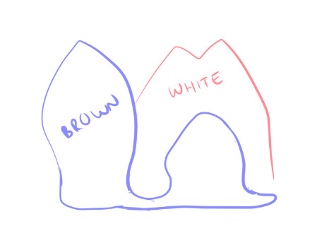
(this is not great i am so sorry – I am realising once again my reference was awful for the gloves)
But you can kind of see how it’s largely bulb shapes for the brown part, which is easy to do with increases and decreases. The white part I made separately and attached afterwards. Yes it was a huge, tedious pain in the ass.
For finer details, like his jewellery and, like, the shoulder armour, etc etc, I use the smallest hook I can tolerate. Please do not attempt this unless you lowkey hate yourself because it is torture.
So when you look at yarn, you can see that it has a bunch of smaller strands wound together, right?
You gotta split em.
Like this.

(image borrowed from http://illuminatecrochet.blogspot.com/2015/03/what-is-ply.html)
And then. You are going to use that tiny ass hook. And crochet those individual strands. It sucks. It breaks constantly. It makes you want to commit a crime. But damn if it doesn’t look good.
On a similar note, don’t be afraid to use the 2.5mm/whatever hook you use for clothes with less than the full ply of the skein you’re using. For Aether’s cape, I did the outer facing white part with only 2 of the strands in my 8ply yarn, and the inside orangey part with the 1.25mm and one strand. It’s still a little fatter than I’d like but it’s better than doing the whole thing in single strand torture mode lol
I’ll wrap up clothing here but if you want some help with anything specific just let me know!
On to hair!
For hair, I use felt square sheets that are like $1 each. Except for Aether because he has to have a Very Special Hair Colour that my craft store doesn’t stock so his cost me $7 :/
It’s a similar kind of deal for hair as it is for clothes. Break down the shapes and start from the bottom up.
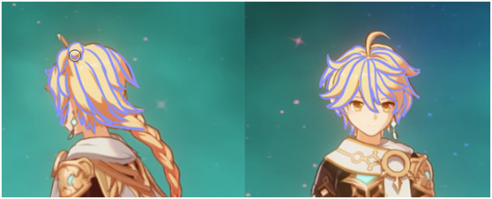
(This is not a good look for him rip)
Layers are your friend! As are sewing pins! For real, do not glue anything down until you’ve got the whole thing pinned down because once you glue you’re in for a bad time if you need to fix something.
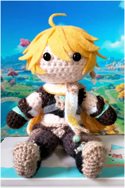

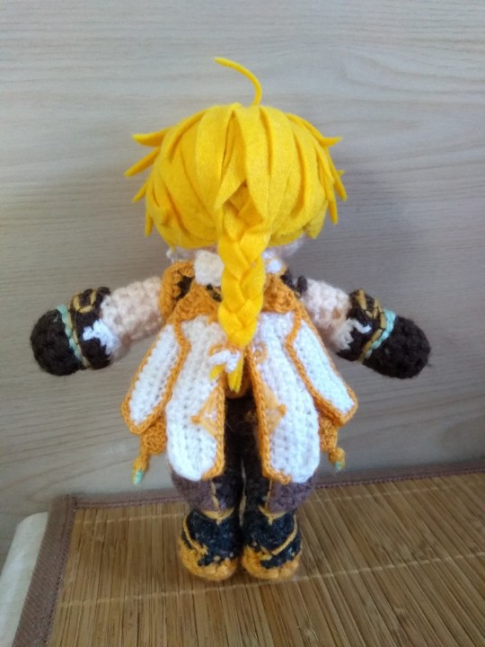
I’ve made two Aethers (one as a custom gift commission, one for myself) and they’re both a little different from each other, but this should help give you an idea of how I translated it to felt. I like to simplify if I can, purely because larger pieces tend to look a bit neater and less chaotic than a bunch of smaller ones.
For his braid, I found the easiest way to do it was to just cut three really long straight pieces, braid em, and then trim the end to the length I needed.
My absolute biggest #1 tip for hair:
If it looks bad but you haven’t finished, do not stop and restart.
It will always looks stupid as hell in the early stages. Don’t make a judgement call on whether or not it looks right until you’ve at least got the whole front part/fringe area fully pinned in place. Trust me.
I think that’s probably about all I have the energy for right at this second, but again if you have any questions or want help on anything specific, my inbox/DMs are always open – and that goes for anyone reading this! I’m always happy to help :)
3 notes
·
View notes
Text


Donut Co. Rugtastic Reset - Explosion of Oddity Edition P.3
(I was originally going to name this set "Racked with Randomness" instead of Explosion of Oddity, so any references in my cover photos mean these ones, just to be clear!!!!!!)
Has 46 Swatches
All english (sorry)
All of our CC can be found by typing " Donut " into the search bar!
Images in game - You can find bonus images on our tumblr > HERE
Most of my images have my reshade on - it changes the color minimally, so white may look a little off in photos, but in game it will look white/normal!! <3!
You can size them up and down using the bracket keys. [ ] <- these ones. I personally, use the tool mod to size my items up and down, and specifically with these if you are wanting them to be "perfectly sized" i would recommend you grab the tool mod by twistedmexi! If you would like to use it in build-buy mode, you'll need BBB!
~~~~~~~~~~~~~~~~~~~~~~~~~~~~~~~~~
Name: Donut Co. Rugtastic Reset - Explosion of Oddity Edition P.3
Buy Mode Description: The Explosion of Oddity reaches its grand finale! Embrace one last blast of nostalgia and playful weirdness in Part 3. Jam out to cassette-themed rugs, encounter a cuddly cryptid or two, and let stargazing designs expand your floors to cosmic proportions. With 46 more swatches overflowing with quirky charm, this is your final chance to dive into this delightfully oddball collection and give your space the quirky upgrade it deserves. Who says floors can't be a little weird and wonderful? After this, your Rugtastic Reset adventure continues – stay tuned for all-new themes and a fresh dose of design madness!
(Works best if you use the bracket keys "[" + "]" to size up and down, or my personal preference of the tool mod!)
~~~~~~~~~~~~~~~~~~~~~~~~~~~~
DOWNLOAD:
Patreon: https://www.patreon.com/posts/102631891?pr=true
Google Drive: https://drive.google.com/file/d/1P6rRiM0m6RevpcV7EK9Ii64Ioc3ahBR7/view?usp=sharing
@alwaysfreecc
#sims#sims 4 maxis match#always free cc#sims 4 cc#patreon#ts4#noideabutsims#simblr#buildbuy#sims 4 custom content#maxis match cc#the sims cc#ts4 cc#cc#the sims 4#cc finds#custom content#ts4 cc free#sims 4 cc free#sims cc free#freecc#sims4 cc finds#free cc#maxismatch#maxis match
49 notes
·
View notes
Text


Commissions Info! Hopefully everything is clear. Don’t be afraid to ask me questions if there’s anything you’re unsure of.
I have so much info and style options because I’m open to suggestions! You can be as specific or general as you want in your request. So don’t worry if you’re not sure about everything. I can show you some sketched ideas and give you price estimates before settling on something if need be.
Message me on tumblr @ spectral-apparitions, on Discord @ SymphonicSpecter #0726, or on Ko-Fi @specter58
Some more info:
Canvas Size:
The standard for my iPad is 1640x2360p. I then crop a bit or rotate to best frame the subject. However, if there is a certain size you would like, feel free to tell me!
Just know that any dimension over 4000 pixels might make layering difficult due to the limits of Procreate.
Anything smaller than 750p may look more pixelated just due to image size.
I can do icons on a square canvas! Just know that small icons under 750x750p will need to be face, bust, silhouette, object, or something else small scale to be best visible.
.
Usage:
As with all of my work, I do not permit the usage of commissioned art in the use of NFTs, AI training, resale, mass produced merch, reposting without credit, or as a means of hate speech.
You may: Make personal-use merch, use as an icon, banner, or background with credit, share to a site other than Tumblr with credit, gift to someone you know, use as a reference (with credit if posted to a site).
Personal designs including your logo/brand are okay to use freely. Feel free to discuss with me if you have any questions or concerns.
.
Payment:
I only take USD ($).
I will send you an invoice through PayPal. This protects from overdrawing and keeps a record of the payment.
We can negotiate a different payment method if need be.
If you ask for further changes after the sketch stage, additional fees may apply, depending on the change.
If you would like to send a tip or any other post-commission payments, you can do so on my Ko-Fi at specter58: https://ko-fi.com/specter58
.
Other:
I do not discriminate by gender, sexuality, race, ethnicity, nationality, or religion.
I will not provide work for Proshippers, Nazis, TERFs, or other bigoted persons.
I will never ask for personal identifying information.
If I think completing your commission will take longer than usual due to events in my life, I will contact you. There will be no extra charge.
Please let me know if a character making eye contact with the viewer is a concern.
Please let me know if you would prefer that I do not use your commission in my portfolio, or post it to my tumblr.
I always save images as PNG format. If there is another format you would prefer, please let me know.
19 notes
·
View notes
Note
Just out of interest do you have a problem with the Britney Spears circus album / tour
(It happened before the issues with her mental health / legal limitations I think)
I never engaged with it positively or negatively. She honestly wasn't as in-your-face omnipresent as TS (I was alive then and I didn't see ads about her every 2 min) and there wasn't as much of a meta culture of analyzing social justice implications in that era so it would have been surprising if it WAS something I thought much about then.
Now that I consider it, the nuances are different IMO even given that the conservatorship started the same year the "Circus" album came out. The effects of the conservatorship weren't felt immediately but would amount to exploitative forced labor so the circus reference is so retroactively fitting. Addressing this without that in mind as you asked, her period of highly publicized erratic behavior started before that (2006-2008 per the internet) and generated unprecedented public interest in her perceived behavioral dysfunctionality and public suffering. She and TS do share being papped relentlessly which I agree is a level of scrutiny most people can't take (look at Princess Di who was literally killed by it). But it's just a bit different when the source of the scrutiny is your public manifestation of what would be diagnosed as bipolar later vs it being about your work's intentional specific references to your personal life in a culture you created of easter eggs and puzzles. I am not stating it has inherent political consequences but the pattern of dissecting clues in an ongoing and consuming way is what QAnon is. I'm referring to the process, not the morals or the message. People like feeling like they have deep insider knowledge of an opaque situation based on their own intelligent analysis of a symbol system with hidden meaning. Even us antis do it because it's pretty irresistible in a culture based on meta, but we were kinda trained to do it by TS.
Please keep in mind as an old person I recall the music world as an industry where women like Britney had very little control over their image, marketing strategies, probably even wardrobe and styling. Britney grew up singing gospel music as a kid but commercial relevance required a Marilyn Monroe-eque image of a teen halfway between sensual womanhood and childlike innocence. She could sign huge contracts based on that image but I don't think her decision-making powers matched TS'. And I give TS credit for gaining control over her image, label, creative output and brand to a large extent as it IS a step forward for women. Like Liz Taylor signing a million dollar contract for Cleopatra and crafting her own contract stipulations.
But in Brit's case the public scrutiny circus about her progressive bipolar-influenced behavior is not one she created and ultimately it put her into slavery. If she were brand and brand manager at that time, designing and booking and adding dates to tours on her terms, speaking cogently about her marketing strategies, gaining control over every aspect of her business and seeming to do it with as much savvy influence as TS does, no, I doubt I'd love the circus imagery. I don't really care for it as a baseline narrative or metaphor for fame by itself. But if used I would like it to be in the hands of those who are marginalized. "The Greatest Showman" the film is a massive rewriting of history but there was something massively cathartic for me in seeing a pacific islander woman who is not just "Hollywood heavy" (like Renee Zelleweger as Bridget Jones playing 'fat' at a size 12) but actually plus size and also playing someone with genetic excess hair. PCOS gang (me!) found a bigger woman who falls under at least 3 categories of minority being the vocal backbone of the movie and the heart and soul of the diversity message undeniably compelling even when much of the historical rewriting was a hot mess and ick.
Taylor has been a victim of misogyny and I didn't mind when she spoke about it and it was truly the source of the criticism. But outside of that and in her billionaire era she is losing credibility with many when she goes for underdog status. Fame is a cage, I get that. Her parents are culpable for overly emphasizing her career and brand management from childhood. But when you set the tour dates, have unprecedented financial returns for them, etc it's hard to see the circus and public interest as not also being the source of much of your gain.
Britney's bipolar diagnosis apparently came at 2008 as well, same year as the Circus album. I am bipolar gang gang and I can't imagine having a sense of control of your life that would render the circus metaphor wholly offensive. She's beautiful and gained riches but everyone could see it cost her more than privacy and we were all worried. Taylor's control of her brand is the thing that separates them. In general, circus metaphors are a bit derivative tho.
4 notes
·
View notes
Text
Game Dev Update for June
Happy July everybody!! ??? Half the year is gone already oh no!!!
I hope you're all well and staying safe out there!

My month was going alright, but one of my housemates moved out so my rents went up, I should be opening some #commissions soon for #pixel #portrait #gifs!
Anyway, here's what I did in June!
(full quality version here: https://www.patreon.com/posts/83905870)
NPC Buildings
Since painting is done with Brushes (or bombs!) now, I took the menu option out of the House menu. In it's place I've added the option to change the Building materials.

1500
Even added a preview of the material change. It's actually just changing them and then reverting when you cancel, but don't tell anyone!!
I've taken out the floor and replaced it with a draw loop on the foundation, figured it saves the number of objects in existence.
Rebuilt how NPC Buildings are generated, they now use an array of strings as reference and loop a designated row/column if the size is bigger than the source size.

1526

1527
Used the same system to draw the NPC buildings when in the Build/Placement Menu!
1536
Now I can just edit the array that stores the data and all 3 will change!
Updated the system for changing The Materials that Building parts are made from to no longer destroy and remake the Building. This means I can keep Painted sections if I bring that back.

1539
Reworked the Collision detection for when you're resizing Buildings, it now correctly detects the Buildings Objects, like Bed/Control Orb/etc
Also updated this so if the size hasn't changed it doesn't destroy and recreate the building again, which was always daft XD

1540
I guess I should do something about Rugs being placed in relation to the Building coordinates instead of the World coordinates ?:| Also I still need to save the location of the Objects for Save games, since when you load it will put them back to where they were in relation to the original shape/size.
Building Objects now have the correct position loaded on Save file load!
And I only broke rugs once in doing it!
1543
Found a slight issue, you can get stuck in the Bartop in Cafe's if you resize too much Upwards, so I've disabled that for them specifically. Guess you'll have to choose you placement more carefully!

1544
Goblin Schedules/Pathfinding
Updated Housed Goblins to go to their bed after 22:00, and wake up after 08:00.
[image too big for tumblr, see Patreon post for fullsize gif :(]

1509
Shortly after recording this gif I fixed pathfinding so they wouldn't walk too close to solid objects making it no longer look like they walk through them.
Gave Goblins a Sleeping bag in case they don't have a house! And you can see them sleeping in the NPC menu!
[image too big for tumblr, see Patreon post for fullsize gif :(]

1514
Fixed Farms not working after the first crop, updated Apiary code was clearing the soils connection to them so the Goblins would just stand there until bedtime.
Tools
Changed the controls, now I've got a designated [Item Action] button instead of it being an [Attack] button with with most other Items being used with the [Interact] button. Also upgraded the Shovel to have Charge up,kinda overpowered right now though!

1515
Also added the Watering Can to the Charged Tool system

1516
Added some Particle effects and scale tween to Mining. I'll adjust their appearance at a later date, they seem a bit chonky? Getting particles just right is finicky work.

1528
Also added Particles to Chopping Trees.
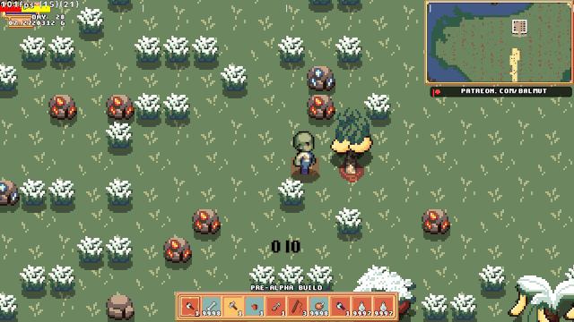
1524
...added Mirrorball item for...partying? I dunno, blame Bluwit she gave me the idea!

1534
It's basically a modified Glowstick, kinda want to make it bounce up and down?
...or make it continue to work when on a Pedestal?
I'm also conflicted as to whether the coloured lights should show in the white light areas?
Minor Changes
-Removed Flooring from NPC Buildings, now just drawing it instead of them being objects.
-Added NPC Buildings to the Minimap, including their culled parts list.
-Fixed Buildings expanding into Flooring/Paving
-Fixed Walls connecting to Buildings, this would cause problems if you deleted the building as the wall wouldn't autotile afterwards.
-Made Paving not qualify as "Indoor" for the purpose of Placing things.
-Cleaned up Minimap code, removing old array stuff.
Unrelated to Goblins
I made this as a small thanks to Bluwit for supporting me on Kofi, it's Nia a character from the game she's making. Please check out her stuff!
https://gamejolt.com/@bluwit @pixel-bluwit

Thank you all once again, I really appreciate your support and couldn't do this without you.
Please stay safe out there and look after yourselves.
And please keep being awesome!
#gamedev#rpg#goblins#pixelart#farmingsim#farmingrpg#game maker#gms#gamemaker#indiegames#soloDev#patreon#kofi#indigames#goblin#goblin girl#indiegamedev#indiedev#indie games#video games#gaming#games#pc games#pc gaming#commissions#support
10 notes
·
View notes
Text
ok answers for what each of these things is a reference to below the cut! :]

listening to - flower/note:
kaf's name is 花譜, "ka" and "fu", in this case meaning "flower" and "music note" or "sheet music". her name basically means Flower Music or Flower Note. the only kaf specific headphones or microphone i could remember weren't very visually interesting so i went with this instead of a more obvious icon
reading - book:
a while back kaf was hired as brand ambassador for a company called kiminovel that sells books to youth and encourages youth reading, and a few things were released because of that collaboration but one of them was the song ソレカラ (sorekara) which has an mv partially animated by young student animators in various 2d styles, but there is also a portion where kaf is looking at a floating book and i tried to copy the design (but had to simplify it because of the small size)

looking at - kaf's eye:
it's kaf's eye. she is looking. if you didn't get this one i don't think you know who kaf is (i was out of ideas lmao) here's kaf winking though she has pretty eyes im totally not gay about this (lie)

eating - bowl of ice cream:
kaf is commonly associated with ice cream but this is a really specific ice cream cup design! during her concert fukakai kyou at the budoukan last year, they gave out kaf ice cream and cookies with a specialized design for the cup - i took some creative liberties on the ice cream itself to make it more obviously ice cream with multiple scoops but i copied the design of the cup (images below from the official kaf twitter at the time of this promotion)


drinking - laplace drink:
kaf had a themed cafe in japan recently in correlation with her radio show and this is just one of the drinks they were offering, it's themed after laplace :] photo courtesy of my friend alt who went irl (im so jealous. a different friend who went brought me back cafe merch though bless his heart)

playing - weird laplace:
this one's the deep reach that not even most of my kaf friends got lmao. the image is a scaled down and simplified version of this laplace graphic:

what does this have to do with playing video games and where does it come from you ask? well uh
youtube
this specific MV made for the 柊キライ remix of 戸惑いテレパシー (confused telepathy)!! where kaf puts on a VR headset and plays... some sort of fucked up racing game on drugs idk LMAO. the little laplace graphic represents the kaf character she chooses on the character select screen and i thought it would be a perfect deepcut reference for this
thanks for coming to my ted talk i'm still not done with that blog skin LMAO
5 notes
·
View notes
Last Seen Blogs
ryutsu
hehehe

tongkolnyasar
Tanpa judul
tehandeh
Teh Andeh's Official TUMBLR
whosaidistopped
Officer Pedesco

serlijewelerystore-blog
Serli And Siroan