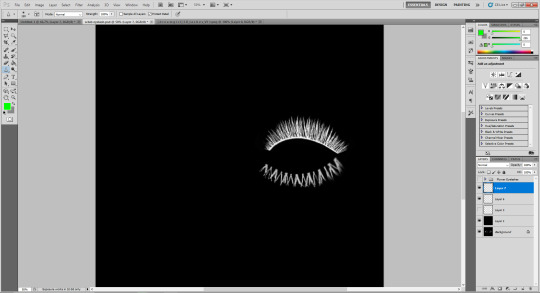
#grid adjuster tutorial
Explore tagged Tumblr posts
Visit Tumblr Blog
Explore Tumblr blogs with no restrictions, modern design and the best experience.
Last Seen Tumblr Blogs


Fun Fact
The “We are the 99%” Tumblr blog became the slogan for the Occupy Wall Street movement.
Text

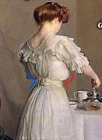
Grid-Adjuster Tutorial: How to Attach a Garage to a Lowered Foundation
Tutorial now available on Simblr, and MTS, and my Blog.
The house built in this tutorial is here, on Tumblr.
Enjoy! 🦚
#sims 2#ts2#catherinetcjd#sims 2 download#sims 2 cc#sims2cc#ts2 download#ts2 lot#sims 2 lot#ts2 cc#grid adjuster tutorial#sims 2 tutorial
149 notes
·
View notes
Note
I’m obsessed with the Lackadaisy comics way of shading/colouring! Could you please give a tutorial of how you do that and what brushes you use?
Here's a sample I used for the Lackadaisy Essentials art book. About 98% of the time, I'm not using specialized brushes - just basic soft and hard-round brushes, with various opacities.


Digital scan of the establishing shot pencil drawing - I added some some grid lines on top to double check the 1-point perspective. I didn’t include the characters here because I knew I’d be using the art as a background for more than one panel in the comic.
Initial lighting pass - This was done almost entirely by burning shadow directly into the pencil art scan. This way, I preserve a lot of my pencil lines (rather than painting over them) and the grain of the paper remains in play. This helps retain a sort of aged, natural media look despite the largely digital nature of it.
Contrast and brightness adjustments - Here I hand-painted more minute details into the rug, decor and fixtures with small diameter round brushes. I drew a wallpaper pattern on a separate canvas, then applied it as an overlay layer here too. And, of course, the characters arrived as raw pencils on new layers.
Character compositing and color wash - I didn't want to go fully monochrome with the colors, but I also didn't want to treat this like a full color digital painting. Instead, I opted for something resembling a warm-to- cool wash, achieved with a color layer on top of the grayscale base. Young Mordecai and Rose were toned to match the scene with a combination of burning, dodging and painting.
Lighting effects and atmosphere - Overlay layers can be used to push warm values into a much more saturated, vibrant place than a color layer alone can manage, and that's what I did here to create the streaming sunlight. I used a screen layer to include overexposure on bright colored elements as well. Floating dust motes in the light were added for atmosphere, and I polished the characters up with their own color and overlay layers to match the scene.
There's another, older process breakdown here on the Lackadaisy web site too, if you want more information.
1K notes
·
View notes
Text

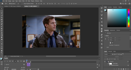
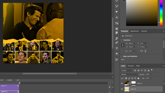
GRID + TORN PAPER + RAINBOW LAYOUT TUTORIAL (yeah, i'm sorry, but that is the title i came up with)
Hi everyone! This tutorial was requested by an anon, and we're going to make a gifset like this. You need, as usual, basic gifmaking skills and basic photoshop knowledge, but i'll try to explain this as easily as possible!
You'll also need a torn paper brush, which you can download here.
And here are the links to download the fonts used in my gifset: x, x
Okay let's start!
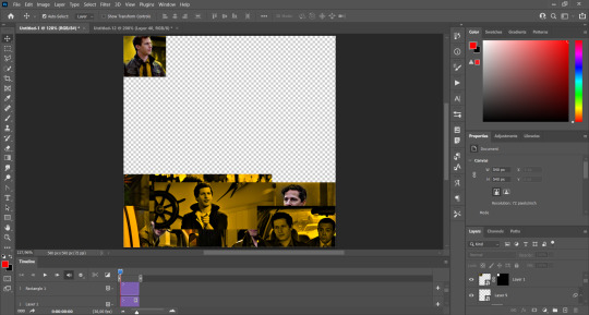
→ First you're going to create a new canvas, and it will be 540x540 px. Make sure to click on create video timeline (if you dont have a timeline, go to window > timeline. We'll leave this canvas there waiting for us :)

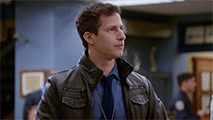
Then, onto our first gif. We're going to make the small square gifs first. All i do is resize the image and make it 120 px high, and you'll see why in a moment.
Make sure to remember the number of frames of this gif!! All the gifs we're going to put in the same canvas should have the same amount of frames.
Okay, so we have our first small gif:
As you can see it's a smart object, and I added some brightness, but so far that's all. You can sharpen it, but i like to sharpen until i've colored it. Now onto the important part:
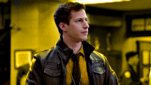
Most of the gifs i worked with were mostly blue (aside from the skin color), which is recommendable, because you can create lots of colors starting from blue, using the hue/saturation adjustment, or camera raw filter. I also recommend you to use a gif that doesn't move a lot, so it'll be easier to color the background:
For the tutorial, we have our predominantly blue gif, but we are going to make it yellow, which is the opposite color, so it's the hardest to get. I hope you can see how i manipulate colors, and do it yourself :)
Here, you can use camera raw filter (filter > camera raw filter) to turn the blues and purples greener, like this:
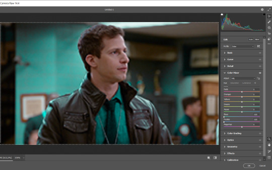
And click ok to exit the camera raw filter. Then, we're going to use hue/saturation (image > adjustments > hue/saturation) to turn it yellow:

Since it was cyan, i changed the cyans, but if you got a much greener result you'll have to use green (duh, right? i dont know i just dont want anyone to get confused akjsdhs)
And you can also add a selective color adjustment to make those yellows more yellow:

The reason i don't directly use hue/saturation is cause it might look ugly and lose quality, or it wont pick up all the colors i want it to but they're also very small gifs so if you wanna do that, do it :)
I sharpen it until this point, but if you already have that's okay.
Now we're going to color the background! For that, you just add a new layer, and set the blending mode to color.
Then you'll use your brush, set it to 20px and 0% hardness, and pick the color you're using for this gif, you can use the eyedropper tool. This is why it's important that the gif doesn't move a lot, so you can color the bg like this:
I colored carefully around the edges, and that's the result. In some gifs from my gif set I colored Jake's jacket too because i was too lazy, but this looks cleaner :)
You might want to select the color layer and the gif layer to convert them both to a smart object, just to make everything easier. So, be careful, because after that you won't be able to change anything!
But let's say you have a scene that you want to include, and it moves too much and has no blue and it's going to be a nightmare to color it.
Well, don't worry, you can! Simply, instead of manually coloring everything, you can just choose to add a gradient map to it (image > adjustments > gradient map), like this:
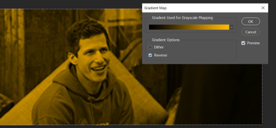
And this is the result:

Just remember, it has to be the same amount of frames as the other ones!
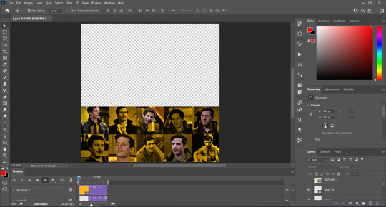
You repeat the process, until you have 10 small gifs. I made around 5 manually colored gifs, and 5 gifs with gradient for each gif. That's a confusing sentence but i hope you get it.
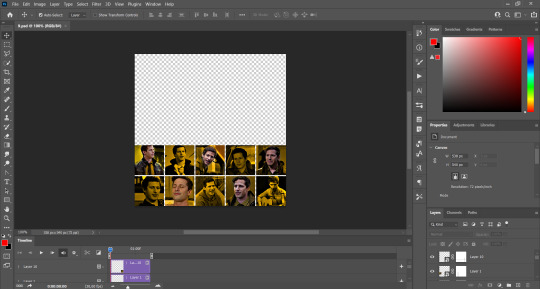
We are going to start pasting the small gifs on our first canvas.
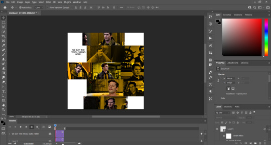
(You can paste them one by one but i did this so you can see my 10 gifs)
You're going to create a square that has to be 108x108 px, using the rectangle tool. You can remove the default white background.

And you may be wondering, why did we not just crop the small gifs into those dimensions? Well, you can do that, but to me it's much easier this way, because sometimes cropping isn't accurate, or it's tedious.
Place the small square on top the gif you're going to crop, right where the face of the character is (or whatever objects you're giffing), and while holding ctrl, click on the square. It will select it:

You're going to create a layer mask:

And then drag that layer mask to the gif:

And voila! It's now the same size as the small square. Once that's done, right click on the layer and convert it to a smart object, because we have to remove that mask. Make the square layer invisible, and start placing your gifs where you want them:
You're going to repeat that process with the rest of the gifs, and then place them all together. Don't forget that if you're making the first gif, they will all be at the bottom of the canvas, if it's one of the middle gifs, one row should be at the top and the other one at the bottom, and when you're making the last gif, they should all be at the top. Here we're making the first one, so they will all be at the bottom:
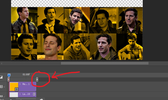
If you forgot to check that all the gifs had the same amount of frames, you can fix it here, just make sure no gif is past this little guy:
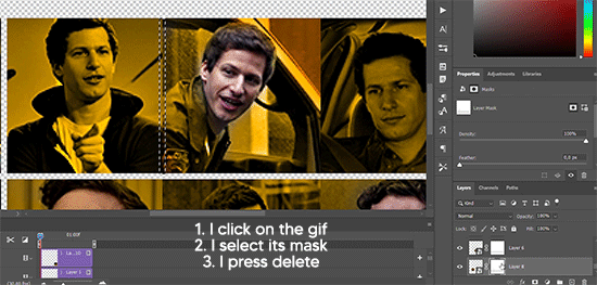
Okay! Now, to create the gutter, we're going to add a layer mask to each small gif, so that we can cut some of it.
The gutter has to be 4 pixels, (i recommend you to REALLY zoom in). What i do is make sure the width of the gutter takes 2 pixels from the edges of the gifs, since they are all together. As you can see in the image above, there's no a single empty pixel between the gifs.

This is a close-up of what i'm talking about. I select two pixels from each gif, and go all the way down to create the gutter:
(I hope I'm not over or underexplaining)
I usually use this tool when i have to make so many selections:
But that was just an example :)
(Another way you can do this, is by changing the size of the small square from the beginning and make it be 104x104 px, but i don't know why that seems more complicated to me ajsdks)
Anyway, this is what we have so far:
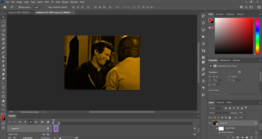
Now we're going to create the big gif. Its normal dimensions are usually around 1920x1080, unless you have different dimensions and have to crop it, but whatever it is, we're going to resize it and crop it to be around 550 px wide, and 400 px high:

We'll do the same thing of adding an adjustment of gradient to it to make it the color we're using. For this, i usually add a brightness layer before, because sometimes the gradient is a bit dark.
And using a 600px brush with 0% hardness, you can add some "light" on a new layer, like this:

Selecting all the layers, right-click on them and convert them to a smart object. Again, be careful, because once its a smart object, you wont be able to change any of it!
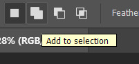
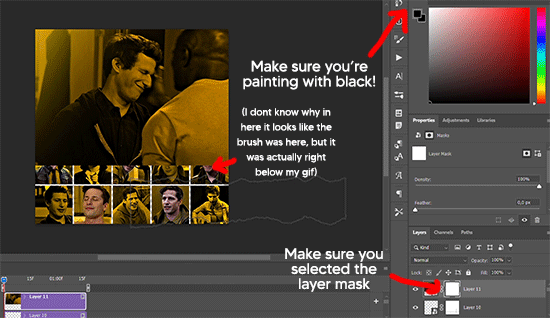
Then we paste our big gif on the canvas with small gifs, and add a layer mask to it. Using the torn paper brush at 600px, remove some of the gif to shape it like the torn paper. Make sure you're using black, otherwise it won't work correctly:
To make the effect better, add a layer UNDER the big gif, and using the torn paper brush, with the same size, you can paint under it:
Yeah, I covered some of jake's face, but that's how it supposed to look so the effect works!
And finally for the text! I used Granesta, at 150 px, and at -10.00º to make it a bit askew.
We're going to double click on it and give it a color overlay, set to normal, and give it a solid shadow if you want, then place it right here on the corner:
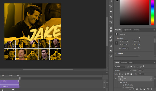
But as you can see, it's too big for the gif. So we're going to add a layer mask to it, and again, shape it the same way that we did with the gif. Make sure they're exactly the same shape, like this:

And that's it! This is our final result:

As always I'm sure there are easier ways to do many of these things, this is just how i do it but if you know an easier way to do it, go ahead. I hope this was at least understandable enough so you can apply the logic of it any way you want :)
If you have any questions you can send me an ask and i'll clarify!
If you found this helpful i'd really appreciate it if you left a tip on my ko-fi!
Happy giffing!
#will i ever learn how to properly explain things 😭#tutorials#uservivaldi#userraffa#userbuckleys#userhallie#tuserheidi#usertina#userfern#usersole#usercera#userzaynab#userisaiah#usernik#userpriyas#usertj
392 notes
·
View notes
Text
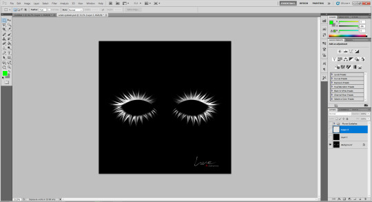
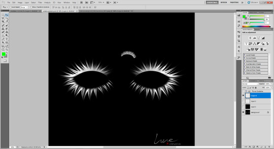
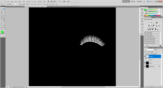
How To Convert Eyelashes
I was asked to make a tutorial on converting eyelashes. Well, here it is. Dirty, badly explained tutorial by Rollo. I'm assuming you know how to work with required programs, it won't teach you the basics, just a process of converting eyelashes from ts4 to ts3.
Requirements:
S4Studio
s3pe
TSR Workshop
Sims 3 Pack Multi-Extracter
These files (full credit goes to @gruesim)
Graphical program that works with .dds files
Let's go:
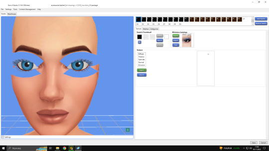
Open the desired lashes in S4Studio. Export diffuse of the ones you want to convert (you only need the black ones). You can also export the thumbnail. Close the program.
2. Unzip the folder that you downloaded from this tutorial. You will find a .dds files called "sclub eyelash". Open it up in the graphical program. Make a black layer above it and hide it for now.
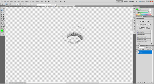
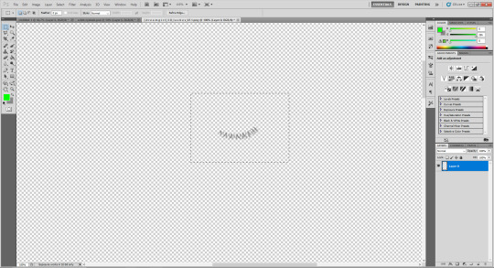
3. Now open up your ts4 eyelashes file. Start from the upper eyelash, crop it and go to the sclub eyelash.
4. Paste it, click ctrl+i, it will make ts4 eyelash white.

5. This is the worst part. You have to make the ts4 eyelash fit to the sclub one as close as possible. Use every method possible!
6. Unhide the black layer and see if your eyelash look alright. It may need some sharpening.
7. Now crop the bottom eyelash and follow the exact same steps as for the upper eyelash.
8. It should look more or less like this. Bottom eyelashes are always harder to adjust and may need even more sharpening.

9. Merge your upper and bottom eyelashes, duplicate the layer. Click ctrl+a, ctrl+t, then right mouse button and choose "Flip Horizontal".

10. Voila. You should have a complete set of your new shiny eyelashes! Save them as .dds. You can close the program. We're moving to TSR Workshop.
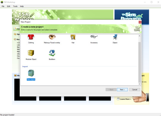
11. New Project -> New Import. Import Eyelashes AFBase from the downloaded folder.
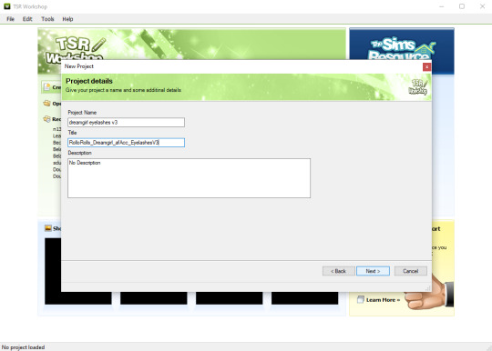
12. Name your project, name your file and click "Next".

13. You should see this. Go to Texture tab and click "Edit" on the Transparency Map.
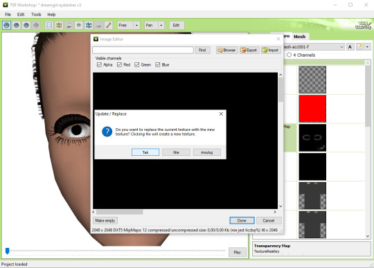
14. Import your eyelashes and click "Yes" when asked.
15. You should see your lashes, yay! But this is TSRW, they won't look exactly the same in game, as they look here. If you want a set of eyelashes, add more presets.
16. Now this is important. If you want to see your eyelashes in Accessories, go to Project tab, Clothing Type and change it from eyeliner to glasses. You also have to do this if you have more than one preset in one file. They won't show up in Eyeliner section. If you want to have set of eyelashes in Eyeliner category, you have to make each preset into seperate file. Also, eyelashes are recolorable ONLY in Accessories section. Don't forget to check Categories section to see which outfit has the eyelashes available.
17. Now you're ready to export your file! Export -> To Sims3Pack. Use the Sims 3 Pack Multi-Extracter to convert your sims3pack to package file. We're moving to s3pe.
18. THESE STEPS ARE ESSENTIAL! Open up your shiny new package in s3pe. Click on the GEOM with the right mouse button.

19. Click Replace and choose AUID.simgeom from the downloaded folder. AUID is for adults, CUID for kids and PUID for toddlers. We have one more step to do.
20. Now click on the CASP normally (left mouse button) and click Grid on the bottom of the program.
21. A small pop up window appears. Scroll to the very bottom and find a line called OverlayPriority.

22. Change the 8 to 2. This will make eyelashes not being visible through hair that's covering eyes.
23. Save your package. You're ready to test your converted eyelashes in game!

Here they are. Nothing fancy, it was a quick conversion :D They're also compatible with S-Club eyelash sliders ^^
Btw, you don't necessarily have to convert both upper and bottom eyelashes. You can have upper or bottom only. Play with the lenght, not all eyelashes have to be very long. Convert it for males, kids, toddlers. You just have to remember to change the options in TSRW and replace the correct .simgeom file in s3pe. There is a lot of possibilities and you'll probably get better in this than me :D
Good luck! ♥
206 notes
·
View notes
Note
How are you so good at ikeaframe/orbiter fashion... share some tricks on how to get pieces to get into position you want, most versatile decoration pieces (that can be used in many different ways, what are your favorites?); on a less serious note, how to farm all this standing for all the zariman wall panels ;A;'
So, quick disclaimer: I play Warframe on PC and have never played on console, so all of my answers will be oriented to PC controls.
Edit: This got quite detailed, so I may wind up making this a multi-part Thing.
Positioning:
Understand the anchor point; this is the point on an object that cannot pass through other objects and around which it is oriented. To find it, select an object and right-click to orient it; where the 3 different orientation guiding lines fall is an object's anchor point.
Understand orientation; if you hit Tab to turn on advanced mode it will show this, but I'll put it here for good measure. There are 3 planes of movement: up-down, left-right, and forward-backwards. R controls the orientation marked by the red arrow, F by the green arrow, and X by the blue. (If you have selected an item with your mouse, you can also hold X to 'push' an object, but I don't use this often as the direction and depth can be hard to predict.)
Grid and angle snapping are your friends! They're going to make your life a lot easier when you need to place objects at consistent distances, angles, etc. Now that you can angle things by degrees of 1 or 5, it's a lot easier now to make small adjustments without having to turn off angle snapping. Also: one way to ensure consistent distancing is to choose another feature (e.g. lines on the ground) and use that as a reference point. This is something that I use a lot especially when decorating my clan's dojo.
Using F to duplicate objects, and using C/V to scale them up/down will help when placing multiples of the same object so they will be the same size and orientation. It's also a time saver so you don't have to size and orient every single object you place. (If you're going to scale something all the way up or down, just hold R and use your mouse to quickly get it to size.)
Using Z to change how you can orient objects. 'World' will orient the object in relation to how it's been placed. 'Local' will orient the object based on its anchor point. (If this doesn't make sense, I encourage you to experiment to understand the difference!)
Sometimes, even when using grid and angle snapping, things won't quite line up right. That's when you want to turn off grid snapping to make small adjustments. Ideally, you would hover your mouse over the object and then hit R to turn on constrained movement. When doing this, I suggest only adjusting one plane at a time (R, X, F); for example, moving it left or right, then saving it to lock in that adjustment before trying to move it up/down or forward/backward.
If you've moved an object and dislike the result, instead of saving it, hit Esc. It will put the object back to where it was before you messed with it.
Experiment! Sometimes redzones will get in the way, but you never know what areas are available to be decorated until you give it a shot. Rotate objects every which way to see the different sides and features; for example, I had no use for the Entrati Serpentine Chair until I realized that I could use the underside to decorate the walls.
Sometimes an object just won't behave the way you want it to; if it's a symmetrical object, try turning it around. This is a big one when you're trying to get 2 objects to touch, but the anchor point is getting in the way. In the case of the Zariman wall panels, if you look at it from the side you'll notice that one side bevels out, while the other is completely flat; I put the curved side down, which is how I was able to have that nice flat, flush wooden flooring and on the ceiling.
Hopefully you find this helpful; I also suggest looking up tutorials on YouTube! They were especially helpful in making me understand how anchor points and orientation work, since they also have visuals for you to accompany the explanation.
I'll make another post addressing other parts of your questions :)
39 notes
·
View notes
Note
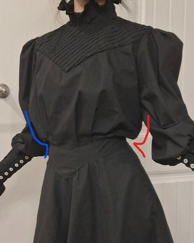
do you have a pattern for that black edwardian-esque shirtdress you made?
Hey all. So one of my sewing posts has gotten a lot of unexpected traffic in the past day. Whenever this happens, it's usually because the tumblr algorithm is pushing the post onto the dash of anyone who follows the sewing tag. So for everyone who is sick of the dress in question assaulting your dash for absolutely no reason, I am so sorry.
@curiouscalembour
Short answer: yes, scroll down to the photos below
Longer answer: kind of, not really, I mean I have a pattern but it comes with no instructions and you're going to enjoy it about as much as most people enjoy scaling up Patterns of Fashion patterns, maybe even less. Also, this is not a tutorial, just an approximate recounting of what I did. So, uh, good luck.
So here's the thing. I don't use commercial patterns because they often have me finishing seams with a serger which I don't own, or constructing garments with the modern bag-lining method which just breaks my brain. I'm also not a professional pattern maker and have no idea how to digitize patterns, so I do all my drafting with good old-fashioned pen and Christmas wrapping paper. I'm also entirely self-taught and learned everything I know about pattern alterations through osmosis from TheClosetHistorian's videos, so I don't know if anything I'm doing here is industry-standard.
I got the original base pattern by tracing a modern button-down shirt that already fits me, and then converting it to be back-closing, then slashing and spreading the pattern pieces to get the desired style lines and amount of pintuck/floof I wanted, and then adjusting the fit over a series of wearable mockups. (5, to be exact. I now have 5 of these things in my wardrobe, and only 1.5 of them are successful.)

So here's^ the yoke piece. Wait, why are there 3 of them? Why do 2 of the pieces have a weird diagonal line running through them with the grid lines all messed up? Because I suck at this, that's why. I frankensteined this pattern from a previous mockup pattern that had a narrower V-shaped yoke and needed to widen it. If you want to digitize this for yourself and clean it up, you'll have to take one of the faint blue squares (they're 1"x1") and make a grid and then overlay that on top of the photo of the pattern shape. The back yoke piece has 2 different grainlines marked because the fashion fabric has a bias pintucked yoke, so its grainline is going to be different from the lining. The fashion fabric is meant to be pintucked beforehand, and then the pattern pieces traced on top of the pintucked panel and then cut out. Oh, and all of these pieces are drawn net, so you'll need to add seam allowance all around. Except at the center back, apparently, where past-Me already added allowance for a bound edge.

The bodice front and back pieces^ are a little more straightforward. No pintucks needed here. The upper edges ease into the bottom edge of the yoke, and the bottom edges gather/tuck down into the waistband. The center front tucks you'll have to drape on a dress form (or on yourself - I pinned a strip of twill tape which was my skirt waistband around my waist and then pinned the excess front bodice fabric onto the twill tape, then covered the raw edges with a dip-waist belt). The center back is a lot shorter than the rest of the bodice because I have a swayback. I learned from a previous mockup that if I leave the back of the bodice longer, I have to constantly tug my shirttails back down into my skirt because it gradually gets untucked throughout the day. These pieces also need seam allowances added. I assembled my bodice by sandwiching the bodice front and back pieces between the fashion and lining layers of my yoke pieces, but it was a bit bulky dealing with the folded back pintucked parts of the yoke seam allowances, so you can finish your seams however you want.
I'm fairly short-waisted, so if you have a longer torso than mine, then you'll want to lengthen the pieces vertically. You want these pieces to be longer than your torso, so that they poof out a little like a subtle muffin top, to get that Edwardian silhouette where the waist looks tiny under the poof:

Here's^ part of the sleeve pattern. Again, sorry it's a chaotic mess. I had to use bits of scrap paper and cobble the pattern together. The pattern above is just the upper arm part of the sleeve and ends at the elbow. You'll have to extend about 10" all along the bottom edge to make the smocked part that covers the forearms. I only sewed the sleeve seams closed down to the elbow, then left the seam open from the elbow down to the wrist, so that it closed with rows and rows of buttons and loops. The smocking will give the lower sleeves a bit of stretch, so you might still be able to get your hand through even without the button closure.
This is also a net pattern so you should add seam allowances, but the sleeve is ridiculously puffy already, so forgetting the seam allowances here isn't a big deal.
(I call it my Elphaba shirtdress but it's not an actual replica of anything she wears in the movie. If you want your sleeve to look more like Elphaba's, which is puffy at the shoulders and elbows and fitted around her biceps and forearms, you can change where you add your rows of gathering/shirring.)

And finally, the collar piece. I'm not completely satisfied with how mine gapes at the center front (I think I need to contour/curve it a bit so that the top edge is narrower than the bottom edge), and I think the whole thing could be another inch taller all around, but this is the pattern piece I used to get my finished product. Notice that the back half of the collar slowly curves downward so that the center back is about 1/2" longer than the center front. That's on purpose. If you leave this little detail out, your collar will tilt backwards and make you feel like the front is trying to strangle you.
And because I'm nothing if not inconsistent, this piece features hem allowance already added to the top edge, but no seam allowance pre-added to the bottom edge where it attaches to my bodice yoke, and no allowance for overlap for the center back closure. So be very careful when making and marking your own copy and maybe be a little more consistent than I am?
Speaking of inconsistencies, remember how I drafted my yoke pieces to be cut from an already pre-pintucked panel of fashion fabric? Well, I didn't do that here for the collar. Instead, this collar piece is meant to be cut (on the fold) directly from flat fabric, and THEN pintucked (with lines of vertical pintucking perpendicular to the collar) after cutting. The pintucks are 1/4" deep, spaced 1/4" apart. So the pattern piece you cut out will pleat down to half its original length.
So this:

Becomes this:

Also, note on the pattern piece that I drew a horizontal line across the entire length, running parallel to and about 1.25" below the top edge? That's the point at which your pintucks stop. This gives the collar that ruffle you see at the top.
#sewing#sewing patterns#long post#idk what to tag this as#tricia sews (kind of)#asks#answered#curiouscalembour
10 notes
·
View notes
Text
Tutorial on how to make lineart (my way)
In this tutorial I show my method for making lineart after having made a sketch. The program I use is Krita (but you can use also a different one)


Lower the opacity of the sketch. I also suggest changing its color: since we'll be using black for the lineart, I recommend using a saturated color (green, blue, red....) so we won't risk to confuse the sketche's lines for the lineart. In this case, since it was a colored sketch, I used an artistic filter; normally I would block the pixels and change the sketch's color (button with lock on a grid on the right of layer's name, for Krita users)


2. Begin drawing with a black, 80% opacity brush (one that changes opacity with pressure). I use to try different brushes sometimes to see the difference. Maybe you can do the same, until you find one you're comfortable with. In this step, don't worry if the lines aren't very clean: do you best without stressing, we'll clean afterwards. Remember to change layer for the lineart!
3. Since the face of this character is meant to be symmetrical, I only drew the right side. Now I'll select it with a lazo tool and copied it to a new layer, as you can see below.


4. Now select the layer and mirror it horizontally. To do so, for Krita users, see the image below. You will obtain something similar to what shown in the second picture


5. Use the transformation tool to slide the layer to the correct position, until it looks mostly right. I then did the same for the sword. Once you're done, you can merge the layers and obtain a single layer for the lineart.


6. Hide the sketch, or move it to the side like I did if you want to use it as a reference. If the image is too big, you can also make a screenshot of it and opening a different window to see it.
7. Now, begin working on the lines to clean them. To do so, I use two brushes and switch continuously between them. One is an eraser, with soft edges. The pen I use is the one on the right. In the middle is the airbrush -ignore it. What I tend to do is going over the lines with the brush until I'm satisfied with the shape and intensity of the line, then I take the eraser and clean on both sides. I repeat this process a bit everywhere until it's done. Remember to adjust the eraser's size to help you in the process.
In this example while revisiting the lines I also decided to make some changes: I redrew the cheeks making a different slope. I reshaped the eyes going around the edges with the eraser. The trickier parts are those with a sharp angle: you can use the eraser on the wider side but for the thinner side you need to shrink the eraser or sometime I prefer erasing the point completely and redoing it cleaner with the brush.


In the end, I decided to change the horns with the transformation and lazo tools, and I also adjusted the eyes' position


For the final touch, I created new layer beneath and added base color. Alright, this is all. If you made it until here, I hope you found this tutorial useful. Also, thank you for your interest!
7 notes
·
View notes
Note
hiiii just wanna start off by saying I love your art style and general vibes ✨️ I'm a stay-at-home partner always in search of fun things to do, and I've recently gotten back into art after not engaging with it since I was a kid (largely because your sun n moon fixation rubbed off on me 😭). I've never tried digital art and it looks cool! Do you have any advice for a beginner like me?
Oh it makes me so happy when people say I inspired them to start creating again 😭 The DCA and the fandom brought me out of my own years-long artistic funk last spring. Clown power, yeehonk 🤠 🤡
I’m planning a significantly longer post in response to an ask I got ages ago all how I learned to draw the way I do, so lookout for that.
But in the meantime, here’s a couple things I can think of off the top of my head:
Specific tools don’t matter much. I currently use Procreate and would recommend it if you have an IPad. It’s an extremely simple but effective program.
On desktop, I use Clip Studio Pro, but Krita is another program I’ve used and liked AND it’s completely free.
I do also have loads of experience with Photoshop and other Adobe products but can’t recommend them at the price, not to mention they’re not super beginner friendly.
Hardware-wise, I almost exclusively use my IPad to draw because it’s so portable. I also have a Huion Kamvas pen tablet monitor that hooks up to my desktop. But I started doing digital art with a dinky lil Wacom tablet that was less than $100. There’s definitely a bit of a disconnect at first, not looking at where you’re drawing but rather on a screen, but you get used to it.
Bottom line is to use whatever tools are convenient and comfortable for you! I even know of a great artist that exclusively draws with their mouse. I realized I hated sitting at a desk and that stopped me from practicing digitally. I got an IPad and now it’s much easier for me to work comfortably on what I love.
Point two I’d like to make is take advantage of the capabilities of working digitally. This means using the godsent undo button to your heart’s content. Download fun brushes to play with and add texture. Use perspective grids. Turn on line stabilization so your strokes are extra smooth. Like what you’ve sketched so far but want to try something different? Duplicate the layer and work from there so you can go back to the old version if you change your mind. Radically change the colors or values with adjustment layers. Use clipping masks. Abuse the liquify tool.
A lot of this might sound like gobbledygook to a digital art beginner but just googling any of this terminology will get you loads of tutorials and information for your specific setup. Also I’m happy to go into details about specific digital art techniques I’ve picked up with over a decade and a half of experience.
Finally, and most importantly—make what you want to see in the world AND what feels good to make. This ofc is not exclusive to digital art, but I always want to stress this to new artists. I realized after I got into the DCA fandom that I had been letting shame, fear, and perfectionism keep me from creating the content I was really interested in making. But then man, idk. Frickin’ robot clowns amirite ¯\_(ツ)_/¯ it’s like there was a secret agent sent into my brain and he uploaded a DCA virus into my mainframe or smth idk hacker style. tktktktkt. they’re in.
Anyway. Hope this helps! Feel free to send another message if u have more questions :3
15 notes
·
View notes
Text
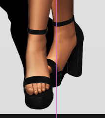
How I edit my Sims' shadow in Photoshop
as requested by @adelarsims
& based on this tutorial.
━━━━━━ ・❪ ☾ ❫ ・ ━━━━━━
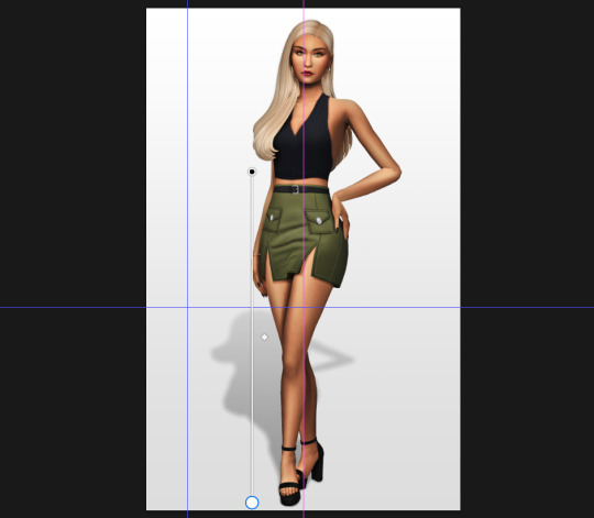
1. Taking a screenshot
First of all take a screenshot of the Sim - I always do CAS but in-game works too ofc.
I take mine in front of a background that loosely matches the color of the background of my edit, in this case white. If you have a fancy CAS background, I recommend this CC by @sonyasimscc to easily get a simple background for screenshots.
I also use this tutorial by @katverse to get really good screenshots, I use 4000x3000px resolution, and this tutorial by @vyxated to not have a CAS UI in your screenshot if you use a reshade like me.
━━━━━━ ・❪ ☾ ❫ ・ ━━━━━━
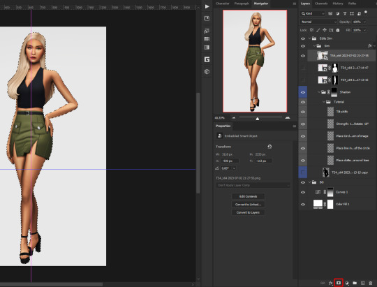
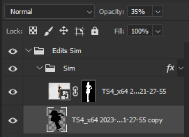
2. Setting up the Photoshop file
Now in Photoshop create a file, I use 1250x2000 px.
I made a few guidelines, pink being the middle of the image and dark blue guidelines for my shadow editing.

I have a usually white background and a slight Curves adjustment layer with a gradient layer mask so it gets slightly darker at the bottom, completely optional ofc.
━━━━━━ ・❪ ☾ ❫ ・ ━━━━━━
3. Removing the original background
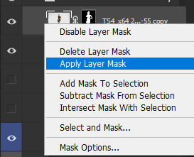
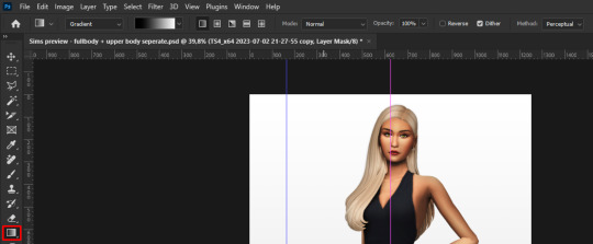
Import the screenshot and place it however you want. I try to align the Sim in the middle and make it as big as possible.
Then select the layer and go to Select - Subject.

This will usually do a decent job.
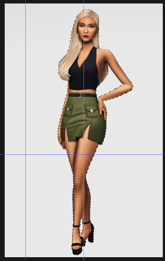
If there are some leftover unselected areas (like on her left hand on the hip) you can either add them to the selection now or edit the layer mask later.
Then create a layer mask.
Since the screenshot has a similar background, it shouldn't show too much if it is not perfect.
━━━━━━ ・❪ ☾ ❫ ・ ━━━━━━
4. Creating the shadow
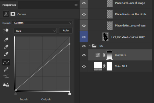
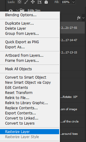
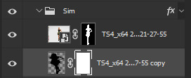
First duplicate the Sims' layer (Shortcut: Ctrl + J).
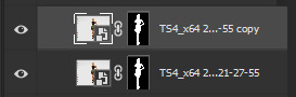
The layer is probably a Smart Object, so you need to rasterize it and right click the layer mask to apply the layer mask.
Now lock transparent pixels and paint the layer black.
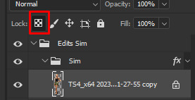
Next unlock the transparent pixels again and move the black layer below the actual Sim. Leave it selected.
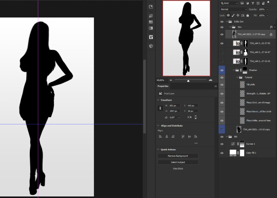
Now you will need the Perspective Warp tool.
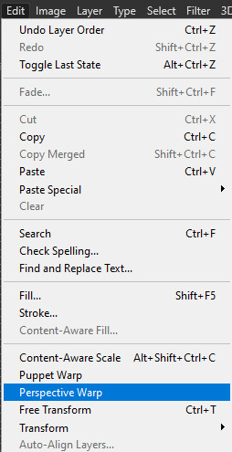
Draw the grid over the Sim, it doesn't have to be perfect, but make sure every part of your Sim is in the grid and nothing pokes out.
Press enter.
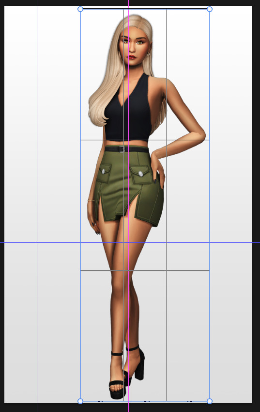
Now you want to drag the upper 2 corners separately wherever you want the shadow to be. I always put mine to the left and around the upper thigh area. I also try to match how slanted the left and right side are.
Now move the bottom 2 corners to try and match the shadow with the Sims' feet kinda. It won't work perfectly and you will need to fix it by hand after.
Press enter again.
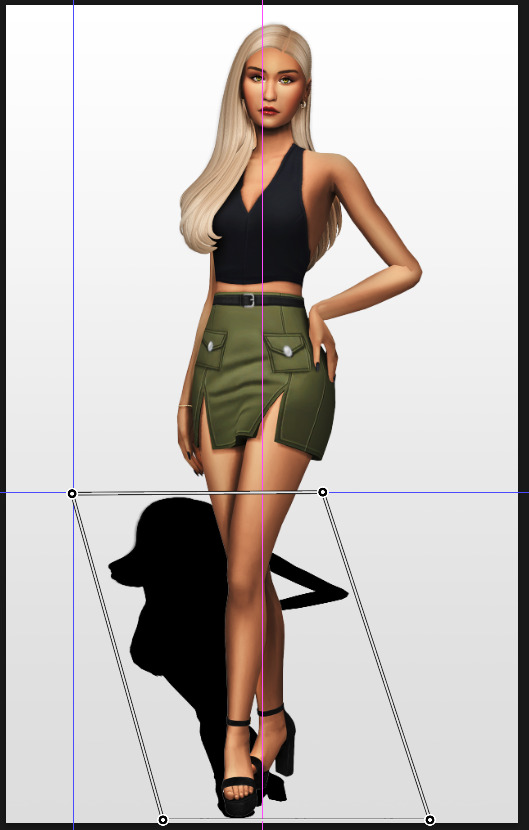
Now go in by hand and fix the shadow around the feet.
Simply paint with black on the same layer and erase parts if necessary.
━━━━━━ ・❪ ☾ ❫ ・ ━━━━━━
5. Making the shadow look nice
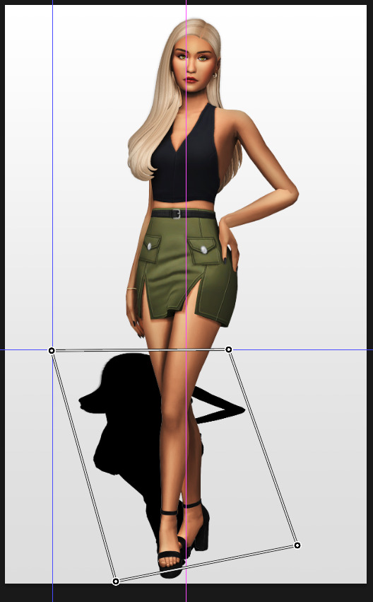
I like to change the layer opacity to 35%, but it depends how strong you want the shadow to be.
Next I apply a tilt shift blur, unlike in the video.
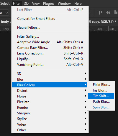
I use a blur of 15px.
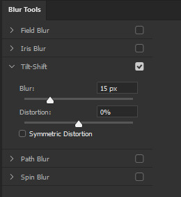
Move the circle at the edge of the image basically or a bit below by dragging the middle of it. Then rotate it on the bottom line by around 10°.
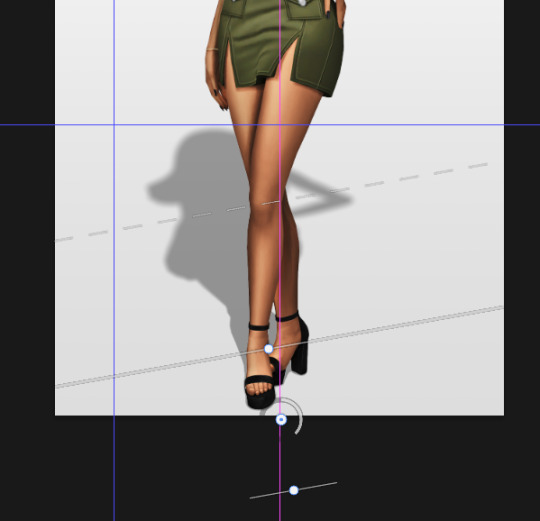
Next move the solid line to the middle of the circle and the dashed line around the ankles.

Then press OK at the top.

━━━━━━ ・❪ ☾ ❫ ・ ━━━━━━
6. Optional: Gradient layer mask
Lastly I like to make the shadow fade out a bit towards the top.
Apply a layer mask to the shadow.
Then get your gradient tool and the default black to white gradient.
Hold shift to make a straight line and drag the gradient down.
This is how I roughly place mine so it's not too strong.
━━━━━━ ・❪ ☾ ❫ ・ ━━━━━━
And that's it!
If you have any questions, let me know~
98 notes
·
View notes
Note
tips for not drawing stiff and awkward poses? P.s (your art is hecking adorable)
I am not the greatest at giving tutorials, but maybe this will be of some use to you?
My main tip is the use of gesture lines! Essentially, the skeleton of a pose. Very messy, hard to discern unless you’re the artist, but in my situation they’re essential for posing (especially limbs!).


From the gesture/skeleton I can start to fill out the rest of the body, following those lines. I usually use the gesture lines as a suggestion, not necessarily as a detail-for-detail map. The gestures will usually be a little off, especially in the length department, but those things can be adjusted with the base! Gesture lines are just to get a feel of the weight and flow of the base. It’s during the base that I fill things out and see what needs to be tweaked from there.

This first image is the same form the last set, but it’s to show a side-by-side of my base before and after I do some tweaking. I’m a BIG supporter of digital stretch-and-squish tools, grids, and other line-manipulators. If you’re using digital mediums, don’t be afraid to use these to your full advantage, ESPECIALLY on the base stage! I’ve found it’s much less painful fixing a base than trying to fix lineart.
If you’re a traditional artist, my best advice is to not be afraid to erase ;w; Obviously I am not as well-versed in that department, so I don’t have many other tips for that.

Last step is usually adding other details that would go on lineart, though I only do this about 50% of the time. Just depends on the mood, but adding sketchy details like sleeves and belts and ties (and anything else) will obviously help map out the lineart — it’s a good way to see how things will interact with your base without committing in lineart just yet.
If you’d like to see a type of speedpaint of my progress, I’ll throw one in! It’s hard to quite tell when I use stretch-and-squish tools, but I do use them a lot! I think that + gesture lines are the two biggest helps when it comes to posing.
Hope this was some amount of help! Happy arting!
(PS. Thank you! <3)
46 notes
·
View notes
Text
The cheeky last minute UI rework
A week ago, I had Lucinius play a near-complete version of the demo build and he had a bunch of good suggestions after playing it for a solid few hours.
One part of his feedback centered around how move information was displayed. Previously, in non-battle menus, the move info would follow your cursor, and thus you weren't able to mouse over the various stats or check the description (which would have outputted to a log that isn't visible anyway).
Now I've made it so that clicking on the move icon displays the window in a static pane, letting you mouse over the various icons. Also, the description now appears in-line inside the window, regardless of where you're looking at it!
I made a whole bunch of other changes, and ahead of tomorrow's demo release (I can't believe it's finally happening), you can read about them below the cut!!
v0.18 - Demo Build 1
Features:
Auto-deposit materials is working and on by default
Mouse over now shows curr/max for hp/en/ammo + stat title
Going past the max floors now sends you back to the ship
New trap added that instantly spawns an encounter
Clicking on an attack icon with the mouse now makes the info panel stay open
Clicking the description button/pressing pause with a move selected now displays it within the panel
Archive sprite added to base
Game now tracks enemies encountered and killed
Added target marker to tutorial area
Archive can view logs and tutorials, and enemy names
Balance:
Starting area has slightly more loops
Starting area has slightly higher encounter density,
Removed local relay from starting area
Added spatial constant to starting area
Added Holepunch routine to Punch Press
Slightly increased passive random recruit chance from 1 to 2%
Buffed max damage recruitment rate divisor from /3 to /2.5
Nerfed heal recruitment rate divisor from /3 to /4
Changed starting system escape fuel needed to 20
Gain a small amount of fuel when researching local/relativistic navigation
Added party size to the base matrix research rather than subsequent research
Features now scale around the mid floor of the dungeon instead of around floor 2
Dungeon floors, rooms, and corridors get bigger as you go down
Damage/heal recruit function ceiling'd so you make at least 1% progress when you do the correct action
Slightly revised title screen animation
Revised enemy encounter formula to scale around the center floor of the dungeon + adjusted dungeon encounter mass respectively
Changed Gimbal Lock's status from stun to slow
Made summons recruitable
Buffed all part slots and changed power load formula to compensate
10% buff to large enemy stats for each square above 1
Make killing with an element apply advantage, even if it resists or was neutral to the element
Polish:
"are likely in rooms" -> "are more often found in rooms"
"can be used for fuel" -> "could be used for fuel"
"once a line has formed" -> "once a line has formed in the element grid"
"the astronaut has been destroyed" -> "your suit has been critically damaged"
"the robot core's power load." -> "the robot core's power load (to the left of the equipped parts)."
Power load tutorial only comes up when you exceed it
Changed POWR to HEAL when looking at a healing move in the attack description
Disabled interaction with central 3x3 core area and changed description
Changed first strike/ambush bar colour and text
Added fuel unit value to fuel item descriptions
Added filter menu icon
Deep Diver sprite updated
Burrow sprite updated
Recruit chance icon doesn't show mouseover text when invisible
Swapped weapons 1 and 2 equip location on the assistant to match sprite appearance
Removed extra line on the bottom of the big map
Equip vfx effect now appears under move info panel
Black outline added to all dungeon features
Made recruitment pink text appear over the damange numbers
Made it so that locations can't spawn directly behind the black hole image in the navigation screen
Made the main black hole image slightly transparent in the navigation screen
Reordered research tutorials
Scan description revised to indicate it can reveal more and more information progressively
Updated matrix tutorial to talk about core tiers
Changed equip sprite fx to green
Swapped arm that has the arm computer in a cutscene
Tutorial edited to say cores have innate routines
Edited lowest_5levels to be an accurate tutorial
Bugs:
Disabled the ability to look at the big map during the beginning of an encounter
Floor scanning effect now shows all the time for unexplored tiles
Removed debug value allowing you to interact with lore objects infinite times
Priority of mouseover is only cleared with the text now
Fixed player recruit chance status doing the opposite of what it says it does
Fixed healing-type recruitment not working
Fixed no item tutorial firing incorrectly because research inventory manager was not ready
Conduct animation was not happening when the conducted element was not the last hit on an enemy
Fixed lowest floor tutorials not firing
#indiedev#gamedev#gaming#pixel art#scifi#space#gamemaker#programming#rpg#robot#devblog#videogame#codeblr
19 notes
·
View notes
Text

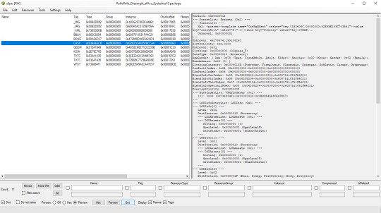
Modest 4B Ranch
MidCentury Design V11396 2-Step Foundation 4 bedrooms - 3.5 bathrooms - garage semi-furnished - large yard - pet friendly
The floor plan comes from this book: One-Story Homes, published by HomePlanners, Inc in 1991 An on-line archive of the plan is HERE.
This house was built as part of a Tutorial.
Read more on my blog »
Also available on MTS and Simblr.
Lot Size (Grid & Lot Adjusted): 3X3 Lot Price (semi-furnished): $94,667
DOWNLOAD @ SFS
Enjoy! 🦚
50 notes
·
View notes
Text
A Simplified Method to Build a House 🛠️
Just looking at an empty lot can take away the motivation to continue from there. I'm sharing with you my step by step method that encouraged me to continue building the neighborhood. 😊
The Grid: Let's memorize the grid system before we begin. In build mode, everything fits into a grid. Small objects like chairs take up 1 grid square, while larger items like beds or windows can take 2-4 grid squares. Remembering this will help with the walls and size of the home later.

Finding a Floor Plan: Having a floor plan ready to use can save you a lot of time. For this tutorial, I'll be recreating my house from The Sims 4. I made sure the lot size can fit a large family home with a back door.

Making a Shape: To make wall construction easier, I start by using a random floor tile to create the shape of the floor plan. It doesn't have to be perfect; it may end up being too large, short, or wide, depending on how you perceive the shape.

Building the Walls: Now, we can begin building the walls while paying attention to the number of grid squares we're using. I like to start at the entrance and add a random door and window to help me assess if the rooms are the right size. For example, the main door takes up 5 grid squares, while the original house likely takes up 7 or 8. In this case, I add 2 more walls, knowing one will be used for a lamp that will hang on the wall, and the other will provide extra space. I continue adding walls, doors, and windows to help define the rooms, adjusting their size to match the original layout.


Here's the first floor ready! I reduced the size of the garage and dining room, added the porch floor, and made the sidewalk a bit thinner.

Second Floor: If the house has additional floors, always pay attention to leaving blank spaces for the roof. I start by working around the staircase, then build the walls for the rooms, carefully counting the grid squares to make sure the rooms aren't too big or too small.

The second floor differs quite a bit from the original. In The Sims 1, doors can't be placed on diagonal walls, and the second master bedroom turned out smaller than expected. In this case, I could have expanded the first floor, but since the dining room felt reasonable to me, I decided to leave it as is and turn it into an additional study room.
Building a Roof: The original house has a flat roof for the porch. To replicate this, I need to use a transparent floor and cover all the grid squares of the porch. This is necessary to place a roof decoration. Next, to create the illusion of a platform, I add walls around the porch and place a railing window.

Most roof decorations don't include many height options, and they tend to look nicer with a smaller roof size. But this is better than nothing.

Finishing Up: Now it's time to update the flooring, perhaps replace some windows or doors, and paint the house before adding the furniture!

Conclusion: After using this method several times, I found that the houses usually turned out very similar to the original. There may be mistakes due to the lot size or other game limitations, as I experienced, but you'll eventually get it right. It's fun to learn from trial and error. I hope this tutorial was helpful, no matter which game you're using. Enjoy the process, and have fun!
4 notes
·
View notes
Text

Referencing this gifset.
So tbh I was inspired by a different gifset which is linked in my original post. I made my own templates and everything, I didn't steal or get them from someone else.
I also did not expect to get asked about this so I didn't save my psds which is why it took me so long to answer this. sorry for not including visual examples, i just didn't want to remake the gifs. if anything confuses you please send me an ask or dm me!
To start with, I made my gifs and then the template which is a 5x5 grid of squares. I made it by making a bunch of lines and then adjusting them until they were all equi-distant apart. there is probably a better and easier way to do that, i just don't know it
The base layer is Big Megumi. On top of him is the smaller unhinged Megumi and the blend on him is set to Screen. And then Gojo is on top of them all, blend set to normal.
Duplicating the grid into the folder, I used the Rectangle Tool to draw three rectangles where I wanted Gojo to show through in the middle. These rectangles were all different layers originally, then I selected them all and Merged them into one shape.
Setting the shape below Gojo's layer, I then right-clicked on Gojo and chose Create Clipping Mask, which clips Gojo to the shape. I adjusted him from there until I got him set the way I wanted in the box.
The grid goes on top of everything then I did the recoloring.
Gojo is H/S with the Sat all the way down, and there's a layer mask on him where i erased the H/S from his eyeball and then increased the Cyan with Selective Color layers.
For the Megumi's, I used H/S and Selective Color to increase the blues until I got it the way I wanted. And that's honestly pretty much it.
The middle gif is simple blending which I actually already have a tutorial on here, and the coloring method is the same as Gojo.
I didn't really add any screenshots to this tutorial, I'm sorry, but I will give you my grids. I have a 5x5 and a 6x6. There's no need to credit me for them, I hope they help you in some way!
If you have any more questions, please reach out!
#liontutorials#liongifs#icybtchgifs#asks#anonymous#giffing#gif making#photoshop tutorial#adobe photoshop#photoshop template
15 notes
·
View notes
Text

I had this idea for a story that would be told via a walkthrough for a JRPG that doesn't exist, but I decided in order to tell that story I had to write a different walkthrough for the same JRPG first, and then I decided that reading that walkthrough would be too dry and so I decided to just make the game first... or, at least, a little browser-based toy simulating its combat system to accompany the guide's random encounter tables...
So that's been the last month or so. The basics of it are working and playable now! Just for the tutorial fights, and not all the enemies in the tutorial fights do anything yet, but now I've got this extensible framework and I can make more of it later. You just click on the little encounter map grid thingy, and it pops up a little thing that lets you adjust Nora's level and position (or just accept defaults) and pop her down on the map. Fun!
You can read the Datasouls InFinite WIP starting here, or skip right to the playable tutorial segment here.
42 notes
·
View notes
Text
November Report and the Next Big Steps
Hello again!
It’s been a week since the demo launched, and I’ve learned a lot since then.
Overall, the response has been very positive, despite the admittedly bumpy launch (major issues have since been fixed, so please make sure to update the demo if you haven't yet). A recurring observation is that many players are missing some essential mechanics early on such as reading messages on the computer lamps by touching them and are finding the early-game learning curve a bit rough.
While I did intent to push new-age boomer shooter enthusiasts off their comfort zone and in general to maintain an alienating theme, I didn’t intend for the difficulty curve to be this steep.
As a result, the main focus of version 1.1 will be a dedicated tutorial zone designed to ease players into the game’s core mechanics. Inspired by Elden Ring, the tutorial will be skippable if you don’t need it. Here’s what I have planned, but feel free to suggest anything else you think could be clarified further.
Tutorial Zone Highlights
Clearer guidance on reading messages on the computer lamps.
Introduction to bunny-hopping, as the game’s movement system centers around it (more traversal upgrades will come down the line).
Lock-on targeting mechanic, inspired by Metroid Prime.
Basic swimming controls.
Explanation of save rooms.
Emphasis on exploration as a core aspect (resources are scarce, except in combat-heavy areas).
Introduction to green, blue, and red grids.
A boss fight to conclude the tutorial because why not?
Additional 1.1 Features
Added lore for deeper immersion.
New options to hide the HUD and hide guns.
Minor adjustments to other levels and the hub.
Minor visual adjustments.
Further bug fixes and balance adjustments based on continued feedback or personal findings.
Known Issues
Brief stutters when fighting newly introduced enemies. This is a Godot 4.3 engine issue, planned to be fixed in 4.4. The stutters lessen with playtime and are brief, but I’m fully aware this isn’t ideal.
Mouse button remapping limitations. Left, right, and middle mouse buttons remain separate in the keymapping options, as backend programming isn't my strong suit(I fucking suck at it). I hope to eventually hire help for this or improve my own skills over time.
Intermittent crash possibly linked to the lock-on function. I cleaned up some code that could have caused a crash, but it's unclear if this issue is fully resolved or if other factors might still trigger it.
Standing on top of enemies. Personally, this is a pet peeve since no one’s reported it as a problem but I spent days trying to find a workaround and I am still searching for an elegant solution any advice is welcome! This is a cry for help.
Thank you all for sharing your thoughts and suggestions! Your input has been invaluable for refining the game, and I’m excited to bring these updates to you.

#3d#gamedev#indie game#3d art#indie dev#scifi#lowpoly#science fiction#godot#godot game engine#solo game dev#game development#game dev blog#game developers#game dev stuff#game dev update#indiegamedev#game update#blog update
4 notes
·
View notes