#my coloring tutorial
Explore tagged Tumblr posts
Visit Tumblr Blog
Explore Tumblr blogs with no restrictions, modern design and the best experience.
Last Seen Tumblr Blogs


Fun Fact
BuzzFeed published a report claiming that Tumblr was utilized as a distribution channel for Russian agents to influence American voting habits during the 2016 presidential election in Feb 2018.
Text
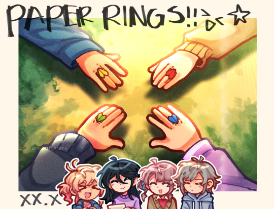
rings made out of papers.
#project sekai#prosekai#prsk fa#fanart#hatsune miku colorful stage#pjsk#leo need#leoneed#l/n#ichika hoshino#saki tenma#honami mochizuki#shiho hinomori#my art#ruxxifyart#a headcanon of mine where childhood leoni would make paper rings together#small ichika found a video tutorial on how to make paper rings at the ipad and she immediately uhhh thought of her dear friends
669 notes
·
View notes
Text

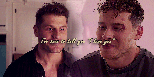


God, I'm jumping in the deep end It's more fun to swim in Heard the risk is drownin', but I'm gonna take it I'm gonna take it 💕
#bucktommy#bucktommyedit#bucktommy gif#vicki's gifs#911edit#adventures in gifmaking#baby's first lyric gifset! lol#dailykinley#loafrunners#911 spoilers#my gifs#911 abc#buck x tommy#bucktommy kiss#evan buckley#tommy kinard#tevan#*gifs#the 20 tommy fans#lyric edit#lyric gifset#lyric gif#911 7x04#911 8x11#911 8x06#911 8x15#gracie abrams lyrics#huge shoutout to abi (tommykinard) and her gif tutorials <3#the coloring is not exactly matching but this is the best I can do rn lol im new to this haha
473 notes
·
View notes
Text
My GIF Making process: Screen capturing using MPV player, Organizing files, 3 Sharpening settings, Basic Coloring PSD + Actions set

This is a very long post so heads up.
I’ll try to be as thorough and true as much as possible to the way I make my gifs (I already use Photoshop Actions which I’ve long since set up but now for this tutorial I’m reviewing them to show you the exact steps I’ve learned to create my gifs 😃) and present them to you in a semi-coherent way. Also, please bear with me since English is my second language.
First things first. Below are the things and tools we need to do this:
Downloaded 4K or 1080p quality videos (let’s all assume we know where to get these—especially for high definition movies and tv series—so this post doesn’t get removed, okay? 😛)
Adobe Photoshop CC or the CS versions can work as well, but full disclosure I haven’t created gifs using the CS versions since 2020. I’m currently using Adobe Photoshop 2024.
mpv player. Use mpv player to get those frames/screenshots or any other video player that has a screen grabber feature. I’ve used adapter for the longest time but I’ve switched to mpv because the press to screenshot feature while the video is playing has been a game changer not to mention ultimate time saver for me. For adapter you need to play it in another video player (like VLC player), to get the start and end timestamps of the scene you want to gif which takes me ages before I can even open Photoshop.
Anyway! Please stop reading this post for a moment and head over to this amazing tutorial by kylos. She perfectly tells you how to install and use mpv player, both for Mac and Windows users.
One thing I have to share though, I had a tough time when I updated my MacOS to Sonoma since MPV is suddenly either duplicating frames or when I delete the duplicates the player seems to be skipping frames :/ I searched and found a solution here, though it didn’t work for me lol. My workaround for this in the meantime is decreasing the speed down to 0.70 then start screenshotting—it’s not the same pre Sonoma update but it works so I’ll have to accept it rather than have jumpy looking gifs.
Now, after this part of kylos’ tutorial:

you can continue reading the following sections of my gif tutorial below.
I want to share this little tip (sorry, this will only cater to Mac users) that I hope will be helpful for organizing the screenshots that MPV saved to the folder you have selected. Because believe me you don’t want to go through 1k+ of screenshots to select just 42-50 frames for your gif.
The Control + Command + N shortcut
This shortcut allows you to create a new folder from files you have pre-selected. As you can see below I have already created a couple of folders, and inside each folder I have selected screenshots that I want to include in one single gif. It's up to you how you want to divide yours, assuming you intend to create and post a Tumblr gifset rather than just one gif.

Another tip is making use of tags. Most of, if not all the time, I make supercorp gifs so I tag blue for Kara and red (or green) for Lena—just being ridiculously on brand and all that.
Before we finally open Photoshop, there's one more thing I want to say—I know, please bear with me for the third? fourth? time 😅
It's helpful to organize everything into their respective folders so you know the total number of items/frames you have. This way, you can add or delete excess or unnecessary shots before uploading them in Photoshop.
For example below there are 80 screenshots of Kara inside this folder and for a 1:1 (540 x 540 px) Tumblr gif, Photoshop can just work around with 42-50 max number of frames with color adjustments applied before it exceeds the 10 MB file size limit of Tumblr.

Sometimes I skip this step because it can be exhausting (haha) and include everything so I can decide visually which frames to keep later on. You'll understand what I mean later on. But it's important to keep the Tumblr 10 MB file size limit in mind. Fewer frames, or just the right amount of frames, is better.
So, with the screenshot organization out of the way, let's finally head over to Photoshop.
Giffing in Photoshop, yay!
Let’s begin by navigating to File > Scripts > Load Files into Stack…

The Load Layers window will appear. Click the Browse button next.
Find your chosen screenshots folder, press Command + A to select all files from that folder then click Open. Then click OK.
After importing and stacking your files, Photoshop should display the following view:

By the way, I'll be providing the clip I've used in this tutorial so if want to use them to follow along be my guest :)
If you haven't already opened your Timeline panel, navigate to Windows > Timeline.
Now, let's focus on the Timeline panel for the next couple of steps.
Click Create Video Timeline, then you’ll have this:

Now click the menu icon on the top right corner then go to Convert Frames > Make Frames from Clips

Still working on the Timeline panel, click the bottom left icon this time—the icon with the three tiny boxes—to Convert to Frame Animation
Select Make Frames From Layers from the top right corner menu button.
So now you have this:

Go and click the top right menu icon again to Select All Frames
Then click the small dropdown icon to set another value for Frame Delay. Select Other…

The best for me and for most is 0.05 but you can always play around and see what you think works for you.
Click the top right menu icon again to Reverse Frames.
I think Photoshop has long since fixed this issue but usually the first animation frame is empty so I just delete it but now going through all these steps there seems to be none of that but anyways, the delete icon is the last one among the line of feature buttons at the bottom part of the Timeline panel.
Yay, now we can have our first proper GIF preview of a thirsty Lena 😜

Press spacebar to watch your gif play for the very first time! After an hour and half of selecting and cutting off screenshots! 😛 Play it some more. No really, I’m serious. I do this so even as early (lol) as this part in the gif making process, I can see which frames I can/should delete to be within the 10 MB file size limit. You can also do it at the end of course ����
Now, let’s go to the next important steps of this tutorial post which I’ve numbered below.
Crop and resize to meet Tumblr's required dimensions. The width value should be either 540px, 268px, or 177px.
Convert the gif to a Smart Object for sharpening.
Apply lighting and basic color adjustments before the heavy coloring. I will be sharing the base adjustments layers I use for my gifs 😃.
1. Crop and Resize
Click on the Crop tool (shortcut: the C key)

I like my GIFs big so I always set this to 1:1 ratio if the scene allows it. Press the Enter key after selecting the area of the frame that you want to keep.
Side note: If you find that after cropping, you want to adjust the image to the left or another direction, simply unselect the Delete Cropped Pixels option. This way, you will still have the whole frame area available to crop again as needed and as you prefer.
Now we need to resize our gif and the shortcut for that is Command + Opt + I. Type in 540 as the width measurement, then the height will automatically change to follow the ratio you’ve set while cropping.
540 x 540 px for 1:1
540 x 405 px for 4:3
540 x 304 px for 16:9
For the Resample value I prefer Bilinear—but you can always select the other options to see what you like best.
Click OK. Then Command + 0 and Command + - to properly view the those 540 pixels.

Now we get to the exciting part :) the sharpen settings!
2. Sharpen
First we need to have all these layers “compressed” intro a single smart object from which we can apply filters to.
Select this little button on the the bottom left corner of the Timeline panel.


Select > All Layers
Then go to Filter > Convert for Smart Filters
Just click OK when a pop-up shows up.
Now you should have this view on the Layers panel:

Now I have 3 sharpen settings to share but I’ll have download links to the Action packs at the end of this long ass tutorial so if you want to skip ahead, feel free to do so.
Sharpen v1
Go to Filter > Sharpen > Smart Sharpen…
Below are my settings. I don’t adjust anything under Shadows/Highlights.
Amount: 500
Radius: 0.4
Click OK then do another Smart Sharpen but this time with the below adjustments.
Amount: 12
Radius: 10.0

As you can see Lena’s beautiful eyes are “popping out” now with these filters applied. Click OK.
Now we need to Convert to Frame Animation. Follow the steps below.
Click on the menu icon at the top right corner of the Timeline panel, then click Convert Frames > Flatten Frames into Clips
Then Convert Frames > Convert to Frame Animation
One more click to Make Frames From Layers
Delete the first frame then Select All then Set Frame Delay to 0.05

and there you have it! Play your GIF and make sure it’s just around 42-50 frames. This is the time to select and delete.
To preview and save your GIF go to File > Export > Save for Web (Legacy)…
Below are my Export settings. Make sure to have the file size around 9.2 MB to 9.4 MB max and not exactly 10 MB.

This time I got away with 55 frames but this is because I haven’t applied lighting and color adjustments yet and not to mention the smart sharpen settings aren't to heavy so let’s take that into consideration.
Sharpen v1 preview:

Sharpen v2
Go back to this part of the tutorial and apply the v2 settings.
Smart Sharpen 1:
Amount: 500
Radius: 0.3
Smart Sharpen 2:
Amount: 20
Radius: 0.5
We’re adding a new type of Filter which is Reduce Noise (Filter > Noise > Reduce Noise...) with the below settings.

Then one last Smart Sharpen:
Amount: 500
Radius: 0.3
Your Layers panel should look like this:

Then do the Convert to Frames Animation section again and see below preview.
Sharpen v2 preview:

Sharpen v3:
Smart Sharpen 1:
Amount: 500
Radius: 0.4
Smart Sharpen 2:
Amount: 12
Radius: 10.0
Reduce Noise:
Strength: 5
Preserve Details: 50%
Reduce Color Noise: 0%
Sharpen Details: 50%
Sharpen v3 preview:

And here they are next to each other with coloring applied:
v1

v2

v3

Congratulations, you've made it to the end of the post 😂
As promised, here is the download link to all the files I used in this tutorial which include:
supercorp 2.05 Crossfire clip
3 PSD files with sharpen settings and basic coloring PSD
Actions set
As always, if you're feeling generous here's my Ko-fi link :) Thank you guys and I hope this tutorial will help you and make you love gif making.
P.S. In the next post I'll be sharing more references I found helpful especially with coloring. I just have to search and gather them all.
-Jill
#tutorial#gif tutorial#photoshop tutorial#gif making#sharpening#sharpening tutorial#photoshop#photoshop resources#psd#psd coloring#gif coloring#supercorp#supercorpedit#lena luthor#supergirl#my tutorial#this has been a long time coming#guys. i'm BEGGING you. use the actions set - it was a pain doing all this manually again ngl LMAO#i've been so used to just playing the actions#so this has been a wild refresher course for me too 😆
772 notes
·
View notes
Note
Hullo! I’ve been watching a bunch of your Timelapses and I was wondering how do you always come up with the colours for your pieces? They’re always so cohesive and pleasing to look at (I almost exclusively work in greyscale so if I’m using colour it’s always a lucky guess and it never looks quite right)
Hey there!
I have to be honest that most of the time I don't actually know what I'm doing and that I have no idea how most of my pieces are gonna turn out. My work process is usually based on "Fuck around and find out", haha. I'm happy to know that it apparently doesn't come across that way, though.
A lot of it comes very naturally to me simply because I've been drawing non-stop for so long, but I can give you some small tips that really help me:
1. Have as many references as possible!
Here's what my reference sheet looked like for the Jayvik piece:

It helped me a lot to understand the overall color scheme I wanted to convey. Lots of very cold tones, pinks and very light blues and greens. These colours sorround Jayce and Viktor throughout all of season 2 and I wanted to keep them, especially since in my piece they are lying in the glowing hexcore.
Don't shy away from using references, get as many as you possibly can! Look at other poeple's art too and try to understand how they work with colours.
2. Work with complementary colours!
Since I paint a lot of romantic illustrations I want them to look pleasing and comforting, which I can accomplish by using complementary colours! You see this a lot with couples that are blue and red coded, for example. And I wanted to do the same thing in the Jayvik piece! For that I used the highlights in their hair!


Viktor's highlights are a soft pink hue.


While Jayce's are a soft blue hue.
The colour wheel works perfect for figuring out if two colors compliment each other because they are literally right across from one another!
3. It doesn't have to be true to life.
Pretty self-explanatory, but I thought I'd add it in here anyways. It's important to understand how colour and light works, but you don't always have to follow the rules. Does the rim light look cool but it makes zero sense? Who cares! Keep the cool rim light! Just have fun and fuck around.
4. A little trick to make your life easier!
I'm not excatly the best at colour theory, I still struggle with it quite a bit, but here's a little trick I like to use from time to time:
If you want all your colours to look coherent, take one specific color as your flat colour. Choose a hue that you would like your piece to have. Like this:

Now you choose whatever colours your characters have and paint them in. For example, here are the skin colours I chose for Jayce and Viktor:

Looks off, right? These colours don't fit the overall piece at all. So what do we do?
Turn down the opacity! It's that easy, wahoo!

I went from 100 Opacity to 72 for this specific illustration. And look at that!

It's so much nicer already! Now you know what colours to use as your actual flats! Just repeat this with every other part of your illustration and you'll have a great starting point. :)
I really hope this was helpful! I'm not an actual teacher and I don't have a proper illustration degree, so some things might not be completely accurate, but I thought I'd try my hand at this anyways!
#teacher han is at it again#if I talked bullshit forgive me#I just hope I was able to help at least a little bit haha#I'm always happy to give some tips!#art process#art tutorial#color tutorial#colouring#illustration#tips#my art#arcane#jayvik#tutorial#anon#ask
783 notes
·
View notes
Text

repost , figured this would be handy for somebody
#robin gives advice 🦇#art advice#advice#my art#digital art#art#artists on tumblr#digital artist#color theory#art resources#art tutorials
838 notes
·
View notes
Text


radskier + same shot (s3)
#radskier#thewitcheredit#the witcher#witcheredit#fantasyedit#my edit#ughmerlin#jemmablossom#userhann#userava#arthurpendragonns#userbecca#ivashkovadrian#adaptationsdaily#thewitchersdaily#witcherdaily#witchersdaily#usergay#thewitcherdaily#jaskierxradovid#(hope it's ok to tag!)#radovid#special thank you to becca for her coloring tutorials bc i made this set before (unpublished) and my attempt was......... bad
299 notes
·
View notes
Text


🍺(๑///๑) ⊹。˚ Top Form [01.04 BTS]


#top form#top form the series#smartboom#smart chisanupong#boom raweewit#tortigifs#adorable#boom is so frikin cute#i love him#thai bl#bl series#bl drama#im not sure some of this was translated correctly but i did my best#HOWEVER i love the way i colored this and the only thing that could make it better for me is if i could blur the text but#i cant find a tutorial for that
211 notes
·
View notes
Text
'Dead Poets Society' gang
Headcanon that these four drop poetry and literature quotes on their conversations unprompted.
Jason 'English-major-I-only-visit-the-manor-for-the-library' Todd-Wayne
Damian 'I-master-liberal-arts-unlike-you-plebs-PHD-holder' al Ghul-Wayne
Cassandra 'I-learn-English-thru-Shakespeare-as-god-intended' Cain-Wayne
Duke 'only-title-holder-of-vigilante-poet-and-will-cuss-you-just-as-poetically' Thomas-(future) Wayne
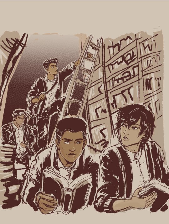
#My background is ass#I promise to practice but omg i am losing motivation coz its too ugly#started putting some on coloring that i started being happy about it#But my background is level toddler i hate it#the patience and discipline to make my lines straight and clean is nonexistent gdi...why did past me choose library gdi#Just writing some Duke in my fics and this image of them all just made me wanna do art...Duke is a poet and writes stories u kno?#Duke is not a wayne yet...and is not dead yet...but with how comics goes then its just a matter of time lol#They're all in school here...Cass and Jason are college watching over their juniors in high school#everyone use cardigans but Jason like his leather so no thanks lol#Duke and Cass in outsiders are cute#jason todd#dc comics#damian wayne#fanart#robin#cassandra cain#duke thomas#inking & background study#Damian is now 14!!!! He's getting old...he's like a baby yesterday omg#I need to stop obsessing over this so i posted a WIP so i can continue writing my fic!!! argh#Im gonna watch youtube tutorials again on drawing bookshelves coz i cannot do this without guidance
653 notes
·
View notes
Text

Cora-san the angel you are
#forever grateful color tutorials exist#he is a literal angel idk#corazon#corazon my pookie#donquixote rosinante#fanart#digital art#one piece#holy crap the quality is shitty as hell
198 notes
·
View notes
Text
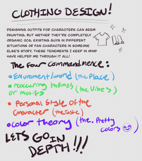
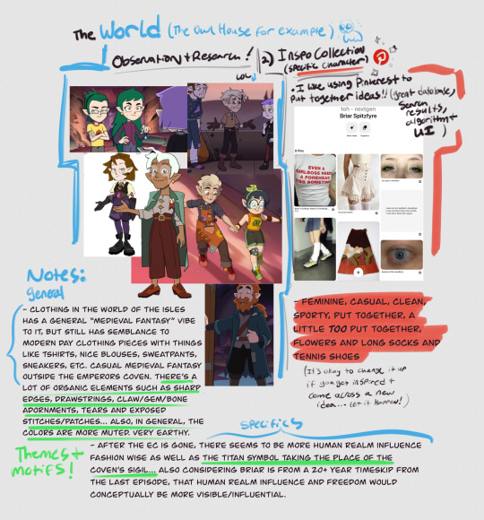

I’m really not sure why this took me a week but here’s a little tutorial on how I design clothes for characters ??? I hope it’s somewhat comprehensive, making tutorials can be hard for me because I have so much to say LOL
While I used a preexisting show in this example, this method can really be applied to any oc universe or story as long as you establish the basics :]
#my art#art tutorial#character design#clothing design#the owl house#toh#color theory#toh nextgen#Briar Spitzfyre#brischa
1K notes
·
View notes
Text

made a rendering tutorial a bit ago since i had a few people asking about it. hope this helps!
since tumblr might butcher image quality, you can download the high quality file here and you can download my brushsets here. im always happy to help with art resources so if anyone else had any ideas in mind for future tutorials please feel free to shoot them my way
#murder drones#uzi doorman#murder drones fanart#glitch productions#md fanart#tutorial#drawing tutorial#color tutorial#art#art resources#my stuff
675 notes
·
View notes
Text
some more professors and laytons


#the first was originally gonna be for the second idea but i liked it so much i colored it#also the second is inspired by the fact that by the little clips ive heard#layton in spanish sounds SO MUCH like the fucking yt tutorial loquendo voice 😭#maybe its just me but like. i swear#i forgot the name of which voice though you'll have to trust me ok#my art#professor layton#hershel layton#luke triton#hes there
152 notes
·
View notes
Text
I learned to color i think

#happy valentines#!!#ryomen sukuna#jjk sukuna#jujutsu kaisen fanart#sukuna fanart#my art#didn’t expect to post this so late ahhh sorry#hope you enjoy I watched a whole coloring tutorial for this
186 notes
·
View notes
Text
Posted the tutorial for this piece early on p4tr30n!!! 🧡 You can watch it now there, or wait til Christmas Day to see it on youtube for free!
I talked about how I colored and rendered this sketch from my october sketchbook pdf :3
#my art#knight#lady knight#knight lady#how to paint#how to render#tutorial#tutorials#how to color#tutorial video
263 notes
·
View notes
Text
🥖 𝓨𝗈 𝗍𝖾𝗇í𝖺 𝗎𝗇𝖺 𝖾𝗌𝗉𝖾𝗋𝖺𝗇𝗓𝖺 ᭪ᬻ𓏸𓈒゚⃝
𝅄 ི۪۪۪ ֯ ּ ֗ ۫ 𝖤𝗇 𝖾𝗅 𝖿𝗈𝗇𝖽𝗈 𝖽𝖾 𝗆𝗂 𝖺𝗅𝗆𝖺 𝅘𝅥𝅮♪ ˟̫ː᜴ 🍰


#꒰ atsubie ꒱ ౨ৎ︵⠀⠀#gif by me#heres how the mb from my tutorial turned out ☆#ㅤㅤㅤㅤㅤㅤㅤㅤㅤㅤㅤㅤㅤㅤㅤㅤㅤㅤㅤㅤㅤㅤㅤㅤㅤㅤㅤㅤㅤㅤㅤㅤㅤㅤㅤㅤㅤㅤㅤㅤㅤㅤㅤㅤㅤㅤㅤㅤㅤㅤㅤㅤㅤㅤㅤㅤㅤㅤㅤㅤㅤㅤㅤㅤㅤㅤㅤㅤㅤㅤㅤㅤㅤㅤㅤㅤㅤㅤㅤㅤㅤㅤㅤ#stayc layouts#stayc moodboard#stayc j#kpop icons#kpop layouts#messy moodboard#kpop themes#kpop moodboard#kpop aesthetic#alternative moodboard#alt moodboard#colorful moodboard#yellow moodboard#pink moodboard#indie moodboard#y2k moodboard#fresh moodboard#nature moodboard#soft moodboard#simple moodboard#maximalist moodboard#retro moodboard#vintage moodboard#dark moodboard#edgy moodboard#divider by im4yeons
234 notes
·
View notes
Text
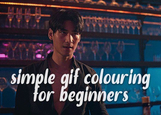
✨ Simple Gif Colouring for Beginners ✨
I wrote up my basic gif colouring process for a friend recently, but a couple of people here mentioned they'd also find it helpful! so, as requested, this is a beginner-friendly walkthrough of the way I colour my gifs :) it's aimed at brand new gif makers with no prior experience with photoshop or photo editing.
when I first started gif making I found colouring and photoshop in general suuuper daunting, so I've tried to simplify everything here as much as possible. hopefully this will be relatively easy to follow and not too intimidating!
a couple of things to begin with:
I'm only talking about colouring here - this is not a full gif making tutorial. I've linked to some of my favourites of those here!
I personally like to make bright, 'clean' looking gifs with vibrant but natural colours, so that is the style of colouring this tutorial is geared towards. most of gif colouring is subjective and about personal taste - the only thing that I'd say is possible to get wrong is skin tones, which I talk about a lot in this guide.
as I mostly gif Thai dramas, most of the advice is geared towards colouring for East Asian/South East Asian skin tones - but the techniques should be fairly universally applicable (and here are some tutorials that talk about gif colouring for other skin tones).
I'm not an expert! I'm not claiming this is the best or the only way to colour gifs - it's just how I do it.
this post is very image-heavy. if the images aren't loading (or the gifs are running slowly or cutting/looping weirdly), then try viewing the post in its own tab (rather than on the your dash or someone's blog) and refreshing the page.
okay, full walkthrough beneath the cut!
contents:
1. intro a. natural gif colouring goals b. very very basic colour theory 2. super simple colouring (the essentials) a. curves b. selective colour (and skin tone correction) c. hue/saturation d. saving and reusing colouring e. another simple colouring example 3. other adjustment layers a. brightness/contrast b. levels c. vibrance d. colour balance e. channel mixer 4. troubleshooting a. curves b. saturation 5. fin!
1. intro
the colouring part of gif making can be super overwhelming, especially if (like me when I first started!) you're completely new to photoshop and/or have no experience with colour theory or photo/video editing.
if you're opening photoshop and making gifs for the first time, I highly recommend getting used to making a few basic, uncoloured gifs to begin with. just to practice, rather than post anywhere (though you can always come back and colour them later if you want) - but it'll make the rest of the process much easier if you're already beginning to get used to working in timeline mode of photoshop. give yourself a bit of time to practice and get a feel for things like how many frames you tend to like in a gif, where you like to crop them for the best loop, what kind of aspect ratio you like etc* - so that you're not trying to navigate all of that for the first time on top of everything else!
* frames: for me between 60-90 frames is ideal, but 40-120 frames is the absolute min-max I'd personally use in a normal gifset loops: for the smoothest loops, try to avoid cutting someone off mid-movement or mid-word if possible. aspect ratio: for full-size (540px) gifs, I tend to go for either 8:5 (slightly 'skinnier' gifs), 7:5, or 5:4 (particularly big, thick gifs lmao)
✨ natural gif colouring goals
part of what can be so daunting about starting gif making is not knowing where to start or what you want to achieve. this is definitely something that gets easier with practice - the more gifs you make, the more you'll get a feel for what kind of look you like and the more instinctively you'll know how to get there. it also helps to see if any gif makers you like have made "before and after colouring" posts - these can help with getting a sense of the kinds of changes made through gif colouring. here's one I made!
in general, I like to make my gifs bright and 'clean' looking, with vibrant but natural colours. these are the things I'm usually hoping to achieve with colouring:
brighten dark scenes
remove muddy, yellowish lighting or filters
saturate colours
correct any skin lightening filters or overexposure
make lighting and colours as consistent as possible between gifs within a single gifset, especially gifsets featuring gifs from multiple scenes/episodes/videos
this guide is focusing on natural colouring, but of course there are many cool ways to make stylised/unnaturally coloured gifs. imo you'll need to master these basics first, but if you want to learn how to do things like change the background colour of gifs or use gradients or other cool effects, then @usergif's resource directory has loads of super helpful tutorials!
✨ very very basic colour theory
[disclaimer! I don't know shit about fuck. I do not study light or art. this is just an explanation that makes sense to me exclusively for the purposes of gif making.]
the primary colours for light/digital screens are red, blue, and green. having all three colours in equal measures neutralises them (represented by the white section in the middle of the diagram).
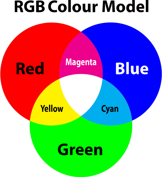
so to neutralise a colour within a gif, you need to add more of the colour(s) that are lacking.
in practice this usually means: the scene you want to gif is very yellow! yellow is made of red and green light, so to neutralise it you need to add more blue into your gif.
it can also mean the reverse: if you desaturate the yellow tones in a gif, it will look much more blue.
looking at the colour balance sliders on photoshop can make it easier to visualise:
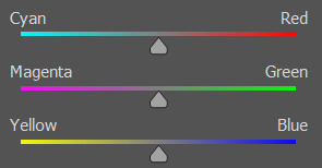
so making a gif more red also means making it less cyan.
removing green from a gif means adding magenta.
taking yellow out of a gif will make it more blue.
tl;dr:
neutralise yellows by adding blue (and vice versa)
neutralise reds by adding cyan (and vice versa)
neutralise green by adding magenta (and vice versa)
2. super simple colouring (the essentials)
starting with a nice sharpened gif in photoshop in timeline mode. (these are the sharpening settings I use!)
some scenes are much harder to colour than others - it helps to start out practising with scenes that are bright/well-lit and that don't have harsh unnaturally coloured lights/filters on. scenes with a lot of brown/orange also tend to be harder.
I usually save a base copy of my gif before I start colouring just in case I end up hating it, or find out later that it doesn't quite fit right into a set and need to redo it etc.
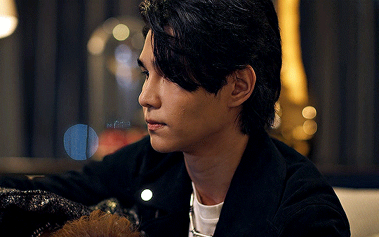
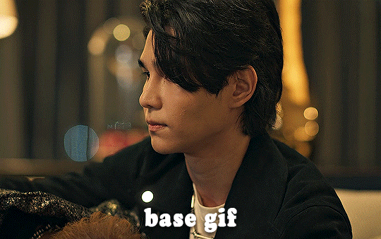
so here is my base gif!

it's an okay gif, but it has a bit of a yellow tint to it that I want to reduce.
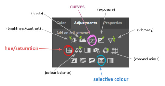
colouring is easiest to do in adjustment layers, which can be found under layer -> new adjustment layer - or for me they are here:
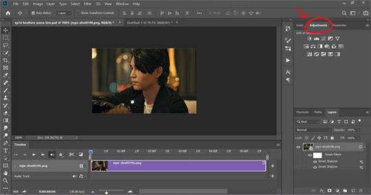
there are lots of different types of adjustment layers that do lots of different things - but for me the absolute essentials for colouring are curves, selective colour, and hue/saturation.
I also use brightness/contrast, levels, exposure, vibrance, colour balance, and channel mixer sometimes, depending on the gif - but I use curves, selective colour, and hue/saturation on every single gif.
✨ curves layer
the first thing I always do is a curves layer. when you first open one it will look like this:
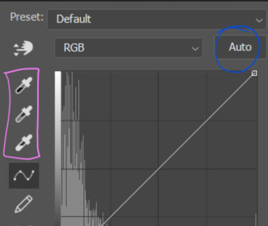
first I usually click the ‘auto’ button, just to see what happens. sometimes it makes a big difference (it usually brightens the gif a lot) - but on this gif it didn’t do much.
if it had made the gif look nicer then I would have kept it and added a second curves layer on top to do the rest of these steps.
the next step is selecting the white and black points with the little eyedropper tools.
the bottom eyedropper lets you pick a white point for the gif. click somewhere super light on the gif to see what happens - for this gif, I clicked on the lampshade on the left. if it looks weird, I just undo it and try somewhere else - it usually takes a few goes to find something that looks good.
here's what that did to the gif:

then I pick the top eyedropper and use it to pick a black point by clicking somewhere really dark, again playing around until I find a black point that looks good.
here's what the gif looks like after picking the white and black points:

this can take some experimenting, but you can make super easy drastic changes to your gif just with this. in this case, the curves layer took out a lot of that yellowy tint.
and this is what the curves graph looks like now:
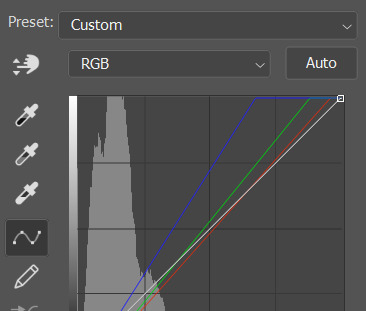
you can click and drag those lines to make further changes if you want - I usually leave them alone though. the colours of the lines indicate which colours have been changed in the gif - for example, you can see from that steep blue line on the graph that blue has been added to neutralise those yellows.
next I usually do another curves layer and just press the ‘auto’ button again to see what happens. usually it brightens the gif a bit more, which I like.
‼️if nothing is working: usually with a bit of fucking about a curves layer works well - but sometimes you can’t find a good white and black point anywhere, and instead your gif turns wacky colours and nothing looks good. this happens more often with very heavily colour tinted scenes :( the troubleshooting section at the end goes over some options, including starting with a levels layer instead.
✨ selective colour (and skin tone correction)
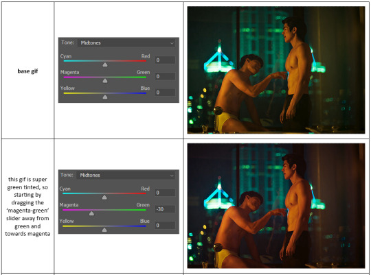
skin tones are made up of a mixture of yellow and red.
removing yellow (or adding blue or red) to a gif will make the skin-tones too red - and removing red (or adding cyan or yellow) to a gif will make the skin-tones too yellow.
adding blue to this gif with the curves layer took out the yellowy tint, which I wanted - but it also took the yellows out of Kim's skin tone, which I don’t want. so I need to put yellow back into the skin tones specifically - without putting it back into the rest of the gif.
selective colour layers let you select an individual colour and adjust the levels of other colours within that colour. you can change how yellow the green shades are, or how much cyan is in the blues, for example.
I need to add yellow back into the red tones to correct the skin tones on this gif. this is the case for most gifs in my experience - the vast majority of the time, unless a scene is very heavily tinted in another colour, a curves layer will add blue/remove yellow.
in the 'colors' dropdown, select the 'reds' section and drag the 'yellow' slider higher - this will add more yellow into just the red shades within the gif.

the amount of yellow you need to add back into the reds depends on how much yellow was taken out of the gif initially - I just play around with the slider until it looks right. if you're not sure, it helps to have some neutrally-coloured (not white-washed!) reference photos of the people in your gif to compare to.
here's the result. Kim's skin is a lot less pink toned and much more natural looking:
✨ hue/saturation
this adjustment layer lets you adjust the hue and saturation of the gif as a whole, and also of each colour individually.
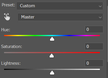
I don't use the hue or lightness sliders unless I'm trying to do something more complicated with the colouring.
clicking the dropdown menu that says 'master' lets you edit the saturation of each colour individually. this is useful if your gif is still super tinted in one colour.
I thought the yellows on this gif were still slightly too bright, so I switched to the yellow channel and desaturated them slightly. (remember if you do this then you need to go back to selective colour and add more yellow into the red skin tones to balance out the desaturation!)
then I increased the 'master' saturation of all the colours to +5:
I usually find the right amount of saturation is somewhere between +5 and +12, but it depends on the gif.
‼️if the gif feels undersaturated, but the saturation slider isn't helping/is making the colours worse, try a vibrance layer instead.
done!
✨ saving and reusing colouring
you can copy and paste adjustment layers between gifs to make your colouring even across each of your gifs for one scene - so if you're making a set of multiple gifs of the same scene, or you think you might want to gif the same scene again in the future, you can save it as a psd so you can reuse the colouring again later.
each gif's colouring will then still need tweaking - different cameras/angles/shots of the same scene can still start out with slightly different colouring.
I recommend uploading the gifs as a draft post on tumblr so you can see what they all look like next to each other and catch any inconsistencies.
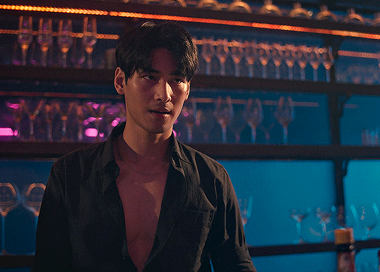
✨ another one! (speedrun!)
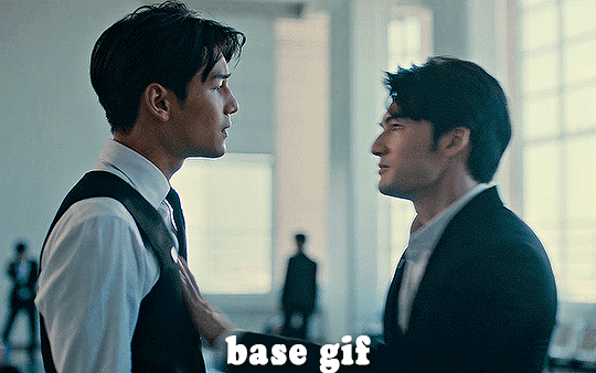
HI KEN!
the white point for the curves layer was in the window behind them.
the curves layer removes the muddy yellow tint, but again it makes their skin tones (especially Ken's) very red toned, which is adjusted by the selective colour layer.
3. other adjustment layers
imo many many gifs can be coloured really nicely with just those three adjustment layers, but some need different adjustments.
✨ brightness/contrast
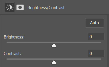
pretty self explanatory!
I personally usually avoid using the 'brightness' slider because I rarely like the effect - I only tend to use the 'contrast' one.
the 'auto' button is sometimes useful though, especially if you’re struggling with the curves layer.
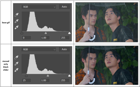
✨ levels

levels alters the white and black points of the gif, like curves - but unlike curves it doesn't also alter other colours.
use the sliders beneath the graph to alter how dark/light the gif is. you can slide the black slider further to the right to make the blacks darker, and the white slider to the left to make the whites lighter.
levels is a good place to start if your curves layer isn't working.
(I'm going to hit the image limit for this post lol so here are some screenshots of a table I made to demonstrate this rather than actual gifs. sorry!)

on both sides, I dragged the sliders up to where the big jumps are on the graph - this is usually a good place to start!
✨ vibrance
vibrance... makes the colours more vibrant. it's more subtle than saturation.
it's really helpful for gifs that feel grey. sometimes adjusting saturation just makes the greys kind of weirdly tinted, but a vibrance layer can fix that.
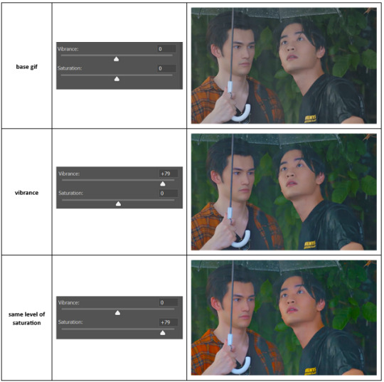
vibrance is much more subtle!
✨ colour balance
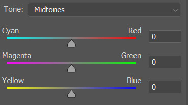
colour balance affects the overall balance of colours within a gif.
it's good for scenes with heavy tints.
I tend to stick to the 'midtones' dropdown, but you can also alter the colour balance within the shadows and highlights if you want.

✨ channel mixer
I avoided channel mixer for such a long time because it scared me. but it's great for scenes that are very heavily tinted in one colour.
basically, it works with the levels of red, green, and blue within a gif. you select an output colour and then play around with the levels of the colour you selected within each other colour.
kind of the reverse of selective colour?
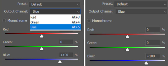
so in the 'blue' channel, the levels of blue are at 100%, and the levels of red and green are at 0% - but you can impact how much blue is in the reds and greens and blues.
this tutorial explains it well - but imo the best way to get to grips with channel mixer is just to play around with it a bit (sorry)
(when I made this guide for my friend, I also made a slightly more complicated gif colouring walk-through that included using channel mixer. there isn't space to include it within this post, but if anyone is interested I could always upload it as an 'intermediate' gif colouring tutorial - lmk!)
4. troubleshooting
‼️curves
usually with a bit of fucking about a curves layer works well - but sometimes you can’t find a good white and black point anywhere, and instead your gif turns wacky colours and nothing looks good. this happens more often with very heavily colour tinted scenes :(
for example, with this base gif:
using many of the brightest points as a white point turn it wacky colours, like this:

yikes :(
some options for these cases:
try brightening the gif first with the 'auto' button on the curves layer or with a levels layer. having a brighter gif to start with can give you better options for picking a white point.
try finding an alternate, whiter/brighter white point. look for places the light reflects - on this gif, using the light on Porsche's cheekbone works well as the white point. it also helps to find places that would be white if the scene wasn't tinted - the lightest part of a white shirt is often a good place to start, for example.
skip the curves layer, and instead use a levels layer to alter your white/black points, and colour balance or channel mixer to balance the colours.
‼️over/undersaturation
if your gif (especially the skintones) is looking a little washed out or lifeless, it might be undersaturated. boost that saturation - or if that's not working, try a vibrance layer.
oversaturation is often easiest to spot in the mouths and ears of any people in a gif. if the mouths are looking unnaturally, vibrantly red, then you've gone too far with the saturation.
5. fin!
and done! I hope this was coherent helpful to somebody.
if there's anything that I've missed or that doesn't make sense pls feel free to shoot me an ask or a message and I'll do my best to help! I've also collated a bunch of additional reading/resources below.
happy gifmaking 🥰
✨ some links!
photoshop basics by @selenapastel
gifmaking for beginners by @hayaosmiyazaki
gifmaking guide for beginners by @saw-x
dreamy's gif tutorial by @scoupsy-remade (includes instructions on how to blur out burned-on subtitles or annoying video graphics)
beginner's guide to channel mixer by @aubrey-plaza
how to fix orange-washed characters by aubrey-plaza
colour correcting and fixing dark scenes by @kylos
does resampling matter? by usergif
how to put multiple gifs on one canvas by @fictionalheroine
watermarking using actions by @wonwooridul
resource directory by @usergif
#i got a couple of asks about this so i figured i'd type it up as a post#it's been sitting in my drafts for a while now though i'm so sorry omg.#i had to replace my laptop and it took me a while to get round to downloading photoshop on the new one#but i hope this is helpful!!#gif making#tutorial#photoshop tutorial#colouring tutorial#coloring tutorial#gif colouring#gif coloring#photoshop resources#gif tutorial#gif resources#userbunn#uservik#darcey.txt#darcey.gif#usergif
896 notes
·
View notes