#I covered as much as I could find
Text
Fantasy Guide to Interiors

As a followup to the very popular post on architecture, I decided to add onto it by exploring the interior of each movement and the different design techniques and tastes of each era. This post at be helpful for historical fiction, fantasy or just a long read when you're bored.
Interior Design Terms
Reeding and fluting: Fluting is a technique that consists a continuous pattern of concave grooves in a flat surface across a surface. Reeding is it's opposite.
Embossing: stamping, carving or moulding a symbol to make it stand out on a surface.
Paneling: Panels of carved wood or fabric a fixed to a wall in a continuous pattern.
Gilding: the use of gold to highlight features.
Glazed Tile: Ceramic or porcelain tiles coated with liquid coloured glass or enamel.
Column: A column is a pillar of stone or wood built to support a ceiling. We will see more of columns later on.
Bay Window: The Bay Window is a window projecting outward from a building.
Frescos: A design element of painting images upon wet plaster.
Mosaic: Mosaics are a design element that involves using pieces of coloured glass and fitted them together upon the floor or wall to form images.
Mouldings: ornate strips of carved wood along the top of a wall.
Wainscoting: paneling along the lower portion of a wall.
Chinoiserie: A European take on East Asian art. Usually seen in wallpaper.
Clerestory: A series of eye-level windows.
Sconces: A light fixture supported on a wall.
Niche: A sunken area within a wall.
Monochromatic: Focusing on a single colour within a scheme.
Ceiling rose: A moulding fashioned on the ceiling in the shape of a rose usually supporting a light fixture.
Baluster: the vertical bars of a railing.
Façade: front portion of a building
Lintel: Top of a door or window.
Portico: a covered structure over a door supported by columns
Eaves: the part of the roof overhanging from the building
Skirting: border around lower length of a wall
Ancient Greece
Houses were made of either sun-dried clay bricks or stone which were painted when they dried. Ground floors were decorated with coloured stones and tiles called Mosaics. Upper level floors were made from wood. Homes were furnished with tapestries and furniture, and in grand homes statues and grand altars would be found. Furniture was very skillfully crafted in Ancient Greece, much attention was paid to the carving and decoration of such things. Of course, Ancient Greece is ancient so I won't be going through all the movements but I will talk a little about columns.
Doric: Doric is the oldest of the orders and some argue it is the simplest. The columns of this style are set close together, without bases and carved with concave curves called flutes. The capitals (the top of the column) are plain often built with a curve at the base called an echinus and are topped by a square at the apex called an abacus. The entablature is marked by frieze of vertical channels/triglyphs. In between the channels would be detail of carved marble. The Parthenon in Athens is your best example of Doric architecture.
Ionic: The Ionic style was used for smaller buildings and the interiors. The columns had twin volutes, scroll-like designs on its capital. Between these scrolls, there was a carved curve known as an egg and in this style the entablature is much narrower and the frieze is thick with carvings. The example of Ionic Architecture is the Temple to Athena Nike at the Athens Acropolis.
Corinthian: The Corinthian style has some similarities with the Ionic order, the bases, entablature and columns almost the same but the capital is more ornate its base, column, and entablature, but its capital is far more ornate, commonly carved with depictions of acanthus leaves. The style was more slender than the others on this list, used less for bearing weight but more for decoration. Corinthian style can be found along the top levels of the Colosseum in Rome.
Tuscan: The Tuscan order shares much with the Doric order, but the columns are un-fluted and smooth. The entablature is far simpler, formed without triglyphs or guttae. The columns are capped with round capitals.
Composite: This style is mixed. It features the volutes of the Ionic order and the capitals of the Corinthian order. The volutes are larger in these columns and often more ornate. The column's capital is rather plain. for the capital, with no consistent differences to that above or below the capital.
Ancient Rome
Rome is well known for its outward architectural styles. However the Romans did know how to add that rizz to the interior. Ceilings were either vaulted or made from exploded beams that could be painted. The Romans were big into design. Moasics were a common interior sight, the use of little pieces of coloured glass or stone to create a larger image. Frescoes were used to add colour to the home, depicting mythical figures and beasts and also different textures such as stonework or brick. The Romans loved their furniture. Dining tables were low and the Romans ate on couches. Weaving was a popular pastime so there would be tapestries and wall hangings in the house. Rich households could even afford to import fine rugs from across the Empire. Glass was also a feature in Roman interior but windows were usually not paned as large panes were hard to make. Doors were usually treated with panels that were carved or in lain with bronze.
Ancient Egypt
Egypt was one of the first great civilisations, known for its immense and grand structures. Wealthy Egyptians had grand homes. The walls were painted or plastered usually with bright colours and hues. The Egyptians are cool because they mapped out their buildings in such a way to adhere to astrological movements meaning on special days if the calendar the temple or monuments were in the right place always. The columns of Egyptian where thicker, more bulbous and often had capitals shaped like bundles of papyrus reeds. Woven mats and tapestries were popular decor. Motifs from the river such as palms, papyrus and reeds were popular symbols used.
Ancient Africa
African Architecture is a very mixed bag and more structurally different and impressive than Hollywood would have you believe. Far beyond the common depictions of primitive buildings, the African nations were among the giants of their time in architecture, no style quite the same as the last but just as breathtaking.
Rwandan Architecture: The Rwandans commonly built of hardened clay with thatched roofs of dried grass or reeds. Mats of woven reeds carpeted the floors of royal abodes. These residences folded about a large public area known as a karubanda and were often so large that they became almost like a maze, connecting different chambers/huts of all kinds of uses be they residential or for other purposes.
Ashanti Architecture: The Ashanti style can be found in present day Ghana. The style incorporates walls of plaster formed of mud and designed with bright paint and buildings with a courtyard at the heart, not unlike another examples on this post. The Ashanti also formed their buildings of the favourite method of wattle and daub.
Nubian Architecture: Nubia, in modern day Ethiopia, was home to the Nubians who were one of the world's most impressive architects at the beginning of the architecture world and probably would be more talked about if it weren't for the Egyptians building monuments only up the road. The Nubians were famous for building the speos, tall tower-like spires carved of stone. The Nubians used a variety of materials and skills to build, for example wattle and daub and mudbrick. The Kingdom of Kush, the people who took over the Nubian Empire was a fan of Egyptian works even if they didn't like them very much. The Kushites began building pyramid-like structures such at the sight of Gebel Barkal
Japanese Interiors
Japenese interior design rests upon 7 principles. Kanso (簡素)- Simplicity, Fukinsei (不均整)- Asymmetry, Shizen (自然)- Natural, Shibumi (渋味) – Simple beauty, Yugen (幽玄)- subtle grace, Datsuzoku (脱俗) – freedom from habitual behaviour, Seijaku (静寂)- tranquillity.
Common features of Japanese Interior Design:
Shoji walls: these are the screens you think of when you think of the traditional Japanese homes. They are made of wooden frames, rice paper and used to partition
Tatami: Tatami mats are used within Japanese households to blanket the floors. They were made of rice straw and rush straw, laid down to cushion the floor.
Genkan: The Genkan was a sunken space between the front door and the rest of the house. This area is meant to separate the home from the outside and is where shoes are discarded before entering.
Japanese furniture: often lowest, close to the ground. These include tables and chairs but often tanked are replaced by zabuton, large cushions. Furniture is usually carved of wood in a minimalist design.
Nature: As both the Shinto and Buddhist beliefs are great influences upon architecture, there is a strong presence of nature with the architecture. Wood is used for this reason and natural light is prevalent with in the home. The orientation is meant to reflect the best view of the world.
Islamic World Interior
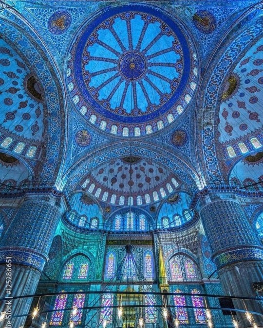
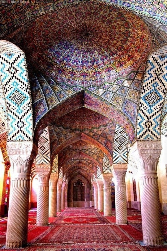
The Islamic world has one of the most beautiful and impressive interior design styles across the world. Colour and detail are absolute staples in the movement. Windows are usually not paned with glass but covered in ornate lattices known as jali. The jali give ventilation, light and privacy to the home. Islamic Interiors are ornate and colourful, using coloured ceramic tiles. The upper parts of walls and ceilings are usually flat decorated with arabesques (foliate ornamentation), while the lower wall areas were usually tiled. Features such as honeycombed ceilings, horseshoe arches, stalactite-fringed arches and stalactite vaults (Muqarnas) are prevalent among many famous Islamic buildings such as the Alhambra and the Blue Mosque.
Byzantine (330/395–1453 A. D)
The Byzantine Empire or Eastern Roman Empire was where eat met west, leading to a melting pot of different interior designs based on early Christian styles and Persian influences. Mosaics are probably what you think of when you think of the Byzantine Empire. Ivory was also a popular feature in the Interiors, with carved ivory or the use of it in inlay. The use of gold as a decorative feature usually by way of repoussé (decorating metals by hammering in the design from the backside of the metal). Fabrics from Persia, heavily embroidered and intricately woven along with silks from afar a field as China, would also be used to upholster furniture or be used as wall hangings. The Byzantines favoured natural light, usually from the use of copolas.
Indian Interiors
India is of course, the font of all intricate designs. India's history is sectioned into many eras but we will focus on a few to give you an idea of prevalent techniques and tastes.
The Gupta Empire (320 – 650 CE): The Gupta era was a time of stone carving. As impressive as the outside of these buildings are, the Interiors are just as amazing. Gupta era buildings featured many details such as ogee (circular or horseshoe arch), gavaksha/chandrashala (the motif centred these arches), ashlar masonry (built of squared stone blocks) with ceilings of plain, flat slabs of stone.
Delhi Sultanate (1206–1526): Another period of beautifully carved stone. The Delhi sultanate had influence from the Islamic world, with heavy uses of mosaics, brackets, intricate mouldings, columns and and hypostyle halls.
Mughal Empire (1526–1857): Stonework was also important on the Mughal Empire. Intricately carved stonework was seen in the pillars, low relief panels depicting nature images and jalis (marble screens). Stonework was also decorated in a stye known as pietra dura/parchin kari with inscriptions and geometric designs using colored stones to create images. Tilework was also popular during this period. Moasic tiles were cut and fitted together to create larger patters while cuerda seca tiles were coloured tiles outlined with black.
Chinese Interiors
Common features of Chinese Interiors
Use of Colours: Colour in Chinese Interior is usually vibrant and bold. Red and Black are are traditional colours, meant to bring luck, happiness, power, knowledge and stability to the household.
Latticework: Lattices are a staple in Chinese interiors most often seen on shutters, screens, doors of cabinets snf even traditional beds.
Lacquer: Multiple coats of lacquer are applied to furniture or cabinets (now walls) and then carved. The skill is called Diaoqi (雕漆).
Decorative Screens: Screens are used to partition off part of a room. They are usually of carved wood, pained with very intricate murals.
Shrines: Spaces were reserved on the home to honour ancestors, usually consisting of an altar where offerings could be made.
Of course, Chinese Interiors are not all the same through the different eras. While some details and techniques were interchangeable through different dynasties, usually a dynasty had a notable style or deviation. These aren't all the dynasties of course but a few interesting examples.
Song Dynasty (960–1279): The Song Dynasty is known for its stonework. Sculpture was an important part of Song Dynasty interior. It was in this period than brick and stone work became the most used material. The Song Dynasty was also known for its very intricate attention to detail, paintings, and used tiles.
Ming Dynasty(1368–1644): Ceilings were adorned with cloisons usually featuring yellow reed work. The floors would be of flagstones usually of deep tones, mostly black. The Ming Dynasty favoured richly coloured silk hangings, tapestries and furnishings. Furniture was usually carved of darker woods, arrayed in a certain way to bring peace to the dwelling.
Han Dynasty (206 BC-220 AD): Interior walls were plastered and painted to show important figures and scenes. Lacquer, though it was discovered earlier, came into greater prominence with better skill in this era.
Tang Dynasty (618–907) : The colour palette is restrained, reserved. But the Tang dynasty is not without it's beauty. Earthenware reached it's peak in this era, many homes would display fine examples as well. The Tang dynasty is famous for its upturned eaves, the ceilings supported by timber columns mounted with metal or stone bases. Glazed tiles were popular in this era, either a fixed to the roof or decorating a screen wall.
Romanesque (6th -11th century/12th)
Romanesque Architecture is a span between the end of Roman Empire to the Gothic style. Taking inspiration from the Roman and Byzantine Empires, the Romanesque period incorporates many of the styles. The most common details are carved floral and foliage symbols with the stonework of the Romanesque buildings. Cable mouldings or twisted rope-like carvings would have framed doorways. As per the name, Romansque Interiors relied heavily on its love and admiration for Rome. The Romanesque style uses geometric shapes as statements using curves, circles snf arches. The colours would be clean and warm, focusing on minimal ornamentation.
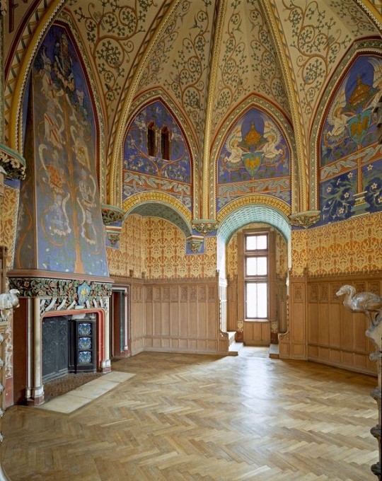
Gothic Architecture (12th Century - 16th Century)
The Gothic style is what you think of when you think of old European cathedrals and probably one of the beautiful of the styles on this list and one of most recognisable. The Gothic style is a dramatic, opposing sight and one of the easiest to describe. Decoration in this era became more ornate, stonework began to sport carving and modelling in a way it did not before. The ceilings moved away from barreled vaults to quadripartite and sexpartite vaulting. Columns slimmed as other supportive structures were invented. Intricate stained glass windows began their popularity here. In Gothic structures, everything is very symmetrical and even.
Mediaeval (500 AD to 1500)
Interiors of mediaeval homes are not quite as drab as Hollywood likes to make out. Building materials may be hidden by plaster in rich homes, sometimes even painted. Floors were either dirt strewn with rushes or flagstones in larger homes. Stonework was popular, especially around fireplaces. Grand homes would be decorated with intricate woodwork, carved heraldic beasts and wall hangings of fine fabrics.
Renaissance (late 1300s-1600s)
The Renaissance was a period of great artistry and splendor. The revival of old styles injected symmetry and colour into the homes. Frescoes were back. Painted mouldings adorned the ceilings and walls. Furniture became more ornate, fixed with luxurious upholstery and fine carvings. Caryatids (pillars in the shape of women), grotesques, Roman and Greek images were used to spruce up the place. Floors began to become more intricate, with coloured stone and marble. Modelled stucco, sgraffiti arabesques (made by cutting lines through a layer of plaster or stucco to reveal an underlayer), and fine wall painting were used in brilliant combinations in the early part of the 16th century.
Tudor Interior (1485-1603)
The Tudor period is a starkly unique style within England and very recognisable. Windows were fixed with lattice work, usually casement. Stained glass was also in in this period, usually depicting figures and heraldic beasts. Rooms would be panelled with wood or plastered. Walls would be adorned with tapestries or embroidered hangings. Windows and furniture would be furnished with fine fabrics such as brocade. Floors would typically be of wood, sometimes strewn with rush matting mixed with fresh herbs and flowers to freshen the room.
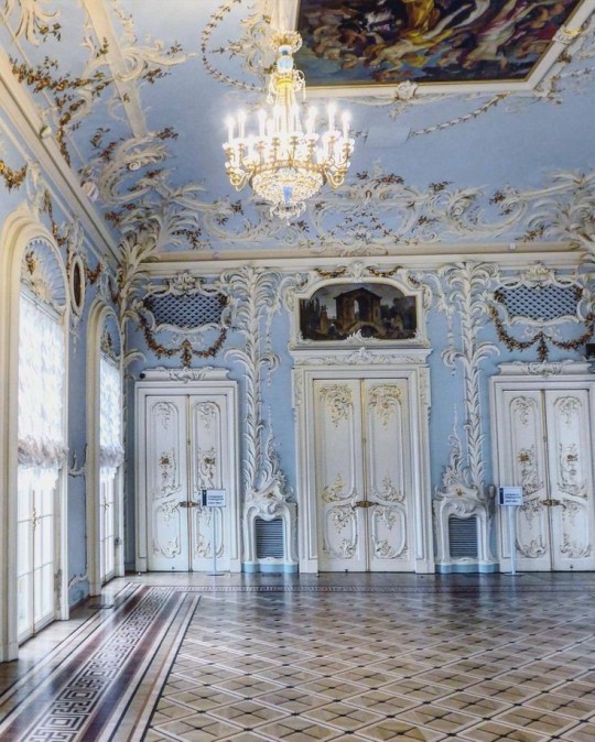
Baroque (1600 to 1750)
The Baroque period was a time for splendor and for splashing the cash. The interior of a baroque room was usually intricate, usually of a light palette, featuring a very high ceiling heavy with detail. Furniture would choke the room, ornately carved and stitched with very high quality fabrics. The rooms would be full of art not limited to just paintings but also sculptures of marble or bronze, large intricate mirrors, moldings along the walls which may be heavily gilded, chandeliers and detailed paneling.
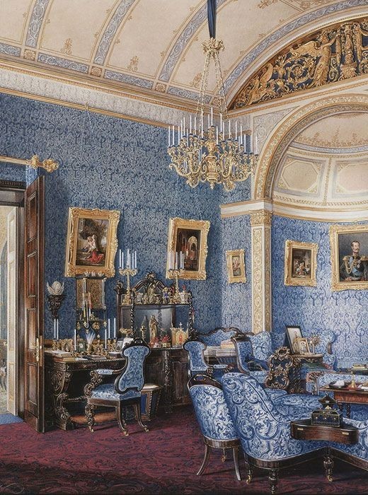
Victorian (1837-1901)
We think of the interiors of Victorian homes as dowdy and dark but that isn't true. The Victorians favoured tapestries, intricate rugs, decorated wallpaper, exquisitely furniture, and surprisingly, bright colour. Dyes were more widely available to people of all stations and the Victorians did not want for colour. Patterns and details were usually nature inspired, usually floral or vines. Walls could also be painted to mimic a building material such as wood or marble and most likely painted in rich tones. The Victorians were suckers for furniture, preferring them grandly carved with fine fabric usually embroidered or buttoned. And they did not believe in minimalism. If you could fit another piece of furniture in a room, it was going in there. Floors were almost eclusively wood laid with the previously mentioned rugs. But the Victorians did enjoy tiled floors but restricted them to entrances. The Victorians were quite in touch with their green thumbs so expect a lot of flowers and greenery inside. with various elaborately decorated patterned rugs. And remember, the Victorians loved to display as much wealth as they could. Every shelf, cabinet, case and ledge would be chocked full of ornaments and antiques.
Edwardian/The Gilded Age/Belle Epoque (1880s-1914)
This period (I've lumped them together for simplicity) began to move away from the deep tones and ornate patterns of the Victorian period. Colour became more neutral. Nature still had a place in design. Stained glass began to become popular, especially on lampshades and light fixtures. Embossing started to gain popularity and tile work began to expand from the entrance halls to other parts of the house. Furniture began to move away from dark wood, some families favouring breathable woods like wicker. The rooms would be less cluttered.
Art Deco (1920s-1930s)
The 1920s was a time of buzz and change. Gone were the refined tastes of the pre-war era and now the wow factor was in. Walls were smoother, buildings were sharper and more jagged, doorways and windows were decorated with reeding and fluting. Pastels were in, as was the heavy use of black and white, along with gold. Mirrors and glass were in, injecting light into rooms. Gold, silver, steel and chrome were used in furnishings and decor. Geometric shapes were a favourite design choice. Again, high quality and bold fabrics were used such as animal skins or colourful velvet. It was all a rejection of the Art Noveau movement, away from nature focusing on the man made.
Modernism (1930 - 1965)
Modernism came after the Art Deco movement. Fuss and feathers were out the door and now, practicality was in. Materials used are shown as they are, wood is not painted, metal is not coated. Bright colours were acceptable but neutral palettes were favoured. Interiors were open and favoured large windows. Furniture was practical, for use rather than the ornamentation, featuring plain details of any and geometric shapes. Away from Art Deco, everything is straight, linear and streamlined.
#This took forever#I'm very tired#But enjoy#I covered as much as I could find#Fantasy Guide to interiors#interior design#Architecture#writings#writing resources#Writing reference#Writing advice#Writer's research#writing research#Writer's rescources#Writing help#Mediaeval#Renaissance#Chinese Interiors#Japanese Interiors#Indian interiors#writing#writeblr#writing reference#writing advice#writer#spilled words#writers
3K notes
·
View notes
Text
Yoyogi Park, 2004
#i love the variety of pinks#i don't know much about baby's scallop hem jsk#but these look like two different releases of it#i like how theyre almost matching#obsessed with their blouses too#if i could find a blouse that actually covered my wrists.... id be complete#egl#old school lolita#lolita fashion#baby the stars shine bright
231 notes
·
View notes
Text
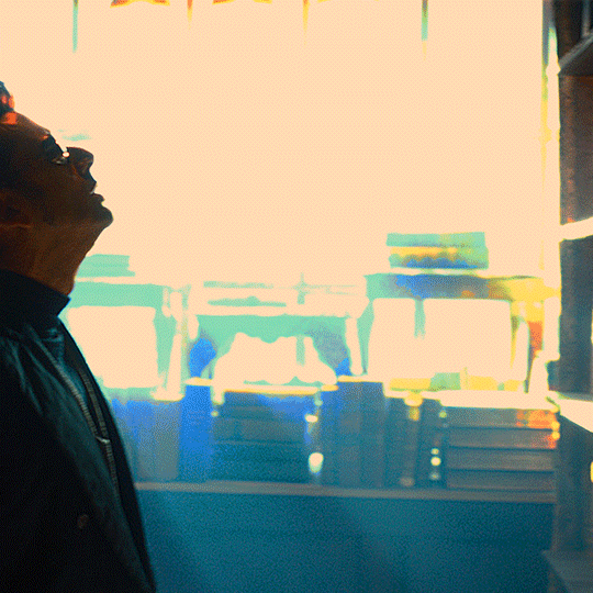
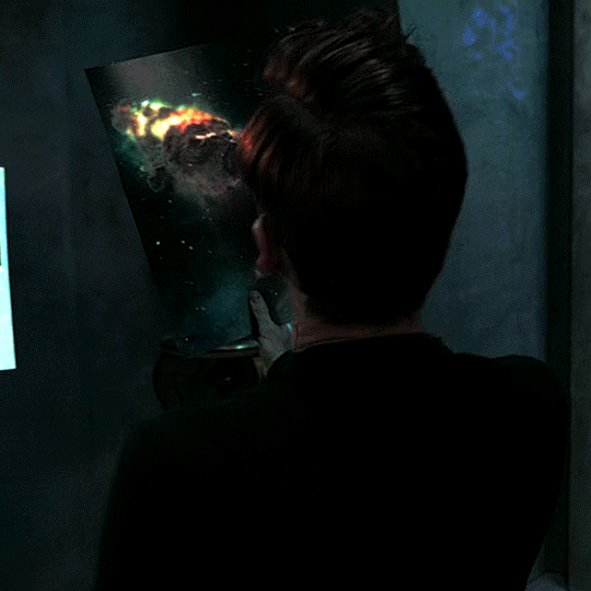

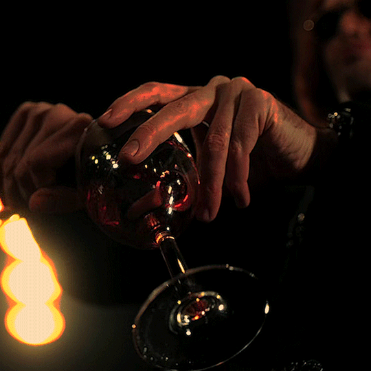
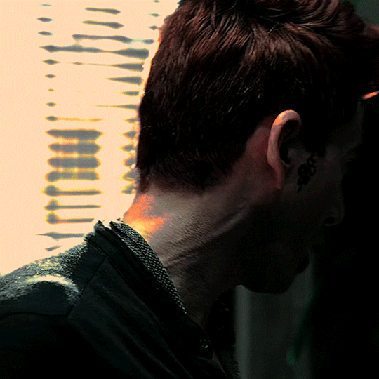

#good omens#goodomensedit#crowley#(and technically aziraphale too bc of the last scene hah)#david tennant#davidtennantedit#myedits#this started out as a lyric edit but i liked the coloring in that first gif so much i didnt wanna cover it with text#so then i tried finding scenes that could fit it aesthetically and made this set#(attempt 2 sorry if you saw the first version asjdklsjf)
121 notes
·
View notes
Text
one thing that stands out to me about the IVF arc is the way that, for as much as i make fun of her for asking her coworker if she can have his babies, scully asking mulder to be involved in the biggest process of her life (and the most important thing in the rest of her life) is such a healing and reverent experience. like he says “i’m absolutely flattered,” but it’s so much more than that. it’s like…spending your whole life feeling like you should’ve died at age twelve and then being told someone just wants more of you, more and more and more, in everything.
#it reminds me of 'sixth extinction' / 'amor fati'#when he quite literally was tied down and couldn't speak#and the way we hear him try to SCREAM when his mother just leaves him there#but his mind is Silent from the moment he hears scully in the hall begging to see him#and he couldn't crack a joke or run out the door#he literally just had to lie there and feel it#feel it on his Skin#her hand holding onto him#her tears falling onto his face#listening to the overwhelming depth of her fear that she is failing him and her devotion and her dedication to finding a way to help him#her Pleas for him to just 'hold on'#'i think that...if you know...if you could just find a way to hold on...i need you to hold on...please...'#everybody go listen to the civil wars' cover of 'talking in your sleep'#i don't think it can be overestimated how much of an impact that had on them and the lightness and healing in s7. that he Had to hear it#and then with the baby thing it's like...he CAN'T deny her that. he HAS to say 'yes'#there's no part of him that's capable of denying her something that she desires this badly. enough to ask for outright#and so he HAS to let himself be wanted and be invited into this unimaginably important and personal thing#let himself be a part of something bigger. be SEEN as someone who is valuable in a way that's bigger#and again he can't run from it and he can't deflect it and he can't hide from it. he has to just accept it#txf.txt#per manum
320 notes
·
View notes
Text
That conversation between PatPran about their parents' reactions to the play and everything makes so much more sense to me. Ming isn't on social media and he doesn't really care about Pat's extracurriculars outside of rugby. He's not going to care what event Pat puts on or is involved in - he likely also doesn't have much room to say anything anymore. So Pat can give up his play for Pran, he can sacrifice that without it being an issue.
But Dissaya likes all of Pran's photos, is still a big part of Pran's life. She's okay with them acting together because it's just a play, it means nothing. She cares about all of Pran's achievements. She would care that he suddenly isn't putting up a play as his department event when he does so every year. She would care even more if engineering put on that play instead.
No wonder Pran is so anxious, no wonder he's on a mission for this permission. And if it fails once he's tried everything, he has an answer for Dissaya. Until then, he's an impenetrable (i'm trying very hard not to make the joke i want to make) ball of stress.
But you get Phupha intervening and giving them the signature with the condition that only PatPran can play the leads and Pran has a convenient reason. How he sells it, I'm not sure. Maybe just a simple "they're making us work together". Who they is, Dissaya doesn't need to know. But a lie with a hint of truth is always easier - especially when you're lying about so much already.
Pran is aware of how much Pat is sacrificing because that includes his relationship with his dad. Pran is aware that he still has a relationship with his mom. Pat is aware that him and his dad's relationship will never be the same whether he gets to be with Pran or not. Pat is aware that Pran is risking a lot in his relationship with his mom. They're both still scared.
And then you add in Pran-as-Phupha telling Pat-as-Tian "no one should use their whole life to repay anyone" and you have Pa tear up at that? Good god, the sheer amount of guilt these two families carry with them, that all three of these children are trying to work through.


This isn't Pat getting really into character and Pa getting really invested in the play they're putting on. This is their lives, each and every day. Everything around that is them trying their best to live for themselves, to not let that guilt take over their lives. Because that brings them right back here

Once again, I'm very happy that this is a little stopping point before ep 12. That we get to see them be happier. That as they get older and older, they get more and more freedom, they get to expand their world just the slightest bit more. They need it. And this is the reminder of how hard they worked for that happiness we see.
and also, this just made it clearer to me how much pran needed to go to singapore. just to get away from Dissaya. just to get to the point where he tells dissaya the big moments of his life when he comes back, when she's not tuned into everything. when she can hear pat sneak into pran's room the moment he's back and know that not only is she okay with it but after everything, there's nothing she could do even if she wasn't. they all need time but these kids also need space
#i need to find my pat oh moment post again#i was very very right and i'm just going to take a moment to acknowledge that#because every new bit of information we get fits into it#and it shaped so much of the way i look at pat#but all three of them need hugs#all the hugs#ink has pa covered already#and pran and pat could hug each other#but isn't it nicer if tian and phupha get step in too :)#bad buddy#bad buddy brain rot#bad buddy series#our skyy 2#our skyy bad buddy
295 notes
·
View notes
Text
me: *has a bad week*
oscar: say no more, i know how to fix it
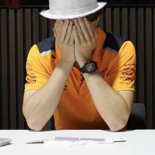


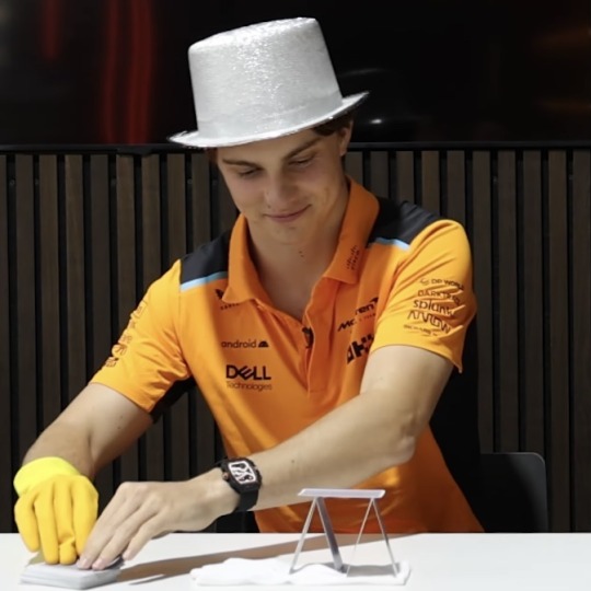

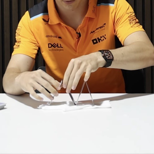
#i would crush them both in a card house contest lmao how are they do bad??#so**#there’s something so sexy about men covering their their faces with their hands. so big and so…… what else could he do with those?...anyways#i find it so interesting how i still to this day look at his neck and get surprised by how good it looks#like seeing it for the first time all over again#he’s so prettyyyy it hurts me so bad#and at the same time heals me#when i look at him i feel like i’ve never been sad in life#except when he’s sad#his smile :(((#the way he looks at lando……. is anyone surprised?#@ lola !! the gif on the right !!!#looks SO much like my friend that i told you about#she does those exact expression whenever she does something she’s proud of like that lol#anywayssss i love oscar#and lando for that matter#f1#formula 1#formula one#oscar piastri#mclaren racing#osc hands osc neck osc arms
129 notes
·
View notes
Text

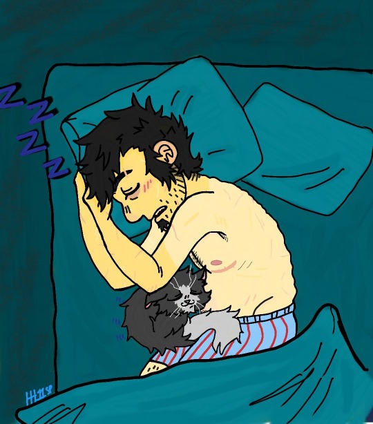
eepy
With and without a filter lol
#ok here it is lol#dan vs#this is the new thing i been on for a few weeks lol#anyway i just liked my sketch so much that i had to color it and make it pretty#sleepy dan and mr mumbles#mr mumbles is just like purrin like an engine rn#also slight headcanons i guess#dan just gives off such strong transmasc vibes that i have to remind myself that its not canon lol#and even tho hes not drawn with scars i just know he'd be covered in them he gets hurt like so much yk#i actually forgot to give him a lip scar which i like to do with characters sometimes#anyway#i was gonna put a kinda blueish filter to make it look more like night but i didn't find one i liked so went with the dark edge one#me#my posts#my arts#dan mandel#dan vs mr mumbles#dan vs revival#i dont remember what else i was gonna say#i mean i could tag something else but#no i shan't#lol
58 notes
·
View notes
Text
i don't wanna take over the world, it sounds like a lot. but you know, laying siege to a golf course sounds really nice sometimes
#just me hi#i'm giggling thinking about it hfbvhs#you can use the sandbanks for cover and if you plan far enough ahead you can start farming around those little ponds#and you can steal golf balls :D and use them as currency ?? or just collect them :3#and you could use the tennis ball guns to shoot the balls at people of course!! and you're supplied with sticks when you get there !! free#weaponry !! :D#and if you can hold out for long enough you could start planting rose and blackberry bushes in places they wouldn't look#why? bc roses Always Come Back#and blackberries will take a minute but who can get mad at a blackberry bush !! nature's surprise :D#oh and of course you could have a noble steed too (golf cart) !! :DD#and you could make the building a castle#and make a little gnome town in the fields once the battle is over#OH you could build a miniature golf in and around the town too :D for the funsies#/places are very cool i like places#could some be used better? oh yea for sure#i have dreams for abandoned malls hfvbs - some of my favorite places ever#that's one big odd thing i want. to have a mall to live in hfhs :3#is it a lot of space ? ye. but it's also SOO much space.. the possibilities !!#//anyway i Need to go for a walk in a city sometime soon lol#i miss the riverwalk aaa#GASP campus martius during the winter. my dearest#i didn't realize the threshold for being a city was so low lmao ?? like man these are just big towns what is this hfvbsh#//but aside from the city pining MAN#i got to drive earlier today ('got to' they put me in the seat and it wasn't very fun hfvbshf) and oooohhh#you know that feeling on a roadtrip when it's all worth it for just a little while.maybe when you broke over the top of a hill or looked up#from whatever you were doing to find a storm ahead and the rear lights of the cars seemed to blink in agreement with how gorgeous it all is#just that hfbsh :3#i like places a lot. sobs [<- crying candy hearts]#//okey i'm goin to go do my somethings now hfvhs :3 :D#music and caffeine are SO good ehehhehghhg [slinkies away so fast]
12 notes
·
View notes
Text
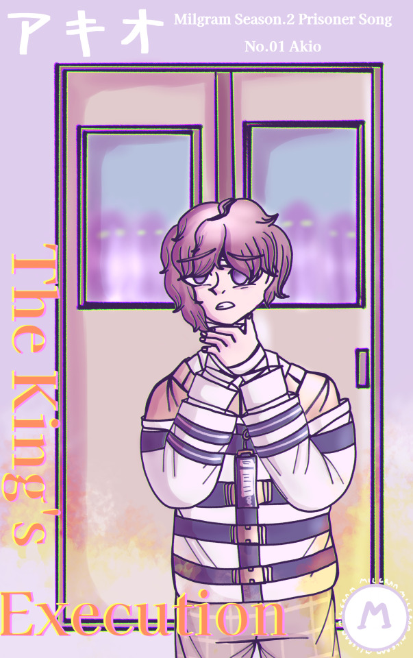
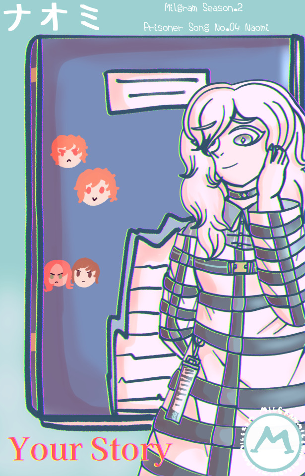
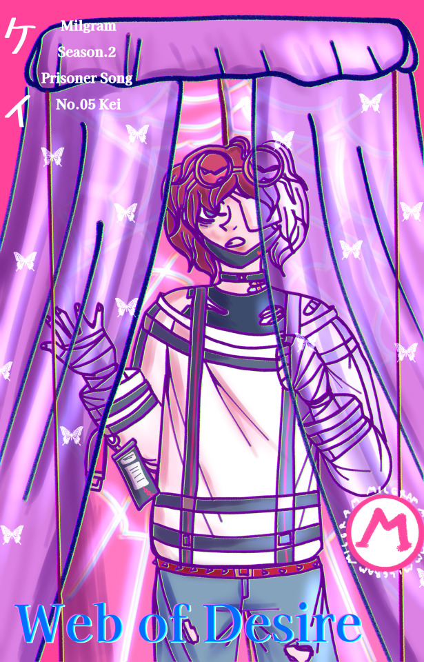
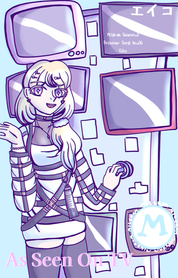
everyone's album covers, song previews and album trailer voicelines!


YESSSSSSSSSSSS I'M FINALLY DONE WITH ALL OF THEM *falls on the floor*
okay okay i'm actually kinda proud of myself?? :'D like i always prefer just. drawing characters even though i don't really avoid drawing backgrounds and i don't find drawing them that difficult but i rarely pay attention to things like. doors so yeah it's kinda cool that i've managed to come up with ten different door designs and draw them! even though most of them don't even look like doors. it's okay listen i just wanted to make them as weird as their mvs okay
(also about some prisoners having the symbols on their uhhh restraints and most of them not having them. well you see i just didn't have any energy left to draw them so i was like "it's fine i'll just draw the actual symbols later" and guess what. i didn't :) and i'm too tired to draw all of them so y-yeah. honestly maybe i'll change the symbols to something else like it takes way too much time to draw them and they're not even that close to the canon ones)
okay sorry for rambling, you can read everyone's song previews, titles (though you can see them on the covers, but still. or maybe you can't see them i'm sorry if the text is hard to read 😭) and album trailer voicelines under the cut! and also more of my rambling
Album trailer voicelines:
Akio: "DON'T COME ANY CLOSER!"
Aimi: "Don't you think that's kind of.. unprofessional?"
Shun: "I-Isn't it a good thing that I'm getting better?"
Naomi: "But in the end, I've simply decided to agree with you."
Kei: "It's time for your punishment, Eiji~"
Eiko: "It's like.. your life finally has a purpose."
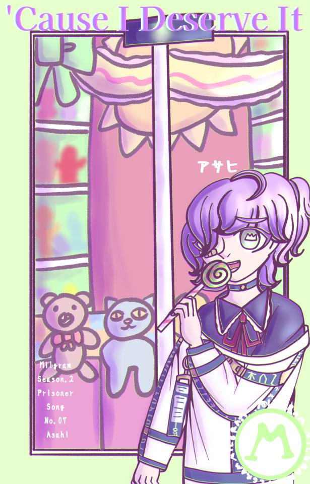
Asahi: "I wanna go home, even if I don't have one anymore."
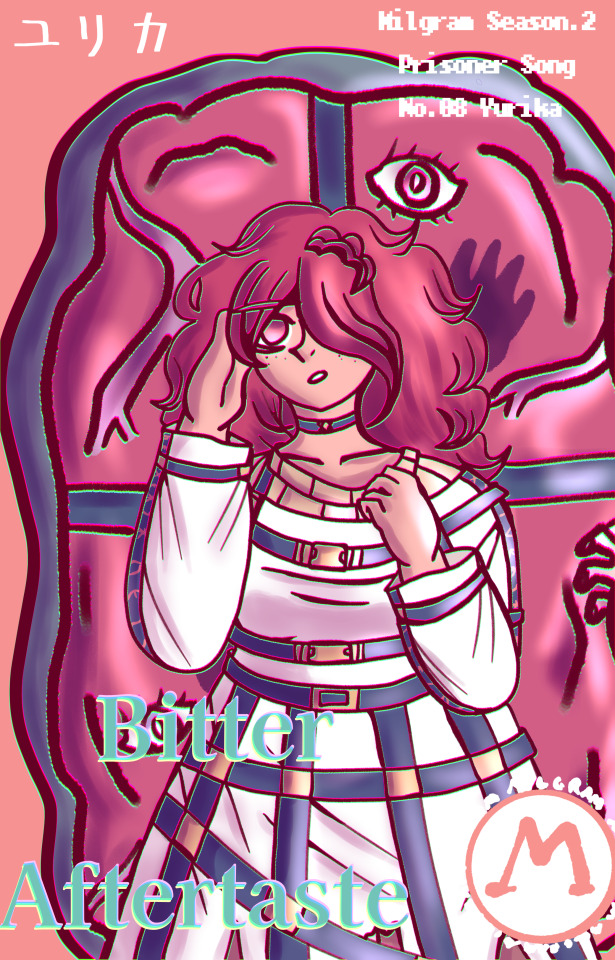
Yurika: "THIS DOESN'T MAKE ANY FUCKING SENSE!"
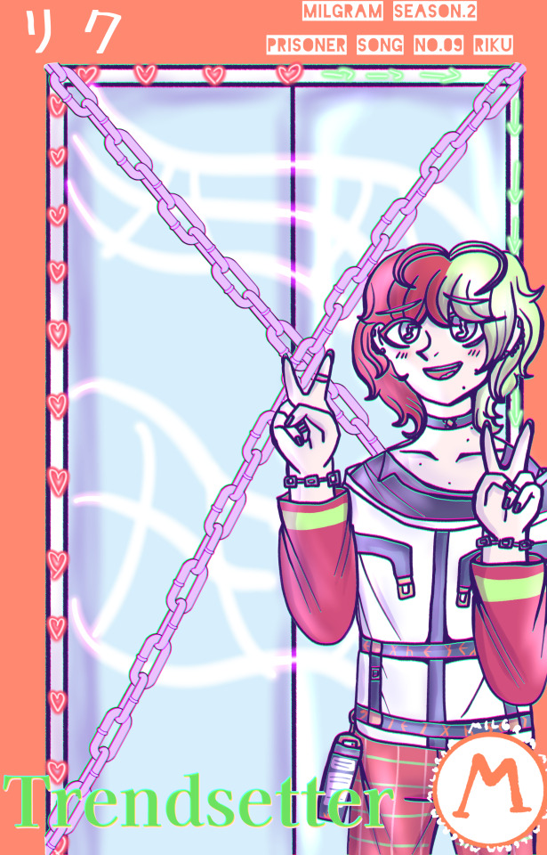
Riku: "Haha, trust me, I'm strong enough to do that."
Reina: "So, yeah, the show's over."
Song titles:
Akio: The King's Execution
Aimi: Mask of Kindness
Shun: Wrong Route
Naomi: Your Story
Kei: Web of Desire
Eiko: As Seen On TV
Asahi: 'Cause I Deserve It
Yurika: Bitter Aftertaste
Riku: Trendsetter
Reina: Death of the Author
Song previews:
Akio: "Come on, fight me, punch me, beat me to death,
Show me how you've really felt about me all this time
There's no one left to support me, no one left to call me "Your Majesty"
I guess it's time for me to admit my defeat"
Aimi:
"Let's have as much fun as we can today, like this is the last day of our lives
I won't ask you to be careful, I know you won't listen to me anyway
Let's make these moments more colorful than ever before
Let's turn today into our best masterpiece"
Shun:
"I know that this is the best option, I don't even need a guide
"Real life"? What's that? Some kind of joke?
I know you will love me in every world and universe
Tell me I'm your everything, let me get the best ending"
Naomi:
"I can't believe I found out about this only now
Why didn't you tell me sooner? Why didn't anyone else tell me about this?
Your life was so short, but so full of pain
Does this mean that I've saved you from all that suffering?"
Kei:
"Congrats, you've fallen right into my trap
Make yourself comfortable, you're in for a long ride
Tying you up, choking and biting
Keep your eyes on me, take those rose-colored glasses off"
Eiko:
"Yay, she did it, good for her! What an icon, am I right?
Haha, thank you, thank you! Serves him right, I know
You've forgiven me, darling, so let me thank you properly
Tell me what you want, I will give you everything and more"
Asahi:
"Give me more, you know that it'll never be enough for me
You want me to repay you? That's funny
Why should you give me so much and get nothing in return?
It's obvious, 'cause I deserve it"
Yurika:
"Please, please, make my world sweet again
This world is so cold, so bitter, if I take a bite, I'll get poisoned for sure
Hey, hey, what are you saying? You want more sugar as well?
Sure, anything for my master! But you're not her, so get out."
Riku:
"Now, listen, I don't like to do this
I'm not the type to abuse my power
But looks like it's time for you to get what you deserve
So get him, everyone, I'll pat you on the head later"
Reina:
"What about my crime? What about my sins?
Well, why don't you figure it out yourself?
I'll let you decide, I'll let you write my story
Aren't you the one who's supposed to judge us anyway?"
Random facts about everyone's song titles, lyrics and doors (spoiler-free. mostly):
The silhouettes from Akio's T1 MV are back!
If you've read Aimi's T1 MV description, you probably already went "Wait, is her song title a reference to that mask from her video?" and you are correct!
Shun's song title is kinda supposed to be a pun? Basically it's a reference to dating sims, character routes and all that stuff, but it's also supposed to mean taking a wrong path in life or something like that.
Naomi's song title was the hardest one to come up with and it turned out to be the most boring one. I am so sorry.
I actually wouldn't say that Asahi's door shows his MV that well, since his video will actually have mostly white and green colors, but I thought that a door like that would look boring, so yeah, I made it more colorful!
"Why is Yurika's door like that?" Oh, don't worry, compared to Asahi's door, Yurika's door shows her MV perfectly fine <3
Riku's door. Riku's door made me go through so much pain, IT WAS THE LAST DOOR I CAME UP WITH. I LITERALLY HAD NO IDEA WHAT TO DRAW. Not even because I dislike his MV, it's just that his MV has this motif that's. Very hard to show as a door. Like all ideas I had just sounded stupid so I decided to go with something like this instead. Also I still hate drawing chains and I used a brush instead.
Yes, Naomi's door just. Looks like a diary. BUT I TRIED TO MAKE IT LOOK LIKE A DOOR OKAY I TRIED
Reina's door having a more "actor-like" motif probably doesn't make much sense because of the song title, but trust me, it does. And yes, her song title is based on the trope of the same name.
Aimi's song lyrics kinda sound like a sequel to her T1 song though i guess her t2 song can be called that here, but the rest of the lyrics sound more different. And yes, there will be more of their song lyrics in the MV descriptions this time >:)
Kei's song lyrics are actually supposed to be much more sad this time and even the chorus will sound differently in the end.
Reina, please, stop breaking the fourth wall, you're becoming way too powerful.
#also i apologize in case it's hard to tell which characters were voted guilty/innocent like#i tried to do the same thing canongram is doing with them standing in different ways#but i'm afraid their poses don't look that different djdksklsdl#i actually wanted to draw notes on riku's door too but then i remembered that i don't know anything about music#and i guess i could just find random notes online and use them but. t-too much work#i could use the notes as a reference to a song that tells something about riku's character or something but. oh well 😔#(i think i would end up going with something more funny instead)#ah and also yes their album covers show their second image colors too#milgram#milgram oc#milgram project#ocgram#👑prisoner 001: miyagawa akio👑#🌸prisoner 002: hanasaki aimi🌸#💔prisoner 003: ishizu shun 💔#🌿prisoner 004: chiba naomi🌿#🍓prisoner 005: sanada kei 🍓#💎prisoner 006: yoshioka eiko💎#🍬prisoner 007: yano asahi 🍬#🎀prisoner 008: maruyama yurika 🎀#🎸prisoner 009: kuroki riku 🎸#🎭prisoner 010: himura reina🎭
42 notes
·
View notes
Note
Do you have any romantic first headcanons or scenarios? He doesn’t get enough love and I adored who you wrote him in the ‘first isnt okay’ fic
Of course Anon! Romantic First headcanons coming right up!
Masterlist
Content under the cut!
Has walls like China
Meaning they’re large and imposing but easily maneuvered around if you figure out where to go
Also unfinished
He wants to think he’s good at keeping people out and not letting them in
But he’s Link- it’s like... his whole thing
That’s why he’s the hero as it is
He acts stand off-ish at first and tries to be mean and cold so that people don’t get to close
The farther away they stay, then he won’t fall for their smiling faces again and he won’t be betrayed again
So he requires a bit of persistence to befriend
Once befriended however, he’s a lot calmer, if still just as quiet
This is his danger zone
He falls hard and fast
And he knows it
But the more time you spend together the more he can see how you react
To people
To animals
To children
To elderly
Your morals and values and stances are all important to him
When you get hurt in the one in a million chance, First borderline looses his mind
You know that line “When people yell at me, I just hear people caring about me very loudly”?
Well I hope you have that attitude
Because this instance is what also slams First’s feelings right into his face
Then.. when he calms down and apologizes for his behavior
He explains why he acted that way
Gasp!~ Back story :D
Well no
But it’s enough to count
And long story short, it adds up to basically “I was terrified in the moment where I had to consider living in a world without you. That and I had failed to preserve something dear to me. In my frustration, fear and disappointment, I took it out on you. The very thing I wish to protect. My apologies. I failed you on multiple accounts.”
Take that as you will
He’s a lot less distant that way and he opens up a lot more
But it’s up to you if you want your relationship to grow more than what it is
He’s a very scared man to be honest
There’s a lot he knows that he has to live up to and he doesn’t know if he’s capable of doing so
That being said, he’s a huge tease when he gets to that point
Like- an actual jerk but lovingly
Does that make sense?
The kind where he wants to hold you, but you’re flustered so he opens his arms for you to leave if you really don’t want to be there, knowing that you’re going to stay right where you are
Because he sucks -.-
Why must he be so charming?
It’s so dumb
I love this man, help
#legend of zelda#first link#first link x reader#link x reader#covering my bases#This is the last of the First requests#our typical LU Chain programming will return#I feel like I could have gone on for longer with this guy#but alas he is not what people sign up for when they find my blog#so the first content has been completed until the next requests open#First Thirst ends here I'm afriad#but also#:D#I'm glad I got to explore his character so much#I adore that menace
197 notes
·
View notes
Text
you ever catch feelings for somebody but you've spent your entire life convinced/convincing yourself that you're fundamentally unattractive and broken in a way that makes you unlovable and unsuited to any sort of relationship, and so instead of just enjoying that extra dopamine burst of seeing them around you just make yourself feel miserable for even daring to feel that way in the first place? or is that just me?
#hhhh i hope this doesn't come across as some sort of “ohhhhh you have to come fix me and save me” bullshit cus that's not it. it's just#i'm sick of my brain acting like this and i wish i could process my emotions in a healthier way#one that doesn't feel like i'm just using them to mentally selfharm you know#or at the very least in a way where i don't immediately think i'm being some sort of creep for daring to find somebody attractive#i just. don't have the self-esteem for it and my brain immediately sabotages even just idle fantasy scenarios#some sort of long-term relationship? god i'm so distant and easily distracted i'd just hurt them by inadvertently ignoring them#something short-term and low-key? well i'll still forget to check in or i'll fuck up some other way and feelings will get hurt#just fuckin? god i hate my body so much i. cannot convince myself that i'm desirable in any way#even if i literally know people who would tell me otherwise and mean it. it's just so deep-seated i think#i think i just have a lot of problems to work on. and i don't really know how to go through that process yet#anyway. this isn't like helpful processing of emotions or anything it's just venting lol#this doesn't even cover the “am i aroace or not” confusion spiral that i've got going on...#it was a therapy day so my brain is already primed to Dig In Deep to everything that hurts#:thumbsup:#vent#delete later
8 notes
·
View notes
Note
What was the first vocaloid song that got you into it?
Ah so its Mod Sachiko lore time!
I'm currently 23 right now, I got into VOCALOID when I was 11 (which was 2011). I don't remember what my very first VOCALOID song was because TL;DR back then western fandom was horrible at reprinting properly and giving credit, all I remember is that the image (which may or may not have been from the song or just stolen pixiv art) had a blue hue and it had 3 characters, I think Luka might have been one of them. I don't even remember what it sounds like, because when I was 11 I looked it up on YouTube because I thought it was honest to god anime not music, so I mostly just remember my shock that it was music and that it sounded different than anything I've ever heard before
The first song I remember listening to, which was probably my second vocaloid song ever but I'm not sure, was AVTechNO!'s Darkness Six ft Kagamine Len, which is posted on the blog here.
It's genuinely a good song so I would give it a listen if you haven't heard of it.
#anonymous#asks#honourable mention for ievan polkka and bad apple voca covers which i had an obsession with as an 11 year old#and would just have playlists of different vocaloids like every different vocaloid i could find singing them#as a kid I always like. Yes i liked miku i was a weeb but i also very much was interested in the technology#and would read the vocaloid wikis for hours as a kid#(note. i am neurodivergent and later on this became one of my longterm hyperfixations)#which is why I listened to LOLA originals even as an 11 year old#obligatory 'i liked english vocaloid before it was cool' comment /lh but also like yea a lot of kids back then HATED english vocaloid#or refused to listen to it bc 'japanese is better XD'#but I always loved all language vocaloid
35 notes
·
View notes
Text
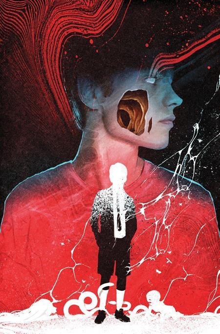
still writing my fic, and it’s going well. i want you to know that it is Dead Boy Detectives AU (or was at least inspired by that story from the sandman) and this piece of artwork essentially sums it all up
#this is an alternate cover for one of the dbd comics i believe btw#ill try to find the artist#but seriously#the gaping hole on the right side of his face and the glossed over eyes#you would think i based nigel’s description off of this artwork but oddly enough i found it after i established how i wanted him to look#of course the the bullet wound would be much higher on his cheek#probably directly below the eye due to his face being pressed directly up against the barrel#but i thought i would share anyway#also i don’t have good docs or word on my macbook#*google docs (too lazy to rewrite that tag)#so if anyone could recommend any free alternative that’d be wonderful!#first draft is in my notes app as of rn 😭#like minds#nigel colbie#alex forbes#murderous intent
22 notes
·
View notes
Text
Definitive compilation of the Spanish Watership Down Book covers.
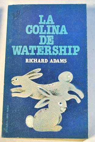


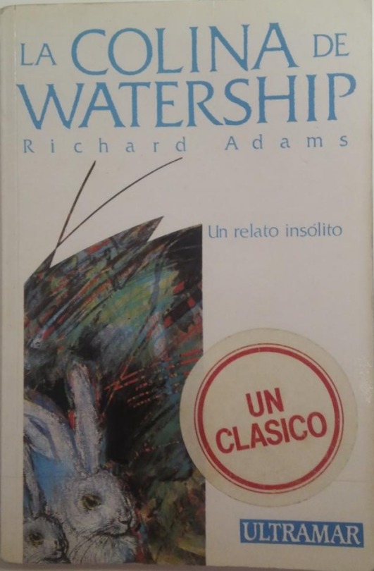


#Sorry if someones have a shitty quality i can't find better photos (That says a lot about how much unknown is this novel here)#watership down#animal#books#book cover#book#cover#la colina de watership#spanish translation#also realiced that the editions have different translation and these kind of things.#but i cannot search more about it because only one translation was scanned and uploaded#if i have the enough money i'm will buy all the editions i could found#its a promise to myself (?
151 notes
·
View notes
Text
i think murder kylar is so cute. especially with a manipulative pc....
all you have to do is lie a lil bit about someone grabbing your ass and kylar's raring to go!!
#hatkuuasks#kuuskylarposting#like. you could lie about soooo much stuff and he'd believe you whole heartedly ...#< then when he finds out you've been lying its either 'teehee!! ur so silly pc!!! now u owe me 6 months straight of raw sex. no bc.'#OR ur sent to the basement because he was so worried!!! and you LIED!!! why would u do that :(#so much fic potential.......... nhdhhdh blood covered kylar being mad at you n fucning you rough and fast.....#< i wamt himm soooo bad.
17 notes
·
View notes
Photo
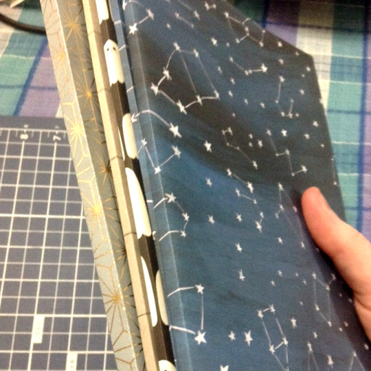
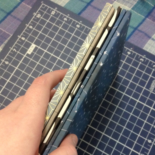
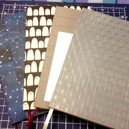
My printer hates me :) (with many thanks and credit to @niennanir as before)
Gosh aren’t they gorgeous tho ♥ Especially the latest and largest, though I have to give all the credit to the paper on that one haha, it’s stunning IRL, I could almost stare at the gold lattice forever rather than read, but I’m so happy with how it turned out between the pages as well!
Quick showcase of the new additions! :D
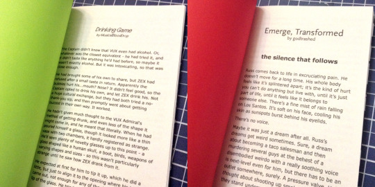
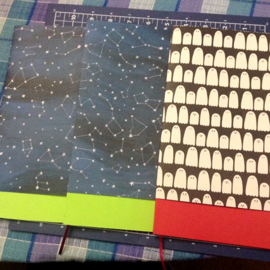
My Drinking Game as another test run, I got the spacing how I wanted it! Yay! It’s so much handsomer and less cramped! Also I gotta say, if it wasn’t such a large usage of paper, this would be my ideal way of checking for typos - I found a couple after setting it down to ink lol, they’ve been fixed now at least ♪
Paired here with the emerge, transformed three-parter, one of my all-time-favourites <3 I reread it the night I finished it and cried again, a little bit of tender mercy always wrecks me hhhh ♥ There are so many beautiful evocative lines! I’m so happy to hold it ♪ And as you can see above, that was the one that got the cute little ghost dust jacket :D
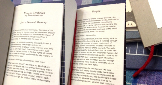
Another test run of what I’m calling volume 1 of my Vargas Drabbles lol, so not including Have you lost your mind? since that one’s currently unfinished. I do fully intend to print it once it’s done tho :3c Hopefully that one will cause me fewer problems! I hate measuring, so I may have flubbed two covers before finally getting this one into good enough shape XP And my red yarn is still in storage so >.> Did I go purchase another ball of red yarn? I’ll never tell. You can’t tell me it doesn’t look great as a bookmark tho <3

And my current happiest! Ah!! It turned out fantastic on all counts! The cover paper obviously, as I couldn’t Not lead with that, but also the size of the spine and the way the pages settled against each other while glueing - I used a different type of paper for this one and I think I’m completely converted over, it feels amazing to work with. Whatever I was using before had to have been like 15lbs lol, I’m literally just using normal 20lb printer paper but it feels and looks and behaves so much nicer <3
The size of Helix also allowed for a slightly larger bookmark, which was perfect because we had this soft gold ribbon that was all of a couple millimeters wider than the other ribbons/yarn I’d been using, and it looks so so so pretty with the gold detailing!! I’ve put it between Ch. 1 and 2 and getting to see the actual physical size differences of the chapters is so fun ♥
#Hhhhhh crafting is so funnnnn <3 <3 <3#Fully intending to make more - I have the next set picked out and the accompanying dust jacket to go with it haha#I've decided to stick to dust jackets for the plain non-textured covers for the most part#It does hide my detailing on the covers but it also hides if I haven't done anything to the fronts as well! Haha ♪#I added a Captain/ZEX caption to Drinking Game like I did with ZEX/DAX but the latter is still the prettiest by far <3#Their names were made to go together you could say hehe ♪♫#You can kinda see I tried my hand at making a custom cover for the Vargas drabbles as well - it kiiiinda turned out? Lol#As stated I hate measuring and the lines turned out wonky :P But it's done and I've reread it for typos lol#I was worried I'd find rereading my own work cringy since most of those are older than either of my SCII fics but no it was nice actually :)#I did actually go supply shopping yet again for these since I'm having so much fun with it hehe <3 <3#The yarn and the cover paper I used for Helix were both good finds :) I got a whole booklet of space-themed cardstock! :D#That one was one of the lesser space ones hehe ♪ I had a couple other considerations - like a yellow-on-white constellation one ♫#But I think I'm the happiest with this one! It's beautiful and I feel like it reflects the Idle Rich themes a little bit hehe <3#Hhhhhhh it's so nice to read them like I would a book ♥ I enjoy reading them on my iPod but there's something about The Experience hehe#Being able to hold it and place a physical bookmark and not having the glare of a screen or if the scroll goes funny lol#Just exactly what it is! And I can pull any of them at any point!#I actually had a moment where I wanted to read one of them but didn't want to move from my spot to physically go get it#Only to realize later I was holding my iPod at the time and could've read it that way as it's still very much available online lol#SCII#LAC#Vargas
16 notes
·
View notes
Last Seen Blogs

h50europe
LGBTQ+ MonChevy, Merthur, McDanno, Tarlos, Buddie,

makedigital36
Untitled
transmhyra
trust me, I'm an engineer!
primrosenewleafcrossing-blog
Primrose Adventures
whippedformochi
7 Wonders Of The World