#css gradient border
Explore tagged Tumblr posts
Visit Tumblr Blog
Explore Tumblr blogs with no restrictions, modern design and the best experience.
Last Seen Tumblr Blogs


Fun Fact
In 2020, 27% of US Tumblr users had an annual household income of over $100,000.
Text

CSS Gradient Border
#css gradient border#html css animation#codingflicks#html css#learn to code#frontend#css#html#css3#frontenddevelopment#css animation examples
3 notes
·
View notes
Text
🎈 Bogwaters Demo update!! :D
Formatting update, 2 new NPCs, randomisation feature, and quality of life changes
(Previous post)
Bogwaters is a free, text-based, interactive fiction browser game about running an underground shipping Discord server in the 2021 MCYT fandom, hosted on itch.io.

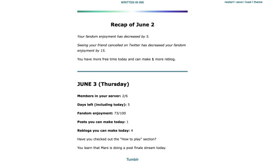
Formatting update:
Added more headers. Also added coloured dividers to section off text:
Home: teal
Tumblr: light blue
Discord: light purplish blue (Discord colour)
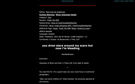
Ao3: dark red (Ao3 colour)
Messages: yellow
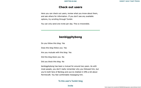
Check out users/invite: light green
Sleep/new day: gay man flag gradient
Trivia: colours for Tumblr, Messages, and Check out users are eyedropped from the old Tumblr UI
Feedback for these colours are welcome!
2 new NPCs:
Now you won't be locked out of winning the game if someone blocks you! The new NPCs are carbonara-art and hippie-benbog with their own storylines and unlock conditions.
New features:
Randomised mandatory daily fandom enjoyment decrease ranging from 3 to 7
Chances: -3 (10%), -4 (10%), -5 (60%), -6 (10%), -7 (10%)
When you sleep, there is a randomised potential +1 increase in reblog (20% chance) and post (10%) quota for the following day. Does not carry past that day.
In addition to blogs of the 2 new NPCs, blogs for doehills, ofthebigwaters, and riversymphony are added. These three are not interactable.
Quality of life changes:
Skippable prologue
Some scenes that don't have bearing on the gameplay are skippable (for this version, it's the conversation with kindredwaves on June 2)
An individual "check out a user" section now has a link to their respective Tumblr blog and vice versa
Misc:
Minor changes to dash content
Minor changes to text formatting
"Days played" shows up as a stat when you get an ending
"Days left (including today)" shows up in the home menu
Reduced animation
Reblogs and feedback are appreciated! Thanks for playing! <3
#interactive fiction#ink#inkle#bogwaters#trafficblr#treebark#life series#mcyt#mcytblr#hi yes. i added gacha#the gradient was gonna be rainbow but it looked soo goofy#this is like middle grade student's first html project#the thing is. ink itself is not very good with css since you can only put a class in one line. can't span multiple lines#so i haven't figured out how to make borders for sections but the dividers should help hopefully#my less ugly css baby...
67 notes
·
View notes
Text

Gradient Text Border Animation
#gradient text border animation#neon border animation#html css#codenewbies#frontenddevelopment#html5 css3#css animation examples#pure css animation#css animation tutorial#css#html css animation#pure css effects
5 notes
·
View notes
Text
Modern Scroll Shadows Using Scroll-Driven Animations
New Post has been published on https://thedigitalinsider.com/modern-scroll-shadows-using-scroll-driven-animations/
Modern Scroll Shadows Using Scroll-Driven Animations

Using scroll shadows, especially for mobile devices, is a subtle bit of UX that Chris has covered before (indeed, it’s one of his all-time favorite CSS tricks), by layering background gradients with different attachments, we can get shadows that are covered up when you’ve scrolled to the limits of the element.
Geoff covered a newer approach that uses the animation-timeline property. Using animation-timeline, we can tie CSS animation to the scroll position. His example uses pseudo-elements to render the scroll shadows, and animation-range to animate the opacity of the pseudo-elements based on scroll.
Here’s yet another way. Instead of using shadows, let’s use a CSS mask to fade out the edges of the scrollable element. This is a slightly different visual metaphor that works great for horizontally scrollable elements — places where your scrollable element doesn’t have a distinct border of its own. This approach still uses animation-timeline, but we’ll use custom properties instead of pseudo-elements. Since we’re fading, the effect also works regardless of whether we’re on a dark or light background.
First, we’ll define our scrollable element with a mask that fades out the start and end of the container. For this example, let’s consider the infamous table that can’t be responsive and has to be horizontally scrollable on mobile.
Let’s add the mask. We can use the shorthand and find the mask as a linear gradient that fades out on either end. A mask lets the table fade into the background instead of overlaying a shadow, but you could use the same technique for shadows.
.scrollable mask: linear-gradient(to right, #0000, #ffff 3rem calc(100% - 3rem), #0000);
Defining the custom properties and animation
Next, we need to define our custom properties and the animation. We’ll define two separate properties, --left-fade and --right-fade, using @property. Using @property is necessary here to specify the syntax of the properties so that browsers can animate the property’s values.
@property --left-fade syntax: "<length>"; inherits: false; initial-value: 0; @property --right-fade syntax: "<length>"; inherits: false; initial-value: 0; @keyframes scrollfade 0% --left-fade: 0; 10%, 100% --left-fade: 3rem; 0%, 90% --right-fade: 3rem; 100% --right-fade: 0;
Instead of using multiple animations or animation-range, we can define a single animation where --left-fade animates from 0 to 3rem between 0-10%, and --right-fade animates from 3rem to 0 between 90-100%. Now we update our mask to use our custom properties and tie the scroll-timeline of our element to its own animation-timeline.
Putting it all together
Putting it all together, we have the effect we’re after:
We’re still waiting for some browsers (Safari) to support animation-timeline, but this gracefully degrades to simply not fading the element at all.
Wrapping up
I like this implementation because it combines two newer bits of CSS — animating custom properties and animation-timeline — to achieve a practical effect that’s more than just decoration. The technique can even be used with scroll-snap-based carousels or cards:
It works regardless of content or background and doesn’t require JavaScript. It exemplifies just how far CSS has come lately.
#ADD#animation#animations#approach#Articles#background#border#container#content#CSS#CSS Animation#css-tricks#custom properties#Dark#devices#digitalocean#gradients#how#indeed#it#JavaScript#Light#linear-gradient#mask#Mobile#mobile devices#One#responsive#safari#scroll
0 notes
Text
0 notes
Text
peachy keen ao3 site skin
If you'd like to add this site skin to your AO3 account, the code is under the cut.
Colours Used: pale peach: #ffeae4 darker peach: #f3c6ba yellow: #ffd7a8 orange: #ff9b75 reddish orange: #f44336 darkest orange: #8E0505
CSS:
#outer { background: linear-gradient(90deg, rgba(255,155,117,.9) 0%, rgba(255,215,168,1) 100%); }
#header .primary { background: #ff9b75; background-repeat: repeat; box-shadow: none; }
#search .button, #header .logo { display: none; }
#header .heading a, #greeting img.icon { visibility: hidden; }
#header #search .text { background: #ffeae4; border: none; box-shadow: none; width: 7em; }
#header h1.heading a::before { content: " 🍑🍑🍑"; visibility: visible; }
.splash .module h3 { border-bottom: none; color: #f44336; }
#header .menu, #small_login { background: #ffeae4; box-shadow: none; width: 20em; }
#greeting .user > li a { color: #8E0505; }
#header .menu li, .splash .news li { border-bottom: none; }
#header .actions a:hover, #header .dropdown:hover a.dropdown-toggle, #header .menu li a { background: none; color: #f44336 !important; }
#footer { background: #ff9b75; }
#main { color: #8E0505; }
#main a { color: #f44336; }
.splash .favorite li:nth-of-type(2n+1) a { background: #ffeae4; border: 1px solid #ffeae4; border-radius: 5px; }
.splash .favorite li:nth-of-type(2n+1) a:hover, .splash .favorite li:nth-of-type(2n+2) a:hover { background: #f44336; border: 1px solid #f44336; border-radius: 5px; color: #fff !important; }
.resp-sharing-button--twitter, a.resp-sharing-button__link { color: #fff !important; }
.listbox, fieldset, fieldset dl dl, fieldset fieldset fieldset, fieldset fieldset dl dl, dd.hideme, form blockquote.userstuff, .dynamic form { background: url("https://image.freepik.com/free-vector/vector-seamless-pattern-with-peaches_1015-1760.jpg"); background-repeat: repeat; border: 4px solid #fff; box-shadow: none; }
form dl { background: #ffeae4; border: 2px solid #fff; box-shadow: none; }
input, textarea { border: 1px solid #f44336; box-shadow: none; }
input:focus, select:focus, textarea:focus { background: #ffeae4; }
form dt { border-bottom: 1px solid #fff; }
form dd.required { color: #8E0505; }
.LV_invalid { background: #ffd7a8; border: 1px solid #fff; color: #f44336; box-shadow: none; }
.LV_invalid_field, input.LV_invalid_field:hover, input.LV_invalid_field:active, textarea.LV_invalid_field:hover, textarea.LV_invalid_field:active { border: 1px solid #8E0505; }
.autocomplete div.dropdown ul { background: #fff; border: 1px solid #f44336; color: #f44336; box-shadow: none; }
.autocomplete .dropdown ul li:hover, .autocomplete .dropdown li.selected { background: #f44336; color: #fff; }
.required .autocomplete, .autocomplete .notice { color: #f44336; }
.ui-sortable li { background: #ffd7a8; border: 2px solid #fff; box-shadow: none; }
.ui-sortable li:hover { background: #ff9b75; border: 2px solid #fff; box-shadow: none; }
.ui-draggable form { box-shadow: none; }
.notice, .comment_notice, .kudos_notice, ul.notes, .caution, .error, .comment_error, .kudos_error, .alert.flash, muted.notice, form.verbose legend, .verbose form legend, span.question, span.symbol, select { background: #ffeae4; color: #f44336; border: 2px solid #f44336; box-shadow: none !important; }
#modal { background: #ffeae4; border: 4px solid #ff9b75; box-shadow: none; }
#modal .content { border-bottom: none; }
.actions a:visited, .action:visited, .action a:link, .action a:visited { color: #f3c6ba; }
.actions a:hover, .actions input:hover, .actions a:focus, .actions input:focus, label.action:hover, .action:hover, .action:focus { color: #f44336; border-top: none; border-left: none; box-shadow: none; background: #f3c6ba; }
.actions a:active, .current, a.current, a:link.current, .current a:visited { color: #fff; background: #ff9b75; border-color: #fff; box-shadow: none; }
.actions label.disabled { background: #ff9b75; }
.actions .disabled select { color: #fff; border-color: #fff; }
.delete a, span.delete { color: #f44336; box-shadow: none; }
.secondary { background: #fff; border: 2px solid #f44336; box-shadow: none; }
.own, .draft, .draft .wrapper, .unread, .child, .unwrangled, .unreviewed { background: #ffeae4 !important; }
.draft { border: 2px dashed #ff9b75; }
span.unread, .replied, span.claimed, .actions span.defaulted { background: #f3c6ba; color: #f44336; border: 1px solid #fff; border-bottom: none; }
.actions span.defaulted { color: #8E0505; }
.draggable, .droppable, span.requested, .nominations .rejected { color: #8E0505; }
.nominations .approved { background: #ffeae4; }
.nominations .rejected { background: #f3c6ba; }
span.offered.requested { color: #ffeae4; }
.wrapper { box-shadow: none; }
dl.index dd { background: #f3c6ba; }
p.kudos { background: url("https://64.media.tumblr.com/14dd2ee05dbcc111dab41d6206985fe8/b1eb33fb168e0088-4b/s1280x1920/8fabca965895c42bae4d746506ffc96324eb2fd5.png"); background-repeat: no-repeat; }
.statistics .index li:nth-of-type(even) { background: #f3c6ba; }
fieldset fieldset.listbox { background: #ffeae4; border: 2px solid #ff9b75; box-shadow: none; }
.listbox>.heading, .listbox .heading a:visited { color: #f44336; }
.listbox .index { background: #ffeae4; box-shadow: none; }
dl.meta { border: 2px solid #f44336; background: #ffeae4; }
.actions a, .actions a, .action, input[type="submit"], button, .actions label, .actions a, .actions a:link, .action, .action:link, .actions input, input[type=submit], button, .actions label { background: #ffeae4; border: 1px solid #f44336; text-shadow: none; color: #f44336; }
.current, #dashboard .current { background: #f44336; border: 1px solid #fff; text-shadow: none; color: #fff; }
#dashboard.own { border-top: none; border-bottom: none; }
#dashboard a { color: #f44336 !important; }
#dashboard a:hover { background: #ff9b75; }
label { color: #f44336; }
li.blurb, fieldset ul { background: #ffeae4 !important; border: 2px solid #fff; }
#header h2.collections, .reading h4.viewed, dl.index { background: #ffeae4; color: #f44336; }
.comment h4.byline { background: #f3c6ba; border-bottom: 2px solid #fff; }
.comment div.icon { border-bottom: 5px solid #ff9b75; }
li.comment { border: 2px solid #fff; background: #f3c6ba; }
li.comment ul.actions { background: transparent !important; border: none !important; }
#stat_chart g[clip-path^=url] > g:nth-of-type(2) rect, #stat_chart svg g:nth-of-type(2) > g rect:last-of-type, #stat_chart g[clip-path^=url] > g:nth-of-type(2) rect:first-of-type { opacity: 50% !important; }
h5.fandoms.heading a, .fandom .tag, .work .fandom a.tag { font-variant: small-caps; }
.warnings .tag, .work .warning a.tag { background: #8E0505; border: 1px solid #8E0505; border-radius: 5px; color: #fff !important; padding-left: .5em; padding-right: .5em; }
.relationships .tag, .work .relationships a.tag { background: #f44336; border: 1px solid #f44336; border-radius: 5px; color: #fff !important; font-weight: bold; padding-left: .5em; padding-right: .5em; }
.characters .tag, .work .characters a.tag { background: #ff9b75; border: 1px solid #ff9b75; border-radius: 5px; color: #fff !important; font-weight: bold; padding-left: .5em; padding-right: .5em; }
.freeforms .tag, .work .freeforms a.tag { color: #f44336 !important; }
.commas li:after { content: none; }
ul.tags { line-height: 190%; }
1K notes
·
View notes
Text
Dark Mode Work Skin for the fic To Be a Dragon Among Men
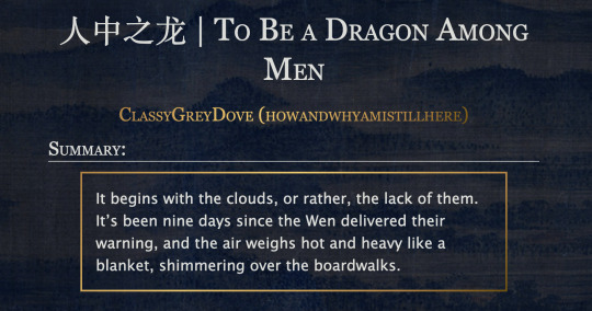
This is the code and urls for the custom dark mode work skin I made for my fic To Be a Dragon. Feel free to use it for your own works or for site skins, just remember to credit my user if you do.
[EDIT 25-03-18: Fixed padding for .frameborder class]
[EDIT 25-06-12: Added formatting rules for .poetry class and <p>]
Additional Resources
A Step-by-Step Guide to Work Skins from AO3 News - A great basic guide to what work skins are and how to make one.
How to Apply Work Skins to Others' Works by classygreydove - This is a guide I made on how to make a work skin into a site skin. You'll need to know this if you want to apply the work skin to any fic you want to read.
How to Change Work Skin Font by classygreydove - Don't like the font I use for the work skin? Don't worry, I'll show you how to change it.
Light Mode CSS - You can find the code for the Light Mode work skin here.
Light and Dark Mode Backgrounds - You can find the background images for the Light and Dark Mode work skins here.
Other Background Options - Here are a few mid-tone backgrounds that will have a lower contrast to the text.
Line Breaks (for Phone) - Do you like the custom dragon line breaks? Here's the phone-sized ones.
Line Breaks (for Wide Screens) - Do you like the custom dragon line breaks? Here's the laptop-sized ones.
[Code begins under Keep reading break]
#workskin .userstuff .hr, #workskin .hr, #workskin hr { height: 36px; width: 178px; background: url(https://64.media.tumblr.com/f19653c8c877dbe7a14e78434f1d0df6/d0f8688c32033f2d-b3/s250x400/6edcdac1e5614693d10491cff0725fd3633de77e.png); background-repeat: no-repeat; background-position: center; border: 0; }
#workskin { background: url(https://64.media.tumblr.com/f20ef324c5117a56d7dd2c8aa7e45151/4dcdf7c3c32cb0d1-68/s2048x3072/10c1120c78cd66a99c1067e6ed8b1addcd52ef57.png); background-repeat: repeat-y repeat-x; background-position: top; color: rgba(255, 255, 248, 0.85) !important; font-family: 'Georgia', 'Lucida Grande', 'Verdana'; }
#workskin a { background: linear-gradient(135deg, #b4853f 0%, #edc967 40%, #b4853f 80%, #705103 100%) !important; -webkit-background-clip: text !important; -webkit-text-fill-color: transparent !important; border-bottom: 0px; }
#workskin a:hover, #workskin a:active { background: linear-gradient(135deg, #b4853f 10%, #edc967 60%, #b4853f 80%, #705103 100%) !important; -webkit-background-clip: text !important; -webkit-text-fill-color: transparent !important; }
#workskin h2, #workskin h3 { line-height: 1.25; font-variant: small-caps; }
#workskin .userstuff blockquote { display: block; border: 2px solid #b4853f; border-image: linear-gradient(135deg, #b4853f 0%, #edc967 40%, #b4853f 80%, #705103 100%); border-image-slice: 1; padding: 15px 15px 15px 15px; margin-left: 1.5em; margin-right: 1.5em; }
#workskin .goldborder { display: block; border: 2px solid #b4853f; border-image: linear-gradient(135deg, #b4853f 0%, #edc967 40%, #b4853f 80%, #705103 100%); border-image-slice: 1; padding: 15px 15px 15px 15px; }
#workskin .frameborder { border: 2px solid #b4853f; border-image: linear-gradient(135deg, #b4853f 0%, #edc967 40%, #b4853f 80%, #705103 100%); border-image-slice: 1; padding: 0px; }
#workskin .mobilebreak { width: 178px; max-width: 100%; max-height: 100%; display: block; margin-left: auto; margin-right: auto; }
#workskin .textlink { font-variant: small-caps; }
#workskin .notesheading { font-size: 120%; font-variant: small-caps; font-family: 'Georgia', 'Lucida Grande', 'Verdana'; line-height: 2; }
#workskin .triggerwarning { color: rgba(240, 240, 240, 0.9); border-radius: 5px; background: rgba(128, 0, 0, 0.8); padding-left: 2px; padding-right: 2px; font-weight: bold; font-variant: small-caps; }
workskin .userstuff p { margin: 0; }
workskin .poetry { margin-inline-start: 1.5em; }
#ao3 skins#ao3 writer#ao3 fanfic#ao3 work skin#dark mode#the untamed#mo dao zu shi#To Be a Dragon Among Men
27 notes
·
View notes
Text

Day 1 - 100 Days CSS Challenge
Welcome to day 1 of the 100 Days CSS Challenge! In this challenge, we'll bring a design to life using only CSS. Our goal is to recreate the image we're provided with on the challenge page using HTML and CSS.
On the challenge page, we see:

A small preview of the design we need to replicate.
A starter HTML template.
A submission form to showcase our work alongside others who have taken on the same challenge.
Let's dive into the process step by step.
Step 1: Screenshot the Image
The first thing I always do is take a screenshot of the target design. Even if the design includes animation, having a static reference helps me focus on the basic structure and colors. Here’s the screenshot of the design we’re aiming for:
Step 2: Extract the Color Palette
Next, I identify the color palette that we'll need. This helps ensure that we maintain consistency with the original design. Here’s the color palette I’ve created:

Step 3: Identify and Create the Image Elements in HTML
Now that we know the colors, I break down the elements in the image:
Background: This is a linear gradient.
The 100 number: This is the main challenge, and it will require some work.
Text: “days css challenge,” which we’ll place to the left of the number.
Here’s the HTML structure for these elements:
<div class="frame"> <div class="center"> <div class="number"> <div class="one-one"></div> <div class="one-two"></div> <div class="zero-one"></div> <div class="zero-two"></div> </div> <p class="sentence1">days</p> <p class="sentence2">css challenge</p> </div> </div>
Now that the elements are in place, CSS will bring them to life.
Step 4: Bringing the Elements to Life with CSS
Linear Gradient
To create the background, we’ll use a linear gradient. Here’s a basic syntax:
background: linear-gradient(to <direction>, <color-stop1>, <color-stop2>, ...);
Parameter 1: Direction/Angle
This defines the starting point of the gradient. You can either specify a direction (e.g., to top, to bottom) or an angle (e.g., 90deg, 180deg).
Direction options:
to top
to bottom
to left
to right
If you want more precision, you can specify angles:
0deg: Gradient starts from the top.
90deg: From the right.
180deg: From the bottom.
270deg: From the left.
You can also combine two directions, specifying both horizontal and vertical movements, like to left top or to right bottom. This means:
The first keyword (left or right) controls the horizontal movement.
The second keyword (top or bottom) controls the vertical movement.
For example:
background: linear-gradient(to left top, red, blue);
This gradient starts at the bottom-right corner and transitions toward the top-left.
Parameter 2: Color Stops
Color stops define how the gradient transitions between colors. Each color stop specifies a point where a color starts or ends. Here's an example:
background: linear-gradient(to right, red 10%, blue 90%);
This means:
The element starts at 0% fully red.
By 10%, the transition from red begins.
Between 10% and 90%, there is a smooth blend from red to blue.
At 90%, the transition to blue is complete, and the remaining part is fully blue.

Once we understand the concept, we can apply the background we need. In our case, the gradient flows from the bottom left to the top right, so the code will look like this:
background: linear-gradient(to right top, #443DA1, #4EC3C9);
Bonus: Stacking Multiple Linear Gradients
You can also apply multiple gradients on top of each other:
background: linear-gradient(180deg, #f00, #0f0), linear-gradient(90deg, #ff0, #f0f);
Step 5: Making the "100" Number
Creating the Zeros
We start with the zeros. These are simply circles created using CSS. To make a full circle, we use border-radius set to 50%.
The white border gives it the appearance of the number zero.
.zero-one, .zero-two { position: absolute; height: 100px; width: 100px; border-radius: 50%; border: 24px solid #fff; box-shadow: 0 0 13px 0 rgba(0,0,0,0.2); }
This gives us a nice circular zero. We adjust their positions using properties like left and top, and manage the z-index to make sure the zeros stack correctly.
.zero-one { z-index: 8; left: 17px; } .zero-two { z-index: 6; left: 100px; }

Now both zeros are positioned, and they overlap in the way we want.
Creating the "1" Number
The number "1" is made of two div elements:
One-One: This part represents the slanted part of the "1".
One-Two: This is the straight vertical part of the "1".
What make the one-one element slightly slanted is
transform: rotate(50deg);)
the one-two is created simply with a little height and width nothing too particular then it is placed directly on top of the slanted part, giving us the full "1". Its z-index tho has to have a higher value than the slanted part of our 1 to ensure it stays above the slanted one.
Step 6: Adding the Text
For the two sentences “days” and “css challenge,” the styling is basic CSS. You can achieve the look with just a few font changes, some padding, and adjustments to font size. It’s as simple as:
.sentence1,.sentence2{ text-transform: uppercase; margin:0; padding:0; } .sentence1{ font-size:82px; font-weight:700; } .sentence2{ font-size:25px; font-weight:700; margin-top:-20px; }
And just like that, we’ve completed day 1 of the 100 Days CSS Challenge! Each part of the design is carefully crafted using CSS, giving us the final result.
Happy coding, and see you tomorrow for Day 2!
#100dayscssChallenge#codeblr#code#css#html#javascript#java development company#python#studyblr#progblr#programming#comp sci#web design#web developers#web development#website design#webdev#website#tech#html css#learn to code
16 notes
·
View notes
Note
hey my bro (mutual) how did you . learn html . like is there a specific guide that helped the most or was it just whatever you could find
HAII OKAY SO these are all my useful site links but sadgrl.online & eggramen.neocities.org will be your best friend!!! Eggramen has a shit ton of templates to choose from & sadgrl.online has a bunch of really useful tutorials!
^ SUPER USEFUL FOR CSS!!! This makes a lot of your css code automatic.
Live coding of html css, i always use this thang...
Also just googling "how to ____ html css" is VERY useful lol. So eggramen and sadgrl to start... LET ME KNOW IF YOU HAVE SPECIFIC QUESTIONS!!! i can also share some of my code if you'd like!!!
12 notes
·
View notes
Text
Macaque Site Skin Thing (yippee!)
────────────────────────────────────────────
Notes:
The CSS is mostly mishmashed from other codes and therefore is not perfect, there a places where the site retains its white accents or boxes and can be quite jarring when scrolling in a dark purple background to then suddenly be met with splashes of bright white
I personally wouldn't read works with this, it's mostly for the aesthetic and was not made with comfortable reading in mind (oof)
Wizard Settings/Code Stuff is REQUIRED alongside the CSS because without it the skin looks... kind awful.
────────────────────────────────────────────
CSS:
p.kudos { background: url("https://i.imgur.com/JmZWnGX.png"); background-repeat: no-repeat; }
.listbox, fieldset, fieldset dl dl, fieldset fieldset fieldset, fieldset fieldset dl dl, dd.hideme, form blockquote.userstuff, .dynamic form { background: url("https://i.imgur.com/xoHN0lj.jpeg"); background-repeat: repeat; border: 4px solid #fff; box-shadow: none; }
header h1.heading a::before {
content: url("https://i.imgur.com/9NaliS0.png"); visibility: visible; }
search .button,
header .logo {
display: none; }
header .heading a,
greeting img.icon {
visibility: hidden; }
outer {
background: linear-gradient(90deg, rgba(24, 12, 41,.9) 0%, rgba(16, 7, 28,1) 100%); }
header h1 sup,
header .button,
header .landmark,
header .logo {
display: none; }
inner.wrapper {
margin: 0em 4%; }
header .heading {
height: 20em; }
header {
background-color: #ffffff; background-image: url("https://i.imgur.com/1jqr3CI.png"); background-repeat: no-repeat; background-position: center center; background-size: cover; border-bottom: 2px solid #fff; }
header .heading a {
color: #fff; padding-left: 0em; }
header .primary {
background: none; box-shadow: none; }
greeting {
background: none; margin-right: 0em; position: absolute; right: 0em; top: 0em; }
header .primary li:not(.search),
header .primary li a,
greeting li,
greeting li a {
color: #FFF !important; background: #850900; border-top-left-radius: 2%; }
header .primary li:not(.search),
greeting li {
border: 1px solid #372457; }
.warnings .tag, .work .warning a.tag { background: #06000f; border: 1px solid #06000f; border-radius: 5px; color: #dbc2ed !important; padding-left: .5em; padding-right: .5em; }
.relationships .tag, .work .relationships a.tag { background: #0b0121; border: 1px solid #0b0121; border-radius: 5px; color: #dbc2ed !important; font-weight: bold; padding-left: .5em; padding-right: .5em; }
.characters .tag, .work .characters a.tag { background: #220c4a; border: 1px solid #220c4a; border-radius: 5px; color: #dbc2ed !important; font-weight: bold; padding-left: .5em; padding-right: .5em; }
────────────────────────────────────────────
Wizard Stuff:
────────────────────────────────────────────
1 note
·
View note
Text

CSS Gradient Border Animation
#css gradient border#learn to code#html css#frontend#code#webdesign#css#html#css3#frontenddevelopment#css animation examples#css animation#css border animation#border animation css#css gradient animation#css gradient
0 notes
Text
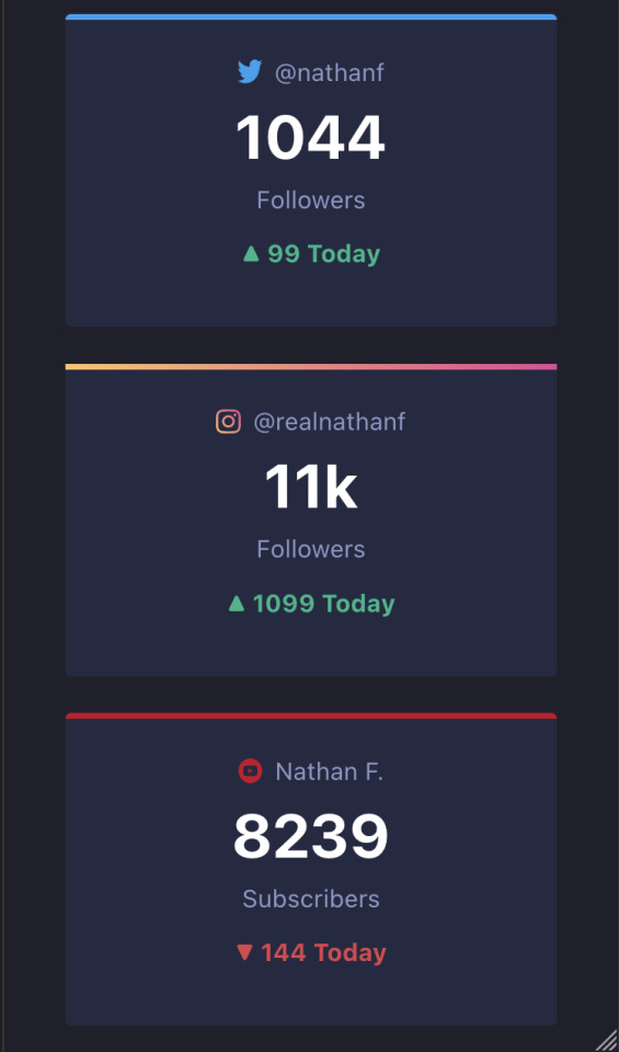
21/07/2023 || Day 55
Frontend Mentor Social Media Dashboard - Log # 2
Made some small progress on this today. I managed to get some stuff done, namely getting the different main social media cards to display:
I also learned how to change the colour of an element depending on certain criteria. Yes, I already know how to do that in vanilla JS, but it's a little different with React. I can't just use "document.getElementById().style.color = myColor"; that will give an error due to the node not being rendered yet. So, I did some googling and saw that I can store the colour in a state, and then once the node is rendered I can change the state of the colour, like so:
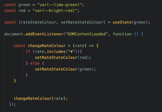
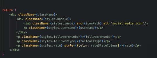
Then, when I'm actually calling the element, I can directly change the colour of that element with the in-tag style keyword (the last <p> tag, notice it has "style = { {color: rateStateColour} }:
All in all, this function will display the rate in green if the rate is positive, and red if negative, as denoted by the direction of the triangle (as we can see in the first image). This is also good because it's given me an idea of how to tackle switching between dark mode and light mode, but that's a later problem.
However, despite this progress, I'm currently struggling with CSS, more specifically with adding the border colours to the top border of each card. All the cards are fine except for the "instagram" card, and the only difference is that this colour is in fact a gradient. As a result, I can't use the border-top-color attribute, but instead have to use the border-image attribute. Now, this isn't normally a problem, except for the fact that the border-image attribute doesn't respond to the border-radius attribute. In other words, the edges for the border are straight where my border image is, while the other borders are round. You can see this in the first image in the "instagram" card. I've been doing some digging and it seems like I need to MacGyver it to work, so that'll be something for later.
Also, can a component itself not have a className? Does the component's className only take into effect inside the component's return statement? As in I have to wrap everything in my return statement with a div with that className, and only then will my CSS take into effect? It's weird, but it seems to be the case.
Anyways, that's it for today! Working with React is proving to be fun!
3 notes
·
View notes
Text

CSS Gradient Border Animation
#css animated border#css gradient border animation#gradient border animation#html css#codenewbies#html5 css3#css animation examples#pure css animation#css#css animation tutorial#webdesign#html css tutorial#pure css effects
3 notes
·
View notes
Text
Hit a bit of a wall-
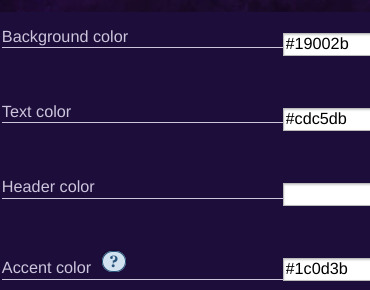
I'm trying to make it so that the reader is able to change the UI design via a drop down menu mixed with variable calling with additional HTML code but it just isn't working? I used the Link rerun method and even that didn't work, it worked with one of them but the other just refuses to switch. I'm using Harlowe 3.3.9, I'll post the code I'm using in under the read more to not clutter anything (and hopefully get some feedback/help on this, I suspect it has something to do with the text color Css)
Stylesheet code:
html.UIDefaultGlow tw-passage { position: static; border: 4px white; border-style: solid; border-radius: 15px; margin: auto; padding: 20px; box-shadow: 5px 10px 10px 10px white; background: linear-gradient(gray,#dcdbdd); opacity: 0.3 color: black; }
html.UIDefaultGlow tw-link { background-color: transparent; border: 2px solid white; border-radius: 15px; padding: 5px; color: white;}
html.UIDefaultGlow tw-link:hover {background-color: transparent; border: 2px solid white; border-radius: 15px; box-shadow: 5px 10px 15px 10px white, 10px 15px 20px 15px black;; padding: 5px; color: white; text-shadow: 10px 10px 20px black, 5px 5px 15px white;}
html.UIDefaultGlow tw-link.visited { background-color: transparent; border: 2px solid #dd9d9d; border-radius: 15px; padding: 5px; color: #dd9d9d;}
html.UIDefaultGlow tw-link.visited:hover {background-color: transparent; border: 2px solid #dd9d9d; border-radius: 15px; box-shadow: 5px 10px 15px 10px #dd9d9d; padding: 5px; color: #dd9d9d; text-shadow: 5px 5px 15px #dd9d9d;}
html.UIDefault tw-passage { position: static; border: 4px white; border-style: solid; border-radius: 15px; margin: auto; padding: 20px; box-shadow: 5px 10px 10px 10px black; background: linear-gradient(gray,#dcdbdd); opacity: 0.3 color: black; }
html.UIDefault tw-link { background-color: transparent; border: 2px solid white; border-radius: 15px; padding: 5px; color: white;}
html.UIDefault tw-link:hover {background-color: transparent; border: 2px solid white; border-radius: 15px; box-shadow: 5px 5px 10px 15px black; padding: 5px; color: white; text-shadow: 5px 5px 10px black;}
html.UIDefault tw-link.visited { background-color: transparent; border: 2px solid #dd9d9d; border-radius: 15px; padding: 5px; color: #dd9d9d;}
html.UIDefault tw-link.visited:hover {background-color: transparent; border: 2px solid #dd9d9d; border-radius: 15px; box-shadow: 5px 10px 15px 10px black; padding: 5px; color: #dd9d9d; text-shadow: 5px 5px 15px #dd9d9d;}
Passage/UI selection code:
{(set: $UI to "Default Glow")}
{[(set: $UI to "Default Glow") (set: $UI to "Default")]} (dropdown: 2bind $UI,"Default Glow","Default") {(if: $UI is "Default Glow") <script>$('html').removeClass("red yellow blue").addClass('UIDefaultGlow');</script>] (if: $UI is "Default")[<script>$('html').removeClass("UIDefaultGlow").addClass('UIDefault');</script>]}
0 notes
Text
ToolsToEdit.in – Your Ultimate Free Toolkit for Everyday Digital Tasks
In today’s fast-moving digital world, being productive means using the right tools at the right time. But what if you could access over 30+ essential online tools in one place—without paying a cent? That’s exactly what ToolsToEdit.in offers: a centralized, no-cost platform built for students, teachers, professionals, content creators, and anyone who wants to get things done—fast and efficiently.
🌐 What Is ToolsToEdit.in?
ToolsToEdit.in is a multi-purpose online toolkit that combines the functionality of dozens of individual tools into one convenient, browser-based hub. From quick calculations to SEO audits, PDF conversions to text clean-up—this platform is designed to simplify your work, save you time, and help you perform complex tasks with just a few clicks.
👥 Who Is It For?
This site isn’t just for techies or web developers. ToolsToEdit.in is built for everyday users:
🎓 Students can calculate percentages, solve EMI questions, or convert between binary and text.
👨🏫 Teachers can create resources, check text readability, or compress files.
🧑💻 Content Creators & Bloggers can analyze SEO, clean content, and manage PDFs.
👥 General Users can generate strong passwords, spot phishing links, and much more.
🔧 Key Tool Categories and Features
Here’s a breakdown of what ToolsToEdit.in offers:
🧮 Calculator Tools
No need for separate apps—just launch and use:
BMI Calculator – Check body mass index.
Discount Calculator – Know how much you’re saving.
EMI Calculator – Plan your finances smartly.
Age Calculator – Get accurate age from date of birth.
Percentage Calculator – Solve quick percentage problems.
✍️ Text Utilities
Content handling made easy:
Word Counter – Know your length before publishing.
Case Converter – Switch between uppercase, lowercase, and more.
Remove Duplicate Lines – Clean up large text files.
Find & Replace – Mass replace words or phrases.
Binary ⇄ Decimal/Text Converters – Useful for coding and education.
Text Encoder/Decoder – Encrypt and decode web-safe content.
🔐 Security Tools
Keep your data secure:
Password Generator – Create complex passwords.
Password Strength Checker – Test how secure your password is.
Phishing URL Detector – Protect yourself from scams.
🔍 SEO Optimization Tools
Get your website found:
Meta Tag Analyzer – Improve search engine visibility.
Mobile-Friendly Test – Make sure your site works on smartphones.
Page Speed Analyzer – Identify and fix performance issues.
Sitemap Generator – Generate XML sitemaps for indexing.
Keyword Density Checker – Analyze your content for keyword balance.
Robots.txt Generator – Guide search engine bots effectively.
🎨 Design & Image Tools
Handy for bloggers, designers, and developers:
Color Picker Tool – Find and copy hex codes easily.
CSS Gradient & Animation Previews – Visualize effects before using them.
Box Shadow & Border Radius Preview – Quick CSS styling helpers.
Image Compressor – Reduce image file sizes without losing quality.
Image to Base64 Converter – Embed images in web code.
Image Color Picker – Get exact color details from any picture.
📄 PDF Tools
Manage documents like a pro:
Merge PDF Files – Combine multiple documents into one.
PDF to Image/Text/Word – Convert PDFs into different formats.
Image to PDF Converter – Make professional documents from images.
💡 Why ToolsToEdit.in Stands Out
✅ No Installations: Everything runs right in your browser.
✅ Free Forever: No subscriptions, no sign-ups, no hidden fees.
✅ Mobile-Friendly: Use it seamlessly across devices.
✅ Time-Saving: Get tasks done in seconds.
✅ Clean UI: Easy to use even for beginners.
📢 Final Thoughts
In a world of scattered tools, ToolsToEdit.in brings clarity and convenience. Whether you're a digital marketer doing an SEO audit, a student calculating your GPA, or a teacher preparing resources—this site empowers you to work smarter, not harder.
Visit www.toolstoedit.in and explore the full suite of tools today. It’s time to edit, create, calculate, optimize, and convert—all in one place.
1 note
·
View note
Text
Menu destaque:
Oi, bom, pra quem não sabe que menu é esse vai ai o preview.
Esse menu não tem muita coisa complicada, é apenas css, então vou tentar explicar algumas coisas e também na parte de ps. Vou começar pelo css principal:
.destaque { float: right; margin-right: -20px; margin-top: -5px; background: url('http://static.tumblr.com/tx5g7yp/nFYmaau44/bot__o.png'); background-repeat: no-repeat!important; width: 64px; height: 25px;} .boxdestaque:hover .destaque { background-position: -0px -25px;}
Logo acima, temos o .destaque normal, que é o style onde fica nosso botão. Esse botão é feito com imagem, quase igual do do menu rollover.

Note que são duas imagens, certo? Uma com o gradiente mais redondinho e outra com o gradiente parecendo estar fundo. Mas na real, apenas mudei a posição do gradiente. Essa imagem ela é apenas uma, dai eu coloco ela ali na parte do background com imagem, defino a altura de UMA imagem, que no caso é 25px e a largura que é 64px;
Bom, logo acima temos também o .boxdestaque:hover .destaque.
Por que o hover é no .boxdestaque:hover?
Você pode sim tirar aquele .boxdestaque:hover e colocar o hover no .destaque, mas dai só quando passarmos o mouse sobre o botão que vai ter o hover. Como no preview, note que ao passar o mouse sobre o box o botão da o hover.
Por que?
Porque o nosso botãozinho fica DENTRO do boxdestaque. Então ele tem que obedecer o comando que dei para o meu css.
Sobre o style do hover, ali tem um: background-position: -0px; -25px; certo? Como meu primeiro botão tem 25px de altura o de baixo também vai ter isso, então o que fazemos? Colocamos um -25 que vai fazer o botão de baixo subir pra cima, dando o hover correto. Quando digo altura, estou me referindo ao height da imagem.
É basicamente isso a parte style do botão. Então na hora de criar o botão no ps, caso faça outro com uma cor fofa combinando com seu theme, lembre-se de que ele tem um tamanho e altura, defina corretamente que tudo vai dá certo.
.boxdestaque { text-align: left; -webkit-border-radius: 6px; -moz-border-radius: 6px; border-radius: 6px; margin-right: 7px; background: #fff; padding: 5px; margin-bottom: 7px; } .boxdestaque:hover { background: #; text-shadow: 1px 1px 1px #fff;}
O css acima, é o style do nosso box. Você pode mudar a cor do background, deixando-o com a aparencia que você queira. Pode dar mais padding, dependendo da altura do seu botão para que fique fofo.
.boxdestaque .title { color: #999; font-size: 11px; font-weight:none; font-family: Georgia; font-style: italic; -webkit-transition: all 1s ease; -moz-transition: all 1s ease; -o-transition: all 1s ease; transition: all 1s ease;} .boxdestaque:hover .title{ color: #7797a7; padding-left: 15px; -webkit-transition: all 1s ease; -moz-transition: all 1s ease; -o-transition: all 1s ease; transition: all 1s ease;}
O css acima, é o style do nosso title, ou seja, o jeito que a escrita do box vai ficar. A cor que vai ter, se vai ter uma fonte personalizada e etc. Se você vai dar uma cor diferente no hover. Temos o transition, que vai faz a fonte mudar de cor lento e vai ela andar >> lento também. Como podem ver no preview.
Bom, é apenas isso. Logo abaixo, vou postar o css e o html de tudo para que vocês possam usar.
CSS:
.destaque { float: right; margin-right: -20px; margin-top: -5px; background: url('http://static.tumblr.com/tx5g7yp/nFYmaau44/bot__o.png'); background-repeat: no-repeat!important; width: 64px; height: 25px;} .boxdestaque:hover .destaque { background-position: -0px -25px;} .boxdestaque { text-align: left; -webkit-border-radius: 6px; -moz-border-radius: 6px; border-radius: 6px; margin-right: 7px; background: #fff; padding: 5px; margin-bottom: 7px; } .boxdestaque:hover { background: #; text-shadow: 1px 1px 1px #fff;} .boxdestaque .title { color: #999; font-size: 11px; font-weight:none; font-family: Georgia; font-style: italic; -webkit-transition: all 1s ease; -moz-transition: all 1s ease; -o-transition: all 1s ease; transition: all 1s ease;} .boxdestaque:hover .title{ color: #7797a7; padding-left: 15px; -webkit-transition: all 1s ease; -moz-transition: all 1s ease; -o-transition: all 1s ease; transition: all 1s ease;}
Coloque isso acima, antes de </style>!
HTML:
<div class="boxdestaque"> <span class="title">Descrição do link <a class="destaque" href="URL"></a> </span> </div> <div class="boxdestaque"> <span class="title">Descrição do link <a class="destaque" href="URL"></a> </span> </div> <div class="boxdestaque"> <span class="title">Descrição do link <a class="destaque" href="URL"></a> </span> </div>
Repita o html acima quantas vezes quiser, em sua sidebar ou o que seja. Beijos.
0 notes