#example: flat colour
Explore tagged Tumblr posts
Visit Tumblr Blog
Explore Tumblr blogs with no restrictions, modern design and the best experience.
Last Seen Tumblr Blogs


Fun Fact
The “We are the 99%” Tumblr blog became the slogan for the Occupy Wall Street movement.
Text

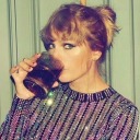
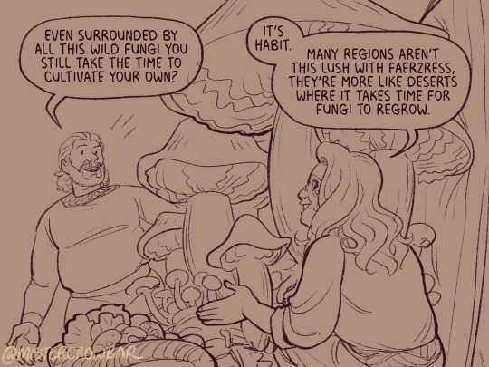
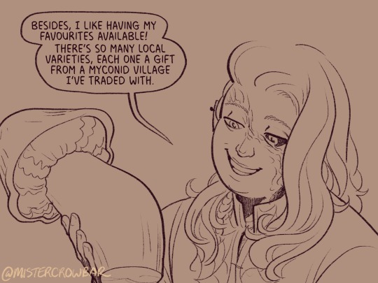
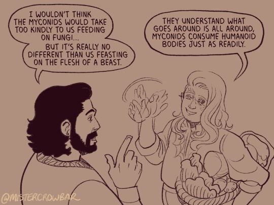
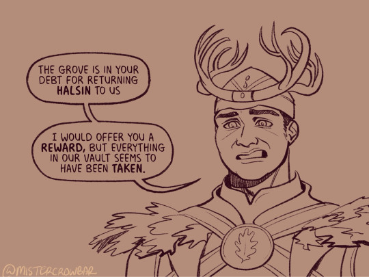
Art for sweet @thepalehorsevictoria of her Rook Iris Ingellvar and Emmrich Volkarin. Thank you so much for commissioning me, it was a pleasure to draw for you! ❤✨
ko-fi ☕💗 | info & commissions
#commissions#example: flat colour#dragon age rook#dragon age oc#emmrich volkarin#emmrich x rook#dragon age the veilguard#dragon age#art#fanart#digital art
841 notes
·
View notes
Photo
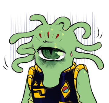
VUX versions! (Patreon)
#My art#SCII#DAX#ZEX#Adding to my own warmup projects for funsies lol#I was curious! And they look cute!#I'm not gonna say the meme is closed Exactly - but considering how close September is coming upon us it might be folded in soon#Having specific examples to go by would probably be helpful anyway lol#Anyway all that when it gets to that point! For now - themst!!#I tried again for a limited palette like their Ghost mockups :) Their pupils are the same dark blue of their uniform rather than black :D#Although ZEX's eye has a couple extra colour-highlights - but look how pretty!#I didn't feel like going back to change DAX's lol next time#The various reds and pinks are probably my favourites :) Those pops! Cute#I have become quite partial to the barely-visible little pink dots at the ends of their head tendrils#Determines directionality as well! I love that kind of thing! Same silhouette but different angle appearance :D#They're all cheating out/downstage but it'd be fun to draw them elsewise another time#Also like how I shined basically everything Except the faces of the medals lol - edges? Yes - Cuffs? Of course - Eyelids and head bumps!#Even their uniform tops! But the gold shiny bits with the flat surface? Sorry I can't read suddenly#Lol#Fun to use the whirly marks for their head tendrils as well haha#I'd like to do more - the rest of the expressions#Even I'm curious how the others will shake out! In pose and face of course but also the others had a human shuffled into the mix lol#He'd not getting the VUX treatment so sorry Captain#Split and combine I suppose haha
8 notes
·
View notes
Text
#Get Ready With Me.

THIS JUST IN: YOU LOOK AMAZING. DON’T THINK TOO HARD. The world is burning, but here's what’s in my cart 💅 #GRWM During the Collapse 12 Looks That Survived the Fire Hauls More Explosive Than the Headlines Best Lip Glosses for Evacuation Day These Leggings Ended a Regime “This is Bisan from Gaza”
Wake up Wake up Wake up Scroll Scroll Scroll Scroll ScrollWake up ScrollWake up ScrollWake up ScrollMake your jaw look snatched Scroll - Scroll - Scroll Scroll Scroll Scroll Scroll - Scroll - Scroll Scroll Scroll Scroll Scroll - Scroll - Scroll Scroll Scroll Scroll Scroll#GRWM while ScrollWhile ScrollWhile ScrollWhile... Interact from the bottom up please See me Anyone See me Please see me Wake up Wake up This is Bisan from Gaza See me Anyone? Like comment share please Someone see me Scroll This can’t be the end Scroll
Source: #Get Ready With Me.
1 note
·
View note
Text
Im taking commissions!
helo i am taking commissions on my Ko-fi because my money situation sucks for the winter unfortunately.
this is my first time doing commissions so please be kind!
#i will be offering flat colours too i just don't have any examples saved#art#digital art#art commisions#art comms open#art commissions open#digital illustration#clipstudiopaint#neeru talks#neeruart
4 notes
·
View notes
Text
it makes me so unreasonably happy that the recommended pins under this pin are mostly sweater vest knitting & crochet patterns
#mika#mikasounds#mika penniman#i hope someone knit that for him#he seems like a very knitworthy person#i'm really enjoying his super comfy cosy outfits lately#(the wide leg jeans + cardigan or blazer-sweater + flat cap for example)#including this sweater vest. it looks so snuggly#but you can't see the cablework very well bc the colour combo is too busy :(#generally: the busier/more complicated the pattern the simpler the yarn should be#if you want to show off cablework or textured stitches: use a solid/semi-solid/heathered yarn#if you want to show off a variegated/striped/multicolour yarn: use a simple stitch pattern#ok. the knitter hat is coming off before i get more invested in this than is reasonable
10 notes
·
View notes
Text
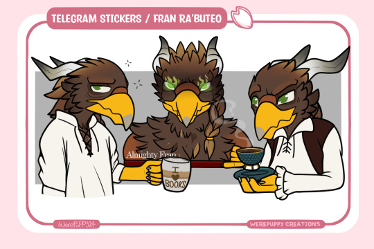
First Telegram Sticker commission of 2024! These are flat colour stickers for Geraint!
#telegram stickers#flat colour#art examples#furry artwork#character art#artist#artwork#artists on tumblr#art#furry fandom#furry community#furry art#furry character#sfw furry#furry oc#furry anthro
6 notes
·
View notes
Text
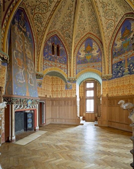
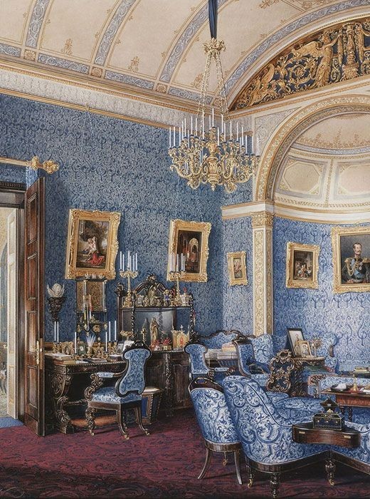
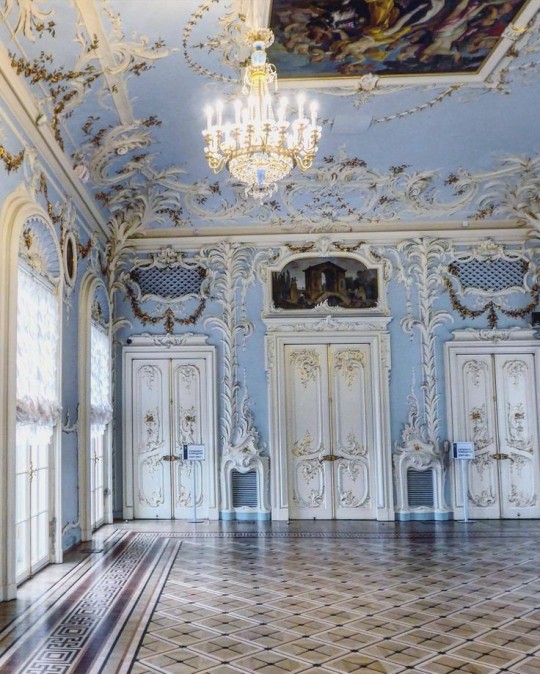
Fantasy Guide to Interiors

As a followup to the very popular post on architecture, I decided to add onto it by exploring the interior of each movement and the different design techniques and tastes of each era. This post at be helpful for historical fiction, fantasy or just a long read when you're bored.
Interior Design Terms
Reeding and fluting: Fluting is a technique that consists a continuous pattern of concave grooves in a flat surface across a surface. Reeding is it's opposite.
Embossing: stamping, carving or moulding a symbol to make it stand out on a surface.
Paneling: Panels of carved wood or fabric a fixed to a wall in a continuous pattern.
Gilding: the use of gold to highlight features.
Glazed Tile: Ceramic or porcelain tiles coated with liquid coloured glass or enamel.
Column: A column is a pillar of stone or wood built to support a ceiling. We will see more of columns later on.
Bay Window: The Bay Window is a window projecting outward from a building.
Frescos: A design element of painting images upon wet plaster.
Mosaic: Mosaics are a design element that involves using pieces of coloured glass and fitted them together upon the floor or wall to form images.
Mouldings: ornate strips of carved wood along the top of a wall.
Wainscoting: paneling along the lower portion of a wall.
Chinoiserie: A European take on East Asian art. Usually seen in wallpaper.
Clerestory: A series of eye-level windows.
Sconces: A light fixture supported on a wall.
Niche: A sunken area within a wall.
Monochromatic: Focusing on a single colour within a scheme.
Ceiling rose: A moulding fashioned on the ceiling in the shape of a rose usually supporting a light fixture.
Baluster: the vertical bars of a railing.
Façade: front portion of a building
Lintel: Top of a door or window.
Portico: a covered structure over a door supported by columns
Eaves: the part of the roof overhanging from the building
Skirting: border around lower length of a wall
Ancient Greece
Houses were made of either sun-dried clay bricks or stone which were painted when they dried. Ground floors were decorated with coloured stones and tiles called Mosaics. Upper level floors were made from wood. Homes were furnished with tapestries and furniture, and in grand homes statues and grand altars would be found. Furniture was very skillfully crafted in Ancient Greece, much attention was paid to the carving and decoration of such things. Of course, Ancient Greece is ancient so I won't be going through all the movements but I will talk a little about columns.
Doric: Doric is the oldest of the orders and some argue it is the simplest. The columns of this style are set close together, without bases and carved with concave curves called flutes. The capitals (the top of the column) are plain often built with a curve at the base called an echinus and are topped by a square at the apex called an abacus. The entablature is marked by frieze of vertical channels/triglyphs. In between the channels would be detail of carved marble. The Parthenon in Athens is your best example of Doric architecture.
Ionic: The Ionic style was used for smaller buildings and the interiors. The columns had twin volutes, scroll-like designs on its capital. Between these scrolls, there was a carved curve known as an egg and in this style the entablature is much narrower and the frieze is thick with carvings. The example of Ionic Architecture is the Temple to Athena Nike at the Athens Acropolis.
Corinthian: The Corinthian style has some similarities with the Ionic order, the bases, entablature and columns almost the same but the capital is more ornate its base, column, and entablature, but its capital is far more ornate, commonly carved with depictions of acanthus leaves. The style was more slender than the others on this list, used less for bearing weight but more for decoration. Corinthian style can be found along the top levels of the Colosseum in Rome.
Tuscan: The Tuscan order shares much with the Doric order, but the columns are un-fluted and smooth. The entablature is far simpler, formed without triglyphs or guttae. The columns are capped with round capitals.
Composite: This style is mixed. It features the volutes of the Ionic order and the capitals of the Corinthian order. The volutes are larger in these columns and often more ornate. The column's capital is rather plain. for the capital, with no consistent differences to that above or below the capital.
Ancient Rome
Rome is well known for its outward architectural styles. However the Romans did know how to add that rizz to the interior. Ceilings were either vaulted or made from exploded beams that could be painted. The Romans were big into design. Moasics were a common interior sight, the use of little pieces of coloured glass or stone to create a larger image. Frescoes were used to add colour to the home, depicting mythical figures and beasts and also different textures such as stonework or brick. The Romans loved their furniture. Dining tables were low and the Romans ate on couches. Weaving was a popular pastime so there would be tapestries and wall hangings in the house. Rich households could even afford to import fine rugs from across the Empire. Glass was also a feature in Roman interior but windows were usually not paned as large panes were hard to make. Doors were usually treated with panels that were carved or in lain with bronze.
Ancient Egypt
Egypt was one of the first great civilisations, known for its immense and grand structures. Wealthy Egyptians had grand homes. The walls were painted or plastered usually with bright colours and hues. The Egyptians are cool because they mapped out their buildings in such a way to adhere to astrological movements meaning on special days if the calendar the temple or monuments were in the right place always. The columns of Egyptian where thicker, more bulbous and often had capitals shaped like bundles of papyrus reeds. Woven mats and tapestries were popular decor. Motifs from the river such as palms, papyrus and reeds were popular symbols used.
Ancient Africa
African Architecture is a very mixed bag and more structurally different and impressive than Hollywood would have you believe. Far beyond the common depictions of primitive buildings, the African nations were among the giants of their time in architecture, no style quite the same as the last but just as breathtaking.
Rwandan Architecture: The Rwandans commonly built of hardened clay with thatched roofs of dried grass or reeds. Mats of woven reeds carpeted the floors of royal abodes. These residences folded about a large public area known as a karubanda and were often so large that they became almost like a maze, connecting different chambers/huts of all kinds of uses be they residential or for other purposes.
Ashanti Architecture: The Ashanti style can be found in present day Ghana. The style incorporates walls of plaster formed of mud and designed with bright paint and buildings with a courtyard at the heart, not unlike another examples on this post. The Ashanti also formed their buildings of the favourite method of wattle and daub.
Nubian Architecture: Nubia, in modern day Ethiopia, was home to the Nubians who were one of the world's most impressive architects at the beginning of the architecture world and probably would be more talked about if it weren't for the Egyptians building monuments only up the road. The Nubians were famous for building the speos, tall tower-like spires carved of stone. The Nubians used a variety of materials and skills to build, for example wattle and daub and mudbrick. The Kingdom of Kush, the people who took over the Nubian Empire was a fan of Egyptian works even if they didn't like them very much. The Kushites began building pyramid-like structures such at the sight of Gebel Barkal
Japanese Interiors
Japenese interior design rests upon 7 principles. Kanso (簡素)- Simplicity, Fukinsei (不均整)- Asymmetry, Shizen (自然)- Natural, Shibumi (渋味) – Simple beauty, Yugen (幽玄)- subtle grace, Datsuzoku (脱俗) – freedom from habitual behaviour, Seijaku (静寂)- tranquillity.
Common features of Japanese Interior Design:
Shoji walls: these are the screens you think of when you think of the traditional Japanese homes. They are made of wooden frames, rice paper and used to partition
Tatami: Tatami mats are used within Japanese households to blanket the floors. They were made of rice straw and rush straw, laid down to cushion the floor.
Genkan: The Genkan was a sunken space between the front door and the rest of the house. This area is meant to separate the home from the outside and is where shoes are discarded before entering.
Japanese furniture: often lowest, close to the ground. These include tables and chairs but often tanked are replaced by zabuton, large cushions. Furniture is usually carved of wood in a minimalist design.
Nature: As both the Shinto and Buddhist beliefs are great influences upon architecture, there is a strong presence of nature with the architecture. Wood is used for this reason and natural light is prevalent with in the home. The orientation is meant to reflect the best view of the world.
Islamic World Interior
The Islamic world has one of the most beautiful and impressive interior design styles across the world. Colour and detail are absolute staples in the movement. Windows are usually not paned with glass but covered in ornate lattices known as jali. The jali give ventilation, light and privacy to the home. Islamic Interiors are ornate and colourful, using coloured ceramic tiles. The upper parts of walls and ceilings are usually flat decorated with arabesques (foliate ornamentation), while the lower wall areas were usually tiled. Features such as honeycombed ceilings, horseshoe arches, stalactite-fringed arches and stalactite vaults (Muqarnas) are prevalent among many famous Islamic buildings such as the Alhambra and the Blue Mosque.
Byzantine (330/395–1453 A. D)
The Byzantine Empire or Eastern Roman Empire was where eat met west, leading to a melting pot of different interior designs based on early Christian styles and Persian influences. Mosaics are probably what you think of when you think of the Byzantine Empire. Ivory was also a popular feature in the Interiors, with carved ivory or the use of it in inlay. The use of gold as a decorative feature usually by way of repoussé (decorating metals by hammering in the design from the backside of the metal). Fabrics from Persia, heavily embroidered and intricately woven along with silks from afar a field as China, would also be used to upholster furniture or be used as wall hangings. The Byzantines favoured natural light, usually from the use of copolas.
Indian Interiors
India is of course, the font of all intricate designs. India's history is sectioned into many eras but we will focus on a few to give you an idea of prevalent techniques and tastes.
The Gupta Empire (320 – 650 CE): The Gupta era was a time of stone carving. As impressive as the outside of these buildings are, the Interiors are just as amazing. Gupta era buildings featured many details such as ogee (circular or horseshoe arch), gavaksha/chandrashala (the motif centred these arches), ashlar masonry (built of squared stone blocks) with ceilings of plain, flat slabs of stone.
Delhi Sultanate (1206–1526): Another period of beautifully carved stone. The Delhi sultanate had influence from the Islamic world, with heavy uses of mosaics, brackets, intricate mouldings, columns and and hypostyle halls.
Mughal Empire (1526–1857): Stonework was also important on the Mughal Empire. Intricately carved stonework was seen in the pillars, low relief panels depicting nature images and jalis (marble screens). Stonework was also decorated in a stye known as pietra dura/parchin kari with inscriptions and geometric designs using colored stones to create images. Tilework was also popular during this period. Moasic tiles were cut and fitted together to create larger patters while cuerda seca tiles were coloured tiles outlined with black.
Chinese Interiors
Common features of Chinese Interiors
Use of Colours: Colour in Chinese Interior is usually vibrant and bold. Red and Black are are traditional colours, meant to bring luck, happiness, power, knowledge and stability to the household.
Latticework: Lattices are a staple in Chinese interiors most often seen on shutters, screens, doors of cabinets snf even traditional beds.
Lacquer: Multiple coats of lacquer are applied to furniture or cabinets (now walls) and then carved. The skill is called Diaoqi (雕漆).
Decorative Screens: Screens are used to partition off part of a room. They are usually of carved wood, pained with very intricate murals.
Shrines: Spaces were reserved on the home to honour ancestors, usually consisting of an altar where offerings could be made.
Of course, Chinese Interiors are not all the same through the different eras. While some details and techniques were interchangeable through different dynasties, usually a dynasty had a notable style or deviation. These aren't all the dynasties of course but a few interesting examples.
Song Dynasty (960–1279): The Song Dynasty is known for its stonework. Sculpture was an important part of Song Dynasty interior. It was in this period than brick and stone work became the most used material. The Song Dynasty was also known for its very intricate attention to detail, paintings, and used tiles.
Ming Dynasty(1368–1644): Ceilings were adorned with cloisons usually featuring yellow reed work. The floors would be of flagstones usually of deep tones, mostly black. The Ming Dynasty favoured richly coloured silk hangings, tapestries and furnishings. Furniture was usually carved of darker woods, arrayed in a certain way to bring peace to the dwelling.
Han Dynasty (206 BC-220 AD): Interior walls were plastered and painted to show important figures and scenes. Lacquer, though it was discovered earlier, came into greater prominence with better skill in this era.
Tang Dynasty (618–907) : The colour palette is restrained, reserved. But the Tang dynasty is not without it's beauty. Earthenware reached it's peak in this era, many homes would display fine examples as well. The Tang dynasty is famous for its upturned eaves, the ceilings supported by timber columns mounted with metal or stone bases. Glazed tiles were popular in this era, either a fixed to the roof or decorating a screen wall.
Romanesque (6th -11th century/12th)
Romanesque Architecture is a span between the end of Roman Empire to the Gothic style. Taking inspiration from the Roman and Byzantine Empires, the Romanesque period incorporates many of the styles. The most common details are carved floral and foliage symbols with the stonework of the Romanesque buildings. Cable mouldings or twisted rope-like carvings would have framed doorways. As per the name, Romansque Interiors relied heavily on its love and admiration for Rome. The Romanesque style uses geometric shapes as statements using curves, circles snf arches. The colours would be clean and warm, focusing on minimal ornamentation.
Gothic Architecture (12th Century - 16th Century)
The Gothic style is what you think of when you think of old European cathedrals and probably one of the beautiful of the styles on this list and one of most recognisable. The Gothic style is a dramatic, opposing sight and one of the easiest to describe. Decoration in this era became more ornate, stonework began to sport carving and modelling in a way it did not before. The ceilings moved away from barreled vaults to quadripartite and sexpartite vaulting. Columns slimmed as other supportive structures were invented. Intricate stained glass windows began their popularity here. In Gothic structures, everything is very symmetrical and even.
Mediaeval (500 AD to 1500)
Interiors of mediaeval homes are not quite as drab as Hollywood likes to make out. Building materials may be hidden by plaster in rich homes, sometimes even painted. Floors were either dirt strewn with rushes or flagstones in larger homes. Stonework was popular, especially around fireplaces. Grand homes would be decorated with intricate woodwork, carved heraldic beasts and wall hangings of fine fabrics.
Renaissance (late 1300s-1600s)
The Renaissance was a period of great artistry and splendor. The revival of old styles injected symmetry and colour into the homes. Frescoes were back. Painted mouldings adorned the ceilings and walls. Furniture became more ornate, fixed with luxurious upholstery and fine carvings. Caryatids (pillars in the shape of women), grotesques, Roman and Greek images were used to spruce up the place. Floors began to become more intricate, with coloured stone and marble. Modelled stucco, sgraffiti arabesques (made by cutting lines through a layer of plaster or stucco to reveal an underlayer), and fine wall painting were used in brilliant combinations in the early part of the 16th century.
Tudor Interior (1485-1603)
The Tudor period is a starkly unique style within England and very recognisable. Windows were fixed with lattice work, usually casement. Stained glass was also in in this period, usually depicting figures and heraldic beasts. Rooms would be panelled with wood or plastered. Walls would be adorned with tapestries or embroidered hangings. Windows and furniture would be furnished with fine fabrics such as brocade. Floors would typically be of wood, sometimes strewn with rush matting mixed with fresh herbs and flowers to freshen the room.
Baroque (1600 to 1750)
The Baroque period was a time for splendor and for splashing the cash. The interior of a baroque room was usually intricate, usually of a light palette, featuring a very high ceiling heavy with detail. Furniture would choke the room, ornately carved and stitched with very high quality fabrics. The rooms would be full of art not limited to just paintings but also sculptures of marble or bronze, large intricate mirrors, moldings along the walls which may be heavily gilded, chandeliers and detailed paneling.
Victorian (1837-1901)
We think of the interiors of Victorian homes as dowdy and dark but that isn't true. The Victorians favoured tapestries, intricate rugs, decorated wallpaper, exquisitely furniture, and surprisingly, bright colour. Dyes were more widely available to people of all stations and the Victorians did not want for colour. Patterns and details were usually nature inspired, usually floral or vines. Walls could also be painted to mimic a building material such as wood or marble and most likely painted in rich tones. The Victorians were suckers for furniture, preferring them grandly carved with fine fabric usually embroidered or buttoned. And they did not believe in minimalism. If you could fit another piece of furniture in a room, it was going in there. Floors were almost eclusively wood laid with the previously mentioned rugs. But the Victorians did enjoy tiled floors but restricted them to entrances. The Victorians were quite in touch with their green thumbs so expect a lot of flowers and greenery inside. with various elaborately decorated patterned rugs. And remember, the Victorians loved to display as much wealth as they could. Every shelf, cabinet, case and ledge would be chocked full of ornaments and antiques.
Edwardian/The Gilded Age/Belle Epoque (1880s-1914)
This period (I've lumped them together for simplicity) began to move away from the deep tones and ornate patterns of the Victorian period. Colour became more neutral. Nature still had a place in design. Stained glass began to become popular, especially on lampshades and light fixtures. Embossing started to gain popularity and tile work began to expand from the entrance halls to other parts of the house. Furniture began to move away from dark wood, some families favouring breathable woods like wicker. The rooms would be less cluttered.
Art Deco (1920s-1930s)
The 1920s was a time of buzz and change. Gone were the refined tastes of the pre-war era and now the wow factor was in. Walls were smoother, buildings were sharper and more jagged, doorways and windows were decorated with reeding and fluting. Pastels were in, as was the heavy use of black and white, along with gold. Mirrors and glass were in, injecting light into rooms. Gold, silver, steel and chrome were used in furnishings and decor. Geometric shapes were a favourite design choice. Again, high quality and bold fabrics were used such as animal skins or colourful velvet. It was all a rejection of the Art Noveau movement, away from nature focusing on the man made.
Modernism (1930 - 1965)
Modernism came after the Art Deco movement. Fuss and feathers were out the door and now, practicality was in. Materials used are shown as they are, wood is not painted, metal is not coated. Bright colours were acceptable but neutral palettes were favoured. Interiors were open and favoured large windows. Furniture was practical, for use rather than the ornamentation, featuring plain details of any and geometric shapes. Away from Art Deco, everything is straight, linear and streamlined.
#This took forever#I'm very tired#But enjoy#I covered as much as I could find#Fantasy Guide to interiors#interior design#Architecture#writings#writing resources#Writing reference#Writing advice#Writer's research#writing research#Writer's rescources#Writing help#Mediaeval#Renaissance#Chinese Interiors#Japanese Interiors#Indian interiors#writing#writeblr#writing reference#writing advice#writer#spilled words#writers
5K notes
·
View notes
Note
Hullo! I’ve been watching a bunch of your Timelapses and I was wondering how do you always come up with the colours for your pieces? They’re always so cohesive and pleasing to look at (I almost exclusively work in greyscale so if I’m using colour it’s always a lucky guess and it never looks quite right)
Hey there!
I have to be honest that most of the time I don't actually know what I'm doing and that I have no idea how most of my pieces are gonna turn out. My work process is usually based on "Fuck around and find out", haha. I'm happy to know that it apparently doesn't come across that way, though.
A lot of it comes very naturally to me simply because I've been drawing non-stop for so long, but I can give you some small tips that really help me:
1. Have as many references as possible!
Here's what my reference sheet looked like for the Jayvik piece:

It helped me a lot to understand the overall color scheme I wanted to convey. Lots of very cold tones, pinks and very light blues and greens. These colours sorround Jayce and Viktor throughout all of season 2 and I wanted to keep them, especially since in my piece they are lying in the glowing hexcore.
Don't shy away from using references, get as many as you possibly can! Look at other poeple's art too and try to understand how they work with colours.
2. Work with complementary colours!
Since I paint a lot of romantic illustrations I want them to look pleasing and comforting, which I can accomplish by using complementary colours! You see this a lot with couples that are blue and red coded, for example. And I wanted to do the same thing in the Jayvik piece! For that I used the highlights in their hair!


Viktor's highlights are a soft pink hue.


While Jayce's are a soft blue hue.
The colour wheel works perfect for figuring out if two colors compliment each other because they are literally right across from one another!
3. It doesn't have to be true to life.
Pretty self-explanatory, but I thought I'd add it in here anyways. It's important to understand how colour and light works, but you don't always have to follow the rules. Does the rim light look cool but it makes zero sense? Who cares! Keep the cool rim light! Just have fun and fuck around.
4. A little trick to make your life easier!
I'm not excatly the best at colour theory, I still struggle with it quite a bit, but here's a little trick I like to use from time to time:
If you want all your colours to look coherent, take one specific color as your flat colour. Choose a hue that you would like your piece to have. Like this:

Now you choose whatever colours your characters have and paint them in. For example, here are the skin colours I chose for Jayce and Viktor:

Looks off, right? These colours don't fit the overall piece at all. So what do we do?
Turn down the opacity! It's that easy, wahoo!

I went from 100 Opacity to 72 for this specific illustration. And look at that!

It's so much nicer already! Now you know what colours to use as your actual flats! Just repeat this with every other part of your illustration and you'll have a great starting point. :)
I really hope this was helpful! I'm not an actual teacher and I don't have a proper illustration degree, so some things might not be completely accurate, but I thought I'd try my hand at this anyways!
#teacher han is at it again#if I talked bullshit forgive me#I just hope I was able to help at least a little bit haha#I'm always happy to give some tips!#art process#art tutorial#color tutorial#colouring#illustration#tips#my art#arcane#jayvik#tutorial#anon#ask
783 notes
·
View notes
Text
Good Omens graphic novel update: June 2024
Welcome to the June update. A lot of behind the scenes work at the moment but we're grabbing the travel sweets, popping in the Bentley and hitting the road. More on that below.
Admin
Ongoing reminder that the project FAQ can be found here.
I pledged using my Apple ID, or no longer use the address my pledge is attached to, or I cannot work out what email address my pledge is connected to. What should I do? Please contact us via your Kickstarter account where the pledge is connected; we will be able to see on our system which address it is. If it's one you have access to, great! The FAQ has information on how to resend your invite link to access the PledgeManager. If it's one you are not able to access, then you can let us know which email is preferred and we can update this on the system, which will automatically send a new invite.
Events
We've had a lot of queries about when the Good Omens team will be attending events more formally, after some Aziraphale and Crowley spotting at conventions we'd been to previously. Well, we're excited to confirm the first: Good Omens HQ will be at ACME Comic Con in Glasgow, Scotland this September.

We'll be bringing the actual-real-life-home-to-Crowley-and-his-plants Bentley from Season 2 of Good Omens, the first time the car has been made available publicly for fans to come see and get photos with, ahead of its journey back to the set and the start of Season 3 filming.
We also see Quelin Sepulveda, aka Muriel, has been announced for the event for some additional ineffable joy.
You can get your tickets for ACME Comic Con here. We hope to see some of you there.

While we won't be rocking up with the Bentley to this next one, we want to let you know about Ineffable Con which, though sold out in person, is also taking place virtually in July. The fan-run event hosts great panels, auctions and more, with money raised going to Alzheimer’s Research UK, in memory of Sir Terry Pratchett.
Where next? We have - not an exaggeration - a list of about 200 events somewhere from when we asked fans this on Instagram and while we can't promise quite that amount of convention attendance, we're certainly looking to do some more things in future with Good Omens at large. Watch this space.
Good Omens items...
This month has largely seen prototypes and samples for the wider Good Omens merch store arriving, and while we can't share those yet, we are certainly excited to see more fan product suggestions coming to life. That does, however, leave our public item updates a little slim on the ground.
To make up for that, here's some new panels from Colleen:

Also known as, "What could possibly go wrong?" And:

Also known as, "Well why don't you ▇▇▇ ▇▇▇▇▇▇ ▇▇▇ ▇▇!@#▇" or words to that effect, we'd imagine.
Update from Colleen
Following such a positive response to Colleen's piece last month, bringing you behind the scenes into making the Good Omens graphic novel, we are delighted to say that she has agreed to write something for our updates going forward! For June, she's going more in depth into the process of flatting and the technicalities of colouring on screen vs print. Over to you, Colleen.
---
I mentioned the other month that I use a flatter to help me with technical work on GOOD OMENS, and here is a great example.
This is my original, hand drawn line art.

And this is the flatting file which was created using the MultiFill computer program.

It will put your eyes out.
The raw image above demonstrates how the color art lines up solidly under the line art. If it doesn't do that, you get a weird phenomenon in print called ghosting, a tiny little line of white around each segment of color. I had this issue on one major project and ended up redoing every single color file after I got a look at the first printing. Nearly two weeks of work.
The same image with the line art on top.

The layer order looks like this.

Background copy is the clean, line art layer.
I scan the art at 600 dpi, then make the blacks pure black, the whites pure white. Then I convert back to greyscale, then RGB, then duplicate the layer. Then I delete the white on the upper layer so the line art layer is transparent but the blacks on that layer are not.
If you have blacks on a layer that has been multiplied, you can see slight color through those blacks. You want pure black.
The lower layer is where I use the MultiFill program to create the digital flats. First you use MultiFill to drop in the random colors, then the companion plug-in Flatter Pro to make those colors seal under the black lines.
This probably sounds like a silly thing to worry about, but if the flat colors don’t line up perfectly under the black line art, you get the dreaded ghosting I mentioned. You can see it below in this image. It’s a tiny little white line that will appear around the black lines and color areas.

This drives me nuts and is an absolute nightmare to fix.
It’s a very common problem, especially for people who work for web and don’t anticipate the problems going from web to print.
What looks great on your computer can cause big problems in print.
From here, my flatter Jul Mae Kristoffer, who is way over in the Philippines, does flatting that is more in keeping with the areas of color I want to isolate. As you see on Layer 1.

But again, this is still pretty ugly, and not what I would use for final color. Flatting is a technical issue, not a creative one, though in some cases a flatter will make choices you may use. Most of the time they don't.
Here is my final color page.

Sometimes my MultiFill flats are so wonky I have a hard time getting my brain to snap out of what I see before me. If I get stuck, it's a good idea to just pick at it and come back to it later.
If it really, really bothers me, I’ll take the MultiFill flatter layer and desaturate the color so it doesn’t poke my eyes out.
Here’s an example. The digital flat file.

The desaturated flat file that doesn’t make me want to poke my eyes out.

And the final color.

Sometimes I just put in a solid white layer so I don’t see the flats at all. Flatting is there to allow you to easily pick spots to color in, and doesn’t usually appear in the final work.
Sometimes I want to create my colors using transparent color over a white ground, which is more delicate in the final.
Here’s an example from Neil Gaiman’s American Gods. I also selected all black line art here and converted it to sepia to give it a vintage look. Except for the fairies. They’re green.

A colorist must also consider color settings.
Different clients can have different requirements. I find these color settings, which I got from the Hi-Fi Studio, to be pretty solid. I use them as my default for all my projects unless otherwise requested. If your publisher has other settings, they’ll usually send you a csf file which you can upload to Photoshop. The program will save your files and you can just switch between them as you need them.

This tells the printer things about the paper and the spread of the ink you will use. That’s what dot gain means - it makes printed color look darker than intended, so you set up your files to account for it.
When you hover your pointer over each box, it will tell you what each setting is supposed to accomplish.
Another really important thing to consider when coloring comics is color range.
I’m coloring this book in RGB range, but for print you use CMYK.
I’m about to confuse the heck out of some people with this post, I’m afraid. But here we go.
Here is this shot in RGB color setting.

And here is the same page calibrated for print in CMYK.

The biggest shift is in the reds. Print cannot match those reds.
You may not see much difference here, but it’s the sort of thing that drives artists crazy.
A computer should be perfect for conveying exactly what you want, right? It's all just 0's and 1's, binary information, and that information should be the same from one computer to the next?
Nope. Not even close.
First off, computer monitors must be calibrated. You can use a computer program or a tool that measures the color on your computer screen and then adjusts the color to an industry standard.
Have you ever been in an electronics shop where a bunch of TV shows were on display, all of them playing the same show, and have you noticed how different the color was from one TV to the next?
It's like that.
I freely admit I don't pay a whole lot of attention to calibration, but if I were a professional photographer I would. I'd have a little spectrometer attached to my screen and software would adjust my monitor to the best possible standard range. As it is, I just use the default setting on my computer and hope for the best.
If your monitor is properly calibrated and your art is shown on another monitor that is properly calibrated, the art will look almost identical from one monitor to the next.
YAY!
But from one monitor to the next, that's about where the resemblance ends.
Colors are calibrated to something called RGB, or Red, Green, Blue.
All colors come from a mix of red green and blue. At their greatest intensity, all the colors in the spectrum together become pure white light.
This is why RGB is called ADDITIVE color, because you ADD colors from the spectrum to get ALL colors, and all colors create the entirety of the rainbow, and pure white light.
Your computer monitor, your phone, your television, all images are created via light using RGB, a gamut that covers all possible colors that can be created.
That's a lot.
And that's why some of the colors you see on your TV or phone are so deep and intense.
For the widest possible range of color and intensity, you use RGB.
Unfortunately, there is what you can create with light, and then there is what you can create with pigment or ink. And that is why printing what you see on your computer almost never looks exactly like what you see in a book.

For printing, you must use a color setting known as CMYK. This stands for Cyan, Magenta, Yellow and Key/Black.
In printing, the pure blue is actually Cyan and the pure red is actually Magenta.
CMYK color range is not created by addition, but by SUBTRACTION. In order to get the color you want, you reduce the percentage of one of the four colors for ink mixing. Mixing all colors, instead of giving you white, gives you black.
The gamut of CMYK is limited to what can be created with ink.
You've probably heard the term four color press? This is what that means. Four colors, with each color of ink run over the paper on rollers which, combined in varying layers of opacity, create all the printing colors you see.
But remember, what you see on your computer monitor and what CMYK gamut can handle are two different things.
Now, I’ve been really careful with the color settings on Good Omens, so there haven’t been any big surprises, but let me show you a snippet of a project I did for the French fashion house Balmain.
The RGB version:

And then this shot after it was converted to a CMYK file for print.

That's a pretty big difference.
Now, you see this shift mostly with vibrant colors, such as that pink there. But other colors hardly changed at all, right?
That's because this issue is about range of color. CMYK and RGB occupy a shared range which you can see demonstrated by this graphic I got from Wikipedia.

The graphic shows the RGB ranges supported by various digital formats. SWOP CMYK is the most common range my publishers use. Note that the bounding box line shared by the RGB and SWOP CMYK formats shares about half the range space. So whatever RGB colors you use that are outside that range will be digitally converted to the smaller SWOP CMYK range.
And you may not like what you end up with.
As you can see, some of the most ethereal and intense colors get lost outside of the SWOP CMYK boundary.
A look at the Dark Horse Comics color settings in Photoshop. Theoretically, this information should prevent your art from looking like mud on publication.

Now, after I just told you the dangers of coloring in RGB then converting to CMYK for print, I tell you I am coloring Good Omens in RGB anyway. There’s a couple of reasons for this.
Remember, RGB give you a greater range of color, so it can be to your advantage to preserve your original files using a format that gives you the greatest range.
Again, here is the unaltered file.

You can see what the CMYK result will be simply by clicking the Proof Colors button here. This will show you how the art will convert.

And the Gamut Warning will show you which colors are out of gamut range for print.

The intensity of that magenta and that purple in the top right are not going to print true.
This is how it will look in final.

So even if you do what you think is perfect color on screen, there is no way it can perfectly convert to print. Almost everything will involve a little bit of compromise.
Even though you have to consider the color shift issues, preserving your files in RGB gives you greater wiggle room, especially if you get lucky someday and get to work with a printer who can print in 6 colors. Or maybe some technology you don’t know about will pop up and make printing super glorious. Who knows.
Regardless, you should keep an eye on that gamut and color for CMYK print, while preserving your master files in RGB.
Until next time.
849 notes
·
View notes
Text
UPDATE 03/06/2025
Commissions are closed for the summer. Thank you everyone who showed interest and asked for a slot! If I had added you to the queue I will be in touch with you about your request as we have agreed in the DMs or email! 🧡
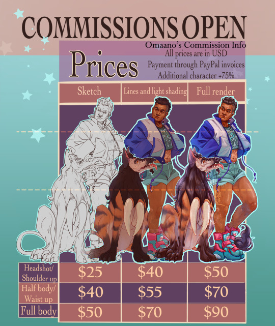
⭐COMMISSIONS ARE OPEN⭐
Reblogs are deeply appreciated even if you cannot afford to ask for a commission ❤️ And if you'd like to support me and my artwork n any other way - like with a small tip - I have a ko-fi too ❤️
I’d be happy to draw your OC, favourite character or ship for you; you may check out my art tag for other examples of my work on top of what is in this post, as well as previous commissions I had drawn. If you have further questions don’t hesitate to DM me, or send me an email at [email protected] - detailed descriptions, and reference pictures are greatly appreciated! I truy love learning more about your characters and their backstories through the art process :)
Text transcript of prices, DOs and DON'Ts and additional information under the cut, I encourage you to check that out as well ->
Prices, payment and refund options
All prices are in USD and to be paid through PayPal invoices upfront. Cancellation of the commission is only possible before work on the piece is started. Once the sketch is finalized no refund is possible.
Prices:
Headshot/bust: sketch $25, lines+light shading $40, full render $50
Half-body/waist-up: sketch $40, lines+light shading $55, full render $70
Full body: sketch $50, lines+light shading $70, full render $90
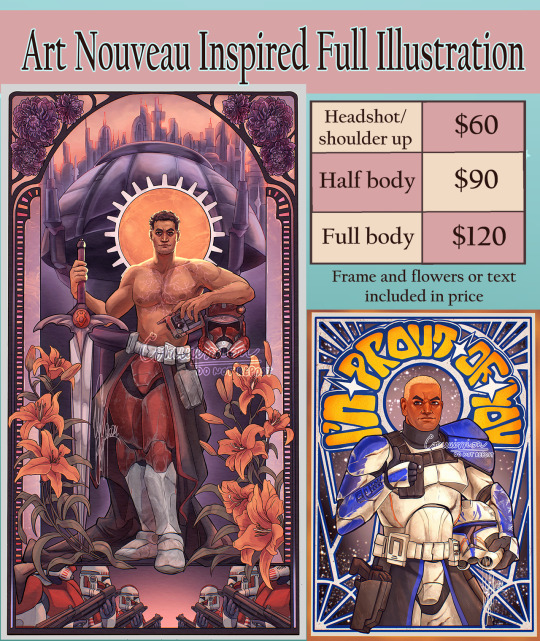
Art Nouveau Inspired full illustration (frame and flowers or text included in price):
Headshot/bust: $60
Half-body/waist-up: $90
Full body: $120
Extra characters are +75%
Simple background is included in the price, anything more complicated (background, very detailed clothing/armour/jewelry/tattoo etc. - clone armor is the baseline) can be negotiated for extra ($15+, or 50% of the full price for a detailed background. Let it be its own supporting character :) ).
DOs and DON'Ts
I WILL draw: OCs, fan characters, self insert characters, fanart, ships/couples, mild nsfw (e.g. blood, scars, suggestive themes, if an antique statue could get away with it, then so can I. If unsure please ask)
I will NOT draw: mecha, anthro, shio art with real life people, or anything I feel uncomfortable with
How it works
Commissioner will receive digital goods - I'll send the high-res version of the commissioned art piece via email. Check-ins can be done via DM or email.
3 minor changes are allowed (e.g. hand placement, flat colours etc) at check-ins with the sketch and colour concepts. Other major changes (like changing the pose after the idea of the sketch is finalized) will cost extra $10+.
I have the right to refuse to accept a commission. The work is for personal use only and cannot be used for commercial purposes. I retain rights to the artwork. The commissioned drawing is not to be used in any AI training program or any NFT-related project.
You may post the finished piece to your social media accounts with credits to me as the artist. I might want to post the piece to my own socials as well but I will ask for your permission for that first.
For detailed Terms of Service and further information please check out the following link.
I’m looking forward to working with you :)
#commission#commissions#commissions open#commission info#commission sheet#my art#art commissions#commission open#open commissions
252 notes
·
View notes
Text

Commission for @wind-up-nhaama, fem!OC Odette Tavelyen x Gale! I had an absolute blast working on this piece. Thank you once again! ✨
info & commissions
#commissions#example: flat colour#oop did i just misspell the last name i'm so sorry 💀#fixed it to the proper one#time for the december 25% discount is almost up!#you can still get it if you reserve an order before the end of 2024#bg3 oc#gale dekarios#fem!tav x gale#bg3#art#fanart#digital art#artists on tumblr
706 notes
·
View notes
Note
What advice would you give to someone who wants to start draw comics?
Read comics. Try to absorb the layouts and lettering - there’s so many ways to tackle it! Also even in published comics you’ll see that the art is messy and scrungly and you can take that as permission to be messy and scrungly too.
Comics are about efficiency and Good Enough. If you try to make each panel a masterpiece you’ll be there forever. Reasons why I mostly do simple pencil comics.
Start small. Do a scene or gag comic at a time. Get a feel for the medium and all the steps you have. If there’s a step you hate, find a way to emphasize the steps you love. EG I hate laying down flat colours but love shading, so I make my page form comics painterly greyscale with a gradient map to spruce them up.
Thumbnail!!!!! Figure out your page or panel layout before you start pencils. It can just be chicken scratch and sticken figures but it will help make sure there’s a clean line of action carrying the viewer from panel to panel and that your lettering fits.
don’t skimp on lettering. you can have beautiful artwork but if your dialogue is time new roman on half transparent ellipses or somehow unreadable it’s gonna drag everything else down. Blambot is a great source for free and affordable comic fonts and even has guides from an industry pro.
There are a huge bajillion elements to making comics but once you’ve made like, literally 100 pages you’ll start just intrinsically knowing things like the 180 rule, how to place a speech bubble when the first speaker is on the right, and that you can draw one nice background and then have gradient colour blocks carry you through most of the page/scene. And then you’ll still keep learning. Always learning!
LOTS of example stuff under the cut, mostly for lettering and layouts:
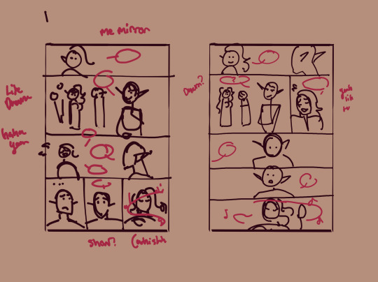
thumbnails vs finished page. The detail is just enough to remind me who goes where. You can see I mostly played with the last part of the scene, going from three panels in one row to making each panel an entire row across three rows. Panels on the same row have less “time” between them as the eyes skips from one to the other faster, whereas there’s a little more gap skipping back to a new row (think resetting a line on a typewriter). Here, the first thumbnail may have fit the artwork more neatly, but I wanted to give Astarion more time to deliberate his decision.
You can also see that I changed the top panel from a close up on Aldiirn to a wider shot showing both. This sets the scene, and the rest of it uses simple/abstract backgrounds until the final panel, which makes a nice bookend while making the overall load easier. One good environment panel will carry you for a while, but don't leave your characters in the void for too long.
Make a script before you start layouts but don’t be shocked if you need to cut things out to have them fit a page. Less is more, generally. This also goes for visual elements - what's most important to the scene? What's just extraneous detail you find fun but is creating clutter?
For the 4-panel comics I don’t put time into thumbnails unless it’s a difficult panel, but I always put the lettering and speech bubbles down first so they have enough room and nothing important gets covered. If you do this much you’re a step ahead imo.
This one I’m working on now and there’s a lot going on with four characters speaking to each other! It’s important to keep a clear line going for the dialogue. Astarion’s first line has the top left corner and clearly starts the conversation. The tail of the bubble carries over to where he whispers to Aldiirn, and we pick up Aldiirn’s lines. The rock wall on the right then draws the eye down to Shadowheart and Gale’s bubble at the bottom. I don’t think the tails on the bottom bubbles are 100% ideal, but it’s Good Enough.
There’s also slightly different points in time going on in this panel, because the art is static but it’s a long convo going on. Gale’s signature finger isn’t in response to Astarion whispering, but to his answer to Aldiirn that comes after. Think of how time works in your panels, especially when you got a big one because size = time.

You can use all sorts of things to direct the eye across a comic page, but I find the strongest things are the bubbles & tails and where characters are looking. Here, Gale’s “stop by” line breaks the panel line to help draw the viewer to him in the last panel, since otherwise the eye was likely to end up at Aldiirn.
I generally like bubbles to be tucked into their panels, either fully inside or up at the edges like “my condolences.” It looks neater than when bubbles are willy nilly over the edges which I see as a sign of poor planning. And! it means when you do break panel lines it can be more meaningful.
the 180 rule is a film/stage thing for composition to avoid confusing the audience, but the simplest way to put it is: if a character is on the left side of the scene, they should stay there until the action or whatever moves them. You can see here that Aldiirn is always on the right facing left, even when the camera is a bit behind him or a bit behind Gale. the 180 line is the front of Aldiirn’s tent, and the camera never crosses it in a way that would put Gale on the right.
I find it distracting when a conversation is happening in comic and a character breaks the 180 for no particular reason, though are times I’ve done it because a panel worked much better that way. The book Framed Ink has some great guides on composition and how to change the 180 line.
You can also see in the above comic that it’s arranged so that Gale’s always the first speaker in the panels he appears so there’s no criss cross bubble tails. Buuuut what if the first speaker is unavoidably on the right?
Stack the speech bubbles. You want the first speech bubble CLEARLY and undeniably the closest to the top left corner and then other speakers can go below.
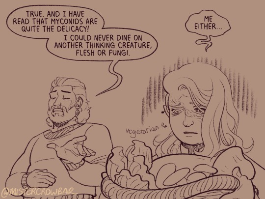
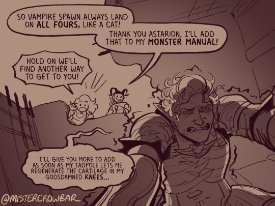
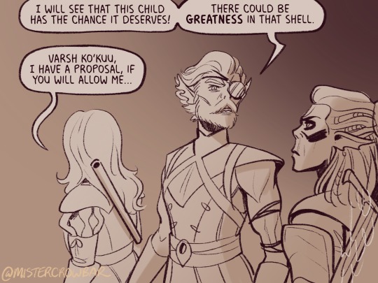
the middle example above also has some examples of playing with the speech bubbles. Wyll’s “square-y round-y” bubble is the standard, the boxy ellipse. The tail has a slight, lanquid curve. He;s comfortable teasing the poor vampire. Aldiirn’s bubble is pointy! the tail straight! with urgency! And Astarion’s bubble and tail are burbling and grumbling through gritted teeth and pain. Varsh Ko’kuu, even though he’s speaking with a standard shaped bubble, has a sharp point in the tail that speaks to his assertiveness in protecting the egg. And Shadowheart has some hesitation with that wiggly tail.
Either hand drawing or using vector shapes for bubbles is fine, but I recommend staying away from true ellipses because they look static. Square-y round-y is where it’s at. Just make sure there’s enough space between text and edge of the bubble, usually enough to fit a capital H or W, but you can play with that spacing too.
The second panel here breaks the “first bubble goes top-left corner” rule, so it’s ambiguous if Gale or Aldiirn speaks first. However! In this case everyone is giving their responses in a jumble to Rath, so order matters less. I’m pretty sure every rule I’ve mentioned has a time and place to break it, but it’s still important to learn the basics first.
Key thing about comics typefaces: the capital I will have bars and the lower case will not. The barred I is used for I, as in, “I am not inclined to share” where the unbarred is used everywhere else.
When choosing a font, I recommend grabbing one that has Regular, Italic, and Bold/Bold Italic typefaces. I use Milk Moustache for my 4-panel comics because it’s very casual and similar weight to my own handwriting, but it doesn’t have an italic typeface and that drives me nuts sometimes. For the most flexibility, choose a font that has lower case AND uppercase type faces. I stick to upper case 90% of the time but lower case adds more options, like Aldiirn’s “really?” being so small due to his stressed state.
There are some official guides on what should be bold or italic in dialogues but they don’t matter as much unless you’re working for a big publisher with a style standard. Italics for thinking and whispering are common. I go with my gut, like Astarion’s speech is so dramatic I use italics and bold liberally, whereas for most others I may or may not just choose a key word to bold.
I think some programs will let you make text to fit a bubble instead of a square box, but tbh I just spend a lot of time manually making the text fit nicely in that bubble shape.
265 notes
·
View notes
Text
#Get Ready With Me.
THIS JUST IN: YOU LOOK AMAZING. DON’T THINK TOO HARD. The world is burning, but here's what’s in my cart 💅 #GRWM During the Collapse 12 Looks That Survived the Fire Hauls More Explosive Than the Headlines Best Lip Glosses for Evacuation Day These Leggings Ended a Regime “This is Bisan from Gaza”
Wake up Wake up Wake up Scroll Scroll Scroll Scroll ScrollWake up ScrollWake up ScrollWake up ScrollMake your jaw look snatched Scroll - Scroll - Scroll Scroll Scroll Scroll Scroll - Scroll - Scroll Scroll Scroll Scroll Scroll - Scroll - Scroll Scroll Scroll Scroll Scroll#GRWM while ScrollWhile ScrollWhile ScrollWhile... Interact from the bottom up please See me Anyone See me Please see me Wake up Wake up This is Bisan from Gaza See me Anyone? Like comment share please Someone see me Scroll This can’t be the end Scroll
Source: #Get Ready With Me.
1 note
·
View note
Text
Savings/Mental Health Recovery Coms

Hello, as some of you may know we recently lost our beloved dog. While some of the process of healing from that has started to settle in I thought it could be nice to try and keep my hands busy with some commissions that would also help recover some of the savings we lost from the last vet visit we had to do. I plan to keep this post circulating for a little bit, and I'd be very grateful for anything that comes my way. Sale prices are still applicable, thank you to anyone who takes me up on one.
Pricing and examples:

Flat colour piece w. basic detailing: $50+ $40
(Piece includes a single character and BG element in flat pixel art, $15 for another character)

Multimedia Y2K Stylized Piece: $50 $35
(Piece includes a custom 3D background created in Bryce 3D and stylized poster/card format) NOTE: Background complexity is limited, please temper expectations

Flat/Pixel art only Y2K Stylized Piece: $50+ $40
(Piece includes a single character/design element in a poster/card format, $15 for another character)

Pixel Chibi: $20 $15
(Piece includes a single character and BG, no additions)


Emote Suite: $35 $25
(Price covers up to 9 custom emotes sized for usage in Discord and other messaging use cases)

Doodle:$25 $15
(A flat simple piece with a simple concept done on a small canvas. Includes one character and simple background, no additions)
Please DM me and we'll discuss things further. Thanks for reading.
294 notes
·
View notes
Note
can you talk about your process when designing your illustrations :)
hiiii marisa <3 <3 hope you're doing really well !! :))
my illustrations are usually either the result of building slowly on thumbnails, or they kind of come to me in a sudden visual flash while i'm walking around. the former tend to be landscapes while the latter can often be more expressive or fluid. here are some thumbs as examples !


i try to get some sense of perspective and space here, but generally it's just to pin the idea down.
then comes colour - i've spoken a bit about how i select colours based on warmth and saturation, but mostly these days i take some loose inspiration and then continue with whatever feels right. my biggest colour inspirations have come from celia lowenthal and alexandre 'zedig' diboine.


i block the colours in under the loose thumbnail layer, then get straight to inking.

there are some speedpaints on my youtube if you'd like to see more of my process here - i usually put on an audiobook or a video essay and use my trusty ink fineliner to outline each and every detail. sometimes if something is in the background i'll reduce the brush size, but generally my lines are all the same weight.

and then I take the colours I outlined under the thumbs and reapply them to the precise lines. ^ here I use a soft round brush for gradients along with the ink sumi-e brush for applying flat colours.

then, finally, comes the overlay layer for lighting effects and extra details!
I hope this helps, as I feel like I always have so much room to improve (especially where composition and layout are concerned). if there's interest i'll make a more concise and clear step-by-step breakdown, but for now i'm always happy to take any suggestions or thoughts on how i can keep trying to make engaging narrative-based illustrations :))
660 notes
·
View notes
Note
as a kpop politics amateur researcher-yeah thats the interesting thing about hybe (katseyes label) they are so. So into the idea of being the coolest kid in school because of their major success story being Boys That Sing (i refuse to spell that in case it comes up on search) that they end up doing this weird game of neutrality/bragpop that ends up flat a lot.
For my money, I find that the factory-manufactured nature of K-pop is both its blessing and its curse. On the one hand, the visual spectacle of it is incredible in a way that no other cultural mainstream music genre can compete with, from the aesthetics to the sheer inhuman synchronisation from the dancing. Even sedentary shots of soloists in MVs can take on these breathtaking, otherworldly sorts of qualities. A while back I reblogged a side by side comparison gifset of Taeyeon's INVU and Key's Gasoline, and they look like gods of moon and sun. Aespa's got a whole bunch of slick, cyberpunk-type videos, like Drama. The sheer aesthetics. Your eyes want to drink them
But, on the flip side, the music itself is very often on a scale from vapid to completely meaningless. You might get an overall concept, like "I'm so great" or "I love my partner", but the execution is frequently sugary sweet or just plain hollow. That was one of the big criticisms of MEOVV's debut song, in fact - they went with this boastful "I'm so great" through line, but the lyrics had them boasting about how much money and fame and success they have, when they were (1) launching their first ever song and (2) literal children. You're right that Hybe does this a lot, but they aren't the only ones - Blackpink have a line in one of their songs that basically reads "My Lamborghini goes vroom vroom".
And, that's what happens with the 'churn them out of the factory' model. There's no time for artistry when you're making your artists record two albums a year, plus the dance training, plus the touring, plus the extreme diets, plus plus plus. Katseye's Gnarly is actually a great example of all of this. God, it is an empty song. But! Fuck me, it's a spectacle. The choreography is incredible. And, you know, we get treated to them describing Tesla as gnarly lol, though not in the 'clean version', where I note they're carefully avoiding hurting Elon's feelings.
I should say, of course, that a lot of these issues are lessened in groups that write/produce a lot of their own stuff. (G)-idle's Oh My God is an absolute masterpiece and is a song about a wlw awakening, something you frankly do not often get to see in the K-pop world; similarly, they produced Nxde as a critique of the sexual commodification of women AND as a way to make "nude girl idol" into a dead search term that perverts could no longer use to try to creep on young female idols, since you just get their stages and MV in the search results. IU's Love Wins All is a beautiful love song, with an MV that fucking shreds your heart. Similarly, artists who are sort of K-pop adjacent produce some amazing artistic stuff (Bibi, Jackson Wang, etc).
But, it's because they have time to dedicate to the artistry. And, frankly, to give roles to the members that play to their talents and let them actually shine. Companies are obsessed with forcing all members of a group to sing in the same pitch, and that pitch is "high" - regardless of whether or not a low-voiced idol will sound good in that register, or if it's even ruining their voices. They're all forced into a narrow box, so they can produce that same sugar sweet vocal colour, factory-made and ready. I think it's notable that the groups and artists who most often stand out in that arena are the ones that write for themselves - Stray Kids wouldn't be half the group they are if Felix wasn't allowed to let the bass notes roll, ditto (G)-idle with Yuqi's contralto.
Anyway. This got overlong. But you're right - bragpop fallen flat sums up a lot of it!
#asks#this makes me look like I'm way more into k-pop than I actually am lol#i am super picky about which k-pop songs I listen to#but I am with all music really
150 notes
·
View notes
Text
Relationships & Other Things🦋🐚🌙
🍕Sagittarius Venus are actually more loyal in a relationship than most signs. They will be all in- in the relationship and give person the world. They are very devoted and when they love someone they are persistent in the relationship they have. They will share everything with this person. Many people do not understand this Venus and caress it enough in this position. For example, Venus in Aquarius is really hard to commit to a single partner for a long time - they will always look for freedom and something that will enrich their life and they are very independent in the things they do. Their love language is also quite different.
🥀Venus suggests a more adult level of affection and bonding - what we want others to appreciate and admire in us. The position of your Venus, by sign and house, as well as the aspects it makes to other planets, indicates what you find attractive and what you need in order to get on well with someone - for a relationship to work, there needs to be mutual appreciation of each other's desire nature. This is harder work of course if your Venus is, say, in Capricorn or in aspect to Saturn (suggesting a controlled and self-contained relating style) and your partner or friend has Venus in Sagittarius or aspecting Jupiter (suggesting an extraverted aesthetic and enjoyment of the good life),
✨Water moons feel loney souls. They sense when someone is a lost soul or when someone needs help. They have a very intuitive energy. Many times they feel much more than people think.
🍸Moon in 9th house- your home is somewhere else. These people often live somewhere else in another country because they can feel better there. They are often looking for their safe space. Many times these people feel as if nowhere is quite their home or as if they are constantly looking for their place under the sun. They may end up living far away from their family or somewhere you have to drive for a long time. But they have to feel home so that they can live in it.
🌛The Moon is perhaps the key planet of relationship in that it suggests how we form emotional bonds - how we nurture and care for others, and what we need from them in return in order to feel safe and comfortable.
🔥If your Moon is in a fire sign for instance, there is a need for life to be a colourful place of risks and potentials; if your partner or boss conversely has the Moon in an earth sign, your enthusiasm might well elicit an annoyingly sensible and risk-averse response that leaves you feeling flat. We are all driven by our basic instincts when it comes to our Moon.
🪐Saturn in Aries -they may be afraid of failure or they may be obsessed with achieving something. They tend to be competitive when it comes to themselves and their energy. They can often be in competition with themselves. Saturn shows where you are most serious and which area you take much more seriously than others.
🎳3rd house synastry many times indicates a person you knew from elementary school years. Or the person you met in high school. You have definitely met this person somewhere before, but you may not remember it right away. A lot of the people you share 3rd house with, you already met before.
🍬4th house synastry is often a person with whom you can create a cozy home and warmth. This house is most likely to make you think about living with this person.
🛼5th house synastry shows romance with the person and keeps the relationship alive. This means that you can fall in love with this person again and again. This house also reflects the fact that you think about children.
🌊8th house synastry you will share the darkest times with this person and they will help you in many things. This can also be the person with whom you can get the closest.
🎤Mercury gemini & libra love to talk and are quick to respond to messages. If you are interesting to them, they will keep the conversation with you. Aquarius mercury likes to talk about topics that are more controversial and not so much in the foreground. They will either write off quickly or not at all. Capricorn mercury mostly do not like to waste time on long conversations or texting. Virgo mercury likes to debate and talk about different things. If you ask them for advice, they will give it to you and tell you how they see it. But there are people who many times won't tell you directly if something bothered them.
🌨️Good & Bad side of zodiac signs☀️
💧Capricorn placements will do a lot for you because they are a sign of action and when you need something they will always be there for you. No matter what, they will always try to find a way. But their downside is sometimes that they devote too much time to career, success (in the sense that it becomes part of their life). They forget to enjoy life and sometimes know how to push themselves too much to the extreme.
🌬️Gemini placements are good at communicating, changing things, topics and everything. But their downside is that they change direction too quickly and don't focus enough on the person/thing. A person with a Gemini in Mars can often be prone to cheating if they do not have enough stable signs in chart.
🥨Taurus placements know how to do a lot for you, spoil you, buy you expensive things (they always buy you something you've always wanted). Their downside is that they can become too materialistic, stand up for money or put it first. And maybe sometimes they live a too monotonous life and don't want change.
🛁Virgo placements can sometimes be too obsessed with work, routine, order, perfection (they sometimes expect too much perfection from themselves and then consequently from their partner).The obsession health can be overwhelming at times. If someone will serve you things than this is them and a lot always about health, herbs.
🛍️Libra placements can sometimes adapt too much to society and to serving everyone before themselves. Sometimes it makes them a different person. You don't always need to be accepted into the circle or to be liked by everyone. Many times they can be obsessed with the fact that they should fix something on themselves even though they look beautiful (libra risings a lot of times). Sometimes they can look too much for balance and rationality in everything. It would be great if you could ever choose a side and not be on both sides at once. They invest a lot in the relationship and put the person they love first.
🥐Aquarius placements I think that they are often example of having commitment issues. I wouldn't say that they are the ones who want to be different or that they would repeat it too much. However, many times they have a specific opinion or view that is sometimes difficult to change, and many times they give an opinion about something that is not always appropriate. They are an intelligent sign and often accept and understand different things. They never find anything strange.
🩰Pisces placements I like their artistic nature, how they can swim in their own world. Their weakness is often that they look too much for some ideal of a person and when the person does not fit the description, they just leave. And that they can quickly find another person they like - I have the feeling with them that they are never fully committed to just one person. Many times they know how to manipulate and lie to others. It seems to me that one part of them is never fully visible.
🧩Cancer placements their downside is that they have their favorite people, whom they choose, and if you are not a person who is always available to them, they can quickly cut you out of their lives. Many times they can clearly show the difference between one person and another. And sometimes they don't feel bad if they gave one person more than others. But they know how to make a really warm and cozy home where you will always feel welcome.
🐬Scorpio placements sacrificed a lot for people that they love , they value their privacy and they are one of the signs that will never betray your secret and are truly devoted to you. Scorpio is all or nothing. They are a ride or die sign - forever sign. They share their soul with you and that's one of the most beautiful things about them to me. But it is their weakness that control, obsession, jealousy can take them over. They are quick to doubt people and things. Many times they have too much trust issues.
🍕Sagittarius placements have a lot of knowledge, they are one of the most optimistic signs and they can show you from a completely different perspective.Sometimes the problem with them is when they start looking for positivity in everything, in the sense that they don't allow themselves to be sad. Many times they are afraid that if they lose their meaning, they will have nothing to live for. They forget that sometimes you can live for others
❤️🔥Aries placements if anyone is braver it's them, they always take risks and know no shame. Their motto is do things - whatever will be will be. However, they can sometimes be too impulsive in their decisions. Sometimes they focus too much on themselves and forget how others feel. Many times they do to others exactly what they would not want others to do to them.They sometimes think that if they have done something a couple of times, that now you should invest even more. And if you don't invest as much as they expect, then they are like "okay bye". They have too high expectations sometimes.
🎬Leo placements are generous, youthful and love to do childish things. They know how to enjoy things without a bad conscience.And as they love you, they will always put you first. The bad side of them is that sometimes they want to be too much in the spotlight and that they relate everything to them. Sometimes they can be too irresponsible about their actions. Sometimes they don't know how to listen to the other person.
-Rebekah🍕🥨🦋
#astrology#energy#zodiac signs#planets#my notes#astrological houses#astrology observations#birth chart#moon#venus speaks#mercury
1K notes
·
View notes
Text
Noah's Ark on Broadway


LISTEN NOW (8 minutes):
Listen Now as Francis Douglas tells of when Noah's Ark was featured on New York City's Broadway stage.
PODCAST TRANSCRIPT:
Today on Celebrate the Bible:
NOAH’S ARK on BROADWAY in 1896
You are not likely to find anything about Noah's Ark on New York City's famous Broadway today … but, at one time, it was the "toast of the town".
Noah's Ark, and the great world-wide flood as recorded in Genesis, is perhaps one of the most easily identifiable events in all of the Bible. The most interesting aspect of this episode is not the illusion itself, but the fact that it attracted so many people from New York City's secular population: from every-day working families, to the City's upper crust … all were thrilled with the experience.

A few points of note:
Technical details of the illusion were featured in Scientific American magazine
The Olympia was the premiere entertainment showplace of the world
Biblical themes were very popular, with all NYC audiences at the Olympia
It was founded and built by famous Oscar Hammerstein
It was reported that audiences were left spellbound after each Noah’s Ark performance
It was so popular and well-received, that the highly respected science publication, Scientific American, devoted an entire page to this Biblically-themed entertainment attraction -- complete with stunning illustrations.
Let’s take a step-by-step look at the Noah’s Ark illusion. I will inter-space the steps throughout today’s presentation.
STEP ONE

Hammerstein's Olympia Theater and Music Hall was once celebrated as the foremost entertainment venue in the entire world.
Located at 44th and Broadway in New York City, it was only two blocks from what is known today as Times Square. The main theater held 2,800-seats. And the building took up an entire city block.
STEP TWO

The rooftop was just as famous as the theater and music hall. It had a 65-foot tall glass roof, and was illuminated with over 3,000 light bulbs. To provide electricity, there were four dynamos that generated 3,200 amps of power. These dynamos also powered a complete air circulation system, and pump, that brought refrigerated water from the basement to the rooftop area -- providing what was a very early version of air conditioning ... in 1896!

Not to be outdone by any other venue, the rooftop also had trees, rocks, and even a stream that eventually led to a 40-foot lake. There were swans, ducks, and even South American monkeys.
And, while you were enjoying all of this, you could walk around the perimeter of the roof, and take in views of Central Park and neighboring New Jersey.
At the time, the cost of admission for everything, including entertainment, was only 50-cents! However, keep in mind, with the rate of inflation from 1896 to 2025, that same fifty cent admission price would be equivalent to roughly $15 to $20 today.
STEP FOUR

The Scientific American publication was founded by inventor and publisher Rufus Porter in 1845. Contributors of note include Thomas Edison, Robert Goddard, Jonas Salk, Albert Einstein, and Linus Pauling -- just to name a few.
STEP FIVE: The SOLUTION

The answer to the filling of the Ark with water is a simple one … the water funnel on the top of the Ark is attached to a hose that runs down through the support beams, then empties under the stage. The water never fills the Ark in the first place.
Other than taking creative license with a few details (for instance, the real ark was never filled with water), it was a wonderful opportunity for audience members to experience one of the great Biblical events on the grand Broadway stage.
Perhaps one day we'll see a revival of the Noah's Ark Illusion, or a variation on the theme. In the meantime, I'm glad to have been able to bring it to you with this Celebrate the Bible 250 podcast.
So, until we meet again, and for celebratethebible250, this is Francis Douglas.
If you would like me to give a presentation and small exhibit to your church group, school, or organization, on the History of the Christian Holy Bible in America, I’ll place contact information below as the 2026 Semiquincentennial America 250 year approaches.
I will be available for Southern New Jersey, Southeastern Pennsylvania, and Northern Delaware.
Source: Noah's Ark on Broadway
0 notes
Note
Hi I have a small question but what is the difference between flat and full colour? I have heard about it alot but don't know what it is.
Here are some examples
Flat color:
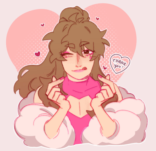

Full color

1K notes
·
View notes