#html is actually pretty easy when you just copy and paste
Explore tagged Tumblr posts
Visit Tumblr Blog
Explore Tumblr blogs with no restrictions, modern design and the best experience.
Last Seen Tumblr Blogs


Fun Fact
1,644 Tumblr posts in 1 second.
Text
there was a thing at work today that required some html. Basically formating an email template with some links, pictures and stylizing embedded. We don't deal with any kind of programming usually but as I am the youngest in the office I'm usually the one approached with this kind of 'it' problems.
In short: never let anyone tell you editing fanfiction on AO3 doesn't tech you valuable job skills.
2 notes
·
View notes
Note
Hii, I just wanted to ask how did you change your text colors to be mixed like that?
Hii! So, I made a very quick tutorial and just follow the steps. It's actually pretty easy and I know it has no voice but it's because I'm sick and my voice it's terrible right now lol.
The generator of the colors is this: Edit fiddle - JSFiddle - Code Playground
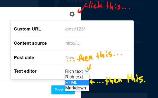
Step 1: when you go to post something, go to that setting and change the text to HTML;
Step 2: go to the website and write what you want and choose the colors;
Step 3: copy and paste the code that was formed in your HTML text on Tumblr and that's it!
Note: I'm not sure if you can do this in your phone, though.
Hope it helps! ❤️
30 notes
·
View notes
Note
hiiiii do you know how to edit the html code after you copy paste a gifsets link on the gif search thing:333 tried to change every 1 in there didn't work:3
oh yeah it's pretty easy. and i know you use tumblr mostly on mobile so i'll show you how to do it in a mobile browser:
copy the link of the post/gifset the gif you want to share is from. it can look like any of these (i use firefox and i have an android so the ui mayyy look a little different but it's the same gist)
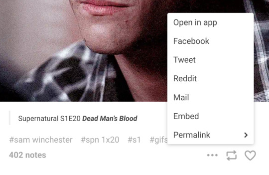


before going onto the next step, i like to grab the gif address that i need so i'm not going back and forth. to do so, you just long-press or whatever on the gif you want and copy its link

this step can be done in either your mobile browser or the app but i just do everything in the browser. start by making a new post and searching for the gifset you want to get your gif from by clicking on the 'gif' option that tumblr gives you and just pasting the link you grabbed in the first step, of the whole post/gifset, into the search bar, then just click the gif that comes up
browser:


app:

either way, you'll get this:

BUT! we want the second gif. so this is where you save the post as a draft if you started in the app and switch over to your browser so we can change the text editor to html


it'll look like this and the bits highlighted yellow is what we'll be deleting and replacing with the gif link you grabbed in step two

once that's done it Should look like this
then when you either post it, save it to drafts, or just return to 'rich text', you'll have the gif you want! in my case, it's the second gif with sam's melancholic twitchy smile :)

i hope this was coherent and actually helps !!
14 notes
·
View notes
Text
Quick guide on how to get big tumblr link in your posts
idk if it’s been like this for everyone, but I know the Link button in tumblr posts has been broken for some ppl for a while.
Basically, what’s happening when you click the button is that it doesn’t insert any html into the post, so links get added as simple plain text. You can get around it by adding in the html yourself, it’s pretty easy (tho not as easy as clicking a button, tumblr 😒), so this guide is mostly for ppl who aren’t used to looking at html.
I prefer to do this on desktop, but it’s easier to edit caps on mobile—the process is the same anyways.
What I tend to do is pull up an old post with a link and copy the html code from that post. You don’t have to fiddle with the code itself, you just need to replace the urls and the display text.
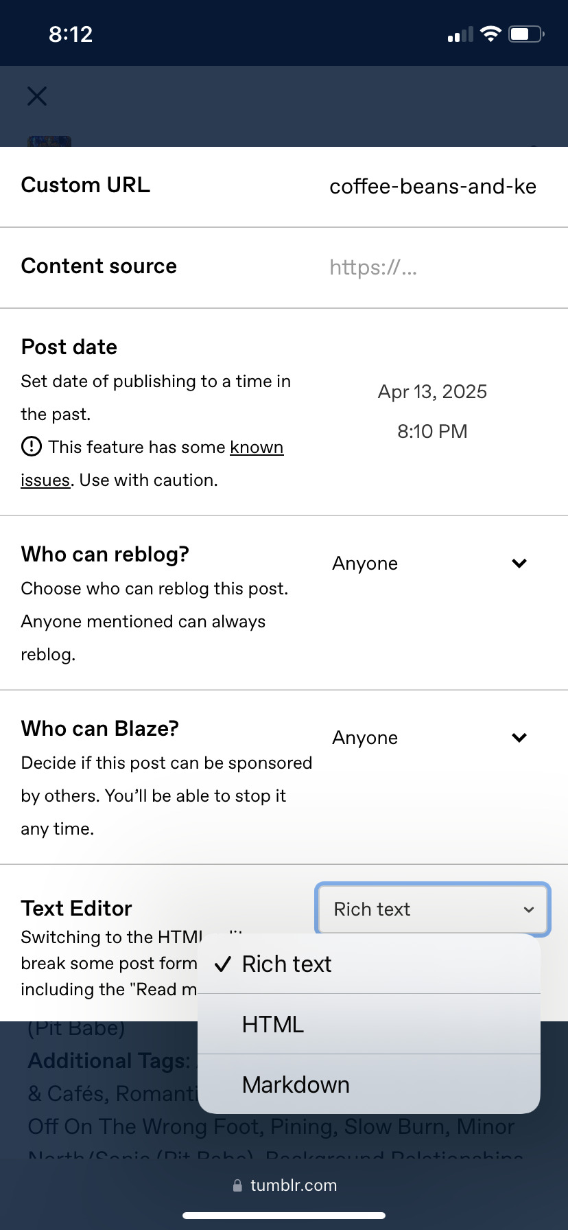
To get to the html editor, click the gear icon on the top right, then click the drop down menu next to Text Editor and select HTML

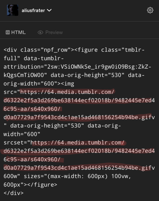
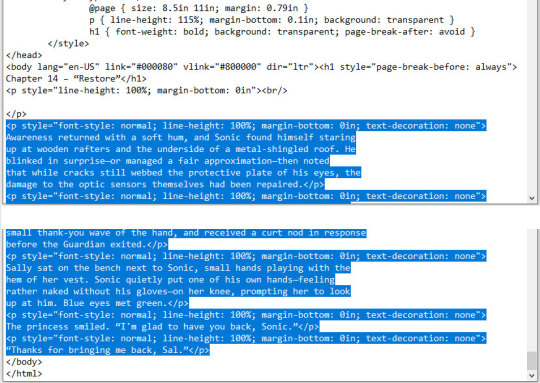
This will pull up the html code, as seen below. What you need to copy is everything from the open < p tag to the close p > tag. (This is easier to find in a post where the link is the first thing)

After you’ve copied the code, then you pull up your new post and past it into the html editor. Next you will need to replace the old url with the new link that you want to put in your new post. This needs to be done in the three locations highlighted below. Then you just need to replace the display text in two locations.

It occurs to me I’ve only highlighted the part of the display text that I actually replace, since I only ever do this for fic updates and only for the same fandom 🤷♂️ Hopefully the principle is easy enough to understand, though.
Maybe this will be fixed eventually, but, well… maybe not :|
#sorry for putting this in the pit babe tag but i’ve noticed several ppl struggling with links 🙏#idk what other fandoms are dealing with this i only care about the pit babe tag lmao#pit babe the series#tumblr things#em post
9 notes
·
View notes
Note
Hi!! Sorry if this is a weird question and u don’t have to answer it but how did u do the moodboard/visual media thingie on ur office gossip nanami fic? Do u have a tutorial/tips? You’re one of my favourite writers by the way ur nanami fics are so good 😘😘
omg thank you soooo! 🤍 it's not a weird question at all, and i hope i'm able of explaining everything! (@gothsuguru i'll tag you since you mentioned the layout, feel free to ignore!)
so a tip i'll give anyone before starting to edit is just to stop and visualize what you would like to do. this fic is an office au and the main character is a mess, so i just thought her home screen would be painful to look at and things evolved from there.
your best friend is pinterest, ibis paint, photopea and deviantart. you can use any other editors of course, go with what makes you more confortable, but i use photopea a lot for college and i personally think it's pretty easy for everyone to use + it's free.
on deviantart you will look for templates (as in: "playlist template", "instagram feed template", etc.), pngs, textures, all those things that will make the base of your edit.
pinterest you will go for both inspiration and what will give flavor to it. like i used a gallery template, and on my many pinterest board i chose what would fit it better.
on photopea/photoshop you will open the template you downloaded and play with it. you will add photos, text, etc. don't be afraid of making something wrong. all you need to do is ctrl+z and try again. if you're not familiar with it, explore, try to look at some tutorials on yt, have your fun.
then on ibis/color pallete sites you will find the color you want everything to be, use the hex code to edit, and give the final touches.
when it comes to the dividers, i make them on ibis. i just paint it with the two colors i want my gradient then change the pencil to the blur and... well, blur.
for you to get the perfect colors, i mostly just fuck around with rgb until i get the ones i like the most.
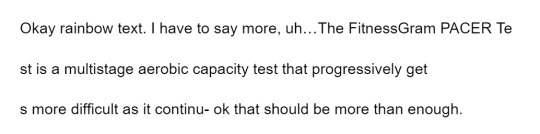
and the gradient texts i use those two sites: this one to copy the html code at the end and this one where i replace ; with blank space (literally put nothing on the second box and hit replace text then copy).
my tip is that you go on tumblr, create a post, change the configuration on the post to html, paste the code, save as a draft. then hit on edit to open the draft, copy the text already with the gradient, and add it to the post that it'll actually be on.
i say that because if you change the configuration to html it'll fuck whatever photos you had on it, so for me it's way more practical to have a draft where i just drop any gradient codes and simply copy it.
from the 12 posts on my draft at least five of them look like that:

#so was it helpful? i don't fucking know#it feels so weird to explain it in text#if you have any doubts just tell me#the gradient thing is super easy really i probably just made it sound awful#ask box
6 notes
·
View notes
Note
22, 40, 73!
For the record, I really prefer when people quote the meme, because I do not always manage to remember that I need to open it in a tab so that I can go through and reference it and figure out what they're asking. It's all good this time, because I did remember to open it in a new tab and it's this one, but for future reference!
22. describe your writing process from scratch to finish.
That varies depending on the story. Let's go with a fairly common writing process when I'm writing fic for exchanges, which I do a lot of because if I don't have a deadline I rarely actually ... finish anything.
My first step is reading through their signup to see what we matched on. If I'm lucky, they'll have given prompts, at least one of which will resonate with me. (Lists of tropes they like are pretty much useless to me; I have never once gotten inspired by a list of tropes.) If they haven't given any prompts, or haven't given any that I groove with, I will let things percolate for a while, going back to re-read the signup.
When I have an idea--and it's usually pretty vague at this point--I copy the stuff from the signup sheet into a blank document and delete the stuff I don't need (DNWs I would never write, prompts I'm not interested in, that sort of thing). With the deadline in bold at the very top. This way I have it all in one place and it's easy to check things. Then I start writing the story, mostly based on vibes at this point.
Usually, once I get actually started writing, my hindbrain will engage and give me stuff to write. Often times in the form of things that have to happen near the middle/end of the story. I will write a skeleton form of those--usually a brief summary of any scene that comes to me--down at the bottom of the document in italics, in the order things need to happen in the story. Once I know where I'm aiming at, I can usually get there with minimal problems. As I get to stuff in my summary/outline, I delete it because it's no longer necessary.
When there's stuff I need to research or decide--names of OCs, canon details I've forgotten, rl stuff I don't know off the top of my head--I put that in brackets and move on, so I don't get stuck. So instead of trying to figure out a name, I just write [CHARACTER1] and then when I'm done with the story I can take the time to pick a name without it derailing me from writing, and then do a replace-all.
When I'm done with the story and have gone back and filled in everything set aside with brackets, I send it off to betas if I can. There's rarely any major changes needed, but sometimes there will be fandom specific stuff (pronouns in TGE fics my beloathed), and also, by this point I usually hate the fic and/or think it is the worst fic anyone's ever written, so I need the reassurance that it's actually fine. Also, I have a problem with endings. As in, my natural tendency is to stop without wrapping things up very well, so I can never tell "is this a decent ending, or does it need something else to tie it together."
Then once I've gone through and made the changes suggested by my beta, I save the fic as a .txt file and do an advanced find-and-replace in Word to put in the html codes and copy-paste it into the AO3 Work Text box (HTML, not rich text). Here's a tutorial on doing html code by find-and-replace, it works with most word processing software except google docs.
Then comes the agonizing part, choosing a title. And usually it stops me cold and I spend hours going through poetry websites and quote websites and hitting refresh on a couple of title generators until I come up with something that I don't hate with the passion of a thousand burning suns. (Sometimes I give up and go with something I hate.)
Then I tag the fic, using this checklist to make sure I don't miss anything important.
Then I hit post!
40. best piece of feedback you’ve ever gotten.
If you mean feedback as in "writing advice" I have no idea. If you mean feedback as in "comment left on a fic" the one I remember most clearly the joy of receiving is this one.
73. how do you visualize scenes? do you see it like a movie in your head, or do the words just flow?
I do not visualize anything, like ever. That is not how my brain works.
I hear the scene--the dialogue--and will pace back and forth saying each character's dialogue in turn. Or lie in bed telling the story to myself, mostly in the form of dialogue.
When I started writing, one of the things that was hardest for me was to learn how to put in the visual things that other people need--scene descriptions, facial expressions and body language, you name it. A very early beta once told me that she felt like the characters were disembodied voices in a featureless white space, and this would not work for most people. They were right.

0 notes
Text
So over the course of about a week, I had extracted the game roms from the various Virtual Console games I had bought on the Wii, 3DS, and Wii U over the years when their online stores were still up. (Well actually, my brother had bought Final Fantasy 1, Circle of the Moon, Minish Cap, Phantom Hourglass, A Link to the Past, and Super Metroid, but whatever. We shared the consoles.)
Now I can do whatever I want with these roms, whether that's using them in an emulator, or putting them on a flashcart or some other rom loader to play them on authentic hardware.
Some of these were easier to get than others. For the Wii U Virtual Console games, I used the Dumpling homebrew application to dump all of the games, and from there, it varied depending on the game. For N64 and DS games, I just had to find the files and rename their extensions. For NES, SNES, and GBA games, I used a program called wiiuvcextractor that converted the proprietary formats they used to more common formats used in emulators (.nes, .sfc, .gba). It was pretty easy to use. And then for the Wii games, I used a program called nfs2iso2nfs to stitch the files together to make an ISO. It was easy enough to use once I knew what I was doing by reading a guide a bit more carefully.
The 3DS Virtual Console games were a bit more complicated to do. I had to go through GodMode9's file explorer to go through the files for each VC game to export the roms. The Game Boy and Game Boy Color games were easy enough to deal with (just had to rename the extensions). The one Game Gear game I had bought, Sonic Triple Trouble, I had to decompress with an application called mdfTools. I don't remember whether or not I just dragged and dropped it or used a command prompt, but it wasn't hard either way. And then there's the one NES game I had on 3DS, The Mysterious Murasame Castle. It was a Famicom Disk System game, and hoo boy, was it quite a doozy. First of all, I had to use a hex editor to copy and paste the actual game data without the filler data to a new file labeled .qd, and then I had to download Python specifically so that I could use a specific Python script so that the .qd file could be converted to a regular ol' .fds file.
It was quite a hassle, and technically, it would probably be the hardest one to do, given that some very basic hex editing shenanigans had to be done, but somehow, I found extracting the roms from the Wii Virtual Console games to be far more infuriating.
After some trial and error trying to extract files from the .wad files I had extracted from my Wii (with mixed results), I had found out about a Python program called vcromclaim, which streamlined the whole process, but I had to provide a NAND dump to use it. So after some more trial and error trying to find a program that could create a proper NAND dump, it took even more fiddling to get it to work because I have a monkey brain, but eventually I was able to get it to work... except I wasn't able to extract the one Neo Geo game I had, The King of Fighters '98, because it used a specific kind of compression. According to the readme on github, I would've needed some Python thing called PyCryptodome installed. I don't know what it did, but if I wanted to get every Virtual Console game I owned, I would need to install it. This took several attempts, but I had to reinstall Python outright because it turns out I didn't install it right the first time, but eventually, I got it to download, and got King of Fighters '98 properly extracted, too. And as an added bonus, I got all of their respective digital manuals as html files, so that's pretty neat.
So I know what you might be wondering after reading all of this, because I've come across the same comment trying to look up guides and tools for this whole process.
"Why go through all of this hassle just for a couple of game roms? Wouldn't it just be easier and faster to just go to [INSERT ROM HOSTING SITE HERE] and download the same games?"
To which I say:
Anybody can go onto the internet and download game roms. I should know. I've done it plenty of times myself. But it was never about the games. It was about wondering if it was possible and seeing if I could do it myself. Life's a journey, not a destination.
#video games#gaming#nintendo#virtual console#nintendo hacking#nintendo homebrew#nintendo modding#some of these roms actually have differences from their original releases#as an example: The Legend of Zelda 1 has a better translation for the opening text#late night rambles
1 note
·
View note
Text
Posting Fic - How to prep your writing to display correctly on AO3 (via LibreOffice)
So I've seen guides online about how to convert your fanfic for AO3 after writing it in Google Docs, because a lot of people use GDocs to do their writing (which is a decent option, since it saves it in the cloud and all that). I'm not planning on repeating that here.
But I don't do my writing in GDocs, I do my writing in LibreOffice Writer, because it emulates an older version of Word (which is what I grew up on and am most used to), and because I can have more robust spellchecking than on GDocs. And when I was first considering finally posting my work to AO3, I'd heard lots of commentary about how often pasting into the rich text editor sometimes loses formatting, or what hoops people had to jump through to make sure everything looked good.
So I'm here with the actually-pretty-darn-simple method I use to post to AO3 for anyone who needs this, because I want to be helpful.
Please note: this is largely for the basic formatting one might use on AO3. I haven't tested it with fancier things (not even smallcaps yet, though I'm hoping that won't prove too difficult when I finally get around to a chapter that needs that functionality). Also, these instructions are for Windows, which is what I use.
The first step is, obviously, to write up your story in LibreOffice Writer. I have some formatting standards I prefer because it makes my works look like they're publication-ready, which helps me stay in the "I'm actually writing fiction here" groove.

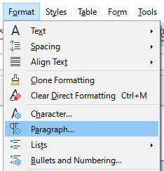
Once you're done writing, you need to make sure the file is ready to save for AO3. With how I write, the only thing I change is that I remove that first-line indent across the whole document. This is easy enough. Select everything, and then go to Format > Paragraph.
Once in that dialog, change the first line indent to 0. If you don't see a number there at all, just enter the number in there.
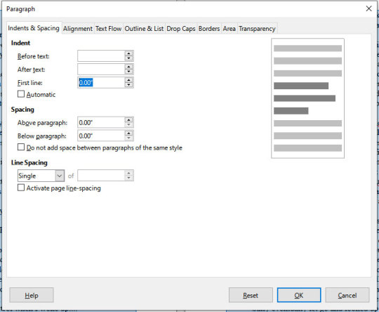
Then press "OK." This will realign all the paragraphs, including their first lines, to the left margin.
Note that I haven't changed the spacing between paragraphs at all. It's still single-spaced, and that's fine, because the next step can handle that.

DON'T SAVE OVER THE ORIGINAL.
What you want to do at this point is select "Save As" and make sure to save it as an html file, not whatever file format you normally use. LibreOffice will probably ask if you want to do that or use its native format, and you can just tell it "use html format."
You should now have an html file wherever you saved it. If you double-click it, it will open in your default browser, and you can check that the formatting carried over properly if you want. It should look ready for posting, complete with the internet-standard single empty line between paragraphs. LibreOffice knows to wrap each paragraph in html paragraph tags, which is what AO3 likes, and AO3 (and generally the rest of the internet) reads that as the extra empty space between paragraphs, just like you should see here on Tumblr.
Now you need to navigate to where you have the file on your computer via your file manager of choice (I'm on Windows, so I use File Explorer, which I can reach just by right-clicking on the Start button, but I also have a shortcut to it on my taskbar). Right-click on the file, and "open with" Notepad. You can also just open Notepad and open the file from within the program.
You should see the html code for the file.
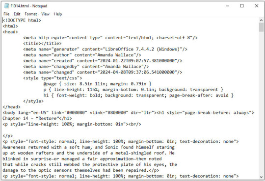
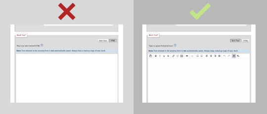
This is all set and ready to go. Copy everything between the "body" tags in the file (I also skip the lines that are for the chapter title, because I can enter that in a different spot on AO3).
Copy the selected code and paste it into the HTML editor on AO3. If you want AO3 to do a bit of cleanup for you, you can click over to the Rich Text editor, then back to HTML, and it will clean up extra carriage returns and such, but this isn't necessary. Double-check that everything looks good by clicking "Preview," and if you're happy, click "Post."
This even preserves smart quotes, which I don't bother to change to straight quotes, though I suppose you could do so if you wanted.
But honestly, that's how easy it is. Save the file as html, copy the html over to AO3, and done. No scripts, no file converters, no worrying if your formatting is going to survive being pasted into the Rich Text editor. Just LibreOffice and Notepad.
0 notes
Text

Save your fic, skip the indentation.
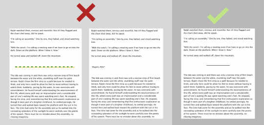
Indentation may be necessary in a high school essay but on Archive of Our Own, indentation can make the reading experience unpleasant, especially if your paragraphs tend to be shorter.
When it comes to line alignment, go left.
While making your text justified may look best at first, it is hard on the eyes to read for longer stretches of time (especially when late at night—which is when most people tend to read fanfic!) So, for the sake of your reader, consider using left alignment.
Use quotation marks, it’s in the name.
Even though it may be super obvious and easy to some, formatting dialogue into your fic can be tricky; let me save you some time. Indicate what is being spoken by bracketing it with quotation marks (these guys → “”) and refrain from using any other method, especially italics.
Shut up, I’m thinking (not talking)
So what do I use italics for? Glad you asked: Italics are typically used to demonstrate a character’s thoughts or emphasize a word or statement. Additionally, you may want to italicize a quote, song lyric, etc. Really, feel free to italicize anything you want, except, of course, dialogue.
Meet your new soulmate, horizontal lines.
No longer are the days of thirty identical emojis and “POV SWITCH” spelled out in bold in the middle of a fic. If you are cutting to a new scene or switching points of view, just insert a horizontal line and call it a day.
Quantity ≠ Quality
*Not applicable for fics under 1,500 words*
Having more chapters may seem more appealing on the surface, but having to press the next chapter button every minute can be a major deterrent for readers, especially those who use ao3 on their phone. Thus, if you have a 20k fic ready to go, think about splitting that baby into ten chapters instead of twenty. Remember, ao3 does not have a sort by chapter number option—only word count.
Yeah, yeah, it’s summary time
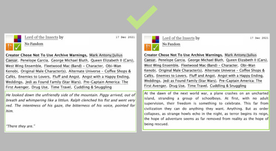
Man, summaries can be confusing to navigate no matter if this is your first or fifth fic. Here are a couple things you should not do when writing your summary.
Writing the word “summary” in the summary
Putting a really long author's note in the summary
Saying “this is really bad” or “this is my first fic” and the like. (they can go in the end notes if you really want to tell your readers, but also, be confident!)
The same goes for “please give kudos and comment” and “please read”
Having a “explainer” summary.
An example of a explainer summary would be saying something like, “this is basically my take on what i think happened after [blank] because [blank] broke my heart and sucked. [blank] essentially is sad when [blank] breaks up with [blank] so they gets revenge and starts a ~relationship~ with [blank]”
Having a really long summary. At most a summary should be 8-10 sentences but I would aim for shorter.
Putting a disclaimer in the summary. The great thing about ao3 is that you do not need to include a disclaimer for reasons that a far too complicated for me to sum up here, but if you would like to read up on it click the link: https://www.transformativeworks.org/faq/
Additionally, below are some examples of good and easy to read summaries. One is an actual summary while the other is a carefully chosen excerpt from the “fic”
O Rich Text! My Rich Text!
The rich text option on ao3 is a life saver and I highly recommend you take advantage of it. Not only is much more user-friendly, but when copying and pasting your fic, the line spacing won’t come out all wonky like it does when you copy and paste into the html box.
On Tagging
Tagging on ao3 is one of those things that, like summaries, seems daunting at first but is actually pretty easy once you get the hang of it. Now, I feel it would be best for me to explain tagging in another post as there’s a lot to cover and this post is already pretty long, so look out for that in the next couple of days.
And always remember the golden rule of fanfiction...
WTPDI
Write in Third Person, Damn It!
(unless it’s a stylistic choice, of course.)
#fanfiction#ao3#writerscommunity#writing tips#fic tips#fancfic writing#ao3 tips#ao3 help#fanfic help#fanfiction help#fanfic guide
798 notes
·
View notes
Text
I also thought I'd make a quick post going over my experiences and observations using the beta editor, as someone who put off switching for months and months and has now been using it for about a week. If you're putting off making the switch because you're not sure what it will be like, and are worried about committing to a broken editor, this post is for you.
General Observations
Overall, the editor itself really isn't that much different. A few things are in different places, such as blockquotes being under the dropdown and being called indented now, but it's not the buggy, broken mess that I half-expected it to be. A lot of the bugs that various people have reported on have already been fixed by staff. (And you can report bugs or just general complaints to staff! There's a feedback section of their form and they are actively taking user suggestions into account. Just remember to be nice about it.)
Sometimes bold, italics, and small text will act up and not apply correctly. But frankly, those would act up on the legacy editor, too. And if things are being weird, it's fairly easy to select the offending text and just fix it.
Things I Like
By far my favorite feature of the beta editor is the ability to disable reblogs on a post. As someone who runs a roleplay blog for a pretty popular canon character, I've gotten used to typing all of the names L.ike Th/is in order to prevent my posts from showing up in search, and slapping a huge "do not reblog" disclaimer onto everything -- only to have some personal who apparently can't read reblog it anyway. But now I can simply take my OOC posts, headcanons, metas, whatever, and set it so that no one can reblog them.
I love the ability to edit tags without having to completely delete and rewrite them. I've gotten so used to having to redo tags over a single typo that the realization of this the other day left me in shock. You can just click inside the tag and change any of the text that you want.
The new content label system is pretty good. You can clearly designate a post as having mature content, and your followers can choose in settings whether they want to have those flagged posts viewable or not. It's another feature I'd love to see Tumblr expand on, and add some more options to flag a post as, it's a really good start.
The post scheduling system is much more clear than before. You can actually schedule a post and feel confident in the exact date and time that it will go up, unlike the previous system that felt like a wild shot in the dark.
You can add colored text to posts pretty easily. There are a bunch of preset colors, and while I haven't played around with it much, I understand that adding custom colors via HTML is pretty straightforward. It's not a feature I personally use much, but it's neat.
There are also additional font and styling options, like Lucille, Chat, and Quote. Again, not things I use very often, but cool features to have.
Things I Dislike
Tumblr will remember your old tags, but without any capitalization. If your frequently used tags have capitalization and you want them to be consistent, you'll have to retype or paste them in every time.
When you paste an image URL into a post, it will insert the image as before, but include that link below it, with no way to easily remove it. This is an issue for those using gifs or icons with transparency, and simply pasting the image in directly will cause it to display incorrectly. As someone who uses a webpage of my icons when working on threads, I now have to download the icon I want to use and upload it, which is a minor annoyance compared to simply copying the image link and pasting it in.
17 notes
·
View notes
Note
Wait so. Hang on a second. You made that really deep post yesterday or so, yes? With the rainbow text? How'd you do that?
Okay so! Here's how you do it. This only works on desktop btw so sorry mobile users you're gonna have to switch if you want to try it. also it doesn't work if you're answering an ask or using the "chat" style of post
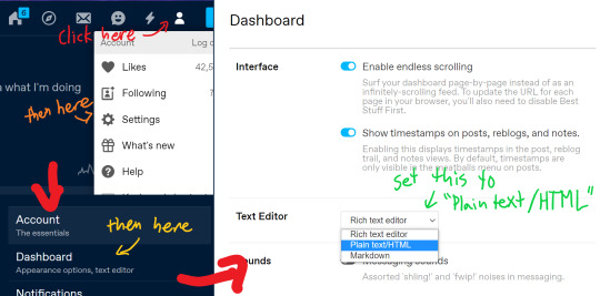
okay so first of all you need to be using the old post editor. You can toggle this with the switch in the top right corner.
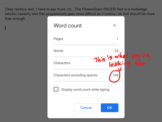
now you need to have the text you want. you need a decent number of characters for it to work right, i'd say about 80 at least (not including spaces). how do you find how many it has? it's simple! paste the text into a google doc and use the keyboard shortcut ctrl+shift+c (or command+shift+c if you're on a Mac). this will show you your word count, and most importantly how many characters there are.
you need to cut the text in thirds, so now take that number and divide it by 3. I've got 54.667, which means two of the sections will be 55 characters and one will be 54. so i've done that. you might cut a word in half don't worry about it.
now you need to go to this website: https://www.stuffbydavid.com/textcolorizer. and you need to open three tabs of it. now paste each one into the text box here. you'll have three tabs, make sure to get them in order.
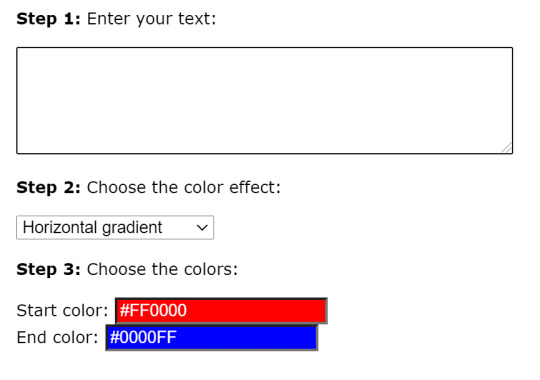
Now, if you want the exact rainbow i got, which is a pretty good one if i do say so myself, you need to do this: tab 1: set start color to #FF0000 and end color to #D1D107 tab 2: set start color to #D1D107 and end color to #0DC6FA tab 3: set start color to #0DC6FA and end color to #FA12F7
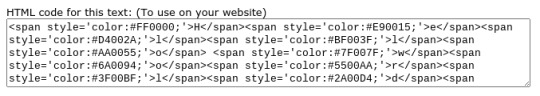
now what you need to do is (start with the first one) scroll down, find the box that says "HTML code for this text: (To use on your website)", and copy the whole thing into your google doc. or a new one it doesn't matter
then do it again with the second one, and the third one. make sure it's all in order. It's going to be pretty long, don't worry about it.
so now you'll have a google doc with this whole thing in it. and what you need to do now is get rid of all the semicolons. idk why they're there but tumblr doesn't like them. you can go and delete them all manually or you can do the easy way which i will explain now: use the keyboard shortcut ctrl+h (command+h might work but i'm not sure). then do this:
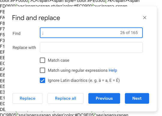
put a semicolon in the "find" slot, and don't put anything in the "replace with" slot. then hit "replace all". now it's semicolon free!
now to actually put it in a post. first thing you have to do is switch to the old post editor with the switch in the top right. you're gonna want to make sure that if your post has any images you put those in first, and any other text should ideally go in before the rainbow as well. you might want to mark where the rainbow should go with like [rainbow text here] or something.
now you need to switch to html mode. do it like this
this is what it looks like before (left) + after (right) switching to html mode.
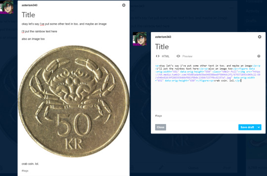
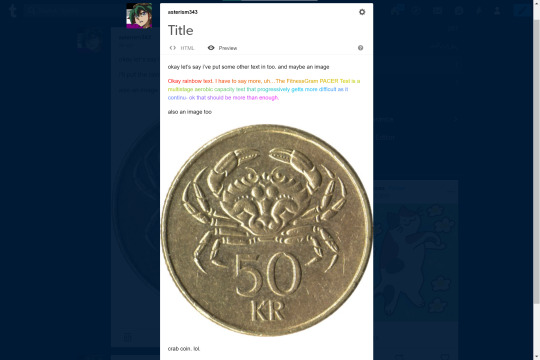
Now, wherever you want to put your rainbow text, paste it from the google doc into your post. some of it may show up black instead of blue and purple, don't worry about that either it's just tumblr being weird.
Once you've put it in, you can hit the "preview" button to see how it will look after you post it! here's mine:
if you want it to be the small text, put <small> before the rainbow part and </small> after it.
the text colorizer does have a "colors of the rainbow" setting but tbh i don't like the rainbow that it gives you, you can barely see the yellow on a light background
oh yeah and one more thing! you can't edit the post after it's been posted, saved as draft, or queued without messing up the rainbow, unless you do this:
now, when you go to edit the post with the rainbow, it will start out in HTML mode. you should probably switch it back to rich text after though because html mode is kind of a pain to use
so yeah that's how you do it
10 notes
·
View notes
Text
my list of resources for edits!
ok so @/mikuedits did a post like this and it gave me an idea (and also people have asked me abt it)
so under the cut is a list of some of the resources I use (including images and a couple tutorials):
for editing:
☆ Pixlr E - this is the editor I use for everything. It’s online and completely free, and has almost anything you can think of.
☆ Picsart - I don’t use it to edit, but this is where I get almost all of my stickers.
☆ waifu2x - this site is amazing. You can resize images up to twice their size without losing quality. Highly recommend.
remove.bg - as the name suggests, this completely removes the backgrounds of images, and it’s completely free. It works surprisingly well, though one catch is that it only works for images up to 625x400 pixels. For images larger than that it requires “credits”.
LunaPic - I don’t use this for edits that much now that I have Pixlr, but it’s what I use for making flags. It does have a lot of pretty good options for making other edits.
gifs.com - back when I made GIF icons, this is what I used to make the actual GIFs. It’s pretty easy to use, you just enter the video URL and choose the section you want to make the GIF, and it also has effects and stuff that you can use if you’d like.
Ezgif - this is what I used for cropping and resizing GIFs, as well as changing the speed. This website also has many options and effects in addition to those things.
for getting character images:
chatsticker - my favorite resource for finding LINE stickers of characters because each sticker is its own individual image.
*chatsticker doesn’t have a very large selection of line stickers, so an alternative is following the instructions on this website!
GoodSmile - probably pretty obvious, but this is where I get all of my images for making figure icons!
miku.sega.com - [VOCALOID only] where I get images for all the modules in Project Diva Mega Mix! The images are transparent which are nice.
*also make sure to check the character’s wiki page for good images ofc!!
a list of people on DeviantArt who have high-quality transparent PD module images:
WeFede
paprika1423
Tuni-kun
Mikudaven
LukeSakurai
for posting:
cutekaomoji.com - has copy-and-paste text dividers for posts, as well as copy-paste kaomoji
igfonts.io - has loads copy-and-paste fonts to choose from.
☆ Text Colorizer - helpful for adding gradient text, or just colored text when you’re not on mobile. Has different gradients that you can choose from, and you can choose any color you want. Just enter your text, choose your gradient and colors (ignore the part that says step 4) and copy the HTML code (the bottom one) and add it to your post (make sure you use HTML editor). The important part is that you need to delete all semicolons after the hex codes for it work. You may need to look up the basics of HTML.
and lastly, a few images that I use pretty commonly in my edits:


if you would like to thicken any of the lines on images like the first 5, you can use Pixlr’s outline tool!
to change the color of a (single color) image in Pixlr:
1. add an empty layer
2. use the fill tool and fill in the color you want
3. move the image layer on top of the color layer and set the blending mode to “mask”
4. merge the image layer with the color layer
5. done!
if anyone has any questions, I am more than happy to help! just send an ask or DM me!
◦◦,`°.✽✦✽.◦.✽✦✽.°`,◦◦
#editing resources#edit resources#editing tips#resources for edits#icon resources#edits#for edits#pixlr#picsart#not icons#ty for giving me the idea @mikuedits
201 notes
·
View notes
Text
Pagination is Hard
If you've been following along lately, you'll have seen that I'm working on a Choose Your Own Adventure style book. Primary writing is happening in Twine, which is a tool specifically for Interactive Fiction/Game Books/etc. But a Twine file is meant for a digital world, and I want a physical book.
More specifically, I want a physical look that looks like a CYOA book, acts like one, smells like one. I want people to pick it up and be teleported back to 1986. And so, there's a few style rules to follow. Some are simple, like the font, but others are more difficult, like pagination.
Twine has absolutely no concept of a page. Pages are irrelevant. It cares about Passages and only Passages. Its primary storage format is HTML, which also doesn't care about pages. Okay, so all you have to do is copy and paste it into Word, and now you have pages, right? Word cares about pages, doesn't it?
Word does not care about pages.
More specifically, Word docx files don't care about pages. Under the covers, they're not much different from an HTML file. (They're actually a zip package of a bunch of XML files, but that particular detail doesn't matter much.) There are tools and SDKs that let you create Word docs, but what you're creating are sections, paragraphs, and runs of text, but not pages.
Now, okay, Word itself does care about pages... Sort of. You can see the pages, you can print the pages, but they're sort of a calculated illusion. Whenever you open a Word doc, the rendering engine figures out how to pretend that the file is organized into pages, even when it's not. But because the pages aren't real, you can do something as simple as shuffle the pages around. That's largely fine, because in most cases, you don't want to shuffle pages around. In a normal document, the page break could come in the middle of a sentence in the middle of a paragraph. Reordering that would result in chaos.
Choose Your Own Adventure books are not normal.
Their whole thing is that all the pages are reordered randomly. Everything is centered around pages. Go on to the next page. Turn to page 73. The pages form an interconnected tree of decisions that make up a story. Pages pages pages.
So, in order to make a CYOA book, you have to be page-based, not passage-based. So, you just take all your passages, turn them into pages, set up links between them, and you're done!
But... Just what the hell is a page, anyway?
A page is a fixed-size panel of text, right? Easy enough concept. But... How much text? One of my passages is 400 words long. Is that more than a page or less than a page?
Trick question! Words don't matter. Pages are measured in lines. With known margins, font, size, spacing, etc., a page can hold a certain number of lines. For the style I'm using, let's say that a page is 25 lines.
So how many words are in a line, then?
Another trick question! Words in a line don't matter.
A cat in a hat ate a pie.
Several loquacious antidisestabilishmentarianistic sasquatches contemplated pseudoscientific philosophies belligerently.
Both of those sentences are eight words long. (So was that one.) But they're vastly different lengths. The first sentence has room to spare on its line, while the second one likely ends up spanning more than one line (depending on how you're reading this post.). So, it's clearly not word count that matters, it's the number of characters that counts. So, how many characters in a line?
Also a trick question! Some lines are short because the last word is a long one and doesn't fit. And letters are different sizes in most fonts.
You pretty much need a full layout engine to figure out how much text fits on a page, and that is not something I have.
But... Why do I care?
I care, because CYOA books are so centered around pages that you have to care about pages. Go grab one and open it up. (You obviously have one just lying around like I do, right?) What's the first thing you notice? Every page ends in one of two ways: The phrase "The End" or with "Turn To X Page" directives. That's the defining feature of the series.
But what else do you notice?
Almost every page ends with a bunch of whitespace. Because every page ends with a complete paragraph. Nothing runs on to the next page.
That's weird in a book.
(Okay, it's not every page. There does seem to be an exception to that rule and the "Turn To Page X" rule, which involves facing pages and a large illustration. It appears that mid-paragraph breaks are permitted in those rare circumstances. But anyway...)
They end with a complete paragraph because they have to. You can't suddenly have a "Turn To Page 37" in the middle of a sentence. No, the book has to pause, give you an instruction, then resume. These books would be irritating if
If you want me to finish the sentence, keep reading the next paragraph.
you were interrupted in the middle of every passage like that. So, in order to avoid that, I need to split the passages up, so that the right number of paragraphs are on each page, and in order to do that, I need to know how many paragraphs I can fit on a page. In order to do that, I need to know how much text can fit on a page and we've already been down that road.
So. What can I do about it?
I can fake it!
Faking things is a foundational principle in computer science. Some problems are too hard to solve the right way, so instead, we solve them the wrong way and make it look good.
You see, I don't really care exactly how much text can fit on a page, I care more about roughly how much text can fit on a page. That, give or take, is 22 lines, and a line is, give or take, 40 characters. And I didn't perform a complex layout calculation involving kerning and justification and whatever'n'th'hell an "em" is. No, I pasted a paragraph into Word with all the settings I wanted, let it do all that work, then I just counted letters. 40-45ish letters and 22-25ish lines, so go low for safety, and presto.
For each paragraph, get ceil(paragraph.length / 40.0) to get the line count for it, and repeat until there would be too many lines. Then put a page break and keep going.
And presto, now you have complete paragraphs and whitespace on every page!
Except for page 153, because fuck page 153:
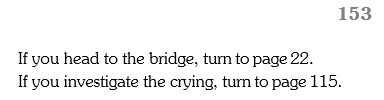
Page 153 is a page number in the heading, followed by two "Turn to page X" choices and nothing else. What this means is that somewhere in my book, there's a directive to tell you to "Turn to page 153.", only for Page 153 to tell you to immediately go somewhere else.
And so you think, "Oh, well maybe that page is full of other paragraphs and there isn't any room left and maybe you can tweak a setting or add a feature that prevents such orphans. So you track down the page in question. Behold page 94:
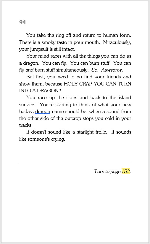
WHAT THE HELL, PAGE 94‽
It's like 60% full! There's plenty of room for the choices there. Why are you doing this to me?
Anyway, that's all I wanted to say. I felt I had to write this big long thing just to name and shame Page 94, rather than spending that fixing Page 94, because you all need to know what Page 94 did.
#writing#cyoa#choose your own adventure#game book#choose your own adventure rules#pages 151 157 45 98 and 85 are also being problems#but don't get me started on them#or how is you have a paragraph that's like 20 lines long it screws everything up#let alone one that's 30 and can't even fit on a page#also in case you were wondering#it's grammar checking 'dragon' because it thinks it should be 'your badass dragon's name'#but no it's correct#you are a dragon and you need a badass dragon name#although if you had a badass dragon#your badass dragon would need a badass dragon name too
29 notes
·
View notes
Note
Ahhhh, your self bound books just look really beautiful? All the color choices and the layout just look soooo good together. And that's such a beautiful gift? I have not read primium non nocere, as I haven't watched Charité but if it is worthy of such a tribute I am definitely giving it a shot anyway. I'd also be really interested of your creative process and choices with the binding, if you're willing to talk about that
hi omg! thank you so much <3<3 Primum Non Nocere is a very good story, and I'd say even if you haven't seen the show, give it a shot anyway, if you're interested? I mean, by all means, try the show as well, season 2 is on Netflix w english subs afaik and it's also really, really good (not perfect, but leagues better than the stuff this country usually makes abt the nazi regime). It's a retelling of canon events from a character's perspective who isn't a focal character in the show - there's probably one or two points at which it skips canon events or may seem a little jumpy, but overall, it's more of a companion piece to canon than a classic fanfic. It's very well researched and detailed; it expands on canon in beautiful ways and honestly, fits with it seamlessly; it might as well be an official novelization (although its focuses are a little different than the og)
as for the bookbinding, I'm really flattered you're interested in my process! I'm still very much a beginner, but I'm slowly figuring out something that works for me.
Also, I don't really know what information you're looking for, so I'm just gonna share some things that come to mind. This isn't really a step-by-step how-to but if you're interested in that, I can try to take some pictures next time I make a book and make a better reference post.
Typesetting
I typeset in OpenOffice because that's my office suite of choice & I'm old; I have never used google docs and I don't plan on starting. I download the fic in html, and then just copy/paste the text chapter by chapter; that's easiest for me. As for fonts, I wanted it to look vintage but I definitely didn't want it to have Nazi aesthetics. I went with Baskerville for the main text (which is such a beautiful font, it might become my go-to) (Garamond is what is most commonly used in books I think, but it almost looks too professional for me. I love that Baskerville has this very distinct, vintage feel to it.) and an Art Deco font for the title and chapter headings. Overall I think it looks more 1920's which, considering that the Nazis really hated the Weimar republic, seems fitting. I'm happy with how it turned out and I hope the author is, too :) As for the rest, it's set in 16pt, 120% line spacing and the margins could be a little larger, tbh, but it works and I'm a little stingy with the paper XD
OpenOffice also lets you draw simple graphics directly onto the document which is what I did for the title page and the little ornaments at the beginning of the chapters.
To make signatures, I use Quantum Elephant Bookbinder. It does what it's supposed to, the only thing that doesn't quite work is the flyleaf option, but I can just add that in the og pdf.
Book construction
I print on copying paper, 80gsqm. It's recycling, 55CIE which is really quite grey; I like it, because white is uncomfortable for me to look at. As for grain, I cut my sheets from A3. The grain is also wrong there, so I ended up wasting half the paper. Whatever; I think it's worth it. Having the grain in the right direction (parallel to the spine) makes it feel so much more like an actual book and not just a stack of copying paper stapled together. I honestly believe it's more important than having fancy paper.
After folding, I do not use a model and an ale for punching holes; instead I put all the signatures together in my makeshift press (2 old cutting boards and 2 bar clamps), I draw some guidelines and then I use a fine saw to cut them all at once.
I sew the signatures on tapes for stability; it makes keeping consistent tension easier. I use linen bookbinder's thread (worth it) and cotton tapes from the craft store (they do their job, and linen sewing tapes are hard to source & expensive). I do not have a sewing frame; but what I do is, I tape the tapes to the underside of my cutting mat, place the signature on top (fold aligned with the edge of the mat) and use a weight to keep it in place. It works okay.
After sewing, I round the spine with this method, which works surprisingly well. I do not trim the edges (I know myself well enough to know that it would not end well) & instead tap the short sides & spine to the table to align the signatures as perfectly as possible.
The rest is done as in pretty much any other tutorial. No backing, because I don't have equipment for that. I like to sand down the edges of the cover boards a little, so they're a bit rounded; I think it makes for nicer haptics.
Decorations
I like to make as much of the book myself as possible. There's several reasons for that; first of all, fancy handmarbled or printed paper, headbands, bookmarks etc are expensive. Second, I have a crafting addiction & what's the point of projects like this when you buy everything you could make yourself, right? But thirdly (most importantly) it's simply that my book blocks look pretty shitty (that's, untrimmed and uneven). But that's okay; you gotta embrace the "amateurishly handmade" look & just have to amateurishly handmake everything. Adding just one or two perfect, machine-produced details looks kinda jarring.
Paper decoration - mix water soluble paint and wallpaper paste and go wild (videos are in German, sorry, idk if this is a thing that's really done in the anglophone world? But I think they're pretty easy to follow even if you don't understand the instructions). I like to use this for covers, mainly, I'm also experimenting with decorating endpapers this way. The paste makes the paper really rough and horrible to the touch; as the very last step, I wax the cover (with a beeswax-based furniture polish. Floor wax works as well, it just doesn't smell very nice). Be careful not to get any on the bookcloth, it will cause stains & ruin everything at the last second.
Headbands - I found this tutorial very helpful.
Bookmarks - this gave me so much trouble. Most amateur bookbinders seem to use cotton, polyester or satin ribbons, which is fine, I guess. I don't particularly like either option. At first I thought I could weave my own; that didn't work out, because weaving tiny bands is harder than it looks (& also the resulting ribbon was much too stiff). But! Bookmarks in professionally made books aren't woven at all; they're braided. Seven-stranded braids work pretty well (tutorial is for 5 strands, but 7 strands work the same). As for the headbands, embroidery floss is best imho (silk would, of course, be traditional but come on). Mercerised cotton crochet thread works as well but isn't quite as nice.
this turned out way too long lol. Sorry. Hopefully the answer you were looking for is in there somewhere. Again, thank you and have a lovely evening!
#also feel free to ask if theres anything more youd like to know#<3#hoard of fanfiction#anonymaus#message
6 notes
·
View notes
Note
I really wouldn't mind you aiding me with some tutorials love
giffing tutorial/resources
hi anon! sorry it took me so long to answer. i figured this might be helpful for others out there who have asked me similar questions, so i’ve compiled a pretty comprehensive list of tutorials/resources. idk about others but when i was new to giffing, it took me a lot of painful effort to go around and look for resources, so i’m putting it all here to make it a little easier!
i download videos using 4k video downloader. it will download very good quality 1080p videos in .mp4 format. if you’re downloading a 4k video, make sure to change the setting option to .mkv so that you get 4k and not 1080p—for obvious reasons since you want the highest quality.
i rely on kpopexciting to get .ts files — which are basically raw, very high quality video files for live performances. they are much less grainy than .mp4 versions of live performances—which are the ones you’ll see uploaded to youtube. i’ve found that 4k videos (in .mkv) are just as good quality as .ts, but obviously you will rarely see live performances in 4k, so get .ts when you can!! you can also try to find .ts files on twitter, but you may have to do a lot of digging. i wish i could recommend you twitter accounts, but the ones i used to go to have been very inactive/taken down all their drives :( but this website is really nice and updated frequently so i would recommend it!
vapoursynth links + download. the reason you would use vapoursynth is to resize your gif, while maintaining the optimal quality of the gif. if you gif without vapoursynth (.ie only using photoshop), it will still be fine, but the image quality may be grainier. also, you will definitely need vapoursynth to gif .ts files —more will be explained in the tutorial i’ve linked below. i would recommend that you have a high processing/lots of ram/newer desktop or laptop to use vapoursynth so that 1, your computer isn’t fried and 2, your vapoursynth process will go a lot faster. i am using a 2017 macbook pro for all my work, and it runs pretty well, but my laptop still gets pretty hot so just make sure you’re not running a million things in the background while using adobe products and vapoursynth lol. i used a pretty old and beat up 2011 model macbook air back then, and i will say that yes vapoursynth worked and ran on it, but it took much longer, and basically fried the laptop’s battery (aka i had to get the battery changed twice and the laptop would die randomly) but issok it was a school borrowed laptop so i didn’t feel too bad lol. im just saying this as a precaution, to preserve the health of your electronic devices!! but don’t be afraid to use vapoursynth! you should still try it at least once.
thank you to @realstraykids for this super detailed, really nice tutorial! it includes how and where to download videos, how to gif using vapoursynth, using photoshop, comparisons, coloring, and pretty much all you need to know. 10/10 would recommend
thank you to @dreamcolouring for this lifesaver!!! the best and easiest way to blur out unwanted captions/objects in your gifs. i recommend doing this step after converting your frames to video timeline and before you do sharpening and coloring. another tip i’ll add is to feather the selection you’ve made right before you click on “add vector mask” —this will make sense once you’ve read through the tutorial. feathering it will make the blurred spot less noticeable and more subtle.
i use this generator to create gradient colored captions! copy and paste your text, then select the colors you want. generate the code, and copy it. change the settings of the text editor on your post to HTML. paste the code, preview, and voila! add elements <blockquote>,<b>,<i>, etc as needed. see more on colored captions in this tutorial by @kylos --i believe op mentioned a different and better color generator but for some reason it won’t work for me :( hopefully it works for u! basically same idea as the previous generator i mentioned.
my own mini tutorial/workflow process of making gifs. this includes working with a .ts file, vapoursynth, photoshop, coloring, watermarking, etc. and a few of my own tips below:
if you are working with an .mp4, you do not have to make any changes to the preprocessor/denoise filters/sharpening in the resizing part of vapoursynth—it doesn’t make that big of a difference if you do. but if you are working with a .ts file, definitely do make those changes,, that’s the whole reason you have vapoursynth. with an .mp4, i like to use vapoursynth to just resize, but i don’t add any additional settings. i use smart sharpen in photoshop to sharpen it, which is pretty good on it’s own (at least in photoshop 2020!).
my rule of thumb is to do add .02 seconds when i am setting frame delay. so if when you first import the frames, they are at 0.04 seconds, i usually change them to 0.06. of course, this is my personal taste—you can make all your gifs faster or slower depending on how you want em to look.
if you are on a mac, you can screen record by pressing Command+Shift+5 (it’s a shortcut to quicktime screen recording). I only screen record for things like the beyond live concert or other live streamed events. the image quality of the screen recording, in my experience, is actually pretty good. when you gif the screen recording however, you may notice that it adds extra frames that you don’t need. by that i mean duplicate frames. you could keep the duplicate frames but that just means the size of your gif is going to be much bigger (keep in mind the limit is 8mb). in order to remove those duplicates, my only solution has been to remove them manually (by holding Command while selecting), or when you are importing the video to frames, select the option to “limit to every 2 frames”—but this method will be less precise and still not as good as manually removing frames. if you remove the duplicate frames, this means you will need to set the frame delay even slower, to make up for lost frames. in my experience, fps(frames per second) and frame delay work in conjunction. so for example, if i delete every other frame because they are duplicates, but the starting frame delay is 0.02, i am now going to change it to something like 0.05 (so i added 0.03 seconds rather than my usual 0.02). if the duration length and the image dimensions of the gif are short/small, feel free to keep the duplicate frames in—i only delete duplicate frames in order to keep my gif under the 8mb limit. then, if you keep the duplicate frames in, continue with your standard frame delay preferences. now that i’m writing this im realizing this might not make a lot of sense lol.. but don’t worry about it for now and if you run into trouble w screen recorded gifs then you can come back to this for reference. again, this is only my experience recording on a mac—it may be a lot different if you use a screen recording program or are on a pc.
i don’t really use .psd templates because i like to give every gif/gifset it’s own unique coloring—so i remake the coloring every time, but if you get into a rhythm it’s pretty easy. there are a lot of nice coloring tutorials out there, too! my personal coloring adjustments in order: levels, exposure, color balance, selective color (if needed), vibrance, photo filter (if needed), color lookup (i use 2strip most often and i put it on ‘color’ blending mode). don’t forget to adjust the opacities and fills of the ‘color lookup’ adjustment layer in case it’s too strong. go back to correct each adjustment layer as needed. then, when you’re done and satisfied, group all those layers, copy the group (you can do an easy command+c), and paste it onto the next gif you’re working on for easy workflow.
if for some reason you can’t see the frames when you import your layers/video, it’s likely because your ‘timeline’ window isn’t showing up. just go to the window menu on photoshop, go to the bottom and you’ll see ‘timeline.’ make sure it has a check next to it.
i recommend watermarking your gifs because a lot of people like to repost tings these days 😠 - so make sure u got your brand on it! i keep my watermark saved to my ‘libraries’ in photoshop so it’s ready when i need it. i use the blending mode ‘overlay’ and adjust the opacity, but if you don’t want to do that you can also add a stroke/shadow to your watermark/do all sorts.
tag #nctinc for your nct creations and #jenonet for your jeno creations!!
here’s my own mini tutorial (well not much of a tutorial ig more like a work process vid?): took about ten minutes including the time to search and download the video (but i didn’t record that part i trust yall know how to do that), vapoursynth, and exporting. i hope this helps somewhat! feel free to ask more questions whenever :)
youtube
keep in mind that giffing takes a lot of patience, energy, and experience—so don’t worry if it takes you a bit to figure things out or if your gifs don’t turn out the way you want them to the first time around. we all start at the same place and all run into problems. i know giffing can sound intimidating and seem like a lot of work, but i promise, once you get into a routine, giffing is going to happen in minutes—and you’ll get beautiful gifs. have fun! 😊
#anon#answered#tut#tuts#giffing tutorial#should i make a tut/resources post on gfx? not rly sure if gfx can be taught.. it's like a lottt about personal style imo lol#hope this helps!#not just for anon but for anyone
120 notes
·
View notes
Text
Since it appears tumblr’s “filter posts by clicking on tags” function is a bit broken, I guess I might as well share what I use to find posts even when the tags I use to sort are buried deep after a tag rant.
The basic magic is the URL format “http://yourURL.tumblr.com/tagged/TagYouWantToFind” If you’re using tumblr in a browser you can actually just type/paste this in and edit it to find a specific tag. (side note: spaces in tags need to be replaced with “%20″ in the URL)
If you want a more permanent way to filter for set tags, or if you want easy access to this magic on mobile, then you’ll want to set up a page of links.
1) Make a new page on your blog (if you’ve never done this before, it’s at the very bottom of the sidebar in the appearance editor)
2) For the text of the page use the general format of <a href="http://yourURL.tumblr.com/tagged/TAG">Display Text</a> to make links for all the tags you want to sort for/have easy access to
3) If you want it to be pretty, use the text editing features of the appearance editor or some html coding to change the text formatting
4) Put a link to the page somewhere get-at-able. There’s a toggle at the top of the page editor to display a link to the page, but I’m not actually sure where that shows up. You can also just copy the URL of the additional page and use it to make a link in your bio or on a pinned post.
Go forth and find your tagged posts!!
1 note
·
View note