#neptunic lesbian
Text
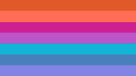
We made a flag combo of the Neptunic flag and the lesboy flag! It's so pretty, This is gonna be the Inclusive Mspec Neptunic Lesboy flag! ^^ WEEEEEE!!!
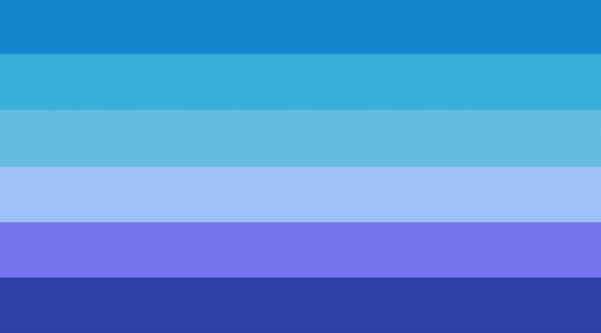
#neptunic lesbian#neptunic mspec lesbian#pro mspec lesbian#mspec lesboy#mspec lesbian#mogai positivity#pro mogai#lesboy#rad inclus#lesboy safe#pro lesboy#pro endo
49 notes
·
View notes
Text
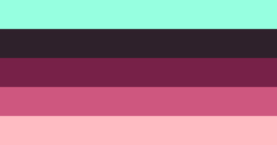

[ID: abrilesbiangender flag: a rectangular flag with 5 equally-sized horizontal stripes and colors in this order, top to bottom: light minty green, warm black(?), dark pink, pink, light pink. END ID]
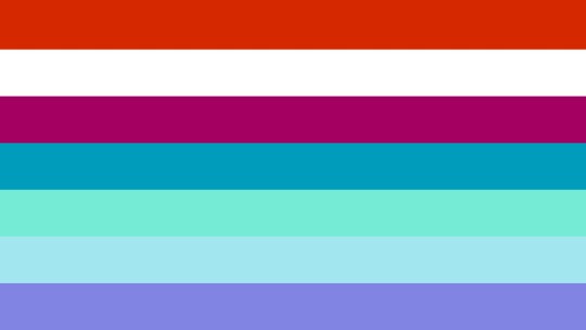
[ID: neptuniclesbiangender flag: a rectangular flag with 5 equally-sized horizontal stripes and colors in this order, top to bottom: pink, teal, light teal, light turquoise, offwhite. END ID]

abrilesbiangender and neptuniclesbiangender flags in the style of my flags
abri lesbian flag link here
neptunic lesbian flags link here
#jester flags#abrilesbiangender#neptuniclesbiangender#lesbiangender#orientationgender#abri lesbian#neptunic lesbian#lesbian#mspec lesbian#gender flag#mogai flag#mogai term#mogai coining#mogai gender#mogai identity#mogai#mogai label
13 notes
·
View notes
Text
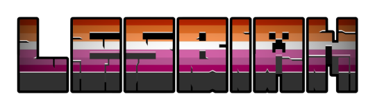
Neptunic + Lesbian
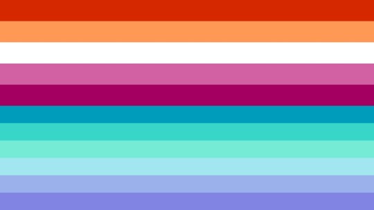
combined the neptunic and lesbian flags! which version is your favourite?
they arent exactly pretty so i might make a new one again soon!
#neptunic#lesbian#neptunic lesbian#neptunic flag#lesbian flag#flag combo#flag combining#flag edits#mogai coining#flag coining#endos dni#endos do not interact#coining blog#flag requests#edits
16 notes
·
View notes
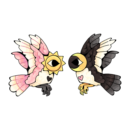
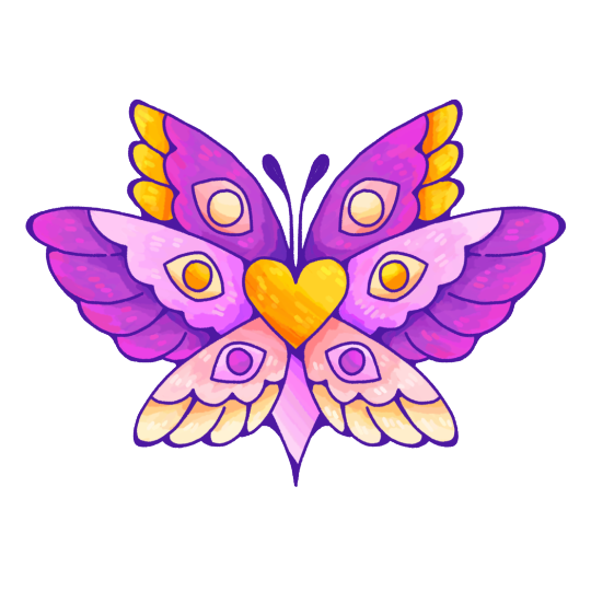
Text
neptunic lesbian pfps!

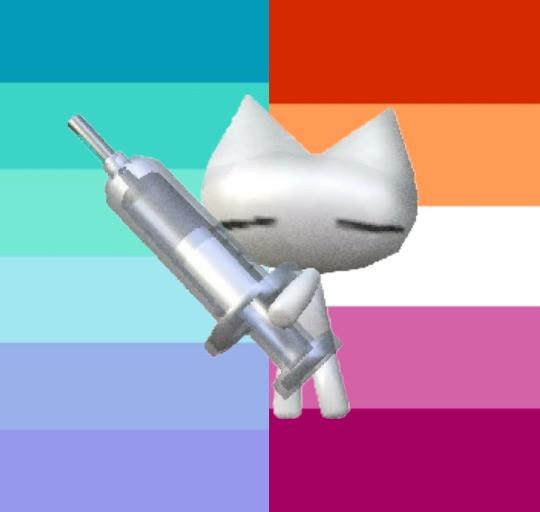
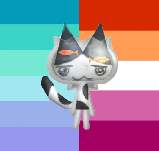


made by me!
#lgbtqia#lgbtq#flag#combo flag#lesbian#neptunic#neptunic lesbian#pfps#free to use#pride pfps#pride pfp
4 notes
·
View notes
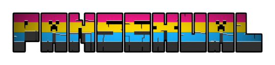
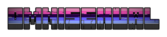
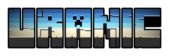
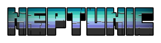
Text
Pride Angels 2024 - Part II


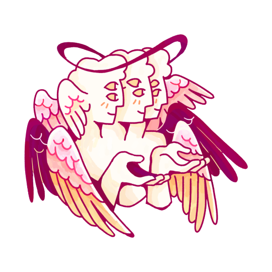


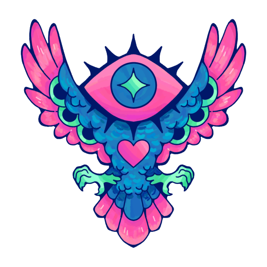
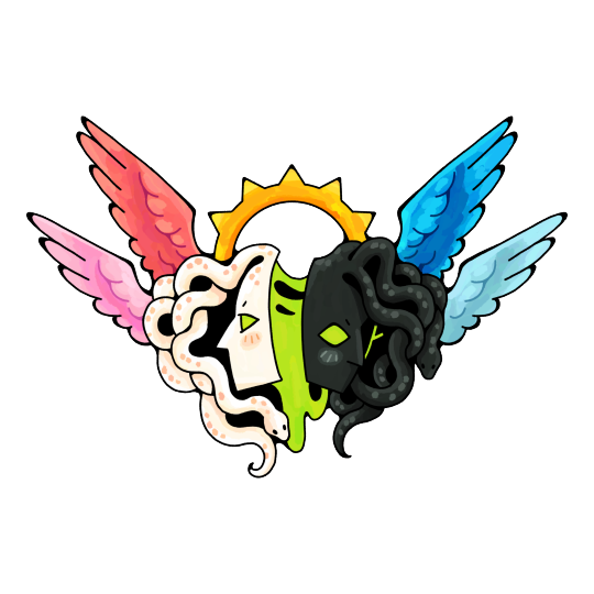
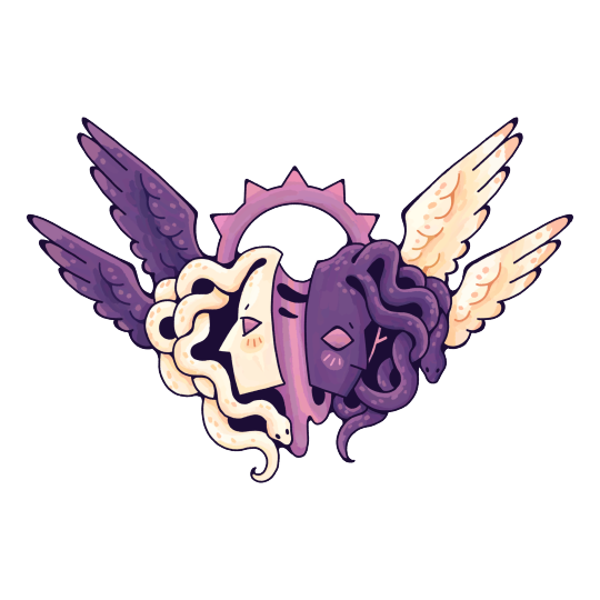

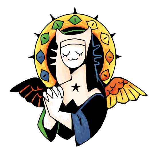
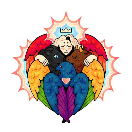


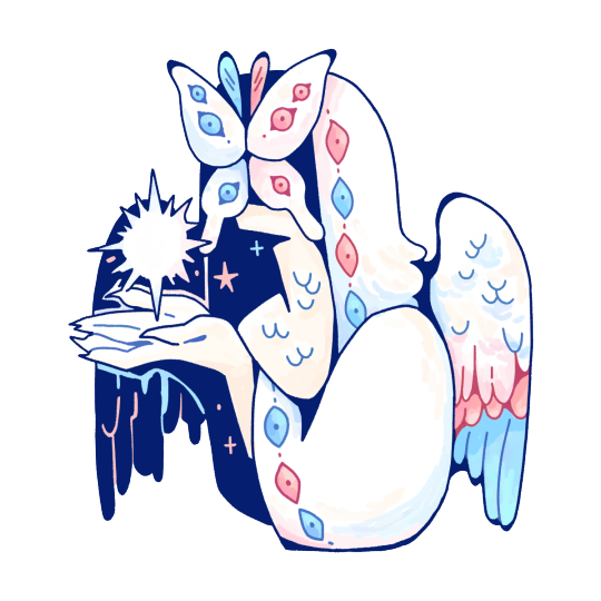
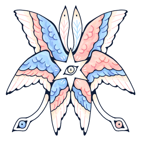

Here are the second half of my new Pride Angels designs! Featuring the following flags:
Lesbian, Lesbian (Alternate), Lithosexual, Neptunic, Nonbinary, Nonbinary (Alternate), Omnisexual, Pangender, Pansexual, Polyamorous, Polysexual, Queer, Queerplatonic, Queerplatonic (Alternate), Questioning, Rainbow/Progress Pride, Sapphic, Toric, Transgender, Transgender (Alternate), Trixic, Unlabeled, Uranic, and Voidpunk.
Additional flags in Part I and Part III. You can go to each flag's post for transparent images, flat colors, and lineart. Read the FAQ and follow the campaign here: Pride Angels🌈
#pride#angels#pride angels#angel#lesbian#nonbinary#enby#nb#omnisexual#lithosexual#queer#queerplatonic#pansexual#sapphic#transgender#trans#trixic#toric#uranic#neptunic#voidpunk#pangender#polyamorous#polyamory#eldritch angel#eldritch angels#biblically accurate angel#biblically accurate angels#seraph#seraphim
2K notes
·
View notes
Text


part 2 - snail themed pride banners! FREE to use!
ko-fi download
part 1
#lgbt#lgbtq community#pride month#snail#gay#genderfluid#genderqueer#greyromantic#greysexual#gynesexual#inritosexual#intersex#queer community#lesbian#moon lesbian#neopronouns#neptunic#non binary#non conformity#omnisexual#orchidsexual#oriented aroace#panromantic#pansexual#plantonic#polyamory#polysexual#queer platonic relationship#quiosexual#sapphic
637 notes
·
View notes
Text


263 notes
·
View notes
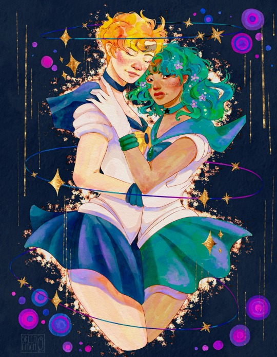
Text

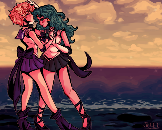
Haruka x Michiru from Sailor Moon ✨🌙
#sailor moon#harumichi#sailor neptune#sailor uranus#yuri#haruka tenoh#michiru kaioh#girls kissing girls#girls love#wlw#lesbian#cherryinthesun
372 notes
·
View notes
Text


201 notes
·
View notes
Note
Hiii!
@ the pride month fanart, I would love to see Sailor Uranus and Sailor Neptune in your style, if that is something that sounds good to you and you have the time 🥰.
I am also a big fan of your Isobel and Dame Aylin paintings. You capture them so lovely, one can never say no to more of that!
Love your work! Happy Pride and have a lovely day! 💖✨
Like every year, I asked my Tumblr followers which fanart they would like to see from me for pride. I started with the suggestion of @haeluin , Uranus and Neptune. This illustration was a little challenge for me. Although I know this TV show from my childhood, I have never drawn anything about it. but I had so much fun. When I was little I always wanted to draw magical girls. haha. I still love it.
But there is one thing I would like to talk about. Because this was the first time I've drawn these characters and it's been a long time since I've seen the show, I went to Pinterest to look for references. I had to scroll for a long, loooong time until the first fanart and original artwork came up. I almost only saw generated “art”. That makes me so sad. Sailor Moon is one of the first fandoms I can remember. The internet has always been full of self made art from this wonderful show. How many of us discovered anime and manga through Sailor Moon? and also the love of drawing. I have the feeling that all these wonderful works have now been replaced by carelessly generated art. it's such a shame. It's no secret that I'm not a big fan of generated art. But the fact that it's becoming increasingly difficult to find human -made art (and the original illustrations) is incredibly sad.
#sailor uranus#sailor neptune#pride month 2024#pride art#haruka x michiru#harumichi#lesbian#wlw#wlw art#sapphic art#sapphic aesthetic#artists on tumblr#my art
378 notes
·
View notes
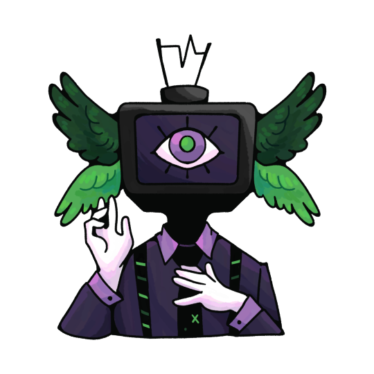
Text
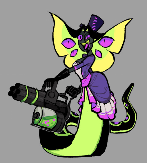
ᑕᕼEᖇᖇIᗷOᗰᗷ ᗩᑎᗪ ᔕIᖇᑭEᑎTIOᑌᔕ ᖇEᗪEᔕIGᑎ
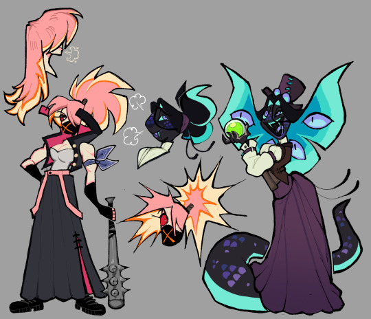
The last two designs for the main cast. With these two done, I can finally work on miscellaneous characters that I've been eyeing the most.
Again, thoughts below the cut:
My issues with their Original designs:
Sir Pentious:
I thought I would only have one thing to say about him (the unnecessary eyes) since he was my favorite in the entire original cast but having taken a closer look at him for this, I saw a lot of things that bothers me.
Too many eyes. specifically the lower half of his body has too many eyes and it seems detrimental to him. It's kind of painful to think about it since I do not think we ever see those eyes close. Is he just slithering on the ground with those exposed eyes? That's got to be irritating at best and damaged at worst as he continuously slithers on them.
There are eyes on the bowtie and the hat? There are already 4 extra eyes on his hood, so why have even more? I get that the original Pentious design was basically a monsterous amalgamation of eyes but the eye thing could have been scrapped altogether.
While his palette was the least red out of the cast (More so composed of yellows), it still blends in with the rest of the reds.
The claws are an unnecessary repeating design trait (Alastor and Vox notably have them too). I don't think it would've been too big of a difference to just keep his fingers fully black.
The stripes on his suit are too thick. It's called pinstripes for a reason.
I don't like how the hat is shaped to fit the head, It's awkward.
not a point, but I just wanted to say how the blue color palette works really well with him in that last episode.
CherriBomb:
She's not that bad of a design (She's sort of bland in my opinion) but it's the little small details about her that makes her so simple and also so complicated at the same time. There are so many batches of freckles scattered everywhere, little explosion lines on her skirt as well as the X on her chest, the tattoos are a jamble of random loops and bombs, and her tattering doesn't have an easy shape to consistently draw.
The thought process for these two:
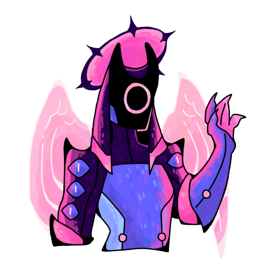
Mx. Pentious:
Pentious goes by both Sir/Miss/Mx. but uses she/they pronouns.
Minimized the actual amount of eyes on her, I kept it only to her actual eyes and those on her hood.
Gave her a butterfly-shaped hood. It's nothing deep since it stems from the fact the notches in Sir Pentious' hood almost looked like one to my bad eyesight. I decided to play more into that idea.
I read some posts where people talk about how Sir Pentious should have a snout and while I understand why and fully support people giving him one, I really didn't want to add the snout to this design. It drove me crazy since I'm not a big fan of it. I tried a compromise where her head was shaped more like Phineas.
Kept the tophat but removed its eye and mouth. If I remember correctly, Viv took that from one of her co-workers from the pilot. I decided to just have it as a regular tophat.
It doesn't have all the colors, but her design does have the Neptunic flag.
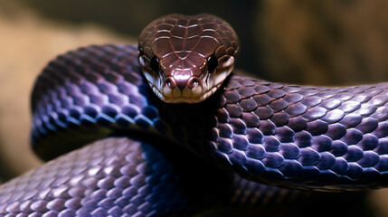
I'm not sure if this even is a real snake but I based Mx. Pentious' design on this:
CherriBomb:
Scraped most of her features in exchange for a sukeban theme. I personally have zero knowledge about the punk scene in Australia.
A majority of the suggestions I received for her rough draft had something to do with the skirt. I elongated it and gave it a slit in which the magenta from the inside is able to pop out.
Thought it would be a cute detail to have her hair explode if she's angry.
----
Apologies this took too long to be posted, Life got in the way as well as the fact I was feeling shitty about Pentious' first draft. Her skin was an awkward and ugly shade of green and seeing some posts critical of Pentious' design got me to think a little bit more about what direction I'd like to move her redesign.
You could see this in the earlier rough sketches but this was how Pentious' first redesign looked like
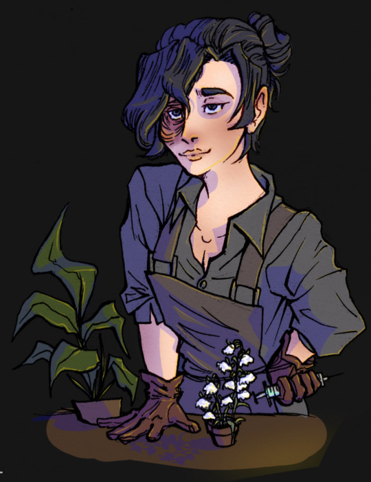
#vivziepop critical#hazbin hotel critical#hazbin hotel redesign#deadbeat motel mrx. pentious#deadbeat motel cherribomb#deadbeat motel redesign#//I only came back from the dead to post these Neptunic Lesbians on pride month/j //#//Happy pride to everyone btw!!//
300 notes
·
View notes
Text

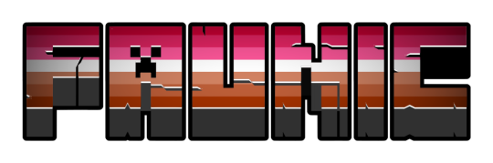
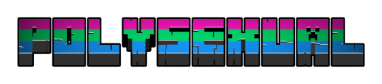
#gay#gay man#vincian#veldian#turian#lesbian#floric#nwlnw#faunic#nmlnm#bisexual#polysexual#plysexual#pansexual#omnisexual#uranic#neptunic
256 notes
·
View notes
Text
Happy yuri day to the blueprint
#sailor moon#bishoujo senshi sailor moon#sailor neptune#sailor uranus#haruka tenoh#michiru kaioh#harumichi#haruka x michiru#yuri#wlw#lesbian art
677 notes
·
View notes
Text


Hugf…Guh…w..women <<<3 :)
So I’m losing my mind and women are hot (nothing new) but ANYWAYS I felt there was a distinct lack of blood covered Donna art or at least I haven’t seen many so I godsdammit will feed myself if necessary.
#this took weeks bc I didn’t like the original lineart and tbh I’m still iffy on it#but colouring/shading it was a blast#i listened to my old favourite emo band I used to put on repeat when I was 13#shout out to set it off ig#resident lover has consumed me mindbody and soul#donna beneviento resident lover#donna beneviento#resident lover game#resident lover#resident evil#re8#women#gay#lesbian#neptunic#queer#queer artist#enby artist#enby#artists on tumblr#art#nonbinary artist#digital art#digital and traditional#traditional art#bfhdhdhdjfjh#nonbinary#(:
246 notes
·
View notes
Text


Pride Animals Project
This is an ongoing project I started in 2020. This project is a collection of artworks that combine an animal with the colour pallet of a Pride flag. I started this project because I was looking to challenge myself to limit the colours I could use and decided to use the colours of various Pride flags. I chose Pride Flag because there are plenty of options to choose from and as a member of the LGBTQIA I wanted to give something fun back to the community. I plan to make a drawing for every flag eventually.
Today's addition is the genderfluid pride gecko as requested by my fiancé.
#pride#pridemonth#genderfluid#transgender#lesbian#asexual#bisexual#pansexual#demisexual#neptunic#artist#digitalart#art
113 notes
·
View notes
Text

HARUKA & MICHIRU
Manga Panel Redraw 🌟✨
#harumichi#haruka tenoh#michiru kaioh#sailor uranus#sailor neptune#sailor moon#uranep#haruka and michiru#haruka x michiru#haruka#michiru#naoko takeuchi's art makes me squeal#the married couple of all time ever....#shoutout to lesbians#cant stop staring at harukas yaoi hands im sorry
508 notes
·
View notes
Last Seen Blogs

dalemeetsworld
Dale

muratkaraer
MuratKaraer
karinyosa
it is like a psalm for me
taidanamatsu
Lazy 4 life

coolblewin
Cool Blew, Inc