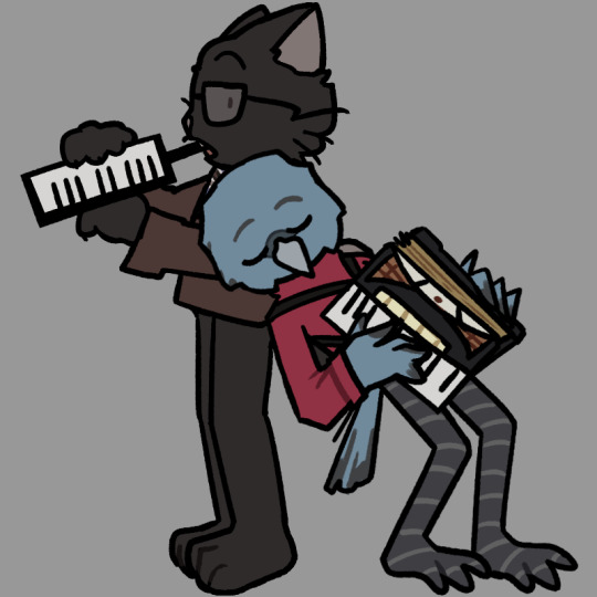
#oh and just to cover my bases
Note
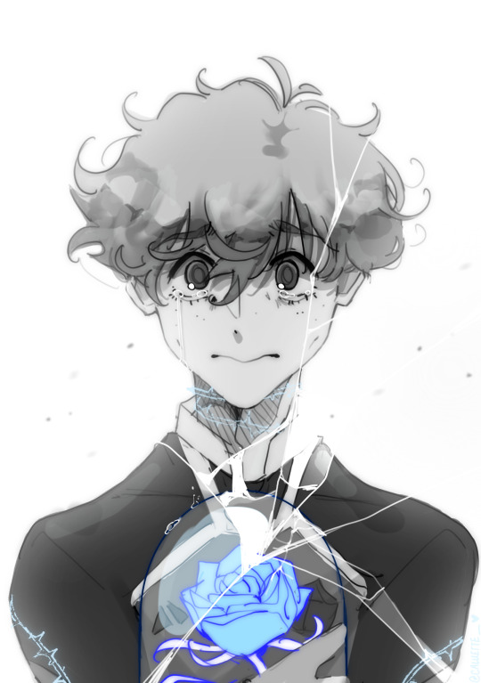
Wait so do u think timmy wasnt neglected as a child or do u think that neglegence isnt a big deal as long as their rich
Damn friend you really asked that in the most dishonest way you possibly could, like the only reason why I wouldn't think tims parents are neglectful is bc they're rich and not bc I just don't think they qualify as neglectful but let's go into it anyway
First off let's get our definition correct neglectful in parenting means the failure of a parent or guardian to provide basic needs for a child such as food clothing shelter medical care or supervision, which when people refer to tims parents being neglectful they're usually talking about that last one but even that's a stretch considering while tims parents were away working alot they never just left tim to fend for himself usually tim had someone else to watch him mostly in the form of boarding school so by the broad definition Jack and Janet drake were not neglectful parents - just bc theyre weren't always physically beside tim does not make them neglectful
Now do I think Jack and Janet were perfect parents - no but I do think people give them a lot of grief for reasons beyond their control such as them being away alot since theyre archaeologists and it's part of their jobs to travel alot personally i think it'd be worse if instead of leaving tim in a safe stable environment they were constantly upheaving him, moving him around and disrupting his schooling so what he could hang out at a dig site? Also we don't actually know for sure how often Jack and Janet were away for - we just know Tim wishes they were home more which btw is understandable I'm not saying Tim can't be upset at his parents not being around more, I'm just saying it's not exactly a good enough reason to jump to jack and janet were the worst parents ever like a lot of people seem to do.
The other thing people like to point to when talking about bad parenting is Jack and how he interacts with Tim after Janet died which honestly is just alot of the parent and child love each other but don't understand each other causing conflict troupe it's not exactly something I could really say puts Jack on the worst dad's list especially since he does try to be better and does get that character development as time goes on (you know before he dies too)
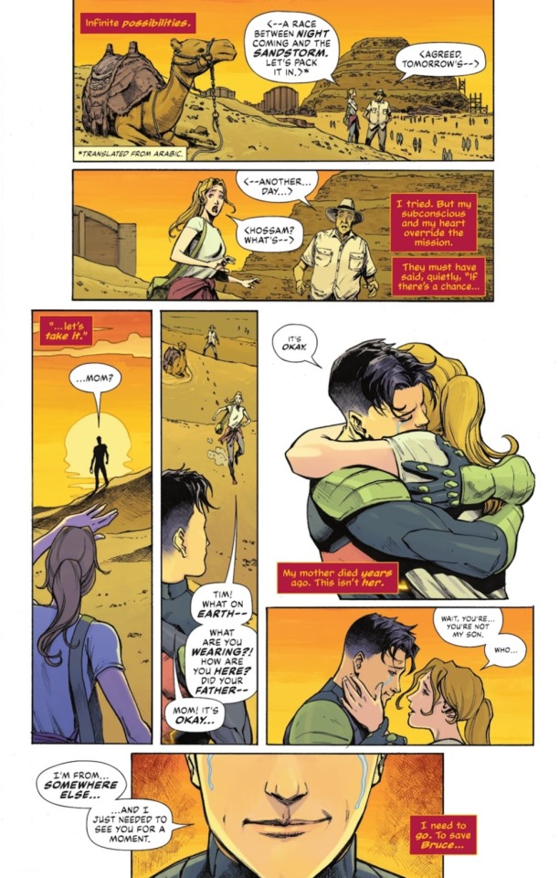
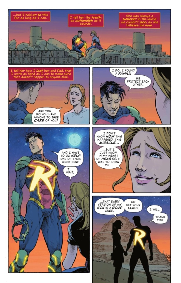
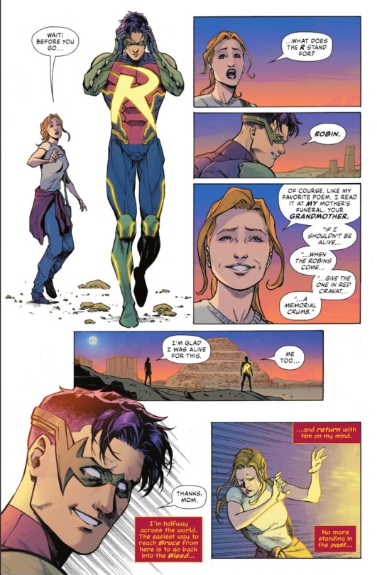
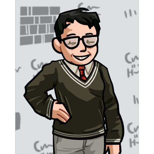
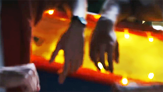
Anyway this is all long enough but I wanted to end on a cute note with these pages from this week's issue of batman #134
#ask#anon#i think my problem when people talk about jack and janet#is that they tend to not think about it from a human perspective#like why didnt jack and janet quit their jobs#maybe bc they loved their jobs and being a parent shouldnt stop you from doing a job you like doing#theres also something to be said that these characters were written in the 90s and yearly 00s#but yeah i dont think they were perfect#and i do think tims allowed to feel how he does about them#but that includes how tims allowed to love them and miss them#oh and just to cover my bases#batman spoilers#wednesday spoilers#tuesday spoilers#batman 134 spoilers
158 notes
·
View notes
Text

good morning wyllstarion nation
#baldur’s gate 3#baldur's gate iii#bg3#astarion#astarion ancunin#wyll ravengard#bg3 astarion#bg3 wyll#wyllstarion#wyll x astarion#astarion x wyll#JUST COVERING ALL MY BASES HERE#ANYWAY HI THIS IS SO DUMB I'M SORRY#these two have been rotating in my mind CONSTANTLY i had to do something about it#cryptk.png#<- that's my art tag :D#OH RIGHT I ALMOST FORGOT#BLOODFRONTIER#THAT;S THE NEW ONE GOING AROUND#editing this years later#bloodpact#apparently that's one of the main ones too
1K notes
·
View notes
Text
i know obviously the still of buck and chris is probably-almost-definitely gonna have something to do with the basketball thing but on the tiniest off chance it doesn't: it's christopher trying to act cool and nonchalant as he asks buck what it's like to have a crush on someone and buck turns further and further away from chris as he describes it, hunches deeper and deeper as the words just keep spilling out and when he finally goes quiet chris asks "is that what you feel with natalia?" and buck whispers to himself "no" and then eddie walks in and goes "woah looks serious in here, everything okay?" and buck's like "uh, yeah, yeah, i've gotta go do something but uh see you guys soon" and then he goes and frees natalia from the homoerotic situationship haunting los angeles' women. [bonus: chris asks eddie the same question after a bit of deliberation about how insufferable his dad might be about the implications of chris asking said question and eddie gives an answer that is essentially the same as buck's and chris like. narrows his eyes and goes "that's exactly what buck said" and eddie like blanches a little bit and goes "huh, is it? anyway. who's got you feeling butterflies?"]
#sami rambles#just covering all my bases with spec#the more delusional the better to me <3#911 show#911 abc#911 spec#buddie#evan buckley#eddie diaz#christopher diaz#buckley diaz family#uh oh i have become attached to this idea now
303 notes
·
View notes
Text
it just occurred to me that some of you might have missed seeing american football player joe burrow’s suit this past june during paris fashion week, and it is my personal opinion that everyone see these images at least once in their lifetime, especially those of us with a shared interest in slutty clothes on men (fictional or otherwise). so here they are.


#not to assume!! i’m sure there are some tumblrinas into sports like myself who have seen these#but i’m just covering my bases here playing it safe#the perfect suit for a fictional character of your choice!!!#will this mean anything to anyone who isn’t me? not sure#i gasped when i first saw these images#number one bc i was like joe burrow is at fashion week? as i do like american football and was not expecting this move from him#and number two bc oh my GOD his BACK#sluttiest suit i’ve ever fucking seen#immediately i jotted it down in my head for later#i said i have so many fictional men i can put this on#anyways it was really groundbreaking for me#it might be in my head bc i like joe burrow personally but i hope this is life changing for u all as well#idk what to tag this??#just fictional men i think it would look good on i guess#and why not i’ll tag joe burrow bc i know there ARE joe burrow fans on this app just maybe not running in the circles i’m in#joe burrow#sam winchester#dean winchester#anakin skywalker#will graham#obi wan kenobi#obi-wan kenobi#bruce wayne#sorry bruce wayne was random lmao#idk everyone just tag hot ur own hot men#my post
84 notes
·
View notes
Text

[chapter 408] extended cut - sewer chase scene
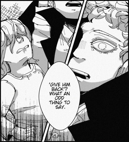
#oh yeah you knowwww where this was based from🤧🤧#im kinda sad how mid this turned out rip i hnstly thought i was cooking with the idea (the execution blew tho</3)#anyways yeah the idea just popped in my head when i was looking at the cover redraw i did#and i was like hm the talk of izukus possessiveness here.....woah this scene would be real good with the dawn of quirks era cast#at first it was gonna be the other way around with kudou taking yoichi and afo going batshit and screaming GIVE HIM BACK#but then i was like wait no THIS is a cleverer idea#cus another thing!!! i always like to think afo-yoichi-kudou-bruce had a confrontation before they all started running and yoichi dying#which would further expand afos angry impulsive choice#cus after this scene yoichi has alot of words to say about his brother after he gets out of his grasp and then runs to kudous side#and boom the chase scene . the handhold was the last straw for him#my hero academia#boku no hero academia#mha manga spoilers#mha#bnha#mha all for one#mha afo#shigaraki yoichi#yoichi shigaraki#mha kudou#mha bruce#second one for all user#third one for all user#second ofa user#dahlia.art
236 notes
·
View notes
Text
the truth
#blue lock#blue lock fanart#alexis ness#ブルーロック#art#fanart#blue lock manga#my art#michael kaiser#in spirit#i think about scenarios where ness leaves kaiser#whether just to pass to isagi or for good#and i believe this is the key to kaiser's awakening#given that his “identity”/ego first appeared not out of malice but out of the desperation to protect the one thing he cared about (the ball#and of course his monologue in 260 about how he treats the ball explicitly parallels how he treats ness#which makes me believe losing ness or the risk of losing ness is instrumental in kaiser's reawakening#BUT.#kaiser is a deeply sad angry person and he cannot let the world know he's weak#so i fear that ness leaves him and instead of admitting oh maybe i do care kaiser snaps#because ness can't leave him if he pushes ness away harder right?#kaiser telling ness exactly what he was to him#exactly why he approached him in the first place#you're nothing but a dog#an experiment#because fury covers up the hurt (hurt that kaiser is even angrier that he *has*) and so the damage is done#so that's what this doodle is based on el oh el#and ness is left reevaluating every moment they've ever shared and wondering if it was real at all#(because even if kaiser did care he doesn't have the capacity to realize he did-- i do believe his behavior in 243 was genuine and proof he#-cares for ness in the only way he can he just does not understand that yet because he fundamentally does not understand kindness)#and he won't before it's almost too late
117 notes
·
View notes
Text
The sun as a corrupting horror, the heavens pouring out
#oh black ink? what if it were glowing liquid gold#lmk#lego monkie kid#monkie kid#lmk mk#lmk art#lmk fanart#lego monkie kid art#lego monkie kid fanart#tw body horror#tw emetophobia#just wanting to cover my bases#art#my art#my poor lego son
547 notes
·
View notes
Text
I am once again putting in too much effort
#mark hoffman’s an ally. he sees mild transphobia and BAM force fem saw trap#anyway this is basically my manifesto for my whole ‘saw gender thing’ thing#anyway this is basically my manifesto for my whole ‘saw gender thing’ tag#saw gender thing#saw franchise#saw#adam stanheight#adam faulkner stanheight#lawrence gordon#alison gordon#amanda young#lynn denlon#peter strahm#mark hoffman#chainshipping#shotgunshipping#rockstarshipping#adamanda#coffinshipping#oh wow damn this kinda just kinda covers all the bases huh
78 notes
·
View notes
Text
various john drawings. mostly just the good ones. drawings that suck too bad are not here. sorry about the weird way they probably look in the small version its a thing i do for insta sorry.


these are from like. multiple months so they still vary in quality a significant amount. scijohns are not here they probably get their own post at some point.
#john linnell#john flansburgh#oh my god i forgot the one horrible mspaint image was here let me delete that#ok its gone. that would need its own post#sorry about the one mr. flansburgh drawing looking creepy. and im sorry that i draw mr. linnell as a bird thing#tmbg#they might be giants#ok i covered my bases#sorry i just post these so often on insta i forget how little i post them here#CHALKO DRAWING TAG
166 notes
·
View notes
Text
as a chinese person yall need to stop blaming the ccp for everything (read: hoyo is capable of making colorist design decisions and not everything is a result of censorship pls)
#the govt is v racist while also doing like a lot of rlly questionable economic exploits but also: as a company hoyo can suck#please read what china actually censors and what historical nihilism covers#also: sumeru proves that a) they can make brown people b) the '''race'' dynamics were literally crucial to the plot#it was *intentional* that the rainforest region designs were pale and the desert designs were (a rather laughable) tanned because it added#to the colorism plot they tried weaving into the academic and knowledge inequality plot#so i think it's also gonna be intentional that the natlan designs are pale like they're not fucking fools#open at will: hater behavior#also: you fail to consider that mandatory (for cn server) skins for old 1.x characters got released bc they decided they were too revealing#however neither kaeya nor xinyan's skintones got changed; sumeru released as normal#literally based on what's been changed: the only thing hoyo seems to be out of line with right now is excessive cleavage on some fem chars#i dont think the skin tone censorship is the real issue. maybe the company is just. a product of the colorism and biases#in china/asia as a whole#it's not 'oh ccp censored them' maybe their skin tones are just colorist#this is technically a ''''subtweet'''' as they say but it's also: bro ccp is not the end all be all bogeyman#also idc if you are from the cultures that genshin tries repping in game but gets skin tone godawfully wrong idc you have the right to ask#for more from them and call them out for colorism! it's a societal thing yeah but they can also do so much better#edit: another thing about this is like: yall are literally infantalizing chinese ppl like do u think cn people can't be racist of tehir own#free will?? the government is the only thing forcing them to be racist?? get a grip. not everything is because of the ccp oh my fucking god
20 notes
·
View notes
Text
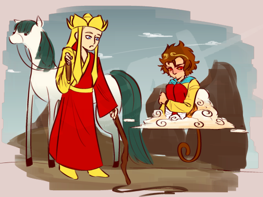
“Are you sure you remember the way back to that town?”
“Yes. Probably. The path went like this…”
“Neigh.”
#inktober#jttw#jttw sun wukong#jttw monkey king#jttw tripitaka#jttw fanart#jttw tag#sun wukong fanart#sun wukong#lmk sun wukong#(just to cover my bases)#tripitaka fanart#tripitaka#white dragon horse#day 5: map#oh my god i am so late#hashtag slay i guess
77 notes
·
View notes
Text
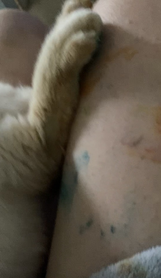
*he spilled my cup of paint water all over everything idk why I said he spilled watercolors I just woke up girls
I literally walked away for two minutes tops to make coffee and came back to his ass sitting on this water color palette and my painting open after spilling my watercolor water all over it
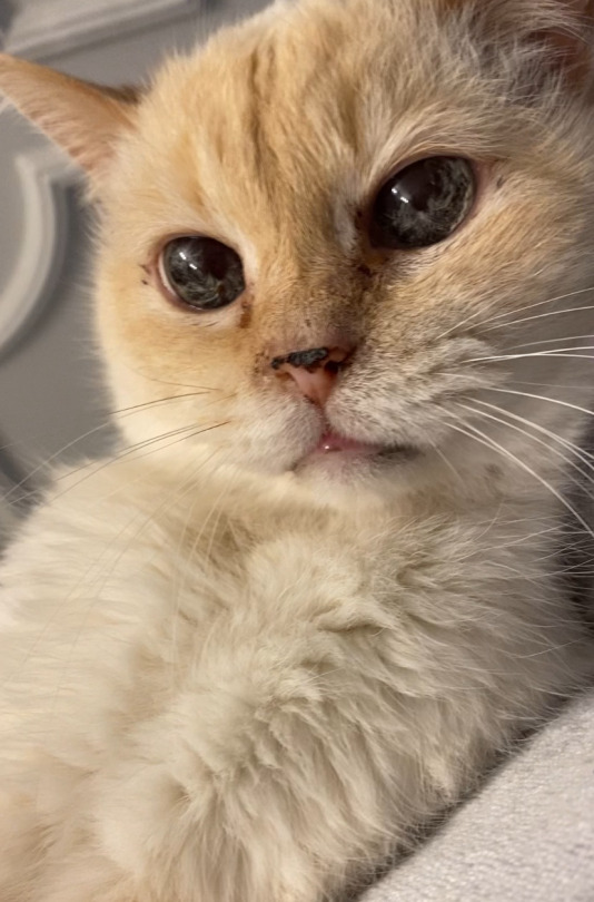
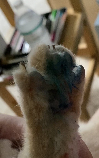
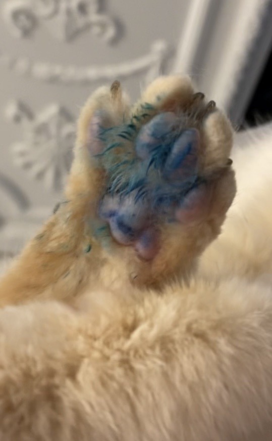
Look at that face. He knows he did something wrong hahahha
#I really wish I had a pic of him just sitting on the watercolors bc it was hilarious#like he looked so innocent and cute and I just knew his was was covered in various colors hashahwhwha#but i was more concerned with the toxicity so my immediate reaction was to try to clean his paws the best I could#and research#it won’t cause any skin or gastrointestinal issues so we’re good thankfully#he will be fine don’t worry lmao it’s water based watercolors#gonna watch him close just in case#grabbed him asap and a wash cloth and took him to the sink#but yes to reiterate it’s NOT TOXIC AND HE IS FINE I PROMISE#also thank goodness I grabbed him immediately before he started prancing around on the white carpet bc I would be yelled at for weeks#u have four bloody scratches on my face but there are not rainbow foot prints all over the house and he is safe so I am fine with that#i**#they’re ^#the way cats attack you and think they’re being punished when you’re literally potentially trying to just save their life#or help them#like unhooking their claw from somethin their stuck too#and like I give a fuck about clothes as much as my cat but there’s paint all over my favorite robe too now hahah#legit thiught the red streaks on my face were watercolor hahahaha so I was like oh shit that blood#I’m not mad#after I found out it wasn’t toxic and that he didn’t step all over the wet carpets and that he was okay i laughed for like 15 minutes#I’m still laughing like… y’all ☠️#please excuse my voice I’m a little sick and I sound like a southerner ew#like why do i sound like someone’s Christian Baptist mother offering someone cookies#Queso#my cats#lmao
28 notes
·
View notes
Text
The Many Illustrators of
A Tale of Two Cities
7: A. A. Dixon

"'Collins' Clear-Type Press, let me ask you a question.'"
This is a very long post.
This week's edition has, in my research, become quite the edition.

Sadly, this image is the best source for the cover wrapper illustration that I could find.
You are likely familiar with Arthur Augustus Dixon's illustrations for the 1905 Collins Pocket Edition of A Tale of Two Cities. Several of them are very common to find in Internet searches and articles about the book, if not other editions of the book itself.

But the question raised by my research for this week's edition is:
Are you familiar with all of them?


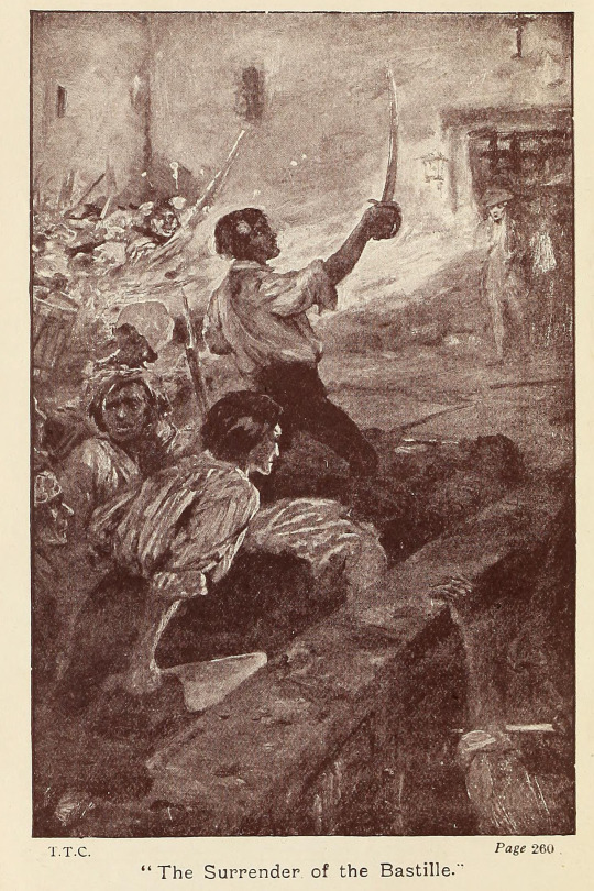
Thing is, as the source above states (read the whole article if you have the time, it's very interesting!), Dixon created twelve illustrations for this novel.


And sure enough, this source from the Internet Archive and this source from @oldillustrations (hello!) both have eleven of the same illustrations - with the twelfth presumably being for the wrapper, as seen in this source (previously cited) from the Victorian Web.


Alright, so that's three separate sources, all with (effectively) the same set of elaborate illustrations from 1905. Neat!


...


...but if you start counting...

...you'll notice that this seems...


...like a lot more than twelve!
Basically, there are five illustrations by A. A. Dixon that are completely unaccounted for in any of the three sources previously cited.


For the purposes of this post, the cover wrapper is considered #0 and is not pictured in these banners.
In full-size set of illustrations in this post, this source from Google Books is the source of four of those mystery illustrations:
#3: "'He stared at her with a fearful look.'"
#6: "'Drive him fast to his tomb.'"
#7: "He said, 'Farewell!'"
#12: "'She appeared with folded arms.'"
#9 ("'Patriots and friends, we are ready!'") and #11 ("'You are consigned to La Force.'") are sourced from Google Books in the full-size versions in this post simply because the Internet Archive versions of those two illustrations had cropping issues.
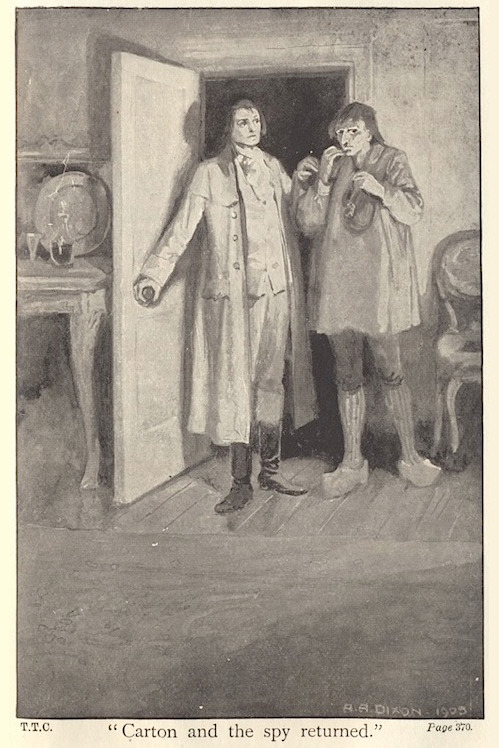
To me, this is mystery enough on its own. Why would another version of the book suddenly have more than the originally-stated number of illustrations by this artist? Especially considering that the Google Books source does not have #13 ("''I know you, Evremonde!''") - why would it be missing one of the "main" set?

It gets even more interesting.
As you'll notice in the banner, we're still one off: Keen-eyed observers of the full-size set of illustrations might have already noticed that #14 ("'Carton and the spy returned.'") looks a bit different than the rest of them - a bit like what happened in the previous edition of this series!
That's because that Dixon illustration comes from this completely random source - a post from a blog called the Paperback Palette dating back to 2018 - that I happened across on Google Images of all places while sitting on an airplane trying to set up this post last week!
And to top it all off, that source is missing #6!

At this point, if your first instinct is, reasonably, that perhaps Dixon didn't actually illustrate these extra five and that it was someone imitating him for later editions, then know that that was my instinct too - until I (dare I say it again) checked those signatures!!!

(I edited the colors to prevent flashing.)
All five of those illustrations bear Dixon's signature, so it's safe to assume that they are A. A. Dixon originals - from 1905, even.
Interestingly, #s 1, 10, 13, 15, and 16 don't have signatures!
Does this mean anything? Probably not - as an artist myself, I often forget to put my own signature - but still, I can't resist mentioning it!
So the most likely explanation here is simply that the publishing house originally commissioned A. A. Dixon for more than twelve illustrations and then held on to some of them, eventually choosing to publish them in other editions. Still, we can't say for sure.
And as to why some are missing from the more "complete" sets - human error, most likely!
If you scrub through the Google Books source, you'll notice that #s 11 and 12 actually repeat (one even changes color, which I have no explanation for) - it's most likely either that the book was accidentally printed with repeats of #s 11 and 12 where 13 and 14 were supposed to go or that the person scanning this edition made a similar error.

As an aside, it's so interesting that the illustrations are evenly spaced throughout the book - I had not noticed that until now!
And as for the Paperback Palette source, it's most likely that the blogger accidentally skipped over an image while combing through their edition or just glossed over it when posting the batch (I understand that from experience!)
We can see this by adding up the letters in some of the illustrations' captions - doing so reveals that the letters are meant to go to P, the sixteenth letter of the alphabet.

Thus, one must be missing! Case closed!
Except...
It's actually (going by both the chronology of the book and the order in which this set was found in Google Books) missing the wrong letter!
Here, it seems that In the Google Books source, #7 in the full set is given the seventh letter in the alphabet, G - whereas in the Paperback Palette source, "#7" is labeled as the sixth, F:

This implies not only that #6 is absent from the Paperback Palette source but also that there is a missing mystery illustration located between this source's H and K - that is to say, before or after #9!
EXCEPT...
For one, this isn't the only inconsistency I've noticed - there are several places where the letters seem shifted in a strange way. I've seen #2 listed as "C" and #9 listed both as "H" and "I2i" (???), just as two examples.
(My theory is that the cover wrapper and the frontispiece may be at play here, but who knows?)
More importantly, though, it seems that, for some mysterious reason, all of the sources with relatively consistent use of these letters (i.e. all but the Victorian Web) - even the sources with only eleven interior illustrations - still give #15 in the full set the fifteenth letter, O.
Which, of course, may make all of this pretty moot anyway.

Dare I say..."Oh."
Suffice it to say, just as much as major sources like the Internet Archive and Google Books are vital to this sort of research and preservation work, so are smaller websites and bloggers!
After all, without the Victorian Web and the Paperback Palette, we as collective netizens likely wouldn't have ever known about the cover wrapper or illustration #14 (not to mention that the versions of the illustrations from the set posted by @oldillustrations have by far the best image quality and standardization that I've found! Please go check them out if you haven't yet!).
As for the reasons behind Collins' Clear-Type Press not publishing all of the illustrations from the beginning (if that's the explanation we're to go with here), I suppose the question I'd like to ask is:

why? why would you put us through this?
& the standard endnote for all posts in this series:
This post is intended to act as the start of a forum on the given illustrator, so if anyone has anything to add - requests to see certain drawings in higher definition (since Tumblr compresses images), corrections to factual errors, sources for better-quality versions of the illustrations, further reading, fun facts, any questions, or just general commentary - simply do so on this post, be it in a comment/tags or the replies!💫
#A Tale of Two Cities#AToTC#dickens#charles dickens#bookblr#litblr#literature#classic literature#victorian literature#vintage illustration#illustration#illustrators#A. A. Dixon#1900s#UGH oh my GOD oh my GOD this one#like. hours. so many hours.#You Can See Why I'm Late With This One I Think#so yeah based on the pretty consistent thing with the letters I do believe there are very simply 16 interiors & a cover wrapper and no more#but Still like. why. whywhywhy couldn't they just be consistent#and again Why Why Why don't all of the versions just have all of the illustrations!! like hello! What Is Going On#maybe it Is significant that not all of them have Dixon's signature...but even then that raises so many questions#I'm also of course gonna keep my eye out for that cover wrapper because I want to see it in full and it does also confuse me#also check out number16 in a lot of those sources because there's a halo effect on Carton's head that isn't super visible in the one I used#anyway. 1) yes I accidentally said this was the 8th when it's the 7th 2) this month features a two-parter!#3) the results of the previous poll were a tie between Congratulatory and A Plea. the latter of which was my vote so nice work everyone#4) I'm either gonna skip the off-week's post this week and do it double for next time or just post it later in the week this week#so. until next time! & enjoy!
19 notes
·
View notes
Text
Okay, friend
#OH NO I HAVE TOO MANY THOUGHTS ABOUT THIS#first of all the obvious red and blue boys#the one who's ready to jump all in at the slightest hint of reciprocation#and the one who gets too into his own head and tries to chicken out of talking about his feelings#but also thinking about all the meta (and specifically jemmo's post) about the ep 10 fist bump#and how they were on the same level through it all and how their relationship is level and reciprocal at every point#and how we're seeing the exact opposite take place here in msp#tinn has just been rejected#and done so in a way where he has no idea that gun likes him too#gun trying to reach out in a situation that IS difficult for them both#but he has a step up on tinn here where he knows that his feelings are reciprocated even if they can't be together right now#and so of course tinn is the one to step back when he tries to make a move under the cover of the mv#because he has just been rejected where gun... just hasn't#and most importantly both episodes ending with immaculate food based flirting 10/10#anyway here's some boys fist bumping about their feelings in ep 6#(and talking about said feelings next to a body of water)#tune in next week for boys not really dating and also performing a tragic romance in ep 7!#my school president#my school president series#bad buddy#bad buddy series#bad buddy brain rot#this isn't about bad buddy but when is anything not about bad buddy anymore#< i love this tag but you best believe i am going to make anything and everything about bad buddy#kk.gifs#oh this is my first gifset of 2023!!!
360 notes
·
View notes
Text


5 years difference, feels like progress! :D
[tumblr stole the quality :( click to see it better]
#i like my colouring now :]#ut art#the flowers felt easier to do this time#i remember struggling so hard with them back then#((lmao i gave up on them in the second one))#but i don't draw flowers now so maybe its just a better understanding of how to draw shapes like that?? idk man#frisk looks like theyre doing a sassy pose#oh well ¯\_(ツ)_/¯#redrawing old art#my art#doodle#not turtles#tw blood#VERY slight blood but trying to cover the bases ig#fighting tumblr resolutions grr grr#Undertale#frisk
22 notes
·
View notes
Text
I normally don't vague post about other people (and I'm not really here, even) but someone in the tag suggested that Jack would make a better Team Leader than Yusei and it made me realize something, in part, about why people think that Yusei is boring.
tl;dr: Yusei isn't boring; he was written as the MC in the wrong genre.
See, Shonen protagonists typically have the following personality traits: loud, brash, hot-headed, sometimes abrasive. Yusei is none of those things, and Jack is ALL of them. Which, I'm sure, is what led that person to say that Jack would make the better leader and what leads so many people (who are mostly only fans of Shonen anime) to say that Yusei is boring. He doesn't fit their expectations of what a Shonen protag is supposed to look like, therefore he's boring.
But the thing is, if you popped him into, say, a Slice of Life, he'd be perfectly at home (well...except for the Trademark YGO Hair anyway) and well-loved by the fan base. I can say this with fair certainty because I've at least never seen anyone say that Natsume Takashi (Natsume's Book of Friends) is boring in any way, and honestly the two of them have very similar temperaments. The difference is, obviously, the genre of their respective stories.
Slice of Life allows for its protags to be softer-spoken, more reserved; Shonen often does not.
It's time people stopped saying that Yusei is boring and just admit that they like loud, brash characters as opposed to quiet ones, and that Yusei just doesn't fit what they expect from a Shonen protagonist.
He's not boring; he was just written for the wrong genre.
#not to mention that sol actually allows for exploration of trauma but that's another story lol#oh also for the record: jack would NOT make a better team leader#loud brash hotheaded and abrasive are NOT traits that make a good team leader#i could make a whole post solely about that but i won't haha#it doesn't mean i dont like jack btw#i love jack!#...but that doesn't mean i think he would make a good leader#anyway#yugioh 5ds#yusei fudo#also before someone comes for my head and starts listing off shonen with reserved mcs#i'm sure not ALL of them fit the description above#i haven't seen every shonen every made#what i CAN say is that of the ones i've seen the mcs usually fit at least TWO of the four traits listed#this also isn't anything against shonen! i like a good shonen once in a while!#i'm just saying there are differences in genre here (which. should be obvious. but this is tumblr. so gotta cover my bases lol)#and different genres have different character tropes#and yusei as the mc does not fit those character tropes#so for people who love that character trope then yeah a character who doesn't fit it isn't going to be interesting to you personally#okay at this point i have an additional essay in the tags so i'm done lol
26 notes
·
View notes
Last Seen Blogs

basedgamers
Based Gamers

carolusofmycastle
Carolus of My Castle

huuthoreal
Hữu Thọ

ali-the-weirdo-3
Ask my oc's!