#BLUE PURPLE RED YELLOW GRADIENTS GIVE ME LIFE
Text
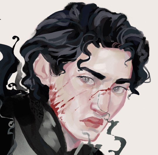
Tutorial: How I Render Accents
PART 2: COLORS
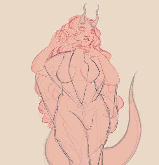
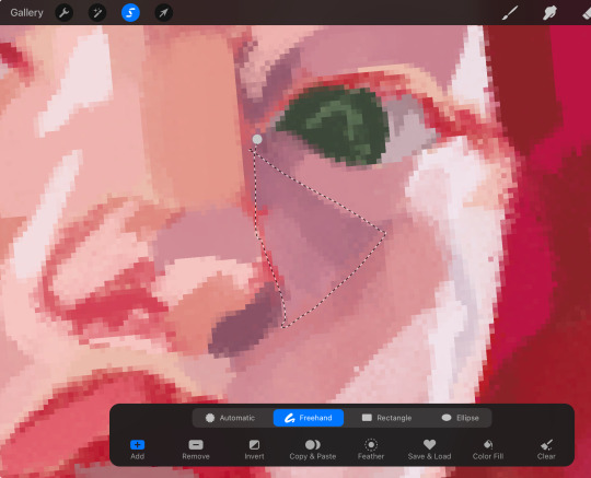
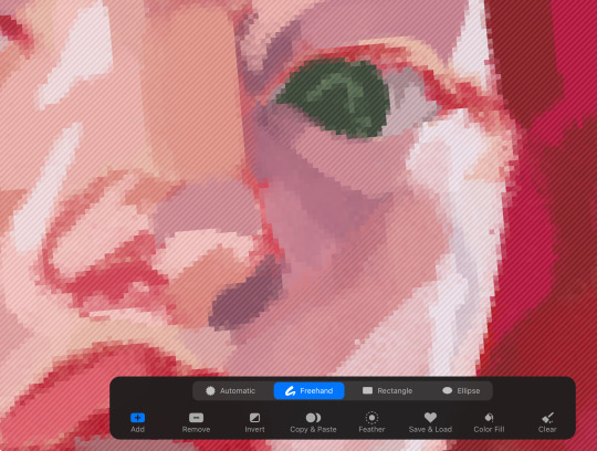
I usually do not recommend 'pixel hunting' aka going over your work with a fine tooth comb and picking out stray pixels to erase. However, for setting up a proper base layer for accents it is imperative to do so.
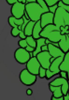
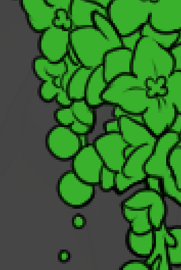
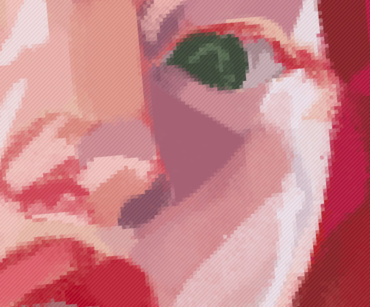
To explain my method of color blocking: I select everything outside of the lines, invert that selection, then fill in. This does a more accurate job than going into each and every section and filling them all in individually, and is also significantly faster. Only downside is small sections like above where you can see bits of the green (which I use bright green against a dark grey background to contrast the base color, lines, and background) poking out, as well as the inner section where it filled in a spot I did not want filled in. Getting all of this right in this stage will make your life easier as you go. (It's also the method I use to color block all my work, even beyond accents)
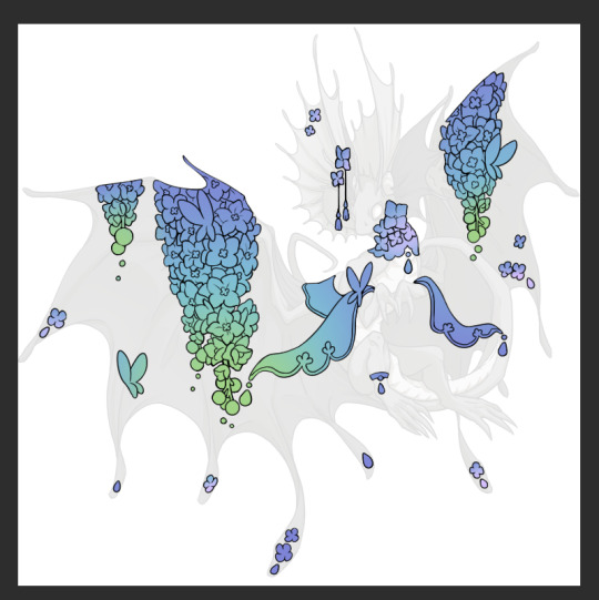
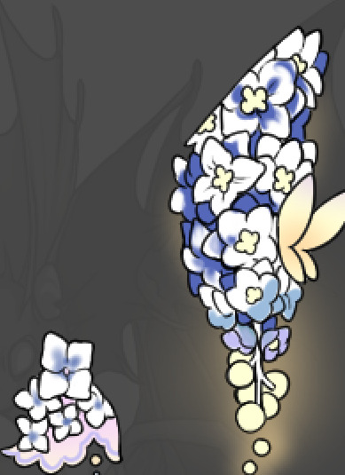
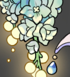
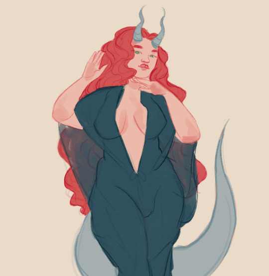
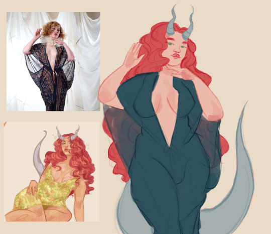
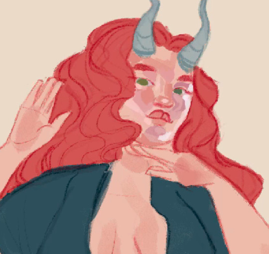
Now this where my style of rendering color may come off intimidating and, tbh it might be. I do gradients first and then I color over them with "normal" blend layers. I typically don't use multiply layers unless I'm shading something that has a lot of textures. If this scares you, it's okay I'll keep walking you through it. Here, my gradient goes from a pastel but deep periwinkle, to a soft more cyan blue, then to a lighter pastel green. Skipping steps and going from the periwinkle to green will give it a different look. There's also hints of a pinkish tone as an accent color.
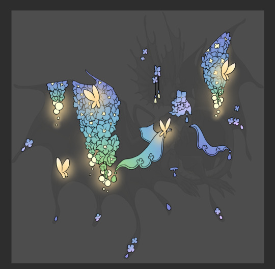
So as I said, these additional layers are done with regular "normal" blend mode layers. I've placed one in between the butterfly line art and the line art for the rest of the flowers, and then an additional layer under everything else. This allows me to create a glow effect specifically around the butterflies, and then specifically under the flowers. Going back and forth with the proper amount of opacity (by using the airbrush transparently) helps to make it glow but not be Too Loud. Also checking it against a dark background can help to check for spots where it spills past the borders, as well as really gauge how Bright it is. I've also color matched the butterflies with the flower pits and the bulbs. This adds extra cohesion and makes them all look uniform but different enough with the gradients.

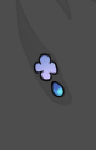

The stages of how I render gems/dew drops. Take the base color, make it a bit darker and less saturated (as well as changing the hue a bit depending on what the default color is. For yellows I go more orange/red, for blues I go more purple or even pink. It depends), add a small drop light at the bottom thats a fairly saturated version of the base color, and then a stark white/ near white highlight. That's it. Don't over complicate it, it will not matter when it gets shrunk down. Note that I do not use multiply/overlay/screen layers for these types of things as it adds too much bulk to the files and doing it manually helps to strengthen your color theory skills.
For shading and rendering, again, I create a "normal" layer and simply. Draw over what exists. Color picking and hand blending allow me to create the exact shades and effects that I want that multiply/screen/overlay layers may not be able to achieve. (which isn't to say I dont use them! i just don't use them for the main meat and potato part of my coloring) All of what is shown here is also achieved with the CSP asset SOIPEN (which can be found for free in the asset store)

another example. The one on the right is showing how the layer looks without the gradient base layer under it. All of this is rendered by hand. I also specifically put a highlight color around where the butterfly is sitting to give a better illusion that it is properly sitting on the flowers rather than just in front of them.
Next is changing the color of the lines, if needed. A method i'll use is I color just the sections I want (on a separate clipping layer) then lock that layer's alpha setting to them add in a gradient. It's a small and subtle effect that adds more depth without doing a lot of effort. (work smarter not harder)
Now we get to the Polish Layers!
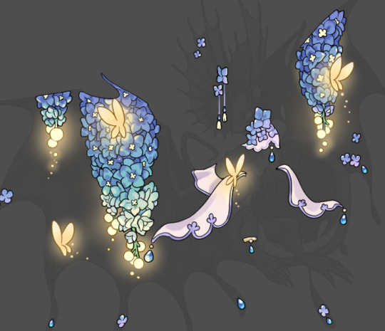
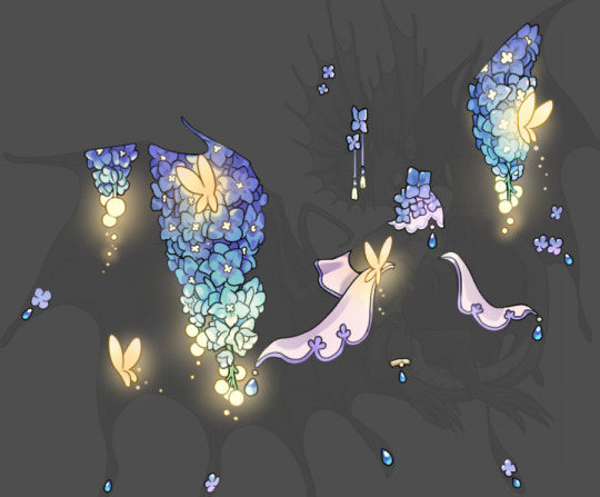
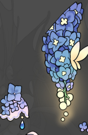
first image is how it looks as a base. second image is with an overlay layer applied. I've used some dark purples and mid tone desaturated greens to push the values a bit further (especially evident on the top left wing) Third image is with a screen layer applied, highlighting the inner most part of the flowers and adding some additional bounce light.
An important thing to note about making accents vs making full coverage skins: OPACITY AND LAYER TYPES MATTER OVER TRANSPARENT SPOTS. What I mean by this is that if you use a soft, light grey to shade with a multiply layer, don't clip it to anything, and have it go outside the lines - that will no longer appear as a 'shadow' when it comes to the final result. Instead you will have a section of soft light grey that is simply laid on top of whatever the image under it is. The same applies for overlay/screen/add layers and so on. If i use a very dark color on a screen layer (to give a soft highlight) and airbrush it over a bunch of stuff and don't clip it, it will end up with this horrible dark splotch over everything that isn't opaque. To this end, mastering normal layers is imperative to having well rendered and convincing accents.
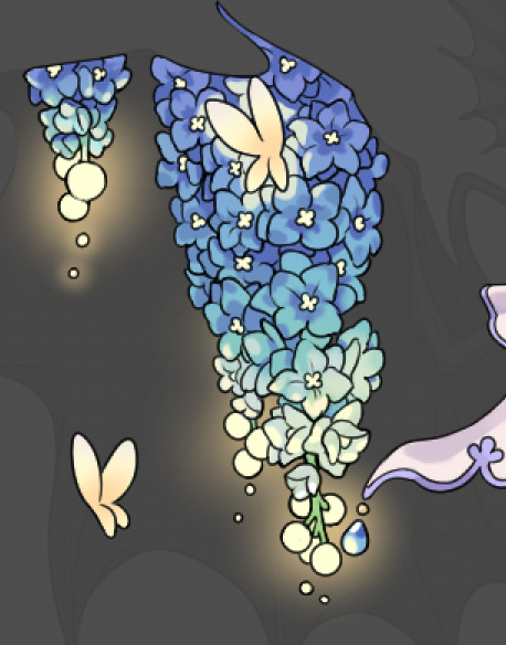
Another thing of note: when it comes to sparkles/small details, note how 'large' the sparkles behind the butterflies are. They seem a bit chunky, yeah?
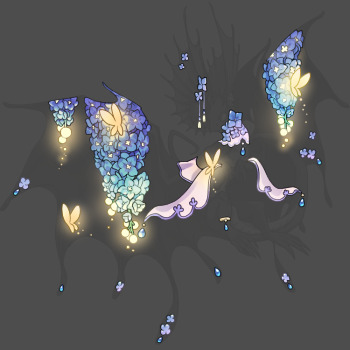
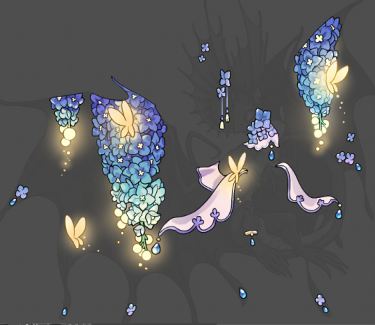
this is what they look like at proper size. If anything, I could have gone larger on the small metal beads connecting the dew drop jewels to the lace.
Another trick I also like to do is this:

a slight hint of transparency! It's just enough to let the dragon's lines underneath show through but not enough to be super noticable. I like to do this a lot when it comes to sparkly and magical effects.
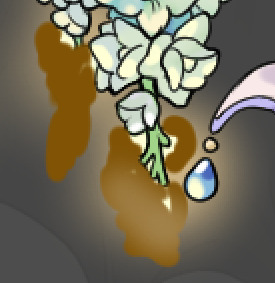
Next is the worst part of all: destroying all that beautiful hard work with the shadow and line art layers! (sobbing)
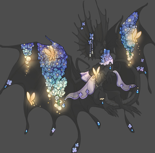
This stage always agonizes me. This is my first pass of the shadow/line layers and let's hope it's dark enough.
But yeah that's a start to finish look at how I create my accents. Unfortunately a lot it devolves into needing to know, yknow, line weight and silhouette importance, color theory and the ways that drawing applications actually apply color to a png vs how its rendered in app. All of these things impact the finesse of the accent, and are things you do have to learn gradually over time, but hopefully this has given yall some additional insight and perhaps some helpful tips.
And this should also explain why I get so mad when people go 'hey can I get this accent in another color' no! no you literally can't!
146 notes
·
View notes
Text
a trashcan’s guide to coloring
using @thoughtfulshepherdmongerkid beautiful ivy rose, because I’m thinking of her always and also really struggling w the comm sorry (also this is long as hell fair warning)
sketch/line-art. I suggest making it at least kinda neat so you have a solid guideline, but honestly just do whatever you gotta do. I also like to set my sketch layer to multiply so that the line art meshes w the base
2. usually I lay down one base color (in this one it’s pink), then I use a clipping mask to lay down some flat colors. the brush you use for this won’t really matter because it’s gonna get covered by rendering (merge layers when you’re done)
3. get your references!! you’ll need them for when you start painting over your base, trust me. references changed my life and saved my summer harvest
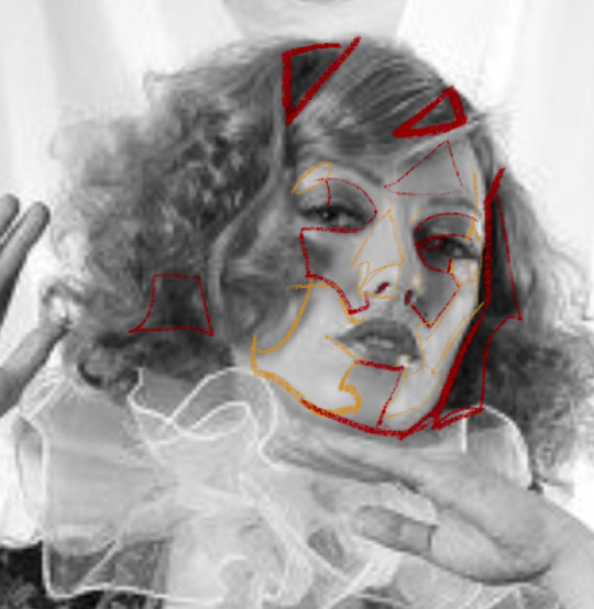
4. now, on a layer created above your sketch and base, go in w/ a mix of lasso tool/freehand brushing and start blocking in your colors. the values on our faces naturally form blocky shapes, so try to focus your energy into getting those down
I like to use the spectra brush to render because it adds a nice texture, but feel free to experiment with what you’ve got. also, I tend to go darkest -> lightest -> middle in terms of coloring order
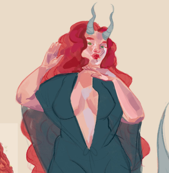
if you struggle with value, I suggest finding any picture (make it black and white by turning saturation down) where there are 3 clear values (black, grey, and white). then with a colored brush, outline all of the different shapes those values make. kinda like this!
5. quick color theory run down before we wrap up: use a cool toned grey (red based, pink based, purple, etc) for the blue parts of the skin, a desaturated red/pink for purple, and gray yellow for green. this will give you very lively and compelling coloring without being too crazy. obviously, you can do whatever you’d like, but I’ve found that this makes my palettes more cohesive and adds depth to the skin
6. so I can’t really finish this piece because I have to start working on commissions again, but after an hour ish of blocking and blending, you should end up with this
and then if you continue and blend a whole lot more, you’ll end up having something more like this!
also, little lasso tool guide
to lay down the colors you’ve gotta click the brush, personally I like to freehand instead of color drop, but you do you
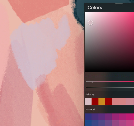
finally, if you aren’t satisfied, you can either 1) merge all of your layers and add a gradient map, or 2) merge your layers, duplicate your new layer, add a gradient map at 100%, and change your canvas blending mode to soft light + change the layer opacity. this’ll make your piece more vibrant and cohesive
#final disclaimer: you will not get these exact results if you aren’t at my skill level#art tutorial#sage’s art tag
72 notes
·
View notes
Text
The Life Series and Eyes (A Headcanon Rambling)
hello traffiblr! Y'all voted to have me rant about the life series and my personal headcanons regarding eyes, so. Here we go!
Overview
So let me hit you guys with a quick overview.
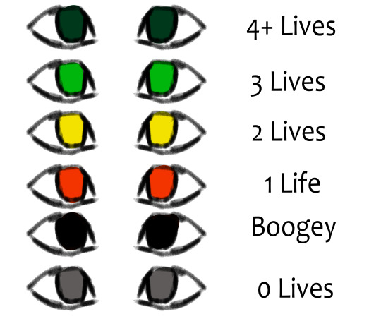
here's a quick reference. While these all depend on the individual, and the series, I'll explain what each general eye color means.
4+ Lives
People with 4+ lives fall into this category. Their eyes are a dark green, bordering on teal. I think it would be interesting if A. eyes act as a sort of weak gradient in terms of 4-1 lives. So, there's a bit more blue. 2. Personal headcanons regarding speakers, and their colors. 3. A sort of parallel to the Boogey eyes. both are very dark. So its harder to tell if they have 4+ lives somehow, or if they're boogey.
3 Lives
A classic. A nice, simple green. While the exact hue varies depending on the person (because of either violent or peaceful behavior/simply what looks good with them), greens have generally bright green eyes.
2 Lives
Similarly to 3, the exact hue depends on behavior of the individual. Someone who's more violent would be closer to an amber, while peace loving players lean towards more of a yellow-green. The eyes are always clearly yellow, though.
1 Life
While the others would go towards a color dependent on behavior, all bets are called off for reds. The hue is purely aesthetic. It is no longer a clue towards general behavior. There's rarely any allowance for personal preferences in reds. All they can see is violence and conquest.
Boogey
Basically, I reject the idea of boogies having purple eyes or glints for symbolism with watchers. It's far more threatening to me if their normally bright colored eyes are chips of the void. Obviously, characters still have pupils, I just don't include them in my style. I can't decide if Boogies have pure black eyes, or if their eyes are a dried-blood color so dark it only seems reddish in light.
0 Lives / Dead
And finally, we have grey eyes. When it comes to deaths before the final death, the bodies disappear quickly, as soon as the person respawns, I'd wager. But after that final death, their body remains. Their eyes quickly lose all color, and end up as grey. This was chosen just out of design choice, the lifeless look, and also, by incident, Scar's red-life skin. It makes him completely greyscale, so a similar logic applies here.
Character Specific Colors
Here's a quick guide to character specific colors. Again, everyone has a unique one. Do note that most of these are simply what looks good, as I've only had the time to watch Grian's pov, and not anyone elses.
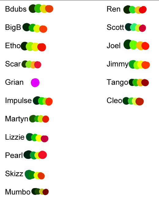
Ik they don't really... look good and may not fit, but hey, I'm here to rant about design ideas, not actual colors lol. And you will not believe how hard it is to make 16 different palletes unique and at least kinda match the character while having the same main 4 colors. I will address Grian, dw. Boogey and dead eyes are the same color, regardless of character.
3rd Life
Alright, so, from the base rules, nothing changes. It uses the same logic mentioned up above. Green, yellow, red, and grey. There's no real special mentions here that are exclusive to 3L.
Last Life
Similarly to 3L, LL lacks any specific changes to eyes. The only addition are the new eye colors for boogey and 4+.
Double Life
Here, characters share eye colors. What do I mean by this? I mean, their signature eye colors are at a gradient with their soulmate's. So, for example, Pearl and Scott's Green eyes are mixed as a gradient with both are on green. This applies for every life, and every soulbond. It gives people slight clues as to who exactly their soulmate is, but its hard to tell. When scar showed up boasting purple eyes, everyone was confused, to say the least lmao.
Limited Life
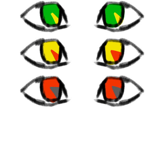
ok i'm definitely the happiest with this one. The idea is that everyone's eyes are functionally, like a clock. I illustrated it really badly, but the idea is cool ok. The idea is that like, idk, every 1/8 of someone's eye represents an hour. Every hour lost from the 'benchmark' turns to the next color. For example, if someone has 24 hours, their eyes are pure green. If they have, say, 18, they only have 1/4 (2/8) of green left, the rest of their eye being green. If they have only an hour left, they only have an 1/8 of an eye red, the rest being grey. The color of their current life slowly recedes in an almost spiral pattern as time goes on. If someone somehow had 24+ hours, same rule would apply to their 4+ life, so to speak. they'd only have a sliver of the dark green, with most of their eye being their 'normal' green.
Grian
okay, I know for sure people are questioning why Grian's eyes are neon purple. The reason why is on the simpler side. Watcher. He's the only one out of the players to be an actual watcher. Some people (like Pearl and BigB) definitely have some ties to them, but Grian's the only full blown watcher. (Martyn is tied to the listeners, who are green to me, so his colors are greener despite being prone to violence lmao. And Scott is tied more to the Speakers, who are blueish/cyan to me. Pearl, as Scott's soulmate in DL, has that bluish tint to a degree. )
But, you might ask, how do people not notice??? Well, its because of my Grian design.
This is old and it doesn't quite show my idea well, but alas.
I've already made reference images for this and I can't find the motive to draw a Grian headshot lmao. The idea is taking the Watcher's face plate. You know the one. The mask. And taking that, and instead of having the Evo symbol, no, it has, guess what. Grian's weird freaking eyes. Yep. Whether this was his attempt at camouflaging himself among non-watchers, or if it was his basically middle finger towards them, refusing to show obvious alliance with them, idk. All I know is he basically vandalized his Watcher mask. Still, you might say, that doesn't explain why is eye color is purple. Well, if you take away his mask, it's either basically a void with purple eyes inside, or probably some sort of void looking crack through his face, as if it isn't actually flesh. He can choose to have 'normal' eyes, but they always remain that Alexandria's Genesis purple, and it messes with his sight. Basically he sees too much. (I'd elaborate in my Watcher/Listener/Speaker post if people wanted 👀)
#mcyt#trafficblr#traffic smp#traffic series#god this took a while. enjoy it y'all#enjoy it#also#people are free to use these headcanons if they want! I'd just like some acknowledgment/credit at some point lol#but yeah if people want my other traffic series hcs i /will/ share#3rd life smp#double life smp#last life#life series#limited life#3rd life#double life
140 notes
·
View notes
Text
WIP sharing time, because my partner has been writing and copy/pasting RP posts for the first chapter of our upcoming paranormal investigation au fic, while I’ve been on and off writing scenes that I’m excited for (like this one, hehe)
The dim, sickly yellow fluorescent bulbs hummed to life overhead and illuminated the room: a large space that once was white and sterile, but had since become dingy and gray with dust and filth streaked across the walls and the floor. The tiles beneath their feet were grungy with dirt thickly packed into the grout lines. Two gurneys and old wheeled trays of surgical tools were still positioned in the center of the room. Against the far left side stood a wall with rusty hinges on metal cabinets, each one large enough to hold a human body.
The morgue.
The smell hit them next - an astringent odor of embalming fluid and formaldehyde that mingled together in the poorly ventilated cellar. Yugi coughed, trying not to gag as he pulled the collar of his shirt up over his nose. He remained right behind Ryou as they came down off of the stairs and stepped fully into the room. Aside from the odor, the air down here was different from the rest of the house upstairs, almost… heavier.
Yugi glanced down at the EMF meter secured in his belt holster. Two green lights remained steadily lit, and the first yellow light began to flicker cautiously. The thermal camera in his hand continued to give no strong readings as he scanned over the center of the room.
“I’m picking up some light electromagnetic readings,” he said quietly, his own eyes searching the shadows. “Let’s stay close.”
He turned his attention back to the thermal camera as he carefully made his way over toward the mortuary cabinets. The readings had been neutral since they stepped down into the cellar, slightly dipping into the colder side. As he scanned the area, he noticed the heat signature drop. It seemed logical to Yugi at first - mortuary cabinets were naturally refrigerated to slow decomposition. But the morgue had been abandoned for decades, so there was no chance they would have been functional…
His thoughts halted when he felt something brush against his arm.
Yugi nearly jumped out of his skin. He looked back, only to see Ryou startle beside him.
“Easy - it’s just me,” he murmured.
Yugi took a deep breath as he tried to calm his nerves - then his heart - as Ryou placed a hand on his shoulder to steady him.
The white noise of the thermal camera peaked, picking up a massive cold signature visible on the screen. He wanded the sensor over the cabinets to uncover a gradient of blues and purples shifting the way a shadow would in the light.
“There,” Yugi said, indicating the area in front of them.
As if on cue, the wailing began again - the haunting, inconsolable sobs of a child.
Yugi shivered, his breath visible before his eyes. He heard Ryou’s shuddering breath just behind him. He looked down at the EVP device to make sure it was still recording, its steady red light contrasting sharply against the rapidly blinking colors of the EMP meter next to it.
Swallowing back the fear beginning to dry his throat, he reached into his bag and pulled out the Spirit Vox - small and black - and turned it on. White noise abruptly churned out of the speaker, chugging at a rhythmic frequency.
“If there are any spirits here who would like to speak with us,” Ryou called out, “make your presence known.”
For a moment, there was an eerie silence, save for the feedback in the Spirit Vox. Murmurs could be heard deep within the noise.
Then they heard the same thin, small voice from last night’s recording, repeating the same question as before:
🇼🇭🇪🇷🇪’🇸 🇲🇾 🇧🇷🇴🇹🇭🇪🇷?
#Renae writes#(with Quill!)#fanfiction#Yugioh#Heartshipping#*heavy breathing* GHOST HUNTER AU GHOST HUNTER AU#oh - also a quick warning tag for#tw: character death
4 notes
·
View notes
Text
Stars of the Fall
Thinking clearly is never true for me and speaking true gets lost in foggy night time scenes.
Looking out at downtown LA at 3 AM. Buildings and homes lit by dreams and LED’s.
After a bit of drinks at a bar in the arts district. I think of what your eyes would gleam from these flickering streets and moistened steps to another place.
I wonder what your heart would take in from the twilight air that chills the soul and fills the ether with dreams and more.
Midnight still above.
As the gradient glow from steel and concrete swallows the white twinkle of the ever reaching stars.
Sitting in a random parking lot with faded markings and darkened signs as music plays on a crappy stock radio.
As you breathe You can smell the ocean and somehow the glow as well.
Of the trillions of places that exist and just as many thoughts that follow suit.
I still try to guess if the same midnight makes you daydream like midnight only can for me or is it only day daydreaming for you?
The morning is a mild sight. As sunrise comes the colors have been used by night and sunset again.
She breathes relief. The coming day will be filled again, with gorgeous sights, sounds to love or sounds to hate.
Dew to catch the air you breathe. Due to your ever present sea of wondrous things.
Is the morning your habitat?
is a lacy dream and comfy bed your perfect day?
Afternoons will sometimes shower down around to remind us that Freyr lives.
Golden rays continuously push through some dense and dark clouds to give you a california glow you probably don’t need.
A kiss of it would last a million years, but a million is far too much for human beings. A hundred years of it will do while the remaining feeling flows like ambrosia to the gods to bless the present, future, and past.
Do you like a gloomy sky with a hint of warmth?
Sitting on a towel, bathed in salt and sand, on a shore between the Malibu Hills and water that is a bit too cold to dive right in.
The evening hues are a vibrant wash of yellows, reds, pink, blues and purples too. The hum of endless cars along the Pacific Coast Highway paint the scene a little too.
A scene of cheeky pretty bathing suits and gorgeous girls with long blonde or brunette hair to fall in love with every day.
I guess that’s just the frames I see. I’m sure someone else would see things differently.
Walking back to your car while you’re heading home. Your lovely feet stroke the sand beautifully.
The sand, just like the world, with ardent joy would pay its life to caress your soles and be your path to evermore.
I wonder if your eyes see the grains that cover everything while you drive away as a problem or a parting gift.
3 notes
·
View notes
Note
Hi! Would you share some tips on how to achieve the colouring of this gif set maybe? /720060252150808576/for-pscentral-event-16-pride-colorsand It looks so beautiful! I love how you coloured Buck so much! Have a great weekend!
hi!! first of all, sorry this took a minute. life, you know. anyways thank you so much for your kind words, i'm so glad you liked the set!! and i'm always happy to share techniques and resources so never hesitate to ask!
since you asked for tips and not a tutorial, i'm going to assume you have a handle on the basics and try to keep this fairly general. if you want a more in-depth explanation for anything just let me know!
so most of this was achieved with a combination of adjustment layers (mostly the love of my life selective color) and color/gradient layers, and a whole lot of layer masking. my first tip is use timeline mode and familiarize yourself with the stopwatch controls, particularly the layer mask position stopwatch. i'm just gonna direct you to the first half of this tutorial if you're unfamiliar. this set would've taken me waaaay longer if i'd had to rework the masks frame by frame, since i was moving the masks for multiple layers on each gif
now for the colors themselves, tip #2 is don't rely only on solid color/gradient layers for colorful gifs. it's certainly possible to get something decent with just a base coloring and a fill layer set to blending mode>color, and that may be what you want depending on context (that's exactly what i did with poker buck in the first gif!). but that's gonna be a really stark (heh) effect, and for the brother, babygirl, and bisexual gifs i wanted them to look soft and warm and glowy, so for those i adjusted the backgrounds to fit with my blue/purple/pink palette AND used color fills and gradients on top of that
for example, on the gif of buck and maddie hugging, in addition to my base coloring i have two selective color layers to shift the background from yellow/red closer to pink and bring out the blue in buck's shirt, a violet photo filter to tone down the reds even further, and and pink solid color layer set to soft light at 49% opacity (all of those were masked so that maddie's face wasn't bright pink or whatever)
that's all under the gradient layer that went on top (which is set to hard light, 50% opacity). below on the left is that same gradient set to color, 100% opacity, without any of the other adjustment layers underneath. it certainly doesn't look bad, but it's a very different look to the one on the right, which is the one i went with


this brings me to my next tip, which is play around with blending modes. i'm sure you know they all have wildly different effects, but don't shy away from any of them, cause today might just be the day that hard mix gives you the look you want. like normally when i'm doing a glowy gradient on top of everything i go for lighten or screen, but i happened to mostly use hard and soft light in this set (this video is a godsend for understanding the different blending modes - if you have a free afternoon i definitely recommend browsing this guy's channel. you will learn so much)
the last thing i'll mention is the gradient i used. rather than generating a gradient fill in photoshop i took this texture (which i wish i could link the source to but it's from a pack i downloaded ages and i have no idea where i got it):

made it bi:

and then stretched/rotated it differently in each gif so that there was some variation. having that softness and slight variations in vibrance and luminosity helped with the overall warm glowy feel i was going for, which i don't think i would have have gotten just by using a gradient fill layer
and that's about it for the colorful gifs in that set. as for the others, the first gif really is as straightforward as it looks: a blue->purple gradient set to color on poker buck, and a pink overlay on buck in turnouts, blended so that the colors overlap and mesh together.
the black and white ones were also very simple. this tutorial explains how to do the colorful outline thing if that's new to you. that's all i did for the small b&w gifs. for the baby boy and braincells gifs i used the same technique only instead of using a a black->color gradient map in the group set to lighter color, i used the same gradient as above set to multiply over the black and white gradient map
i hope at least some of that was helpful!! again if i need to elaborate on anything i'm happy to. my 'process' is really more me throwing things at a gif to see what sticks so i may not always be able to give the most coherent explanation but i will try! thanks again for the ask anon and have a great rest of your week 💖
4 notes
·
View notes
Text
Vivid Echoes: Embracing Radiance in a World of Monochromes
Chapter 1: The Canvas of Memories
In the monochrome tapestry of life, my love for colors persists as a vibrant sequel, a testament to the enduring beauty that hues bring to our existence. The world may paint itself in shades of gray, but within me, a kaleidoscope of emotions and experiences bursts forth, creating a vivid mosaic that refuses to be subdued.
In the quiet recesses of my mind, where time intertwines with the whispers of nostalgia, there exists a canvas adorned with the vivid hues of cherished moments. This is the sacred space where the past is not a distant echo but a living, breathing masterpiece, each brushstroke a testament to the symphony of emotions that have graced the stages of my life.Upon this canvas, the indigo hues of childhood innocence dance alongside the golden strokes of laughter under the warm embrace of the sun. The first delicate pinks of budding friendships bloom into a riot of colors, a kaleidoscope of shared secrets and adventures that define the early chapters of the heart.As I traverse the canvas, the landscape changes, and the colors deepen. The passionate reds of love, both tender and fierce, paint themselves into the corners of my memory. The subtle gradients of blue reflect the serene moments, like a tranquil lake mirroring the moonlit sky, where time seemed to stand still.Yet, not all colors on this canvas are bright and joyful. The somber grays and muted blues capture the inevitable storms, the moments of loss and introspection that cast shadows upon the otherwise radiant tapestry. Each shadow, a reminder that even in the palette of memories, contrast is what gives depth and meaning.The canvas of memories extends beyond the boundaries of personal narratives. It hosts the collective experiences of shared history, where the vibrant yellows of triumph and the solemn purples of collective resilience tell stories that transcend individual lives. Wars and revolutions, victories and defeats—they all find a place on this expansive canvas.In the quietude of reminiscence, I run my fingers over the textured canvas, feeling the raised brushstrokes of joy and the gentle depressions of sorrow. The memories, like colors, are not static. They bleed into one another, creating new shades, new narratives, with the passage of time.As I stand before the canvas of memories, I am both artist and spectator. Each stroke, a decision made; each color, an emotion felt. The canvas is not just a repository of the past but a living testament to the continuous artistry of existence. And so, in Chapter I, the canvas unfolds, inviting me to explore the vast gallery of memories that shape the landscape of my soul.
#[email protected]#authors#blog#blogging#books#literature#novel#publishing#reading#writing#writing tips
3 notes
·
View notes
Text
Uyir-kaga eluthukal ( Letters for life )

[ ID: Small sized digital fanart of Putunia Mollar, Jimothan Botch and Trencil Varnnia from Smile For Me the game. Trencil and Jimothan are close to game style while Putunia is more in the artists simplified semi realistic one. The sketch is somewhat messy and is flatly colored.
The changes to her are scruffier hair, a visible big nose, a toned down reddish-brown skin tone and the dress she wears is simply patterned like a purple petunia such as the skirt bottom having a splash of spotting.
Jimothan gestures to the first vowel of the Tamil alphabet written in a book that is 'A' pronounced like the 'u' in 'nun'. There are papers, pencils and a rubber scattered behind this book. Jimothan is saying," A for Annam" which means swan. Putunia is sitting in his lap and leaning forward horizontally to the open alphabet book. She says "A-A-A..." but Jim corrects her," No baby it's "Ah"..."
Jim is wearing a baniyan and blue dhoti. Behind him Trencil garlands his arms around Jim's neck, listening to it all with a neutral expression. The background is a pale gradient of green, yellow, red. End ID]
--
HAHA get it, get my pun, does anyone get my Tam pun🥸( disguise emoji with glasses and moustache indicating amusement in this context)
But yeah since Tunia has the heritage, but due to her circumstances she does not know her parents and didn't have a chance to learn her mother tongue, later on Jimothan teaches her from scratch best as he can. He isn't a teacher by job but he sure can darn try atleast for the basics. Tunia calls it's her "Tamil Tution" with "Jim-Appa"!!! He isn't a 100% serious and boring in it all the time, come on guys this is our community daughter. He does uppu-muttai with her, which is like.
You carry around someone like a 'salt bag' and keep asking how much people will pay for them, like those guys who sell things on the road. However once he gets a high bid Jim simply says she's too precious to give sorryyyyy X ) (X eyed face emote with smile ) !!
And you know, I projected here BUT I think since he did not like, grow up a Lot in Russia in my HC but was US-raised then as for his own language, Habit can speak reasonably well in casual conversation but more formal stuff and bigger words are lost on him. He can write the script from muscle memory since he was taught when young but he didn't use it much later anymore in an English world, so he cannot form many written words on his own. And he can't read very well. So yeah there's a lot of room for improvement if he'd like and I'm learning too hdjdjdh yanno.
BUT! He has an accent doesn't he? Correct me if this sounds contrived BUT for that one I reasoned that his parents were just-arrived immigrants, so he probably picked up their speech patterns ( But mostly from his mother and also his uncle who helped her raise him in the early years as her husband's brother-in-law and her own brother ). Uncle Grigory lives back in Russia though( I'll figure out a specific place) and later on he only sees him during month-long vacations. And the last thing was that Habit really did not interact well with so many people as he grows up more so that relative isolation might be a factor too. That said considering everything( it would fade) the accent probably isn't like thick, but noticeable if you listen.
Anywayyy what I wanted to say is that Habit probably tries to learn more about this stuff too either self taught or with help and I like to imagine Putunia and him bouncing off what they've learned that day with each other. Also they make each other say things in the other's language just to hear them butcher it LMAO Putunia I BET as a Certified Baby Kid just, catches Habit's face and pulls it around to make him say the sounds like stretching him for " EEEEE" SHES PUPPETING HIM 🥺 ( pleading emoji )
Fun fact: There is actually a Super Special Hatch at the back of Habit's head and if you find it, open it, and stick your grubby hands in then you can PUPPET HIM AND MAKE HIM SAY WHATEVER STUPID THING YOU WANT!!!!!!
#i say#txt#jimothan botch#Putunia mollar#Habitician#habiticians#s4m#smile for me game#trencil varnnia#dr habit#(talked abt in the description)#my headcanons#headcanons#roseverse#au#s4m au#fanart#my art
5 notes
·
View notes
Text
Mother Natures Beauty
The theme that I chose for my collection of photos is that of mother nature. I chose this as my theme because we often live life not seeing the beauty of our planet. The world is a canvas with the most beautiful vivid colors. I decided to go to the botanical gardens to take pictures of our beautifully crafted landscapes with the greenest grass and leaves and the most brilliantly surreal colors of flowers.

The first picture in my collection is one showing Blue Sage. When I was walking around looking at all the different flowers and shrubbery, my eyes caught the lively shade of blue. The shade of blue that is intertwined with the green of the foliage gives a great contrast and only makes the blue pop more. The name of this plant as I stated before is blue sage and I think that its a fitting name since the green is sagey and the flowers are blue.

While walking down the path and enjoying all the scenery, I realized that I had been focusing on what was in front of me and not looking at everything as a whole. I captured this picture of the blue sky, middleground and forefront of the shrubbery. The middleground and forefront are two different shades of green which gives a monochromatic story. The blue from the sky makes the picture pop.

The third picture that I took was one of a plant called the Bixa Orellana. The picture shows a background of trees and again it is darker than what is at the forefront, giving it a nice darker contrast as your eyes move towards what is closer. The hues of the plants go from greenish brown to a yellow which gives it a beautiful gradient look that is appealing to look at. The seed bods are a beautiful and intense red.

This picture that I took looks very simple at first but I enjoy the simplicity of the piece. This is a picture taken outside of the original photography spot that was too pretty to pass off. This piece shows the radiant earthy green that we see day to day. What I enjoy most is how the droplets of water on the leaves glisen because of the sun radiating off of it.

The last and my personal favorite picture from this collection is this one that I took at the end of my walk around the botanical gardens. My favorite part of the picture is how the camera captures the flower at the forefront and blurred the background. I feel that this effect gives the flower and therefore its colors importance. The colors of the flower are purple and white and the pattern is one that can only be made by mother nature herself. I feel that this picture makes you feel the importance of nature and its beauty.
0 notes
Text
GENERAL
Name/Aliases: Penny Pink, Pink Girl (Her Fans), Pink Lady or Women (Stranger) Strawberry Shortcake (Her Boyfriend Rafael)
Age: 18
Birthday: February 14
Gender: Female ♀️
Place of Birth: Rio de Janeiro
Species: Neon Human
Sexuality: Heterosexual
Nationality: Brazilian
Country: Brazil
Ethnicity: African “Black”
Color: Pink “FF009D”
Language: Portuguese/English
Object/Weapon: Magical like Winded-Buster and some Hair Solening Accessories
Personality Type: ESFJ
Alignment: Good
Food/Drink: Strawberry and it comes with Cakes, Milk, Cookies,
Body Type: Hourglass
Occupation: Hair Saloner
Weakness: Metal and Earth
Status: Alive
Element/Power: Wind
Animals: Sheep, Flamingo, Komodo Dragon, Crested Newt,
Emblem Shape: Heart
Emotion: Loving
Super Abilities: Throw, Back or Front Flip, Running, Smash, Punch, Kick, Control, Swing, Climb, Levitate, Shoot, and Jump.
Height: 5’6”
Weight: 53-65=Kg
EXTRAS
Like: Hip Hop, Fashion stuff, Beauty stuff and care things, Pink Collectable characters, Crossovers, Partying, Cities, Her Boyfriend Rafael Red, Family & Friends, and Small or Medium Creatures.
Dislike: Misleading, Racism, people get sexist, Shoplifting, Karen's, Large Animals that are dangerous, and get her dress dirty.
Hobbies: Hip Hop, Hair Salons, Musics, Pink Stuffs, Card games, Video game's, and Natures.
Club/Group: Neon Wonders 01
Spouse: Payne Pink (Mom) Pamela Pink (Older Sister) Pablo Pink (Young Brother) Pierre Pink (Older Brother) Philip Pink (Dad)
Pronouns: She/ Her/ Hers/
Physical Strength: 1.21x.BW
Friends/Allies: Gaku Green, Oscar Orange, Yandel Yellow, Priscilla Purple, Brody Blue, and Cindy Cyan.
Enemies/Rivals: Willow White and Ben-zi Black
Love Interest/Crush: Rafael Red
Flower Sign: Dahlia
Gemstone Sign: Spinel
Zodiac: Pisces
VOICE SOUNDED TONE:
Deep, Dreamy, and Smooth.
APPEARANCE:
Penny Pink is the most romantic one. She wears a bright pink long maxi dress that has a value-like gradient on it. Her belt is dark pink with the Cutted-heart shaped spinel. Her undergarments are lighter pink and she wears elegant high heels with the pendant heart. Her earrings are light pink in heart shape. She has fake fingernails that are bright pink such as her makeup. Her whole DNA is also pink including her Hair, Blood, Body Wastes, her Hands and Feet, and her eyes are pink with the heart highlighted. Except for her skin color.
DESCRIPTION:
In the Brazil, Penny Pink was a 9 year old and she was living lively in Rio de Janeiro. Whenever there we're Parades,
Celebrations, and all Pink Fictional Characters that are real life in public. Penny love spending time on the window while daydreaming and viewing everything. Later that night, the wind is too strong when there's a lot of bad weather, especially hurricanes. Intel then, it was over. After everything it's already destroyed in some place far away that is abandoned. Penny Pink made a relief. She went back to bed. In 10 months later, It is now her 10th birthday! And her party is so big with a lot of big foods like Desserts, Fruits, Snacks, and Meats, Penny went exploring along with her friends and family on the boat in the Amazon Rainforest. The people have been amazed and see the pink exotic animals. In the second later, Penny just feel something that's in her hand and it's a strange unique present and the address. “Hey Dad! Mom! Look at this! Somebody give me a present with my name on it!” Penny said. “That's awesome, sweetheart. But where did it come from?” Her Father said. Penny is started to opening if curiously. But now something surprised her shiny. It's a Heart-Cutted Shaped Spinel! And use for her belt! But that's not all. This is where it ends when her shapeshifter come appear to see Penny named “Pinkioid”.
PERSONALITY:
Passion, Serious, Energetic, Strict, Humorous, and Sassy.
TRIVIA/STORY:
Penny Pink is inspired by me that I decided to draw her back in 2021. But not like Nicki Minaj the rapper when she loves Pink. Because I used to be inspired by other Pink dresses for Penny's like the heels and earrings. But not other all fictional characters but Pink Hearted Treasure from “Hanazuki Full of Treasures” just like I made her Shapeshifter. But now her name is “Pinkioid”. I decided to give her wind as her element. Especially the user inspired me named “Caramelangel714”.
GALLERY:
N/A
#anime#cartoon#illustration#digital art#original artwork#originalcharacter#neonwondercrew#oc reference#original art#original character
1 note
·
View note
Text
Color crayon set and watercolor paint – My colorful world
Hey there! I'm just a kid who loves to create amazing art with my favorite tools - a colorful crayon set and some vibrant watercolor pigment. Every day, I embark on exciting adventures in the world of art, using my imagination to paint the world around me.
My color crayon set is like a treasure chest of vibrant colors. It has all the shades of the rainbow – from fiery red to sunny yellow, leafy green to ocean blue, and deep purple to pretty pink. Each crayon has its own unique personality. The red one is bold and passionate, while the blue is calm and serene. I use them to draw and color the things that make me happy.
When I want to make my art even more magical, I reach for my watercolor pigment. These little pans are like pots of magic waiting to bring my dreams to life. The colors blend and swirl together like a beautiful dance, creating gradients and hues that fill my heart with joy. I feel like a real artist as I mix colors on my palette and then gently brush them onto the paper.
One of my favorite things to paint is the sky. I dip my brush into the watercolor pigment, and with a few strokes, the sky transforms from plain blue to a mesmerizing sunset. The oranges and pinks blend together, just like the colors in a candy shop. It's like I can taste the colors on my tongue!
But it's not just about landscapes; I also love to create stories with my crayon set. I draw characters with silly faces and wild hair. Some wear superhero capes, while others are friendly animals. I use my watercolor pigment to give them vibrant clothes and backgrounds that match their adventures. It's like a whole world inside my sketchbook.
My art doesn't stop at paper; I like to make cards and gifts for my friends and family. For my grandma's birthday, I painted a bouquet of flowers with my watercolors. The petals were so delicate, and the colors made her smile from ear to ear. It felt like giving a piece of my heart.
When it's a rainy day, I draw pictures of the sun and colorful rainbows. It's my way of bringing a little sunshine into my world. And when I'm feeling blue, I use my crayon set to create a world full of happy faces and balloons. Art has this magical power to make everything better.
My room is like an art studio with posters of famous artists on the wall. They inspire me to create and experiment with my crayon set and watercolor pigment. I learn new techniques and add my own special touches to my artwork. It's so much fun!
So, if you're a kid like me, don't forget to grab your color crayon set and watercolor pigment. Let your imagination run wild, and see where your art takes you. With these tools, every day is an adventure, and your world will be as colorful as a rainbow!
0 notes
Text
Virtual Sketchbook 2
JOURNALING –
Unity and Variety:
Unity is sticking to the same style and elements in your artwork, this helps make an artist’s work recognizable. Variety is mixing it up, so all the artist’s pieces have a different focus point. Balance is the key to finding harmony with unity and variety in artwork.

This painting is by Fernando Botero called The Musicians. This piece creates unity through the men’s similar outfits and appearance while the woman is the variety because she is the different, eye-catching element as she is dressed in a blue, poofy dress.
Balance:
When artists use opposing elements to create an equilibrium either through symmetry or asymmetry.

The piece is called Cutout of Animals. This artwork clearly demonstrates balance through symmetry and uses a repetitive pattern as each animal has a mirror image on the other side.
Emphasis and Subordination:
Emphasis is usually the focus point of an artwork and uses subordination which is areas of less color and interest, so your eyes are drawn to the figure in the piece with emphasis.

The painting is by Francisco Goya and is called The Third of May 1808. Emphasis is drawn to the guy in white as there is a spotlight on him and everyone else is dressed in dark clothes, which is the subordination.
Directional Forces:
These are elements that draw a viewer into different paths and places within the piece.

I could not find the artist of this painting, but the artist uses directional force through the waves as they crash into each other, and multiple are going separate ways causing the viewer to look at many paths in the current.
Repetition and Rhythm:
Repetition consists of unity and multiple uses of an element in a picture and rhythm is the pattern and overall flow of the artwork.

This piece by Tughra is named Sultan Süleiman the Magnificent. This artwork depicts repetition through the lines and shapes. The rhythm is created using the same color palette as well as the straight and curved lines.
Scale and Proportion:
Scale is the size between two objects in artwork and proportion relate to the size relation of elements compared to the whole piece.
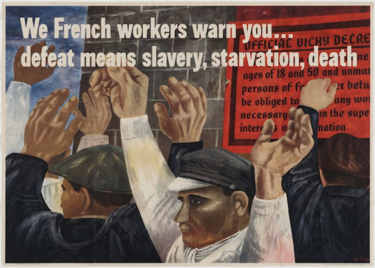
This painting is by Ben Shahn called We French Workers Warn You..Defeat Means Slavery, Starvation, Death. The artist uses scale and proportion by enlarging the workers’ hands to draw attention to them. This puts emphasis on how these workers are at the mercy of their hands as they need them for the hard labor jobs they were doing.
2. WRITING AND LOOKING –

Utagawa Hiroshige, Light Rain at Shono. (Pg 5, Ch 8)
This woodblock print by Hiroshige contains directional force through the diagonal lines covering the print, chaotic rhythm, shadows on top of a gradient, vanishing point, highlights to add depth, focal point, and contrast with the dark, gloomy background.
3. CONNECTING ART TO YOUR WORLD –
I love color. Just like the sun, color gives me joy and warmth. I feel like color adds life and radiance to a place. For example, like how people say, a new paint job can change the whole look and feel of a home or building. Humans are attracted to color; we think dull things are boring. Color excites me and I can feel passion and emotion through the intensity or hue. Color even can influence my mood as I have a more positive mindset in areas with bright colors compared to darker and dreary colors. If I had to pick a color scheme for my life, it would be pops of orange, green, yellow, blue, and purple.
4. ART PROJECT – ARTIST’S CHOICE – CARTOON
5. PHOTO/DESIGN –
Good Layout Design:
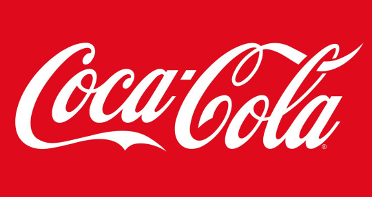
Coca-Cola has a good layout design because it is simple and uses the same logo for all products. The intent of this layout is a bold color like red that captures people's attention and is consistent throughout time. A good logo layout is something that can be recognized easily and associated with the company of the top of people's heads. Coca-Cola practically owns this topography as they have been using it since the company was created which is what makes this a good layout design for the brand. This logo fulfills its purpose as millions of people can comprehend the logo and the contrast of the logo makes it very legible and easy to understand. There are no distracting figures or symbols around it making it easy to remember as your eyes are immediately drawn to the letters.
Bad Layout Design:

This is a bad logo design because Kraft changed its logo colors and they do not nearly resemble the color palette of the original. Kraft's intent was to make the logo simpler so that it is more recognizable for consumers. Since they choose less subtle colors it throws customers off as it can be hard for customers to associate the new logo for Kraft's products. This design layout was a bad choice because it did not fulfill their purpose as it caused a miscommunication to their audience.
0 notes
Text
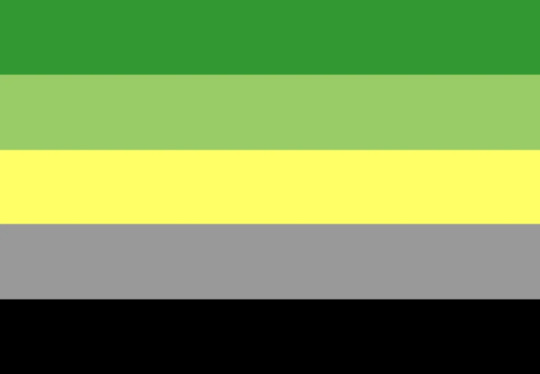
Whats an aromantic flag and why you should include it in your pride posts
disclaimer: i know theres fighting every year about who should and shouldn’t be included in pride posts, this isn’t to argue with people who just hate aspec ppl, this is an informational post. don’t send me bullshit about it
Why should you include aro flags?
many people believe that aromanticism is covered under the asexual flag, so if they include that they’re including aros, however that’s not the case. aro and ace people share the aspec community, but one identity does not fall under the other. It’s less like using the trans flag as an umbrella for all trans and nonbinary people even if there’s a separate nonbinary flag, and more like using the transmasc pride flag to represent all transmascs and transfems. Aros are just not covered under the ace flag because both groups are separate identities. people can be aro and ace but not all aros are ace.
aro is also an incredibly important identity for a lot of people, something we take a lot of pride in. we get relegated to “minor or add on identity” all the time because people keep thinking of us as the -romantic version of asexual. we have multiple terms, multiple flags, and a huge array of different aro experiences, we are not a subset of asexuality and many of us wish for that to be more respected.
last on the reasons of why you should include aros in pride posts is that we have no larger umbrella flag, unless we’re counting the rainbow flag. the aro flag is the umbrella flag for arospec identities. if you don’t include it then we aren’t being included. and this isn’t me telling you you have to include an aro option for everything you make (tho that would be nice) ppl have the right to choose what flags they want to include. but theres been many times when i see people add flags representing all parts of the community except aro, and then add on smaller more niche flags. i don’t want this to come across as another post like “how dare you include X flag but not Y flag!!!” because i think everyone should have the joy of representation, i just think many people don’t realize they’re even leaving aros out. either through lack of awareness or lack of knowledge on what the aro flag actually is, and that’s what i wanna help with this post.
What even is the aro flag?
Let’s start with what it’s not:

[ID: a flag with four horizontal stripes. from the top down they are green, yellow, orange and black. End ID]
This was the first proposed aro flag. We do not use it anymore for a couple reasons, the main one is that it resembled another countries flag too closely and was getting confused. I’d think this one would have died out by now but i literally just saw a post include it today.
[ID: A flag with five horizontal stripes. from top to bottom the colors are dark green, light green, yellow, grey, and black. End ID]
This was the second popular aro flag. It is very close to the main aro flag now except the middle stripe is yellow. That stripe was changed due to causing some people sensory problems. This one is sometimes still accidentally used, probably because it looks very close to the main flag, but it’s not the main aro flag either.

[ID: A flag with five horizontal stripes. from top to bottom the colors are black, grey, white, light green, and dark green. End ID]
I’ve actually seen this flag used a lot by people not very knowledgeable about aros. This is a flipped version of the aro flag. I also for the life of me can’t find an example of this but i’ve seen more than once a version that is flipped and removes a stripe of green so it looks like a recolored ace flag. These are pretty common, enough for me to have seen multiple people selling merch with this incorrect flag. I think it comes from people thinking the aro flag is the same as the ace one which does start with black at the top and has only four stripes.
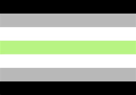
[ID: A flag with seven horizontal stripes. from top to bottom the colors are black, grey, white, green, white, grey, and black. End ID]
Yeah, this is the agender flag, not the aro flag. I see these get mixed up all the time. It’s not hard so see why with similar colors and a white grey black gradient, but as someone who is agender and aro, it kinda gets on my nerves when people mix these up. Also no this is not the same color palette as the aro flag. I’ve seen people make designs labeled as agender/aromantic that just use the agender color palette. The aro flag has two greens and they’re both different than the agender green.

[ID: Two flags next to each other. The first one has five horizontal stripes. from top to bottom the colors are orange, light orange, white, light blue, dark blue. The second flag has eight horizontal stripes. from top to bottom the colors are dark green, light green, white, grey, black, grey, white, and purple. End ID]
These are two common aroace flag designs. These flags are used by a lot of people and you might see them included in pride posts. These are good flags, however, they should not be used to represent all aros. Including an aroace flag does not mean you’re including all aros and all aces, it means you’re including just aroaces. There’s plenty of aros who aren’t ace and aces who aren’t aro. It’d be like putting a gay trans flag in a post and saying its there to represent all gay and all trans people, when the flag is usually used to represent only people who are both gay and trans. Again, these flags are not bad, and them being included in pride posts is good actually, but they should not be used to represent all aro and all ace people.
Now let’s go over what actually is the aro flag:

[ID: A flag with five horizontal stripes. From top to bottom the colors are dark green, light green, white, grey, and black. End ID]
This is the main aro flag. It’s the one most widely used and recognized. The color meanings are dark green and light green representing the spectrum of aro identities, white meaning friendship, and grey and black representing the spectrum of sexual identities in the aro community.
But wait there’s more!
The aro identity is a spectrum, meaning theres more identities under aromantic, and they have their own flags too. If you really wanna go wild and include some other aro flags heres some more. (this is not a full list of all arospec identities, just some i see around the most. feel free to look into more arospec identities and flags! also all of these definitions are coming from me and my personal knowledge of aro identities, i do not identify as any of these though, only as aromantic, so if i give the wrong definition please tell me so i can fix it!)

[ID: A flag with five horizontal stripes. From top to bottom the colors are dark green, light green, white, yellow, and dark yellow. End ID]
This is the alloaro flag. Alloaros are aros who aren’t ace. They deserve more support and attention because they’re really amazing members of the aro community.

[ID: A flag with five horizontal stripes. From top to bottom the colors are dark green, grey, white, grey, and dark green. End ID]
This is the greyromantic flag. Greyromantic means someone who feels romantic attraction rarely. The term greyromantic is also sometimes used to mean aro identities that still feel some form of romantic attraction.

[ID: A flag with four horizontal stripes. From top to bottom the colors are black, green, aqua, and grey. End ID]
the quoiromantic or WTFromantic flag. It means someone who can’t or doesn’t want to tell the difference between platonic and romantic attraction basically. It’s got a special place in my heart bc i used to id as quoi.

[ID: A flag with five horizontal stripes. From top to bottom the colors are red orange, orange, yellow, white, and black. End ID]
This is the Lithromantic flag. Lithromantic means someone who feels romantic attraction but doesn’t want it reciprocated, or may no longer feel romantic attraction when it is reciprocated.
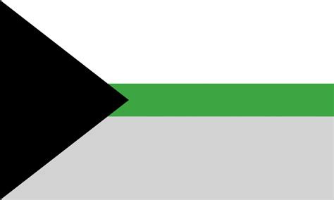
[ID: A flag with a black, sideways triangle on the left side pointing right and three horizontal stripes. The first stripe from the top is a thick white stripe, the next stripe is thin and dark green, and the bottom stripe is thick and grey. End ID]
The demiromantic flag. Someone who is demiro doesn’t feel romantic attraction until they have formed a deep emotional connection with someone.
And there’s many more arospec identities!
I hope i’ve helped to clear up some misconceptions about aros and our flags! We’re not under the ace umbrella, we’re our own community. We all have different experiences, different relationships to our identity, and I hope to see more people represent aros this year!
Have a happy pride month!
#aro#aromantic#lgbt#lgbtq#LGBTQIA#lgbtpride#lgbt+#pride#pride month#arospec#void screams#ace#asexual#hope this is an okay post#i just woke up and realized i needed to write this before june hits#long post
4K notes
·
View notes
Note
Criticism of the concept art of team rwby. Specifically your thoughts on the volume 1 concept art.
The concept arts for the girls really had some good points, and most of their looks besides Blake worked as a starting point for the superior fits they start the show in.

Honestly, I really like this outfit for Ruby.
For Beacon? I prefer her finalised look more. It just suits the more immature, idealised look for Ruby at that point in her life, where she was coming into Beacon wide eyed and ready to be the heroine like the ones in her stories.
But after Beacon when she lost her friends and has to grow up? This helps portray that character progression.
It's not too different from her finalised look, but I would honestly go back to this or her V2 alt for her Mistral look, rather than the canon one we got. It still has some aspects of her Beacon outfit in the puffy sleeves, corset, huge skirt, and long boots, but without the things that bogged her Mistral outfit down.
The corset even has the red on it to help it stand out and add some red to her look, even with the light grey shirt she wears instead. I love the cross imagery being more apparent on her, selling the gothic look for Ruby, and I honestly think I prefer it to her rose emblem.
The thing I'm not too sure about is the neck collar thing, which just looks a little silly to me, and the colour of her shirt. It's a bit too light for my liking, I would've gone for a darker grey to help make the red pop next to it. Also, I'm glad she didn't keep the bandolier or chains on her skirt, it cluttered her design a bit too much.
So yeah, great concept art. I even used the corset and shirt look for my Vacuo design of Ruby.

There's not much that's changed from Weiss' finalised look, unlike Ruby. The look really works with the blue and white, her clothes having the lace and quite icy look with the fabric, really selling the rich look of her outfit compared to the more tone downed outfits of her teammates.
I'm glad they shortened her sleeves honestly, because right now they just look like they get in the way and make Weiss look a bit too silly. She reminds me of a clown. That being said, I like the idea of gems hanging from her sleeves, like the little gems that would hang from her Atlas outfit later on. I wish they kept them, but maybe change them to silver so they don't stand out that much.
Besides that, I think they made the right changes from this. The beauty mark is cute, and I wish one of the other main girls had it instead, but I think the scar is a better choice that opens up a story for Weiss. Also, as much as I wish the show didn't give every girl the same choppy bangs, Weiss' bangs here just look weird.
Maybe it's because I'm used to her normal bangs, but compared to how I wish Blake kept her straight bangs, I'm glad Weiss changed hers.

I'm gonna be honest, I don't like this outfit.
It could just be because of how it's coloured, but the outfit looks so muddy with the purple tinted brown and desaturated gold that I would honestly take later Blake outfits' colouring than this. The colours make the yellow look so dull next to it, and you can't really see that her colour is meant to be black, not muddy purple brown.
The actual style of the shirt with the long open skirt thing looks bad and cluttered, especially with the belt over it. I'm glad they toned it back with her vest and shirt with shorts, using simple lace and gradients to give some interest to her finalised outfit.
There are some bits I do like. Her thigh highs are really pretty save the questionable colouring, and Blake has shown that she fits the thigh high aesthetics with her Mistral outfit. Her heterochromia is also a really neat touch and something I wish they kept, as well as her bangs being straight rather than choppy like every other girls in the show.

Her other concept is really just her finalised outfit with a bow on her chest. I think it's cute and wish they kept that little accessory on her final outfit, it'd keep in line with her bow style and is just adorable.

Green Yang isn't real, she can't hurt us.
It's just like Yang's finalised outfit but with different colour attempts. The second one having a scarf is honestly a cute idea, and something that I wouldn't have minded Yang wearing maybe later on, like in Atlas.
The problem is that the colouring is awful. The first one having an all green look just doesn't look good with the yellow, especially the more desaturated bronze on her jacket. It's also just so much that you wouldn't be surprised if people thought her colour was now green rather than yellow. It's just plain ugly.
Her second one is better with the light tans and oranges, but the tan here is the same problem as the tans she uses in Atlas. They're lighter and yellow in tone, but they're so desaturated that it looks so dull right next to her vibrant yellow and orange. The random white sleeves look disconnected and like Yang is wearing two different vests, and the black pokka dot bandana just sticks out. It works much better as the purple of her eyes.
And as much as I like the scarf, the random gradient from orange to cyan blue is ugly and sticks out from Yang's establish colour scheme.
I do like how vibrant her eyes are, and it's something I wish translated over to the show. Ein Lee always colours Yang's eyes in really well, along with the bandana, and it's a shame that part of the design is always ignored.

Her other concept art is more refined, and the only difference is that the purple of her bandana is instead a light blue. I like both, but I think the purple just fits in better with her colour scheme than the blue, it connects with her eye colour and looks more balanced because of it.
#rwby#rwde#outfit critiques#ruby rose#weiss schnee#blake belladonna#yang xiao long#answered#luke.txt
15 notes
·
View notes
Photo


Heaven, Hell, and Fallen angel cats.
(Sexes)
Males: Angels, these sweet boys reside in Heaven and are typically light, white, or pastel colors. Their wing size range from small and light to big and fluffy. They're normally very friendly and it's rare for them to be aggressive. It's also rare, but still possible for a Heaven cat to be dark colors, or a mixture of dark and light colors.
Females: Devils, these lovely ladies reside Hell and are typically dark, murky, or monochrome colors. Wing size range from small and thin, to large and thick. They're normally aggressive, rude, sassy, and unkind and it's very rare for them to act in any positive way but not unheard of. A hell cat can very much feel love or form bonds but their way of showing it is not in the typical way (I.E normally show it subtly or Tsundere like.) It's also very rare but very possible for a Hell cat to have light, pastel, and monochrome colors.
Non-binary and other: Fallen Angels, these beings of other gender identity (or multiple pronouns such as They/them and She/her) can live anywhere really. Hell, Heaven, Earth, they typically do not care as long as they find the environment comfortable enough. They're a mixture of both, having feathered demon wings and no restriction on color shade. They have both halos and horns as well. Fallen angel cats body can actually change and shift based on gender identity (Example: Non-binary would have no sex organs and reproduce through recycling genetic material)
_______________________
Breeding/The Mating Frenzy: Heaven, Hell, and Fallen angel cats reach sexual maturity at 100 years of age and their breeding season starts in June and ends at the beginning of August. The kits are born in October and depending on the gender, they will grow up in either Heaven or Hell. If they come out as the Fallen angel the parents will actually stay on Earth together to raise them. After kits are born, the partners will normally leave each other, but even though it's rare it's still possible for the partners to stay together some just get along that well if none of the kits are Fallen angels. The females are the stronger and bigger of the species and they attract males with their fluffy tails that get exceptionally fluffier during breeding. Here's where the mating frenzy comes in, during the season Hell cats and sometimes the Fallen angel cats are VERY irritable from sexual frustration and need to reproduce (asexuals are exempt from this), If a male comes and they don't think he matches the cat's standards they will attack until either the Heaven cat leaves...or dies.
_______________________
Sexual dimorphism:
Hell cats: Females of the species have arm and leg fur that resemble formal gloves and thigh high stockings, they also belly fur that wraps around the back that resemble a corset. Their tales are typically large and fluffy but can be thin or sleek. They have large venomous fangs and can even spit this venom at others. Hell cats can choose to not inject venom if they just want to give a warning bite. They typically stand to 6'6 ft tall but the tallest recorded stood at 7'6 ft tall.
Heaven cats: Males have arm and leg fur that resemble simple men's gloves and boots, they have belly fur that wrap around to give the appearance of a formal vest. Their tales are often thin and sleek but some have longer fur. They have a heal kiss that can repair small or minor injuries and some rumor that their tears can revive the newly deceased. Typically males stand at 5'1 ft tall and the tallest recorded stood at 5'5 ft tall.
Fallen angel cats: They're appearance actually remains rather androgynous, they have arm fur that resembles fingerless gloves and the leg fur would be different depending on the pronouns used, leg fur for non-binary would actually be different based in the cats personal style preference. Their height ranges from 5'1 ft to 6'6 ft, though the current tallest stands at 7'1 ft tall.
__________________________
Extra info: Heaven, Hell, and Fallen angel cats don't really interact with other species, especially humans though that's not always the case. Hell cats typically act aggressively if they sense danger or any other species near them. Heaven cats will either fly away or turn invisible until either the possible threat leaves or he senses no ill intentions. Fallen angel cats react really just based on the individual's personality. Heaven cat's powers include, invisibility, healing, singing that can make anything fall asleep, and teleportation. Hell cat's powers include, invisibility, teleportation, mind control, possession, super strength, and super speed. Fallen angel cats can mix of both while a shared power is shapeshifting/perception manipulation for all three.
__________________________
Monarchy: Heaven and Hell cats have a rather simple leadership system and very similar to humankind. Heaven cats are ruled by a King and or Prince, said leader is born into the position. Due to the fact that Hell cats do not live in Heaven, there has never been a reported Queen or Princess in Heaven. Hell cats are ruled by a Queen and or Princess, once again said leader is born into the position. There has never been a reported King or Prince in Hell. However, if the King of Heaven cats or Queen of Hell cats do not have an heir to their throne by the end of their lifetime (Which is rather rare), then a new heir will be born into a lower or middle Heaven or Hell cat family. The child is easily recognizable and their position is known since the moment they are born, though the parents will show some shock due to them not knowing they would bare the new heir to the throne. Fallen angel cats really have no leader and only follow the current ruler if they're in Heaven or Hell.
Heaven cat heirs: When or if a Heaven cat has to be born outside the royal family, then they tend to look very different from their normal Heaven cat counterparts. When the heirs are born in a normal family then they will always be a combination of purple, yellow, and blue (including shades of said colors). They will also have two halos instead of one. Said halos will float around their ears. Next, the heir with have four wings instead of two, these wings are very large and tend to droop on the ground are golden with a colored tip. In VERY rare cases, the heir will have six wings and a third halo floating around their tail.
Hell cat heirs: When or if a Hell cat has to be born outside the royal family, they will look different from their fellow Hell cat counterparts. When the heirs are born into a normal family, they will always be a combination of warm sunset colors, mainly orange, red, and blue, However, raspberry, yellow, and yellow-green are also possible, along with the occasional purple. The young princess will also have large fluffy bat-like ears and a very large fluffy tail. Gradients are very common with these heirs. Their wings are are rather boney and they also have boney plating here and there around their body like a type of armor. In very rare cases, the heir will have a second set of horns on the sides of their head.
Birthright age: The heirs of course do not get the throne until they reach a certain age, but the age is still rather young because of their species. Heaven cat heirs can assume the throne when they are 90 years old. Hell cat heirs assume the throne when they are 85 years. A council of five rules until the heirs have reached the proper age.
_________________________
Health and life expectancy: Heaven Hell, and Fallen angel cats are near immortal beings and can live for a very long time. However this can change due to how healthy they are, this range is different for the males and females.
Males low health/below average: 9000-10,000 years
Males normal health/average: 100,000-200,000 years
Males very healthy/above average: 500,000-900,000 years
Females low health/below average: 9000-10,000 years
Females normal health/average: 700,000-820,000 years
Females very healthy/above average: 1,000,000-1,800,000 years
Fallen: Age averages for Fallen angel cats are generally in between both Heaven and Hell cats, though sometimes they can live a bit longer than an above average Hell cat.
Heaven, Hell, and Fallen angel cats rarely reach a point of low health due to their abilities and special endurance, they also have a powerful immune system. Hell cats also eat a healthy diet of souls, magma, and meat. But, they can eat other things liked baked goods from time to time. Heaven cats eat a healthy diet of veggies, fruits, and positive feelings, they don't like meat but adore baked goods. Fallen angel cats eat just about anything they want with no strict diet restriction but healthier food is still recommended or constant unhealthy food.
___________________________
Classes: The Heaven and Hell cat species have a variety of classes, some roles only going to certain classes. These will be listed now. (Fallen angel cats typically have no classes, they're either on Earth with no strict society or just found their place in the classes of Heaven or Hell)
Heaven commoner: Any class
Heaven merchant: Middle or high class
Heaven orphan: Low or middle class
Heaven outlaw: Low class
Heaven mage: High class
Heaven shop keepers(varies): Middle or high class
Heaven council: High class
Heaven royalty: Ultimate authority
Hell commoner: Any class
Hell merchant: Middle class
Hell orphan: Low or middle class
Hell outlaw: High class
Hell mage: High class
Hell shop keepers(Varies): Low or middle class
Hell council: High class
Hell royalty: Ultimate authority
___________________________
Religious stand points: Depends on the individual and views on religion.
___________________________
Conclusion: This use to be a closed species of mine but now this is a species and lore ref for me to use. Though if anyone wants me to make them a Heaven, Hell, or Fallen angel cat let me know and I'll think about it.
-----
Random oc facts:
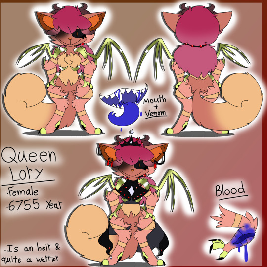
Ireland: My sona and the mascot for Hell cats. Lory’s most trusted.
Rogue: Bad bitch, Ireland’s friend.
Takashi: Better than my real brother.
Queen Lory: Wings and bones are made of gold, dominatrix that’ll step on you and make you like it but secretly has low self-esteem.
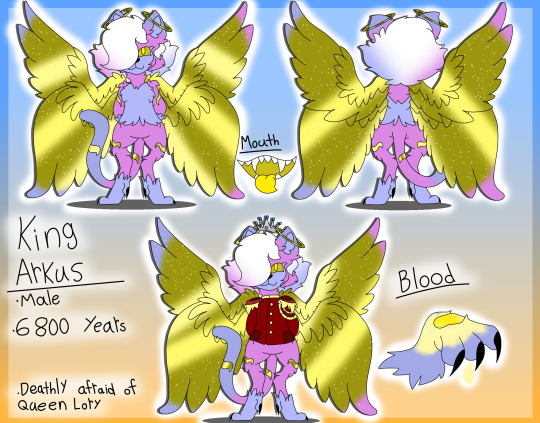
King Arkus: Golden feathers and markings, scared of Lory.
#hell cat#heaven cat#fallen angel cat#oc#fc#feline#anthro#demon#angel#fallen angel#open species#I guess?#idk anymore#I just love my kitties#no human medicine cat heal a Hell cat's venom#only the kiss of a heaven cat or healing venom of a fallen angel cat can heal it
11 notes
·
View notes
Photo

And the last set of swaps! :D
Gerry Podunk is a bit of a little troublemaker, always thinking up ways to stir up some chaos. He and Tim Tam were living at the same orphanage before the caretakers there dumped them at the Cosmatarium, and if it weren’t for the latter’s attempts to try and make a respectful salesperson of themself Gerry would gladly have them join him in his shenanigans again. Ah well. At least he can mess with the new kid, he may be a big kid but he’s taken on adults with his pranks before so he can handle a teenager.
Tim Tam used to join Gerry in causing trouble at the orphanage, but lately they’ve decided to try getting into sales early in life. It’s not going very well, though, as they lack a critical skill all successful salespeople have: decent communication skills. They’re just a kid of few words, saying only what they need to and nothing more. It could be that they’re also distracted, as they do seem to be mesmerized by the tower of lights in the center of the carnival…
💖🐶 Check out my pinned post for ways to support my artwork, among other things! 🐶💖
~If you like, please reblog to show your friends! Likes are appreciated, but reblogs let more people see my content! If you have something to say, feel free to give feedback in tags/comments/replies as well!~
Gerry Podunk and Tim Tam © LimboLane
Role swap designs and artwork © PuppyLuver Studios
—–
[Image Description: A digital illustration of role-swapped versions of Gerry Podunk and Tim Tam from Smile For Me. Gerry is a boy with aqua green skin, very curly teal hair held back by a red plaid bandanna, dark blue eyes with pale orange sclera, green freckles, and sharp pale orange teeth, one of which is closed. He is wearing a pale red t-shirt, blue overalls, and red boots. He is scratching his nose and grinning mischievously. Tim Tam is a kid with purple skin, dark violet hair falling over their eyes, and very large dark violet eyes that are mostly obscured by their hair. They are wearing a teal coat with a large silver zipper, dark violet pants, and matching yellow boots and gloves with orange trim. They are holding a stick in their hands, with a red and blue horseshoe magnet tied onto the end. The background is a pixellated gradient of multiple blues, oranges, and some yellow. End ID.]
#smile for me#smile for me game#gerry podunk#tim tam#break your silence au#role swap au#jess drew the thing#sfw#image description
23 notes
·
View notes
Last Seen Blogs

robinsouns
ThinkMage

maria-andreacaraveo
l☼ve summer

captainditrag
Captain Ditrag's Movie Reviews & Singing Videos

gopokethings
POKEMON THINGS

notanybiblemale
Untitled