#Charts and graphs
Text

In before: The dash, which is how I personally use tumblr, is in chronological order from exclusively people I follow.
5K notes
·
View notes
Photo
341 notes
·
View notes
Text

Lots of people have asked me about Josh Crockett's video last week which BJU Alumni bragged was "transparent."
Crockett said that enrollment was 2734.
"What does that mean?" people have asked. "How could that be?"
That's the Grand Total Enrollment, folks. Every part-timer, every full-timer, every grad student, every undergrad, every one who is taking one class to a full load.
And last year BJU reported to the State that the Grand Total Enrollment was 2893.
That's only a 5% drop from last year.
We shall see if that's what BJU reports to the State.
#Bob Jones University#Enrollment#Grand Total Enrollment#Josh Crockett#President Josh#Charts and Graphs
2 notes
·
View notes
Text

A fan made All Tomorrows family tree I fussed over quite a lot before settling on this version. It includes human lineages, other earthlings, and a few aliens. I did this mainly to add context to the book's family tree and organize some groups for clarity. And if you can believe it, this isn't even the whole roster of species, but I kept the well known species and their cohorts and ancestors in the picture as much as I could.
I found a lot of trouble trying to tie posthuman groups together with the boxes (miMind will try to attach them to the nodes because the boxes are just big nodes), and conveying the less obvious connections to some groups as indicated by the dotted lines. I'm aware there are more that should've been added, but, at a certain point I wanted to avoid added visual noise.
Now there's no way all the information thus far can fit into the ALT text feature, so it's probably best to take a crack at it here.
The very top starts with a non-human, therizinosaurs, to contextualize what Panderavis pandora is. Or, was. The green outline for these nodes indicates it's a reptile. I stuck it in the node closest resembling a coffin because Panderavis went extinct well before it was discovered.
The modern humans split off into two nodes, the Earth Humans, and the Martians. They had eventually interbred to create the Star People, who then discovered Panderavis bones.
The Star People hereafter had almost all populations genetically modified by the damselfly-like aliens known as the Qu, or Quhanim.
Under the posthuman lineages that died out during bottleneck events are: Mantelopes, Bone Crushers, Temptors, Hand Flappers, Blind Folk, Titans, Striders, and unknown others.
One lineage of Star Person went into hiding and avoided the Qu, which are the Spacers.
The surviving lineages that were Qu modified are:
Insectophagi, Ruin Haunters, Swimmers, Lopsiders, Colonials, Parasites and their Hosts, Worms, Finger Fishers, Flyers, Lizard Herders, Hedonists, and Predators with their Prey.
Note the Lizard Herders co-existed with a reptile originally from planet Earth, which had become the Herd Lizards. As appropriate, their outline is also green.
Onwards to the second empire era posthumans as indicated with blue fill and outline, with one notable green exception. Insectophagi gave rise to the Bug Facers, Ruin Haunters the Gravitals, Swimmers the Tool Breeders, Lopsiders the Asymmetric People, Colonials the Modular People, Parasites and Hosts the Symbiotes, Worms the Snake People, Finger Fishers gave rise to aerial species and the marine Sail People, Flyers gave rise to aquatic and terrestrial species along with the aerial Pterosapiens, Spacers became Asteromorphs, the Lizard Herders became Human Steeds, Hedonists turned Satyriacs, and the Predators became the Killer Folk. Prey still exist, but some of them are farmed.
And the one species that is considered arguably more human than the posthuman steed it coexists with, is the Saurosapients. They're descended from Herd Lizards.
The big box enveloping most of these posthumans indicates they were eradicated by the Gravitals, thus ending the second empire. Although most precursors went extinct in the sense they all evolved into their second era iterations, there is at least one exception. The Lopsiders still existed with the Asymmetrics, and were wiped out by their descendants. Only the Asteromorphs, Bug Facers, and Gravitals themselves remained.
The Gravitals then subjugated and modified the Bug Facers into the Subjects.
Meanwhile the Asteromorphs underwent further changes into godlike forms. They usurped the Gravitals, who were altered into the New Machines, and rescued the Subjects, who became the Rescued Subjects. The Asteromorphs, being hands-off parents of this new humanity, created Terrestrial forms of their kin to withstand gravity and watch over their Subjects on their home planets.
These are a few lineages left of what was once humanity, and an alien with an equally complex yet unknown history enters, the Amphicephali.
New Machines, Rescued Subjects, Asteromorphs, Terrestrials, and Amphicephali are indicated as coexisting in this new era with red.
The Qu descend from an unknown species, and the Author character's descent is equally mysterious.
And that about wraps it up. I've left out fan theories around the origins of the Amphicephali, Qu, and Author alien in trying to keep this chart objective to the original book. It may outdate itself once the redux is published, and there might not be a "need" for another fan chart if CMK includes one in the redux and polishes it to a shine. We'll see in a few years, realistically speaking.
#All Tomorrows#charts and graphs#fanart#it just barely qualifies but I'm trying to keep things organized#long post
6 notes
·
View notes
Photo

Sissel Tolaas
14 notes
·
View notes
Text
0 notes
Text
How to Use Graphics in Microlearning to Enhance Learning

Microlearning is a powerful educational strategy that delivers information in small, manageable chunks, making it easier for learners to absorb and retain knowledge. Graphics play a crucial role in enhancing microlearning by making content more engaging, accessible, and memorable. Effective use of graphics can transform complex information into easily digestible visuals, facilitate better understanding, and promote active learning. Here’s a comprehensive guide on how to use graphics in microlearning to enhance learning.
1. Simplify Complex Information
Graphics can simplify complex information, making it easier for learners to understand and remember. When dealing with intricate concepts or data, visual representations like diagrams, charts, and infographics can break down information into more digestible parts.
Infographics: Use infographics to combine text and visuals, providing a clear and concise overview of complex topics. Infographics are particularly effective in presenting data, processes, and comparisons. For instance, an infographic about the benefits of a new software tool can visually highlight its features, advantages, and usage statistics, making the information more accessible and engaging.
Flowcharts: Flowcharts are excellent for illustrating processes and workflows. They provide a step-by-step visual guide that can help learners understand sequences and relationships between different stages of a process. For example, a flowchart showing the steps of a customer service protocol can guide employees through each stage, from initial contact to resolution.
Diagrams and Models: Use diagrams to represent structures, systems, or concepts. For instance, a Venn diagram can effectively illustrate overlapping areas of two related concepts, while a model of a cell can help biology students visualize its components and functions.
2. Enhance Retention and Recall
Graphics enhance retention and recall by leveraging the brain's natural preference for visual information. Visual aids can help learners encode information more effectively, leading to better memory retention.
Mind Maps: Mind maps visually organize information around a central concept, showing the relationships between different ideas. This technique is useful for brainstorming sessions, summarizing lessons, or revising topics. A mind map about a historical event, for example, can connect key dates, figures, and outcomes, helping learners see the big picture and remember details.
Mnemonic Graphics: Use mnemonic graphics to create visual memory aids. Mnemonics are tools that help learners recall information through associations. For example, a graphic that uses the acronym "HOMES" to remember the Great Lakes (Huron, Ontario, Michigan, Erie, Superior) can be a fun and effective learning aid.
Flashcards: Digital flashcards with graphics can enhance vocabulary learning, language acquisition, and other memory-based tasks. Each flashcard can display an image along with a term or definition, making it easier for learners to create mental associations.
3. Engage Learners Actively
Active engagement is crucial for effective learning. Interactive graphics can transform passive learning experiences into active ones, encouraging learners to participate and interact with the content.
Interactive Infographics: Create interactive infographics that learners can explore by clicking on different sections to reveal more information. This approach allows learners to engage with the content at their own pace, diving deeper into areas of interest.
Simulations and Virtual Labs: Use graphics to create simulations and virtual labs that replicate real-world scenarios. These interactive environments enable learners to practice skills and apply knowledge in a safe, controlled setting. For example, a virtual lab for chemistry students can simulate experiments, allowing them to mix chemicals and observe reactions without the risks associated with physical labs.
Clickable Diagrams: Incorporate clickable diagrams that provide additional details when learners hover over or click on specific parts. This technique is useful for exploring detailed systems, such as the human body or machinery, where learners can click on different components to learn more about their functions.
4. Support Diverse Learning Styles
Different learners have different preferences and strengths. Some may be visual learners who benefit greatly from graphics, while others might prefer textual or auditory information. Using a variety of graphics can cater to these diverse learning styles.
Visual Summaries: Provide visual summaries of key points at the end of each microlearning module. These can include bullet points, icons, and illustrations that encapsulate the main ideas. Visual summaries help visual learners quickly grasp the core concepts and serve as a handy reference.
Video Content: Integrate videos with graphical elements such as animations, subtitles, and on-screen text. Videos can combine auditory and visual learning, making them effective for learners who benefit from seeing and hearing information simultaneously. For example, an instructional video on CPR can show animated sequences of the procedure along with audio explanations.
Graphical Storytelling: Use graphics to tell stories that illustrate concepts and scenarios. Storytelling is a powerful tool for making information relatable and memorable. For instance, a graphic story about a company’s journey to achieve sustainability goals can engage learners and provide a narrative context for the information.
5. Facilitate Quick Understanding
In microlearning, time is of the essence. Graphics can convey information quickly and effectively, ensuring that learners grasp the key points without feeling overwhelmed.
Icons and Symbols: Use icons and symbols to represent concepts, actions, and categories. Icons are universally recognized and can quickly convey meaning without the need for lengthy explanations. For example, a series of icons can represent different stages of a project lifecycle, such as planning, execution, and evaluation.
Charts and Graphs: Incorporate charts and graphs to present numerical data and trends. Visualizing data helps learners understand patterns and relationships at a glance. A bar chart showing sales performance across different regions, for example, can quickly highlight areas of success and those needing improvement.
Annotated Images: Use annotated images to highlight and explain specific parts of a visual. An annotated image of a complex machine can label and describe each component, helping learners understand its structure and function quickly.
Best Practices for Using Graphics in Microlearning
To maximize the effectiveness of graphics in microlearning, consider the following best practices:
Keep It Simple: Avoid cluttering your graphics with too much information. Focus on clarity and simplicity to ensure that the visuals are easy to understand.
Consistency: Maintain a consistent style, color scheme, and typography throughout your graphics to create a cohesive learning experience.
Relevance: Ensure that all graphics are directly related to the content and learning objectives. Irrelevant or decorative graphics can distract learners and reduce the effectiveness of the lesson.
Accessibility: Make sure your graphics are accessible to all learners, including those with visual impairments. Use high-contrast colors, alt text for images, and ensure compatibility with screen readers.
Feedback: Gather feedback from learners on the effectiveness of your graphics and make improvements based on their input. Continuous refinement will help you create more effective learning materials.
Conclusion
Graphics are a powerful tool in microlearning, capable of enhancing engagement, simplifying complex information, and supporting diverse learning styles. By integrating well-designed visuals into your microlearning modules, you can create a more effective and enjoyable learning experience. Whether through infographics, interactive elements, or visual summaries, the thoughtful use of graphics can significantly enhance the impact of your microlearning efforts.
#Microlearning#Graphics in education#Visual learning#Infographics#Flowcharts#Diagrams#Interactive content#Learning retention#Active learning#Simplifying complex information#Memory aids#Mnemonic graphics#Digital flashcards#Interactive infographics#Simulations#Virtual labs#Clickable diagrams#Diverse learning styles#Visual summaries#Instructional videos#Graphical storytelling#Quick understanding#Icons and symbols#Charts and graphs#Annotated images#Educational technology#Visual aids#Learning engagement#E-learning#Learning preferences
1 note
·
View note
Text
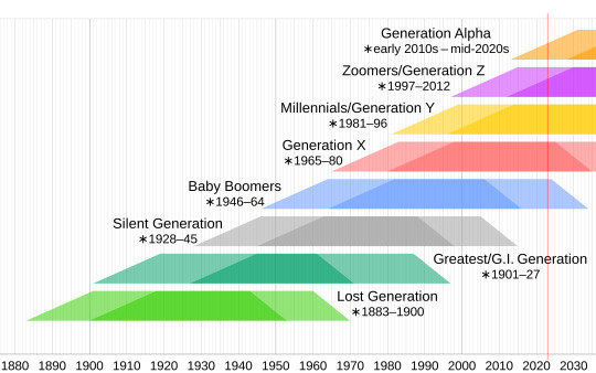
Those born between 2010 and 2024 make up the group called Generation Alpha. They’re likely to grow to more than two billion people, which could make them the biggest generational cohort so far.
0 notes
Text
Help I can't find that one post that goes like beep boop boop bop and it has a lady with like charts and graphs and it's the SpongeBob remix
#spongebpb#spongebob#remox#remix#music#help#find#help me find#also for you#beep bee boo bop#beep boop bop#bee be boop be be boo bop#charts and graphs#a lady did it
0 notes
Text
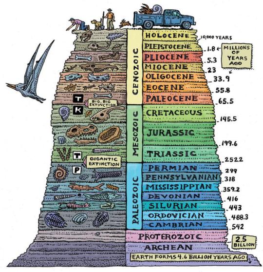
Guide For The Geological Time Periods In Order
#geology#geologists#charts#graphs#infographics#infographic#time periods#educational#earth#science#interesting
10K notes
·
View notes
Text
Tier Ranking the Ranking Tiers:
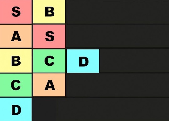
B is so Amazing!
A is okay but even in last it's not bad, it's just not as good as S.
2K notes
·
View notes
Text

#wolf hall#wolf hall memes#hilary mantel#thomas cromwell#memes#charts and graphs#covid#sweating sickness#plagues#personal#op
14 notes
·
View notes
Photo

19 notes
·
View notes
Text

When BJU told the employees that they were simply going to "tighten their belts" due to the lower enrollment this year, we know that meant one things, at least.
The BJU administrators lost their car allowance.

Seriously, gentlemen? You've been getting a car allowance? Why? WHY did you EVER get a car allowance?
3 notes
·
View notes
Text
Gonna spend some time cleaning up the Secret Life Spreadsheet for the final post but I just need everyone to see this absolutely WILD graph that was so insane I had to triple fact check to make sure I wasn't losing my mind.
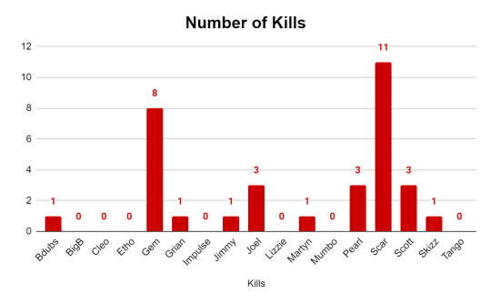
Are. Are you kidding me.
I swear I'm about to make one of these for every other season because I simply MUST know if this has always been the case, that one or two people get most of the kills. There's no way right??? Scar was simply on something this finale (Gem is always Like That I was expecting her to look this way)
Also fun tidbit: all three of Etho's deaths were because of Scar. He killed that man three times. Etho is the only person who died the same way every time.
#as i was making the chart i was thinking to myself#'huh scar sure did get a lot of kills this ep wonder how that's gonna affect the graph'#AND THEN I MADE THE GRAPH#scar you legend these fools are not immune to the good times#also sidenote: the etho's wither and grian's warden aren't credited to them they're credited as '1 stick wither' and 'ethos dishwasher'#might change that later idk#secret life spoilers#goodtimeswithscar#geminitay#secret life smp#secret life#life series#trafficblr#saf does stats
1K notes
·
View notes
Text

659 notes
·
View notes
Last Seen Blogs

blogresponse
Untitled

afdfgcbcvb-blog
제목 없음

itshealthiqy
Healthiqy

ceitripegprim
Untitled

sotrinogro
Untitled