#How to Make Column Chart in Excel
Explore tagged Tumblr posts
Visit Tumblr Blog
Explore Tumblr blogs with no restrictions, modern design and the best experience.
Last Seen Tumblr Blogs


Fun Fact
In 2020, 44% of users from Denmark used Tumblr daily.
Text

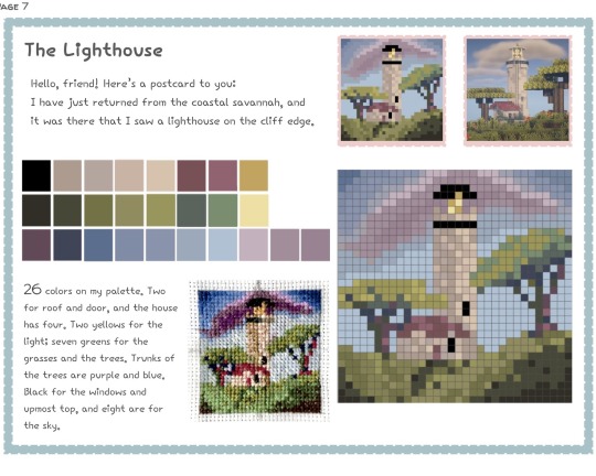
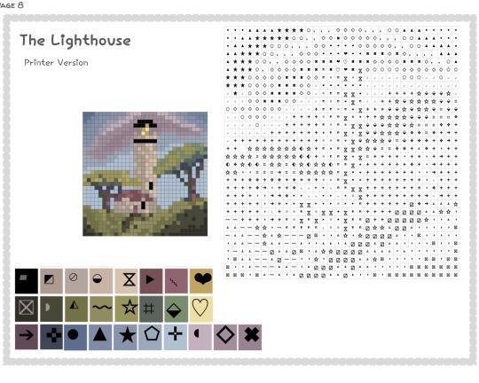
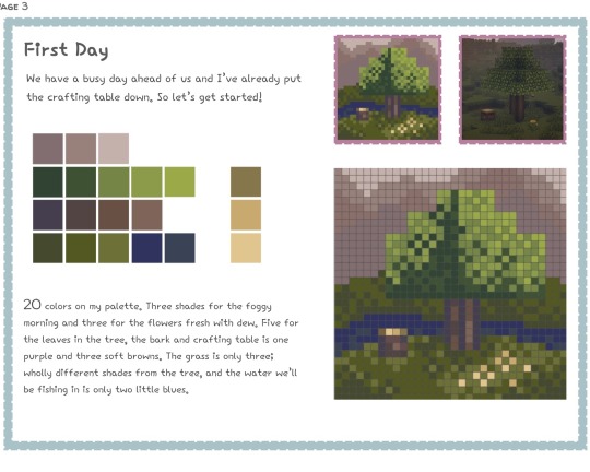
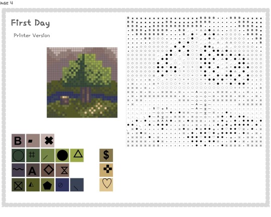
HELLO i did not expect the minecraft cross stitch post to do as well thank u very much for ur support😭 here are some sample pages from the work in progress zine. it needs some adjustments absolutely, like the symbols need some fixings but i am very excited to work on this project and to share it :)
#it is going to be a free zine booklet btw and i am the only person working on it idk how long itll take to complete but i am cross#stitching these patterns as i go in a genuine love for the medium and this does not have to be cross stitch like if u want to use these for#whatever then please absolutely do it is not married to cross stitch u can do anything u want in ur lifetime#also i will absolutely include instruction on how to make these bc they are rly very easy and fun to make i encourage ppl to make their own#and experiment w ideas :) ok bye im just rambling bye ily#u have to crop a photo into a 1:1 perfect square and then put it into [most] pixel art programs as a 32x32 resolution and then manually#paint over it to refine it and that is how u make them#in brief#OK BYE😭 <3#DANG IT also to make the symbol patterns i opened an excel sheet g00gle sheets and i made all the columns/rows to be like square sized and#and then i filled it in w symbols for each color these were all manually put into place bc i could not find a ‘cross stitch pattern#generator’ that was decent it was all nonsense but that is how i made the charts if u would like to also make them#just get some symbols and copy/paste them into the squares#WILL ELABORATE on it more in the zine but in case any1 wants to make their own that is how i did it#OK BYE NOW FOR REAL
8 notes
·
View notes
Text
Jason, who starts gaslighting his family members by saying that All Blades were always a thing and that they just didn't take him seriously, once they found out about it.
Bruce, frustrated: If you yielded a magical sword in the past, I would know, Jaylad.
Jason: Jesus fucking Christ, I told you, I don't use it often, since it uses my soul. But I did mention that I have it!
Dick: You did not!
Jason: I said that Robin gives me magic! I said I *am* magic!
Bruce: That's—
Dick: But—
Bruce and Dick, turning to Damian helplessly: Your verdict?
Damian, who got already paid by Jason (price was two sneaked in rabbits): That's true. Mother said Todd had always had them. He only ever was sent to All Caste because he needed to be taught how to use it correctly. Didn't Dulcra say that you were the chosen one, Todd?
Jason, intentionally irritated: Exactly! Thank you.
The rest of the family: ●○●
Bruce, sitting in the Cave, in the middle of his 300th existential crisis: I— If Jason is the chosen one, was I technically wrong in our argument?
Dick: ...I can't believe that this is what takes you to accept that you were wrong, and not the fact that— Dunno, he is your son— And you kinda failed him—
Tim: On the more important note, should we call Jason Harry Potter now or something?
Stephanie, snickering: Jason... You are a wizard!
Bruce, sniffling: He did like these books as a child. Perhaps it was his way to try to tell us the truth.
Dick: Damn... Once we were arguing, and I told him that he had no magic... How foolish I was.
Jason, pressing phone to the shoulder, while cooking: ...And now they are staring at me, like I am about to do the whole Enchantix transformation, lol
Talia: I admit, that's amusing. Damian did a great job at supporting this circus.
Ra's voice on the background: Enchantix? What is it? Had that boy found ANOTHER magical device plot?!
Talia: ...Do you think I am too old to pull the same move you did on my father?
Jason: Nah, it is never too late to trick your dad. Get his ass.
Talia: You are absolutely correct.
Talia, screaming to Ra's: He did, father. It is related to the constant cycle of being brought back alive.
Jason, turning around to Damian, who is playing with rabbits on his couch: Prepare, little gremlin. You are about to testify falsely again, this time to your grandfather.
Damian, snorting: Two golden fish and one parrot.
Jason: I will warn your mother.
Tim, with Excel Chart open: Okay, so we figured out that he has All Blades, strange version of immortality, quick recovery thanks to Pit... What other magic Jason can have we don't know about it yet?
Cassandra: Cooking?
Stephanie: ...I think he is just a normal person, Cass.
Dick: NO, no, listen, it is one thing to cook normally, another to be trusted by Alfred.
Duke: ...You are reaching, guys. I think he is just a good chief.
Bruce: He always makes me laugh.
Tim: That's not— B, no one laughs, but you, so what kind of magic power is that?!
Duke: Listen, y'all, what if he sees ghosts?
Everyone: (pauses)
Stephanie, hitting Tim on the shoulder: WRITE IT DOWN, WRITE IT DOWN—
Tim: I am putting it in the "unclear" column, but good idea, dude.
Alfred, glancing at all of this sceptically: Dear Lord, this family is not your brightest soldiers...
#in the next Episode: Ra's is obsessed with Enchantix#just kidding#also Talia deserves to bully Ra's a little as a threat#Jason influences LoA's course of work even after leaving it#jason todd#red hood#dcu comics#batman#dcu#dc universe#batfamily#bruce wayne#batfam#dick grayson#tim drake#damian wayne#talia al ghul#ra's al ghul#stephanie brown#cassandra cain#duke thomas#alfred pennyworth
4K notes
·
View notes
Text
The Writing Tracker and Statistics spreadsheet for 2024 is here!
What is it?
The spreadsheet is a way for writers who like statistics to track their daily wordcounts and writing habits (and also, probably, don't want to or can't pay to use software for this purpose). The idea is, once you've got the workbook set up and customised to your tastes, all you need to do is input your daily wordcount per project into one sheet and let the rest of the workbook populate from there. I originally designed this in late 2022 because I wanted a way to track my writing habits while also comparing how much original fiction VS fanfiction I wrote. It has since expanded to be more flexible, with a comparison function that's easy to adjust or scrap entirely, and a variety of other neat statistics besides. Key features include:
Line graph that displays your daily writing across the whole year.
Total word counts for each month displayed in stacked columns so you can see which projects you worked on.
Counters for your current daily writing streak and longest daily writing streak.
Pie chart to show which projects were worked on the most overall.
Ability to separate projects into "types" – i.e., personal and academic – and compare type totals each month.
Words-over-time progress charts for specific projects, with the ability to help set and track writing goals.
Daily and monthly averages.
You don't need to be a genius (or even fairly confident in using) Excel/Google Sheets to make this work for you. I've written up a detailed set of instructions that walk through each sheet and explain how to make a variety of changes, as well as breaking down how certain aspects work.
If this is something that interests you, follow the link below to my Payhip. It's a free resource; Payhip just gives you the option to leave a tip, should you feel like it and have the cash to spare.
Want to know more? Keep reading below the cut for a closer look at the features.
Daily graph to see your writing habits across the whole year at a glance:
Your top statistics: monthly and daily averages, top writing days, longest writing streak, current writing streak, and daily averages by month.
Monthly writing totals displayed in a stacked column chart so you can see which projects you worked on each month:
Clustered column graph to show one type of project compared to another, and a pie chart to show which projects you worked on most across the year:
Project-specific progress charts that show words over time, similar to the NaNoWriMo graph. (Plus, there are instructions on how to add goal lines to make it even more like the NaNoWriMo graph!)
303 notes
·
View notes
Note
If possible, can you show an example of what ur excel chart looks like/how it’s structured? I have trouble planning writing and that seems like a cool method as opposed to the typical outlining.
I don’t at all recommend replacing a written outline with a chart or timetable. The chart is to keep track of various plot lines and events in the timeline so that you can visualize the pacing and make sure you are advancing everything at the right speed without forgetting anything. It helps with deciding when to include what events in the fic for maximum tension.
Here is a generic example:

Column A is the chapter numbers. The intention is to do quick notes on events happening in chronological order and alongside each other. I don’t include details because that’s what the actual outline is for. I would consult my outline on the details of the scene for the dinner party, for example. For the chart, all I want is to know that the party is happening in chapter 2 alongside a couple other developments in the side character plot lines. I hope this helps!
8 notes
·
View notes
Text
dnp movie analysis p2: genres, studios, franchises
thanks everyone for enabling me <3 i'm back with some more analysis by genre, franchise, and studio!
genre ratings
first, genre ratings (genre is kinda arbitrary here, tbh; there's a lot of overlap!)
here we have the first table (please tumblr don't mess with the quality) (i can post the excel sheets if needed; r tables were being a pita)
here we have the number, mean (= median for all of this analysis), minimum, and maximum ratings by genre. within each statistic, i've highlighted the minimum (light) and maximum (dark) for dan (blue) and phil for genres with >1 movie (just realized i fucked up western, ignore that lmao)
phil has watched the most horror (64) and dan mostly sci-fi (53). interestingly, but presumably because of their love for these genres, each of their minimum scores went to these genres. if you watch a lot of one type of movie, you're gonna find the duds.
both of them liked christmas movies (tbh this was like, home alone, so), with their highest minimum and mean ratings being for that category (nostalgia, i assume because like, same). lowest mean scores were for superhero movies (both) and mystery (phil). for both of them, marvel was pretty all over the place (we'll get into that in a sec), so that's not super surprising.
their highest minimum scores were both given to war movies, which is a little surprising but this include movies like 1917 and dunkirk which are ~critically acclaimed~, so makes some sense. their minimum max scores went to westerns and mysteries for dan, and musicals, mysteries, and biopics for phil.
here are the histograms/bar charts for genres. these aren't the prettiest tbh, and i excluded some that had only one or two movies / weren't very interesting. without delving deep into the data, you can see how their preferences play out especially in horror and sci-fi, where phil has more highly-rated horror movies (partly because he's rated more) and dan has a lot of highly-rated sci-fi (but also low ratings). you also see how superhero movies are pretty middling -- there's almost a normal distribution! (not really, but sort of!). romance too. there's in general a lot of left skew here -- they like to rate movies highly.
final genre analysis is number of movies in one genre rated by one and not the other. i'm so sorry this table is so long.
i highlighted here the top three genres one has watched without the other. again we see phil likes his horror (and as i said in my last post, a fair amount of these movies were watched when dan was on tour, and this doesn't even include the guillermo del toro's cabinet of curiosities episodes he rated), but also thrillers (similar!) and comedies (which i get; i love to put a comedy on in the background). unsuprisingly, dan's watched a lot of sci-fi without phil, but also horror and comedy. in general, though, his genres are more distributed.
next, studios/franchises!
again, i've highlighted the maximum and minimum in each column, only for franchises. both of them really like ghibli, and dan likes disney more than phil (though i think this is missing big hero 6 now that i'm looking at it again, because dan rated that lower). that's theatre kid behavior: the 4.5 was beauty and the beast, all pixar and aladdin and so on were highly rated.
i fucked up the matrix somehow so just ignore that -- they both gave matrix sequels low scores
turning to franchises, phil is a harry potter hater (valid at this point). but loves lord of the rings. so does dan, though his dan's ratings actually skew pretty high for franchises in general (see: his maximum scores for each franchise are 4.5 or 5); he can pretend to be alternative or whatever but he's still a millennial at heart. their minimums minimums are both for star wars (sequels!) and marvel, which, valid. phil's highest minimum is bond (there were only a couple rated) and dan's is the hunger games, but unlike phil he only rated thg and catching fire, not either mockingjay.
and bar charts!
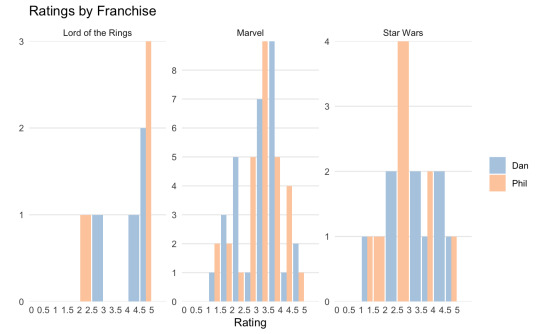

i only picked the most interesting ones here as well. marvel follows a similar distribution to the superhero movies, which, since they each only rated a couple dc movies (and i didn't include nolan's batmans), makes sense. again they both rate lotr highly, but the hobbit was low. the studio ones are less interesting imo because they skew so far left, but again: dan is such a disney kid.
that's all i have! i love this because dan, for all his faux cynicism, just rates movies so highly + it's so often the movies that don't fit his curated doomer persona but moreso the pooh one. and also phil expressing opinions! phil just watching a lot of horror!! i love it.
#dnp#dan and phil#phan#dan howell#phil lester#also i am so sorry about accessibility; i can make these more accessible (sharing the spreadsheets?) if that's useful#also i have histograms separated into d and p if ppl want to see that instead of these ones which are a little confusing to see them both o#one chart but are also imo good for general trends/comparisons#tbh i think there's an issue with the musical ratings maybe too because the shape here suggests there's no overlap in ratings but they def#both rated at least the greatest showman...#the yapping. is because i was raised by dan.
40 notes
·
View notes
Note
🕸
(asking this one because I know the answer and others should be made aware lmao)
🎱🔥🧼
Also, tell your mother I said hello.
i'll eat you
🕸: Do you outline? How detailed?
I LOVE MY SPREADSHEETS!! i live and die by my fucking plot chart. you shall not shame me today /aff

^^ example of previous chapters in the chart
I have every chapter organized in a table, basically acting as my overarching timeline for ATWLP. the left column is summary/ideas i have for the plot of the fic/any conversations i think would be funny and the right column is the link for the corresponding doc (because any doc over 30 pages long makes me want to chew concrete)
I also have an excel sheet to keep track of word counts and to calculate the projected total word count of atwlp with respect to the total chapter number and average word count per chapter.
every chapter starts with bullet points and the losers tell me how it goes down from there.
the voices, ya know?
🎱: Have you ever had readers correctly guess a twist or reveal in the comments?
yes. and i cannot for the life of me remember what it was lol
🔥: What's a piece of writing advice you consider bad advice?
might be the adhd talking, but the whole "sit down and dont get up until you've written x amount of words" never worked for me. simply designating a time to write is nice, but that pressure ultimately made me freeze up and dread every minute i was writing.
also the whole "show don't tell" thing. there is a time for both.
🧼: Do you ever go back to edit fics or chapters after they've already been posted?
All the time lmao. I added two whole ass chapters to the middle of "Days of a Past Future" (which y'all should read, i'm so proud of that one)
it is my plan when i am finally finished with atwlp to go back and edit the entire fic so i can make a physical copy of it.
19 notes
·
View notes
Note
hey! loving your off-season prompts event so far! not a prompt, just wondering how you manage it all, it seems like a lot 😅
im so glad you like it so far!
yes, it is a lot to manage and it is making my brain hurt a little, but im having so much fun, so it makes it worth it lol
to start, i check my asks every morning to see if i have any new requests and if i do, i copy them over to a list in my notes app so i can make sure i don’t accidentally miss any.
then i go over to my pages app and create a new document with the prompt in the folder i have for the off-season prompt event.

then i go over to the numbers app (the excel of apple) and add them to the chart over there, along with an estimated word count based on the prompt.
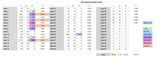
column 1: total word count of the document
column 2: word count of the prompt
column 3: column 1 minus column 2 (word count of actual story)
column 4: estimated total word count once the fic is complete
then i go over to the wordtracker app and insert that data there to make sure im staying on track and getting enough written per day.
im sure there’s a less complicated way for me to do this, but this is the method i’ve found that works for me lol
#answered asks#prompt event#behind the scenes#nico hischier#jack hughes#new jersey devils#nhl#hockey
4 notes
·
View notes
Text
Top 5 Selling Odoo Modules.
In the dynamic world of business, having the right tools can make all the difference. For Odoo users, certain modules stand out for their ability to enhance data management and operations. To optimize your Odoo implementation and leverage its full potential.
That's where Odoo ERP can be a life savior for your business. This comprehensive solution integrates various functions into one centralized platform, tailor-made for the digital economy.
Let’s drive into 5 top selling module that can revolutionize your Odoo experience:
Dashboard Ninja with AI, Odoo Power BI connector, Looker studio connector, Google sheets connector, and Odoo data model.
1. Dashboard Ninja with AI:
Using this module, Create amazing reports with the powerful and smart Odoo Dashboard ninja app for Odoo. See your business from a 360-degree angle with an interactive, and beautiful dashboard.
Some Key Features:
Real-time streaming Dashboard
Advanced data filter
Create charts from Excel and CSV file
Fluid and flexible layout
Download Dashboards items
This module gives you AI suggestions for improving your operational efficiencies.
2. Odoo Power BI Connector:
This module provides a direct connection between Odoo and Power BI Desktop, a Powerful data visualization tool.
Some Key features:
Secure token-based connection.
Proper schema and data type handling.
Fetch custom tables from Odoo.
Real-time data updates.
With Power BI, you can make informed decisions based on real-time data analysis and visualization.
3. Odoo Data Model:
The Odoo Data Model is the backbone of the entire system. It defines how your data is stored, structured, and related within the application.
Key Features:
Relations & fields: Developers can easily find relations ( one-to-many, many-to-many and many-to-one) and defining fields (columns) between data tables.
Object Relational mapping: Odoo ORM allows developers to define models (classes) that map to database tables.
The module allows you to use SQL query extensions and download data in Excel Sheets.
4. Google Sheet Connector:
This connector bridges the gap between Odoo and Google Sheets.
Some Key features:
Real-time data synchronization and transfer between Odoo and Spreadsheet.
One-time setup, No need to wrestle with API’s.
Transfer multiple tables swiftly.
Helped your team’s workflow by making Odoo data accessible in a sheet format.
5. Odoo Looker Studio Connector:
Looker studio connector by Techfinna easily integrates Odoo data with Looker, a powerful data analytics and visualization platform.
Some Key Features:
Directly integrate Odoo data to Looker Studio with just a few clicks.
The connector automatically retrieves and maps Odoo table schemas in their native data types.
Manual and scheduled data refresh.
Execute custom SQL queries for selective data fetching.
The Module helped you build detailed reports, and provide deeper business intelligence.
These Modules will improve analytics, customization, and reporting. Module setup can significantly enhance your operational efficiency. Let’s embrace these modules and take your Odoo experience to the next level.
Need Help?
I hope you find the blog helpful. Please share your feedback and suggestions.
For flawless Odoo Connectors, implementation, and services contact us at
[email protected] Or www.techneith.com
#odoo#powerbi#connector#looker#studio#google#microsoft#techfinna#ksolves#odooerp#developer#web developers#integration#odooimplementation#crm#odoointegration#odooconnector
4 notes
·
View notes
Text
hiiiii first of all thank you for saying they're pretty <33 !! I tried my best afskhgsk (this is the post anon is referring to)
How I made my ao3 wrapped:
I'm not saying this is the best or even the most convenient way to do any of this, I'm just going to share the system I came up with, hopefully something here is useful or helpful!
There are 3 parts to this system:
1. Bookmarks
3. The spreadsheet
3. The charts
- Bookmarks:
I use bookmarks for everything (and they're always private). I bookmark every fic I read with the tag "Read" and the tag of the year I'm in, like "2024". This is incredibly useful since you can filter through your bookmarks and it keeps everything neat and tidy
- The Spreadsheet:
I'm scared of Excel, I'm sorry. So I use Notion, because I already use it for everything else in my life and to me it's much easier to handle (and it looks cuter)
I tried to make my spreadsheet in the least complicated way possible because I'm not tech savvy at all
It's just a basic table, without any manual formulas. Sadly this will sound kinda incomprehensible if you aren't familiar with Notion, but it's really simple once you look into it
The spreadsheet has 9 columns (between brackets I'll put the type of column they are):
- Date I finished it [Date]
- Title [Name]
- Fandom [Select]
- Ship [Multi-Select]
- Words [Number]
- Tags [Multi-Select]
- Rating [Select]
- Year of publication [Select]
- Month I finished it in [Select]
It ends up looking something like this:
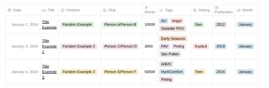
These are the parameters I chose to track, but you may be interested in tracking other things!
Most of these columns are [Select] or [Multi-Select], and in Notion that means they function with tags. For example inside the column "Rating" I can choose between the tags "Gen", "Teen", "Mature", or "Explicit". In the column "Year of Publication" I have a tag for every year. In the column "Fandom" I have a tag for every fandom I read about. And so on and so forth!
In the "Tags" column I have a selection of tags I personally want to track/I know I read a lot about. So I don't have a tag for every tag the fic had in AO3. For example, since I mainly read Spn fics, I have tags like "Weechesters", "Early Seasons", "Late Seasons", "Post-Finale", etc, because that's something I was interested in keeping organized. I also have kink-specific tags, and in this column I have the "FAV" tag as well
At the bottom of the table it will tell you the number of rows it has, which in this table means the number of fics. And the "Words" column, since it's a [Number] type of column, will let you do all kinds of automatic calculations with all the existing fics (like Sum, Average, Max, etc) - that's how I get stuff like the words I read in total, the words I read every month, the longest fic, etc
I can then filter the table through the different aspects of the columns in any way I want to get the different data I need to make the charts. In a way, it functions similarly to how filtering through tags works in AO3
Another great thing about Notion tables is that each entry is a page in itself, meaning you can click on it and it will open a page where you can write stuff. I use that to add: 1) the name of the author, 2) a link to the fic, 3) a downloaded epub of the fic, 4) any thoughts or review
I usually add a fic to the spreadsheet right after I finish it, but sometimes I wait until I've accumulated a couple of fics in my "Read" Bookmarks, and then I do them all together in a batch
- The Charts:
I make them with Canva - it has a feature where you can add and edit graphs and charts (all the info, the colors, etc). So first I collect the data I want by filtering the spreadsheet in different ways, and then I manually make the charts on Canva (if you're not familiar with the app don't worry it's kinda intuitive, and there are tutorials about everything)
And that's all! I came up with this system completely by myself and if you're reading this and you also track your fics but you use Excel or something maybe you're thinking what the hell is this girl even doing, but it works really well for me and I'm really happy with it afdhsafskh
English is not my first language so I apologize if there are any mistakes, I hope I made sense <3
#I could say more things but I didn't want to clutter the post#but I'll add two things here. like a PS lmao#I have another tag in the Tags column to mark my all-time favorites to diferenciate them from the regular “fav” ones#also I have a whole system inside this called “Special Awards 🏅”#by which I give certain fics a medal when they mark a special achievement or milestone#like “first fic I read of X ship” “fic that marked 1 million words read this year” “last fic I read in 2023” etc etc lmao#and they get their little medal icon in the Tags column. it's a big deal okay ! serious stuff....#ao3 wrapped#fic#⚝
5 notes
·
View notes
Text
Mastering Excel Basics: 10 Essential Tips for Spreadsheet Success

I. Introduction
In this section, you will introduce the blog post by emphasizing the importance of Excel in various aspects of life and work. You will highlight the significance of mastering the basics of Excel for efficient usage of spreadsheets. This will set the tone for the rest of the blog post. II. Tip 1: Navigating the Excel Interface
This section will guide readers on navigating the Excel interface effectively. It will explain the key elements of the Excel interface, such as the ribbon, menus, and toolbars. You will provide tips on customizing the interface based on individual preferences, improving productivity while working with Excel. III. Tip 2: Creating and Formatting Cells
In this section, you will explain the process of creating and formatting cells in Excel. You will cover essential aspects such as adjusting column width, merging cells, and applying borders. This will help readers make their spreadsheets visually appealing and organized. IV. Tip 3: Working with Formulas and Functions
This section will introduce readers to the concept of formulas and functions in Excel. You will explain basic mathematical operations, referencing cells, and using common functions like SUM, AVERAGE, and COUNT. Practical examples and shortcuts will be shared to simplify the creation of formulas. V. Tip 4: Sorting and Filtering Data
Here, you will demonstrate how to sort data in ascending or descending order in Excel. Additionally, you will explain the benefits of filtering data to focus on specific information. Tips on applying multiple criteria and using advanced filtering options will be provided. VI. Tip 5: Data Validation and Error Handling
This section will discuss the importance of data validation in Excel to ensure accurate data entry. You will share techniques for setting validation rules and creating custom error messages. Furthermore, insights on handling errors, such as using error checking and the IFERROR function, will be provided. VII. Tip 6: Working with Worksheets and Workbooks
In this section, you will guide readers on managing multiple worksheets within an Excel workbook. Techniques for rearranging, renaming, and grouping worksheets will be explained. Additionally, tips on linking data between worksheets and workbooks for efficient data management will be shared. VIII. Tip 7: Using Charts and Graphs
This section will highlight the power of visualizing data with charts and graphs in Excel. Readers will be walked through the process of creating various chart types, such as bar graphs, line charts, and pie charts. Suggestions for customizing and formatting charts to effectively convey information will be offered. IX. Tip 8: Applying Basic Analysis Tools
Here, you will introduce readers to basic analysis tools in Excel, including sorting, filtering, and conditional formatting. The benefits of using these tools to gain insights from data will be discussed. Practical examples of analyzing data using these features will be provided. X. Tip 9: Enhancing Productivity with Shortcuts
In this section, you will share a selection of useful keyboard shortcuts in Excel to streamline common tasks. Time-saving shortcuts for navigation, formatting, and formula entry will be highlighted. Readers will be encouraged to practice and incorporate these shortcuts into their workflow. XI. Tip 10: Troubleshooting Common Issues
This section will address common issues that users may encounter while working in Excel. Troubleshooting tips for issues like formula errors, data inconsistencies, and printing problems will be provided. Resources and recommendations for further assistance will also be given.
Microsoft Excel Basics Microsoft Excel is a powerful and versatile tool that provides numerous benefits for individuals and organizations across various industries. This conclusion highlights the fundamental aspects of Microsoft Excel and its importance in everyday tasks. Firstly, Excel serves as a comprehensive spreadsheet program that allows users to organize and analyze data efficiently. Its wide range of functions, formulas, and formatting options enable users to perform complex calculations, create visually appealing charts and graphs, and manipulate data with ease.
Excel’s intuitive interface and user-friendly features make it accessible to users of all skill levels. Secondly, Excel enhances productivity and saves time by automating repetitive tasks through the use of macros and advanced formulas. It enables users to create templates and apply them to new data sets, thereby streamlining workflows and reducing errors. Additionally, Excel facilitates collaboration and data sharing by providing options for data import/export, real-time co-authoring, and integration with other Microsoft Office applications. Moreover, Excel is a valuable tool for financial analysis, budgeting, and forecasting. It enables individuals and businesses to track expenses, manage budgets, and generate accurate financial reports. Excel’s built-in financial functions and tools make it an indispensable asset for finance professionals, enabling them to make informed decisions based on reliable data. Furthermore, Excel is widely used in various industries such as finance, accounting, marketing, and project management. Its versatility allows it to adapt to different business needs, making it a universal tool for data manipulation and analysis. Proficiency in Excel is often a prerequisite for many job positions, and acquiring Excel skills can significantly enhance one’s employability
In this article, we’ll cover the fundamental capabilities in the Lace, which is what the primary menu bar in Succeed is called. Things in the lace contain gatherings of symbols that carry out comparable roles. These incorporate :
File Home Insert Page Layout Formulas Data Review View
File

The Record menu is the furthest left thing in the Succeed strip. The Record strip things empower you to perform document the executives capabilities, including open, save, close, and print. You likewise utilize the Document menu to import from outside sources into Succeed, alongside choices that permit you to change Succeed itself.
Expert Tip: The Document menu doesn’t show up as a lace in Succeed for Macintosh. All things being equal, the Document menu shows up in the Application Menu Bar.
Home

The Home menu is the second menu in the Succeed menu bar. The Home lace things incorporate choices for arranging textual style, variety, restrictive designing, channel, number sort, and that’s only the tip of the iceberg. This multitude of capabilities help one in performing different viable computations.
Expert Tip: Attempt the Configuration Painter. It permits you to duplicate the designing starting with one cell then onto the next, which can be an incredible efficient device.
Insert
As the name recommends, the Supplement menu assists you with embedding different choices and things into a Succeed calculation sheet. You can embed different things going from turn table to picture, cut craftsmanship, shapes, screen shots, diagrams and charts, text box, header and footer, images, condition, and that’s only the tip of the iceberg.
Expert Tip: You can likewise embed hyperlinks and even guides utilizing the Supplement menu.
Page Layout
Once more, the name recommends the assortment of capabilities on the Page Format menu. You’ll see numerous choices for arranging pages for survey and printing — including page size, edges, tones and text styles, etc. You can likewise tweak cell level and width on the Page Design menu.
Expert Tip: You can add a foundation to an assortment of cells — or even your whole bookkeeping sheet. Simply click Foundation and select the picture you need to utilize.
Formulas
The Recipes menu is where you track down all the calculating choices. Succeed accompanies heaps of equations including monetary, intelligent, text, date and time, query and reference, and math and geometry.
Expert Tip: You can name cells or scopes of cells – this can make it more straightforward to modify your recipes.
Data
The Information menu likewise contains numerous significant capabilities in Succeed, incorporating imports and associations with data sets. You likewise access the sort, channel, eliminate copies, information approval, solidification, bunch, ungroup, and subtotal capabilities on the Information menu.
Expert Tip: Utilize the Information Approval capability to guarantee consistency in cells.
Review

Prior in this article, we referenced Succeed’s capacity to team up on calculation sheets. The Survey menu is where a significant number of those errands happen. You can offer remarks in cells for your associates, check spelling, track changes, and even limit authorization involving things in the Audit menu.
Expert Tip: Utilize the Offer Exercise manual connect to impart to your associates!
View

On the View menu, you tweak the manner in which accounting sheets show up on your screen. Choices incorporate showing matrix lines between cells, flipping the recipe bar and headings, and that’s only the tip of the iceberg. This menu additionally gives you choices to view and record macros, also — macros let you record normal advances you perform so you don’t need to rehash exactly the same things again and again!
Expert Tip: Utilize the Freeze Top Line or Freeze First Segment, and they will wait while you look at endlessly pages of numbers.
Conclusion In the concluding section, you will recap the 10 essential tips for mastering Excel basics. Readers will be encouraged to apply these tips to improve their spreadsheet skills and achieve success. The importance of continuous learning and exploration of advanced Excel features will be emphasized. By explaining each outline in detail, the blog post will provide valuable insights and practical guidance to readers looking to master Excel basics and succeed with their spreadsheets.
Microsoft Excel is an essential tool for data management, analysis, and productivity improvement. Its diverse range of features, ease of use, and widespread applicability make it an indispensable asset for individuals and organizations alike. By mastering the basics of Excel, users can unlock its full potential and gain a competitive edge in the digital age.
2 notes
·
View notes
Text
Most kids do not enjoy spreadsheets. Most kids, as far as I know, float through elementary school in a haze of pre-Excel bliss, never once dreaming of tracking their finances or doing their taxes.
Not me.
I was born with a filing cabinet in my brain and a deep desire for patterns. As soon as I understood the concept of "more than one thing" I felt an overwhelming urge to put them into a color-coordinated list. Marbles? Arranged. Books? Shelved by author. Stuffed animals? Writing those little bitches' names down in my diary like I was Light Yagami and they were America's Most Wanted.
I used to lie on the floor of my bedroom and HAND-DRAW grids on taped-together sheets of paper with a ruler, probably because I didn't know how to turn on a computer yet. When I had successfully made hundreds of (sort of) identical boxes I filled them with incredibly important information about my OCs, such as name, eye color, number of siblings, magic powers-- you get the idea. (I think most of them were unicorns, but I can't check because I lost all these proto-spreadsheets at some point in the two decades since i made them.)
Around age 9 I gained access to my family’s desktop Mac and started spending all my time alone and unsupervised in the "computer room" (early 2000s kids remember) because my parents didn't know enough about the Internet to be worried. Luckily their kid was a nerd, so instead of discovering porn or chatting to 40-year-old men or whatever my peers were doing I found Excel and was immediately fascinated. So many options! Such easy data entry! I could even color-code!!
I used my new power to invent endless OC families with at least 20 kids each, all named around a theme like "plants" or "semi-precious stones" or "Irish". I spent more time on baby name websites than a pregnant Mormon-- all for the sheer pleasure of writing them down, picking my favorites, and neatly squaring them away in Excel docs, organized by age and hair color. I'm sure there are still dozens of them on my dad's hard drive somewhere, buried alongside the maze of nested folders I created to categorize and store my favorite photos of cakes.
(the cakes are a whole other can of worms, but really this too is spreadsheet...)
My biggest project, though, was recording all the different color names in my mom's Lands End catalogs. It took years and ended up with HUNDREDS of entries. I'm not sure there even are that many colors, and if they do exist they're certainly not fully represented in Lands End heather v-neck sweaters. But damn if they aren't all written down in color-specific columns!
this project extended into high school. On an unrelated note, I didn't go on a real date until I was 21.
Look, I'm being rude to myself because I can, but it's fond teasing. Spreadsheets are great!
For example, I actually do well with money even though I'm an impulsive little bastard with a bad memory, no sense of consequences, and a strong desire for little treats-- mostly because every single week I sit down and meticulously go through my finances in my carefully tailored Money Spreadsheet.
(I also sit down every month and meticulously go through my Spotify history, but that's beside the point. My Spotify chart makes graphs, and everyone knows graphs are cool.)
But really, I genuinely think it's helped me manage my likely undiagnosed ADHD that i so enjoy organizing stuff into little rows. Or maybe it's the other way around, I don't know. Chicken and egg ¯\_(ツ)_/¯
So yeah, spreadsheets! A fun and helpful way to organize things that do and also don't matter! Don't come for me and my 256 Spotify playlists, okay?? We're fine. We're chilling. We have the dozens of pages in my Notes app listing all my new OCs and their attributes to keep us company. I haven't changed since I was six years old.
Because this came up in my life recently, a question:
To be clear I mean a spreadsheet in any program (Excel, Sheets, Notion) and for any reason EXCEPT for it being required of you. It could be cataloging stuff you own, categorizing characters in a show you like, etc. But it has to be something you chose to do without being paid or graded for it
#Poll#The fun thing about being undiagnosed is that you have so many options to explain your childhood and also adulthood#Was I just an only child? Is there something else going on? Who knows!
8K notes
·
View notes
Note
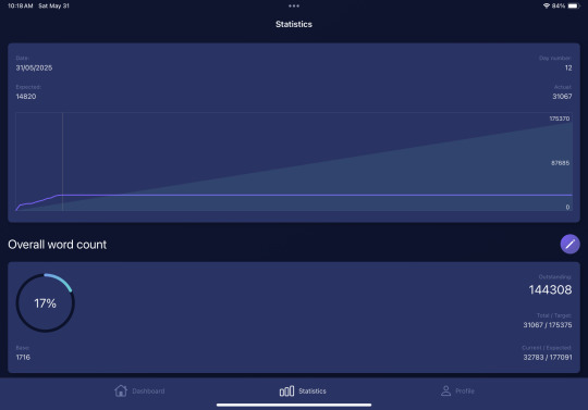
This could very easily just be me being blind and incompetent when it comes to spreadsheets, but in the word count tracker you made for this year, is there a sheet that lets you look at the total words you’ve written for X project over the year, rather than just in a certain month? I just want to make sure I haven’t completely missed something (it’s quite likely I have lol).
Also, this is definitely me being dumb, but is there a way to delete project columns? I tried to delete one but it made a bunch of the other sheets freak out and stop loading info so I’m wondering if there’s a work around I don’t know about. For a person that doesn’t know the first thing about spreadsheets your trackers have been ridiculously easy to use, it’s pretty much just been these things and the fonts that I’ve been having any trouble with (speaking of which, thank you for helping me fix the fonts and dates earlier!).
If you could tell me whether you're using Google sheets or excel and maybe show screenshots of the problem I can definitely do my best to help :)
As for project totals, that information is (should be?) represented in the pie chart! If you can't see it, unhide the "Comps. Data" sheet and check for a table like this one:

(numbers are sample numbers. alas i haven't actually already written 141,57 words for a project this year......)
Make sure that each box for the total number has the formula for the sum of the project column in rows 3–367, e.g., project 1 has the formula =SUM(Daily!B3:B367), project 2 =SUM(Daily!C3:C367), and so on. That'll give you your project's yearly totals.
If your pie chart just isn't showing numbers, here's how to change that in
Excel: Add or remove data labels from a chart.
Google Sheets: Add data labels, notes or error bars to a chart.
5 notes
·
View notes
Text
How to Keep Your Check Sheet in 7 QC Tools Current and Move It Forward

In the world of quality control and continuous improvement, the 7 QC tools are the foundation for solving problems and enhancing processes. Among these tools, the Check Sheet in 7 QC tools is one of the simplest yet most powerful methods for collecting real-time data in a structured, visual format.
However, just creating a check sheet once isn’t enough. To keep it valuable and relevant, you must update, improve, and align it with your changing process needs. In this blog, we’ll explore how to keep your Check Sheet current and how to enhance its effectiveness over time.
✅ Why Check Sheets Matter in Quality Control
A Check Sheet helps collect data at the source—during inspections, operations, or even customer service. It’s a tool to track:
Defects and error types
Equipment failures
Downtime causes
Frequencies of events
Inspection results
Used correctly, it helps teams spot trends, make decisions based on evidence, and take corrective actions. But if the format is outdated or misaligned with current operations, it loses effectiveness.
✅ Steps to Keep Your Check Sheet Current and Effective
1. Revisit Your Quality Objectives
Begin by asking: What are we trying to measure or control?
As business priorities shift—new product lines, new machines, or different customer complaints—your Check Sheet must reflect those changes. Update your data categories, frequencies, and timeframes to match your current quality goals.
2. Validate the Categories and Data Points
Are you still tracking the right issues? A Check Sheet created months ago may be collecting data that’s no longer useful.
✔ Eliminate outdated categories ✔ Add new defect types or failure modes ✔ Clarify ambiguous terms ✔ Ensure frontline operators understand each category
3. Keep the Format Simple and Clear
A cluttered or confusing Check Sheet leads to inconsistent data collection. Stick to these principles:
Use plain language
Keep columns/rows organized
Avoid excessive detail
Use tick marks or symbols for faster recording
Consider using digital versions (spreadsheets or apps) for efficiency
4. Align Check Sheets with Process Changes
Have you changed tools, materials, or workflows recently?
Update your Check Sheet to reflect these adjustments. For example, if you’ve introduced automation, you might need to track machine error codes instead of manual defects.
5. Standardize Across Shifts and Teams
Inconsistent data ruins trend analysis. Make sure everyone uses the Check Sheet the same way by:
Providing short training or refresher sessions
Using standardized formats across shifts and departments
Clarifying who fills it out and when
Reviewing entries regularly for completeness
6. Review Data Trends and Take Action
A Check Sheet isn’t valuable unless you do something with the data.
Summarize data weekly or monthly
Identify defect patterns, peak times, or recurring failures
Share findings with relevant teams
Link data to corrective actions, Kaizen events, or root cause analysis
7. Digitize for Better Insights
While paper-based Check Sheets are still useful, digital versions offer advantages like:
Real-time data capture
Easy filtering and analysis
Automatic charts and graphs
Remote sharing with quality teams
Consider using tools like Excel, Google Sheets, or quality management software.
✅ When to Revise or Replace Your Check Sheet
Your Check Sheet may need a revamp if:
The same issues have been solved and no longer occur
New types of defects are emerging
Operators complain it’s too complicated
The data collected isn’t helping decisions
The process being monitored has changed
Don’t be afraid to revise or rebuild your Check Sheet—it’s a living tool.
✅ Benefits of Keeping Your Check Sheet Updated
Ensures accurate, real-time data collection
Helps identify trends before they become major issues
Supports faster problem-solving
Increases operator engagement and ownership
Provides valuable input for other QC tools like Pareto Charts or Control Charts
✅ Conclusion
A Check Sheet may look simple—but when updated and used effectively, it becomes a powerful tool for improving quality. By regularly reviewing and refining it, you ensure it continues to support real-time decision-making, reduce defects, and drive continuous improvement.
Remember, in the spirit of the 7 QC tools, quality is not a one-time act—it’s a habit.
#7QCTools#CheckSheet#QualityControl#ContinuousImprovement#ProcessImprovement#QualityManagement#DataDriven#ManufacturingExcellence#QualityAssurance#RootCauseAnalysis
0 notes
Text
Learn Python and Excel in a Data Analytics Course in Delhi with Uncodemy
Introduction
Are you interested in a career in data analytics? Do you want to learn how to use tools like Python and Excel to analyze data and make better decisions? If yes, then this article is for you. At Uncodemy, we offer a comprehensive Data Analytics Course in Delhi that teaches you the most important skills, including Python and Excel. These tools are widely used in the world of data analytics, and mastering them can open the door to many job opportunities.
In this article, we will explain:
What data analytics is
Why Python and Excel are important
Benefits of learning with Uncodemy
What you will learn in our course
Career opportunities after completing the course
Frequently asked questions
Let’s get started!
What is Data Analytics?
Data analytics means analyzing data to find useful information. Companies use data analytics to understand trends, make better decisions, and improve their performance. Today, data is everywhere—from websites, apps, social media, and even machines. Companies want people who can look at this data and find valuable insights.
There are four main types of data analytics:
Descriptive analytics – What happened?
Diagnostic analytics – Why did it happen?
Predictive analytics – What will happen?
Prescriptive analytics – What should we do?
By learning data analytics, you become someone who helps businesses grow using smart decisions based on data.
Why Learn Python and Excel for Data Analytics?
Python and Excel are two of the most powerful tools used in data analytics. Let’s look at both of them in detail.
1. Why Learn Python?
Python is one of the most popular programming languages in the world. It is easy to learn and great for beginners. In data analytics, Python helps you:
Clean and process large amounts of data
Create beautiful data visualizations
Use machine learning to make predictions
Automate tasks like collecting and organizing data
Python has many powerful libraries like Pandas, NumPy, Matplotlib, and Scikit-learn that make data analytics easy and fast.
2. Why Learn Excel?
Microsoft Excel is another important tool in data analytics. It is widely used in offices and businesses. Excel allows you to:
Organize data in rows and columns
Perform calculations using formulas
Create charts and graphs
Use PivotTables for data summarization
Analyze data without writing code
Even if you don’t have any coding experience, Excel helps you get started with data analysis.
Why Choose Uncodemy for Data Analytics Course in Delhi?
Uncodemy is a trusted name in IT and professional training. We offer industry-focused courses with hands-on practice. Here’s why you should choose Uncodemy:
1. Expert Trainers
Our trainers are experienced professionals who have worked in real companies. They teach you not just theory but also real-world applications of Python and Excel in data analytics.
2. Practical Learning
Our course is 80% practical and 20% theory. We believe the best way to learn is by doing. You will work on real-life projects, case studies, and assignments.
3. Live Classes and Recordings
We offer live online and offline classes. Can’t attend a session? No problem. We provide recorded classes so you can learn at your own pace.
4. Job Placement Support
We provide placement assistance and interview preparation. Our team helps you build a resume, prepare for interviews, and connect with top companies.
5. Affordable Fee Structure
We believe in quality education at an affordable price. Our course fees are reasonable and we offer flexible payment options.
What Will You Learn in the Course?
At Uncodemy, our Data Analytics Course in Delhi includes in-depth training in Python and Excel, along with other important tools.
Excel Training:
Introduction to Microsoft Excel
Formatting data and using formulas
Basic and advanced Excel functions
Creating charts and graphs
Conditional formatting
Data validation
PivotTables and PivotCharts
Excel dashboard creation
Working with large data sets
Importing/exporting data in Excel
Python Training:
Python basics: variables, data types, loops, and functions
Working with libraries: Pandas, NumPy, Matplotlib, and Seaborn
Data cleaning and transformation
Data visualization with Python
File handling and working with CSV/Excel files
Basic statistics for data analysis
Introduction to machine learning
Building simple prediction models
Other Tools (Bonus Modules):
SQL (Structured Query Language)
Tableau or Power BI (for visualizations)
Basics of cloud (AWS or Google Cloud)
Resume building and interview prep
By the end of the course, you will be able to analyze any dataset using Python or Excel, create reports, and share your insights with confidence.
Real-Life Projects You Will Work On
We make sure you get hands-on experience by working on real-life projects. Some examples include:
Analyzing sales data using Excel
Building an Excel dashboard for a business
Cleaning and visualizing customer data using Python
Predicting customer churn using machine learning
Creating data reports for a marketing campaign
These projects help you build confidence and prepare for real job roles.
Who Can Join This Course?
Our Data Analytics Course in Delhi is designed for everyone. You don’t need any coding background. Here’s who can join:
Students who want to build a career in data analytics
Fresh graduates looking for a job in the tech field
Working professionals who want to switch careers
Business analysts and marketers who want to upgrade their skills
Anyone who wants to learn data analytics for freelancing or self-learning
We start from the basics, so beginners are welcome!
Career Opportunities After the Course
Once you complete the course from Uncodemy, many career opportunities will open up for you. Some common job roles are:
Data Analyst
Business Analyst
Python Developer
Excel Specialist
Data Visualization Expert
Reporting Analyst
Junior Data Scientist
You can work in industries like:
IT and Software
Healthcare
Finance
E-commerce
Marketing
Education
Companies today are hiring data professionals in large numbers, and your skills in Python and Excel will make you job-ready.
Salary Expectations
A fresher Data Analyst in India can expect to earn between ₹3 LPA to ₹6 LPA. With 2-3 years of experience, salaries can go up to ₹10 LPA or more. Skilled professionals who know Python, Excel, and additional tools like SQL or Tableau are in high demand.
Student Success Stories
Many of our students from Delhi have successfully completed the course and are now working with top companies. Some of them had no background in IT, but with hard work and the right training, they made a successful career switch. Our team stays in touch and continues to support them even after placement.
Frequently Asked Questions (FAQs)
Q1: Do I need to know coding before joining?
No. We start from scratch. You do not need any prior coding or technical background.
Q2: Is this course online or offline?
Both. You can choose classroom training in Delhi or attend online classes from anywhere.
Q3: Will I get a certificate after the course?
Yes. You will receive a recognized certificate from Uncodemy after successful completion.
Q4: How long is the course?
The course duration is usually 3 to 4 months, depending on your learning pace.
Q5: Will you help me get a job?
Yes. We provide full placement support including resume building and interview preparation.
Conclusion
Learning Python and Excel in a Data Analytics Course in Delhi can be a life-changing decision. These skills are in demand and can help you get a high-paying job. With Uncodemy, you get expert training, practical knowledge, and full support until you succeed.
Don’t wait to build your future. Join Uncodemy’s Data Analytics course in delhi today and start your journey toward a successful career in data analytics!
0 notes
Text
Build a Dynamic Dashboard Using VBA and Excel
In today’s fast-paced business world, data visualization and automation have become essential tools for professionals. One of the most powerful ways to combine both is by creating dynamic dashboards using VBA in Excel. With the right VBA (Visual Basic for Applications) skills, you can automate data processing and build interactive dashboards that update with just one click.
In this blog, we'll explore how you can build a dynamic Excel dashboard using VBA, step-by-step. We’ll also show you how you can upgrade your skills with expert training from Innozant Institute, a leading name in smart tech learning.
🧩 What is a Dynamic Dashboard?
A dynamic dashboard is an interactive visual representation of your data that updates in real-time or with minimal manual effort. It includes charts, pivot tables, buttons, drop-downs, and reports that respond to user inputs like date selection, product filter, or region.
Unlike static reports, dynamic dashboards can be reused, refreshed, and reused with just a few clicks. And when combined with Excel VBA automation, they become even more powerful.
🛠️ Why Use VBA in Dashboards?
While Excel’s native tools like PivotTables and slicers are helpful, VBA offers added flexibility. Here’s what VBA can do:
Automate data import and cleanup
Dynamically refresh charts and PivotTables
Hide/show sheets, rows, and columns based on selections
Trigger actions with buttons or UserForms
Save or send dashboard reports in PDF or email
In short, VBA gives life to your static Excel files and makes your dashboards dynamic and intelligent.
📊 Step-by-Step: Build a Dynamic Dashboard Using VBA
Let’s look at how to build a simple yet dynamic sales dashboard using Excel and VBA.
Step 1: Prepare the Data
First, get your data ready. It could be from an Excel sheet, a database, or even an imported CSV file. Make sure it’s well structured — rows for records and columns for fields like Date, Region, Product, Sales, etc.
Step 2: Insert PivotTables and Charts
Use Excel’s built-in PivotTable feature to summarize your data — total sales by region, top products, monthly sales trends. Then, insert PivotCharts based on these tables.
To make the dashboard dynamic, we’ll now connect it with VBA.
Step 3: Add Form Controls (Buttons, Drop-downs)
Go to the Developer Tab in Excel and insert buttons and drop-downs. For example:
Combo box to select Region
Button to refresh data
Button to export dashboard as PDF
Name these controls so you can reference them in your VBA code.
Step 4: Open VBA Editor and Write Code
Press ALT + F11 to open the VBA editor. Create a new module and add code like:
Sub RefreshDashboard()
Sheets("Dashboard").PivotTables("SalesPivot").PivotCache.Refresh
MsgBox "Dashboard Updated!"
End Sub
You can also automate chart updates, formatting, and data filters. Connect your buttons to the macros via "Assign Macro."
Step 5: Add Export or Email Option
Want to share your dashboard? Try this code:
Sub ExportDashboardToPDF()
Sheets("Dashboard").ExportAsFixedFormat Type:=xlTypePDF, Filename:="Sales_Report.pdf"
MsgBox "Dashboard Exported as PDF!"
End Sub
This allows users to download or email the dashboard as a professional PDF report — all from within Excel.
Step 6: Build a UserForm for Advanced Control
Using a VBA UserForm, you can let users select multiple filters (like date range, region, or category) and click a button to view updated results. This adds a sleek, app-like feel to your Excel file.
🎯 Real-World Uses of Dynamic Dashboards
Sales Teams: Track targets, product performance, and regional trends
HR Departments: Monitor hiring status, attrition, and employee engagement
Finance Teams: Compare monthly expenses, profits, and forecasts
Project Managers: View project timelines, milestones, and risks
With just a bit of VBA, your Excel file becomes a powerful business intelligence tool.
📚 Learn Excel VBA Dashboard Design at Innozant Institute
Want to master the art of Excel VBA dashboards? Join Innozant Institute, the fastest-growing training hub for data, digital, and tech skills. Our Excel VBA course covers:
Macro recording and editing
VBA syntax, loops, and conditions
Working with charts, forms, and events
Creating real-time dashboards
Automating reports and emails
✅ Live Projects ✅ Expert Trainers ✅ Hybrid (Online + Offline) Classes ✅ Placement Support
Whether you’re a student, working professional, or business owner, Innozant Institute can help you upgrade your skills and boost your career.
🚀 Final Thoughts
Creating a dynamic dashboard using VBA in Excel is not only fun but also incredibly useful in real-world business situations. It gives you more control, automation, and speed.
If you want to go beyond the basics and become an Excel automation expert, start learning VBA today — and there’s no better place than Innozant Institute to begin that journey.
0 notes
Text
Unlocking Insights: Reporting and Dashboards in Salesforce

In the dynamic world of business, data is king. But raw data, in its unorganized form, is like a scattered pile of puzzle pieces – full of potential but lacking a clear picture. This is where Salesforce Reporting and Dashboards come into play, transforming disconnected data points into actionable insights that empower businesses to make informed decisions, identify trends, and drive growth.
Salesforce, as a leading CRM platform, collects a wealth of information about your customers, sales, marketing efforts, and service interactions. Without effective reporting and dashboards, much of this valuable data remains locked away, underutilized. Let's explore how these powerful tools unlock the true potential of your Salesforce data.
The Power of Salesforce Reports: Your Data, Your Way
At its core, a Salesforce report is a list of records that meet criteria you define. Think of it as a highly customizable spreadsheet that pulls live data directly from your Salesforce instance. The beauty of Salesforce reports lies in their flexibility and versatility:
Customization: You can select specific fields, filter data based on various conditions (e.g., all open opportunities in the last quarter, leads from a specific campaign), and group information to create meaningful summaries.
Report Types: Salesforce offers various report types (e.g., Tabular, Summary, Matrix, Joined) to suit different analytical needs.
Tabular Reports: Simple lists, great for quick overviews.
Summary Reports: Allow grouping and summing of data, ideal for subtotals and basic analysis.
Matrix Reports: Provide a two-dimensional view, excellent for comparing data across different categories.
Joined Reports: Combine data from multiple report types, offering comprehensive insights from related objects.
Scheduling and Subscriptions: Automate the delivery of reports to your inbox or to other users, ensuring that key stakeholders always have access to the latest information.
Exportability: Easily export reports to Excel for further manipulation or sharing.
Whether you're tracking sales performance, analyzing customer service metrics, monitoring marketing campaign effectiveness, or managing project progress, Salesforce reports provide the granular detail you need to understand the "what" and the "how" of your operations.
The Magic of Salesforce Dashboards: Visualizing Your Success
While reports provide the detailed data, Salesforce Dashboards are where that data comes alive. Dashboards offer a visual representation of key metrics and trends, making complex information easily digestible and understandable at a glance. Imagine your most important reports summarized and presented in a series of charts, graphs, and gauges – that's the power of a Salesforce Dashboard.
Key benefits of Salesforce Dashboards include:
Visual Storytelling: Dashboards transform rows and columns of data into compelling visual narratives. A pie chart showing lead sources, a bar graph illustrating sales by region, or a gauge tracking customer satisfaction scores can convey insights far more effectively than raw numbers alone.
Real-time Insights: Dashboards are dynamic and update in real-time (or near real-time, depending on your refresh settings). This means you always have access to the most current information, allowing for agile decision-making.
Customization and Personalization: You can arrange components, choose different chart types, and tailor dashboards to specific roles or departments. A sales manager's dashboard will look different from a marketing manager's, focusing on the metrics most relevant to their responsibilities.
Drill-down Capabilities: Most dashboard components allow you to "drill down" directly into the underlying report, enabling you to investigate the details behind a particular metric.
Performance Monitoring: Dashboards serve as powerful performance monitoring tools, allowing you to track progress against goals, identify bottlenecks, and quickly pinpoint areas that require attention.
Common Use Cases for Reports and Dashboards
The applications for Salesforce Reports and Dashboards are virtually endless. Here are just a few common use cases:
Sales Performance: Track sales pipeline, closed won opportunities, sales rep performance, average deal size, and forecast accuracy.
Marketing Effectiveness: Monitor lead generation, campaign ROI, website traffic from campaigns, and conversion rates.
Customer Service: Analyze case volume, resolution times, customer satisfaction (CSAT) scores, and agent productivity.
Financial Tracking: Monitor revenue, expenses, and profitability (when integrated with financial data).
Project Management: Track project status, task completion, and resource allocation.
Best Practices for Maximizing Your Insights
To truly unlock the power of Salesforce Reports and Dashboards, consider these best practices:
Define Your KPIs: Before building, clearly identify the key performance indicators (KPIs) that matter most to your business goals.
Keep it Simple: Avoid clutter. Focus on presenting the most critical information clearly and concisely.
Audience-Centric Design: Design reports and dashboards with your target audience in mind. What information do they need to make decisions?
Regular Review and Iteration: Data needs and business priorities evolve. Regularly review and update your reports and dashboards to ensure they remain relevant.
Data Quality is Paramount: The accuracy of your reports and dashboards depends entirely on the quality of your underlying data. Implement robust data entry and data hygiene practices.
Leverage Custom Report Types: For more complex reporting needs, consider creating custom report types to join objects in specific ways.
Utilize Filters and Groupings Effectively: These are your best friends for narrowing down data and making it digestible.
Don't Be Afraid to Experiment: Salesforce offers a wealth of customization options. Play around with different chart types and layouts to find what works best for your team.
Conclusion
Salesforce Reports and Dashboards are not just features; they are essential tools for any organization looking to become truly data-driven. By transforming raw data into meaningful insights, they empower businesses to understand their performance, identify opportunities, and make proactive decisions that fuel growth and success. So, dive in, explore the possibilities, and start unlocking the invaluable insights hidden within your Salesforce data today!
#salesforce consultant in Dubai#salesforce consulting in Dubai#salesforce consulting partner in Dubai#salesforce consultants in Dubai#salesforce developer in Dubai#salesforce consultant in london#salesforce consulting in london#salesforce consulting partner in london#salesforce consultants in london#salesforce developer in london
0 notes