#and/or depending on your color palette
Text

#pun#it's true though#this was a particularly silly post#it's not going to land as well on mobile#and/or depending on your color palette
124 notes
·
View notes
Text
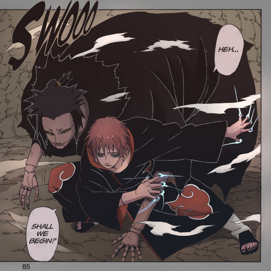
Since I don't like to wait or make people wait… I'll end this quickly.
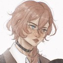
#sasori#akatsuki#naruto akatsuki#sasori of the red sand#sasori akasuna#third kazekage#naruto manga coloring#manga coloring#i discovered a program to enlarge images and i have so much power now#in most cases you could easily set it as your wallpaper if the aspect ratio was better lol.#enjoy sasori and third in a-lil-dead vampirish but still vibrant palette#bc official colors suck#i wanted to prove to myself that desaturated colors can be used well#i have one or two more kakuzus cooking depending on how you look at this#and then i'll probably open polls again#phi colors#i'll prepare a better ID later#they say that shitty ID is better than no id#i can tell you it looks v good in b&w too. it fucks in b&w
154 notes
·
View notes
Text

Good afternoon hsr tumblr
#honkai star rail#hsr black swan#black swan#obviously itll depend on how good their gameplays are but. yeah#i wanted black swan since the aeons trailer THIS IS NOT FAIR#+ if she's good as a damage dealer im getting her since i need wind units far more than i need imaginary#CURSE YOU HOYO AND YOUR PRETTY CHARACTER WITH PURPLE COLOR PALETTES
49 notes
·
View notes
Note
every day i regret being a balance main because why do I have to wear this ugly shade of brown. with like. orange and pink.
blah blah stitching but white and red are the school colors. what is this
if necromancy is most hated by ambrose, sorcery is most hated by the shopkeepers i tell you
THIS IS SO INCHRESTING because in my playthrough experience in terms of balance colors it's either the pretty maroon/crimson/gold palette, the orange/brown/sand/pale palette, or like what this ask just said and it looks like your sorcerer lost a paintball fight
the easiest solution to this. since balance is supposed to be all of the schools, make it all of the colors. all balance wizards ✨🌈 G R A D I E N T /j
#brown orange and pink together really uh. rewlly is a choice#IT CAN BE PRETTY cuz those arent the most outrageous colors to be found together but thats in like nature. not in your battle robes of armor#idk im not an art student JSLSBSJSK#the white and red gear is also a choice. it also depends on what gear it is and how the colors are utilized#plot twist: ambrose hates necromancers because of the limited color palette /j#other than black and white what other color have we seen in death clothes and imagery#i think maybe green? some blue? purple? cant remember#but this is coming from The Guy who thinks purple and yellow fit together. so please dont listen to me#“yeah balance and death colors kinda mid” (blinds people with my bright yellows and purples storm gear)#wizard101#wiz101#w101#asks#anonymous
14 notes
·
View notes
Text
Need you guys to help me stand up and put on my shoes and get my bag and get my mask and get my water bottle and put water in my water bottle and put my water bottle and mask in my bag and go out the door and lock the door and get in the car and
3.times do |i|
drive to a store and put on my mask and go inside the store and find the items and pay for the items and leave the store and find the car again and put the items in the car and get in the car and take off the mask and
end
drive home and get out of the car and unlock the door and
while items_in_car.count>0 do |i|
remove an item from the car and o
# TODO: w
#tumblr needs to add a generic 'muted' text color style#you know for commenting your code#slightly lighter/darker than the tag text color depending on which mode/palette is active
4 notes
·
View notes
Text

this is so stupid but i actually quite like jayce's skin on this one--- it looks like its supposed to be
#coloring in general is a bit harder when your line isnt black; at least thats my experience.#you have to play more with colors to make them fit; and also some colors are not... registered as the actual color they are.#like for black i actually use deep purple; but it cant be too deep bc otherwise it ruins the whole aesthetic#with the line being lighter than the filler. i dont use actual black anymore i think; its always some shade or purple.#depending on the other colors i use a very very light shade of pink/red for white. i can also use actual white#but then again; it depends of the other colors lol. and in this case isnt even that light of a color. skin is other issue#i have a palette full of skin colors but i dont really use it for just the color-- i moreso use it as a reference.#then you have me being all stupid with the color wheel for a bit trying to find a color and the saturation that fits the piece.#and dark skins are kind of their own thing; bc otherwise it doesnt give the image of actually being brown#and actually gives the image of idk you fucking slapped a random color on them. and VEEERY rarely actual brown in the color wheel works#rn jayce's color is in a mix between pink and red. but it doesnt looks like that!! it mixes and looks brown in the piece.#i used a different color on the one with chase but that was because the lineart colors were different kjsnfkjndjfds#so yeah for someone who doesnt have that much of an eye for this; this is kind of a training in a way. its ok though#i refuse to go back to pure black lines the thought of doing them sickens me (no that doesnt means i dont like when others do them)#(and no im not saying using black lines its easier or not as worthy or something its not what im trying to say)#sorry for going in a ramble about how i color?? idk sorry i just thought about adding it#lilith whispers
1 note
·
View note
Text
Femme Fatale Guide: How To Master An "Effortlessly Elegant" & Put-Together Look
Table of Contents:
Treat your skin like royalty
Take ample care of your natural hair
Dress in crisp neutral outfits that cater to your body shape
Choose your accessories wisely
Embrace feature-enhancing makeup
Keep your nails clean, filed, and simple
Regarding your signature scent(s)
Follow your dental & bodily hygiene routines religiously
Treat your skin like royalty:
Use high-quality skincare twice a day
Wear sunscreen every day
Remove your makeup every night before bed no matter what
Use makeup that doesn't clog your pores/irritate your skin
Change your pillowcases weekly
Eat plenty of produce & drink lots of water
Prioritize sleep
Limit or eliminate alcohol, cigarettes, caffeine, and processed foods/sugary drinks
Keep your skin exfoliated/derma-planed
Take ample care of your natural hair:
Use high-quality shampoo/conditioner combos that suit your hair type & don't cause build-up
Hydrate with a scalp mask 1-4 times a month
Use cold or lukewarm water to wash your hair
Apply shampoo to the roots/hair covering your scalp and conditioner only on the "ponytail" section of your hair
Use a specialty hair towel after getting out of the shower
Always comb wet hair and brush 1-3 times a day when dry
Limit heat on your hair when possible & always use a heat protectant every time you do
Use non-elastic or silk hair ties
Get regular trims at least 3-4 times per year (get your hair layered if it's very thick)
Try to limit how much you dye or, especially bleach, your hair and do elaborate styles with tons of heat & harsh products
Dress in crisp neutral outfits that cater to your body shape:
Embrace minimalist basics (tees, tanks, blouses, sweaters, jeans, trousers, blazers, leather jackets, coats, etc.) in high-quality fabrics (Pima cotton, Merino wool, Tencel, mulberry silk, etc.)
Choose options in black, white, grey, charcoal beige, navy, burgundy, or cream depending on your skin tone and preferences
Invest in a collection of sleek footwear options (black boots, loafers, black pumps, white sneakers, etc.) in minimalist, timeless styles that suit the color palette, hemlines & proportions of your go-to outfits
Ensure your shoes and accessories feel proportional to the weight/silhouette of your outfit, color-coordinate with the rest of your look, and have streamlined hardware from head-to-toe (all silver, all gold, or one piece that mixes silver/gold and another gold & silver piece each to balance out the color palette)
Keep all of your clothes steam and lint-rolled, so they look crisp & fresh all-day
Befriend your tailor to take in or let out clothes as needed when purchased off the rack
Choose clothes/styles that flatter your body shape and proportions
Utilize belts and bra tape to adjust the waist, keep shirts tucked in, and keep straps from falling down or create an impromptu cuff/hem on your pants
When in doubt, select a neutral head-to-toe monochrome outfit
If on a budget, consider choosing black, grey, camel beige items to hide fabric imperfections that could cheapen your look
Choose your accessories wisely:
Select sleek, simple neutral (& almost exclusively) monochrome shoes made with smooth (recycled/vegan) leather with
Pair almost any outfit with a shoe featuring a slight platform, block heel, kitten heel, and/or a sharply pointed toe to elongate your silhouette
Complement your outfit with structured, pared-back handbags with no logos (Focus on quality and construction, not the brand name) in a neutral shade and timeless silhouette
For jewelry, choose at most one statement piece and all others should be focused on different areas of the body (e.g. don't mix statement earrings with layered/bold necklaces or stacked rings * bracelets). When in doubt, choose simple diamond chains or earrings, sleek bangles or chainlink necklaces & bracelets, simple pendant necklaces, and minimalist rings in hardware that all go together
Embrace feature-enhancing makeup:
Cover up any dark circles, blemishes, or hyperpigmentation with a color-matched concealer
Lightly contour with a bronzer that complements your skin tone
Fill in your brows for a naturally full look (or get them professionally tinted)
Apply a light wash of rose, coral, or mauve blush
Use black mascara with a little bit of eyeliner and/or a subtle wash of brown eyeshadow on the lids
Apply a "your lips but better" nude shade or "just kissed' berry lipstick or pigmented lip balm for a subtle wash of color
Keep your nails clean, filed, and simple:
Maintain cut, cleaned, and filed short nails
Opt for a square or almond nail shape
Choose a timeless nail shade (pink, nude, red, beige, dark cherry, navy, dark purple, black) with no nail art
Hydrate your hands and scrub under your nails daily
Regarding your signature scent(s):
Ensure your body wash/lotion and perfume scents don't clash
Test perfumes for a trial day to ensure they smell divine with your unique pheromones
Choose a fragrance appropriate for the seasonal/occasion
Apply a dab on each wrist and on your neck/behind the ears. If the scent doesn't project well on you, try applying these small dabs on the cuffs and shoulders of your jacket/walk into it to get it on your hair (if it would stain your clothes)
Don't layer more than one heady perfume at a time or scents that don't have complementary and/or shared notes
Follow your dental & bodily hygiene routines religiously:
Floss every day (after each meal if possible)
Brush your teeth with an electric toothbrush twice a day
Have mints on hand if you're a garlic, spice, or coffee lover
Keep your lips & hands well-moisturized and protected with SPF
Shower your body daily and be extra diligent in scrubbing your privates, everything behind, and under your arms
Don't use very hot water in the shower (it burns/dries out your skin)
Exfoliate 2-3 times a week with a sugar scrub
Moisturize daily or anytime you get out of the shower
Apply SPF on any exposed sun (especially in the summer or when the UV index is high in your area)
#fashion advice#elegant fashion#styling tips#style tips#style advice#beauty tips#skincare tips#haircare tips#femme fatale#dark feminine energy#dark femininity#high value woman#it girl#the feminine urge#female excellence#dream girl#queen energy#female power#femme fetale aesthetic#glam aesthetic#glow up tips#feminine energy#hygiene tips#girl things#girl talk#elegance#classy life#stylingtips#femmefatalevibe#polished look
2K notes
·
View notes
Note
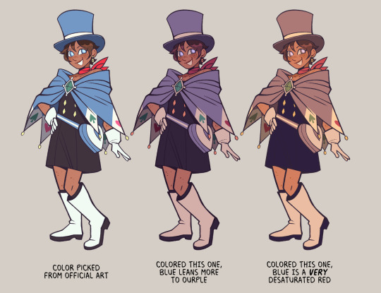
hey :) really like the way colors work together on your movie poster art- you got any tips for a beginner artist on how to find/pick colors for a piece so that they would look sick together?


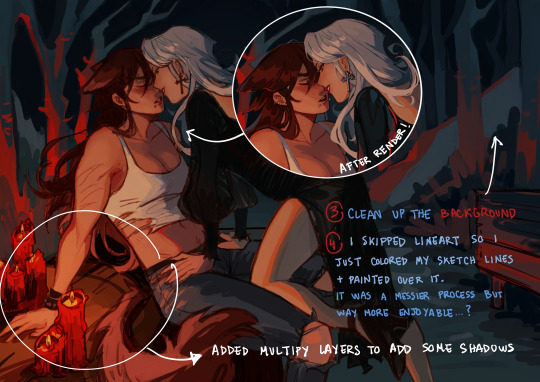
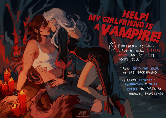
Here's a small step by step breakdown of my drawing process for that specific drawing!
As for picking colors- my knowledge on color theory is pretty much non existent so this answer will probably be a bit disappointing sorry!! but anyways,,, I started working on this drawing with a clear vision in my head (the woods at night + a warm source of light closer to the viewer) so I went on pinterest and looked up some references! I always start by choosing the background color, and then I start picking the rest of the colors in relation to that, in order to avoid colors that are too bright/saturated, etc for the scene. And I always try not to go overboad with overly complicated color palettes and try to stick to 3-4 colors max (that's a trick to make your drawings look very cohesive with minimal effort!!). Simpler color palettes are also easier to work with and can help make your color choices look very intentional (if that makes sense,,,).
For example; the background is literally made of 2 colors: red and dark/lighter blue depending on how far the trees are.
1K notes
·
View notes
Note
Hi Lorkai! I really like your work! I hope I'm not breaking any rules, but could I request something?
So, Malleus hatched from an egg, right? I was thinking about a dragon egg magically appearing in his bed while he sleeps. When he sees it, he knows it's his and his darling's baby. Like, the egg manifests because he loves his darling VERY MUCH.
What do you think he would do next? Would he tell his darling about their baby, or keep it a secret? Would he use the egg to baby-trap his darling?
If you're uncomfortable writing this request, feel free to ignore it! It's alright, I understand. Have a great day!"
.。*♡ A/N: Hiii darling (。・ω・。)ノ~, thanks for your gentle words. Wrote a little drabble and some hcs for you, hope you like it and have a good day /night too!

It was almost like a dream coming true, albeit a bit too early. Malleus was still courting his beloved, slowly expressing his interest through his gestures and words, but he loved his beloved so much that his feelings simply gave life to a whole new being. And as soon as he wakes up in the morning, his eyes water when he sees the egg, when he holds it and feels life pulsing inside. Malleus doesn't usually cry but he cries a waterfall while he holds his unborn child. He is just that happy.
His and his darling's child. Your child. He already imagine they would look. Would they look more like you or more like him? Would they smile so sweetly like you? Would they be sassy and funny like you? Gods, he already wished to meet them. Alas, dragon faes take a while to hatch.
Thunder rolls across the dark skies as a sea of feelings passes through him. And while he holds the egg against his chest, Malleus sets out to find you and tell you the news. He knows where you are, he can feel it and in a shower of green fireflies he appears in front of you. Eyes still shining with tears and a light blush over his face.
"Meet our child." He says softly. Softer than anything he's ever said, so happy that he hands you the egg to hold while he explains to you how dragon fae are conceived.
.。*♡ Now, how Malleus act depends on how you react to the news. He could be a doting boyfriend (and someday in the future a husband) to you and an amazing father for the child. If you are happy with the news, he's going to be delighted, already planning your marriage and life in his mind, discussing names for your child and the color palette for their room. Overall the next days he's spending each and every minute by your side.
.。*♡ Though the moment the child is born, all of you are going home. A school is no place for a baby to grow up, if you still want to pursue your education then Malleus is going to hire the best professors to give you private lessons in the castle. And also to help you adapt to fae society if you are human.
.。*♡ But if you are to reject him or deny being the other parent, Malleus will not take this lightly. The child is yours, no amount of denying will work. You may just be scared but this is no excuse to sprout lies, a new life was born for his love for you and dragon fae needs love from both parents to exist, or so he says. He'll guilt trip into becoming the other parent and to stay with him. He didn't have his parents growing up and he was so so lonely, his child will have both parents present, even if he has to use his magic on you for you to cooperate.
#twisted wonderland#yandere twisted wonderland#yandere malleus#yandere malleus draconia#yandere malleus x yuu#yandere malleus x reader#yandere malleus x mc#yandere malleus draconia x mc#yandere malleus draconia x yuu#yandere malleus draconia x reader#malleus draconia x reader#malleus x reader#malleus x mc#malleus x yuu#twst malleus#twst malleus draconia#malleus draconia x mc#malleus draconia#tw yandere#lorkai headcanons#lorkai drabble
594 notes
·
View notes
Note
How do you do your lighting??? It looks so simple, yet it looks so good???? I’m going crazy with lighting LMAO
Movies can be a great way to reference lighting schemes and color palettes from! I'll be using this scene below as an example:

I use either Normal, Screen, Color Dodge or Linear Dodge (Add) layer modes to add lighting. Don't limit yourself to these, experiment to see what works for you :)
Layer 1: Main lighting source.
Layer 2: Bounce light. (Optional - depends on the environment)
Layer 3: Additional glow. Airbrush the light areas to make it more vibrant.
#sometimes I too struggle with it hours on end#the lighting in JW movies tho *chefs kiss*#cyberpunk 2077#john wick#john wick au#cyberwick#my art#art tips#ask
1K notes
·
View notes
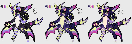
Note
what would they look like as villains? I know that some have canonical versions, but I would like to see your intropritation (let's be honest, for most - the evil alterego is an exact copy, but only with a slightly modified color palette and frowning eyebrows)
(I'm sorry for my English)
oh, this was a wonderful ask to get on the eve of spooky month ;D im not god at villain (re)design but it was a fun thinking exercise! (also im assuming you were asking about HoMies xD so)


I mean, there is only so much one can do to remake protagonists into villains and yet still have them remain recognizable, so no wonder evil!versions often are just recolor/frowny sort, but I tried my best to be creative ;D
(and your english is alright! no worries)
also while you can imagine them being as villanous as you want in these designs, there are some little blurbs/backstories i made up for myself as I tried to design them, if you are interested (they are various shades of dark, since you know, tragic backstory and all that lol):
Kim Possible - Hero for Hire turned Mercenary for Money - Kim is widely known for her profeciency in hand-to-hand and quick thinking when on the jobs, but one time something went terribly wrong. Maybe client info was unreliable, or a freak accident, but as the result both Kim and Ron got hurt, leaving Ron in a hospital permanently, and Kim with scars and trauma. After that the girl who worked on favors and rides lost her trust/belief in goodness of people, becoming jaded by reality of a job she accidently found herself in. Kim changed into someone very cold and calculated, someone who started taking jobs that required using serious weapons instead of gadgets, and more importantly getting paid, so she could support her best friend (who is in coma and thus unable to influence this downwards spiral Kim find herself in).
(in contrast to canon!Kim's free flowing hair, she ties it back in order to never be distracted in crucial moment. has a lot of new scars due to more dangerous jobs. i still cant decide if she kills with her weapons or not, but she certainly learned to hurt people. also a very complicated relationship with Shego, since Kim is also a mercenary now, but Shego still remembers that girl she was and is conflicted about this new Kim)
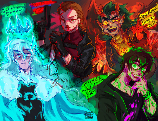
Danny Fenton/Phantom - Ghostly Hero turned Ice Prince - s3e6 Urban Jungle turned out differently, when in the end, defeating Undergrowth, meant also hurting everyone he had been connected to at that moment (level of hurt depends on your preference for angst i guess lol), but anyway, Danny horrified by what he have done (and with memory of Dan still haunting him), still technically unstable with his Ice Powers, flees back into the Ghost Zone to the one place he knows he won't be able to hurt anyone. Sequestering himself in the Far Frozen, he goes full Elsa, and become a remote Ice Prince, that even Far Frozen Yetis are still nervous around, with his only contact being Frostbite. Slowly he wastes away, freezing from his powers not only physically but also like emotionally.
(fun (?) tidbit: fur on his new snow cape/coat is from yetis, unfortunate to wander too close to ice prince. so there are a bunch of partially bald yetis in far frozen lol. Danny is constantly covered in bits of ice and frost, since his ice powers are unstable due to emotional damage. Danny's crown is not a conscious choice, but rather a manifestation of Far Frozen starting to bond with Danny's ice core to become his lair and also sort of recognizing Danny as future Ghost King.)
Jake Long - American Dragon Guardian turned Corrupted by Dark Magic Dragon - Series Finale The Hong Kong Longs, ended differently, when Dark Dragon left a parting shot before he was inprisoned for another Millennium. Since meeting Jake, Dark Dragon has been interested in aquiring him as minion/apprentice(?), and had been steadily trying to sway him to his side. But as he lost he made a last ditch attempt, infecting Jake with Dark Magic. As the result, Jake now cannot control his Dragon Form, being steadily consummed by the Darkness and turning more Draconic as time passes, until he will become full Dragon all the time and under the thrall of Darkness. The change is harsh and as the result Jake falls into violent moments during which he hurt his loved ones that fight to keep him from changing. In one of his more lucid moments, Jake flees to hide away in order not to hurt anyone.
(it seems an interesting thought to expand on the possiblity that the Dragon form can overwhelm the human part and that it would associate with dark magic to succumb to its baser instincts, and also would be a great opening to all those wonderful draconic fan headcanons fandom made about Jake lol)
Ben Tennyson - Hero Wielder of Omnitrix turned Corrupted/Hacked Ultimatrix Unstable User - During Alien Force Ben tried multiple times to hack/meddle with Omnitrix settings, and when he continuously tried the same with Ultimatrix in Ultimate Alien, something has gone wrong. Ultimatrix has bonded deep into Ben's DNA and body, and now every change is felt acutely, not to mention the alien perceptions are now unfiltered and Ben recieves the raw experience of being a different speices/state. It comes to a point when it start to mess with his mind, only made worse by Dagon's reemergence and all the enemies. In the final showdown of Ultimate Enemy goes differently, how? no idea (again depends on your preference level of angst lol). But as the result, Ben, unstable and a little crazy, is on the run with his corrupted Ultimatrix, his reputation in tatters and is considered dangerous by Plumbers.
(i had a little extra idea of Omniverse continuation, where new Plumber Rook Blonko, now has to hunt his hero turned crazy tragic villain Ben Tennyson. Very emotional and angsty (and a bit gay lol), where Rook continuously trying to unsuccessfully catch crazy Ben and convince him to let Azimuth and plumbers to help him.)
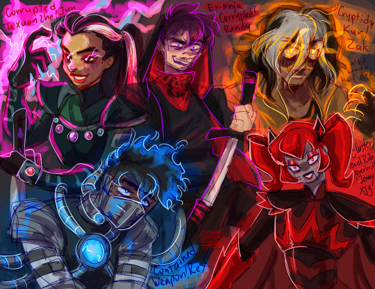
Juniper Lee - Youngest Te Xuan Zhe turned Corrupted/Fallen Te Xuan Zhe - in this case in Out of the Past, what Ah-Mah Jasmine feared about Fallen Te Xuan Zhe Kay Yee managing to corrupt Jun has sort of came to pass. After defeating Kai Yee, being touched by the overwhelming power of Magical Elders has left its mark on Jun, as well as Kai Yee's words and Jasmine's initial fear about/distrust in Jun (she is like 11-12 people, it would FUCK HER UP MENTALLY???). As Jun goes through her rebellious teen phase, the unfairness of her trapped position as protector and the demands of it, grates on her more and more, and she finds refuge in studying magic. As the result, her magical ability grows and as her desire for freedom, and the smallest seed of corruption from the events of Out of the Past grow too. So in the end, Jun learns magic to wield it , like Kai Yee, but unlike Kai Yee, not just for battle, but for personal goal of freeing herself and any future Te Xuan Zhe of her family line.
(fun tidbit, Jun doesn't continue to dye her hair pink, instead she uses blood from battle ;D morbid i know but i couldnt help it i like the imagery of her passing her bloody hands through the white part to paint it. she has lightning scars all over her body, that appear only when she uses magic - a manifestation of her brush with orb of magic elders.)
Rex Salazar - Last Hope Against EVO turned Contained and Controlled Weapon of Providence - Rex's return 6 months after Breach transported him and his introduction to Black Knight goes very differently. Instead of prolonged mind games, Black Knight just imprisons Rex pretty much right away while he is vulnerable, content to attempt to trigger Rex's amnesia ad use the mind-control collar, to turn him into her mindless weapon. She was sorta successful? But with Ceaser on the inside, he managed, with the help of Six and Holiday, to free Rex, even if it was too late to save his mind. As the result, whatever reeducation Rex suffered from Black Knights left him instinctively reacting with force and in defense. The whole last part of the season goes very differently in this state, and the finale also ends differently, with Rex, overwhelmed with power of Omega Nanite (God) but in no mind to actually control it. So in the end he is forced to be contained as his friends and family try to figure out how to save him.
(the angst of mind-controlled Rex is something I enjoy, but since he canonically is immune to it, the idea of an induced amnesiac episode seemed like a best bet for this one, but with like double the angst since Six&Holiday would have to struggle not only with Rex being turned into amind-controlled weapon but also him not knowing them)
Randy Cunningham - Chosen Norrisvile Ninja turned Disgraced/Fallen Ex-Ninja - relatively early in his career, after accidently releasing Tengu and Howard getting possesed by it, Randy makes an ultimate sacrifice by burning the Ninja Mask in order to defeat Tengu. However, he didn't expect that Tengu-possesed Howard to be sealed away together and the Ninja title being taken away from him for his reckless (even if noble) decision. Frantic, because he lost two important parts of his life, his best friend and heroic purpose, Randy tries to get the reborn mask back, but it, along with the Ninjanomicon were spirited away by the Messenger to pass on to another candidate. And thus starts Randy's panicked downward spiral and frantic attempts to get back the mask in order to free Howard. Since he still has his memories, Randy trains to become a better fighter. He knows he has to fight the new ninja for the mask, since he believes the Ninjanomicon would advice strongly against New Ninja helping Randy free Howard. In school He becomes known as resident outcast with bad reputation who lost his best friend under suspicious circumstances, and magical underbelly of Norrisville another antagonist for the Ninja to battle. However he still retains an odd sense of honor about Ninja (because he was one) so when opportunities to team up with Sorcerer, McFist, Sorcereress come up, he either ignores them or uses them for his own goal. The closest thing to hit home for him was when Mac Antfee also tried to get mask back, but for his own selfish purposes unlike Randy, well, lets just say Randy was pissed.
(i feel bad since i practically nipped Randy's career right on the bud, unlike others, but this one felt like a good turning villain opportunity unlike season finale. also! the idea of Randy beng an antagonist to the next ninja, while struggling with his own goodness and desire to save Howard is incredibly interesting to me lol. also he got scars from Tengu)
Zak Saturday - Heroic Fighter for Cryptids turned Cryptid Kur re-Reborn - the last episode, where Argost took powers of Kur and subsequently Zak died for about 3 minutes, Zak didn't reawaken unscathed. Kur is not only powers to control Cryptids, it was a person once, and after Zak died and was ressurected, a part of Kur has come forth, because some part of Zak has been lost in his death. A changed Zak Saturday worries his family, with him being quiet and introspective, not to mention pale/golden eyed and slightly zombie-like from his brush with death. Inside, parts of Zak the Kid and Kur the Olden Cryptid mesh and mix, leaving this new Zak struggling with who he is. As time passes however, Zak the Kid is slowly loosing the battle with a much more powerful older part of the soul of Kur (it wouldnt normally happen but Zak the Kid lost a significant part of his spirit when he died, which was filled with Kur) slowly regain his abilities (like in TGAS). At some point a change happens, and Zak retreats from his family, starting to wander the world as two parts of him struggle for dominance.
(fun tidbit! Zak's outfit is the same from his future vision of him overtaking the world as Kur, it seemed approrpiate lol. Also for some reason I kept thinking of Van Kleiss (from Generator Rex) when designing evil!Zak. they kinda have the same vibe)
Jenny XJ-9 Wakeman - Robotic Hero of Earth turned Robotic Overlord - this is a bit of mixed influences from different points: in season finale Dr. Locust turns Dr. Wakeman's creation against her; Jenny's Older Brother Armagedroid; Vexus attempt to sway Jenny to her fellow robots side; the whole year where Jenny was mind-controlled by a bratty kid and everyone feared her and even her mother planned to create a new XJ-10 in order to defeat her; and also a bit random but that one time Jenny pretended to be a villain Ruby Rocket (hence the red color scheme with bits of Armagedroid/Cluster designs). I have a bit less clear timeline for this, but lets just say its gradual and that at some point a lot of manipulations Jenny suffered turned her against humanity and their use of her robotic brethern. While she does not desire to destroy humanity like her brother, she certainly lost her trust in it, and after a manipulation one time too many, she snaps, turns into a leveled up version of Ruby Rocket/Anti-hero persona, she takes her sisters and leaves to Cluster, where Vega welcomes her. Jenny still protects Earth, but admittingly from afar and in a more evil way I guess?? She loves her mother, but she struggles with Dr Wakeman's previous disregard of her siblings and just callous regard to her creations (Wakeman can be cold/serious/to-the point, without Jenny constantly reminding her that she wants to be like a normal girl).
(Jenny was the hardest, because I couldnt find a clear point of turning in the series for her, so I decided to go with gradual change of mind about humanity sort of deal.)
oof this turned a bit long lol, thank you anyone who read through this clusterfuck! As you can see i sort of went with 'Were a Hero - tragically turned Anti-Hero due to circumstances' kind of vibe, since Im just unable to imagine these guys be like trully horrible evil villains (and this way is more angsty, since, like Fallen Heroes and all that). Im not that creative lol. Anyway, i hope you were as entertained as i was when creating this haha ;D
#que?#hom au q&a#kim possible#danny phantom#jake long#ben tennyson#juniper lee#rex salazar#randy cunningham#zak saturday#jenny xj9#american dragon jake long#secret saturdays#the life and times of juniper lee#rc9gn#mlaatr#ben 10#my life as a teenage robot#generator rex#hom au#i mean sorta? its just about homie characters but very au/evil aus??? lol no necesserily a hom!au au#i spent an embarassingly long time trying to put my thoughts about all of them into writing xD#there is a reason i prefer to draw than to write lol. im not very good at it
657 notes
·
View notes
Text
How would Ghost and König react to seeing your huge makeup collection for the first time when you’re off-duty together?
You don’t wear makeup at work, even if you go out for a drink before going home, you just use some mascara and maybe a very slightly pink colored lipgloss. Since you haven’t met outside of work yet, they have no idea how dedicated you are.
Ghost
When you show up in the restaurant, you wear full makeup. Nothing dramatic, but it makes you look completely different. He can barely take his eyes off of you, because you look so good.
He makes sure you get home in one piece, secretly hoping you would invite him in. When you do, he can’t hide his smile, and he pulls you into a kiss the moment the front door closes.
In the morning he wakes up before you and he takes a good look around the room from the bed where he sat up. He notices the big makeup vanity set by the window and wonders how full it is. You can do makeup, that’s clear after the previous night.
“Morning,” you purr as you get on your knees and wrap your arm around his torso while you rest your head on his shoulder.
Simon smiles at you and kisses the crown of your head. “Good morning, love. Did you sleep well?” You mumble something against his skin without looking up. “Can I ask you something?”
Finally you look up, eyes mirroring a mixture of confusion and worry. “Is something wrong?”
“What? No! I was just looking at the makeup vanity and wondered what’s in there,” he says with a reassuring smile.
None of the women he dated before had such a thing in their homes. Sure, they had makeup, but they usually kept it in the bathroom or somewhere hidden from his eyes. You seemed to be putting a lot of effort into your looks, especially if this vanity is more than just a design choice.
“Wanna take a look? Come on, I’ll show you,” you say with a wide grin as you get out of bed and hold out your hand for him.
Without hesitation Simon grabs it and climbs out of bed as well. You open the drawers, revealing so many products that he’s beginning to wonder how you managed to fit them in there. He doesn’t even know what half of those are for.
“Foundations, concealers, and primers are stored on this side, eyeshadow palettes and eye liners are here, lip pencils, lipsticks and lipglosses are over there, blushes and highlighters–”
“You lost me here,” he interrupts you, picking up a shiny powder to take a closer look at it. “Do you really use all of these?”
“It depends on my mood and the occasion,” you reply with a smile.
He tries to understand it, he really does, but even though you explained him the use of highlighters, he just couldn’t understand it and barely remembered a thing.
Instead of trying to understand it, he just enjoys seeing the excited look on your face whenever you buy something new, and he even buys you some products as a surprise–although you’re always there to choose what you want.
König
He first learns about your collection when he watches you get ready after the first night you spend together. You agree to go for a walk then visit a museum, so you decide to put on some makeup. “Just to look good as your side piece,” you joke.
Whenever you reach for the products, he keeps asking what they are, why you use them, and most importantly, he pays attention to how you use them.
As you get closer with time, he begins to ask you to put on some makeup even when you’re not going anywhere. He loves seeing you do it, and he loves to compliment you even more. A part of him is convinced that you wouldn’t stay with him if he didn’t take any chance he got to compliment you in some way.
“You look stunning, bunny,” he whispers into your ear as he shows you a necklace. “Mind if I put this on you?”
You turn your head to look at him and flash a smile at the man. “It’s beautiful, thank you,” you say before giving him a quick kiss, leaving a lipstick mark on his cheek. “Let me wash your face,” you say with a laugh.
“Let it stay there,” he mumbles as his lips capture yours in a passionate kiss. “It feels like you just marked me as yours.”
“If you put it this way,” you begin with a quiet giggle before kissing his chin, the tip of his nose, his forehead, and any body part that you can reach from there.
These moments are incredibly precious to him, when you let him know you love him, that you don’t want him to leave. Because he wants to stay, he desperately wants to be by your side for the rest of your lives.
“I love you,” you whisper against his lips.
He couldn’t help but smile. “I love you too,” he says.
#könig#könig x reader#konig#konig x reader#simon ghost riley#simon riley#simon riley x reader#simon ghost riley x reader#ghost#ghost x reader#mw2#modern warfare ii#modern warfare#call of duty
2K notes
·
View notes
Note
your rendering is so good how do you do it
Thanks, I love your rendering too!! Gonna try and make a tutorial ^^
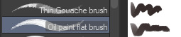
To start off, I'm on Clip Studio Paint and these are the brushes I use! First two for rendering characters (round brushes) and the other two for mostly backgrounds (square brushes)

I used to do lineart, but it takes too long >:( now I just make a sketch and sorta clean it up!

Next I fill it in with a gray color. For simpler pieces I just put in the flat colors, but for more paint-y pieces I do grayscale -> color! I'll be doing that here :)
Also, I make 3 clipped layers on top of the gray - two are multiply, and the top one is screen. On the first multiply, I do a soft gradient using an airbrush
On the next multiply layer, I fill everything in with either a cool-ish or warm-ish gray, depending on the mood ^^
I also determine a light source, and use the lasso tool on the screen layer to block out where (I think) the light hits! Tbh I just do wherever feels right lmao, but I recommend having a reference! I like doing it in triangle patterns
Then adjust the opacity of each layer to whatever feels right, and merge everything (I don't merge the sketch/lineart yet, I do it before adding colors in!)
Now... rendering. Some tips I have are color pick (greys) off of the canvas and use them to paint! Clean up the sketch more, erase edges, but I save details (like Galaxia's red gem, his eyes, etc.) for the end, or during coloring.
After I'm sorta happy with it, I merge the sketch layer, then duplicate it, and add a gradient map! I did this sunset-y one but changed the hue to yellow-ish, then lowered the layer's opacity ^^
Play around with the hue-saturation-luminosity setting!

Now go crazy with blending modes! Multiply, overlay, color, glow/color dodge, etc. Feel free to layer them up on top of each other too, and this is to add the character/piece's actual colors in. For example, I used a white-blueish overlay layer for his mask and glove, blue for his cape, blah blah
Now I clean the sketch up/refine it more. Also, to "harmonize" the color palette, you can add a colored gradient on top. Then set it to multiply, and add overlay/glow dodge layers with any colors you see fit! I like using teal and light/warm orange!
Here is an example of a colored gradient:
Another tip is to add saturated colors on the edges of both lighting and darker shadows, before blending it:

Also I usually add in a light blue/grey in shadowy areas, and lower the opacity for reflective light:

Also! You can lasso + use an airbush with a light blue to block out parts of the background (his cape here, for example). It helps with more depth!
Finally, I like adding sparkles on low opacity :3 And gaussian blur to certain areas! I'm using radial blur on this piece though ^^

For the background, I like doing blocky shapes!! I use my square brush on 90% ish opacity, to color pick different hues from the piece. For lighting I use a glow dodge layer, here's a mini timelapse as well as the finished art!
At the very end, play around with the hue/saturation and contrast tools to change the colors :)
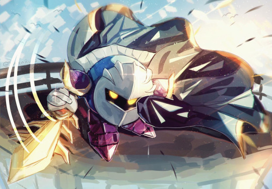
#iiii hope this helped??#first time making a tutorial sorry!!#art tutorial#kirby meta knight#meta knight fanart#meta knight#nintendo kirby#kirby nintendo#kirby fanart#kirby series
517 notes
·
View notes
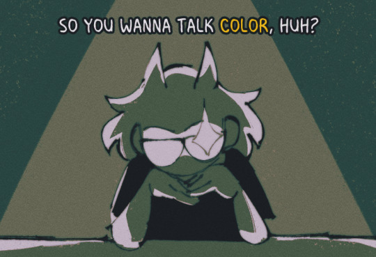
Note
How do you choose the colors in your art? Your color palettes always look so cohesive and so pleasing to look at!
ah, this is gonna be pretty long so i'll talk about it under keep reading :^]
now i am no expert!!! i am just a guy!!!! i'll just be talking about how i do it! ok!
PART 1: COLORS??? HELP.
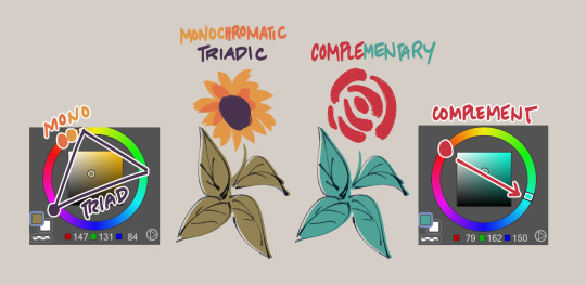
i really like going with warm stuff on my art so it's kind of a given that most colors i use end up wounding up on this side of the color wheel
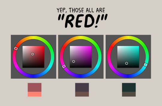
so, let's say i'm coloring trucy, a character who wears blue, i end up choosing warmer looking blues, sometimes i end up choosing purple or gray if the other colors i chose makes it look like blue, yannow, color theory and stuff. like this for example!

now the first one is noticeably blue, but the second one is like a lavender and third one is like, really not blue! it's like a desaturated rose color or something, however, paired with the right colors...
they're all "blue", aren't they?
PART 2: CHOOSE WEIRD COLORS
by weird colors, i mean colors that aren't like what the thing looks like irl. like, a leaf is green right? but, it doesn't have to be when you color it!
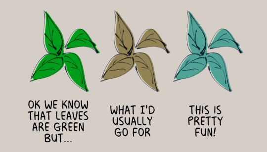
like when i color things gold sometimes, i use a light and desaturated red-orange for it or how like with the color blue, i don't even use blue at all!
now just because i use warmer tones a lot doesn't mean i don't use the colors from the other side of the color wheel, it depends really, if the color scheme i'm going for is monochromatic or if i really wanted to make something pop
but of course, you can't just color willy-nilly, you gotta take into account
PART 3: CONTEXT AND MOOD
where and when is your drawing set? what's the mood? are we having fun here or are there Horrors?
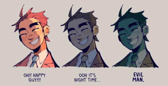
see how it changes the mood? the things we're supposed to be feeling when we look at the drawing? yeahg. ill use warmer colors when i want the drawing to look happy dreamy etc but ill break out the blues and greens when we're in sinister town pftt
also, just wanted to share again how other colors can change what another color looks like:
PART 4: GRADIENT MAPS AND OVERLAY LAYERS
now as for making colors more cohesive... seriously, just slap that thing on top of your piece and it helps the colors get together even more! like of course i choose my own colors but gradient maps + overlay layers are kind of like adding that one final thing.
i'll use this one as an example, left one is no gradients maps/overlays and the right one is with them. i just really prefer some good ol' ourple tones in my art so there are a couple of things i add on top to really bring out the warmth in here, like so:

PART 5: ANYTHING ELSE?
uhhh don't be afraid to use tools in your program to correct the colors you don't like ala color balance tone curve contrast brightness etc etc.
hell, you can even color pick from like irl pictures and adjust accordingly to what colors you want.
i also do have like colors that i consistently use when shading things after countless trial and error; like how i'll use purple to shade red, blue to shade with green etc etc
ig that's all, hope this helps!
#sunnysidetutorials#ajdgdjkd there's another in my ask box asking me about how i shade so stay tuned for that ig#im sorry gusy but if yall wanna get into my head with how i color ya gotta tackle color theory first#like . its pretty easy to understand i think#however it did took me a while to like *actually* be able to apply it in my art#so i understand that it can be pretty difficult
1K notes
·
View notes
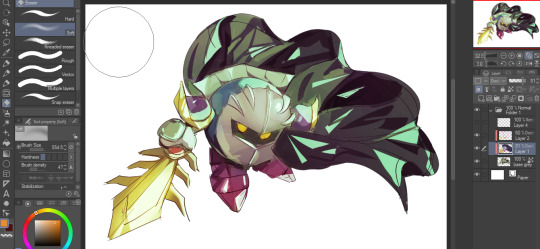
Text
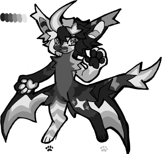
how i make color palettes of my ocs before i pick one, an art tutorial?
hello, whenever i made a new design for myself i found a way to make lots of color palettes and pick one! i see this method more in paintings and rendering but not much on character designs? here are some examples i used that on.
it helps me so much when i feel experimental with colors. here are what you need
a wip character design. sketchy or pixel art works better since the colors can have some anti aliasing issues
a program with gradient maps. i'm using clip studio paint but ik photoshop also has it. like i said this is used more on photos or paintings
and here's what you do!
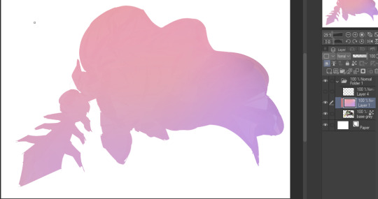
draw your character. i'm making a new fursona for myself but anything should work.
2. decide on their markings/color placement in grayscale. i recommend doing grayscale so you can easily see the values. split your grays into however colors you want. i like doing 5-6 the most. i reccomend duplicating the color layer if you wanna try multiple palettes.
3. this part is program dependent but in csp's case go to edit > tonal correction > gradient map.
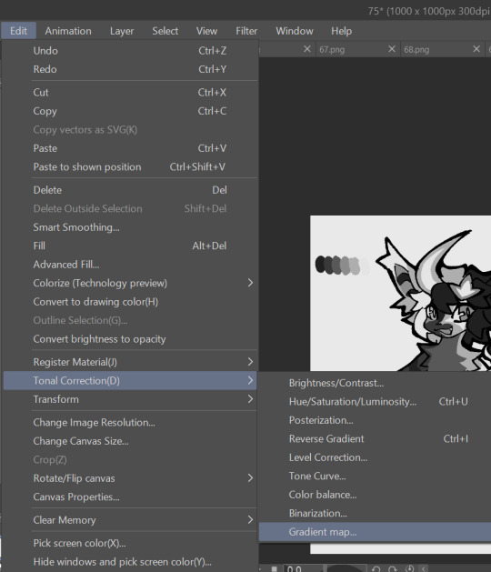
4. i made a few default 5 color gradient maps but if don't use gradients like me i reccomend making the graph like this so they become solid color. split the map into however many colors you used. i'll add a color to the red-orange one bc my character has 6 grays.
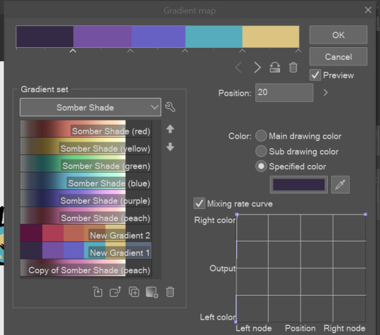
5. replace the colors by clicking below specified color. it all depends on your creativity and what you want. experiment til you like it.
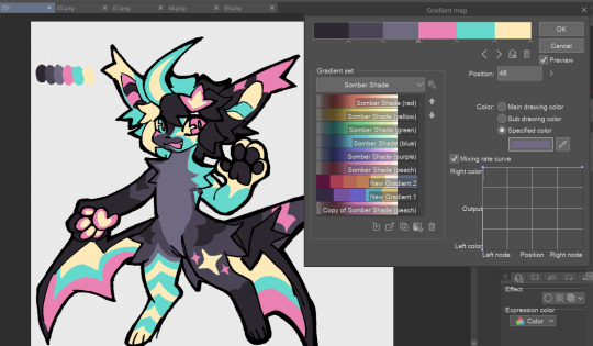
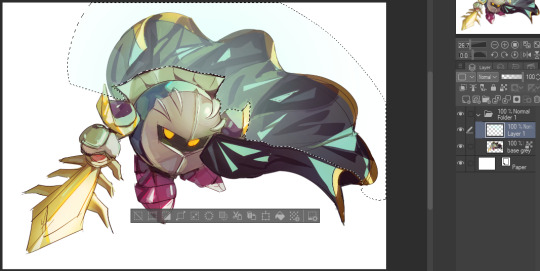
6. fuck around, try stuff, put them together to see if you like any of em. i made 9 to see if i can focus on one of them and i actually ended up loving the bottom right. it really makes them shiny
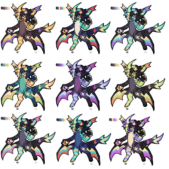
7. (optional) if you like a palette you can further and play with colors while keeping the palette. you can use color balance (in the same menu as gradient map in csp) or layers to mess around, have fun!
also a color tip because people seem to compliment that a lot in my art: digital art has millions of colors! don't be afraid of using wacky tones unless you're going pantone. if you want to get something physical i recommend being open to alternative colors as they tend to be more limited. i know whoever is doing it will try their best to keep the colors close.
color theory is something i don't...care much about mostly because this is something i'm doing for fun. i'll consider it in professional work.
#artists on tumblr#digital art#ika's showtime#ikarnival#art tutorial#art tips#drawing tips#art resources#clip studio paint
358 notes
·
View notes
Text
About scale, process, palette and canvas: a few considerations on pixel art as a medium
User moredogproblems answered an interesting and legitimate question by another, DiscountEarly125, regarding my work and canvas size. He also perfectly isolated two central concepts of pixel art, which are scale and process. Canvas size, which was the theme of DiscountEarly125's specific request, is more of a dependent variable to those two aforementioned concepts, rather than a starting point. I hope the following considerations I shared may help or prompt some other ideas, but this is what I could come up with 15-ish years of experience with pixel art (and a few more years of art and media studies). I was quite in the mood of writing down these few thoughts that have been floating for a while. I apologize as this may also result in a confusing wall of text, but it is all part of a my work and research, and I would love to polish all the material, hopefully with some thoughts, insights from other colleagues, as well as pictures and materials!
A. Scale and canvas size
It is true that the bigger the canvas, the more distance one may visually create from pixel art, but I personally think this is to be possibly considered a matter of perceiving pixels, rather than a fundative problem of the medium. In fact I concur with the idea of "process makes the medium" rather than identifying pixel art as how (evidently) pixeled the result feels. The general picture, or the sum of pixels, though, is a really important matter to the medium nonetheless! Pixels themselves work in relation one with another, so it's their overall result that gives context and makes the subject recognizable. This relationship between pixels links back to all the art fundamentals that each artist is taught, from color theory to shape and composition - and so on.
So, the canvas size debate usually boils down to a matter of scale or necessity of your subjects.
As long as the dimension (canvas) of your subject (as in: a drawing of an apple, a character sprite, a mockup environment) allows you to operate, control and keep an eye on the quantity (number/area of pixels together) and quality (color, shaping of multiple pixels, texturing obtained through color and shapes) of isolated single pixels or pixeled areas, you're in the pixel art universe.
The other way around to define the matter of scaling: in order to be operating pixel art fundamentals and techniques, your subject has to be on a scale that allows you to apply principles of pixel art within the space of your canvas and your personal style.
These very same principles, or basics, can be applied with different results and extent to bigger and smaller canvases alike, each with their own specific difficulties and variables. It is important to adapt your scale when learning, and trying classic canvases per subject like "16x16px" (standard tile or character sprite unit, tied to older consoles and screen ratios, it's a bit complicated there) is always a nice idea - they also tend to be industry benchmarks and necessities so in case you'd like to consider a professional output, that's very useful.
Scale also applies to the array of colors, and there lies the concept of palette: a number of single hexadecimal hues we are using for each single pixel. Any single pixel can have one hexadecimal color only.
Consequentially it is absolutely true that either a huge canvas or a palette too broad may prevent a viewer from perceiving immediately the "nature" of your medium, namely seeing square pixels, recognizing a certain amount of color - or more thoroughly recognizing that you made some choices for each subject on a pixel level. What could possibly happen on a huge canvas (without zooming in) is that you can't really grasp the pixels, but just the "overall picture" - and that may not differ too much from digital, raster art, which is of course also based on pixels. Therein appearently lies a sort of threshold that is really hard to pin down for us pixel artists, as it depends on screen size, visualization methods, distance, filters and lots of other inherently subjective parts.
This kinda is my case sometimes: I make big environments (possibly too big, and too detailed in each part I tell myself) that are a sum of many lesser parts: both tilesets and sprites that relate (but not strictly adhere) to a basic space unit that is 16x16pixels. You can indeed consider scale in a broader sense as a subdivision or magnification issue, much alike squinting your eyes to focus on a picture's overall contrast or, conversely, analyzing its fundamental parts with a magnifying glass, and then a microscope - an analogy as follows:
a. the picture as a whole is like a colorful rock that you can analyze by magnifying its grain.
b. the characters, geographical elements and textures, works like the different substances that compose the rock and give its visible characteristics grain and complexity,
c. single pixels constitute the very atoms of those previously recognized substances.
I mean "atom" in the traditional, classical meaning of indivisible, fundative object. That's a "quantized" part of information, which for pixel art is ultimately color (or a binary value, like yes/no black/white).
If you were, for example, to crop some parts of my work - let's say 160x144 pixels (a gameboy screen resolution in pixels) you would see the substances that are characters and elements of nature, and when you zoom in again, every atom becomes visible as a single entity of color. There are 29 different type of "atoms" in Ruin Valley as in different, singularly hexadecimal colors that work together in different combinations and shapes to create different substances and characters. 18 of them are used for the different qualities of the environment, and 11 more for extra hues for characters and other elements to pop out a bit.
It's really interesting to see how many pixel artists push this "threshold" of pixel art canvases to the extremely small or the extremely big, whereas, notably, palettes are less open to growth: it is indeed my opinion that pixel art tends to quantize color (quality) over than dimension (quantity). Palettes, notably, do not grow exponentially, but tend to a lower, fixed, controlled amount of individual values instead. This usually gives the artist the true possibility and toolkit through which is possible to think about/with pixels. In other words: color (or its absence) is the founding unit and identity of pixel art as a digital medium.
B. Pixels as process or pixels as objective?
Pixels themselves (as strange as that may sound!) are not to be considered an objective of pixel art, I think, but the founding matter of its research as a medium instead. I think that making pixel art is not just devoting oneself to show those jagged, squarey areas or blunt edges that we all know and love: this is just one of the possible aesthetics that pixel art conveys or adopts - especially on small canvases. Pixel art is not about denouncing itself as pixels, but, rather, embracing the square, atomic unit to build an ensemble that conveys a content or a style. That's the important part of the discourse that emancipated pixel art into being a medium, and not just an aesthetic choice or style of representation. Again: process makes this medium. Speaking of that, I consider pixel art as part of a broader family of "quantized art", namely media that operate on/with "indivisible, founding bricks and unities" that can assume a certain quality (color, mainly) within a certain quantity (palette, canvas size) and in relation to its surroundings to describe something.
This puts pixel art, with its specifics and with a certain degree of semplification, among other mediums such as cross-stitch, bead art, construction sets, textile art (on a warp and weft basis), (micro-)mosaics and others.
A classic threshold example of process vs objective: oekaki art. Oekaki art - which I love and also happen to make from time to time - doesn't really work or "think" specifically on a pixel base: it doesn't place pixels per se, but uses pixel-based areas and textures on bigger canvases with a certain degree of freedom, like one would normally do with brushes on raster digital art programs (adobe ps, gimp, clip studio and so on) in order to convey an aesthetic with fewer colors and a certain line style and texturing. That way, oekaki uses and knows pixels in a deep way, but doesn't see them primarily in a quantized way. As a result the "overall picture" shows pixels to a certain extent, and it's possible to recognize distinct pixels for each part, but the objective is not an analysis and use of pixel and quantized information, but the use of an aesthetic based upon accessibility of resources, their control and a certain rendering style.
A huge part of pixel art is its absolute accessibility: everyone with a fairly outdated computer or screen and a basic drawing program can study the medium.
To be fair, it's indeed considering accessiblity that I highly support an inclusive approach to the term "pixel art" and I think traditional oekaki is a close, beautiful relative that builds upon the rules and techniques of pixel art and pixel rendering, yet keeping its identity as its very own medium - somehow like a dress may be built around/upon textile design. Anyway, boundaries are meant to be crossed and I think there definitely are lots of oekaki and pixel-based art that meet traditional pixel art mid-way - or further.
I also think the "is it pixel art?" discourse possibly ensuing - and generally speaking any media belonging purist ontology - is a treacherous, slippery terrain leading to excesses, and this is not my focus today, neither am I able to tackle that subject extensively at the moment.
C. Conclusions and a few good exercises
Everything above may be farfetched or too complicated as a starting point. I tried to write all down as orderly as possible. The point of this (possibly discouraging) analysis and the reasoning between scale and process is that (pixel) art is about trying different canvases, and reasoning on one's subject and objective, rather than limiting oneself to presets sizes or styles. It's important to choose something that resonates with us and, in doing so, thinking about other, more interesting limitations: that's the discourse about quantity of space and quality in color. Limiting is the best possible exercise and one I wholeheartedly encourage: by doing so we are progressively delving deeper on the basics, as we learn the fundamental relationships between shapes and colors that we can achieve through pixels.
A few good exercises that I too implemented in my own workflow come to mind:
1. Trying different canvases (or sizes) for the same subject (sprite, character art, illustration or so on). This helps a lot finding a comfortable size to apply pixel techniques, as well as getting a hold over fundamentals such as aliasing, linework, conventional representation and so on.
2. Trying different palettes for the same subject, both by varying colors themselves (therefore learning about values and contrast and readability, as well as atmosphere and mood!) or singular hues and their components, in order to discover possible relationship between them. Have fun!
3. Reducing the width of the palette progressively for the same subject: reducing the number of singular colors forces a reasoning on shapes, rapresentation. You may go from 1-bit art (just black/white) to 3 colors, 4, 8 and so on. We'll not talk about transparency as a singular color there, but if you happen to be interested in retro art, transparency counts to the palette size. This exercise is very useful in rendering, and possibly tricky. And definitely fun. :')
4. Choosing an objective and usage of our work: for example trying to learn about old pixel art limitations for games, in order to reason within specifics. Get inspired by traditional games (spriters-resource is your best friend here, in case you have a specific retrogame you're thinking of)! I will probably talk about limitations and style on another post.
5. Four eyes (and other multiples) are better than two: try to talk with people and friends and other artists you trust and feel comfortable with to get their point of view. This can be scary, I know, especially at the beginning. You're not forced to, of course, but if you do (in a safespace) there's lots you can learn about concepts such as readability, subject recognition, rendering and composition. Our eyes and brains get accustomed to something, and pixel art being a rather analytic medium made of synergies, subtle changes, limitations and conventions is especially tricky on the artist's eyes on the long term.
Either way, the important thing about pixel art is understanding that this medium is about recognizing and enjoying the process rather than the eventual aesthetic and in order to do so the best choice is to start simple, small, with few colors and techniques at a time!
Have fun and hit me up with your progress and considerations. :')
340 notes
·
View notes
Last Seen Blogs
ravenkings
watch the angel, not the wire
alexsoenomel
The Reveries Of My Mind
xieliancore
"It's okay, we all have our scars."

meatmutt
Puppy's gonna get you