#but. i just need some variety sometimes.
Text
The fascinating thing about my limited planning records for writing is that I will go back to something after months of not thinking about it, & I have to try to parse what I meant through the barest hints of notes recording the different themes of the planned chapters
Ft "bad effects" and "bad effects pt 2", which were nearly all of what I have written for chapters 4 and 5 of Summer Nights lmfao
#speculation nation#transAction shit#i was reminded that this au exists. and i have reached the boredom with the current chapter of discacc#that can only be solved by letting my brain do something else for a bit.#so. i think im gonna work on summer nights some.#not TOO much bc i do still want to meet the discacc anniversary.#but. i just need some variety sometimes.#and i think this will work perfectly for it.#ngl im lucky i wrote down anything at all. most of my 'planning' that gets written is me rambling to andi about chapter construction lol#which. i do end up. searching our messages. semi frequently. for this exact purpose.#gonna search to see what i said about summer nights bc i KNOW i had something pretty concrete planned for chapter 2#but in my 'planning' document there is a 5 work summary of the purpose of the chapter#lmao thats how they all are. chapter 1 has 1 word (establishment) just to capture what the purpose of it was#chapter 2 has 5 words (2 of which to remind of a scene idea)#chapter 3 has. oh! 14 words! practically decadent! & it reminds of two scene ideas#chapter 4 has. 6 words. 2 of which are Bad Effects. no direct scene ideas listed but ive got a general idea#chapter 5 is the most vague. Bad Effects Part Two#tho i do have a general idea of what i wanted to do with that chapter. it wont be pretty lol#chapter 6 is One Word. but i have the best idea of what it's gonna be out of any of these#bc that's the last chapter of this fic and i know very well how i want to end it#hmmmhmhm now that im thinking about it all i am definitely remembering my love for this au#i WILL have a second chapter for something other than discacc. i CAN post other things of worth.#not just setup chapters for concepts that never get expanded on again. NO!!! Summer Nights will be a fully respectable fic of its own#might take some time to actually get updates lol. if i remember right chapter 1 itself took like 5 months to write in between discacc stuff#soooo i guess chapter 2 may be similar.#who knows maybe the writing gods will bless me with writing brain and i can churn out some 10k words of beautiful heart wrenching prose#in a matter of weeks. leaving plenty of time to focus on finishing the discacc chapter.#i probably will want to give myself 2-3 weeks prior to the anniversary to finish up the discacc chapter#we'll see what i can do with Summer Nights before then.
1 note
·
View note
Text
TG: do you think former president ronald reagan smacks rats
EB: sssmacks…rats?
TG: yah do you reckon he smacks rats
EB: oh yeah he TOTALLY smacks rodents—what in GOD’S NAME are we talking about
#submission#homestuck#incorrect homestuck quotes#dave strider#john egbert#mod terezi#i'm with john here but i totally agree that reagan smacks rats#but only if that is meant as an insult#anyways i'm bopping to rush rn i kinda wish music on the radio wasn't so regimented#sometimes i wanna go from ajr's karma to rush's freewill to heart's barracuda and back to lil nas x's old town road#the media could stand to be a little more eclectic and delineated is all i'm saying#it's not gonna kill anyone if we have some fucking variety that makes no sense to the advertisers#but exposes people to enriching experiences that they may not have experienced otherwise#like a while ago i was talking with mod kanaya and they've never heard of blue oyster cult before#and i was like wtf you need to listen to it#if only the once for no other reason than just for something you've never heard before#maybe i should start a vinyl collection and do amateur djing out of my room#anyways if you're following us and are under the age of twenty go listen to blue oyster cult right fucking meow#this is my one command to you
69 notes
·
View notes
Text
I always get leg pain whenever my period hits so I am kinda confused to never having seen discussion of it. It makes standing hard and is one of the most bothersome parts of my period hurdles. So...
As example, I get it from around the hip and crotch area all the way to my knees and down to my ankles. Where my legs meet my hips, knees and ankles hurt the most, while I would describe the pain to generally feel like a nerve running down my legs is aching.
#polls#periods#there are appreantly a variety of reasons for why leg pain happens along with periods according to google#some are the concerning kind that is because of an underlying issue and need to be checked out#some are just normal#I dont know which is mine but I am just curious about how many people also experience this#cuz my leg pain is sometimes worse than just getting cramps in my abdomen
83 notes
·
View notes
Text


finally finished all of one character's entire quests/optional dialogue/questions/etc.... 100,000 words... .... aughhh
#Given some of it IS lines of code and stuff but like.. minus all that it's still probably at least 85 - 95k words hhhhhh#AND I have to do this for another 3 characters. Then a few partial quests for 3 others. THEN the other random misc stuff in the game#(like there are public areas in the city like a park and a forest that you can go and do a few things at. and chat with a few random#townsfolk that aren't actually full characters or anything. And there's a community board where you can#browse some of the random job advertisments or silly things that happen to be posted around#and also pick up a few odd jobs of your own to help earn coin to buy gifts for the npcs. etc. etc.)#Originally I was thinking like 'ah I'll make a short little game just to try it out! :3 It'll take maybe a few months!''#haha........................hee hee........................................hoho#Also evil that it would have been done already if I didn't totally drop itand stop working on it for like 5 years randomly#i could have made 5 years of steady slow progress gradually. instead of like 'one initial idea dump + about a month of art and writing'#...... 5 year break..... 'sudden mad dash to try to get probably 400.000 words written in a year or less' lol#I just really want to be done and have something out there already so it can lead to doing other things in my world..!!!!!! T o T#Like this can be an introduction and then maybe from that I can make other games. or short story anthologies. or other such things#But there needs to be some initially not very complex easy to interact with starting point first I guess... if that makes sense#That's part of why I stopped posting worldbuilding lore dump stuff as often because its' like.. massive walls of novella length#text are much more inacessible to engage with than like.. ooh a game! and there's characters! so its more approachable! and theres#visuals! oo! and the text is broken up in small bits line by line with other things in betwen! oo! etc. etc. lol#Not that THIS is even very accessible. I think dialogue heavy interactive fiction/visual novel type stuff is pretty niche and considered#boring or tedious compared to something with more ''gamplay'' like where you can actually move around in a world#and shoot things or whatever lol. But its an inbetween point. something SLIGHTLY#more accesible for now. Since i just dont have the budget or means or ability to make some skyrim type thing obviously LOL#Though maybe if theres any interest in the visual novel that could lead to making other things too. or at least I hope. I have a VERY cool#idea for a more ''gamey'' type of game that is a super fun concept and etc. but I would need to hire at least 2 people to make it.. ough..#I could do all the writing and probably half of the art. But I think I'd inevitably need a 3d artist and someone who can Code For Real hbjh#the system for ren'py (the thing I'm making a visual novel in) is not that complicated if you stick to just simple dialogue and stuff.#Making a whole moderately sized 3d game with minigames in it and a bunch of quest features and etc. would be out of my simplistic scope#''just learn it yourself!!' ... i barely manage to eat and sleep reliably every day lol... i do not function well enough to spend months#learning that many new skills. I already have a lot of of things I'm good at (not in a braggy way but just factually like.. i already have#a wide variety of different things under my belt).. at some point I have to just be happy with what i CAN already do and focus on that#and admit I need to get outside help sometimes ghjbh... NO more new skills/hobbies!!! ... ANYWAY
17 notes
·
View notes
Text
.
#these are just some thoughts re: friendship as a result of tonight that i need to jot down somewhere but#realising that i really do have a strict and set idea of Good Friend(ship) and what that entails to me#and id written people off bc i wasn't yk ~receiving love or friendship the way id prefer and i was angry with them for that/hurt about it#did i communicate that to them though? nooo. was i fully right in that? also no. like just bc i felt unheard didn't fully mean#that they were doing something wrong. they were trying in their own way (and sometimes they weren't really or it just wasn't nice)#but that's about how we match and how we communicate right? this is so silly that's so basic but it never fully clicked for me like this#i was blaming them for stuff and building up resentment without ever expressing that (and i still haven't yk dhshsjd)#and i think where i went ~wrong was in thinking that bc i felt that way they weren't ~giving me what i need#when it's like... but did i pick up on the ways in which they DID appreciate me and show me love etc? did i give them ANYTHING to work with?#(ok yes occasionally but also... tangent but i was watching a variety show and they were teasing woozi about how#he gives interviewers/hosts literally nothing to work with. like no extra information for them to ask about or tease him for or anything#and i was like ohhhhhh. yeah i do do that sometimes with friends and it's genuinely smth i don't really know how to do like#giving casual information (but not too much and not too little???) so they can then ask questions etc. so then if im like ughh#they never ask (the right) questions or show interest (or let me talk but that's a different thing dhsjdjd) it's like...#well do i give them the chance to? much to think about thank you woozi)#anyways where was i dhsjsnsnsjns idk but it's soooo annoying that i haven't figured this all out yet#but im slowly letting go off a bunch of resentment that has truly no business being here and im trying to self reflect and all that#and im honestly doing so shit some days but others days it's? finding stuff that matters to me on a deeper level ig?#and all of it really does pale in the face of multiple genocides and it's. but yk. if i want to keep fighting#i need to build a strong foundation and sort my shit out as well and be present so im really really trying#and beating my stupid stupid depression and brain with a stick until i get there
9 notes
·
View notes
Text
Thinking about LTL Remus and like... why it is I choose to write him as a Dom, even though I don't necessarily have a lot of overt D/s scenes included (aside from chapter 7 but that was... a special case.)
When he's at his best, he focuses a lot on taking care of the people he cares about. He protects them where and when he can. He's attentive to their needs and wants and he listens to them. He projects an aura of calm authority and, in general, makes himself a safe space. Also, he's demonstrably good at aftercare, and that's canon - I'll fight about it. And he's able to compartmentalize extremely well which lends itself well to scenes imo.
The problem is that for a big chunk of the fic (and in canon), he's not at his best. And when he's not, he tends to get a bit selfish and over sensitive. He gets paranoid and starts questioning his relationships, all of which is rooted in his own insecurities that have developed over a lifetime of extreme discrimination. And he allows his identity as a werewolf to supersede his identity as a partner, lover, or friend (among others.) But I would argue that even him pushing people away or being manipulative is, in his mind, an act of care. He's protecting them from himself. The intent is there, even if it's not good practice. Ultimately though the important part is that he is willing to see where he's wrong and to take accountability in terms of fixing things after (see: shack scene.)
Anyway... either way (my art issues aside) I don't see him as this heartthrob sex God that walked straight out of a werewolf romance novel, like what seems to be the assumption when people hear I write him as a Dom. I just see him as A Guy that's doing his best to take care of his partners, and who, when he's feeling supported and secure himself, excels in making them feel the same. And I think in general that's all a Dom really is. And he fits the bill for me.
#look i love some good bossy smut as much as the next person#but like. sometimes Domming is just reminding you to take your meds#did you drink water today?#do you need a hug?#eat. you'll feel better.#just. being supportive.#i also think that there's a hyper masculization (??) of the Dom role in a lot of fiction and discourse#that erases a wide variety of the experiences out there#esp of more femme-presenting folks#or of disabled folks as well given the physicality assumed#IDK just thinking a lot about why the definition seems to be so narrow lol#remus lupin#hp#lp talks#ltl#atio verse
7 notes
·
View notes
Text
the ending dialogue in the ‘other games’ ending got me thinking. like there’s something very specific about that dialogue, about the idea of the narrator willing to wait for a restart because he knows it’ll come. eventually anyway. huuurghh….
#crow thoughts#there’s such a variety of dialogue within the game that automatically makes me think about the skip button-#-by just hearing it sometimes and it just happened again#I need to make like a small collection. I’m not rlly sure how to word this#but basically this ending has him talking about waiting. how he would wait for the restart every time even if it took a while#twiddles thumbs twiddles thumbs#do you. do you understand where I’m going with this. does this make sense#or am I connecting dots that don’t connect at all and making some weird image rather than a clear picture
14 notes
·
View notes
Text
me like ..... am I a bad teacher .......because I make class fun and my students laugh ........ surely this is wrong ........
#actually that's not really the guilt#the guilt is that I feel certain I'm not stopping or preventing the cheating the way that I should be#or enforcing the rules consistently#i just have this horrible nagging feeling that I'm letting them get away with too much#and it isn't good for them or me or the school#but also like. my class is fun. they are paying attention most of the time to the text and engaging with it in a variety of ways#i enjoy my job (most of the time) so i am not burnt out and bitter#i think i'm opening some real doors for them and isn't that what matters?#and yet!#anyway this has been the voice in my head over and over and over the past couple of weeks!!!!#because there is a lot of cheating that goes on. just generally. and shenanigans i don't approve of and all of that#and there is this part of me that wants to be a hard-ass#not because i think i should be and not because i'm putting that pressure on myself#but because i don't WANT to let them get away with everything! it's important to me that i sometimes catch them out#make them face the consequences of their actions#in a meaningful way!#idk i guess i just need to keep aiming for that without feeling that i need to remove any element of fun#or personality from my room#idk idk just musing aloud
11 notes
·
View notes
Text
i dont have an issue tagging goncharov posts w unreality if someone asks, but telling ppl to do so bc it could be triggering for some theoretical psychotic person out there kinda reminds me of that period of time when everyone on tumblr arbitrarily decided that words like ”stupid” and ”insane” are ableist slurs and ppl were genuinely calling each other out for ”using the s-slur” etc
#ppl who are super sensitive to unreality themed memes etc probably are cultivating their own dashboard accordingly#and unpopular onion: i dont think Accommodating Everyone who looks at ur blog is a necessary mindset#some ppl never tag stuff and they never want to even if u ask and thats not problematic even if its annoying to u#all u can do is unfollow if ur unsatisfied and thats ur responsibility#in the context of tumblr specifically it shouldnt be everyone elses responsibility to make their blog accessible to u if they dont want to#its just part of coexisting w all varieties of ppl. not everyone is willing to make space for everyone at any moment#sometimes the only thing u can do is walk away#these tags arent rly related to the goncharov thing And im absolutely not addressing disability friendly infastructure#or anything outside of tumblr#im just voicing some thots i guess 🤷#personally im fine w tagging common triggers and such#but i wouldnt want to tag everything i reblog. some ppl do and those who need that sort of thing can follow them instead#i would def tag goncharov is a mutuals asked but if someone legit couldnt handle seeing those posts#id feel uncomfortable being responsible for their mental health to that extent and would prefer to just be unfollowed instead
20 notes
·
View notes
Text
ppl ask a lot abt my traditional coloring process but its rlly not that complex u just rlly water down inks and layer thin layers until you realize you’ve been working for 9 hours straight and pass out with all ur supplies still in bed w/ u LOL
#i clean my paint water like. twice a week and i paint everyday 😔#i use a variety of translucent mediums dependin what im going for#if i want somethin a little more pigmented. high flow acrylics + matte pouring medium. esp for neons since neon acrylic inks and watercolors#r pretty weak. flourescent paints tend to be transparent so gouche or acrylic is ur best bet bc neon watercolors are hard to come by and#basically only show up on white paper. and flourescent inks are ok. but a little gloopy usually#also golden has a rlly good color range of neons so.#i also like holbien acryla gouache neons bc the luminous red is prob my most used paint color i use it watered down in about all of my#paintings its just. that fucking beautiful#I also use concentrated watercolors bc they are hypersaturated and transparent and only semi-liftable which is a lot of fun#some ppl dont like them bc despite the name they are not watercolors or liquid watercolors.#they are first and foremost. inks. they are dye based and heavily staining so if you put them down you can lift a little bit but the stain#isnt going anywhere. which is fun bc i like playing with lifting. i also like them being dye based bc if you mix them. when you apply them#they sometimes settle color wise and there are slight blooms and inconsistancies in color which i adore#kiiinda like granulation? but not rlly#ofc for areas where i feel i need something less saturated i use tube watercolors#and acrylic inks for areas that i dont want to lift.#u gotta be careful tho bc a lot of inks r hyperpigmented#i dont like thick opaque paints i find them rlly dull and boring to work with#so everything has to be thin and layerable#bc thats where u get those nice color interactions
7 notes
·
View notes
Text
Ok so I was wondering like
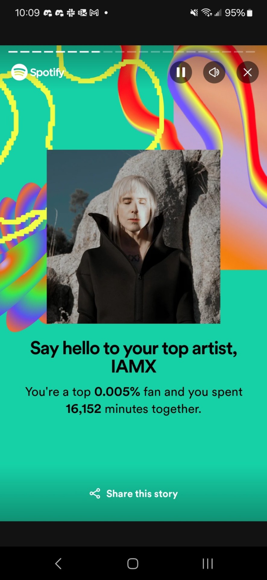
Top 0.005% of listeners. That's Pretty Damn Small. But I was wondering Just how small...
357.1k monthly listeners

0.005% of 357.1k is... just under 18...
Guys. I'm within the top 20 listeners for IAMX. Period. 🫣
#speculation nation#16K MINUTES OF MY 59K TOTAL MINUTES FOR THE YEAR...#A LITERAL 27% OF ***ALL*** MUSIC I LISTENED TO THIS YEAR........#cant help gettin emo i guess#like i knew he'd be indisputably my top artist but. holy fuck.#THIS ALSO ISNT INCLUDING THE SNEAKER PIMPS ALBUM... which ive listened to obsessively too#as an extension of the obsession with his music. bc he sings in it.#SOMETIMES AN ARTIST HITS U LIKE A FREIGHT TRAIN and ur left like. yeah. yeah .#helps that hes got so many albums so i spent Months slowly making my way through them all.#but then i just kept listening to him bc his music just... scratches an itch in my brain idk.#in part it's the grief. Metanoia was a crutch of an album after my uncle died.#and also with my cat... it was just. nonstop IAMX. for Months.#ive been branching out more again recently bc i do like some variety in the music i listen to#but if i want music but dont know what to play it just always ends up going back to IAMX#because it's dependable. it's enjoyable. it's Comfortable.#his music feels like a reset button for me. like returning to a dark room to sleep at night.#it's not dark for the sake of darkness. but for the comfort of it. existing honestly. existing without fear of judgement.#and bringing the analogy together i really have listened to his music to help me sleep a few times#not often just bc i usually dont listen to music as i sleep. im a light sleeper so i need white noise.#but there were a few times i found myself without a working fan. so i turned to his music to act as white noise instead.#not actual white noise of course. but the function of it. the Comfort. the familiarity.#pick one of his lowkey albums and just let it keep going. and it works. it does.#so like. it makes sense. it does. i understand entirely why i rank so high in his monthly listeners.#it's just a bit mind boggling to actually see the tangible numerical value hfkshdjd bc. man. man...
13 notes
·
View notes
Text
Living my best life eating the same food every single day here
#i'm not even joking#i mean i hate my life and everything rn#but i found one (1) vegan food at a supermarket and i eat it literally every single day ever since i first found it#found some vegetarian stuff as well which i sometimes also eat as well as cereal with my overpriced oat milk#but today i had a slice of pizza in addition to my beloved vegan wraps and i thought#'damn this could have been another vegan wrap :('#best stuff honestly#(it's the sauce. i wish they sold that sauce just as a regular product#i would buy all of it and ship it to germany so i can eat it every single day even after i get back home#tomorrow i get 2 wraps again instead of just one and something else#i cannot have variety in my diet#i need to eat this until i get so sick of it i need to find another food i can eat every single day#anyway so yeah#I'm in a bad mood all the time and hate everything but you can't say i don't have something to look forward to everyday#(i fear the day they don't have them in stock anymore#I'll breakdown crying in the supermarket)#void screams
4 notes
·
View notes
Text
Being one of the 3 people who aren't that wild about You're Losing Me is isolating
#adding some variety to the dash <3#also like everyone is like 'she sent so many signs' and quote lines from peace exile lavender haze#and im just.... sorry but sending signals via songwriting is the least effective way to communicate in a relationship#also the boundaries between fiction and reality in folkevermore are supposed to be unclear soo#like yes sometimes its possible to figure out something is wrong and you may have contributed to it without the person telling you#but sometimes you need to be straightforward and just tell them what's wrong#also while its a good song.... do i think its as good as atw mtr last kiss sad Beautiful tragic? no... not even close
4 notes
·
View notes
Note
Hiya honey girl!
How are you doing? ♥️
I feel gay today, and I don’t have anyone to vent to, so it’s gonna be you I’m afraid
I feel so gay, I spent half the day looking longingly in the distance, and *sighing* wishfully
Do you ever feel like that?
Last week I bought a red rose from a dude in the street and offered it to a beautiful lady singer in a bar, and even if I don’t particularly want to see her again, it still felt good to do something chivalrous and lesbiany you know?
I like living my life on my own, but some days I wish I could do those romantic things with somebody, like holding hands and cuddling, and walking along the river, and maybe kissing a little.
Even if I’m happy by myself, sometimes I still yearn for the day I’ll have my own lady to offer my roses to 🥺
inkaaaa hi hi <3
I'm doing pretty good, in drastic need of a weekend. almost there!
!!! gay vents are always welcome here! oh to look longingly into the distance whilst sighing wishfully...
do I ever feel like that YES absolutely in fact while pondering my response I did just that asjdfkl okay I might ramble in the tags but yeah completely relate to be happy with life on my own but sometimes wishing it wasn't just me yeah I'm definitely going to ramble in the tags
offering a beautiful lady a rose I'm 🥺🥺 sometimes you just have to indulge in chivalrous lesbiany actions this is unavoidable. manifesting this for you, I hope all your rose offering yearnings come true!
#this is so sweet and very relatable alksdfjs#only opting to ramble in the tags instead of the response bc I feel like this is going to get long lol you've been warned#but yeah. definitely do feel the happy by myself but sometimes wish I could be sharing that time with others#sometimes if i'm watching tv I'll wonder what new shows or movies I'd be watching if someone else was here#instead of the same eight shows I just watch on rotation all year (this is bc I like them btw. it's just hard to watch new shows#without external motivation to do so)#or when I'm working on the blanket that's been in progress almost two years. I wonder if I'd be making it in someone else's favorite colors#lot of little thoughts like this. some are fleeting and others I tend to get stuck on a bit or overthink#like breakfast for example. would I eat breakfast more consistently if I was also making it for someone else? what if they prefer to eat#the same thing every day? i need variety but I could make sure we always have their favorite fruit or put their cereal box out to make it#easier. or if getting the cereal out is part of their routine i can make sure their favorite bowl is always clean#i find myself wondering which of my mugs would be their favorite? which of theirs would be my favorite?#yeah i'm an acts of service person can you tell. also quality time... can you imagine the shared floor time conversations#a lot of the time I picture myself doing the exact same thing like watching tv and playing switch or practicing music or even working#the biggest different is just that someone else would also be here doing their own thing#to scroll tumblr in silence from the same couch... sending each other posts even though we're both right there. I do miss that#even chores would be more fun and go quicker I think. racing to see if they can do the dishes faster than I can fold and hang laundry#tidying and putting our things together in shared spaces. seeing them side by side just like we are#making the bed together and putting each of our stuffed animals on our own side#or maybe I'd just make it so they have one less thing to worry about#I think i've exposed myself enough alskdfj but there are quite literally hundreds more where those came from#anyway who wants to admit they have a crush on me (kidding) (ish)#asks#oops after posting this is looks like way more tags than I thought it would sorry anyone who made it this far
6 notes
·
View notes
Note
I would be very interested in hearing the museum design rant

by popular demand: Guy That Took One (1) Museum Studies Class Focused On Science Museums Rants About Art Museums. thank u for coming please have a seat
so. background. the concept of the "science museum" grew out of 1) the wunderkammer (cabinet of curiosities), also known as "hey check out all this weird cool shit i have", and 2) academic collections of natural history specimens (usually taxidermied) -- pre-photography these were super important for biological research (see also). early science museums usually grew out of university collections or bequests of some guy's Weird Shit Collection or both, and were focused on utility to researchers rather than educational value to the layperson (picture a room just, full of taxidermy birds with little labels on them and not a lot of curation outside that). eventually i guess they figured they could make more on admission by aiming for a mass audience? or maybe it was the cultural influence of all the world's fairs and shit (many of which also caused science museums to exist), which were aimed at a mass audience. or maybe it was because the research function became much more divorced from the museum function over time. i dunno. ANYWAY, science and technology museums nowadays have basically zero research function; the exhibits are designed more or less solely for educating the layperson (and very frequently the layperson is assumed to be a child, which does honestly irritate me, as an adult who likes to go to science museums). the collections are still there in case someone does need some DNA from one of the preserved bird skins, but items from the collections that are exhibited typically exist in service of the exhibit's conceptual message, rather than the other way around.
meanwhile at art museums they kind of haven't moved on from the "here is my pile of weird shit" paradigm, except it's "here is my pile of Fine Art". as far as i can tell, the thing that curators (and donors!) care about above all is The Collection. what artists are represented in The Collection? rich fucks derive personal prestige from donating their shit to The Collection. in big art museums usually something like 3-5% of the collection is ever on exhibit -- and sometimes they rotate stuff from the vault in and out, but let's be real, only a fraction of an art museum's square footage is temporary exhibits. they're not going to take the scream off display when it's like the only reason anyone who's not a giant nerd ever visits the norwegian national museum of art. most of the stuff in the vault just sits in the vault forever. like -- art museum curators, my dudes, do you think the general public gives a SINGLE FUCK what's in The Collection that isn't on display? no!! but i guarantee you it will never occur, ever, to an art museum curator that they could print-to-scale high-res images of artworks that are NOT in The Collection in order to contextualize the art in an exhibit, because items that are not in The Collection functionally do not exist to them. (and of course there's the deaccessioning discourse -- tumblr collectively has some level of awareness that repatriation is A Whole Kettle of Worms but even just garden-variety selling off parts of The Collection is a huge hairy fucking deal. check out deaccessioning and its discontents; it's a banger read if you're into This Kind Of Thing.)
with the contents of The Collection foregrounded like this, what you wind up with is art museum exhibits where the exhibit's message is kind of downstream of what shit you've got in the collection. often the message is just "here is some art from [century] [location]", or, if someone felt like doing a little exhibit design one fine morning, "here is some art from [century] [location] which is interesting for [reason]". the displays are SOOOOO bad by science museum standards -- if you're lucky you get a little explanatory placard in tiny font relating the art to an art movement or to its historical context or to the artist's career. if you're unlucky you get artist name, date, and medium. fucker most of the people who visit your museum know Jack Shit about art history why are you doing them dirty like this
(if you don't get it you're just not Cultured enough. fuck you, we're the art museum!)
i think i've talked about this before on this blog but the best-exhibited art exhibit i've ever been to was actually at the boston museum of science, in this traveling leonardo da vinci exhibit where they'd done a bunch of historical reconstructions of inventions out of his notebooks, and that was the main Thing, but also they had a whole little exhibit devoted to the mona lisa. obviously they didn't even have the real fucking mona lisa, but they went into a lot of detail on like -- here's some X-ray and UV photos of it, and here's how art experts interpret them. here's a (photo of a) contemporary study of the finished painting, which we've cleaned the yellowed varnish off of, so you can see what the colors looked like before the varnish yellowed. here's why we can't clean the varnish off the actual painting (da vinci used multiple varnish layers and thinned paints to translucency with varnish to create the illusion of depth, which means we now can't remove the yellowed varnish without stripping paint).
even if you don't go into that level of depth about every painting (and how could you? there absolutely wouldn't be space), you could at least talk a little about, like, pigment availability -- pigment availability is an INCREDIBLY useful lens for looking at historical paintings and, unbelievably, never once have i seen an art museum exhibit discuss it (and i've been to a lot of art museums). you know how medieval european religious paintings often have funky skin tones? THEY HADN'T INVENTED CADMIUM PIGMENTS YET. for red pigments you had like... red ochre (a muted earth-based pigment, like all ochres and umbers), vermilion (ESPENSIVE), alizarin crimson (aka madder -- this is one of my favorite reds, but it's cool-toned and NOT good for mixing most skintones), carmine/cochineal (ALSO ESPENSIVE, and purple-ish so you wouldn't want to use it for skintones anyway), red lead/minium (cheaper than vermilion), indian red/various other iron oxide reds, and apparently fucking realgar? sure. whatever. what the hell was i talking about.
oh yeah -- anyway, i'd kill for an art exhibit that's just, like, one or two oil paintings from each century for six centuries, with sample palettes of the pigments they used. but no! if an art museum curator has to put in any level of effort beyond writing up a little placard and maybe a room-level text block, they'll literally keel over and die. dude, every piece of art was made in a material context for a social purpose! it's completely deranged to divorce it from its material context and only mention the social purpose insofar as it matters to art history the field. for god's sake half the time the placard doesn't even tell you if the thing was a commission or not. there's a lot to be said about edo period woodblock prints and mass culture driven by the growing merchant class! the met has a fuckton of edo period prints; they could get a hell of an exhibit out of that!
or, tying back to an earlier thread -- the detroit institute of arts has got a solid like eight picasso paintings. when i went, they were kind of just... hanging out in a room. fuck it, let's make this an exhibit! picasso's an artist who pretty famously had Periods, right? why don't you group the paintings by period, and if you've only got one or two (or even zero!) from a particular period, pad it out with some decent life-size prints so i can compare them and get a better sense for the overarching similarities? and then arrange them all in a timeline, with little summaries of what each Period was ~about~? that'd teach me a hell of a lot more about picasso -- but you'd have to admit you don't have Every Cool Painting Ever in The Collection, which is illegalé.
also thinking about the mit museum temporary exhibit i saw briefly (sorry, i was only there for like 10 minutes because i arrived early for a meeting and didn't get a chance to go through it super thoroughly) of a bunch of ship technical drawings from the Hart nautical collection. if you handed this shit to an art museum curator they'd just stick it on the wall and tell you to stand around and look at it until you Understood. so anyway the mit museum had this enormous room-sized diorama of various hull shapes and how they sat in the water and their benefits and drawbacks, placed below the relevant technical drawings.
tbh i think the main problem is that art museum people and science museum people are completely different sets of people, trained in completely different curatorial traditions. it would not occur to an art museum curator to do anything like this because they're probably from the ~art world~ -- maybe they have experience working at an art gallery, or working as an art buyer for a rich collector, neither of which is in any way pedagogical. nobody thinks an exhibit of historical clothing should work like a clothing store but it's fine when it's art, i guess?
also the experience of going to an art museum is pretty user-hostile, i have to say. there's never enough benches, and if you want a backrest, fuck you. fuck you if going up stairs is painful; use our shitty elevator in the corner that we begrudgingly have for wheelchair accessibility, if you can find it. fuck you if you can't see very well, and need to be closer to the art. fuck you if you need to hydrate or eat food regularly; go to our stupid little overpriced cafeteria, and fuck you if we don't actually sell any food you can eat. (obviously you don't want someone accidentally spilling a smoothie on the art, but there's no reason you couldn't provide little Safe For Eating Rooms where people could just duck in and monch a protein bar, except that then you couldn't sell them a $30 salad at the cafe.) fuck you if you're overwhelmed by noise in echoing rooms with hard surfaces and a lot of people in them. fuck you if you are TOO SHORT and so our overhead illumination generates BRIGHT REFLECTIONS ON THE SHINY VARNISH. we're the art museum! we don't give a shit!!!
8K notes
·
View notes
Text
HOW TO GLAZE YOUR WORK WITHOUT A GOOD PC(or on mobile)/TIPS TO MAKE IT LESS VISIBLE
Glaze your work online on:
Cara app. It requires you to sign up but it is actually a good place for your portfolio. Glazing takes 3 minutes per image and doesn't require anything but an internet connection compared to 20-30 minutes if your pc doesn't have a good graphic card. There IS a daily limit of 9 pictures tho. Glazed art will be sent to you after it's done, by email. It took me 30 minutes to glaze 9 images on a default setting. Cara app is also a space SPECIFICALLY for human artists and the team does everything in their power to ensure it stays that way.
WebGlaze. This one is a little bit more complicated, as you will need to get approval from the Glaze team themselves, to ensure you're not another AI tech bro(which, go fuck yourself if you are). You can do it through their twitter, through the same Cara app(the easiest way) or send them an email(takes the longest). For more details read on their website.
Unfortunately there are no ways that I know of to use Nightshade YET, as it's quite new. Cara.app definitely works on implementing it into their posting system tho!
Now for the tips to make it less visible(the examples contain only nightshade's rendering, sorry for that!):
Heavy textures. My biggest tip by far. Noise, textured brushes or just an overlay layer, everything works well. Preferably, choose the ones that are "crispy" and aren't blurred. It won't really help to hide rough edges of glaze/nightshade if you blur it. You can use more traditional textures too, like watercolor, canvas, paper etc. Play with it.

Colour variety. Some brushes and settings allow you to change the colour you use just slightly with every stroke you make(colour jitter I believe?). If you dislike the process of it while drawing, you can clip a new layer to your colour art and just add it on top. Saves from the "rainbow-y" texture that glaze/nightshade overlays.
Gradients(in combination with textures work very well). Glaze/nightshade is more visible on low contrast/very light/very dark artworks. Try implementing a simple routine of adding more contrast to your art, even to the doodles. Just adding a neutral-coloured bg with a darker textured gradient already is going to look better than just plain, sterile digital colour.
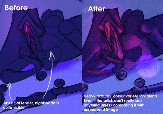
And finally, if you dislike how glaze did the job, just try to glaze/shade it again. Sometimes it's more visible, sometimes it's more subtle, it's just luck. Try again, compare, and choose the one you like the most. REMEMBER TO GLAZE/SHADE AFTER YOU MADE ALL THE CHANGES, NOT BEFORE!!
If you have any more info feel free to add to this post!!
7K notes
·
View notes
Last Seen Blogs


mouth-0ff
Mouth-Off

criceofpain
fate is in my hands.

girlshesravishing-blog
Antique Magic 💫
seathesee
mel