#colour shape square
Text
TOP 5 TWO-DIMENSIONAL SHAPES
(this is my own top 5 and is 100% subjective, i am not trying to offend anyone with my personal shape choices, i am aware that t his is a sensitive subject for people in the 2D shape fandom)
ALLLRIGHT ON 5th PLACE I HAVE THE CARDIOID!!!!!
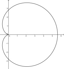
even tho this shape is only fifth place it is still rly good, its nicely shaped and smooth, the wiki page says it was studied a lot, and i agree this type of shape should be studied just ass much as any other shape.
ON 4TH PLACE IS THE RHOMBUS!!!!

BEAUTIFUL NAME AND BEAUTIFUL SHAPE, the name is so great i could just say rhombus every single moment of my life and stay happy. the plurals a Rhombi also
its a 4 sided shape with all 4 sides being the same length, just like a square.
3TH PLACE IS THE INTEGER TRIANGLE!!
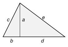
OUTOF ALLL the triangles the integer is my fav triangle of all time, all sides are.. integers, and it is perfect for doing some pythagoring in your free time!
FOR SECOND PLACE IT IS THE ONE THE ONLY
HEXAGON
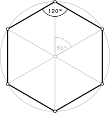
this is one of my more controversial picks, a lot of people in the shape fandom would have chosen hexagon as first place! but i think it is a great second, don't think i dislike the hexagon btw it is a great shape!! amazing repitition!! bee's know the deal. but it could never be as amazing as the amazing, the famous
SQUARE
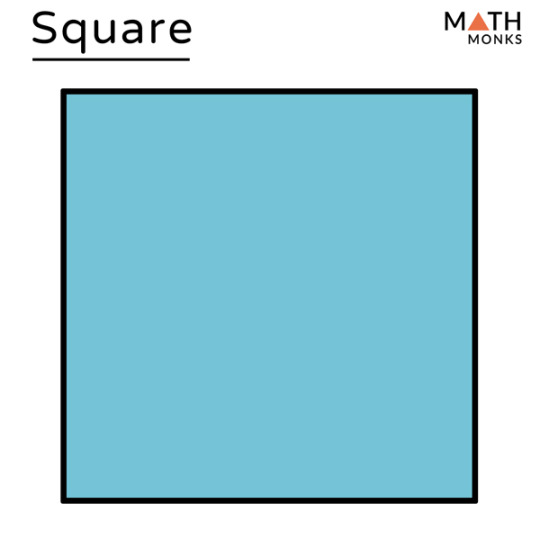
Y'ALL SHOULD KNOW IT
I AM A SQUARE LOVER, SQUARE'S ARE SLEAK PERFECT AND SINY, I'D SUCK THE DICK OF A SQUARE IF IT HAD ONE BUT IT DOESN'T CAUS ALL SIDES AND CORNERS ARE THE SAME!!!! AND THAT JUST MAKES ME WANT IT MORE
SQUARES ARE EVERYWHERE, LOOK AT TETRIS? ITS JUST FUCKING CUBES,LOOKAT MINECRAFT (i know its a 3d shape and made out of cubes but a cube is made out of squares so stfu)
AS A PIXEL ARTIST I HAVE TO SAY THAT THE SQUARE IS THE BEST SHAPE TO DRAW WITH, ITS PERFECT NOTHING CAN. BECHANGED, Y'ALL SQUARE HATERS CAN SHUT THE FUCK UP
#just shapes and beats#colour#colors#creatures#composition#texture#shapes and colors#geometric shapes#geometric#geometry#geomatics#cube#squares#mathematics#mathblr#calculus#graphs#math#pixel#pixel art#pixelart#pixel illustration#pixel artist#pixel scenery#pixel graphics#pixelated#aseprite#8bit
19 notes
·
View notes
Text

another revenge 🍂
edith, winnifred and peanut for @feline-wolf 💛
#2024#artfight#revenge#art#my art#other ppls ocs#deerstalker universe#edith#winnie#peanut#and with this one i've completed 6 attacks!#i was meant to just do a like#coloured square background - mb some lil shapes. but i thought this might b a bit nicer so i just went w it#there r some things i think i could have done better but i'm done now so swagever#this is also my first big points attack yippeeee#if i do any more attacks they will b smaller-scale now i think
9 notes
·
View notes
Text
Ok, ok. Twenty-six crochet sheep granny squares done. Ten to go. I can't wait to weave them all together into a blanket *nervous laughter*

*Proceeds to un-cramp her fingers now*
#i won't be able to even glimpse a sheep again in the foreseeable future after this is done#truth is i can only blame myself#i am determined to finish this for a present#but granny squares? with colour changes? and shapes? seriously? didn'T I LEARN ANYTHING FROM PAST EXPERIENCE *sobs in tendinitis*#personal nube#crochet#crocheters of tumblr
11 notes
·
View notes
Text
~30HRS LATER I FINALLY FINISHED MY FIRST BLACKWORK PROJECT!!!


My big 'design challenge' was to use every single hole, and not double up on edge lines! I'm pleased with how it came out & how much intuitive understanding I've gained from the process~
#I freehanded a couple of designs so that's what the wonk's about#but I'm pleased regardless#I've never done embroidery before and only have done two dollarama xstitch kits recently#so for my third attempt I'm very glad!! :D#fibre arts#my art#rainbow#colours#the circle was also freehanded by mirroring the first 1/4 done#hoping to do more like this since colourfilling in shapes is mentally satisfying#y'all can show me YOUR blackwork stuff in the reblogs too!! would love to follow other crafters~ 🤗#(and if anyone knows where to get a smaller square grid for planning the tile-friendly designs I would be v grateful)#blackwork embroidery
4 notes
·
View notes
Text
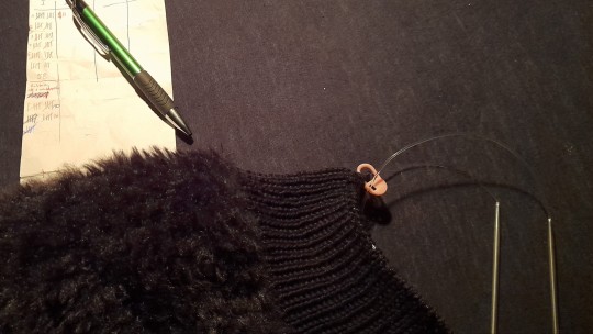
back at it again, knitting the night away 🧶
#still on legwarmer 1 out of 2 BUT nr. 1 is nearing completion!#only 35 more rows on this one and then i can continue the second one of the pair!#...and then start on the white pair 👀#and just like that i'll have decimated my ridiculously big yarn stash <3#after that i'll probably look up bat shape granny squares and make a big blanket for my bed out of all the scrap yarn#i have at least 1000 grams of black yarn and scraps of varying weight of all the colours of the rainbow#let's see how far i'll get!#i really hope alt knots has a bat shape granny square tutorial.... i'm not as well versed in crochet as i am in knitting
5 notes
·
View notes
Text
I should post more abt design/furniture/object/whatever visual things i like i have the most impecable, coolest taste imaginable
#that colourful squares post blew up#i dont feel like the og poster anymore it got so many notes its yalls post now. but i love my colourful squares.frvr n ever. it is my truth#will scream it till the day i die get them fuckign COLOURS n SHAPES baby. plain white walls fill me with sickening rage at its boringness
3 notes
·
View notes
Text

A bunch of Musical Shapes!
AKA had to doodle possibly every single protagonist/ player character that's a shape AND is from a music based/ rhythm game or just a game with really good music.
Every single character and their game, from top left to bottom right underneath the cut:
Red and yellow octahedron with cyan rings: Jumpie/ protagonist from JUMPGRID
White circle with diamond "ears": Player character from THOTH
Black cylinder: Player character from 140
Cyan square, orange circle, yellow triangle and green pentagon: Players from Just Shapes and Beats
Pink square with three smaller white squares behind it: Nanobot from Project Arrhythmia
Pinkish red triangle: "Player" from Super Hexagon
Magenta cube: Player from Vectronom
White circle with purple and white rounded triangles: Player from Rhythmy
#OCTAfan says stuff#My art#just shapes and beats#Jsab#jsab pentagon#jsab square#jsab triangle#jsab circle#project arrhythmia#Rhythmy game#Rhythmy#JUMPGRID#JUMPGRID game#Thoth game#Thoth#140 game#Super hexagon#Vectronom#Tw eyestrain#Tw bright colours
14 notes
·
View notes
Photo

I title this “wanted to draw something basic and red” so here you go
#zkretchy#art#ocs#dissappointed w/ myself for not just postinga red square#also disappointed with not doing that but tagging it as such so y'all w/ slow or no net can get got#weirdly proud of the ear and mouth here#idk i like their shapes#and love this particular shade of red#which is also my bed-wall colour btw#anyhow have fun this night and so on~
4 notes
·
View notes
Text
Sorting and matching things hits my brain like you wouldn’t believe. I get the colours lined up and I’m out of my mind.
#Tetris also hits like this#Woag the colours and shapes#autism#actually autistic#there’s a mobile game called I love hue#where you match up the little coloured squares#god it’s so nice#sort sort sort I love to arbitrarily sort
5 notes
·
View notes
Text
i know exactly what all three of them look like i can see them in my mind theyre so real. but i cannot draw that good to be able to get it right
#chirps#coopers a big guy. tall and broad fat but like strong muscle-y fat. u know#square face also kind of chubby but not in the looks young way. his hair is kind of greasy and dirty blonde/light brown and unevenly cut#he does it himself. hes got a thin mouth that turns down in the corners it always looks like hes pressing his lips together. bit of stubble#butnot too much. wide nose with a straight bridge. hooded eyes that are kind of small + almond shaped. not sure what colour. grey maybe#erm what else.... normal eyebrows kind of thick but not bushy. hes in his mid 30s andis starting to get some stress lines on his forhead#mainly from frowning 24/7#hes white. farmers tan he generally stays pretty covered up wears cargo pants and a big thick jacket#steel toed boots and the like stuff to keep him protected#hes strong and has pretty toned arms and big hands thick fingers a lot of calluses#broad shoulders. thick torso but not much of a gut. tree trunks of fucking legs you couldnt knock this guy over with a bulldozer#he has a scar on his chest frmo heart surgery he had when he was young but other than that not many big scars#do i need to keep going can you just imagine him with me. already.#my ocs#<- saving for my own reference in case i forget what he looks like (i wont)
3 notes
·
View notes
Text
my raads-r score goes up proportionally to the time i spend on the wikipedia article for planigons
#if you like shapes and colours and organizing things and a little bit of math then boy do i have the wikipedia article for you#i’m making planigon granny “squares” rn in on version 2.0 of the design and im using it as practice to make#pentagonal tiling granny squares because pentagonal tiling is also beautiful and fun#eve.txt#you want to look at the wikipedia article for planigons you want to look the wikipedia article for planigons soooooo badly
0 notes
Text
so turns out my newfound appreciation of hue jitter on brushes comes with a newfound need to name my custom brushes because i keep accidentally selecting the versions of brushes i made with hue jitter and then feeling like im losing my mind when the colours just dont come out correctly
#re: the projectTM#ok but genuinely hue jitter is my new best friend#like its really good for drawing things that are meant to be colourful#like those space backgrounds that i draw *so bloody often*.#i used to have to throw the shades of blue and purple on one by one like individually now i just chose a blue and set some hue jitter#but also just like. its a really good low effort way of making a background look more interesting than it actually is#hue jitter + some funky texture = your flat colour background is now no longer a flat colour background#this and discovering i can make new stamp brushes pretty easily by drawing a shape on a square canvas#and setting it as the shape on a new brush are like#the two biggest time saving tricks ive found for this project#thats why i do fuckin. stupidly massive projects like these!#my one redeeming quality when it comes to art is figuring out stupid little shortcuts like this is why i say im very quantity over quality#i cant paint or render for shit but ask me to crank out 30odd full drawings that flash by fast enough that the details dont matter?#yeah im pretty confident i can do that
0 notes
Text
ᴠᴇɴᴜꜱ ꜱɪɢɴꜱ ᴀɴᴅ ᴛʜᴇɪʀ ʙᴇᴀᴜᴛʏ
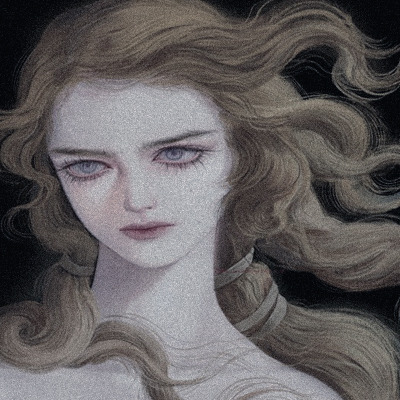


i have one last spot for a chart reading you could [venus persona chart and feminine archetype reading is also available]
follow for more content!

ARIES VENUS

MADISON BEER, RIHANNA AND EVA LONGORIA
♇ literally diamond heads, arched eyebrows and full lips. aries venus women are likely to have cupid bows and very pink lips with amazing smiles. i noted many of them have almond eye shapes , square/sharp jaws and a long face that is finely proportioned with amazing cheek bones.
♇ they are also known for their sense of style, specifically rihanna and eva, eva when it comes to her outfits as gabi from desperate housewives is always talked about. they usually have a slim build that is toned as well.
♇ they usually have nice noses, buttoned noses and most of them have a nice nose bridged, ones that are usually sought out for in the cosmetic industry. they wear clothes, clothes dont wear them! aim for bold colours like red and black, but dont be afraid to be more colourful.
♇ they remind me of the animal lynx, because their facial features are very lifted. they usually are the beauty standard and are likely to start fashion/make-up trends. very sexually appealing and have a flirtatious but fierce look to them, its like they're challenging people to come forward to them.
extra - marilyn monroe
TAURUS VENUS

ARIANA GRANDE, SUNDAY KALOGERAS AND JESSICA ALBA
♱ very doe eyes beauty, square jaws like the sign before them, but they're likely women who have a shorter face compared to aries venuses. they have a more rounder face and they're likely to have straighter eyebrows and an upper lip which is bigger than the lower lip.
♱ look excellent in light clothing and brown. do well with curly hair, and have an innocent/adolescent look to them. they normally look frail and have slender necks that sometimes make them look tall when they're taking up close pictures.
♱ they're the epitome of having a deer face, they also have features that are upturned, but i've noted a lot of taurus venuses usually do get cosmetic surgery. they're considered as adorable to many people, so sometimes they have a hard time feeling sexy because other people see otherwise.
♱ they also tend to have high/cute voices. another indicator to why people might not take them seriously when they try to come off as sexually appealing or annoyed in general.
extra - princess diana
GEMINI VENUS

GISELE BUNDCHEN, STUNNA GIRL AND MARGOT ROBBIE
♇ have a very high face, wide smiles, and long face structure, very sharp and darty eyes and always looks like they're up to something or are about to say a joke. they look like foxes [not in a bad way].
♇ they look good in clothing styles that are considered "corporate", like school clothing, "office" siren clothing. either way, as gemini is a mutable sign and the most adaptable. they can dress themselves in a very versatile way and still look good. but most of the time clothing that are too tight for them can be unflattering.
♇ they usually have a square face, high cheek bones and a long nose. if they do too much cosmetic surgery they look very unflattering. [specifically for them], they look nice with very contrasting hair colours, like they can look good in very dark hair or look good in very light hair.
♇ gemini venus women usually have nice shoulders and nice hands, and look good in outfits that is considered "opposite" to them, as gemini represents the twins in astrology. and when it comes to hairstyles, middle partings look nice on them.
extra - megan fox
CANCER VENUS

ZENDAYA, ANGELINA JOLIE AND HALLE BERRY
♱ very pretty women, amazing side profiles, look good in both straight and arched eyebrows. they tend to have medium length faces but the width of their faces tend to be wide. sparkling eyes, especially due to their venus being moon ruled, sometimes it always looks like they're about to cry.
♱ soft smiles and pearly teeth. look excellent when paired with jewellery, and have pretty necks. usually they give the vibe of being average height. usually do have thick eyelashes, even if its not long, they're usually thick or you can say full. their noses usually point down or have a flick to them.
♱ they tend to look really nice with their hair down, especially because they look like mermaids. they have that "i just got out of the water" look to them. and they usually have a lot of baby hairs.
♱ cancer venus women can easily rock the messy hair look, as cancer is one of the signs that rules the bed, sleep and night. they look really nice with pixie cuts or side-parts. they can stare really hard though.
extra - adriana lima
LEO VENUS

PAMELA ANDERSON, ARIANA GREENBLATT AND MONICA BELLUCCI
♇ like those with cancer venuses, leo venus women have amazing side profiles, and can can look good with both thin and thick eyebrows. their eyebrows are normally arched, but they can also be lowly arched which gives them a more feline look, a lioness appereance.
♇ they usually have medium sized heads, with square jaws and pointy chins, and they are women who look good in messy hair, or hair that is curly. straight hair can look good on them but it can sometimes make them look flat, so big or curled hair [along with hair that is tied up that shows their facial structure more] goes well for them.
♇ puffy lips, and when it comes to make-up, they look really good with ombre colours. strong necks and defined collar bones, and they usually have a distinct point on their noise, like the lion nose.
♇ though besides from lions, leo venuses look like kittens in general, even though its the same family, i feel like the venus in specifically in leo women have a more baby faced feline look to them, one that makes them look youthful, they could also have a round head shape, given them a heart-shape as the jaw is sharper than the rest.
extra - lindsay lohan
VIRGO VENUS

KYLIE JENNER, MEGHAN MARKLE AND BELLA HADID
♱ they usually have a long mid face and structure noses, most of them tend to get procedures done to fit into the market/stereotype of what beauty is supposed to be. their jaw usually tends to be soft and then chin sharp, aside from meghan markle.
♱ their eyebrows tend to be pointed and their lower lip tends to be heavier than their upper lip. broad forehead and wide lips, defined cheek bones or they usually define their cheek bones with their make up, specifically blush.
♱ virgo venus women usually look like elves, and their ears are usually defined as well. slender necks and earthy look [specifically due to virgo being an earth sign], are usually women who look very sophisticated. sometimes have the appearance that they just ran through the woods, [can connect to demeter searching for persephone].
♱ women with virgo venuses normally do have pointed eyes, or eyes that are upturned, and the lower whites of their eyes have spaces to them which sometimes make them look like they have sanpaku eyes. they also look amazing with darker hair and with their locks being down.
extra - sophia loren
LIBRA VENUS

JADA PINKETT SMITH, HILLARY DUFF AND CIARA
♇ normally have long faces, or a long nose bridge that makes them look like they have a long face. nice smiles and apple cheeks, a sharp face structure which is a contrast to how libra placements usually look, as they tend to appear more circular, but the libra being in venus gives them a more structured look.
♇ pearly teeth, and sometimes they could even have small teeth. soft eyebrows but full ones. and sometimes they have a surprised look on their faces. defined adams apple and collar bone. sqaure chins and most of them have brownish/hazel eyes.
♇ dewy/glowy skin, the juno/hera impact gives them that, and sometimes they have a lighter under tone. they have sharp eyes that sometimes make them come across as if they're squinting all the time
♇ have hard stares, sometimes they look like they're piercing through your soul, it gives them that cheetah look. like judgement, [the hera impact again]. libra venus women usually have smaller lips, even thought it could still be full, they can still be smaller.
extra - beyonce
SCORPIO VENUS

CARDI B, ANNE HATHEWAY AND DOJA CAT
♱ surprisingly, most of the ones i've seen and researched upon have circular faces, but their faces are long and their cheekbones are strong and defined, and it comes out a lot when they smile.
♱ like the sign they share mars with in traditional astrology, aries venus, a lot of scorpio venuses have strong cupid bows. look really nice when they outline their lips with a brown lip liner, brown and pink combo goes really well with them.
♱ stunning with dark hair, blonde her brightens them a lot, and looks fine on them, but they can also experiment with many hair colours. dark and darty eyes, long nose bridge and most of them usually get cosmetic surgery, as both their modern and traditional ruler indicates cosmetic surgery, there's a stronger indicator when there's much libra energy, as libra is the main sign that governs over cosmetic beauty.
♱ they have a long facial structure, and look really nice with their hair down or up. particularly in a messy updo. they have this dove look, it is normally because of their distinctive or thin nose bridge and their lips being in a lower power of their face. but i think their features are well proportioned.
extra - dakota johnson
SAGITTARIUS VENUS

CHRISTINA AUGELIRA, ALEXA DEMIE AND BILLIE EILISH
♇ have a bigger than life energy, thick/full eyebrows and a long nose bridge. these women usually had a defined nose bridge with a buttoned nose and a very straight hairline that gives them a square head shape. apple cheeks that are prominent and brilliant smiles.
♇ very sultry and inviting eyes, and sometimes it could be piercing. they normally have big foreheads and square jaws and pointy chins. their face features are well spread, and they regularly have straight eyebrows and its low and close to their eyes that sometimes gives them a rough look.
♇ they go well with clothings that are big for them, a big example being billie, but sometimes they might be considered as cultural appropriators, specifically christina and billie.
♇ sagittarius venuses usually have that bohemian look, they look good in both white and black clothing, but also very colourful clothing. like their sister sign, gemini venus. sagittarius venus women are very versatile with their clothing and tend to look like fallen angels.
extra - kendall jenner.
CAPRICORN VENUS

MEGAN THEE STALLION, CINDY CRAWFORD AND TYRA BANKS
♱ evidently, have the model look to them, have a lean or good body figure, and are usually tall. have nice legs and look really good with messy hair, hair that is also layered.
♱ they have boxy jaws and look good in many hair colours, but the hair colours i think suit them the most is black, brown and blonde, as you can see with the women i've put above. they tend to have a shorter faces, or a forehead that could be considered small.
♱ high cheek bones and arched eyebrows. make-up that makes them look like they're glowing pairs well for them. and a classy femme fatale look is an essence they usually display and embody.
♱ capricorn venus women are prone to have very warm eyes, and the tip of their noses are usually distinct, like having a bulbous nose or an upturned one. brown lipped make-up is aesthetically pleasing for them. even though they could be considered as femme fatales, there's still a teddy bear appearance these women have to themselves.
extra - olivia rodrigo
AQUARIUS VENUS

PARIS HILTON, SHARON TATE AND SADE
♇ they look like fairies to me, they have a bigger lower lip compared to their upper lip, and normally the tip of their nose is down turned. and have the type of eyes where it looks like you're looking into their souls.
♇ slender necks and glossy hair and the size of their forehead is regularly large, it gets them more of that other-worldly look. big eyes that usually makes them look sad or makes them look like they can tell a thousand stories.
♇ aquarius venus women [if they dont have strong moon or saturn in their chart], they have very soft cheek bones that gives them a youthful image and a youthful glow. they give more of a cute or refined appearance, and are the type to look nice with shorter hair.
♇ because of their fairy like features, they look very frail and delicate, as if they're brittle glass. aquarius venus women age very well too, particularly with the saturnian influence in their chart.
extra - elizabeth olsen
PISCES VENUS

LILY COLLINS, ELLE FANNING AND ROSE HUNTINGON WHITLEY
♱ i dont mean this in a mean way, but pisces venus women look like adorable cows, i've said this before in the ascendant and their beauty post about pisces ascendant women, but it is likely because their eyebrows are very low down their foreheads and they normally tend to have full, thin and straight eyebrows that gives them that cow look.
♱ but they dont only look like cute baby cows, they also have this baby doll, particularly because their features a prone to be in the middle, [or you can say having a heavy mid face].
♱ they also look good in hair styles that cover their face, [chiefly the side of their faces]. middle parts suit them really well, [and side parts, chiefly if they're going for a classy look, for example, lily collins when she did the audrey hepburn photoshoot].
♱ like aquarius venuses, pisces venus women usually look very slender and delicate. and layered hair compliments them, it captures their face frame well, gives their faces a more lean look as most of their face shapes are square and they have very strong jaws. most hairstyles with their hair down look good on them.
extra - quenlin blackwell


masterlist
#d4rkpluto#aries venus#madison beer#rihanna#eva longoria#taurus venus#sunday kalogeras#ariana grande#jessica alba#gisele bundchen#stunna girl#margot robbie#gemini venus#cancer venus#zendaya#angelina jolie#halle berry#leo venus#pamela anderson#ariana greenblatt#monica bellucci#virgo venus#kylie jenner#meghan markle#bella hadid#libra venus#astrology notes#astrology observations
1K notes
·
View notes
Text
honeys guide to fall⋆.ೃ࿔*:・🧸💕

i am so so excited for fall 2024. this fall we're serving bambi doll, cupcake and espresso scented, french tips and nudes, crispy chocolate croissants and coffees, sweaters and mini skirts…💬🎀


FALL BEAUTY ;
♡ soft bouncy curls
♡ nude lip combos
i recommend the nyx butter gloss (madeleine) and the nyx chocolate lip liner for a pretty chocolaty look. if ur looking for another nude lip combo use the nyx butter gloss (angel food cake) and the nyx club hopper lip liner…💬🎀
♡ french tips
♡ nude colored manicures and pedicures


♡ marshmallow scented hand creams
as the weather gets colder it becomes more and more important to keep ur skin moisturized and hydrated. carrying around a sweet smelling hand cream can help your hands to stay soft and not dry…💬🎀
♡ fall scented lip balms, body nectars and fragrances
pumpkin, coffee, vanilla, cupcake, chocolate, cinnamon, caramel and buttercream scents are giving fall…💬🎀
lets talk fall beauty products and scents because my favorite part about literally everything is the pampering aspect and the smelling super yummy so lets get into it. the body products i recommend to capture that fall, bambi eyed, doll scent and vibes are.
the sugar cookie body wash from native
ooey gooey cookie body wash from philosophy
chocolate chip body wash from philosophy
all the cozy fireside s’more scents from bodycology
coco coffee body scrub from victorias secret pink
cupcake swirl body fragrance from bodycology
♡ for nails, tapered square french tips or oval shaped nails in nude colors
♡ claw clip hairstyles including half up-half downs or just a classic claw clip pony
FALL FASHION ;
fall fashion to me is tights and mini skirts. leg warmers and uggs and form fitting sweaters. let’s talk about some fall fashion. the tights and mini skirt combo is a classic and it’s an amazing way to incorporate wearing mini skirts even as the weather begins to get a little colder. the tights add a nice touch, even if it isn’t the color of ur skin tone, tights IN GENERAL look rly nice.


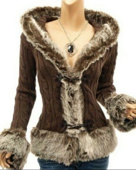
ankle boots, ugg boots, BOOTS are so so fall. i rly love ankle boots that have a heel to them and bonus points if ur fall shoes include fur. the fall shoes on my shopping list are ->
ugg boots
ankle boots
mary jane style shoes
ballet flats
form fitting sweaters and jackets are so in for the fall. along with tracksuits. the color pallete for having a bambi doll fall are very much browns, cashmeres, and baby pink. honestly think of neapolitan colours. pink, brown and an off-whitish almost pastel yellow. think PASTRY PRINCESS.
baby phat puffers are perfect for the transition from fall to winter and a good pair of jeans is CRUCIAL for fall. another thing i wanna talk about with fall fashion is LAYERING. layering is such an important aspect of fashion period but ESPECIALLY fall fashion. experiment with different lengths, textures etc. one of my favorite layering combination during the fall is ->


long sleeve tops with a camisole underneath
a form fitting long sleeve top (the ones with buttons at the front) look so DOLLY and adorable when u dont button it, and wear a camisole underneath. its just MWAH. some more fall fashion details also include ->
fur details
ribbons and lace details
delicate jewelry choices
tights and leg warmers
layering
boots
neopolitan cinnamon princess color scheme
long sleeves
mini skirts + tights combo
HOW TO BE A HOTTIE DURING FALL ;
to be a hottie during the fall lets talk about our fall essentials to be our hottest, healthiest and happiest selves this fall…💬🎀
♡ warm milk and honey with a pinch of cinnamon (a real treat)
♡ warm, buttery croissants
♡ wired headphones and a good fall playlist
a good fall playlist consists of artists like lana del rey, pink pantheress, sabrina carpenter and sade…💬🎀
♡ candles that smell like cinnamon cupcakes


♡ a few juicy novels to read
my favorite genres of books to read during this season include mystery, romance and historical fiction…💬🎀
♡ keep up with ur health
during the colder seasons its important to take good care of ur health so make sure that ur taking ur supplements/vitamins, drinking herbal teas and eating a balanced diet to avoid getting sick…💬🎀
#honeytonedhottie⭐️#it girl#becoming that girl#that girl#it girl energy#autumn#seasons#hottie fall#hottie habits#beauty#beauty regimen#beauty tips#fashion tips#fashion journal#fashion#hyper femininity#hyper feminine#girly#girl tips#dream girl#dream life#dream girl tips#dreamy#music recommendations#pastry princess#glamorous#glamor#fabulously feminine#fabulous#back to school
933 notes
·
View notes
Text
Fantasy Guide to Interiors
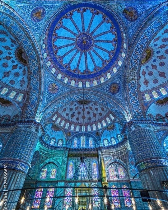
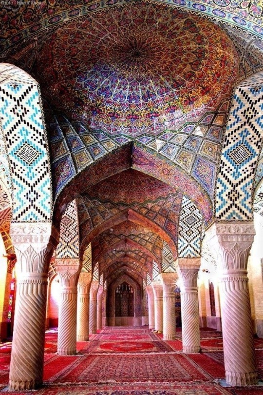
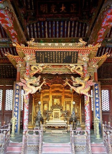
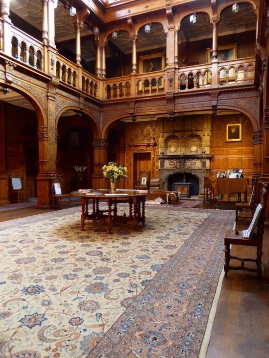
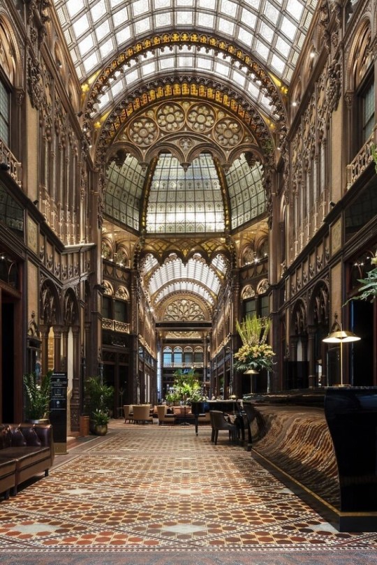
As a followup to the very popular post on architecture, I decided to add onto it by exploring the interior of each movement and the different design techniques and tastes of each era. This post at be helpful for historical fiction, fantasy or just a long read when you're bored.
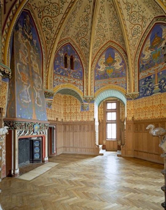
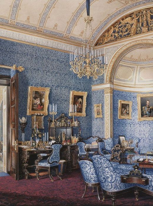
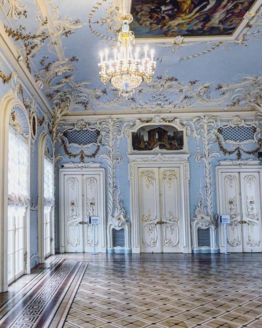
Interior Design Terms
Reeding and fluting: Fluting is a technique that consists a continuous pattern of concave grooves in a flat surface across a surface. Reeding is it's opposite.
Embossing: stamping, carving or moulding a symbol to make it stand out on a surface.
Paneling: Panels of carved wood or fabric a fixed to a wall in a continuous pattern.
Gilding: the use of gold to highlight features.
Glazed Tile: Ceramic or porcelain tiles coated with liquid coloured glass or enamel.
Column: A column is a pillar of stone or wood built to support a ceiling. We will see more of columns later on.
Bay Window: The Bay Window is a window projecting outward from a building.
Frescos: A design element of painting images upon wet plaster.
Mosaic: Mosaics are a design element that involves using pieces of coloured glass and fitted them together upon the floor or wall to form images.
Mouldings: ornate strips of carved wood along the top of a wall.
Wainscoting: paneling along the lower portion of a wall.
Chinoiserie: A European take on East Asian art. Usually seen in wallpaper.
Clerestory: A series of eye-level windows.
Sconces: A light fixture supported on a wall.
Niche: A sunken area within a wall.
Monochromatic: Focusing on a single colour within a scheme.
Ceiling rose: A moulding fashioned on the ceiling in the shape of a rose usually supporting a light fixture.
Baluster: the vertical bars of a railing.
Façade: front portion of a building
Lintel: Top of a door or window.
Portico: a covered structure over a door supported by columns
Eaves: the part of the roof overhanging from the building
Skirting: border around lower length of a wall
Ancient Greece
Houses were made of either sun-dried clay bricks or stone which were painted when they dried. Ground floors were decorated with coloured stones and tiles called Mosaics. Upper level floors were made from wood. Homes were furnished with tapestries and furniture, and in grand homes statues and grand altars would be found. Furniture was very skillfully crafted in Ancient Greece, much attention was paid to the carving and decoration of such things. Of course, Ancient Greece is ancient so I won't be going through all the movements but I will talk a little about columns.
Doric: Doric is the oldest of the orders and some argue it is the simplest. The columns of this style are set close together, without bases and carved with concave curves called flutes. The capitals (the top of the column) are plain often built with a curve at the base called an echinus and are topped by a square at the apex called an abacus. The entablature is marked by frieze of vertical channels/triglyphs. In between the channels would be detail of carved marble. The Parthenon in Athens is your best example of Doric architecture.
Ionic: The Ionic style was used for smaller buildings and the interiors. The columns had twin volutes, scroll-like designs on its capital. Between these scrolls, there was a carved curve known as an egg and in this style the entablature is much narrower and the frieze is thick with carvings. The example of Ionic Architecture is the Temple to Athena Nike at the Athens Acropolis.
Corinthian: The Corinthian style has some similarities with the Ionic order, the bases, entablature and columns almost the same but the capital is more ornate its base, column, and entablature, but its capital is far more ornate, commonly carved with depictions of acanthus leaves. The style was more slender than the others on this list, used less for bearing weight but more for decoration. Corinthian style can be found along the top levels of the Colosseum in Rome.
Tuscan: The Tuscan order shares much with the Doric order, but the columns are un-fluted and smooth. The entablature is far simpler, formed without triglyphs or guttae. The columns are capped with round capitals.
Composite: This style is mixed. It features the volutes of the Ionic order and the capitals of the Corinthian order. The volutes are larger in these columns and often more ornate. The column's capital is rather plain. for the capital, with no consistent differences to that above or below the capital.
Ancient Rome
Rome is well known for its outward architectural styles. However the Romans did know how to add that rizz to the interior. Ceilings were either vaulted or made from exploded beams that could be painted. The Romans were big into design. Moasics were a common interior sight, the use of little pieces of coloured glass or stone to create a larger image. Frescoes were used to add colour to the home, depicting mythical figures and beasts and also different textures such as stonework or brick. The Romans loved their furniture. Dining tables were low and the Romans ate on couches. Weaving was a popular pastime so there would be tapestries and wall hangings in the house. Rich households could even afford to import fine rugs from across the Empire. Glass was also a feature in Roman interior but windows were usually not paned as large panes were hard to make. Doors were usually treated with panels that were carved or in lain with bronze.
Ancient Egypt
Egypt was one of the first great civilisations, known for its immense and grand structures. Wealthy Egyptians had grand homes. The walls were painted or plastered usually with bright colours and hues. The Egyptians are cool because they mapped out their buildings in such a way to adhere to astrological movements meaning on special days if the calendar the temple or monuments were in the right place always. The columns of Egyptian where thicker, more bulbous and often had capitals shaped like bundles of papyrus reeds. Woven mats and tapestries were popular decor. Motifs from the river such as palms, papyrus and reeds were popular symbols used.
Ancient Africa
African Architecture is a very mixed bag and more structurally different and impressive than Hollywood would have you believe. Far beyond the common depictions of primitive buildings, the African nations were among the giants of their time in architecture, no style quite the same as the last but just as breathtaking.
Rwandan Architecture: The Rwandans commonly built of hardened clay with thatched roofs of dried grass or reeds. Mats of woven reeds carpeted the floors of royal abodes. These residences folded about a large public area known as a karubanda and were often so large that they became almost like a maze, connecting different chambers/huts of all kinds of uses be they residential or for other purposes.
Ashanti Architecture: The Ashanti style can be found in present day Ghana. The style incorporates walls of plaster formed of mud and designed with bright paint and buildings with a courtyard at the heart, not unlike another examples on this post. The Ashanti also formed their buildings of the favourite method of wattle and daub.
Nubian Architecture: Nubia, in modern day Ethiopia, was home to the Nubians who were one of the world's most impressive architects at the beginning of the architecture world and probably would be more talked about if it weren't for the Egyptians building monuments only up the road. The Nubians were famous for building the speos, tall tower-like spires carved of stone. The Nubians used a variety of materials and skills to build, for example wattle and daub and mudbrick. The Kingdom of Kush, the people who took over the Nubian Empire was a fan of Egyptian works even if they didn't like them very much. The Kushites began building pyramid-like structures such at the sight of Gebel Barkal
Japanese Interiors
Japenese interior design rests upon 7 principles. Kanso (簡素)- Simplicity, Fukinsei (不均整)- Asymmetry, Shizen (自然)- Natural, Shibumi (渋味) – Simple beauty, Yugen (幽玄)- subtle grace, Datsuzoku (脱俗) – freedom from habitual behaviour, Seijaku (静寂)- tranquillity.
Common features of Japanese Interior Design:
Shoji walls: these are the screens you think of when you think of the traditional Japanese homes. They are made of wooden frames, rice paper and used to partition
Tatami: Tatami mats are used within Japanese households to blanket the floors. They were made of rice straw and rush straw, laid down to cushion the floor.
Genkan: The Genkan was a sunken space between the front door and the rest of the house. This area is meant to separate the home from the outside and is where shoes are discarded before entering.
Japanese furniture: often lowest, close to the ground. These include tables and chairs but often tanked are replaced by zabuton, large cushions. Furniture is usually carved of wood in a minimalist design.
Nature: As both the Shinto and Buddhist beliefs are great influences upon architecture, there is a strong presence of nature with the architecture. Wood is used for this reason and natural light is prevalent with in the home. The orientation is meant to reflect the best view of the world.
Islamic World Interior
The Islamic world has one of the most beautiful and impressive interior design styles across the world. Colour and detail are absolute staples in the movement. Windows are usually not paned with glass but covered in ornate lattices known as jali. The jali give ventilation, light and privacy to the home. Islamic Interiors are ornate and colourful, using coloured ceramic tiles. The upper parts of walls and ceilings are usually flat decorated with arabesques (foliate ornamentation), while the lower wall areas were usually tiled. Features such as honeycombed ceilings, horseshoe arches, stalactite-fringed arches and stalactite vaults (Muqarnas) are prevalent among many famous Islamic buildings such as the Alhambra and the Blue Mosque.
Byzantine (330/395–1453 A. D)
The Byzantine Empire or Eastern Roman Empire was where eat met west, leading to a melting pot of different interior designs based on early Christian styles and Persian influences. Mosaics are probably what you think of when you think of the Byzantine Empire. Ivory was also a popular feature in the Interiors, with carved ivory or the use of it in inlay. The use of gold as a decorative feature usually by way of repoussé (decorating metals by hammering in the design from the backside of the metal). Fabrics from Persia, heavily embroidered and intricately woven along with silks from afar a field as China, would also be used to upholster furniture or be used as wall hangings. The Byzantines favoured natural light, usually from the use of copolas.
Indian Interiors
India is of course, the font of all intricate designs. India's history is sectioned into many eras but we will focus on a few to give you an idea of prevalent techniques and tastes.
The Gupta Empire (320 – 650 CE): The Gupta era was a time of stone carving. As impressive as the outside of these buildings are, the Interiors are just as amazing. Gupta era buildings featured many details such as ogee (circular or horseshoe arch), gavaksha/chandrashala (the motif centred these arches), ashlar masonry (built of squared stone blocks) with ceilings of plain, flat slabs of stone.
Delhi Sultanate (1206–1526): Another period of beautifully carved stone. The Delhi sultanate had influence from the Islamic world, with heavy uses of mosaics, brackets, intricate mouldings, columns and and hypostyle halls.
Mughal Empire (1526–1857): Stonework was also important on the Mughal Empire. Intricately carved stonework was seen in the pillars, low relief panels depicting nature images and jalis (marble screens). Stonework was also decorated in a stye known as pietra dura/parchin kari with inscriptions and geometric designs using colored stones to create images. Tilework was also popular during this period. Moasic tiles were cut and fitted together to create larger patters while cuerda seca tiles were coloured tiles outlined with black.
Chinese Interiors
Common features of Chinese Interiors
Use of Colours: Colour in Chinese Interior is usually vibrant and bold. Red and Black are are traditional colours, meant to bring luck, happiness, power, knowledge and stability to the household.
Latticework: Lattices are a staple in Chinese interiors most often seen on shutters, screens, doors of cabinets snf even traditional beds.
Lacquer: Multiple coats of lacquer are applied to furniture or cabinets (now walls) and then carved. The skill is called Diaoqi (雕漆).
Decorative Screens: Screens are used to partition off part of a room. They are usually of carved wood, pained with very intricate murals.
Shrines: Spaces were reserved on the home to honour ancestors, usually consisting of an altar where offerings could be made.
Of course, Chinese Interiors are not all the same through the different eras. While some details and techniques were interchangeable through different dynasties, usually a dynasty had a notable style or deviation. These aren't all the dynasties of course but a few interesting examples.
Song Dynasty (960–1279): The Song Dynasty is known for its stonework. Sculpture was an important part of Song Dynasty interior. It was in this period than brick and stone work became the most used material. The Song Dynasty was also known for its very intricate attention to detail, paintings, and used tiles.
Ming Dynasty(1368–1644): Ceilings were adorned with cloisons usually featuring yellow reed work. The floors would be of flagstones usually of deep tones, mostly black. The Ming Dynasty favoured richly coloured silk hangings, tapestries and furnishings. Furniture was usually carved of darker woods, arrayed in a certain way to bring peace to the dwelling.
Han Dynasty (206 BC-220 AD): Interior walls were plastered and painted to show important figures and scenes. Lacquer, though it was discovered earlier, came into greater prominence with better skill in this era.
Tang Dynasty (618–907) : The colour palette is restrained, reserved. But the Tang dynasty is not without it's beauty. Earthenware reached it's peak in this era, many homes would display fine examples as well. The Tang dynasty is famous for its upturned eaves, the ceilings supported by timber columns mounted with metal or stone bases. Glazed tiles were popular in this era, either a fixed to the roof or decorating a screen wall.
Romanesque (6th -11th century/12th)
Romanesque Architecture is a span between the end of Roman Empire to the Gothic style. Taking inspiration from the Roman and Byzantine Empires, the Romanesque period incorporates many of the styles. The most common details are carved floral and foliage symbols with the stonework of the Romanesque buildings. Cable mouldings or twisted rope-like carvings would have framed doorways. As per the name, Romansque Interiors relied heavily on its love and admiration for Rome. The Romanesque style uses geometric shapes as statements using curves, circles snf arches. The colours would be clean and warm, focusing on minimal ornamentation.
Gothic Architecture (12th Century - 16th Century)
The Gothic style is what you think of when you think of old European cathedrals and probably one of the beautiful of the styles on this list and one of most recognisable. The Gothic style is a dramatic, opposing sight and one of the easiest to describe. Decoration in this era became more ornate, stonework began to sport carving and modelling in a way it did not before. The ceilings moved away from barreled vaults to quadripartite and sexpartite vaulting. Columns slimmed as other supportive structures were invented. Intricate stained glass windows began their popularity here. In Gothic structures, everything is very symmetrical and even.
Mediaeval (500 AD to 1500)
Interiors of mediaeval homes are not quite as drab as Hollywood likes to make out. Building materials may be hidden by plaster in rich homes, sometimes even painted. Floors were either dirt strewn with rushes or flagstones in larger homes. Stonework was popular, especially around fireplaces. Grand homes would be decorated with intricate woodwork, carved heraldic beasts and wall hangings of fine fabrics.
Renaissance (late 1300s-1600s)
The Renaissance was a period of great artistry and splendor. The revival of old styles injected symmetry and colour into the homes. Frescoes were back. Painted mouldings adorned the ceilings and walls. Furniture became more ornate, fixed with luxurious upholstery and fine carvings. Caryatids (pillars in the shape of women), grotesques, Roman and Greek images were used to spruce up the place. Floors began to become more intricate, with coloured stone and marble. Modelled stucco, sgraffiti arabesques (made by cutting lines through a layer of plaster or stucco to reveal an underlayer), and fine wall painting were used in brilliant combinations in the early part of the 16th century.
Tudor Interior (1485-1603)
The Tudor period is a starkly unique style within England and very recognisable. Windows were fixed with lattice work, usually casement. Stained glass was also in in this period, usually depicting figures and heraldic beasts. Rooms would be panelled with wood or plastered. Walls would be adorned with tapestries or embroidered hangings. Windows and furniture would be furnished with fine fabrics such as brocade. Floors would typically be of wood, sometimes strewn with rush matting mixed with fresh herbs and flowers to freshen the room.
Baroque (1600 to 1750)
The Baroque period was a time for splendor and for splashing the cash. The interior of a baroque room was usually intricate, usually of a light palette, featuring a very high ceiling heavy with detail. Furniture would choke the room, ornately carved and stitched with very high quality fabrics. The rooms would be full of art not limited to just paintings but also sculptures of marble or bronze, large intricate mirrors, moldings along the walls which may be heavily gilded, chandeliers and detailed paneling.
Victorian (1837-1901)
We think of the interiors of Victorian homes as dowdy and dark but that isn't true. The Victorians favoured tapestries, intricate rugs, decorated wallpaper, exquisitely furniture, and surprisingly, bright colour. Dyes were more widely available to people of all stations and the Victorians did not want for colour. Patterns and details were usually nature inspired, usually floral or vines. Walls could also be painted to mimic a building material such as wood or marble and most likely painted in rich tones. The Victorians were suckers for furniture, preferring them grandly carved with fine fabric usually embroidered or buttoned. And they did not believe in minimalism. If you could fit another piece of furniture in a room, it was going in there. Floors were almost eclusively wood laid with the previously mentioned rugs. But the Victorians did enjoy tiled floors but restricted them to entrances. The Victorians were quite in touch with their green thumbs so expect a lot of flowers and greenery inside. with various elaborately decorated patterned rugs. And remember, the Victorians loved to display as much wealth as they could. Every shelf, cabinet, case and ledge would be chocked full of ornaments and antiques.
Edwardian/The Gilded Age/Belle Epoque (1880s-1914)
This period (I've lumped them together for simplicity) began to move away from the deep tones and ornate patterns of the Victorian period. Colour became more neutral. Nature still had a place in design. Stained glass began to become popular, especially on lampshades and light fixtures. Embossing started to gain popularity and tile work began to expand from the entrance halls to other parts of the house. Furniture began to move away from dark wood, some families favouring breathable woods like wicker. The rooms would be less cluttered.
Art Deco (1920s-1930s)
The 1920s was a time of buzz and change. Gone were the refined tastes of the pre-war era and now the wow factor was in. Walls were smoother, buildings were sharper and more jagged, doorways and windows were decorated with reeding and fluting. Pastels were in, as was the heavy use of black and white, along with gold. Mirrors and glass were in, injecting light into rooms. Gold, silver, steel and chrome were used in furnishings and decor. Geometric shapes were a favourite design choice. Again, high quality and bold fabrics were used such as animal skins or colourful velvet. It was all a rejection of the Art Noveau movement, away from nature focusing on the man made.
Modernism (1930 - 1965)
Modernism came after the Art Deco movement. Fuss and feathers were out the door and now, practicality was in. Materials used are shown as they are, wood is not painted, metal is not coated. Bright colours were acceptable but neutral palettes were favoured. Interiors were open and favoured large windows. Furniture was practical, for use rather than the ornamentation, featuring plain details of any and geometric shapes. Away from Art Deco, everything is straight, linear and streamlined.
#This took forever#I'm very tired#But enjoy#I covered as much as I could find#Fantasy Guide to interiors#interior design#Architecture#writings#writing resources#Writing reference#Writing advice#Writer's research#writing research#Writer's rescources#Writing help#Mediaeval#Renaissance#Chinese Interiors#Japanese Interiors#Indian interiors#writing#writeblr#writing reference#writing advice#writer#spilled words#writers
3K notes
·
View notes
Text
Good Animated Omens - Behind the Scenes


Here's a behind-the-scenes look at the walk cycles I animated of Aziraphale and Crowley (original post here).
I'll reiterate that the character designs are @lookitsstevie's creation!
I made builds in Toonboom Harmony based on their designs, and then animated the builds.
Long post under the cut, organized into four parts. Feel free to jump around or just click through the images and gifs to get an idea of the gist. (At least take a look at Part IV, where you'll see a version of Aziraphale without his jacket and a closeup of Crowley's torso!)
Hopefully this is interesting even if you don't know the first thing about animation. It's not a step-by-step-from-scratch tutorial, but it might give animators some ideas to think about when trying this software!
I'm happy to answer questions about what I cover here - comments, DM's, or ask-box questions are all fine by me. If you like any of the new gifs and want to reblog it on its own, I can make new posts for those upon request! (I'd prefer you don't reupload them, but if you do please at least credit me with a tag to my account - thank you!!)
Part I: The interface and some basics

Above is a screencap of the software interface.
In the centre is the Camera window, where all the drawing and animating is done.
To the left, the Node View. It's a representation of how the pieces and layers that make the characters are grouped and connected to each other, which is what makes a character "build". Every piece in this window is called a node, and there are different types. Light blue "drawing nodes" contain the drawings themselves. Each drawing node usually has a green "peg" attached; the peg is used to move and rotate the drawing piece; you set a pivot point on each peg. Light grey nodes are groups that have more nodes within, and dark blue nodes are added effects (eg masks, the blur for the halo, etc).
Below, the Timeline - it's where keyframes are set and tweened. The red square dots indicate there is a new keyframe on a particular frame; the white dots indicate keyframes are on layers nested somewhere under the topmost visible layer. All the pieces of the characters can be found in the timeline and correspond to the pieces that exist in the Node View (and Camera). Typically you work with a collapsed view of the build layers in the timeline, which allows you to set keyframes on multiple layers at once.
To the right, a few tabs in this window - Tool Properties, Colour Palettes, and, shown on top here, the Library. The library is where you store your builds, so that you can bring in a fresh copy when animating a new scene. This library tab also has the Drawing Substitution window, which shows thumbnails of every drawing contained in a drawing node when that node is selected.
A second of animation is 24 frames long. Finished animation will often have keyframes on every second frame with the tweens removed, to help simulate the look and feel of traditional animation - this is known as animating "on twos", and saved time, money and paper in the old days. If you leave the tweens on, and/or have keyframes on every frame, the animation is "on ones".
My walks are on twos - it's the look I prefer.
When I say "tween" I'm specifically referring to the software feature that will automatically calculate and interpolate the path between two different poses/keys of a peg. An inbetween could be the result of using a tween, a new drawing, or both. On twos, an inbetween will look the same as any other keyframe on the timeline when you're finished - its relevance as a concept is during the process, not the end result.
Quality animation is achieved via a combination of moving/tweening pre-existing drawings using their pegs, and adding new drawings as hand-drawn inbetweens when needed. Toonboom Harmony also has nodes called "deformers": they offer a way to tween the shape of a drawing without needing to redraw inside the drawing node. (Part IV has the explanation for which pieces I used them for, and why.)
Part II: Navigating the builds

This is what their default poses with no animation look like.
Animation using builds is sometimes colloquially referred to as "puppet-style animation" because the way you can connect body parts to each other feels like making and handling a 2D digital puppet: you can connect a hand to a forearm so that they can move as a unit, and you can connect that unit to an upper arm to move the whole arm as a unit, and that arm gets connected to the torso, and so on.
When you want to connect two pieces, like a hand to a forearm, then you create another peg in the Node View and attach the two body parts together under that new peg. The screencaps below show the nodes that make up Aziraphale's and Crowley's entire builds inside their respective groups:


Things got a bit sloppy ... It looks extremely complicated, but once it's set up, you don't have to think about it too much when you're animating!
And I've zoomed in on the nodes that make their arms so you can see how there are pegs on top of pegs (all the green nodes), with wires connecting everything:


As I explained in Part I, new drawings are added and contained within a body part's drawing node (the light blue ones under the green ones), and the Drawing Substitution window is where you can see all the drawings that exist in a particular node. In the timeline, you set keyframes for moving the pegs, and you also choose which frame the new drawings will appear when applicable. You might have a lot of drawings stored in the nodes, but only what you set to appear in the timeline will be visible in the final animation.
You can select a body part in the camera view, and then find the corresponding layer in the Timeline or the Node View by pressing the "o" keyboard shortcut. If you select a body part by clicking on it, and then press the "b" keyboard shortcut, you will jump up to the next peg it's connected to. You can hide and unhide pieces using "d" and "a" respectively.


In the first capture above, I'm showing that the arm pieces can be moved separately or together, and you can see how the pegs in the Node View light up when I select them in the Camera window (hiding them turns them red). In the second capture, I pop down to the timeline to step back and forth between the poses - the light grey row (it appears between the rows of red dots) represents the hand's drawing node in the timeline.
Part III: Summary of animation process
In my head I imagined how their walks would differ from each other - Aziraphale bouncier but with very straight posture and limited arm movement, vs Crowley slinking and swaggering all over.
I also knew that I wanted the animation to look good for both a walking-on-the-spot version, and as a version walking across the screen (both versions are at the top of the post!).
Then I started doing some rough animation.
I set aside my finished builds for the roughs. For each character, I made a few drawing nodes and two pegs; a peg for the up-and-down upper body motion, which I tweened, and a peg for moving them across the screen. The legs and arms are drawing substitutions.
With these extremely rudimentary rough "builds", I worked out
- how many frames long the walks would be,
- how far the characters would move across the screen each step,
- how much the upper bodies would move up and down, and
- the key drawings of the legs and feet.
I didn't worry about animating clothing, hair, or Azi's arms in the rough stage. For those elements, the drawings would be spaced really close together and would be easier to figure out with tweens.
(Note: this rudimentary setup would be sufficient if you want to clean up and inbetween characters by hand frame-by-frame instead of making full builds; my preference is build animation because the process is more fun for me)


Then I started working with the finished builds, using the roughs as a guide, and established the broadest motions first: the up-and-down motion in the upper bodies (I set a keyframe at the lowest point, a keyframe at the highest point, then tweened between them) and how far they'd travel across the screen. Then the feet were done.
I went back and forth between viewing them walking on the spot and walking across the screen to make sure that both versions worked. I also made sure they crossed the same amount of ground relative to each other.
After those crucial parts, I moved on to animating their arms, hair, torsos, clothing details, and finishing the legs, not necessarily in that order. I simulated twisting/rotating their torsos in 3d space by moving their waistcoats and lapels.
The first gif switches back and forth between versions (imagine a background scrolling by when they walk on the spot). The second gif is an example of bad "footslip" - they're moving at different speeds, and if you pay attention to their feet, Aziraphale appears to slip on ice while Crowley appears to slide forward on skates.


"You go too fast for me, Crowley!"
Part IV: Extras and details
Here is a version of Aziraphale's walk without his jacket, and a closeup of Crowley so you can see his swaying hips better:


One of the cool things about animating with builds is they lend themselves well to small modifications; the jacketless version took all of five minutes to make.
I'd be remiss not to include a close-up of Aziraphale's hair, the real star of the animation :) (Crowley's hair is also animated but I purposefully kept it understated since it's a much different texture.) And a closeup image of Crowley's snake tattoo:


The biggest unit for both of them are their upper bodies, which includes their pelvises. The up-and-down motion is only on one peg instead of on every single piece, which is handy because it means I can hide just that part of the animation when I want to work on the clothing details:


During the process of animation, I am often hiding then unhiding pieces like this so I can see what I'm doing.
Their clothing ended up being a lot of separate pieces, which I kept adding during animation rather than before, as it was hard to predict everything I needed. Their clothing also incorporates cutters (aka masks), and deformers (see explanation in Part I). In the next set of gifs the deformers show up as green outlines with handles and get turned on and off.
Aziraphale's torso functions as a mask for his clothing. The shape of his torso subtly changes via deformer. His lapels and waistcoat have V shapes that are masks/cutters (they cut a V shape out of those pieces); the same pieces that make the cutters also are used for the black lines of those V shapes via a special layering setup. The main shapes of his lapels are animated with deformers, and you can see how far beyond his torso shape they extend when I turn on the deformers in the second gif.


Deformers work best for shapes that change a little bit, and/or slowly. The minor shape changes in his and Crowley's clothes ended up being a great use case for deformers, because they pretty much tweened perfectly.


The reason I didn't use them on Aziraphale's legs was because those shapes change significantly between keys; I predicted I'd have to re-adjust every frame of a tweened deformer, so I drew the inbetweens by hand (halfway through, I realized I probably should have used them after all, but I was in too deep by then; hand drawing was fun though!). Deformers worked well on his bottom jacket:


Crowley's pelvis is layered above and below his thigh pieces and has a deformer. Also take a look at all the drawing substitutions for his hands:


And lastly the deformers on the hair:


Epilogue
I'm hoping the gifs all play at the same speed for everyone as they play for me. Hopefully the demo gifs are at least watchable, if not super clear... (I'll listen to feedback on the presentation of the information, for if I do similar posts in future!)
Don't hesitate to ask questions about anything I covered, or about any details you noticed that I didn't elaborate on!
ko-fi.com/marieanimate
I'm shy about mentioning it, but I set up a Ko-fi account in case this post compels anyone to leave a small "tip" (but reblogging and sharing is just as good)!
Thanks for reading, and have a nice day!
#2d animation#animation#animated gif#walk cycle#toon boom harmony#toonboom animation#good omens#good omens fanart#ineffable husbands#aziraphale#crowley#crowley and aziraphale#aziracrow#animation process
818 notes
·
View notes