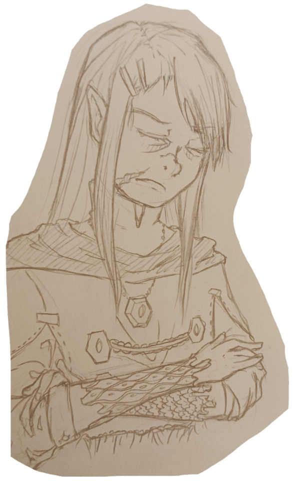
#design for a fabric bookmark i'm making :^]
Explore tagged Tumblr posts
Visit Tumblr Blog
Explore Tumblr blogs with no restrictions, modern design and the best experience.
Last Seen Tumblr Blogs


Fun Fact
28.6 is the average number of monthly visits per US mobile user.
Text

baby ghosts
#pokemon#pokemon fanart#gastly#litwick#drifloon#mimikyu#shuppet#duskull#yamask#glitchy art#design for a fabric bookmark i'm making :^]
37 notes
·
View notes
Text

Fanbind of "Rebuild your Seawall (brick by brick)" by @deheerkonijn & @roselightfairy


I am so so happy to be able to share with you the complete project, and I really want to thank both Deheer and Roselightfairy for giving me permission to bind their work!

This fanfic has a special place in my heart and I'm happy to be able to give it a proper place on my bookshelf. I think it resonated with me a lot in ways that other depictions of depression never have- it really reflected my experience of depression as the gutting feeling of something that you've never experienced, yet you feel is the right way things should have been, and you never stop longing for it. If you're at all in the mood for some introspective fanfic, I highly reccomend it.
Much more unnecessary details under the cut and how the entire binding experience went, and as always thank you to the @/renegadebindery discord server without whose members I would be doing nothing at all!
Okay so! To say that this book is rounded and backed would be an insult to all bookbinders in the world but there was a sincere try at it, and it didn't really come out, but it did just enough that there's a real noticeable roundness at the spine which I am OBSESSED with. I WILL be trying to do this again with every single one of my future projects.
This project actually originally started as a way to use a ton of scrap materials I had that would have been more noticeable on a bigger project. The textblock was printed on alternating cardstocks because I didn't have enough of a single type left, and many of them are a bit faded because my printer was running out of ink. I actually kind of like the effect, but I wish the title illustration came out more defined and less foggy, since it was already pretty blurred as a file. This is also the first time I put in a bookmark! It looks different in the pictures but it is almost IDENTICAL to the colour of the endpapers, which was a wonderful gift my mum brought home from a trip. I love it in contrast to the more minimalistic cover pattern, even if those blues clearly do not match.
This is also the project with which I discovered the magic and miracles of using wheat paste to adhere the endpapers to your covers instead of glue and oh my god. I was blind this whole time. Wheat paste goes on so smooth and uniform and gives you SOO much wiggle room to adjust things. I am never going back go endpapers with pvc ever again. It does have the side effect of being very moist and it did warp the textblock inside a bit, but that's very much my fault since I keep using cardboard instead of actual press board for my books since press board is so uncommon here. And hey some might say using professional material instead of substituting medical gauze for fraynot might help your book be better but what do I know. I am just an idiot who made the mistake of letting glue dry WAYYYYY to much TWICE on the same project. (Once before rounding; once after making the cover and forgetting cardboard warps when glued. I am very bright).
Making the title graphics was also so rewarding yet so so so difficult. Mostly because I've been overwhelmed by my life so it took me ages to sketch out a design I did like. And when I finally had it, and I asked my aunt to borrow the machine she uses to print on fabric, we had to keep delaying for different reasons that kept coming up. But I'm SO glad to have a proper cover on there. It's difficult to keep being proud and happy of it since it's been so long since I was done with the actual object, but honestly it's really satisfying to have a book with your OWN, personalized cover on it. I'm also very proud of the nautical theme inside- in general I put a lot of care in making the textblock feel coherent.
After this experience I do think I'll order some proper board since I want my next project to come out as good as I possibly can. Though I am still on the ledge about what my next project will actually be. Maybe in the meantime I'll stick to figuring out a logo and name for myself.
And maybe next time I'll remember to take some decent process pics too!
30 notes
·
View notes
Text
A very special gift for my wonderful friend @everythingsbetterunderthestars <3

Many years ago, I watched The Holiday (Christmas movie with Jude Law, Cameron Diaz, Kate Winslet, and Jack Black) and loved it. It's sort of a slow movie, not usually people's favorite. It isn't my favorite holiday movie (The Family Stone is) but I do really really love it and have watched it at least 20 times.
Well, I made a moot last fall and at the time both of us were very busy with writing and life and when they started posting a fic advent style (does it get any better than a chapter a day for 25 days for a Marauders Christmas AU fic???) I thought for sure I was too busy to read it. But then I realized it was an AU based on The Holiday movie. That sold me. And am I glad I jumped on board. Not only because I love this little work but because I made a friend in the process.
Due to my love of the original movie, my love of this work, and my general love of cozy holiday vibes I much I simply had to make a bound copy for myself and one for @everythingsbetterunderthestars.
We are the cursed of the loved ones on AO3
Then they went on and wrote a super sweet one-shot for me for my birthday (probably because I think I am one of the work's biggest fans)!!! I then had to add it to this bind as well. :)
More loved ones on AO3
My craftmanship isn't perfect. I'm still learning a lot about book binding. Hence me taking on this very reasonably sized (<40K word) project. I've got the typesetting and sewing down, but the covers are what get me. So intimidating to design, so finicky to construct. I should probably learn to use Canva. And, once printed, they never turn out quite as well as I envision them. Anyway, I'm still super pleased with how it turned out. Here are some photos of the FINISHED product!!!


Here are some closer shots. Again, don't look TOO close because there are a lot of flaws, like that white ribbon I had to add to the covers where the book fabric met the paper because I was a bit distracted when I was putting it together and forgot the book fabric must go UNDERNEATH the paper. A lesson learned the hard way. I think I was able to salvage the situation.


What I love about book binding is getting to add the silly little frills like the ribbon bookmark, the metal corners, and the little bit of book tape (that thing that you can see sitting along the spine of the book at the top and bottom). The book tape alone makes a home project look fancy!
It isn't the holiday time of year, but when it is I will be re-reading my lovely copy of We are the cursed of the loved ones. I hope you will tab over to AO3 to check out this amazing little feel good fic and the one-shot as well.
Thank you @everythingsbetterunderthestars for writing this work and for letting me bind it. It was such a fun project. <3
#marauders christmas#marauders au#marauders fic#marauders fanfic#regulus black#sirius black#james potter#remus lupin#wolfstar#jegulus#remus loves sirius#james loves regulus#fic rec#dead gay wizards from the 70s#ao3#book binding#james x regulus#regulus x james#remus x sirius#sirius x remus#marauders fandom#hp marauders
11 notes
·
View notes
Text

A Worksheet Manifesto (Rough Draft)
The Worksheet Manifesto is an attempt to explain why I'm moving my game design toward something I can print for free at the public library and give away. It's not a scold or a call to action; I buy full-color zines and hardcover books, and I support people charging for their work. This is a personal manifesto—an exercise in self-exploration.
The first reason I pursue this is ACCESS. I want people to be able to find and play my games. (Accessibility is maybe a better word for this, but I don't want it confused with the process through which something is made easier to use for people with disabilities.)
Some of the main barriers I've seen are financial (someone can't afford my games), technological (lack of computers and/or printers makes it more complicated to read my games), and international (shipping to someone outside the U.S. is prohibitively expensive).
Combining these three elements, I realized I wanted my games to be cheap or free. The common "community copies" solution on itch.io is much touted, and for good reason, but as I tried explaining the process to friends who weren't familiar with the site (or who flat-out aren't tech savvy), many responses were confused or frustrated. So I've set most of my games to pay-what-you-want with a suggested price.
Going from computer tech to printer tech, my most recent games were laid out in black and white, without ink-sucking textures (although some still have large spots of black in the art--something I continue to consider). Many American libraries offer limited free printing, and I always hope people will "utilize" the printers at their jobs or schools. I want people to be able to easily print out my games and share them at the table or pass them to friends.
And more selfishly, I hate dealing with fulfillment and shipping. It's stressful for me, it requires money up front to print things, and I'm bad at it, which means shipments go out slow, or not at all if someone lives outside of the U.S. Creating a file that's easy to print hopefully encourages people to create their own copies.
These cheap print copies also hopefully contribute to a feeling of DISPOSABILITY. I grew up with comic books, magazines, newspapers, and mass market paperbacks, and I think these cheap, short slabs of culture helped them feel like someone could engage with them without having to be fancy or educated or in the know. (A lot of us gatekeep ourselves!)
Prices for RPGs, like so many nerd collectibles, have steadily risen at least since the start of the pandemic. Crowdfunders often capitalize on FOMO, encouraging people to go all in on deluxe hardcovers with fabric bookmarks or whatever. And if my experience working at a used game store is anything to go by, lots of those fancy editions go right onto the bookshelf, unread. Don't want to break the spine or get fingerprints on it!
And I guess I'm just against consumerism? If someone wants a nice thing, I hope they get it, but a culture of games as luxury items and status symbols is not something I'm interested in.
So if someone has a game of mine and they don't want it anymore, I hope they pass it on, put it in a little free library, or recycle it.
And those dirty little printouts of my games? I want people to touch them and write them. I want TACTILITY. This is partially a usability issue: 300-page hardcovers are hard to find information in, and they're heavy if you have to lug them to a friend's house.
So I try to design games where everything a player (including the GM) needs is on, at most, three sheets of paper. I want them to be able to spread a couple pages out and take in the shape of the game they're about to play. I want them to circle things and make notes in the margins. Moving a pencil around does wild things to your brain, the same way that picking at a guitar or molding clay does. It focuses attention in interesting ways.
And in the end, you hopefully have a personalized article of play. And if you spill beer on it, no one's worried about replacing that $50 hardcover.
Speaking of beer, I want my games to be available to and contribute to COMMUNITY. As the pandemic started, I retreated into lots of online spaces, and those were absolutely vital to my survival. But I lost touch with lots of my friends and acquaintances in my city. I want to reconnect with them.
One of my favorite cartoonists, Mark Connery, is known for drawing little zines and just...leaving them all over. Coffee shops, art galleries, bathrooms. And when I think of him, I think of an artist responding directly to the places around him. Is it sad that some of this work is probably "lost" to all readers other than the person that happens across the zine? A little bit. But I think that comes from a bad part of my brain, the part that wants to own things.
I certainly don't want the entirety of my own work collected and widely distributed. Some of those things were specific responses to specific times that I've moved past. Some were bad! But I want to keep responding to my specific times and my specific place. I want to give things to friends (even if they just pass them on or recycle them). I want to give a game to someone at a zine fest and have them recognize my name from a zine they read in a coffee shop bathroom. And maybe they'll give me a zine in return.
My last hangup is MODULARITY. First, similar to tactility, I want to be able to give a player only the rules that matter to them. Character creation and basic rules? Here's a page. And once you're familiar with that and we've entered a downtime phase, here's a page with those options. You want to start a farm? Here's a page. I want it to feel like printing coloring pages for kids or ripping out my favorite magazine articles. These are the parts that matter. And if they stop mattering, you can get rid of them.
But I also want modularity on a system level. I want to add a subsystem to game as I think of it. I want to throw in an adventure pamphlet when it comes to me. I can keep them all in a little box, like a care package from my past self, and when it's time to run a game, I can dig around like a verminous animal and build my nest out of the best bits.
In CONCLUSION, I want to reiterate that this is a personal practice, and I'm not criticizing people who work differently. I used to work differently, and in the future, I'll probably work differently again.
This is simply the way I've identified what's important to me, set that up against the things that cause me to stumble, taken advantage of the privileges I have, and tried my best to bring that all together in a way that keeps me excited about my own work.

147 notes
·
View notes
Text
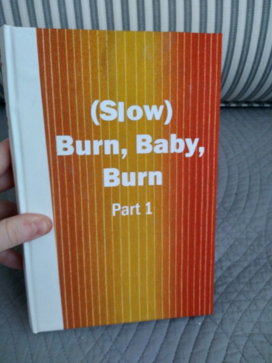
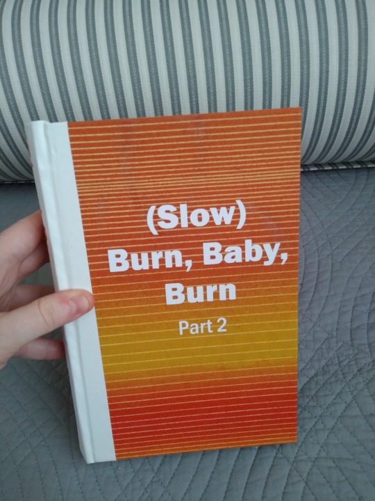
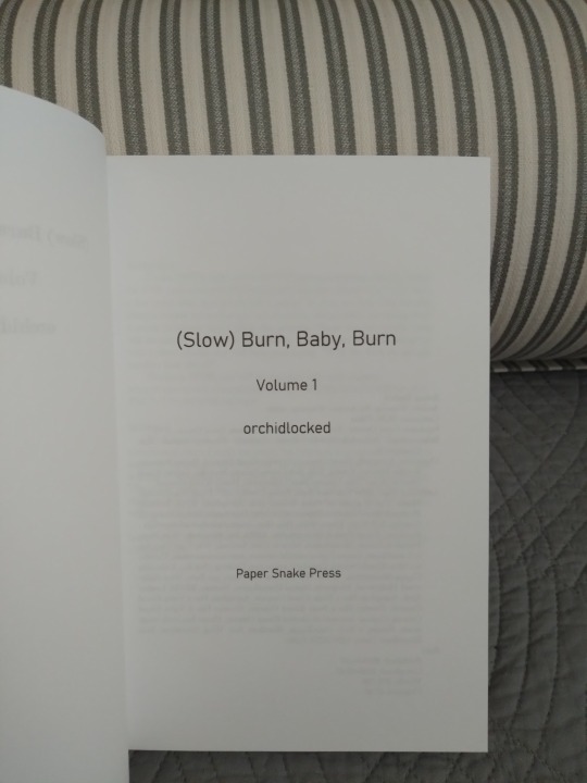
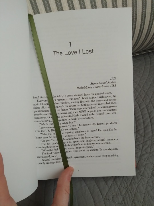
Very belated Binderary books, uh...I've lost track actually. I think they are #6 and #7. And it's another two-volume split! This is (Slow) Burn, Baby, Burn by orchidlocked, an extremely long Good Omens fic set in the 1970s. It's about our favorite angel/demon pair navigating the disco scene, and it's not an AU, which is sort of usual in a fic this long and with such a specific premise. There are a fair few real people featured here, some as major characters, and a lot of music history and an excellent playlist alongside all the fun and angsty relationship stuff that so many of us are here for. I learned a lot about disco reading this fic and it was fascinating and also way more queer than I ever realized.
For the cover up there we have a white Allure book cloth on the spine, and white HTV over homemade book cloth for the main cover. The cloth pieces both come from the same sheet but I oriented the stripes this way so they'd be coordinated-but-not-matched and I really love the effect. They're also cotton and really nice to hold. It's funny, I was thinking of binding this fic when I found the fabric while digging through the Joann's remnant bin, and as soon as I saw it this fic not only came to mind but moved up to the top of the to-bind list. It was fate, clearly.
More photos under the cut!
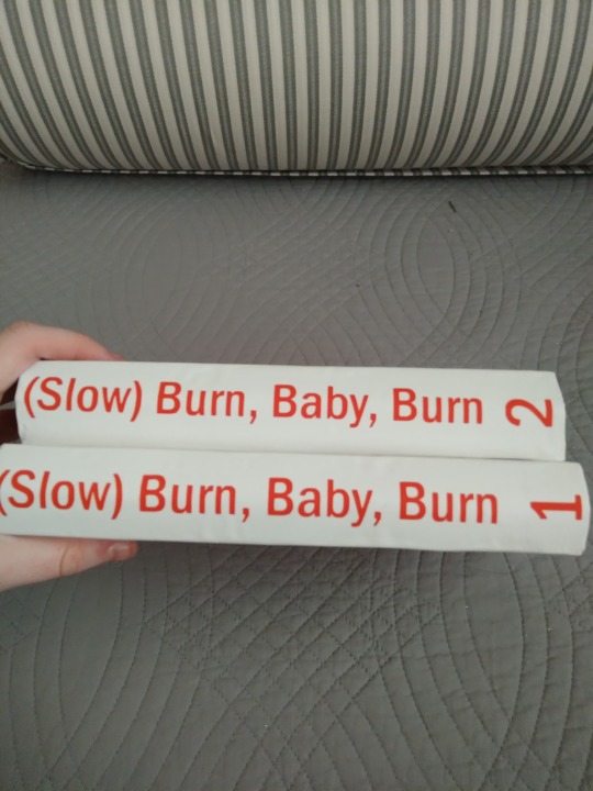
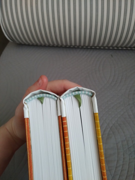
Both spines and a top view. That's orange HTV for the titles. This it the first time I've worked with matte HTV (I usually use metallic or foil) and I was surprised at how much thinner it is, and how easy it was to stick. And I like the color inverse here in counterpoint to the front cover. The top view shows off the handmade endbands and bookmark, and also the rounding job. I'm still working on rounded spines, and the turn-in over the spine didn't come out as smooth as I'd have liked, but I think it's a good result. The ribbon bookmark was supposed to be blue to match the endbands, but every blue ribbon I could find clashed horribly with the cover so it's this nice leafy sage green. Which actually works really well with...
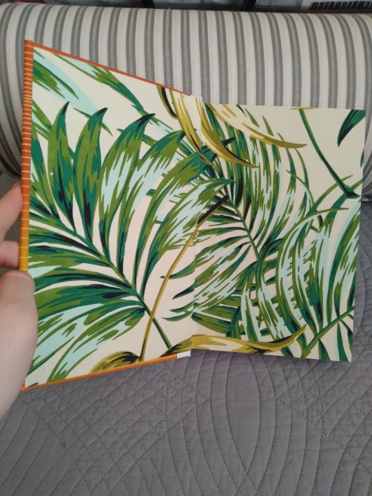
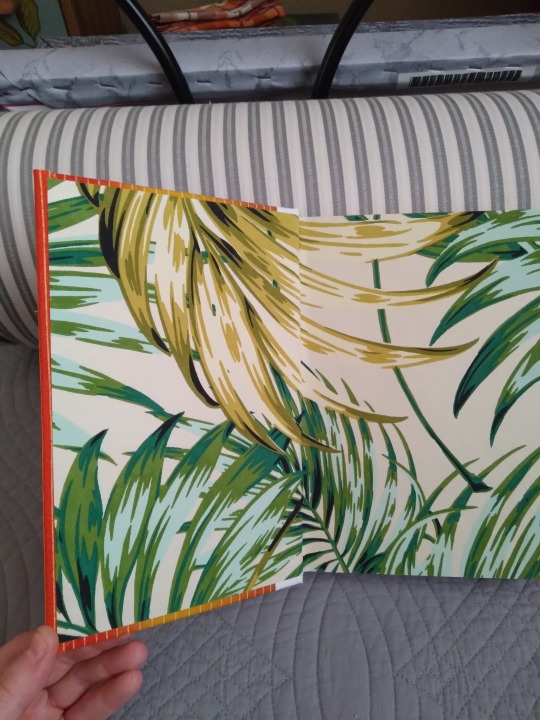
The endpapers! I got these as Joann's too. All four are cut from the same print, but I shifted and rotated them when I trimmed them so the patterns wouldn't all be in the same place. I had desperately wanted this other paper I found on Etsy with little vinyl records all over it, but the pieces weren't the right shape and I'd have had to ship them from overseas ($$), but I like the mood these ones set. And they're thick and nicely textured and look awesome with the cover, so really I think things worked out very well.
Couple of pics of the interior. I kept it fairly simple but I feel like it fits the story.
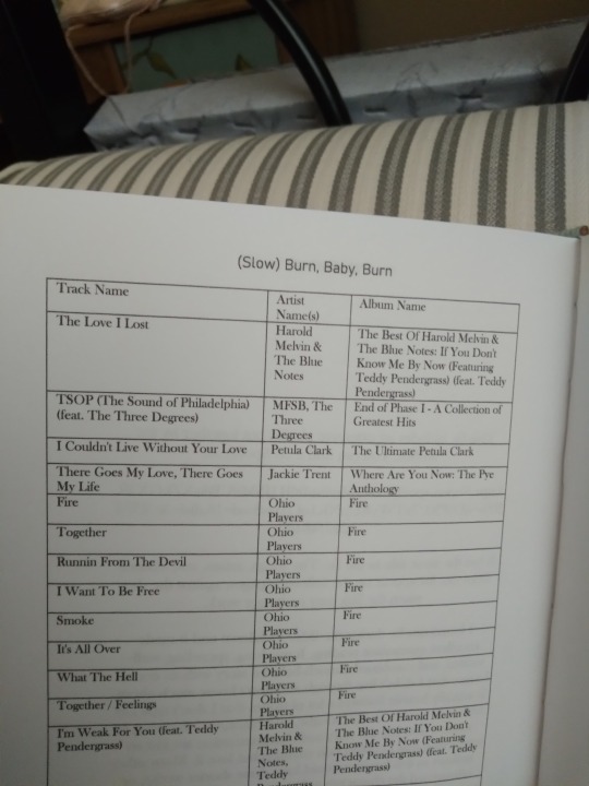
The scene break line is orange, to match the covers. I usually use gray but wanted something more fun. I recently bought some off-white paper that I used for most of my binderary projects this year because I've heard it's easier on the eyes, and it is, but I used the older bright white for this so the color contrast would be sharper. No complaints; I think it looks amazing. The second image above is the appendix I put together for the volume. Being so centered in the music industry, this fic has a really long playlist that the author put together with their preferred recordings. It's linked in the story and I did include the link text in the book, but I had my mind on preservation and the challenges of digital archiving while I was making this one, so I also took all the title/artist/album info and just listed it here. It was too much to do all by hand, so I learned how to export a Spotify playlist into an Excel doc, then moved that into the Word doc to print. A lot of steps, but not nearly as hard as I'd thought, and way less tedious.
I have to say this book is aesthetically really different than all my previous ones. I ran into so many design hurdles but I honestly couldn't be more pleased with the end result. I'll have to push my comfort zone like this more often, I guess.
#bookbinding#fanbinding#snek makes books#good omens#it's disco so it needed to be appropriately funky#and i think i nailed it actually#look at them they're awesome
39 notes
·
View notes
Text


there she is. my pride and joy. i think this is the best quality bind i've ever done. i didn't make any of my usual tiny little mistakes (the textblock is glued in straight!), and i'm not even a little disappointed in the design.
for the covers, i used a fabric i've had since i was a very small child — it's a really thin fabric, so i was a little worried, but it performed beautifully for me. it's white with delicate little blue flowers evenly spaced. i embroidered the lattice pattern over it, centering the flower print in each diamond. (i was thinking of the way leather covers are tooled sometimes in a very similar way.)
you'll notice there's also a straight line of stitching at the inner edge on both the front and back. aside from aesthetic value, what that's actually doing is creating a clean edge on my fabric. i can't leave open edges on the front cover, of course, or they'll fray, so what i did is fold it under and stitch it in place. it worked much better than my previous attempts to glue it in place.
the spine is a nice dark brown (the same one i used for shane) that i hand stitched the title into. i'm getting better at doing letters without guides, and it's honestly such a relaxing part of the process.
the endpapers inside are a sky blue to match the flowers, and the ribbon bookmark i added as well matches the color scheme. the book itself was actually a copy of p+p that was my sister's before me and has been around almost as long as i can remember, so there's a lot of my childhood put into this book.
114 notes
·
View notes
Text
TFNation 2024 Catalogue
Okie m'dears! TFNation is this weekend(yaaay!) so here is a quick catalogue of the things I'll be bringing along this year.
Plushies £30 each. There are a few new ones as well as some from last year. As with all the handmade items, numbers are limited so grab them while you can. Under a read-more for length

Keyhains £15 each Keychains are making a return too. Joined this year by Twitch, Kaon, Optimus, Shockwave, and Grimlock who have a little squeaker inside them!

Mini stickers £1 each
Large Stickers £2 each
New to the sticker line up are the TF enjoying their favourite hobbies! It was fun thinking about what some of the bots&cons got up to in their spare time. Mini stickers are just little non-TF bobbins I've wanted to make forever XD


Bookmarks £3 each
Coasters £5 each
Rescue Bot Magnet set £5
Bookmarks for the booklovers out there! Coasters for protecting your tables from water marks and whatnot. Rescue bots magnet set of the boys preparing some sweet treats.


Dicebags £10
Hairbands £5
Dicebags are back with a new Dinobot design! The same fabric was used to make the hairbands too. I'm retiring the Autobot and Decepticon designs this year so it's you last chance to get them.


Characters pins £1 each I tried to limit myself to a sensible number of characters... I think I failed.

Aaaand that's it! As some of you have already seen, I'm part of the Zodiac stamp rally. Any purchase from my stall earns you a stamp!
Please check out me and the other rally members! If you have any questions about any of the items please feel free to ask. See you soon!
#TFNation 2024#Transformers#Optimus Prime#Megatron#Autobots#Decepticons#too many darn characters to tag!
10 notes
·
View notes
Text
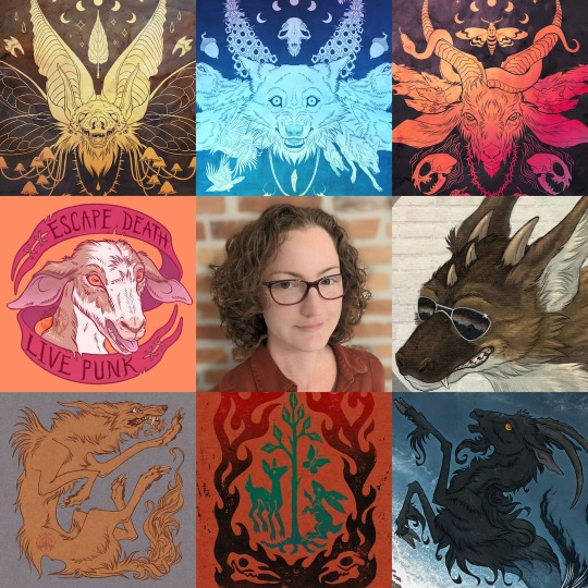
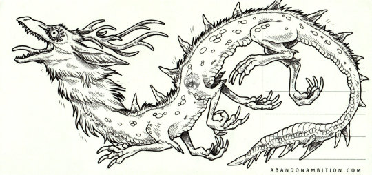
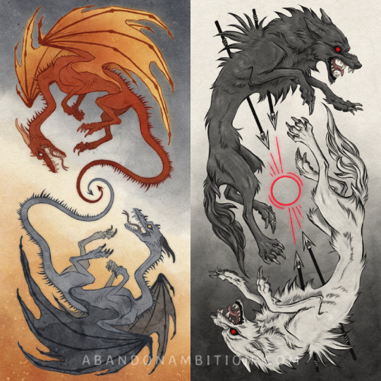
Who drew these Capricorns? It's me! I did it. S...Sorry.
HI TUMBLAR. I'm Dana. I draw animals and mythical creatures (mostly capricorns and dragons). I like to reflect on lesser-known or dark aspects of nature, feelings of distress and despair, or creating designs that just look cool for the sake of looking cool. I have a sort of positive nihilist outlook on life, in that I'm rather upset with the general state of things but I still feel compelled to find or create beauty and interest anyway, even if my darker feelings sometimes come out through my work.
"Abandon Ambition" is both grimly serious and darkly humorous. I was raised in both a household and country that emphasized setting lofty goals of acquiring high earnings and impressive assets, but the timing of my pursuit of these things has laughably aligned with global financial crises, global pandemics and lockdowns, and now global heatwaves and global conflicts. Abandon ambition, and instead embrace what you want to say and do and create and build now; Tomorrow is not yours, and your goals may not be waiting for you there.
Be responsible, and be kind. But hope and wait for nothing.
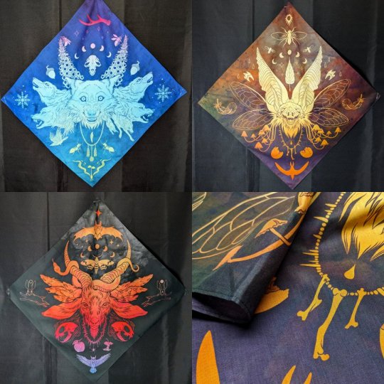
So uh, yeah, I draw a lot of stuff and explore a lot of things that I think I've been holding back on for years for one reason or another. I want to draw dark goats, glowing bats, tempest capricorns, skinny dragons, snarling wolves. So here they are.
Check out what I made!
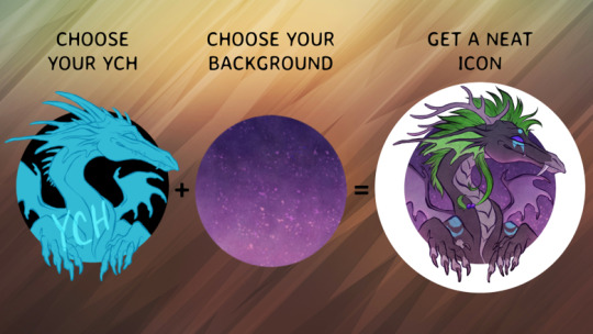
A lot of my designs find themselves on fun and/or practical merch! I like to create things that are high quality and have a long shelf life: I don't want to make something thinking it'll go in a landfill in a year, I want you wearing and enjoying my work for a very long time.
Here's a hat that glows in the dark!

Wow! Here's another hat that doesn't glow in the dark, but still looks really nice.
Pretty! If keeping your skull cozy isn't your thing, I've printed my art on fabric, too. I like this idea because if you move house a lot and/or can't afford custom frames, art printed on fabric can be displayed anywhere, and folds up nicely when packing up for your next move, without any breaking glass or anything.
A big part of my thinking when I'm designing products is also what do I myself use in my day-to-day life, and lately I've been desperately trying to cut my phone addiction by going back to pen-and-paper planners and books and things instead of using screens. And to keep track of where I am in my planners and books, I've made bookmarks!
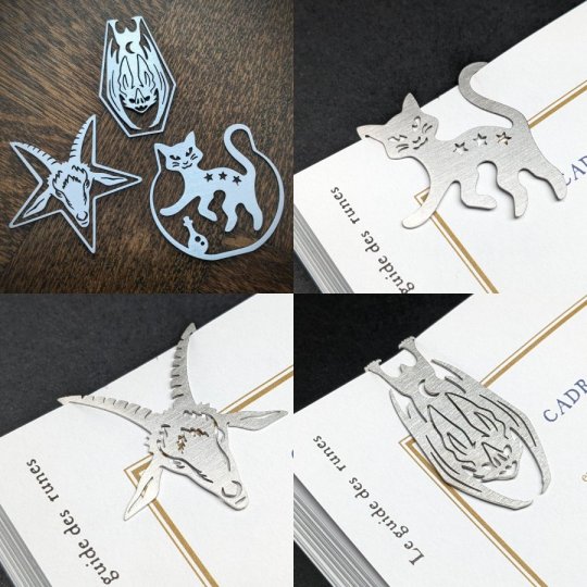
I had so much fun designing these. You have something enjoyable to look at on both sides of the page it's clipped on. How fun is that?
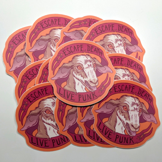
Okay lastly, I make a TON of stickers. A lot of my designs translate really well into small, self-contained things like stickers, and I only ever print vinyl stickers, so they live a long time on your laptop or phone case or wherever you wanna put them.

So that's a small collection of the things I've done and made. Do you like them? I hope you like them. I liked designing them.
A COOOUPON JUST FOR YOUUUU
If you'd like one o' these things for yourself, you're in luck!
You, lucky Tumblar user, can visit my shop and take 20% off with code TUMBLR20. This coupon expires 1st April 2024 (or does it...? That's April Fools' Day after all... Okay yeah it does actually expire then. Sorry).
Oh, commissions?
Hey! Sometimes people like my art style and want a custom commission. That's great, and I'm so glad you're interested!
If you'd like a custom ink mailed to you on a postcard that also features my art on the back (so it's like... you get two pieces of art on one postcard), these are exclusive to my Patreon right here. I have limited slots per every month, so check back often in case I'm sold out.
I also offer what I call "instant order" commissions via my Ko-Fi. You pick out one of the offerings I have, send me your ref sheet, pay, and I just...get it done. It's as close to instant as commissions can get.
Besides those, I also do more bespoke work, so you can send me a message to discuss your idea and we'll work something out. :corporatethumbsupemoji:
Honestly? Thanks!
The internet has become a pretty weird and honestly rather hostile place. I'm a solo act that's as indie as they get. So, it really does mean a lot to me when your eyeballs land on my stuff and you click that little heart or reblog icon, or even better when you add it to your cart and click check out. Your eyeballs land on thousands of stuff every day, so the fact that my stuff brought you joy or interest or something deep that you resonated with means a lot to me. I think in a sense it makes me feel like my brush strokes are going somewhere far beyond whatever canvas I've otherwise confined them to.
This is a pinned post to share who I am and help me get some coins to fund my life and art projects, but yeah you can reblog it and share it around planet earth, I don't mind. It's nice.
So yeah, that's me! Feel free to comment if you have questions or want to know whatever else, I'll uh... reply and like answer them and stuff.
#artist alley#tumblr artist alley#art#drawing#animal#animals#artwork#creature#creatures#artist#goat#occult#baphomet#bat#cat#biquette
29 notes
·
View notes
Text
If you want to and have the extra money, you can buy my Flatlander Anatomy posters from the collection on my Threadless store!
"https://rjalker.threadless.com/collections/flatlander-anatomy-posters/"
But!
You can also download them for free and print them out yourself!
Or put them on your own shirt or button if you've got the resources! (which could include printing it out in black and white, putting a white shirt over it with a light behind it, and tracing it onto the shirt with fabric markers. Or just eyeballing it lol.)
The store is just for people who have extra money they'd like to send to me, but all of my designs are free to download and print on your own!
Why? Because I'm poor, and I think other poor people should be able to have fun too. Which is also why all the books I write will be free to download and you'll only have to pay for the cost of materials of printing a physical copy unless you specifically want to pay me extra!
The world is a better place when people get to have fun :)
Here's where you can download just the anatomy posters from the web archive. It'll get updated whenever I finish a new one, so make sure to bookmark it :)
"https://archive.org/details/flatland-anatomy-posters-2023"
And here's where my pencil drawings and other assorted Flatland art has dumped, which you are also free to download and print / trace / whatever :)
"https://archive.org/details/flatlander-anatomy-pencil-drawings-august-23rd-2023-15"
Actually, if you've got extra change, you can donate it directly to the web archive, lol, they let me read books for free, and let me upload my drawings and books for other people to read, so they deserve it!
#Flatlander Anatomy#Flatland#Flatland Merch#and stuff you can print yourself!!!!#Rjalker reads Flatland A Romance of Many Dimensions#Flatland art#Flatart#is that a tag?#flat art
23 notes
·
View notes
Note
All of your quilts are so unique! Where do you turn to for inspiration?
Thank you for the ask!
For me it depends on the quilt. If I'm making a quilt for someone I might centre the fabric or design around things they like (pigeons, monkeys, jellyfish) or a colour they like. I might ask them what vibe they want from their quilt. Then I look at my 1000 bookmarks of quilt patterns and figure out what's a good fit.
With my donation quilts I don't know exactly who will get them, so I'm playing with random ideas or patterns or fabrics I want to use. They're small, so I'm free to experiment without many consequences. I am throwing a few flag/rainbow based ones in there because I don't know if the Youth like quilts, but they seem to love a flag.
I also get inspired by the world around me, my life, and media that I enjoy! As soon as I finish handquilting The Grandma Quilt and The Recovery Quilt I'm starting work on my Vast Quilt (hell yeah Magnus Archives). I've been wanting to make it for years, and I've been slowly collecting fabrics and thinking about patterns and I'm So Close...
Finally, I get inspired by other quilters! I'm going to join my local guild in a week and I'm so excited. Seeing what other people have made, even when you're thinking about what you would have done instead, is a really great starting point.
At the end of the day? I think quilting is like any other form of art. Inspiration comes from everything and anything :)
2 notes
·
View notes
Note
what inspired the character designs in amadeus?
What a fun question! With the caveat that specific things can't be discussed without spoilers (and therefore won't be discussed), I'll try to talk about them to the best of my ability.
Amadeus:
I made the first sketches of his design so long ago I barely remember what the initial vibes were. I do remember that his long straight hair and rich boy vibes were kind of meant to be Lucius Malfoy-ish (Prisoner of Azkaban was a huge reason I initially became obsessed with werewolves, so that's where this inspiration came from. I don't want Amadeus to have anything to do with HP beyond this, for obvious reasons; but I should admit this influence).
As far as his actual clothing, Amadeus's weird shirt-coat thing is actually largely drawn from the cape I made for a DGS Sherlock Holmes cosplay. Hound of the Baskervilles is another huge inspiration for the game, and I find it way easier to draw clothes that I have made or worked with in some way, so I drew from that.
(this is the only photo I have easily on hand, lmao)
The pants for his full design are based off of pants I made for a Lloyd Irving cosplay, and the boots kind of are as well. So well, pretty much, cosplay gave me a ton of experience interpreting weird clothes into IRL fashion and making them, so now I get to do the opposite thing where I have a ton of weird clothes I've made that I can pull from when thinking about what characters might wear.
The most iconic part of his design, the arms, well... to put this in vague terms because of spoiler reasons: that was an example of the design actually being revised to fit plot details. It has resulted in a way cooler and more interesting design, but it wasn't originally there. I had to realize some plot things before I could reflect them in the design, and now the design would be unrecognizable without it.
Solea:

Solea went under drastic revision since my first version of her, because her character also underwent drastic revision and the OG design no longer felt like her. I wrote about this a little bit in a devlog, but in order to draw a hairstyle for her that I liked, I spent about 3 hours watching Black haircare videos on YouTube to get a feel for different typical styles for her hair texture and variations on those styles, and bookmarking the ones that felt like they had the right vibes. After that, I drew a mockup and sent it to a friend who has similar hair texture to Solea, and asked "does this hairstyle make sense?" and she said "yep!" so it was a go.
In terms of the rest of her design: I'm being intentionally vague here, but there are reasons she looks the way she does, and it took a lot of tweaking to get it to feel right. My favorite part is the ugly ass gardening gloves she's got on. Without those it still felt too Disney's Hercules-esque (especially the top half - her bottom half design fixes this somewhat, but you can't see it in the talksprite). But the big ugly functional gardening glove contrasting with her pretty flowing fabrics I think results in the right aesthetic for her.
The Witch:
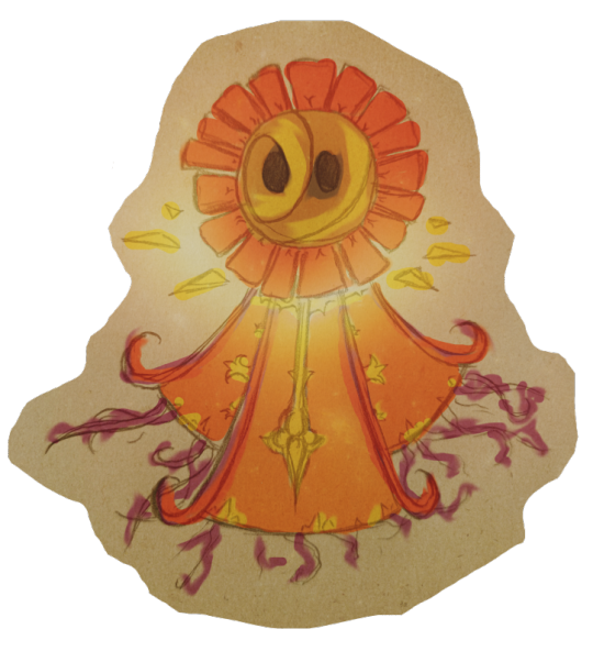
It came to me in a dream.
OK, not really, what actually happened was I was thinking about Amadeus while lying in bed about to go to sleep, and for some reason imagined the witch who lives in his home now descending from the second floor banister looking like some abstract weird ass orange-red creature. It was one of those things where I was just like "that's weird as fuck. Kind of creepy. ...Let's do it." I remembered the head was circular with square "petals" protruding, and the bottom was kind of triangular, but since it was all made up in my head it wasn't that concrete. So when it came time to actually draw her, I drew from the stylized and very Shaped designs in Super Paper Mario, and tried to get it to feel close to the image in my head.
...It was only after coloring it that I realized it looks very, very Homestuck. This was probably a huge subconscious influence, but not for a second did I consciously consider it. If anything I think my initial daydream was inspired by an enemy from Final Fantasy VIII.
Anyway, hope this was somewhat interesting! Thanks for the ask!
5 notes
·
View notes
Text
I have a lot of Harry Potter fabric and I'm trying to get rid of it the somehow. I've made keychain wristlet lanyards, mini pouches, zipper bags, and bookmarks; and decided I was going to make a quilt like duffle bag. That should take up a good portion of fabric.
So I got to work...
༶•୨♡୧•༶
After cutting each strip for the bag, I sewed them together and put padding on the other side to give the (somewhat) quilt thickness. Once together, I sewed my diamond pattern onto the fabric panel changing the color of each thread to match the house colors.

From there, I cut up more pieces to create the straps. Both ends of the straps would be the faux leather I was using and the rest of the strap would match the Hogwarts house color theme.

Once pieces of the straps where sewn together they were ready to go on the bag.

There was just one problem...

These straps are hiding the crates on Hufflepuff and Ravenclaw. I went to fix them immediately and in the process, I ripped the fabric....

I had to come up with a plan and thought of using the faux leather as an accent design on the bag and sewed it onto the bottom of the bag.

After that, I moved the straps over, messed around with rivets, then slapped a 'handmade' token on the panel.

Then I was ready to add the zipper!

By this time two nights ago I was tired, so I out the project to the side to rest up.
Today I spent the rest of my time piecing the design together. The sides are the most frustrating part because I feel like the patterns side panels are too small compared to the panels. So it caused a lot of dimples on my corners. I was debating on no longer doing the duffle bag and going straight to a tote, but I pushed forward and did what I needed to do to get the duffle bag design done.
This took over 16 hours to finish, but I think it came out great!

It's currently available on my Etsy shop.
🌐 https://nottooshoddy.etsy.com/listing/1739410553
And is UNOFFICIAL Harry Potter merchandise. Please note that there are imperfections on this bag (dimples).
.

#harry potter#etsy#smallbusiness#merch#etsyseller#etsyshop#etsysmallbusiness#beginner sewist#handmade#sewing#Hogwarts#duffle bag#gryffindor#slytherin#hufflepuff#ravenclaw#bag#tote#shoulder bag#red#blue#yellow#green#faux leather
1 note
·
View note
Text
got faux leather to make a nice cover for my 1st lotr book, let's see how this goes
#my inspo is nerdforge on youtube but also i have neverrr done this#i have done some crafts with paper and white glue#so i think i' might use that with some cardboard to shape it and make some design and then cover with leather#and paint some details with gold foil like nerdforge usually does hers but i'm having a hard time finding the glue/primer for it in portuga#portugal*#i'll show the progress if anyone cares (even if no one cares)#oh! alsoo saw a leather bookmark which seems so pretty#but she made a lotr book with a fabric bookmark painted with things in elvish so? maybe too? idk man what y'all think
0 notes
Text
Super Paper Roblox: Boundless Bibliopegy Designs (Pt. 1)
Each of the characters represent an aspect of bibliopegy (the art of bookbinding)!


More written information about Boundless Bibliopegy!
If you're curious on what Boundless Bibliopegy is... It's a fanfiction I've been planning for over a month now that I've just started to write! Currently at it's first chapter, I plan on getting the second chapter out soon! I try to keep updates going on a weekly basis but no promises. It's essentially your average SPR continuation. Read the first chapter here!
Now, let's get to characters. I'll cover the rest of the cast at a later point and compile everything into a singular masterpost when everything's done!
Tess Aract
Tess represents the ink that comprises the pages of a book, laying down words as the story's main protagonist. Without words to be seen, what's the point of a narrative? Tess's very involvement is what catalyzed the events of the plot.
Scriptliss
With a bookmark tail, Scriptliss represents the ribbon bookmark at the spine of the book to help one keep their place. With a desire to practice heroism, he knows what he wants to be. Though he doubts himself at times, he always keeps on going and never loses sight of his values.
Wiscara
As a sorceress of scissors, it's obvious what she represents. Like the scissors that trim down the pages, Wiscara knows what fits in the fabric of reality. With connections with Dusekkar and inherent knowledge that comes from her element, she's aware of discrepancies in reality.
Bonus material:
I think that if Boundless Bibliopegy were to be a game, it'd be your average turn-based RPG with elements of the Paper Mario and Mario and Luigi ones (albeit with more characters). I'm not exactly sure how this would work but I do plan on working that out for fun later!
Tess Aract
His high magical stat comes from years upon years worth of experience with magic. Tess is the type of character ideal for dealing magical damage on enemies, though void magic comes at a cost. Few of Tess's moves are powerful at the expense of recoil damage. (Which his health stat compensates for.)
Since he's on the weaker side in terms of defense, he's best placed in the back lines. Though, his higher health stat allows him to take a few hits here and there if you haven't expended too much of it already. Tess was never exactly afraid of death, was he?
Scriptliss
An overall balanced character with a high health stat due to his immortality. He can act as a tank for his allies thanks to this, making him viable for the front lines. As someone that focuses on physical attack, Scriptliss is sure to slice through enemies with his sword. Though, if needed he knows enough magic when in a pinch.
However, his main weakness is his low speed which causes him to strike last out of his allies and potentially even his enemies. It's important to make sure to choose your moves wisely for your team when stategizing.
Wiscara
Wiscara is a scissors sorceress that's also fairly balanced. Now, the 3 star magic stat isn't to say that Wiscara isn't worse at magic than some of her peers but rather how the scissors element combines both physical and magical prowess. Why have one or the other when you can have both!
However like with Tess, her defenses are quite low so it's important to make sure to evade attacks properly. With her portals, she's given the ability to dodge attacks easily but any mistake can leave behind great damage.
52 notes
·
View notes
Note
Is there anything you want to create that you haven't had the chance to yet for whatever reason - time, access to materials, feel like you need to develop more skill, not sure there is an audience, etc?
I really like this question! I could give a thousand examples for that, as I have new ideas every day. I will try to list just a few!
- I constantly try to learn to paint better, and experiment with different paints. I feel like each type is suitable for different topics and styles. However, my few attempts at oil paintings were a disaster. I simply can't understand the medium at all and it's frustrating! If I had the possibility, I would like to get a teacher that would guide me. I feel like oils are perfect for moody portraits, flowy fabrics, still life, big canvases and Pre-Raphaelite inspired art, but I can't explore them unless I conquer my fear of oil, and I can't do so on my own.
- I'd love to make a completed herbarium book with flowers gathered and pressed by me, and illustrations and descriptions on each page. I imagine it like a very old scientific book on botany and herbology with many details and calligraphy. It would take years to make it, but I will hopefully start soon with the bookbinding process.
- Paper making - it's relatively easy to gather old paper pieces and turn them into handmade paper at home, but for now I don't have enough space in my small room to dry many pages at once. And with added pressed flowers from my collection, this paper must look so pretty!
- A Pre-Raphaelite collection for my shop: journals, stickers, stationery, envelopes, bookmarks, wax seals and so on. I know some people would love it, but I think most of my instagram audience don't know much about art history and it wouldn't be a very successful release. I wonder if the effort of many months is worth it, since I love the topic so much, but it's not widely known.
- I'd love to design a wax seal for my personal use and for sale too. It would be a pretty expensive purchase for me, and even more for my clients, but nevertheless a very fancy item for a paper lover's collection.
- I started designing postcards with my analog photographs, and I think the sets I've chosen go really well together. It could be a very special gift to receive in the mail and have this vintage touch. Unfortunately, few people care for my analog photography when I post it, so I don't expect it to be a popular purchase.
- I started a series on flower - inspired ballet costumes in watercolor, but haven't had any time to work on it for weeks. And there's so many flowers perfect for it, that I feel a little overwhelmed! This could be a series of a 100 paintings, yet I struggle to finish the first one.
- Poetry and Art book, or at least a small handmade booklet. A secret project for now!
I could go on and on! Especially about things that I want to paint, but never have enough time! I expect this year to be a time when I can at least start working on these projects, and hopefully come up with many more. I'm just enjoying the creative process, even if the outcome is not what I imagined.
27 notes
·
View notes
Text
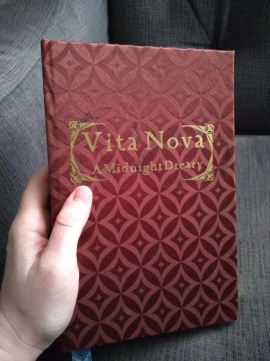
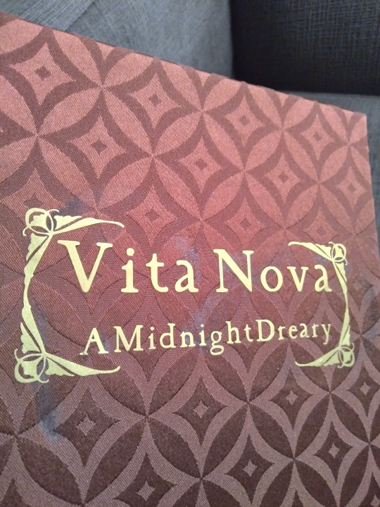
At long last, I have a new book to share! Feels like forever since the last one. This is Vita Nova, a fantastic Good Omens fic by @philoomenaa that I asked to bind way back in October. It took me a while to get here and I learned several new techniques for this bind but it was so very worth the wait. It's an excellent pre-season 2 story from 2019-2020, involving the fandom's favorites dealing with an unexpected bout of both humanity and memory loss. It's just...really really good and I love it.
More photos and process talk under the cut! There are a lot of details to see with this one.
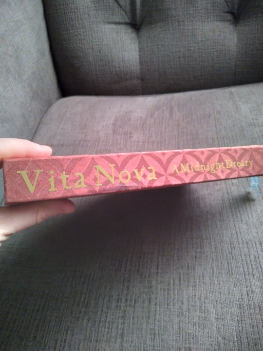
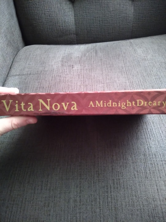
One of the things I learned for this bind was homemade book cloth. I used the heat n bond method and had pretty good results with this satiny bronze cloth that I found in the Joann's remnant bin. The making of the cloth was fairly straightforward but it handles very differently to regular book cloth. The satin is really slippery and absolutely would not hold a crease at the hinge. I think it also shrank a little at the gluing stage? Which sounds weird but I left my usual amount of space for the corner turn-ins but still had teeny tiny gaps on three of the corners, which has never happened to me before. I also had an issue with glue seepage when I applied HTV to the cover and spine. You can see this in the images above, and here in the spine photos:
Part of the reason it has that fancy art nouveau frame on the cover is an attempt to hide this. I think it's the heat press re-activating the heat n bond to cause it. I found out two things here: that fabric requires less press time than book cloth or cardstock, and that if you move the heat press slowly but constantly like an iron it is way less likely to do this. I was super disappointed that it happened but now, a few days later, it doesn't seems so bad. I guess some items just come with a little personal history already baked in.
Here, have some more glamour shots:
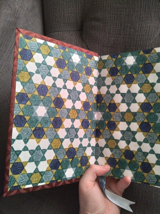
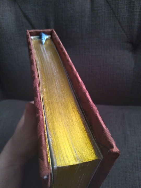
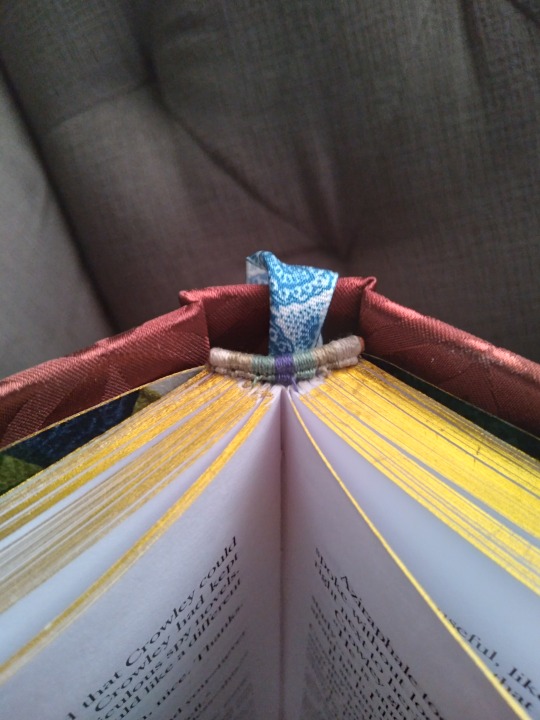
The geometric endpapers were chosen specifically to go with this cloth. I found them at the same craft store and knew I had use them together, they look so incredible. And I learned edge gilding for this project! It was very annoying. The final result here is with heat transfer foil, and I did about six tests on scrap text blocks before I got a result I was at all satisfied with. I tried rub n buff (great coverage, not shiny enough, kept coming off on my fingers even after curing for 2 days) and an actual gilding kit (flaked off as soon as I separated the pages). The heat foil still has some patchy spots but was by far the best-looking result. I also learned double-core end bands for this project! Because I wanted some kind of match for those opulent endpapers and didn't want to settle for just two colors. I think they came out pretty well for a first try and I'll definitely be doing them again.
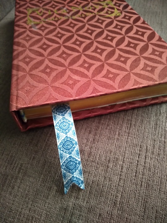
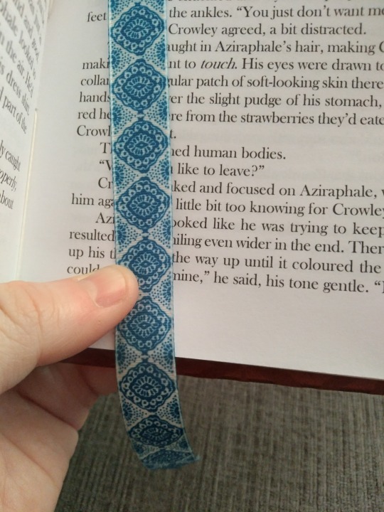
Couple of photos of the ribbon I chose for the bookmark. It's probably a little too wide for a book this length; you can see in the end band photo that I had to fold it in half to get it to lay in the spine properly. But it looks so good with the other design elements that I couldn't resist. Luxury all the way on this one.
Speaking of luxury, have a look at the interior:
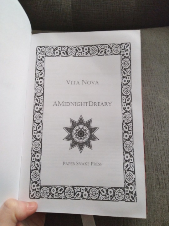
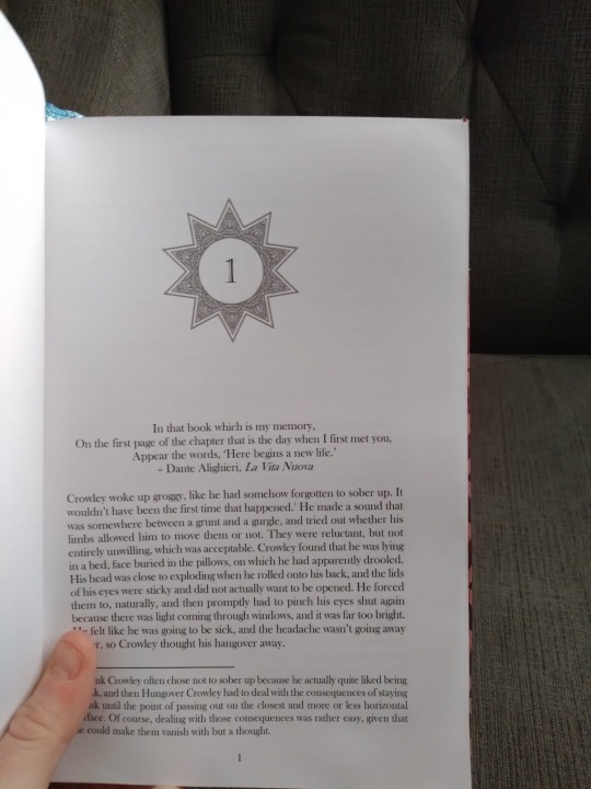
From left to right, we have the title page, the ornament I chose for the chapter numbers, and the scene break divider. All the images came from rawpixel with just the lightest amount of editing from me. The chapter image is the same as the star on the title page, but I made it gray and took out the center to turn it into a frame for the numbers. The cloth and endpapers really set the tone for this one all the way through, and all the other design choices followed from there. It's really gorgeous, guys. I love it so much.
And that's it! That was the last work in progress I had from 2023, and I'm so pleased to have finally finished it. Hope you like it, AMidnightDreary!
#bookbinding#fanbinding#snek makes books#good omens#i can't believe it's done it's been a wip for like four months#i am still a little sad about the glue but it really is gorgeous and I'm proud of it
22 notes
·
View notes