#graphic design advice
Text
fellow artists:
how do y’all organize having a couple styles/mediums that you’re willing to take commissions in?
for context: I’m a graphic design major but I like drawing people a lot. I’d love to design logos and posters for people, but I also would like to do character commissions too. on top of that, I have three different styles for characters/people depending on what medium I’m in
so how can I have all of those as options without using like 20 google forms that get all jumbled?
help
please and thanks
#send help i’m an art student#send help#please help#advice would be appreciated#advice#art advice#advice needed#art advice needed#commissions#graphic design#graphic design advice#asking for a friend#asking for advice
4 notes
·
View notes
Text
The Seven Typographic Sins!
Basically, 7 things to NOT do with your words, whenever it be fonts, where you put them, how they're arranged and whatnot!
SIN 1: COMIC SANS
The one font that's a sin at this point if it's not meant for kindergarten or elementary school! Comic Sans. Don't use it in your comics or ANYTHING, it would possibly and WILL ruin any mood that isn't for preschoolers you're trying to put in. It's just... A font for literal babies! You don't want that in anything you're trying to appeal to anybody older than 3rd grade! I feel horrible for Vincent Connare, who made this font.
If you want to be look like a pro and not some kindergarden level clown. Comic Sans would be like giving yourself a swirlie in public!
What you should do instead is to simply... Select another font that's more suitable, and thanks to the internet, there's plenty of fonts out there that are A MILE BETTER than Comic Sans. Like "Happy School" from DaFont. Or my Love in First Sight "Futura Handwritten"
SIN 2: BAD KERNING/NEAR UNREADABILITY
Kerning is the space between letters. You don't want your letters looking uncomfortably close together, or else it would look like a... THING!
You don't want your kerning to be like too wide...
O r e l s e i t w o u l d l o o k li k e t h i s.
Yeah, you also don't want a font that's like that NATURALLY.
And as for Near Unreadability, let's use Jokerman as an example, it has too much pizazz going on that it could distract readers because of that. And Bleeding Cowboys is ten times unpredictable, I mean, I can see it only being used as for decoration because of how over the top it is.
So, how do you avoid this sin? *INHALE* .... Use the Kerning tool. Toy with it until it looks just right and even. And like with the Comic Sans sin, don't use a font like Jokerman, and you don't have to use a font like Bleeding Cowboys either, you can use a much cleaner font and place a texture over it if you want it to look a lil' worn and torn.
SIN 3: TOO MANY FONTS!
Okay, this one explains itself, having way too many fonts would only make you look like a slop artist. So, limit yourself to about three fonts at max. And also, make them look like they can go together. Like let's say you picked a nice script or handwritten font, pair it with a similar one that complements it.
Hell, some fonts come with seemingly completely separate looking variants such as one of my favorites "Goodlife", its Sans version of the font seems completely different to its Brush variant.
SIN 4: BAD ALIGNMENT
Face it, we all used Word or similar software. And we all know the 4 alignment options, Left , Center, Right, and Justified. With Left Aligned being the most common and easy on the eyes, because most of us read from left to right. Right Aligned only works if its used right.
If you have ragged lines, it would screw up the alignment you seek. Using the Center Alignment will spell it out to you if you use it wrong.
All you have to do is adjust how long your lines are to make it look lovely.
SIN 5: LONERS
Let me clarify, I'm talking about words all alone in one line in a paragraph. Let me show you an example by pretending there's a tiny box with all my words, with the loner being in bold.
The quick brown
fox jumped over
the lazy brown
dog
There, do you see the loner? Thankfully there's a easy fix, like expanding the box, or spacing one letter to be with the loner.
SIN 6: SARDINE CANS AND VOIDS
What I mean about these is giving you text barely any space or too much empty space. I mean, who would put your words in a cramped box that seems to look more like a sardine can? Or just in one very big box it barely fills?
Think of it like Goldilocks, and the space being the porridge and beds. You won't want it "too cramped" or "too loose". You'll need to find that "Just right" for your text. Give it a bit of space to breath.
SIN 7: FULLY DISOBEYING GRIDS, MARGINS AND COLUMNS
Imagine, what would a modest breakfast menu of your design look like you just slapped the text randomly with no input? Yeah, doesn't look pretty.
So, you have... Let's say a .25 margin, you don't put anything that's not a background thing outside it! And any columns you have are there for a reason. Say.. You have 2 columns, making 3 columns of text. You don't disregard those! Just no!
All 3 of these will seriously help it so your thing isn't a mess! They're there for a reason.
1 note
·
View note
Photo
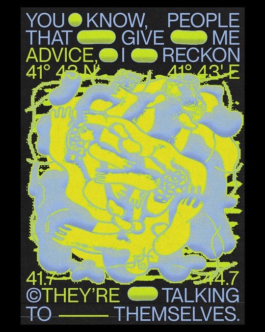
Advice – Bekaia
892 notes
·
View notes
Text
if anyone has any tips on how to grow big on social media, please share your knowledge🩷
i post daily, i interact with people, my content is high quality...what else do i need to do?
#social media#need advice#digital creator#graphic designers#jirai#jirai kei#jiraiblr#jiraiblogging#jirai girl#landmineblr#landmine girl#landmineblogging#landmine kei#landmine type
25 notes
·
View notes
Text


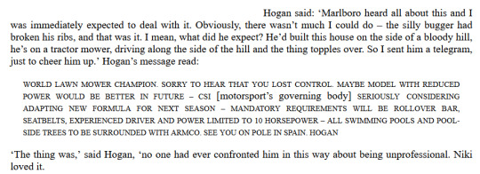
Niki Lauda convincing everyone he was anything but as insane as the rest of them was the biggest con he ever pulled. I'm enamoured with the workings of his mind.
Something in me broke when I got near the end, and he was like "No, I WILL take time out of my book to complain about people stealing my clothes, the house never having yoghurt, and this one guy trying to sell me a meadow above market price, but I ain't having it."
Also,
>barges into rival's room
>today i vin ze championship
>refuses the elaborate
>leaves
#niki lauda#classic f1#formula 1#f1#there's like so many snippets just around of this sort of vibe from him but grabbing the ones I remembered from epubs were the easiest#never forget niki was a cringefail kid while james' was being looked at as a future doctor#i also appreciate how he was consistent in “i'm taking all medical advice :)” (advice: don't drive) “i'm taking some medical advice :)”#'get back on the horse' brainworms mentality got him in the end as well as the actual horses which he also seemingly could not escape from#there's also the saga with his housekeeper that's too long to include but feels like it came out a comedy sketch#I guess take this as a preview of research for a big graphic design project i've been doing on him that'll be finished up soon
159 notes
·
View notes
Text
when life's decided to kick you in the arse and you feel down, remember Preminger's wise words:

#behold my horrendous graphic design#preminger#barbie as the princess and the pauper#barbie movies#barbie preminger#mental health#life advice
26 notes
·
View notes
Text


todays affirmations
#october#spiritual#art#quotes#graphic design#love#universe#self improvement#self confidence#self care routine#self care#level up journey#glow up tips#life advice#life goals#life quotes#becoming that girl#that girl#girlblogging#t
59 notes
·
View notes
Text
Tutorial: How-To Create Striking Gradient Shapes & Waves for Adobe Illustrator for iPad

In this tutorial, we will explore step-by-step instructions and tips to create striking gradient waves and shapes that can enhance any project, from digital illustration to web design and marketing materials.

Starting off you'll want to open Adobe Illustrator on your iPad, and select 'custom size'.

Create a canvas that measures at 3000 x 3000 points.

Set the colour mode as 'RGB'.

Select the 'Pencil' tool, and then select 'Paint Brush'.

Select 'Calligraphic' brushes, and scroll down until you find the 15 pt. 'Round' brush and select it.

Select the 'Fill' option and set the colour value to none.

Select the 'Stroke' option and set the colour value to a colour of your choosing.

Select the 'Smoothness' option and set it to the maximum value (10).

Draw a wavy line.

Select the 'Stroke' tool and choose a new colour.

Draw another wavy line over the top of the previous.

Select the 'Stroke' tool and choose another new colour.

Draw another wavy line over the top of the previous two.

Select the 'Selection' tool.

Select all of the shapes.

Select the 'Repeat' tool.
Within the 'Repeat' tool, select the 'Blend' option.
Tip: If you have a keyboard connected to your iPad, you can use the keyboard shortcut 'Command+Alt+B' when objects are selected to blend them.

Now our gradient wave shape has been created!

Once the shapes have been blended, you can manipulate the spacing of each shape with the three dots in the middle, each one represents each of the lines.

Move each point around until you feel comfortable with their spacing.

We may want to make some alterations to our shape such as changing the rotation, shape, size, order of lines. Here’s how we can do that.
Select the 'Selection' tool.

Drag and select the shape.

Select the 'Object' tool.
Select the 'Release' option.

Now the objects are unblended they can be altered or manipulated to our liking.

To put our gradient wave back in place, first select the 'Repeat' tool.

Then select the 'Blend' option.
Congratulations on completing the tutorial on creating striking gradient waves and shapes in Adobe Illustrator for iPad! You've taken significant steps in enhancing your design skills, learning how to apply gradients effectively, and bringing your digital artwork to life with vibrant colours and dynamic forms.
Keep Practicing - As with any creative skill, practice is key to mastery. Continue experimenting with different gradient combinations, wave patterns, and shapes. Find new ways to enhance your designs.
The more you practice, the more confident and proficient you will become.
If you're interested in supporting me, or checking out some free eBooks, Wallpapers, and more. Please consider checking out my Ko-Fi page: https://ko-fi.com/spikeeager
#freebies#guides#guide#how to#howto#how-to#how-to's#how-tos#art guide#art#design#illustration#art help#art tip#art advice#art tutorial#drawing tips#graphic design#creative#unique#marketing#tips#artwork#art process#digital painting#drawing#illustrators on tumblr#illustrator#illustrative art
19 notes
·
View notes
Text
Anyone know anything about graphic design?
I've commissioned some designs for an author logo and a book cover, and I would love some impartial feedback! ( I can't enlist anyone I know IRL without giving my pen name away, you see...😅)
You don't need to be a professional by any means, I'm really just looking for helpful opinions, though some familiarity with publishing and design would obviously help. But really, all I need at this point is another set of eyes so it's not ONLY me making the executive decision on this. 😅
You shouldn't really have to know anything about the book itself other than the genre.
I'm happy to offer the same in return to anyone who needs it! Thank you so much!
If you're interested, feel free to reply or send me a message, or just help me out by reblogging! 🥰
21 notes
·
View notes
Photo
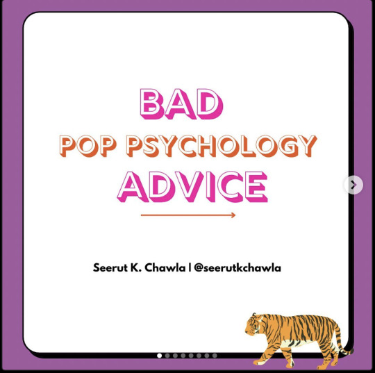
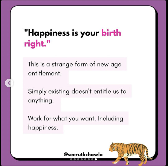


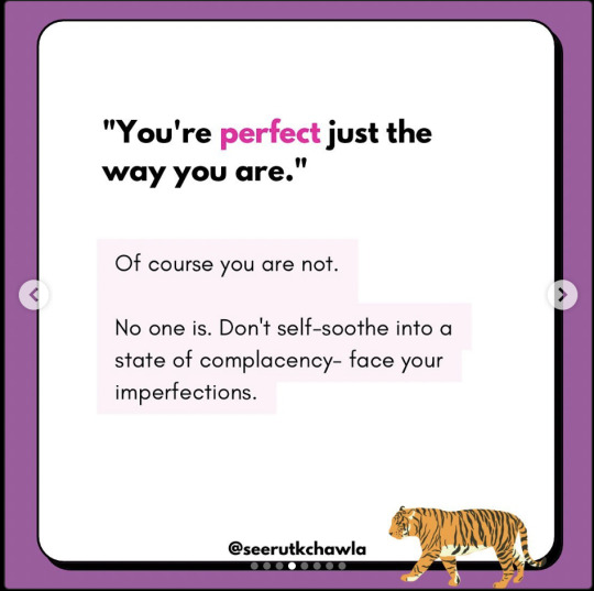


I’m as interested in learning about psychology and mental health as the next dysfunctional, unhappy person but too often I see dodgy advice and overly simplistic maxims repeated on social media.
Seerut K Chawla on Instagram is a breath of fresh air since she takes a no nonsense approach with critical thinking and healthy skepticism towards the infantilising trends in “Instagram DIY therapy”. Here’s an example of her content.
A trained psychotherapist, Dr. Chawla looks at the individual and society instead of just pandering to the self absorbed seeker. She can be kinda crude at times in her language, but she makes thought provoking points and makes the reader examine themselves and others.
You can check her out here https://www.instagram.com/seerutkchawla/.
#seerut k chawla#psychotherapy#mental health#pop psychology#psychology#quotes#growth mindset#individualism#tiger#bad advice#food for thought#purple#graphic design#instagram#instagram culture#wellness#critical thinking#skepticism#wisdom
117 notes
·
View notes
Text

#vsn#utah#salt lake city#quotes#advice#art#city#salt lake#slc#travel#explore#street photography#photography#photographers on tumblr#design#graphic design#graphic art#juxtapose#juxtapoze#motivation#life#inspiration
6 notes
·
View notes
Note
would you ever consider selling that fan-made nerdy prudes must die poster you made?
This is a great question! First of all, thank you for all the love on the poster I made for NPMD! It means a lot. :)
Maybe I will in the future. I’ve just never sold any of my work as of right now.
If anyone has any advice or recommendations for selling prints/posters, I would appreciate it. Thank you!
#team starkid#starkid#nerdy prudes must die#npmd#starkid npmd#fanmade poster#poster#advice#ask#graphic design#prints
11 notes
·
View notes
Text
art youtube is overwhelming AF.
sifting through all the art advice available on youtube (and other sources!) can be overwhelming AF. an ocean of voices screaming DO THIS! DON'T DO THAT! YOU MUST DO THIS!
i feel like no one ever really talks about that.
also: some ways i cut through some of this noise to find signal, below the cut.
i mean, some of these videos are legitimately helpful! and many are drama about the latest outrageous, racist thing some artist *cough cough* kooleen *ahem* did or said in a 'how to draw X' tutorial just noise. still more of them contain outright bad advice, or advice that can't easily be personalized.
(i can tell you right now that 'you must draw everyday!!!' is terrible fucking advice. not everyone can set aside time to do that, and guilt is the world's worst motivator for enjoyment. ever. just stop)
and almost all of it hides behind titles designed to raise your anxiety levels and get you to click. sadly, this is the nature of the platform. emotional engagement drives traffic, and every YT creator is trying to maximize that as best as they can. i don't fault anyone for that; people's livelihoods depend on these streams.
i have advised novice artists to try to narrow things down as much as possible, to 'get granular' about what they want to learn: painting skin. drawing hands, or noses, or faces, or feet, or poses. drawing more expressive lines. workflow, for traditional art or the raster graphics editor of their choice. it doesn't always help: for every subject i've listed, there exists a veritable firehose of videos about it.
so might i suggest a ruthless pruning here?
just go with whatever thumbnail looks interesting and is the least shouty/dogmatic about what it promises to teach you. you will probably miss out on some good advice, but the effect of all the preaching is cumulative. and your sanity is worth it. i promise.
if you don't have the time or patience for hour-long videos, either watch at 1.5-2x speed or skip ahead for the content you want.
look for specific solutions for your specific frustrations. and emphasize the process. how does this artist accomplish what you want to do? how do they lay out lineart, begin the rendering process, and why? can they explain that in a way that makes sense for you (if this is something you need)? if not, don't waste your time watching.
i remember breathing the world's biggest sigh of relief on hearing a professional animator confess that shadows don't always have to make sense for a piece of work to look right.
look for ideas on how to break what you see into scaffolding. by this i mean 3D approximations on a 2D surface, on which you can draw guidelines for proportions. ultimately, this is the key to 'drawing from imagination' and even to successfully working with reference photos. videos on how an artist draws eyes from one specific angle will not necessarily help you draw eyes from other angles. not unless they also touch on eyeball shape and position on the head. and how perspective changes the shapes you see. and...
lastly, how do you feel about the video you're watching? if the creator's voice or sense of humor annoys you, or you don't love the stereotypical way they draw female bodies, or they're actually kinda racist/ableist, or whatever–you're allowed to nope out and look for another source of info. there is a lot to be said for the skill of picking diamonds out of manure... but you can find diamonds of similar quality that aren't coated in shit, too.
#drawing#art advice#artists on tumblr#vent#solutions#intermediate visual artist#professional graphic designer#the best resource is one you'll actually use
7 notes
·
View notes
Text

5 notes
·
View notes
Photo

15th shineeversary timelines: part v - taemin
please credit when using and don’t repost.
///
( click for other posters —> onew I jonghyun I key I minho I ot5)
etsy I redbubble
#shinee#taemin#fanart#kpop#ot5#advice#want#move#criminal#never gonna dance again#ace#key#onew#jonghyun#graphic design#digital art#myart#샤이니#minho#press it
42 notes
·
View notes
Text
https://www.federalregister.gov/documents/2024/02/15/2024-03063/group-registration-of-two-dimensional-artwork
^ the US copyright office is considering a rule change to allow 2D artists to register collections of artworks as a “group”. this is in acknowledgement of the fact that 2D artists these days frequently have to produce a large quantity of images and put themselves at high risk of copyright infringement in order to utilize opportunities found on social media. while registering a work is not technically a prerequisite for copyright protections, i think more and more 2D artists online are interested in the art copyright registration system due to increased discussion about IP theft. public comments are open for 35 days (as of 2/26/24), so i encourage my fellow 2D artists to give their feedback on the proposal to encourage any rules we believe will make for a system that might benefit our livelihoods.
#digital art#illustration#graphic design#artists on tumblr#art advice#art community#copyright#plagiarism#IP theft
10 notes
·
View notes
Last Seen Blogs

jesus-steps-blog
耶稣的脚步

emophil1981
emophil1981

mllak1
Mllak
mllak1
Mllak

verticopenhagen
Verti Copenhagen