#rules for design
Explore tagged Tumblr posts
Text
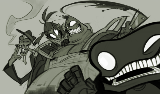
the pilot was spectacular
#my art#art of chel#illustration#fan art#the gaslight district#can't wait to see more out of this project fr omg#the design philosophy rules#just had to draw this crime family..
7K notes
·
View notes
Text

First of all. HOLY SHIT THERE'S PART TWO OF THE REVERSE MECHA RATCHLOCK FIC
Second - I got so excited I decided to design Deadlock~ Because yeah. We didn't really talk about him but Gemma just keeps giving me serotonin and my body is a machine that tirns serotonin into art
#reverse mecha au#deadlock#maccadam#transformers#ref#you remember how I said I want to give Deadlock the shapiest cuntiest mecha#yeh#first rule of character design in mecha genre - robots should be hotter than humans
4K notes
·
View notes
Text
More analog algorithms
Following up on https://codeandcanvas.tumblr.com/post/753299978126016512/welcome-back-i-was-having-issues-with I worked on better understanding (and better counting boxes, more on that below) how these permutations progress.
The examples provided in “Analog Algorithm” this far are visually appealing, and along with some experimentation on my own, I expect to improve my own skills as a graphic designer further.
But first, a mistake.
When you work with the samples in the book, you can use the final shape in the bottom right square to check for mistakes: if you make a mistake in the application of the algorithm, the final shape will look different from the one in the book. Same applies to the individual shapes in the columns and rows: each should look like a progression from its neighbors.
So, when my final shape didn’t align with the author’s, I assumed that my grid was wrong.

I was working at a reasonable canvas size of 1m by 1m, so that I could do fractions more easily: each larger square in the grid is 8cm on its side, broken up into a grid of 8 by 8 1cm squares, while the whole grid is made up of 8 of these larger squares on its side.
And, looking at my algorithm and the author’s, sure enough, I imagined to see him use a grid of 9 by 9 1cm squares. I was sure. I even laughed about how tricky he was, making sure I was paying attention. So I redid the grid with the new measurements, and applied the algorithm to that, too.


So, looking at the final shape on the bottom right, I knew I messed up. I messed up so badly, I started to consider whether or not the author made a mistake in his algorithm.
I took a breather, and then understood that the smallest grid was not a nine by nine grid at all, but always was an eight by eight grid.
So I did it properly this time, checked for mistakes and misalignments, and ended up with the finished permutation grid, which is also correct:
And I happen to find a lot of appeal in these. Maybe you will, too.


#work in progress#grafikdesign#parametric design#made with illustrator#grid system#grid systems#algorithmic design#design as a program#rules for design#karl gerstner#system-based#explorative investigation#analog algorithm#code and canvas
1 note
·
View note
Text
I know whenever people rave about Pokemon's sprite era, it's usually about gens 4 or 5 (for good reason!), but maaaan does gen 2 have such a distinct visual identity that I adore, and I think a large part of that is how creative they get around their limitations
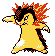
Like! Look at Typhlosion's Crystal sprite! See how many colors it has? There's yellow, there's red, there's black, white... and that's it! Most if not all sprites operate under a four color palette - and since they all have black and white, that means each sprite only really has two unique colors to work with. And man, MAN do they work with them so well. Look at how the reds aren't just part of the fire, they're used to highlight Typhlosion's fur, to give it the illusion of depth. See how the yellows scatter into the flames, how the whites of the legs spread out where the highlights bleed away?
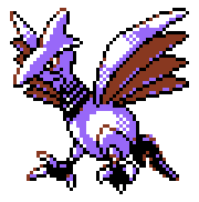
And look at Skarmory! The reds aren't just part of the wings, they're the outline of the eyes that make the sclera look more yellow than white (and I had to color pick to be sure! that's how effective color palettes can be, when it allows your eyes to 'fill in the gaps'). Most of the metallic shine comes just from how the purple and the white are applied- they made this bird METALLIC. on a GAME BOY COLOR. with TWO COLORS
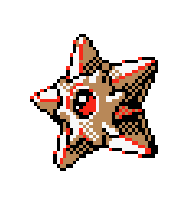
Staryu's shading is complex by design (shining gemstone center, geometric star shape where the light source hits the faces differently), but look how the face-covering-thing around the gem is lighter than the rest of its starfish body. They both use the exact same shade of brown, but one part uses it as shading and the other uses it as its base! And the reds?? Not just how the gem can look so shiny, but it's used so well to complement the outline!

And look at Jumpluff! It's body is mostly a flat blue, but it helps accentuate the detail on its cotton puffs. Look at how scattered the yellows are, how specks of blue will poke out, making each puff look... well, puffy!
I had to size them up for readability in this post, but these sprites are only 56 x 56 pixels. That's so tiny!! And yet they're able to convey such key details for such a tiny game system, all while using such cozy color palettes!
gen 2's era of art design you will always be the moment of all time to me <333
#prompted by an emerald seaglass video I was watching#and that had me go “oh MAN the devs of this romhack know just how to convert modern pokemon designs to gen 2's sprite style‚ these rule”#pokemon#gen 2 pokemon#talking tag
5K notes
·
View notes
Text

TBH that might even thiner they avrage
#transfem#lesbian#game dev#game design#t4t lesbian#196#video games#wlw#trans#r/196#rule#twitter#twitter screenshot#beautiful body#body positivity#that's my girl#Out there on twitter#having fun#I hope
37K notes
·
View notes
Text
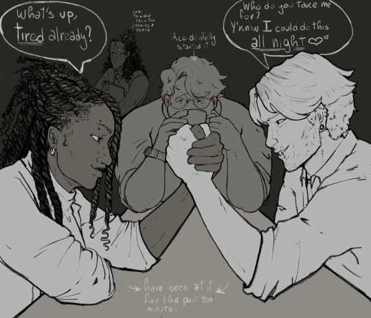
Average day in the archives
#tma fanart#season1 shenenigans#polyarchives#the magnus archive fanart#the magnus archives#tma#fanart#sasha james#sasha tma#tim tma#timsasha#the magnus institute#jon tma#tma john#tma art#tma martin#martin blackwood#jonathan sims#tim stoker#tma season one#tma s1#s1 archive my beloved#they all have a little bit of a crush on eachother#i dont make the rules#digital art#digital sketch#sasha’s design may vary#johntma#john sims
3K notes
·
View notes
Text

touch the spindle, touch it i say!
#the last time i drew Anything related to the spindle was DAYS after i got into twst and i don't think i even posted it. that's unacceptable#how could i draw silver a billion times and not the SPINDLE??? HELLO??? all i care abt drawing is delicious plot ITS RIGHT THERE?#in the movie not the game. YEA. the comp for this was inspired by some tarot designs on twt by @wonder_yoh. BEAUTIFUL!!!#and the frame for this if u looked carefully/compared? the frame is directly pulled from the thorns in sleeping beauty concept art#nods sagely. another catríona classic. it's got all my main points. some drama. my two boys. the birds. the clouds. thorns. its all there#i am very talented at drawing the exact same idea 400 times and somehow the comp is different. and somehow its a new piece#i am here for the silver girlies and silver fans ONLY. the thought of drawing a piece without him hurts....id take damage.#love u all lots. silver nation stays strong. stays winning. these are the rules#twstファンアート#twst#twisted wonderland#twst silver#silver vanrouge#malleus draconia#suntails#ive actually kinda wanted to do a mallerollo comicy thing to a song but i cant get the motivation bc silver isnt there. isnt that sad
2K notes
·
View notes
Text
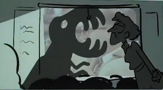
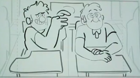
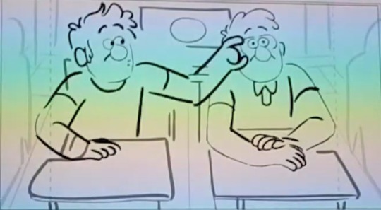
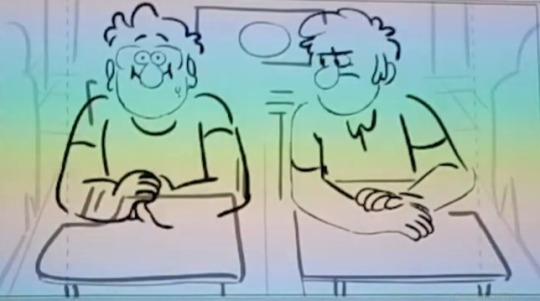
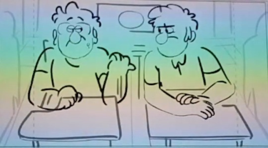
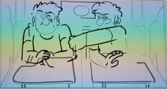
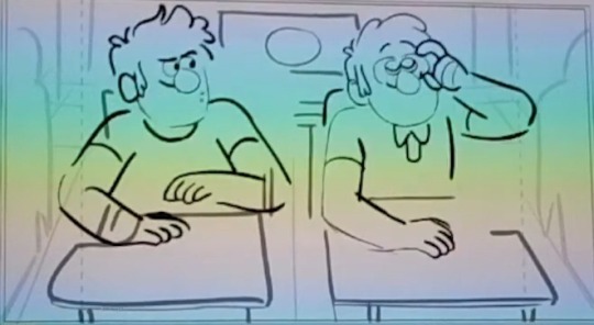
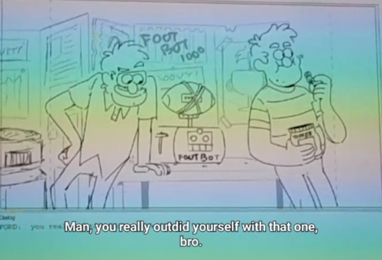
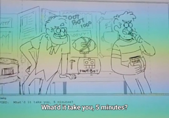
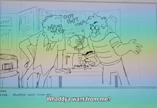
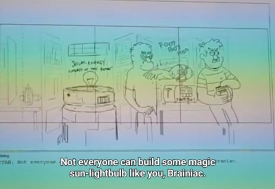
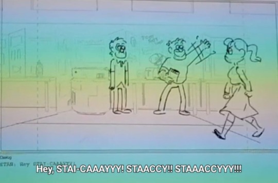
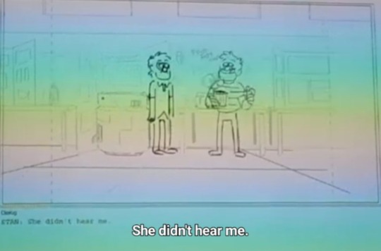
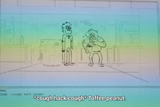
you can see that the script originally had ford building an anti-gravity machine for the science fair (which i guess acts as foreshadowing to the portal?), but the sun lightbulb feels like it would've connected to the opening of stanchurian candidate....

#it probably would've made stan's issues in that ep hit even harder but honestly its not very visually... distinct? impressive? idk#the perpetual motion machine kinda looks like a triangle and probably seems more useful and impressive in comparison tho#and yes footbot is literally a football ducttaped to a toaster#ford pines#stanford pines#stan pines#stanley pines#i do kinda like this version of stan goofing off in class#altho them switching glasses wouldn't work as well with the teen stan design we ended up getting#even still i think briefly showing them doing any type of twin switches is kinda important#with some fans ending up doubting that theyre identical twins lol#but i feel like the scene we got of ford letting him cheat is kinda important to show too#he ain't uptight about rules!!! he didn't mind helping his brother!!!#also its fun that stan likes doing shadow puppets too when he said that ford is super good at them#messy hair stan my beloved
2K notes
·
View notes
Text


𝙶𝚊𝚖𝚎 𝚘𝚏 𝚕𝚒𝚝𝚝𝚕𝚎 𝚑𝚘𝚛𝚜𝚎𝚜 🐎🐎🐎
Fully illustrated board and rule book for a board game, directly inspired by Wrong Organ's Mouthwashing !
• Want to print your own ? Follow the link in the comments, and get all the files on my Kofi for the unbeatable price of (at least) 3 bucks !
This game can and will break friendships and i will not take any accountability for it - if you love your friends play the ludo variant.
#mouthwashing#wrong organ#daisuke mouthwashing#anya mouthwashing#swansea mouthwashing#jimmy mouthwashing#board games#horror art#the download has a fun illustrated rulebook where they're all riding horses :)#it's to distract you from the fact that the rules of the dices throw will make you want to strangle someone and whack them with the board ♥#to be fair - i also designed the board as a cool print if you're not a big player :)
1K notes
·
View notes
Text

hytopia did a number on him
from here
#This is just how they greet each other I don’t make the rules#Lu legend#Lu ravio#my art#linked universe#doodles#Not my usual ravio design… I couldn’t remember what I usually do for him so I guessed; looking at my other ravio art now… I failed#linkeduniverse#linked universe fanart#Lu memes
866 notes
·
View notes
Text

Recently (finally) upgraded Cement to E2! She's got one of my favourite designs, and I've been having a blast with her!
Was inspired to draw her after being directed to @frostdemigod 's blog after raving about her. I am kneeling out of respect for that dedication
[Bluesky]
#frostdemigod there's not enough Cement content in the world and you are carrying hard! I hope you enjoy my little contribution to it!#Cement's design absolutely rules!! I changed it up a little bit here just for fun#I started drawing these “tacticalknights” at the end of last year! I'll post em all eventually!#digital art#arknights#artists on tumblr#art#sketch#Cement#Cement arknights
1K notes
·
View notes
Text

lesbian superbat doodle
#dc#dc comics#superman#batman#clark kent#bruce wayne#superbat#sort of#they’re just design doodles#they are in fact just standing there#so not necessarily romantic#rule 63#genderbend#my art
1K notes
·
View notes
Text
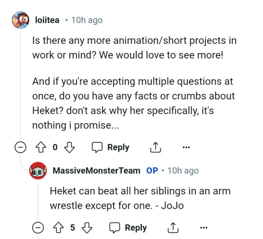
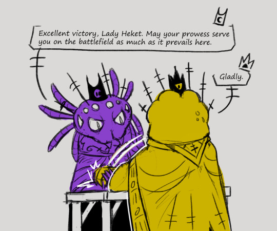
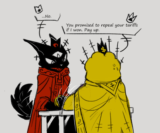

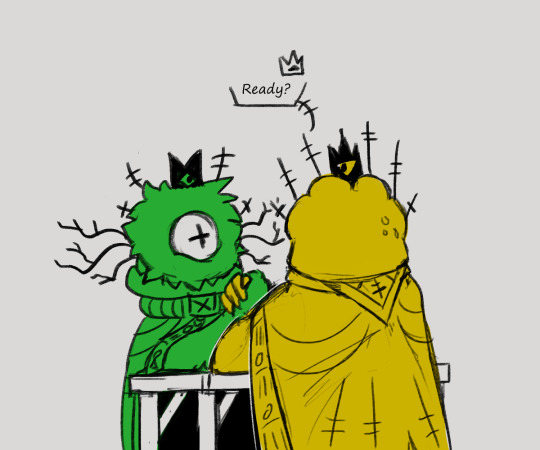
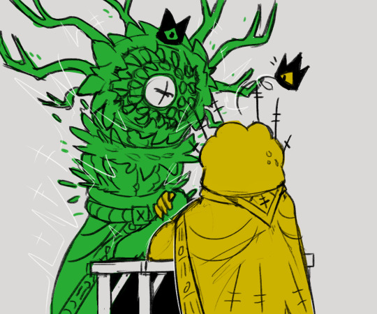

trying to make my case on why the "except for one" referred to in the AMA is actually leshy
#not because he's better or anything#just because he cannot play by the rules for the life of him#my shit#cult of the lamb#also these designs aren't final i just scribbled some down quickly for the post#uhhh how you tag the bishops#cotl shamura#cotl leshy#cotl heket#cotl kallamar#cotl narinder#shitpost#sorry for the sloppiness i cranked this out after work
5K notes
·
View notes
Text
*peering down at my own genetic sequence* uh-huh uh-huh bold choice bold fucking choices my friend
#and i don't have veto power over any of this? that Cannot be correct information#there must surely exist an Appeal Process or#*me discovering how any of reality's systems function* this can not POSSIBLY be how this system functions#*scribbling furiously filling an entire college ruled notebook DOUBLE-SIDED with a list of design flaws to present to the court*
9K notes
·
View notes
Text
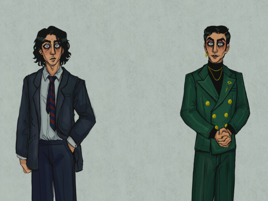
DID ONE OF MY OG ELIAS IDEAS.
I couldn't get this diagram out of my head.
Institute Director!Elias' horrid mannequin eyes were extremely difficult to get into the exact most upsetting position, but I think I accomplished it in the end.
.




.
.
.
#the magnus archives#tma#elias bouchard#elias bitchard#tma fanart#tma art#og elias bouchard#og!elias#original elias bouchard#character design#this is definitely the same guy#all of these things come with a change of authority#bureaucracy doing its thing#elias from research would whimper#i don't make the rules#Spotify
536 notes
·
View notes
Text
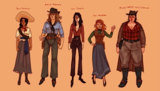
i just had to actually make them a good genderbend,,,beautiful strong women
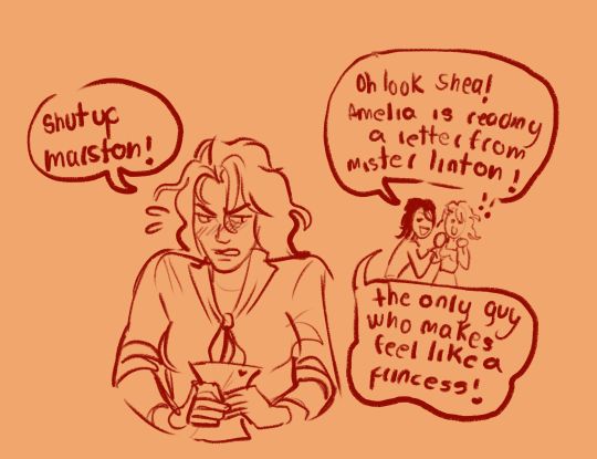
also girl arthur and her charming prince
(i forgot to put the "her" on what marston is saying)
#my art#my style#small artist#my art style#rdr#rdr2#red dead fandom#red dead redemption 2#red dead redemption#rdr2 art#rdr2 fanart#arthur morgan#arthur morgan x mary linton#john marston#javier escuella#sean macguire#bill williamson#genderbend#genderswap#rule 63#character design#lesbians#wlw#mary linton#rdr genderbend
1K notes
·
View notes