#label design tutorial
Explore tagged Tumblr posts
Visit Tumblr Blog
Explore Tumblr blogs with no restrictions, modern design and the best experience.
Last Seen Tumblr Blogs


Fun Fact
Tumblr has been providing a Korean-language service since 2013.
Text

Great design for beauty skin care logo and product label design
We make sure that the artwork we give to you is up-to the mark and attractive as well to generate more sales because More glamorous the product, More sales it comes up with Our motive is to work on high quality standards, and to fulfill the need of customer at any cost or based on the commitment.
logo design, product label design, label design, packaging design, product design, how to design labels for a product, brand design, designing a label for a product, how to label skin care products, product label design in canva, how to make labels for products, label design for product launch, bts product label design, logo design process, how to make labels for skincare products, label design tutorial, beauty product logo, cosmetic product label design
#logo design#product label design#label design#packaging design#product design#how to design labels for a product#brand design#designing a label for a product#how to label skin care products#product label design in canva#bts product label design#logo design process#label design tutorial#beauty product logo#cosmetic product label design#skincarelogo#logo#logodesigner#branding#graphicdesign#logomaker#graphicdesigner#logoinspirations#logoinspiration#logodesign#beautylogo#logotype#skincare#logos#design
2 notes
·
View notes
Text

CSS Form Input Animation
#html css form#css form#form design html#css input label animation#input label animation#css animation examples#css animation tutorial#cool css animation#html css#divinector#learn to code#code#frontenddevelopment#css#css3#html#animation
3 notes
·
View notes
Photo

Hinge presents an anthology of love stories almost never told. Read more on https://no-ordinary-love.co
2K notes
·
View notes
Video
youtube
Adobe Illustrator - How to export your label design file for print
Not sure if your Illustrator label file is ready for print? In this video we will go over 4 things you need to check in your file and how to properly export for print.
#youtube#adobe illustrator tutorials#adobe illustrator#How to export your label design file for print#graphic design#educate yourself
0 notes
Text
After releasing my first collection of UI-ish templates and widgets, I found myself making more during the process of editing my posts. I'd planned on keeping this one around the same size as the previous one, but the longer it took me to properly label and organize my layers, the more I added to the file. So now we're here at like 40-ish templates (and a few even have a hidden version).

[CLICK FOR BIGGER!]
Like my previous collection, I designed this to be a "workspace" or "canvas" from which you can just pull whatever template you need. Each template is labeled and organized into folders so you'll know exactly which layers you need for your screenshot.
Tips on how to use these can be found in the original post as well as this google doc tutorial .
Font used is Helvetihand TS4 icons - L'Universims, TheSimKid, deathbypufferfish, w-sims, Tutorial on how to extract icons
TOU: Feel free to use and edit as you wish but please don't reupload and claim as your own. If someone asks where they're from, please link to this post.
DOWNLOAD FOLDER (SFS)
Windslar Collection 2.0 (91.5mb) If you prefer a less overwhelming version, I also divided this file into two parts. You can find it (as well as the first PSD collection) in the download folder.
3K notes
·
View notes
Text
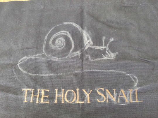
cheapskate bleach tutorial
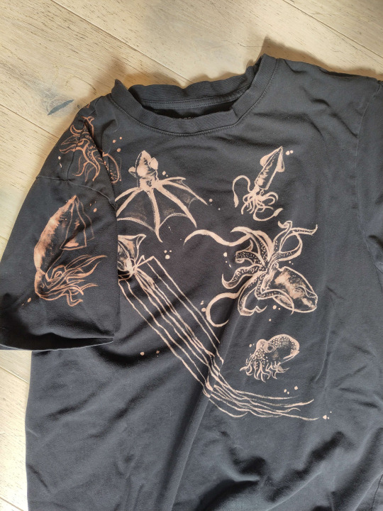
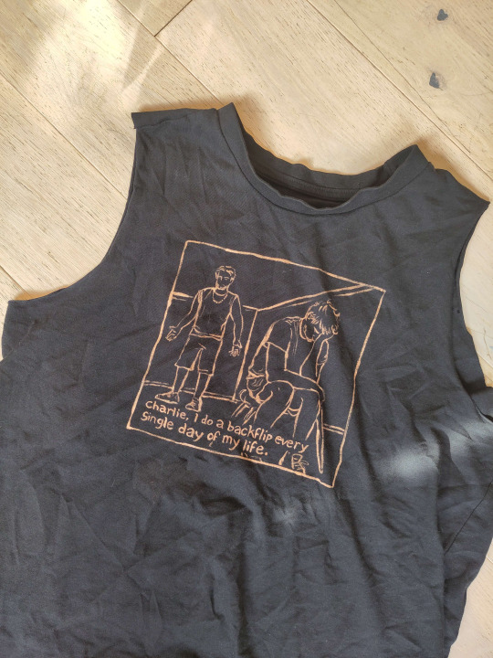
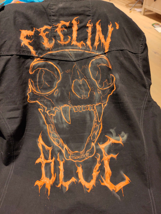
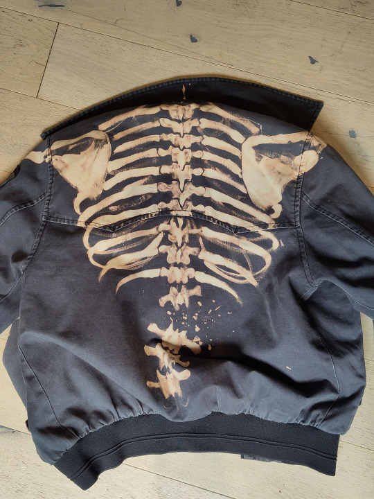
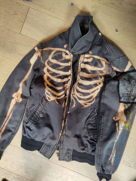
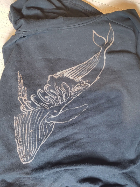
Sticking it under a readmore but this is how i make my shirts etc for like a fiver's worth of materials. I am far from being an expert btw im just playing with chemicals. also probably do this in a ventilated area or something
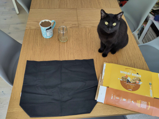
You will need:
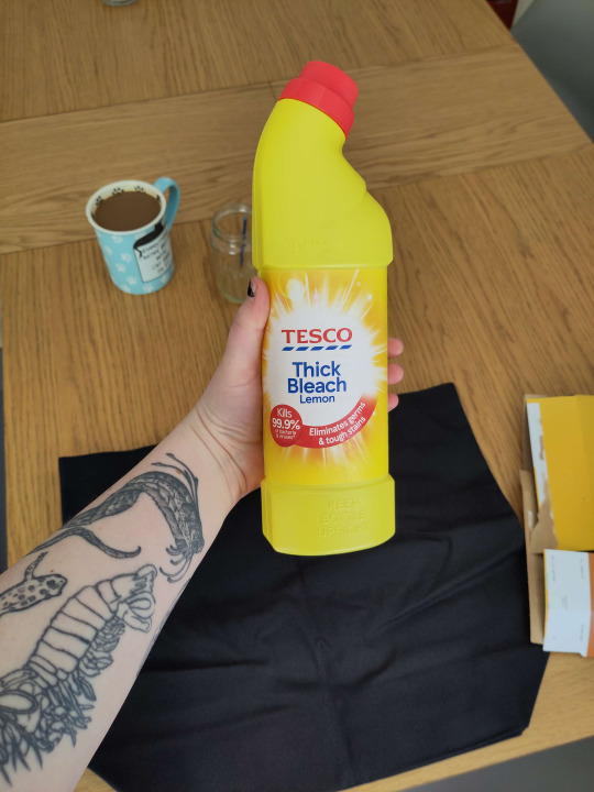
Bleach (I use thick toilet bleach it's like 80p)
The thing you want to bleach onto (In this case, a tote bag for a friend. usually i thrift old black shirts.) You should do a patch test before any real bleaching -- dab a tiny bit on the inside of a hem somewhere before you commit. I don't show that below because i forgot to do it but you should. You should ALSO iron the thing before you bleach it. So it's flat. Do as I say not as I do etc.
Something to put inside / between your garment and the table (Asda brand weetabix box babyyy)
Paintbrush (Mine is from a multipack from Poundland. I also accidentally left it in bleach last time and it kind of dissolved so I had to cut off the most egregious of the stray bristles.)
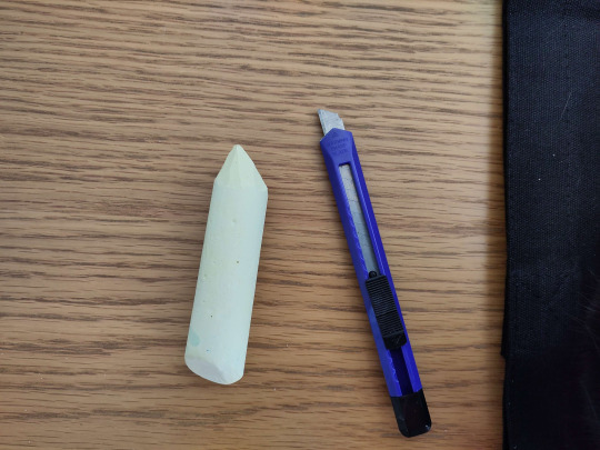
Chalk (For snacking) (I'm joking please don't eat the chalk) (I only have big pavement chalk, again, from Poundland, but you can get a good point with a craft knife)
Step one: move the cat

Step two: insert cereal box into / behind the thing you are bleaching.
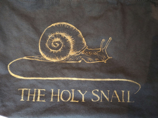
Step three: chalk on your design. this is the logo of a wine brand i have never tried but i like the snail. It can be super rough or very precise, whichever helps you know where to put your lines.
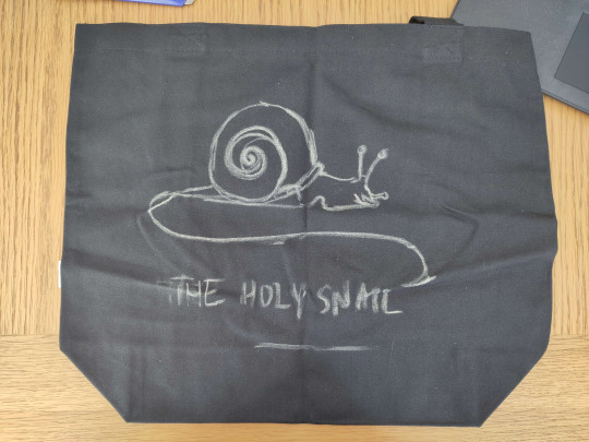
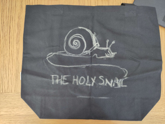
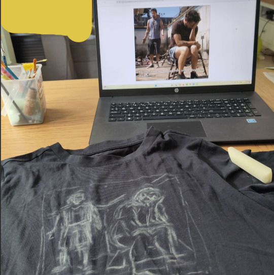
As you can tell it's easy to move stuff and redo it by just smudging the chalk away, or, worst case scenario, giving it a wash. Though that sucks if you're impatient like me bc you do NOT want to bleach this while it's wet. Once you're happy with your design, smack it around a bunch to take off most of the chalk, so you wind up with a vague outline. I didn't get a pic of this stage but here's what the iasip one looked like:
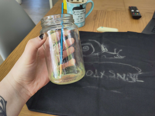
Step four: Acquire your bleach and put it in the special bleach jar your hosuemates labelled so you would stop drinking normal water out of it. Accept that Nyx hates you for not letting her drink it.

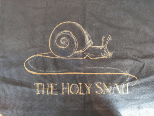
Step five: Go for it man. The bleach is kinda goopy so don't expect it to come out like paint, but it does mean that you can control the line crispness and width quite easily depending on how hard you press the brush down. I find it really helps for stuff like serif fonts.
You can dilute your bleach with water, which can help it get into all the little crevices esp if your fabric is a little bumpy, but do another small patch test before committing to anything on the main piece, because some fabrics absolutely suck up water and your lovely crispy lines will blow out like an old tattoo. don't do it. Unless you want that look, in which case get silly with it

The other weird thing abt it is obviously that you can't see what you painted right away, it takes a couple seconds to show up, so it's a pretty slow process. The fabric will first go darker where you painted, then lighten from orange to a pale yellow over about 30 seconds. DON'T go "this bleach aint shit" and paint over it to make it lighten faster -- overbleaching it can weaken the fabric and make it tear.
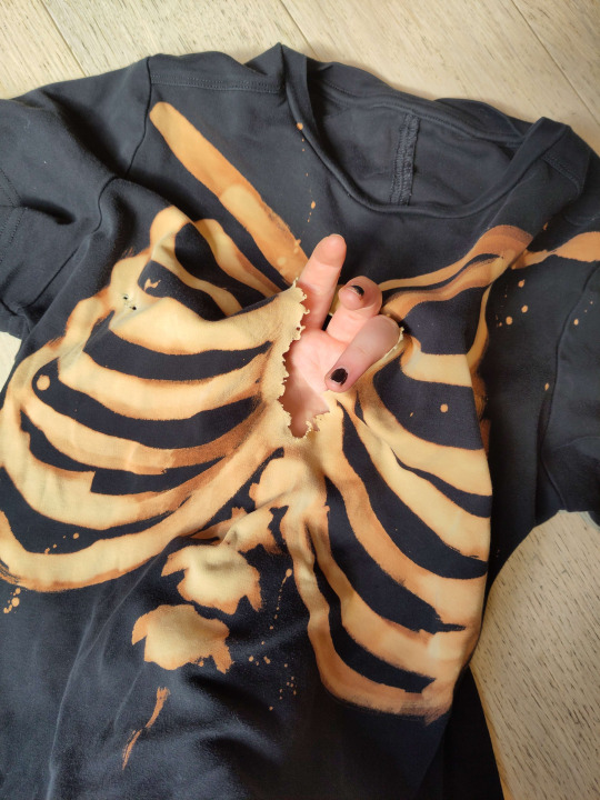
Tragic.
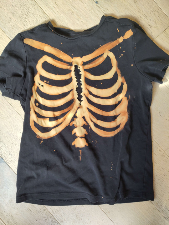
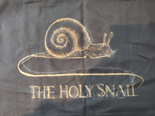
Here are some progress shots of the snail! When you're finished, you should wait for it to develop properly, but it depends how light you want it to be. I let the lines sit for a while before doing the details, and then washed it a bit prematurely so they'll stay a little darker. For nice pale yellow you want to wait around an hour.
Step six: drown her
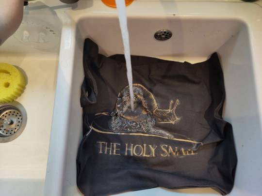
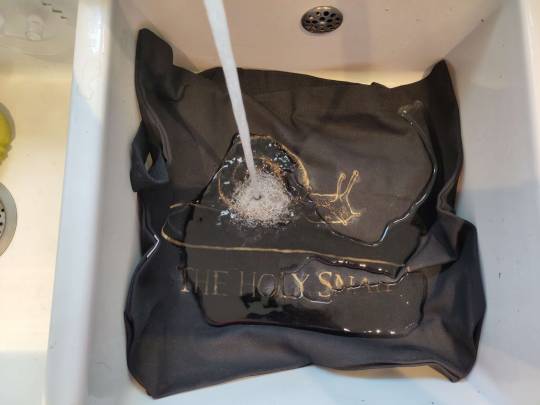
Nice cold water, wash out all the remaining bleach and chalk. I chucked it in the wash for ten minutes because it's a weird shape and size to wash in the sink and I'm a lazy bastard. but handwashing works just as well.
Step seven: revel in your new bootleg merch. You made that. You did that. thrive. go forth and make weird shit.
#bleach#art tutorial#clothes#diy#i've never done a tutorial before so hopefully this is coherent lol#img descriptions are all in alt text#it got dark while i was making this so pls excuse the varying image quality loll
210 notes
·
View notes
Text
as per a request in my local renegade server: here is my process (such as it is) for the stenciled covers i've done for my binds. obviously, huge thanks to everyone in the renegade discord for teaching me most of what i know about bookbinding. this tutorial only exists thanks to the resources they've made available and the conversations i've had there.
material list
vinyl cutter (i have a silhouette portrait 3) + mat + blade
stencil vinyl (i have this one, but have had some adherence troubles with it. unclear whether this is just The Nature Of Stencil Vinyl or whether there's a better brand out there. adhesive vinyl can also be a viable option, although i haven't personally experimented with it yet.)
transfer tape (i have this stuff. it's fine.)
weeding tools (i have this hook and a very fine tip pair of tweezers. i highly recommend getting a hook, especially if you—like me—are haunted by the specter of carpal tunnel. get an off-brand one or get one on sale, though. i only have the silhouette brand one because it was on clearance.)
acrylic medium (i have this one because it was on sale at the time i was buying acrylic medium. when i replace it, i will be replacing it with a matte one. the gloss definitely has a noticeable sheen that i don't love.)
acrylic paint (literally any paint will do. i've been mostly using the decoart extreme sheen because it's $4 at michaels. you may be noticing a theme here.)
stiff stenciling brushes (the ones i have are similar to these but cost even less. again, there's a theme here.)
an iron and some parchment paper (jury is still out on whether using heat to "set" the pattern is necessary, but i do feel like it melts the paint a bit into the bookcloth and lessens the extent to which the pattern sits above the bookcloth.)
your trusty bone folder
instructions and a truly hideous number of words under the cut.
step 0.5: discern what will make a good stencil and what will make you hate yourself, your life, and the art of bookbinding
there are a LOT of different ways to put titling on a book. you could do a paper cover with a printed design or paste paper labels onto bookcloth or foil your title onto your cover with heat activated foil. the best method depends on what kind of design you have in mind, what tools you have available to you, and what materials you're working with (for example, i've had very bad luck getting acrylic paint to adhere to Allure bookcloth, but Allure does foil like a dream).
as far as stencils are concerned, you can kind of sort cover designs into three categories:
BEST for stencils: big, bold shapes on larger format books (think letter folio or letter/legal quarto)
OKAY for stencils, but you might hate yourself: intricate detail at a large enough form factor for it to be cut well by your vinyl cutter
BAD for stencils, you will die and it will hurt the entire time you are dying: lots of intricate detail and lots of fine lines
below are examples of category 1, 2, and 3 (all designed for letter folio). to be clear, category 3 can technically be possible, depending on the design. but only undertake it with the awareness that you will die, and it will hurt the entire time you are dying.
step 1: design a thing to put on your cover
i'm not going to go too in depth on this because cover design is a HUGE can of worms. a few pointers, though:
i never start designing my cover until my text block is done. this allows me to design my cover at "full size" based on the measured size of my text block and cover boards.
i fully lay out my cover in a separate program before exporting a transparent PNG to silhouette studio (or whichever proprietary software you have to use to communicate with your particular vinyl cutter). i use affinity designer. some free options would be inkscape (if you want to work with vectors) or gimp.
i design my cover on a document with dimensions of (HEIGHT of boards + 20 mm) x (WIDTH of boards or spine + 20 mm) and 10 mm margins. the area within the margins represents the actual dimensions of the thing i'm designing, while the area outside of the margins creates a mask that prevents me from getting paint on things i don't want paint on (like the covers, if i'm creating a spine stencil).
i always outline my document with a 3 or 4pt black line. this creates the outer edge of my stencil and provides my vinyl cutter with a cut line. if you're working with a smaller vinyl cutter (like the cricut joy) there are ways to jigsaw designs together from smaller pieces of vinyl, but i'm not the person to ask about that. i specifically bought a portrait so that i didn't have to worry about that.
here's an example of one of my affinity files from a recent cover. i've exaggerated my outline to make it clearer. you can also see that i use affinity to experiment with color combinations. before i export, i turn all my elements black and make any backgrounds transparent, meaning that the PNG i import into silhouette studio looks like the one on the right.

step 2: cut and weed your stencil
again, not going to go terribly in depth here. there is a veritable army of youtubers out there with tutorials about how to use [insert propriety vinyl cutter software here]. but, again, a few pointers:
with my particular vinyl cutter and stencil vinyl, i usually cut my stencils with the material set to "washi," depth at 1, force at 13, and speed at 4. google, experiment, see what works. also, you want to put your stencil vinyl on the mat with the blue vinyl facing UP, and you don't want to mirror your design. with stencils, what you see is what you get.
i cut my vinyl a bit bigger than necessary because i'd rather waste a bit of vinyl than have to worry about a stencil falling off the edge of my vinyl because i misaligned it on the mat.
unlike HTV, you will be weeding out all the black parts of your original image. be prepared to hate the letters "e" and "a" forever, because you will have to somehow keep the little eye of them in place while you pry out the rest of it.
step 3: apply your stencil to your case
alright, now let's get into the meat of it. i always stencil after my case is finished but before i case in my book. this means that if i totally fuck it up, i can trash the case instead of the entire book.
additionally, i completely stencil my spine first (as in lay down stencil, paint, remove stencil) and then stencil my covers. i've found that it's easier when you don't have stencils overlapping and sticking to each other.
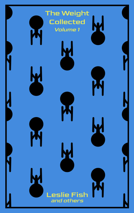
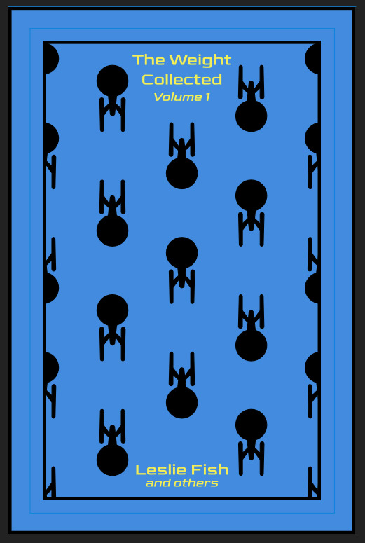
OPTIONAL STEP: mark guides onto your cover to help you position your stencil. whether or not i do this step depends on the design. a lot of the time, i just eyeball it. but for some designs, precision is key. for those projects, i use my ruler to mark out guides in white chalk for where i need certain elements of the stencil to fall. (i used guide marks for the "penguin clothbound" copies of the The Weight Collected that i've been using as an example in this post—the black rectangular boarder would've made uneven placement REALLY obvious.)
use transfer tape to remove your vinyl from its slick backing. what i've found is that you really, really don't want your transfer tape to be too sticky. you want it just barely sticky enough to pick up the stencil if you rub it down with a bone folder or your fingernail. i have a piece of transfer tape that i stuck to my jeans a bunch of times and then proceeded to use for 8 books in a row. it is, frankly, still a little bit too sticky. i have rolled it up so that i can use it for the next 8 books, at which point it will presumably be the right level of stickiness.
position your stencil. when you're happy with it, rub it firmly down with your bone folder. then do it again. then use your fingernail to score down over the titling text. then pray. in my experience, stencils prefer to stick to transfer tape rather than bookcloth. ymmv.
start at one corner of your stencil. carefully begin peeling back the transfer tape. i've found that essentially folding back the transfer tape (like, the corner that's been freed from the stencil being folded back away from the stencil) helps the tape to release. go slowly, rubbing down with the bone fold as necessary.
after you've finally manage to pry the tape off, go back and smooth down the stencil and firmly rub it down to get it to adhere to the bookcloth as thoroughly as possible with as few ripples or air bubbles as possible.
step 4: paint time!
here is a secret that the renegade discord taught me that i am now passing on to all of you: before you put any paint on your stencil, put down a layer of clear acrylic medium. the medium will finish the job of pasting down the stencil to your cover, and any leaks that happen in the process will be clear medium instead of colored paint (and will therefore be basically unnoticeable). ergo:
stipple a thin coat of acrylic medium over your stencil. you want to use an up-and-down daubing motion, not a brushing motion. brushing will get paint under your stencil. let dry.
after your medium is dry, stipple a few thin coats of your colored acrylic paint onto your stencil. let dry between coats. (i usually find that two coats is enough.) again, try to keep your coats thin. you don't want a thick layer of paint because that will create a raised surface above your bookcloth.
let your paint fully dry. i usually leave it overnight, but if i'm feeling especially impatient, i still make sure to at least give it a good three or four hours.
peel up your stencil. your weeding tools will once again come into play here to pry up little bits and pieces of stencil (like the stupid eyes of the "a"s and "e"s that were so annoying during the initial weeding stage).
step 5: optional setting stage
again, jury is still out on whether or not this is necessary, and the effects are pretty subtle. but i do it every time anyway. some tips:
use an iron on very low heat (i keep mine at the low end of the synthetic setting) and with steam turned OFF
keep a piece of parchment paper (NOT waxed paper. you want the slick paper that you put under cookies to keep them from sticking to the pan.) between the iron and your cover.
press the iron down, don't rub it like you're ironing a shirt. it's possible to smear your paint doing that (ask me how i know).
i usually lay the iron down on a section for 10-15 seconds at a time, then lift it and move it to another section.
start with less of everything (less heat, less time) and build up. always better to be conservative with this.
i usually continue until the paint is warm to the touch, then move onto another section. after it's cooled, i evaluate if i feel like it's melted into the cloth enough. if not, i repeat the process.
step 6: BOOK
congrats, you have put a design on a book cover. the world is your oyster. go forth and make books. become ungovernable.


113 notes
·
View notes
Photo

Hinge presents an anthology of love stories almost never told. Read more on https://no-ordinary-love.co
99 notes
·
View notes
Text


Tattoo Parlor Decor Set for The Sims 4
This set was inspired by my personal experience getting tattoos. Some of the signs are those I remember from my friend’s tattoo parlor. While I was excited about getting tattooing in the Business & Hobbies Pack, I did want more in terms of décor objects. I did my best to keep the items as low poly as possible, but be sure to check the poly counts for what your computer can handle.
The building in my screenshots is one I downloaded from the gallery and made modifications so it resembled my friend's tattoo parlor. The username is MickeySimmers and the original build is a NY Pizzeria uploaded on 4/7/25.
When appropriate, objects are available in English and Simlish versions. Simlish font credit to Franzilla: https://modthesims.info/ For new meshes made by me, textures from Blenderkit were used.
SexyIrish7 Phoenix logo credit: © Liliia Marchuk via Dreamstime.com
All items are base-game compatible.
This set includes:
· Tattoo Counter
· Supply Cabinet
· Salty Signs – Small, Medium, and Large
· Tattoo ink bottles
· Tattoo ink cups – empty ink cup and cups with ink colors
· Tattoo ink cup holder
· Sharps container – Wall-mounted and counter versions
· Tattoo Coil Machine
· Foot switch
· Power Supply
· Stencil Machine
· Autoclave
· Non-sterile Nitrile Glove Boxes
· Portfolios
· Consent form
· Tip Jar
You may view an Imgur album with 31 screenshots of the set here
Creations by SexyIrish7
DOWNLOAD for FREE: SFS
OR at Patreon*
*You must be over 18 to access my Patreon page.
These cc objects are new 3d meshes created using Blender and Sims 4 Studio.
All CC have:
*Ability to search catalog using search terms: sexyirish7 and si7
*Customized thumbnail
*******
CREDITS:
Software credits:
Sims 4 Studio v. 3.2.4.3 (Star): https://sims4studio.com
Blender 4.0: https://www.blender.org/download/
GIMP v. 2.10.34: https://www.gimp.org/
Inkscape v. 1.2: https://inkscape.org/
Thank you to the creators and moderators producing tutorials and answering questions!
*******
TOU:
Do not re-upload and claim as your own
Do not re-upload and hide behind a paywall
Mesh and Image Credits along with descriptions of each item are below:
Tattoo Counter
I was dissatisfied with the number of slots and their placement on the tattoo counter that came with the Business & Hobbies pack, so I modified EA’s The Ultimate Nightstand so that it served as a larger counter and added décor slots to it. There are a total of 3 large slots, 9 medium slots, and 27 small slots. I made some minor modifications to the EA texture for The Ultimate Nightstand but did include all 20 swatches.
Polygon Count: 162
Supply Cabinet
I have long been disappointed with the lack of deco slots in various displays. For this object, I modified EA’s Carina Dining Hutch so that it would serve as an appropriate supply cabinet. I made some minor modifications to the EA texture but did include all 9 swatches. There are a total of 2 large slots, 15 medium slots, and 140 small slots.
Polygon Count: 114
Salty Signs
There are 3 files of what I call “salty” signs. The large signs are not as salty, but I wanted to stick with my theme overall. What do I mean by salty? Well, these are signs that are not for the faint of heart and for those with a darker sense of humor. They were inspired not only by signs that I saw at my friend’s parlor, but also by things he and his colleagues would say frequently.
Large Signs: 7 designs (11 total swatches)
Medium Signs: 9 designs (18 total swatches)
Small Signs: 10 designs (20 total swatches)
Polygon Count: 4
The following were used in several textures in all three files:
Caution/Warning Sign Templates by kenshinstock via Freepik https://www.freepik.com/free-vector/blank-label-warning-caution-sticker-template-set_30903862.htm
Large Sign Image Credits:
Swatches 1-2: Original Artist Unknown. Image from https://razorbacktattoosupply.com/tattoo-studio-feel-the-burn-wrapped-canvas-graphic-art/
Swatches 3-4: Original Artist Unknown. Image from https://www.creativefabrica.com/product/funny-tattoo-artist-hourly-rate-cut-file/
Swatches 5-6: Original Artist Unknown. Image from https://www.pinterest.com/pin/tattoo-artist--218917231881445322/
Swatch 7-8:
Hands, Soap, and Ointment Icons by rawpixel.com via Freepik https://www.freepik.com/free-vector/coronavirus-prevention-icon-set-vector_30086831.htm
Do Not Touch Icon Image by Myshopsigns https://all-free-download.com/free-vector/download/18_warning_signs_47669.html
No Swimming Icon by Fitri Handayani via Vecteezyhttps://www.vecteezy.com/vector-art/51936014-no-swimming-sign-illustration
Bathtub Icon by Fitri Handayani via Vecteezy https://www.vecteezy.com/vector-art/51406319-bathroom-icon-with-bubbles-and-soap
Sun and Breeze Icons Images by Freepik https://www.freepik.com/free-vector/weather-icons-set_709126.htm
Talking on Phone Icon by Mungujakisa Edmond via Vecteezy https://www.vecteezy.com/vector-art/25410803-do-not-talk-on-mobile-cell-phone-icon-sign
Swatches 9-10: Tarot Card Images designed by Eight (Elian-James Showell) https://www.eightco.in/
Swatch 11: Original Artist Unknown. Image from https://www.amazon.com/Tattoo-Artist-Tarot-Card-Sweatshirt/dp/B0D8JBHBFZ
Medium Sign Image Credits:
Background images for Swatches 5-8 by All-Free-Download.com https://all-free-download.com/free-vector/download/advertising_sign_templates_retro_shapes_sketch_6849470.html
Swatches 1-2 and 13-14: Tattoo Gun Image from IMGBIN https://imgbin.com/png/ZNRSzcqv/tattoo-machine-tattoo-ink-tattoo-artist-png
Swatches 3-4: Original Artist Unknown. Image from https://www.amazon.ca/Artist-Tattoo-Artist-Kitchen-Vintage/dp/B0B6DRXFZN
Swatches 5-6: Tattoo Gun Image from IMGBIN https://imgbin.com/png/36i2fKAG/tattoo-machine-body-piercing-tattoo-artist-old-school-tattoo-png
Swatches 7-8: Bullhorn image by All-Free-Download.com https://all-free-download.com/free-vector/download/megaphone_312061.html
Swatches 9-10: Border by Rawpixel.com via Freepik https://www.freepik.com/free-vector/vector-set-vintage-elements_3139397.htm
Picture by EA from Business & Hobbies release video
Swatches 11-12: Cheese Grater Image by Macrovector via Freepik https://www.freepik.com/free-vector/cooking-food-icons_1530806.htm
Saw image by EA
Swatches 15-16: Images by EA
Small Sign Image Credits:
Swatches 1-2, 5-12, 19-20: Caution/Warning Sign Templates by kenshinstock via Freepik https://www.freepik.com/free-vector/blank-label-warning-caution-sticker-template-set_30903862.htm
Swatches 3-4: Tip jar image by Freepik https://www.freepik.com/free-vector/jar-background-with-hand-drawn-money_1148170.htm
Swatches 13-14: Image by Printable Designs https://free-printable-signs.com/
Swatches 15-16: Image by by Mungujakisa Edmond via Vecteezy https://www.vecteezy.com/vector-art/25410803-do-not-talk-on-mobile-cell-phone-icon-sign
Swatches 17-18: Crying Emoticon Image from CLEANPNG https://www.cleanpng.com/png-smiley-emoticon-crying-clip-art-no-whining-clipart-546524/
Tattoo Ink Bottles
Due to file sizes, I split these up into 2 separate files. One file has all of the bottles in English, and the other has all of the bottles in Simlish. I modified the EA debug glue bottle. There are a total of 24 swatches.
Polygon Count: 126
Tattoo Ink Cups
There are 2 files for this object. One is an empty ink cup. The other has all of the ink colors as different swatches. There are a total of 24 swatches for the filled ink cups. I modified the water glass object to create these items.
Empty Cup Polygon Count: 107
Filled Cup Polygon Count: 162
Tattoo Ink Cup Holder
When an artist is using a few different inks for a piece, they can sometimes use a holder for the ink cups so the cups do not get knocked over or spilled. This is an original mesh made by me. I have the object set up so that the ink cups (full or empty) will snap to the holes in the holder. Once the ink cups are in, you can move the entire holder to where you want it and the ink cups will go along. Or you can place the holder and then add the cups. While the holders I tended to see were plastic, I decided to make mine a metal version with slight ink stains.
Polygon Count: 208
Sharps Containers
I created 2 versions of sharps containers for this set. I originally was only going to create the wall-mounted one, but then decided to add the counter version of it as well. These are original meshes made by me.
Biohazard symbol is a public domain image
Wall-Mounted Sharps Container Polygon Count: 268
Counter Sharps Container Polygon Count: 106
Tattoo Coil Machine
There are different types of tattoo machines available, but I find the coil machine to be the most recognizable and therefore wanted this version in my game. This is an original mesh made by me. There are a total of 5 swatches.
Polygon Count: 640
Foot Switch
I created a foot switch to operate the tattoo machine with. This is an original mesh made by me. There are 11 swatches.
Design inspired by FK Delta Foot Switch https://www.fkirons.com/products/delta-foot-switch-cosmic-storm
Polygon Count: 57
Power Supply
For this object, I modified the EA Retro Rock of Ages Stereo mesh and texture to create the power supply. I used a few other EA textures to make adjustments to the components of the object.
Polygon Count: 336
Stencil Machine
Unless you allow your artist to freely draw on your skin before tattooing, many use a stencil machine to create the stencil so you can make sure that your tattoo is placed correctly and looks correct before beginning. This is an original mesh made by me. There are a total of 6 swatches (3 designs in English, 3 designs in Simlish).
Design inspired by Vevor Tattoo Stencil Printer https://www.vevor.com/tattoo-machines-c_12593/
Phoenix Image: © Liliia Marchuk via Dreamstime.com
Claddagh Image: http://clipart-library.com/clipart/8iGbR5bbT.htm
Wolf Image: https://freepngimg.com/png/2674-tattoo-wolf-png-image
Polygon Count: 62
Autoclave
No tattoo parlor is complete without the sterilization equipment, namely the autoclave. For this object, I modified the EA The Schmapple Micro Microwave mesh.
Design inspired by Tuttnauer Valueklave 1730 https://tuttnauer.com/us/veterinary-practices/tabletop-sterilizers/manual/valueklave-1730
Polygon Count: 346
Non-sterile Nitrile Glove Boxes
For this object, I modified EA’s Softy Brand Tissues object. There are 2 box colors available, black and gray. There are a total of 12 swatches.
Non-Sterile symbol is a public domain image
Polygon Count: 40
Portfolios
A detail that I thought was missing was a display of the tattoo artist’s work. In real shops, they can be wall displays or portfolios. I decided to make a portfolio with different tattoo designs. There are 3 swatches of different tattoos. This is an original mesh made by me.
Polygon Count: 262
Image Credits:
Swatch 1: EA
Swatch 2:
Snake and Flying Swallow Images by dgim-studio via Freepik https://www.freepik.com/free-vector/new-style-tribal-tattoo-collection_1168313.htm and https://www.freepik.com/free-vector/colorful-flying-swallow-template_8136770.htm
Colorful Old School Images by Freepik https://www.freepik.com/free-vector/old-school-funny-tattoo-collection_1165044.htm
Tribal, Achor, Ship’s Wheel, Skulls, Roses, Dice, Cards Images by Macrovector via Freepik https://www.freepik.com/free-vector/tattoo-black-white-icons-set_9398078.htm
Tribal Images by Freepik https://www.freepik.com/free-vector/new-style-tribal-tattoo-collection_1168313.htm
Swatch 3:
Colorful Images on Left Page by Freepik https://www.freepik.com/free-vector/collection-hand-drawn-decorative-tattoos_1175499.htm
Colorful Vintage Images on Right Page by Freepik https://www.freepik.com/free-vector/pack-vintage-hand-drawn-tattoos_1194571.htm
Crossed Swords, Anchor, Skulls, Scorpion Images by Macrovector via Freepik https://www.freepik.com/free-vector/attoo-studio-flat-icons-collection_4430574.htm
Consent Form
I created a consent form on a clipboard. This is only available in Simlish. I modified some EA textures to create the form. The clipboard is an original mesh made by me.
Polygon Count: 90
Tip Jar
Tipping is heavily encouraged for getting tattoos, at least in the U.S. As such, I decided I wanted to make a tip jar for my parlor. I modified the EA debug jar and some different debug simoleon meshes. The result is a tip jar with both coins and bills inside.
Polygon Count: 579
#tattoo#inked#tattoo parlor#tattoo decor#tattoo studio#sims 4#the sims 4 cc#the sims 4#sims 4 cc#ts4cc#wall decor#ts4#sims 4 custom content#tattoo shop decor#build/buy#sexyirish7#featured
72 notes
·
View notes
Text
PHOTOPEA TUTORIAL: RP ICONS/ICON BORDERS !
HOW I USE CLIPPING MASKS && RECTANGLE SELECT TO CREATE MY ICON BORDERS. this post will include framing the rp icon itself, the border around the icon && adding on optional block quotes—also, a bonus how-to for applying patterns to your block quotes and/or icon border; in case you're after some zesty editing !
pictured below is a simple, PRE-MADE icon that we will be attempting to recreate in this tutorial. all you need is a screencap && photopea ! as for the blockquote pattern, it is an optional design / example that i will provide later on in the tutorial ! this tutorial will involve rectangle select & clipping masks and i will cover how to do them both.

start a New Project, make sure the background is transparent. pick what size you'd like the overall border to be, not the icon itself.

you should start out with a transparent rectangle, as seen above. for this particular recreation, i've listed the width & height of my standard icon border sizes below. if you don't know, these sizes are determined by pixels.
W: 640 H: 107 i.e., W: 640 pixels H: 107 pixels.
next step: select Layer>New>Layer as seen highlighted below. this new layer is where your icon base will be/your clipping mask will go.

now that we've added a new layer for the icon base/mask to go, we're going to use rectangle select to set the size of our icon. right click where the yellow highlight(left bar) is pointing in the example below && drag your cursor to expand the "rectangle select" to whatever size icon you want. for this example(as seen below) i've chosen the size 80x80.

after you've set your desired icon size, you can now drag the selection(you should see a dotted border outlining your selection) to where you'd like your icon to be placed. i personally chose to place mine in the center—i did accidentally forget this step in the tutorial, so don't mind it if you see it move in the next two examples. though not an incredibly important detail, you can always move it after you fill it in !
once you have placed your base, select your brush tool && choose a color(highlighted in yellow, located on the left bar in the example below). you can use whatever color you'd like here, as long as it stands out to you—i usually choose red or green so that it can stand out from the background. once you've picked your color, you're going to color inside of the selection that you've made. don't be afraid to color outside of the lines...the brush will not exceed past what you've selected in advance with your rectangle tool !

once your base is colored in, you may now de-select your rectangle select tool(right click>deselect).
pictured below is an example of our current progress. as you can see i finally moved my icon to the center.

this colored shape will be your 'x marks the spot'—it is where your screencap(as a clipping mask) will be going once we finish the border of the icon.
speaking of which, now it's time to create our border ! add a new layer with the same process as before. Layer>New>Layer. name it whatever you'd like. i've simply labeled the new layer as "icon border" because it will be the layer the border goes on. make sure it is on a layer that is separate from the icon base.

in the "icon border" layer, repeat the rectangle select process outside of each side of your square/icon base. selecting one side at a time, be sure to fill it with the color of your desired border. i will be using a white border, which will be 3 pixels wide on each side. (example is of me expanding the select tool to the preferred pixel height/width outside of the base)

once you've finished creating a selection && filling each section, you can deselect && should be left with something like this:

this is optional, of course, but if you'd like you can also make an outer border/border edge. you can do this in a new layer or simply place it on the same layer as the white border. in the example icon at the top of the post, you can see that the icon i made has a gray outline outside of the white border. to do that, simply repeat the rectangle select option; and this time, only select 1 px width of space(or more, depending on how thick you want it/if your border is wider) on the outer edges of the white border. with you're new color(mine being gray as depicted) you can fill each of these edges. here's what we got going on so far !

now, to add your icon inside of the border! (it doesn't really matter if you do it before or after, just as long as you got your layers right!)

as you can see, i already added my icon to the base; you can do this before or after you've created your border && border edge. in the image above, the rectangle select you're seeing is an example of where the outer border/edge was filled in with gray. of course, to add your icon, file>open and place>choose your screencap. once your screencap is opened, right click it && once you're met with the drop down, left click the option that says "clipping mask." doing this will give you free reign to zoom in or out and move your icon around(to move it, edit>free transform && drag) all within the confines of the icon base you've created with your selection tool && brush.
our current result:

now... for optional blockquotes. make sure to start a new layer for your blockquote/s. once again, you're going to use the rectangle select tool; choose the width && height of your blockquote by dragging/expanding the tool with your cursor. i've made my blockquote 2 pixels wide because i prefer them thin—if you would choose wider blockquotes, just expand the selection.

once selected, fill that selection with the preferred color of your desired blockquotes. most people choose gray or colors relevant to their characters—i will be using red because i will be treating this as a clipping mask, so i can show you how to put a pattern into the blockquotes if you want something that stands out.

you can see ive put two blockquotes in place. you can choose to move them however you want them, or include both the blockquotes in one layer or seperate layers. i've personally separated mine for this example. (layers bq 1 + bq 2 on the side)
ADDING A PATTERN: do the same thing you did with your screencap...file>open and place>choose image. i will be using this abhorrent little pattern(free to use!) i created for the sake of this tutorial. and just like you did with placing your screencap, right click and select "clipping mask" on the dropdown. again, you can move it, zoom in and out however you please. just make sure the image is lined up with the blockquotes!

and here's what you should end up with, or something similar !

EXTRA / ADDING A PATTERN TO YOUR BORDER:
once you've gotten the hang of rectangle select/clipping masks, this part is self explanatory. basically, if you'd like to put a pattern inside your border (this will be the white border you created) you can repeat steps you took to add a pattern to your blockquote, this time placing your clipping mask over the layer with your border.

and that's pretty much the formula of all formulas for me personally—these tools come in hand for a lot of my editing !
#* MY TUTORIALS.#long post /#rp community#icon tutorial#rp icon tutorial#psd tutorial#roleplay help#roleplay resources#roleplay community#roleplay graphics#coloring psd#psds#icon psd#psd#roleplay psd#rp graphics#rp psd#rp resources#tutorial#editing tutorial#rpc tutorial#editing resources#psd coloring#icon border#icon border tutorial
286 notes
·
View notes
Text
Invention to manifest in your reality.
Magic wardrobe
A wardrobe that dresses people. You can draw clothes and they will appear as designer clothes, to your size, exactly as you thought
Crystaliseur
The Crystalizer looks like a round pocket mirror. When you open it, it opens the Crystalizer. It is made of luxury materials with gold and crystal. The Crystalizer is a magical device offered by the school: there is all the necessary information, there are holograms that can come out of it and many applications. Applications in the Crystalizer: The Map of the place, application to talk, Exploration Mode, Personalized Time Schedule, Reminders and Notifications, Priority and Suggestions, The Personal Assistant, Virtual Companion, Story Mode, Communication and Socialization, Holographic Messaging, Holographic Calls, Educational and Creative Games, Care and Well-being, Holographic Interface, Access to Information, Internal Applications, geocalizer, health, journal, Communication Support, Progress Viewer, Journal, Digital Library, Objective Tracking, Magic Calculator, Review Assistant, Career Explorer, Emotion Management, Research Support, Magic Weather, Event Calendar, music, recipe, math, calculator, Encyclopedia of Creatures, Civic Education, label, school social network, Psychological Support, Management of Task, Economics and Management, Astronomical Observatory, Dream Simulation, Sleep and wake-up analysis, Care reminder, photo album, teleportation, Guided meditation, Nutrition monitoring. Celestial map, Hygiene tutorial, Bath assistant, Interactive clock, Success history, etc. It is an electronic device that is in hologram. You can touch the holograms
Gender machine
A machine that can change your gender, if you are really sure
Diagnosty
A device to diagnose, from birth. The device is infallible, confidential. It's free. It is in all hospitals. The baby is placed in the machine and after a few minutes the device is able to diagnose a disorder, disability, disease, etc. Later, the device can diagnose diseases, infections, etc. He can also prescribe a remedy, give instructions, etc.
bookvi
A book in which people can upload images and videos. They can watch them whenever they want. It looks like a normal book
#loa manifestation#law of assumption#shifting#manifestation#law of attraction#imagination creates reality#loa#inspiration#inventions#dream life#manifest your dreams#future#futuristic#law of manifestation#fun things to manifest#manifesation#manifest it#manifesting#master manifestor#random things to manifest series#random things to manifest#things to manifest#dream reality#things to script#Things to scripts#script#reality shifting script#script ideas#scripting ideas#shifting ideas
125 notes
·
View notes
Text
Electric Hearts l k.mg (TEASER)
Synopsis: In a drunken haze, Mingyu orders a sex robot but has no recollection of it even happening. Now he has a sex robot thats way too realistic constantly trying to seduce him. Will Mingyu give in?
Pairing: Mingyu x Sex Robot!Reader
Genre: Smut, Sex robot reader, porn with plot
Teaser warnings: Fem!reader, Suggestive (not really but mentions of sex) afab reader, Wonwoo is in this like alot but he is just there as Mingyu's roommate, Reader is literally a robot LOL but she's very realistic.
Teaser word count: 665

“Mingyu!” Wonwoo called out “Your parcel is here!” dragging the abnormally big parcel into their living room and Mingyu trotted over into the living room where Wonwoo was with the box.
“I didn’t order that” Mingyu yawned, still roaming somewhere in dreamland. Wonwoo shoots him a confused look, scanning the box for any sort of indication of who it was for until he saw a label reading the recipient as ‘Mingyu Kim’
“It’s yours dude, it says your name and everything” Mingyu took a look at the box and sure enough, the shipping label read his name. He remembers he was drinking a few days back but he’s almost positive he wouldn’t have ordered something this huge, under the influence or not. Accepting his fate, Mingyu dragged the box into his room and tried to look for any other indication of what it might be, the shipping label only had the sender address written in some language he definitely did not know how to read. Grabbing a pair of scissors from his and Wonwoo’s shared bathroom, he carefully cut the box open and that's when he saw it. His eyes widened in confusion. Placed carefully within the confines of the box sat a…naked human?
“Wonwoo!” Mingyu shrieked, hearing his roommate dart towards his room.
“Look inside the box.” Wonwoo wordlessly trudged towards the box and that's when he saw it too. A human? That's naked? Inside a box that his roommate ordered? The two of them stood in silence, staring at the box until something clicks.
“Hold on” Wonwoo broke the silence, extending his hand with hesitant fingers towards you inside the box. As his fingertips brushed against the smooth surface of your cheek, a shiver coursed down his spine. Instead of the expected warmth of human skin, his touch was met with a cold sensation. Wonwoo’s gaze flickered up to Mingyu who was looking at him with the same confusion in his eyes, his mind struggling to understand what’s happening.
At Wonwoo’s touch, your eyes lit up, looking up at the two men staring down at you. “Hello”, you greeted, trying to adjust to the faces of the men in front of you. They looked down at you baffled and you realize they might not be aware of what you are. You stepped out of the box, making the men even more confused than they already were.
“I suppose you haven't realized, I’m a robot.” You explain, moving your hair to the side to reveal the small charging port at the nape of your neck. Failing to get either of the men to talk, you take matters into your own hands.
“My name is Y/N, I’m a robot that was recently developed for sexual use” The taller one of the two gasps while the shorter one with glasses freezes.
“A sex robot?” The taller man shrieks, much like the first time when he first opened the box. You take his hands in yours and place them on your chest, letting him feel you up. “I’m designed to please you” A part of Mingyu was freaked out by the advancement of technology that stood before him but another part of him couldn’t help but be turned on.
“Without further ado, I’ll begin the usage tutorial!”
Mingyu felt like he could almost pass out. What the hell did he get himself into? He was so lost in his thoughts he didn’t notice you inch closer to him, taking his face in your soft hands and pressing your lips onto his.
He jolted as your soft lips touched his, he'd be lying if he said he wasn't enticed by you but the shock of the situation made it hard for him to even react to the kiss.
“Master, why aren’t you paying attention to me?” Your voice was whiny, something neither Mingyu or Wonwoo knew was possible. The two men were at a loss of words as they watched your next steps. You sat down on Mingyu’s bed, spreading your legs to reveal your perfectly sculpted pussy. Needless to say, both men were baffled at how perfect and detailed it was.
“Can you actually put stuff in there?” Wonwoo questioned, mostly to himself but you ended up responding,
“That’s what I was built for! Would you like to give it a try?"
a/n: hiii <3 this is a snippet of my mingyu x sex robot fic, Electric Hearts! please let me know if you enjoyed and if its worth continuing HAHA i dont wanan write it all just for no one to be on the same wavelength as me </3 feedback is appreciated!! :D
352 notes
·
View notes
Text
I always love more variety in my game, and I love the conversion of The Sims careers to The Sims 2 by LientebollemeiS2I. I wanted to make them more integrated though, so with the permission of LientebollemeiS2I, here are my amendment's to these careers to include:
Chance cards (for every level)
Different career levels (since some of the levels match other careers)
Connection to University Majors
LifeTime wants! The only things they don't have are specific career rewards and Wants that will roll in the Wants and Fears panel.
Please see below for a list of the career levels (the first three levels are matched for Teen/Elder) and also links if you need information such as job descriptions, wages, work days and skill requirements:
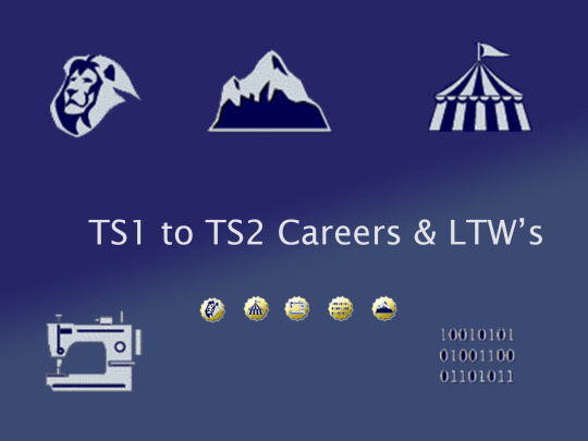
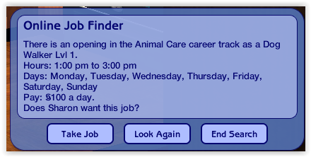
Animal Care (https://sims.fandom.com/wiki/Animal_care)
SimFileShare or MediaFire
Level 1: Dog Walker Level 2: Obedience Trainer Level 3: Sheep Custodian Level 4: Aquarium Technician Level 5: Zoo Keeper Level 6: Dolphin TRainer Level 7: Animal Acting Coach Level 8: Alligator Relocator Level 9: Veterinarian Level 10: Pet Stylist
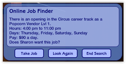
Circus (https://sims.fandom.com/wiki/Circus)
SimFileShare or MediaFire Level 1: Popcorn Vendor Level 2: Ticket Taker Level 3: Midway Carnier Level 4: Sideshow Barker Level 5: Clown Level 6: Human Cannonball Level 7: Acrobat Level 8: Trapeze Artist Level 9: Lion Tamer Level 10: Ringmaster
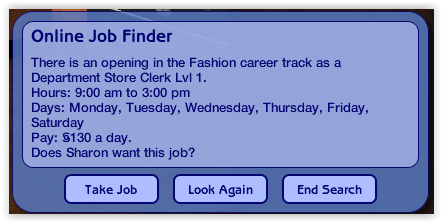
Fashion (https://sims.fandom.com/wiki/Fashion)
SimFileShare or MediaFire Level 1: Department Store Clerk Level 2: Tailor Level 3: Makeup Artist Level 4: Painter's Model Level 5: Fashion Photographer Level 6: Tradeshow Model Level 7: Runway Model Level 8: Supermodel Level 9: Fashion Columnist Level 10: Fashion Designer
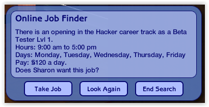
Hacker (https://sims.fandom.com/wiki/Hacker)
SimFileShare or MediaFire Level 1: Beta Tester Level 2: Support Tech Level 3: Web Master Level 4: Hacker Level 5: Security Consultant Level 6: Software Designer Level 7: Internet Entrepreneur Level 8: Software CEO Level 9: Venture Capitalist Level 10: Information Overlord
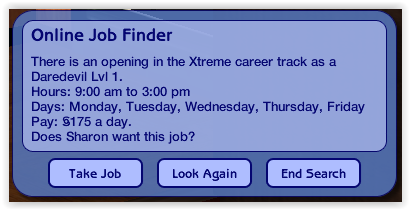
Xtreme (https://sims.fandom.com/wiki/Xtreme)
SimFileShare or MediaFire Level 1: Daredevil Level 2: Bungee Jumper Instructor Level 3: Whitewater Rafting Guide Level 4: Extreme Circuit Recruit Level 5: Bush Pilot Level 6: Mountain Climber Level 7: Photo Journalist Level 8: Treasure Hunter Level 9: Grand Prix Driver Level 10: World Surfing Champion
There are four files per career (eg. AdultCareer_AnimalCare, AdultCareer_AnimalCare_Conditions, AdultCareer_AnimalCare_LTW and TeenElderCareer_AnimalCare).
All four files are required and can just be put straight into your downloads folder.
You will notice some of the above career levels do not match the original careers. Some of the levels are already represented in other careers in the game, so I decided to swap some around and include some new jobs.
These files have new GUID numbers, so they should not conflict with other downloads, even the original versions of these careers.
The Lifetime Wants are also compatible with @lamare-sims 50 New Lifetime Wants for Sims 2: https://modthesims.info/download.php?t=669675
I'd like to thank the following members of our community for their assistance in these updates:
@sims2idea-lientebollemeis2i for creating the converted careers to begin with and providing their permission to share my amendments. Their original careers can be found here: https://s2idownloads.blogspot.com/search/label/SFS%20-%201t2%20Maxis%27%20Careers
@lamare-sims for creating the 50 New Lifetime Wants for Sims 2 mod and providing me assistance in making the Lifetime Wants compatible with their mod.
@sharlasims for her assistance and support with creating the chance cards.
@teaaddictyt For her Photoshop skills and support with converting the career icons.
@episims for their assistance troubleshooting the career outfits.
@rio-sims & @palominocorn for creating a tutorial on how to create Lifetime Wants.
I hope you enjoy my version of these careers and please do not hesitate to contact me if you run into any trouble. 06/07/2023 - EDIT: Thank you to @lamare-sims who found some errors in the files. I have fixed the LTW and Conditions files to reflect some correct instance numbers and I have reuploaded the zip files to include up the amended files. Please replace these two files for each career if you have already downloaded it. 05/08/2023 - UPDATE: @bothersomecryptid has touched up the icons and been kind enough to share them! They made them with to work better with the Clean UI. You just need to replace the images in the career file through SimPE. You can download at this link: https://drive.google.com/file/d/1q5j3AniepLh_lE_kgWgOYOkZkq9EzHNJ/view 03/09/2023 - EDIT: Thank you to @equinoxts2 and @lamare-sims for their further edits to the conditions files. I have reuploaded all files as new links, so feel free to replace the ones in your game. Children should no longer roll LTW's and you shouldn't get any errors when choosing these LTW's. 06/09/2023 - @venomander has been kind enough to create alternative icons for the careers. You can download them at these links: MediaFile 1
MediaFile 2
654 notes
·
View notes
Text

how to turn your spotify playlists into cds! (tutorial under cut)
hey dolls! shout out to @lolita-cain for recommending i drop this tutorial! here's how to turn your spotify playlist into a cd!
what you'll need
a BLANK cd-r
an external cd drive that can burn cds (if your computer doesn't already come with one!)
windows media player (this tut's going to use windows media player legacy bc i find it more aesthetically pleasing)
Avery CD labels (optional, for decorating)
an inkjet printer (optional, for decorating)
a spotify playlist
let's start!
Part One: Making The Playlist
Find your spotify playlist for inspo. You're gonna need to do this the old fashioned way, and download songs as MP3s onto your computer. I recommend doing this by using a youtube to mp3 converter site! there's a bunch out there, find one that works for you!
When you have your mp3 files downloaded, open up windows media legacy player (as I call it, WMLP). Drag and drop your files (one at a time!) into WMLP! Each file will come up with a blank album cover + "unknown album", "unknown artist," "unknown genre," "unknown year." You can right click to edit all of that information! In order to replace the blank album cover, copy the desired image by right-clicking and hitting "copy image" (ctrl-c doesn't work for this). Right-click on the blank album cover, and hit "replace album art." You may get a notice saying something along the lines of "this art can't be replaced while the song's in use", despite the song not currently playing. You'll be fine, the album art will automatically change as soon as you click out of editing that track's information.
Create a playlist by hitting the "Create playlist" button at the top of the WMLP screen! Come up with a name for your playlist.
Add songs to the playlist by right-clicking their names, hovering over "Add to", and clicking the name of the playlist! If you can't find your playlist name, check the "Additional playlists" tab!
Part Two: Burning the Playlist
After your playlist is ready, hit the "Burn" tab in the upper-right corner of the WMLP screen. Click and drag your playlist into the space below the "Burn" tab, creating your burn list. This is what will play on your CD-R! Note: CD-Rs have limited space. Know how many minutes your CD-R can play before burning!
Plug your CD-R drive in, and load your blank CD-R in the drive. Click the button that says "Start burn" in the top-right corner.
Wait for your CD-R to finish burning! WMLP will tell you when it's finished. You can also set up WMLP so that after a CD-R is finished burning, it automatically ejects from the CD-R drive!
Part Three: Decorating!
You can decorate your CD-R however you want, just make sure to only decorate the top side, and use products meant for decorating CD-Rs! This tutorial is going to use Avery CD labels for decorating!
Avery CD label sheets will tell you to visit the Avery website's templates page, and what digital templates are compatible with the physical sheet.
Play around with the digital template! Get to know its features!
When you're done with your design, hit "preview & print" in the lower-right corner.
Click "get pdf to print."
Click "open pdf."
Before you hit the print button, load the label sheet into the printer face-down. When in doubt, print a test page on regular paper!
If done correctly, your CD design will print on the right side of the label sheet! Peel it off, and place it onto the top of your blank CD-R!
Part Four: You're done, happy listening!! Good luck, I'll do my best to answer any questions!
#spotify#physical media#girlblog#this is a girlblog#girlhood#girl interrupted syndrome#manic pixie dream girl#this is what makes us girls#coquette#lana del rey aesthetic#y2k#i'm just a girl#born to die#femcel#gaslight gatekeep girlboss#girl interrupted#girlblogger#girlblogging#this is what makes us boys#coquette dollette#dollette#angelic#it girl#that girl
32 notes
·
View notes
Text
"Tails's Joke Corner: Part 2 – 200% More Chaos, 100% More Punchlines. Btw yes ididnot take much care on this thanthe lasttime technical issues
Why did Sonic start a podcast? Because he wanted to go live at the speed of sound.
Shadow tried therapy once… …but the therapist couldn’t handle the existential edge.
Rouge stole a Chaos Emerald and said: “Oops, my kleptomania’s acting up again.”
Tails built a mech that could fold laundry. It folded itself into depression.
Amy tried Tinder, but everyone swiped left. Except Sonic. He ran from the app.
Omega updated his firmware… Now he’s emotionally unstable and slightly British.
Knuckles locked his keys in the Master Emerald. The echidna tech support said: “Have you tried punching it?”
Sonic Frontiers glitch: Sonic fell off a boss and landed in Skyrim.
Shadow in Shadow Gems be like: “I am the ultimate bug report.”
Big the Cat got lost in Cyberspace. Froggy sent him a GPS pin.
Dr. Eggman created a dating sim. It only matched him with himself.
Tails installed Windows 98 on the Tornado. Now it runs slower than Classic Sonic.
Sonic ordered a chili dog. Shadow asked, “Is that your purpose?”
Shadow’s keyboard only has edge keys. Ctrl + Alt + Existential Crisis.
Silver came from the future just to say: “Bro, 06 still sucks.”
Amy has a hammer. Sonic has trauma.
Eggman tried creating a streaming service. It’s called Eggflix and only plays his TED Talks.
Chaos tried swimming in Gatorade. He evolved into an energy drink mascot.
Rouge infiltrated Area 51. Found Shadow’s original edgy design sketches.
Tails got stuck in Blender. Not the software. The kitchen appliance.
Shadow used Chaos Control to skip the tutorial. Now he doesn’t know how to play life.
Sonic forgot his rings. Shadow said, “You dropped your bling, faker.”
Blaze lit her stove with her fingers. The kitchen is gone now.
Knuckles downloaded Duolingo. He still can’t read ancient text.
Omega’s internal clock runs on doom energy.
Sonic Heroes but every team talks at once. “Sonic! Espio! Charmy! Eggman?!?”
Shadow Generations: The camera is your enemy.
Tails accidentally created ChatGPT. Now the Tornado argues with him.
Eggman made a clone of himself. He lost an argument to it.
Sonic got stuck on a wall. Knuckles asked, “You climbing or glitching?”
Amy’s hammer is Bluetooth now. It plays Spotify mid-swing.
Big became a Twitch streamer. Category: Just Froggin’.
Shadow’s motorcycle runs on trauma.
Tails modded Minecraft. It now runs in the Tornado’s cockpit.
Sonic tried sleeping. His dreams were just speedruns.
Knuckles’ dating profile: “Guardian of your heart. Punch first, ask later.”
Eggman’s mech broke. He rage quit and blamed lag.
Metal Sonic tried making toast. Set the house on fire with precision.
Sonic did a kickflip. Amy said: “Husband material.”
Shadow Generations glitch: “Camera said: I do not perceive you.”
Sonic blinked… And ended up in the ARK again.
Shadow joined a meditation group. He yelled “CHAOS CONTROL” in the first 5 minutes.
Tails tried yoga. Now he’s a pretzel with an IQ of 300.
Rouge wore stealth shoes. Still heard by Knuckles from 3 zones away.
Silver made a TikTok.
ITSTHENEARFUTURE
Eggman uses Microsoft Paint for schematics.
Blaze sneezed. The entire zone caught fire.
Knuckles found a riddle. Punched it. Problem solved.
Sonic Generations glitch: Sonic yeeted himself into the title screen.
Shadow said "Maria" so hard the game crashed.
Tails made a backup of Shadow’s memory. Now it’s just labeled “DO NOT OPEN – TOO MUCH EDGE.”
Shadow blinked in Shadow Gems… Game crashed out of fear.
Knuckles got a library card. Then punched the librarian for "being too mysterious."
Eggman tried stand-up comedy. The punchline exploded.
Sonic ran so fast, he entered another Sonic game. It was Sonic Boom. He immediately ran back.
Tails made a smart fridge. Now it lectures him about nutrition.
Amy joined a rock band. Her instrument? The hammer, obviously.
Omega tried painting. The canvas caught fire from rage.
Shadow sat in a therapist's chair. The chair disintegrated.
Sonic got a sponsorship deal. It was for anti-glitch spray. He refused.
Rouge tried yoga. She stole everyone’s mats.
Knuckles made a smoothie. He punched the fruit directly.
Shadow hacked the game code. He replaced all NPCs with himself.
Sonic found a bug in Shadow Gems. Shadow just called it a “feature.”
Tails asked ChatGPT for advice. Now he’s building a sarcasm bot.
Eggman joined Twitter. He blocked Sonic in real life.
Big the Cat wandered into Final Fortress. No one knows how. Not even Big.
Silver said “IT’S NO USE” at a coffee shop. Now he's banned for life.
Shadow downloaded Spotify. Every playlist is titled “Angst.”
Sonic tried ASMR. Too fast. The mic exploded.
Tails built a drone. It follows Shadow and whispers “edgy…”
Knuckles tried sushi. Punched the wasabi.
Amy wrote a fanfic. Sonic moved to another timeline.
Omega tried gardening. Now he grows C4.
Shadow entered cyberspace. The internet got emotional.
Sonic got invited to Smash. Shadow broke the door down asking “WHERE’S MY INVITE?!”
Tails made a Sonic AI. It speedran its own shutdown.
Eggman bought a Fitbit. Declared war on his step count.
Rouge got a diamond sponsorship. She stole the diamonds right after.
Sonic accidentally boosted into a mirror. Said “Sorry faker” to himself.
Knuckles started a podcast. Only one episode. It’s just grunting.
Shadow turned off motion blur. The game lost 90% of its style.
Tails programmed a meme bot. It only posts "Shadow = edgy" memes.
Silver tried therapy. Time travel made every session awkward.
Omega entered a rap battle. He dropped bars and missiles.
Big became a motivational speaker. His only advice: “Froggy.”
Shadow walked into a Hot Topic. Got hired on sight.
Sonic got a glitch where he turned into a car. Shadow drove him off a cliff for “justice.”
Rouge disguised herself as a Chaos Emerald. Knuckles fell for it.
Tails made an AI Sonic. It spent 3 hours saying “Gotta go fast.”
Eggman’s mech had a voice assistant. It refused to listen unless bribed with EggTokens.
Shadow stared into the void. The void blinked.
Knuckles tried a Rubik’s cube. Solved it with one punch.
Sonic made a cooking show. Every dish was chili dogs.
Silver said “It’s no use” to a vending machine. It worked.
Omega tried to join Instagram. Got banned for explosive selfies.
Amy went to therapy. The hammer got its own seat.
Tails accidentally opened the multiverse. Now there are 12 Sonics and a plumber.
Shadow tried journaling. It was just the word “darkness” 400 times.
Sonic met his alternate self. They raced. Time imploded.
(Btw there might be errors bc of autocorrect in the text like reblog this took me a whilee btw what shoud i do next theory or etc?)
#tails the fox#sonic the hedgehog#shadow the hedgehog#rouge the bat#knuckles the echidna#dr eggman#amy rose#silver the hedgehog#blaze the cat#big the cat#omega#sonic jokes#shadow gens#shadow generations#sonic memes#tails jokes#sonic tumblr#sonic glitch#sonic fandom#gaming memes#funny sonic#sonic humor#chaos emeralds#chaos control#chaos blast#glitchcore#glitch memes#hedgehog with attitude#sega#sega memes
23 notes
·
View notes
Note
hi! not exactly a request but i do wanna ask, whats your process when you're rendering more paint like art? (if that makes sense, English isnt my first language so apologies hdskhsjdbd) i really love how you use the colors and im curious how you do it :0
i’ve been meaning to answer this one for a while so here’s how i painted miku in today’s post (put under the read more because yeah prepare for a long post
i’d also like to preface this by saying that i never follow a set way of doing things, so in terms of what my personal process is like, these are only broad strokes of what i do! sometimes i’ll combine or skip parts entirely, depending on how i feel. also, this is not a tutorial, just how i do things, so please don’t treat it like one :’D this will read like the ‘how to draw an owl’ picture if you do
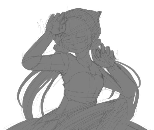
first, like every artist, i sketch. more specifically, i’m getting an idea of what i want to paint later on. this could be how a scene is set up or in this case, how a character is posed. here i’m not concerned about details or getting everything perfectly, i’m only planning how the thing will be composed. maybe a lot of canvas size changing, or adjusting what miku’s doing (note how busted miku’s right hand looks from all the transforming!) however, i still have to be concerned with how clear the sketch will be to future me, because the sketch won’t be any good if i can’t read what miku’s doing

after that, i lay down a flat gray under the sketch, mainly focusing on giving miku a clear silhouette. this is also a good time to make adjustments to the composition on the fly if i suddenly feel like something can be improved upon, like shortening miku’s left arm from the sketch!
after painting a flat silhouette, i start shading in grayscale, focusing only on lighting. i usually do it in two passes, one for the lightest and darkest tones i’ll use (not black and white) and then a second for midtones to blend them better with the base gray but i forgot to screenshot the result of the first pass 🗿 nevertheless, here is where i can start adding some amount of details. i’m not including any extra accessories yet, just focusing on the base design of the outfit and the character herself (for anyone wanting to draw characters from That Gacha Game, this is how i personally make the process more bearable for myself.) i still use the dark gray to separate where certain details (like the facial features and fingers) begin and end, mainly to make colouring more bearable later.
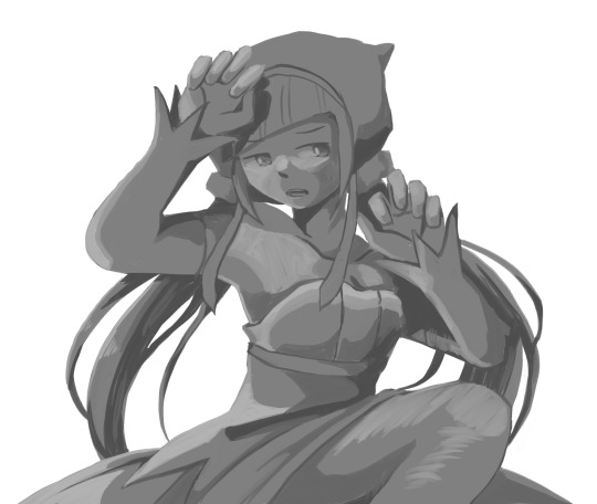
now here’s where i get the Good Colours. it’s a cheat lol. i put a gradient map layer over the grayscale painting so that there’s a little bit of color to start. some gradient maps can be applied as is, some need the layer settings adjusted to make it look good. this one, for example, is a (free) gradient map set from the csp assets store that needs you to set the layer opacity to 20% and to set the blending mode to color to achieve this result. in general, i tend to pick which gradient map i want to use based on vibes, or basically whether i want the work to be warmer or cooler, colour-wise. but this does do quite a bit of lifting for the colors in my stuff.
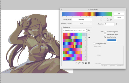
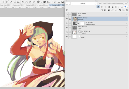
and then, finally, i add the colours. i add flat base colours in an overlay layer. at this stage, i’ve made the character silhouette clear enough that i don’t need to refer to the sketch anymore for what miku looks like. also, the gradient map layer does its magic by making the shading a bit more vibrant than it would’ve been without it. after that i paint over with a new layer to add details like the lace.
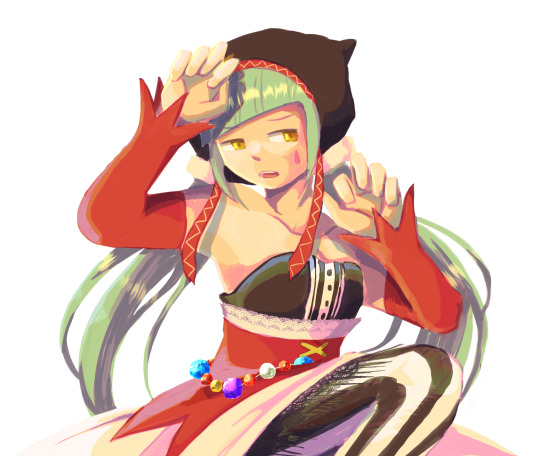
and then i put some extra shading on top. basically this is where the ‘better lighting’ happens. again, this isn’t a tutorial, so i’m not here to say what each part of the lighting is, but i’ve labeled which layers do which job. in other works where the lighting within a scene is more defined (from a window, from a small crack in the walls, etc) the glow dodge layer may be more opaque and sharper, but since this isn’t a work with that, the lighting was applied using an airbrush. the linear burn layer is also there to make the whole thing darker so the glow dodge doesn’t end up oversaturating miku. i also usually match the lights to the vibe i want, and use a complementary color for the shadows. so here you can see i have warm colors on the glow dodge layer, but light purple on both the linear burn and multiply layer.
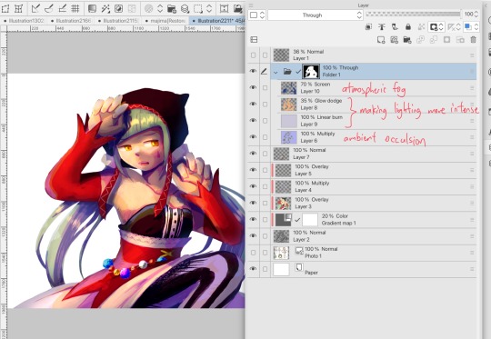
and that’s it for the character—here’s a gif showing how each layer adds to miku! (sorry it’s so toasty)

as for the background, depending on the complexity, it may go through a similar process, or if i can settle with flat image backgrounds, i just go for that. it’s ok to use external image materials. i didn’t have a background in mind for this miku in specific, so i got some default csp materials and threw together something
and that’s about a rough overview of what my process for more finished works looks like! again, art is a fluid process so i never specifically stick to certain steps all the time, and you shouldn’t either. i can probably answer why i’d pick this colour over another in one particular work, but it’s something that kinda has to be learned on a grander scale. i think everyone can already feel what colors work with what atmosphere or what setting, even if they can’t immediately explain why. colors and composition do take some level of experimentation to find what works best!
125 notes
·
View notes
Note
Hi I just started embroidering two weeks ago but I’m also interested in cross stitching. Can you explain the difference between the two (if there is any)?
I can try! Bear in mind that I'm self-taught in a "keep stabbing it til it looks right and turn to books/YouTube only if I'm really stuck" way, so people who were actually trained could probably do this better, and I'm open to being corrected.
Cross stitch is a type of embroidery where each stitch forms an X. It's often, but not always, done on Aida cloth, which looks like this:
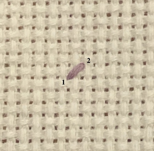
Each X covers a square of the cloth, so the result is a bit like pixel art:

If you have a line of stitches of the same colour, a lot of people will do a line of half-stitches, then work their way back (called the Danish method):

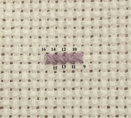
That's really down to preference. Personally I switch between Danish and English (where you complete each X before moving on to the next one) depending on the geometry of the pattern I'm working on. The main thing is that the top arm of each X should be facing the same way to keep the piece looking tidy.
That's the basic idea, and there are plenty of patterns out there that only use cross stitches. Some patterns will also use back-stitching for outlines or details. Generally you do the cross stitching first, then back-stitch over top.
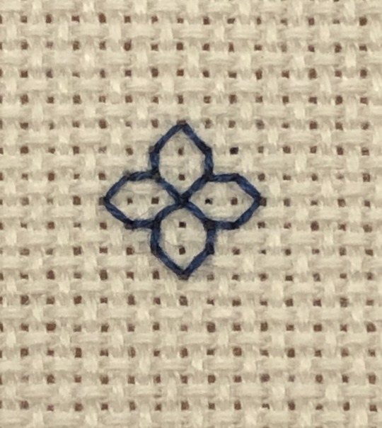
The majority of what I do is actually blackwork, which is related to cross stitch in that it's a type of counted work (each stitch covers a set number of threads of the fabric). I mostly use Aida cloth, but any evenweave fabric would work. There are a number of different styles of blackwork, but the one I do most often involves back-stitching geometric motifs to fill a section of a larger design. The pattern will show lines on a grid corresponding to the grid of the cloth:
A few things that might help if you're getting into cross stitch:
Aida cloth comes in different sizes. You'll see it labeled as 11-count, 14-count, 18-count, etc. That tells you how many squares/stitches there are per inch, so your stitches on 18-count will be much smaller than on 11-count.
If you buy 6-strand embroidery floss, you'll want to separate it into individual strands. If you're cross stitching, then usually the lower the count of your fabric, the more strands you'll need to make each X form a solid square and avoid having fabric show between your stitches. I use fewer strands with blackwork, because it keeps the lines sharp and makes the motifs stand out better. The pictures above are on 18-count. I used 2 strands for the cross stitch, and 1 strand for the blackwork (note that varying the number of strands can also be a method of shading in blackwork, but I haven't really used that technique before).
Some stitchers will tell you that the back of your work should look as neat as the front. If you want to aim for that, go for it. I'm really only careful about the back of my work if I know it's going to be visible in the finished piece; other than that, my backs are chaos and I'm fine with that.
This was at best a really basic overview of cross stitch. Some patterns use things like half-stitches and three-quarter-stitches to get different effects or smoother shapes. Some patterns will call for higher count cloth (like 28-count or more) and have each stitch cover two threads instead of one (called working "over 2"). There are all sorts of YouTube videos and tutorials that cover these things better than I can, but feel free to ask any questions you have, and I'll do my best.
Above all, have fun with it, and I hope it becomes something you enjoy!
270 notes
·
View notes
Photo

Hinge presents an anthology of love stories almost never told. Read more on https://no-ordinary-love.co
2K notes
·
View notes
Text
Naturally, Unknown did not expect, when he brought you back to Magenta, that you’d be so glib about the whole affair. You talked and joked with him on the car ride here, apparently unaware of (or, at the very least, unperturbed by) the blindfold covering your eyes. You didn't seem at all fazed by his rough handling as he steered you through the compound itself, and you even complimented the design of his crisp white suit. So perhaps Unknown should’ve been prepared for your reaction when he finally took off your blindfold in the intelligence room.
Instead, he’s a little caught off guard by the way you move your hand up to cover your mouth and stifle your laughter. “Oh my god,” you giggle.
“I told you I had a present for you here in paradise,” Unknown points out, trying to sound smooth and unbothered. He doesn’t understand what you’re laughing at. The gift he picked out for you might be simple, but he feels it suits the occasion and fits your interests well enough,
“Yep,” you manage between giggles, kneeling down to examine the gift that Unknown left out for you. “It’s just… earlier, I thought you were hitting on me.”
Unknown thinks back to your compliant behavior throughout this entire ordeal. “And you went along with it.” Apparently, this whole time, you’ve had some sort of crush on him. Maybe if he’d known what to look for, he would’ve picked up on the signs.
“Um, yeah?” Your amused expression has transmuted into one of disbelief. “Anyway, what was I supposed to think? You called me and told me to entertain you with my frightened face!”
“Yes,” Unknown confirms. He did, in fact, say that, which might explain why you’d think he was interested in you. In your defense, he is interested in you— but he doesn’t see how that would be mutually exclusive with the gift he’s given you. “But I also said I had a present for you, prince(ss). Did you think I was lying?”
“I thought it was a euphemism,” you admit, “Like, ‘yes, hello, cutie, I have a little gift for you,’” You lower your voice into an annoyingly passable impression of Unknown’s most seductive sneer. He really did not expect this when he brought you to paradise, but perhaps he should’ve seen it coming. “And then you’d go in for the kiss.”
“Would you rather have that kind of present instead, cutie?” Unknown drawls, establishing himself in a languid leaning position against the wall. Despite himself, he’s looking forward to hearing your answer. You have the absolute audacity to giggle at him.
“God, you’re so cute,” you observe without malice. To your great fortune, Unknown discovers that he doesn’t mind being labeled as something so trifling as cute when you’re the one doing the labeling. Still, you shouldn’t press your luck. “I think I’ll be keeping the socks,” you decide, picking up the parcel and carefully removing the red ribbon tied around it so as not to damage the bow. Unknown feels gratified that you’re pleased with his handiwork— he did spend several minutes following a metube tutorial to dress the present that way— though his heart sinks at the knowledge that he’s apparently missed his chance for a kiss. “The penguin print is really cute, and anyway, I didn’t bring any luggage. These socks are the only change of clothes I have.”
Unknown chafes a bit at your decision to describe a pair of penguin-print socks with the same adjective you just used on him, even if you did mean it as a compliment. “I can get you clothes to wear.”
“If you want,” you flop down in Unknown’s desk chair, looking unfairly attractive. “But… since you gave me a present, shouldn’t I get you something in return?” You fashion your lips into a pout, being obvious and really altogether corny.
But, then again, Unknown is a man who tried to lure you to paradise with a pair of novelty holiday socks from a department store Christmas bin. Clearly, corniness is not a dealbreaker for him. “What did you have in mind, sweetheart?”
You shudder at his tone. Then you have the nerve to say, “I was thinking maybe some Christmas tree socks?”
Unknown turns around to face the wall, against which he presses his forehead. “Okay.” He had thought you’d want to kiss him. After all, you seemed so eager when you arrived. But he’s not interested in pushing for something that you don’t want to do.
“I’m kidding,” you announce, “Let’s make out. I left my wallet at the apartment, anyway. If I got you the socks, I would have to steal them, and then we’d both get in trouble.”
Unknown is so excited to follow your suggestion that he ignores the second part of your utterance entirely. The placement of your wallet is a topic to be explored at a later date.
#mystic messenger#mystic messenger drabble#choi saeran#saeran choi#unknown mystic messenger#fanfiction
20 notes
·
View notes