#texture tutorial
Explore tagged Tumblr posts
Visit Tumblr Blog
Explore Tumblr blogs with no restrictions, modern design and the best experience.
Last Seen Tumblr Blogs


Fun Fact
Average visit duration of Tumblr.com is 10 mins and 25 secs.
Text


If you want a slightly more detailed explanation, head over to my Instagram page!
30 notes
·
View notes
Text
youtube
As usual, my tutorials focus on understanding the software and how to use its tools for your own works so here is one focusing on how you can use texture brushes with your painted bases and the software's modes and tools to paint more believable textures. You could also create textures this way and export the maps to bring into 3D material nodes if you wanted. Happy arting!
Patreon
LinkTree
#art tutorial#tutorial#digital art tutorial#digital art tutorials#software tutorial#texture tutorial#texturing tutorial#jaeharuart#digitalart#digital art#Youtube
13 notes
·
View notes
Text
Texture in Digital Pattern Design: Essential Guide to Pattern Effects
Hey texture explorers! 💫
You know that moment when you're staring at your pattern design thinking "why doesn't this look like the ones I love on Pinterest?" Yeah, we've been there too (like, a lot 😅). After countless hours of trying to figure out why our designs felt... flat, we finally cracked it: TEXTURE.
We're not talking about those overwhelming, over-the-top textures that scream "I just discovered filters!" We mean those subtle, gorgeous details that make digital patterns feel alive. You know the ones!
Here's what we've learned on our texture journey (and we're still learning!):
→ Sometimes the smallest grain makes the biggest difference
→ Abstract textures aren't as scary as they look
→ Gradient textures? Total game-changer
→ Those "happy accidents" with mixed media often turn out to be the best designs
We've put together everything we wish someone had told us when we started - all the trials, errors, and tiny victories that got us here. Because honestly? We're all figuring this out together, and that's what makes it fun!
✨ Check out our full guide here: https://design2repeat.com/texture-in-digital-pattern-design
Let's keep exploring and creating together! Drop us a note if you've had any texture "aha!" moments - we'd love to hear about your journey too!
#digital art#pattern design#artist resources#design tips#art tips#digital design#surface pattern design#artistic#art reference#artists on tumblr#design resources#pattern tutorial#digital pattern#texture tutorial#art tutorial#design help#artist help#pattern artist#surface design#pattern maker
2 notes
·
View notes
Text
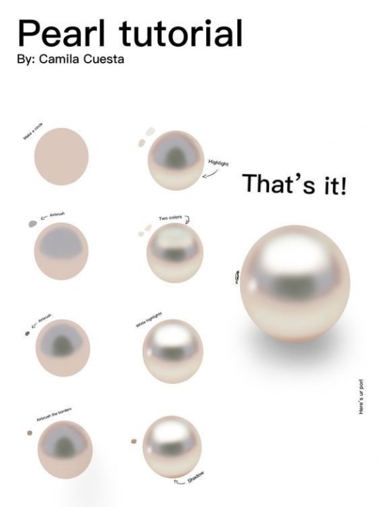
“Pearl painting process by Camilla Cuesta applies to hand-painted gameart texture painting too!”
Source: Twitter at artofjeffp
3K notes
·
View notes
Text

As a thank you for so many new followers, here's a brand new edition of my editing resources masterposts ✨ (you can find the previous editions here). Make sure you like or reblog the posts below if they’re from other blogs to support their creators! A friendly reminder that some of these are free for personal use only, so be sure to read the information attached to each resource to verify how they can be used.
Textures & Things:
Collage Kits from @cruellesummer that I find myself using basically every single day
Taylor Swift Wax Seals from @breakbleheavens that I also use literally every day
Rookie Magazine Collage Kits (1, 2, 3, 4, 5, 6, 7, 8, 9, 10)
Scribble Textures & Cross-Outs (1, 2, 3)
GIF Overlays (1, 2, 3)
Film Grain & Noise Textures (1, 2, 3)
Paper Textures (1, 2, 3, 4, 5, 6, 7, 8)
PNG Overlays (Paper, Flowers, Clouds, Stickers, Lips, Vintage Paper, Misc. Symbols)
Halftone, Scan Line, & VHS Noise Textures (1, 2, 3, 4)
VHS Tape Textures by @cellphonehippie
Misc. Texture Packs (1, 2, 3, 4, 5, 6, 7, 8)
Photoshop Effects (Halftone Text Effect, Chrome Effect, Glitch Effect, Ink Edge Effect, Photo Morph Effect)
Fonts:
Badass Fonts (free fonts designed by womxn 🤍)
Open Foundry Fonts
Free Faces
Uncut Free Typefaces
Some Google Fonts I Like: Instrument Serif, DM Sans, EB Garamond, Forum, Pirata One, Imbue, Amarante
Some Adobe Fonts I Like: New Spirit, Ambroise, Filmotype Yukon, Typeka, Big Caslon CC (TTPD Font!)
Some Pangram Pangram Fonts I Like: Editorial Old, Neue World Collection, Eiko, PP Playground
Fonts In The Wild (font-finding resource)
Tutorials & Resources:
Comprehensive Rotoscoping Tutorial (Photoshop + After Effects, great for beginners!) by @antoniosvivaldi
Rotoscoping & Masking Tutorial (After Effects) by @usergif
Texture Tutorial for GIFs by @antoniosvivaldi
Color Control PSD by @evansyhelp (to enhance, isolate, or lighten specific colors)
Cardigan Music Video PSD by @felicitysmoak
Picspam Tutorial by @kvtnisseverdeen
Moving GIF Overlay Tutorial by @rhaenyratargaryns
GIF Overlay Tutorial (+ downloadable overlays!) by @idsb
Icon & Header Tutorial by @breakbleheavens
GIF Blending Tutorial by @jakeperalta
Split GIF Tutorial by @mithrandirl
Guide to Coloring Yellow-Tinted Shots by @ajusnice
Slow Motion After Effects Tutorial (useful for GIFs!)
Gradient Map Tutorial by me!
Misc:
How to Make Your Own Textures by @sweettasteofbitter
How to Report Tumblr Reposts of Your Work by @fatenumberfor
Tips for Accessible Typography
880 notes
·
View notes
Text
Texture tutorial! Enjoy :)
419 notes
·
View notes
Note
i see you have a little grain effect on all of your digital art that I've seen, and as a fellow krita user i NEEEEEDD to know how you do it bc it's just so scrumptious looking
OKAY SO you want to find a noise texture of your choice and upload it as a pattern here, in the upper left corner, I forgor what it’s called:
Then you can use the bucket tool to fill the whole canvas on its own layer. Then you want to make the blending mode or whatever “combine normal map”. I then turn the opacity down to like 5-10% depending on how it looks with the drawing :)))
Here are some close ups of that grain effect, the combine normal map option makes for some really fun and subtle coloring that I prefer over some of the other blending modes
256 notes
·
View notes
Text
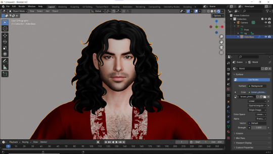
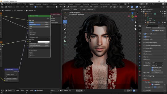
How I do my lighting in EEVEE for Blender 4.0 (´。• ᵕ •。) ♡
Are you running your Blender on a toaster? Don't wanna spend much time on rendering in Cycles? Here's some EEVEE tips for you!
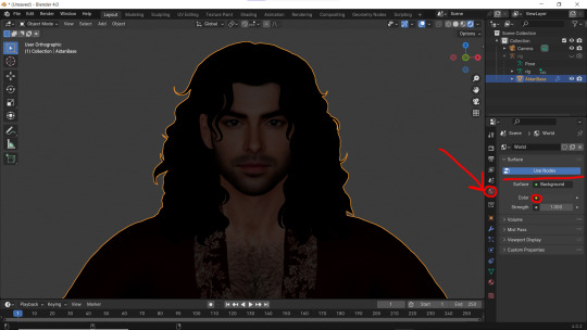
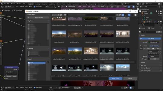
1 - Let's put some HDR lighting on! Go to the Worlds, choose Use Notes and hit that little yellow dot next to the Color.
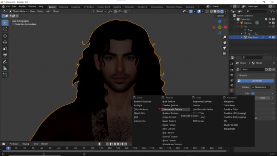
2 - Pick 'Environment Textures'
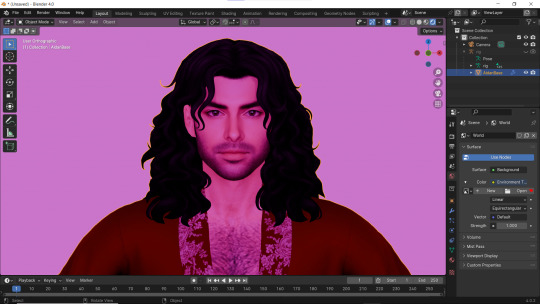
3 - You'll see everything in purple. But worry not! It's just bc you haven't applied any textures yet! Just go on and hit Open.
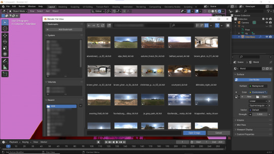
4 - You can find plenty of free, high resolution HDRI textures on Poly Haven. I have almost all of them! Go get some for yourself too and navigate to their location. Pick any you like!
Well... It doesn't look good yet :D
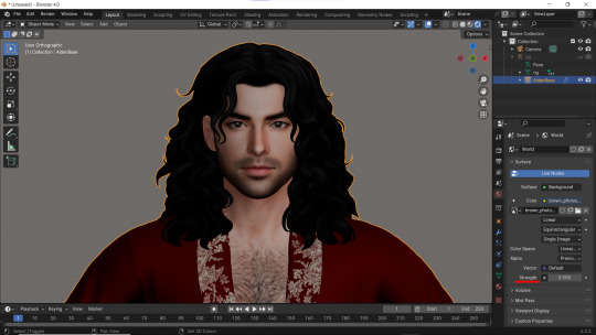
5 - Lower the Strength of the light.
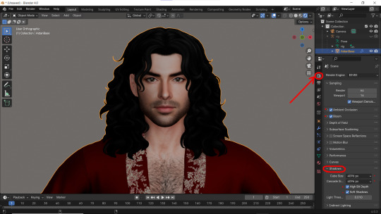
6 - Now. Let's go to the Render Properties and check Ambient Occlusion and Bloom (you can play with it's parameters and see which fits you better). THEN... Go to Shadows and increase the resolution to the max. High Bit Depth and Soft Shadows must be checked too!
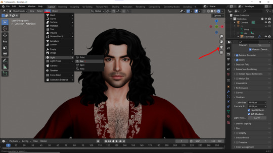
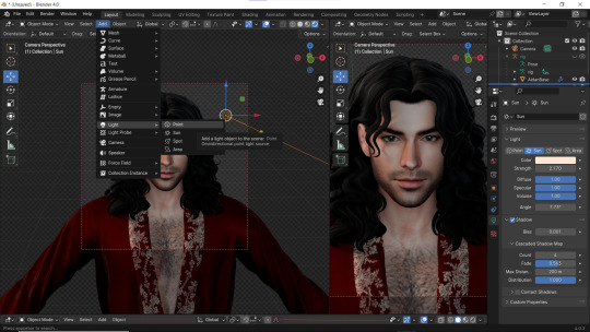
7 - Let's Add our very first light (The Sun)! And go to the Camera Mode.
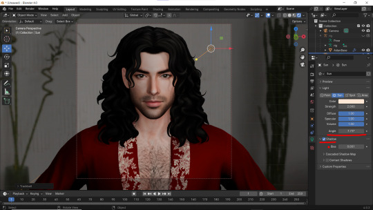
8 - In the Sun Shadow settings: Soften the light by increasing the Angle; Lower Bias to the max.
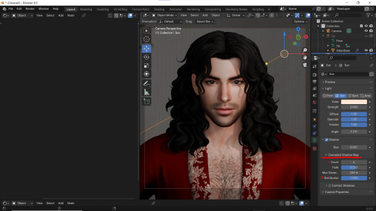
9 - Change the parameters of Cascade Shadow Map the way it looks better for you.
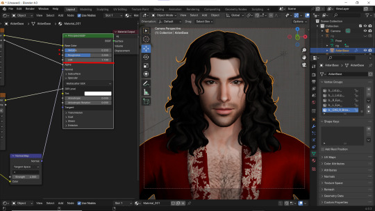
10 - Also don't forget to fix the specular appearance of your model ;3
Now. I don't hate it. But I don't like it much either... So I played and tried several Environment textures for better result.
11 - Looks way better! Now let's go to the Render Properties once again and remove the background in the Film category (in case you don't want one)
12 - It's time to add another light source!
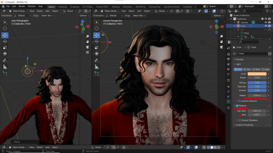
13 - Settings for the new light are quite similar. I made them softer, lowered Bias, changed color, etc.
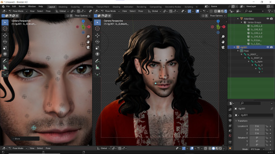
14 - Preparing for the shoot. ▓▒░(°◡°)░▒▓
15 - You did it! (ノ◕ヮ◕)ノ:・゚✧
#WistfulTutorialSims4#the sims 4 blender#sims 4 blender render#blender 4.0#blender eevee#sims 4 tutorials#blender tutorial#sims 4 blender render tutorial#blender render#blender eevee lighting#blender environment textures#sims 4 blender#blender render eevee#blender light#blender light eevee#eevee#blender#simblr#the sims 4#my sims
149 notes
·
View notes
Text
The Permanent Fix For Counter Texture Glitch
A while ago I posted this tutorial for fixing the counter texture glitch. But it was not perfect and couldn't fix each and every cc counter out there.
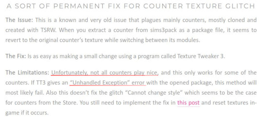
I've finally found a fix for that too. Problem was corrupt TXTC resources that needed to be replaced. Now you can download every cc counter that comes in sims3pack and extract them into package and never have the annoying counter texture glitch ever again. Bad news is you have to do it all yourself. But don't worry! it's not that difficult and I've come with pictures.
What you'll need: s3pe, s3oc and texture tweaker 3 - and optionally Sims3Pack Multi Installer or s3ce. The download link for TT3 is in the 3rd post and there's a tutorial here. If you don't have them already, go download them. You can NOT use TSRW for this tutorial since TSRW itself is the problem. :)
First extract the package from the sims3pack using either Multi Installer/Extractor or s3ce. After you have your package file, open it up in s3pe. In my example, I'm using Gosik's New Vintage Kitchen Counter 1. Select the first OBJD resource in the resource list.
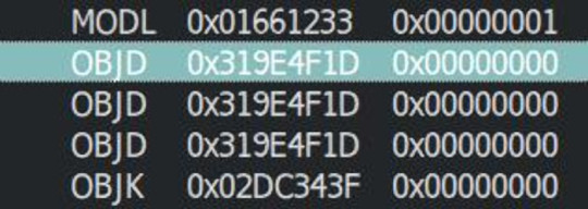
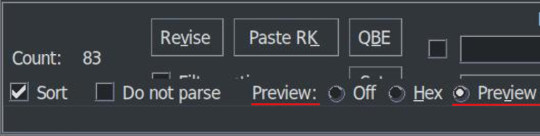
Also make sure you have Preview selected at the bottom of the program window in s3pe.
On the right side, you will see the preview of the resource in text. Scroll down until you see the InstanceName.
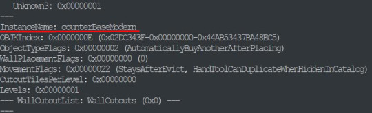
It's usually counterBaseModern but not always. This is the instance name of the object that this counter is cloned from. In modular objects like counters there are multiple objects. For counters, they are base, top and corner. Keep that in mind for now.
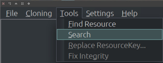
Take a note of or copy the instance name and open s3oc. First, Go to Settings -> Game Folders and make sure game folders are detected. If not, add them manually. You can also define your creator name under the Settings menu. Now, go to Tools -> Search.
Paste the instance name in the search bar; select Resource Name and hit Search.
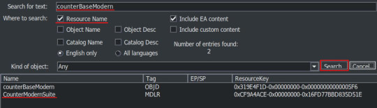
You will have two results: counterBaseModern and CounterModernSuite. I suggest that you clone the suite because it's the modular object that contains all the parts of a counter: base, top and corner. If not, you have to clone every part individually which are counterBaseModern, counterTopModern and counterCornerModern.
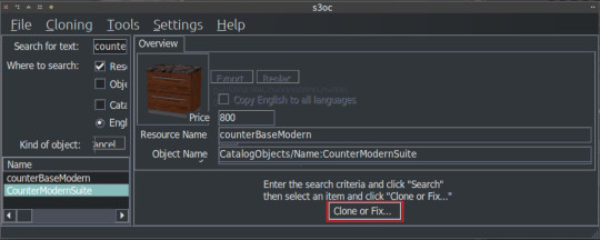
Cloning the Suite makes the process a lot quicker so I'll continue from there. Click on the CounterModernSuite and hit Clone or Fix at the right side.
That will open the cloning interface. Make sure you UNCHECK the Renumber/rename internally. We do NOT want to renumber. Then hit Start.
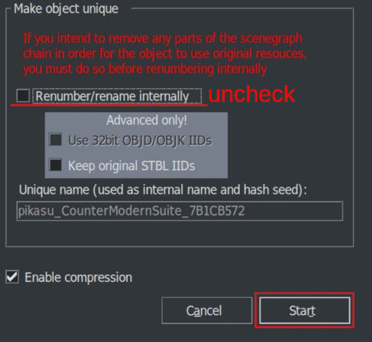
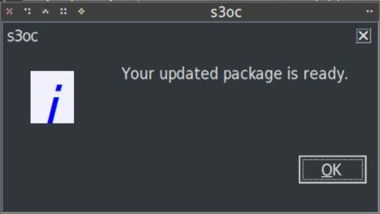
It will ask where you want to save your new package and if you already have a creator name defined earlier it will add it to the package name. If not, it may or may not ask for your creator name. Honestly, I can't remember and I don't think it matters. Anyway, chose a folder - preferably a work folder you created earlier - and keep the name it suggests. It will inform you when it's done.
We cloned our package. Now we need to export the necessary TXTC resources from it. We need the Diffusemap TXTC resource for each part. Start another instance of s3pe and open the package file you've just created which should be something like this: creatorname_CounterModernSuite_someAlphaNumericals.
You'll notice that there are 6 TXTC resources in the resource list. Check the resource names and the Group IDs. You need the DiffuseMap for base, top and corner parts. Click on the resource, then right click and Export.
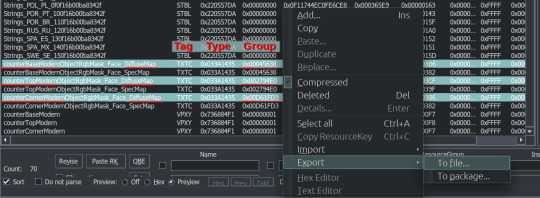
You can export them all at once or create a folder for each if you don't want to get confused. Notice that they all have different Group IDs and names. As we move to the next part keep that in mind.
After exporting, you can close this package. We'll go back to the package we want to fix, in this case, Gosik's New Vintage Kitchen Counter 1. Open the package again or switch to it if it's open in s3pe.
Select the first TXTC resource which is most likely is the DiffuseMap for the base part. Unfortunately, most cc doesn't have a _KEY resource so they don't have resource names. Group ID's come in handy here. For this counter suite Group IDs for parts are like this:
base -> 0x00045638; top -> 0x002794E0; corner -> 0x00D661FD3
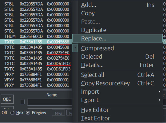
But there are 2 TXTC resources for each Group ID. One of them is SpecMap which is not corrupted. The corrupted one will have a preview like this:
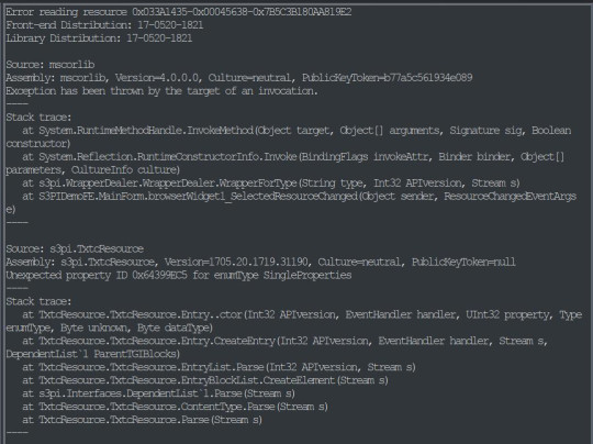
This is simply s3pe telling you it's having an 'Error reading the resource'. My interpretation: The resource is corrupted. So combine this with the right Group ID and right click on the resource and choose Replace. Do not use Import! You need to Replace the resource without changing its instance number. Choose the right resource you exported earlier. Again check the name and Group ID. it should be something like: S3_033A1435_00045638_A85033BB5A059932_counterBaseModernObjectRgbMask_Face_DiffuseMap%%+TXTC
This is for the base object. For top and corner parts, repeat the replacing step with the right resources.
After you replace all the corrupted resources, s3pe will no longer give an error reading those resources when you click on them. And neither will TT3. You will now save your package and close s3pe. A reminder: If the TXTC resources are not corrupted in CC package, skip all and continue as below.
After that you will open your package in TT3 and follow the tutorial here. But a brief rundown would be: select each 'Normal Object' one by one and switch to CASt presets tab after each selection. In this tab, all you have to do is uncheck and then recheck the box next to PatternA and hit Commit. Do it for every preset. Repeat it for every object in the package. Save. Close. Done. :)
For island counters, process is the same but with 4 parts. Base, EndW, EndE and Corner. Also this works for other modular objects like cabinets and sectional sofas.
One last clarification: If the object is cloned from another counter suite, the Group IDs that we used will be different. Also some CC will have Group IDs different from the main object it's cloned from. If that happens, you may need to have a leap of faith.
Usually the order from top to bottom is base, top, corner (counters) and base, endW, endE, corner (islands), starting with the first TXTC resource. So in theory, if you select the corrupt resources from top to bottom, you can replace with that order without the Group IDs.
That's it. I don't think anyone will bother with this. But If you have questions, ask away.
219 notes
·
View notes
Note
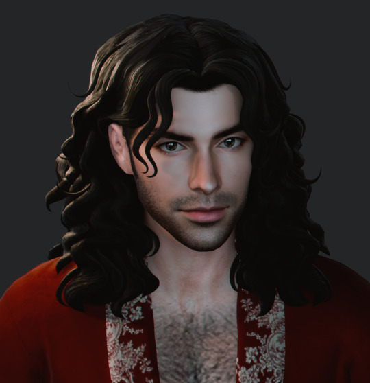
*clicks the pen* How do you draw Vincent's curly fuzzy hair? I imagine you got a good brush for it but how about shading it?
So a lot of it has to do with the brush, which is actually my all-purpose brush I use for most aspects of my painting.
it has a sponge-like texture, as seen below:

you can see how the edges form that perfect fluffy shape, which is ideal for highly textured hair
I actually put a step-by-step of this latest piece up on my patreon wip tier, so I can show you how the hair was done:

so it's basically just blocking in the shape, using the airbrush for the initial gradient, then constantly adding more texture by dabbing the brush in short bursts, from darker shadows to the lighter brown/gray highlights~
I know it's not a super thorough explanation, but I hope this helps <3
#asks#quinncent#tutorial#vince's hair is one of my fave things to draw 🥰#actually..textured hair in general is usually easier and more fun~#(2 of these are just the same image lol whoops 😅)
141 notes
·
View notes
Note
hi! this is Insomniac Anon here!!! I noticed on some of ur artworks (specifically the unique magic posters), that u have a textured look to em, like paper or grain ... i wanted to ask how u get that effect? is it a brush, a filter, or like an overlay/png u use ... ? pls tell me!! ;v; I really like how the texture looks, so i wanted to know how 2 do it since ure a very big inspo 2 me LAWL ... I've been doing art practices in diff styles i find, so, i wanted to know a bit more how you do it :^D
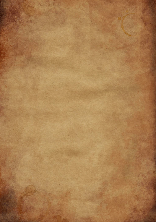
thank you! :D :D :D it's usually photos/textures of paper that I've messed around with; I have a bunch of free/paid/ones I took myself. anytime I see good photos of paper I add it to the collection...it is my weakness. 😔
I mostly use Photoshop, but this should work in any program that supports blending modes (also I did this in like an hour to use as an example, please forgive it :')
image by itself before texturing:
with the texture pasted in (for this one I'm using this public domain one from Pexels):
then mess around with the blending mode to see how it looks -- in this case I went with overlay, but soft light and hard light are usually good ones too, it really depends on the texture:
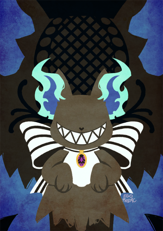
then with a bunch of messing around with opacity/colors/saturation/levels/adding in a bit more texture until I like how it looks:
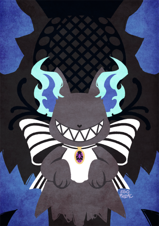
et voilà, texture! (waves hands)
#art#how do art#twisted wonderland#it's a general tutorial i guess but just cause it's grim#usually i end up using a couple different papers on top of each other with bits masked out/levels super messed with and the like#it is super fun to just mess around with and throw things on and see how they look!#but it is also very easy to waaaay overdo so uhhhh exercise caution i guess. less is often more and all#once you start layering textures on there it's just difficult to stop#dangit art stop being so fun#(this also tends to screw with your colors and values a lot so always check and adjust as you go!)#(if you don't want any color influence at all you can just turn the saturation of the paper layer all the way down so it's pure grayscale)
426 notes
·
View notes
Text

goodbye, lewis hamilton
#f1#formula 1#f1edit#lewis hamilton#lewishamiltonedit#lh44#eric.graphics#asdfgh killed the gewis chat with this <3 found a new texture tutorial last night and decided to commit violence with it
101 notes
·
View notes
Text
hmm... im sure someones made a good guide out there somewhere, but i personally havent used any but thats not a good answer, so another place to start is to use a real game as a ref! this is the sims 2 ds:

most of the detailed textures are only used for the player sims hair/face/clothing you can see by the jagged edges of this sims vest that its still a little lower than the faces texture (this is probably because the body has more clothing variations than the face and they needed to save memory)
static parts of the environment have a higher res, because they can tile/repeat the textures. this game has a million variations on bed/chair textures, so they're notably lower res this is a ripped texture of most(?) of the things used to make an area in the game (image credit) :
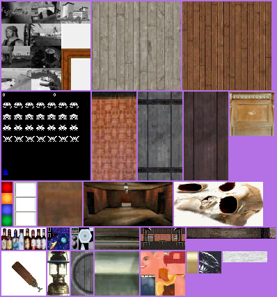
the desert background here is just a 2d image, relatively low res because the player will never be able to reach it
i guess this is just a long winded way of saying "things that arent that important or the player will generally be lower poly + less detailed" but i hope it helps a little
#its hard to explain bc its difficult to set rules unless you try to set the entire environment to the same style rules //#i mostly went into textures here bc ds games are much lower textured than psx or similar most of the time //#i need to actually learn more abt ds stuff sdkfhsdjh im mostly just eyeballing this instead of knowing much abt it //#long post#scopophobia#gif#not my art#sims 2 ds#tutorial#...ok not really but how do i tag this//#newbiealliance#image heavy
705 notes
·
View notes
Note
the way u draw hair is so ❤️❤️❤️❤️❤️ do you have any tips to drawing curly hair especially?
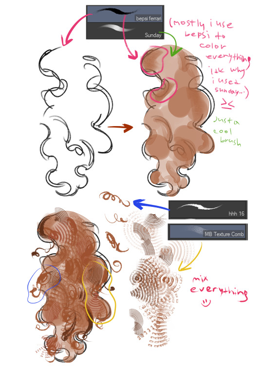
thank you so much!!!!!! brushes + sunday & hhh 16
#idk how to make tutorials........................#you can use random textured brushes!! that's why i LOVE drawing curls#it's like doodling in your notebook when you're spacing out#kind of therapeutic#ask#curly hair#curls#art tutorial#artists on tumblr#brush#brushes#my art
41 notes
·
View notes
Text
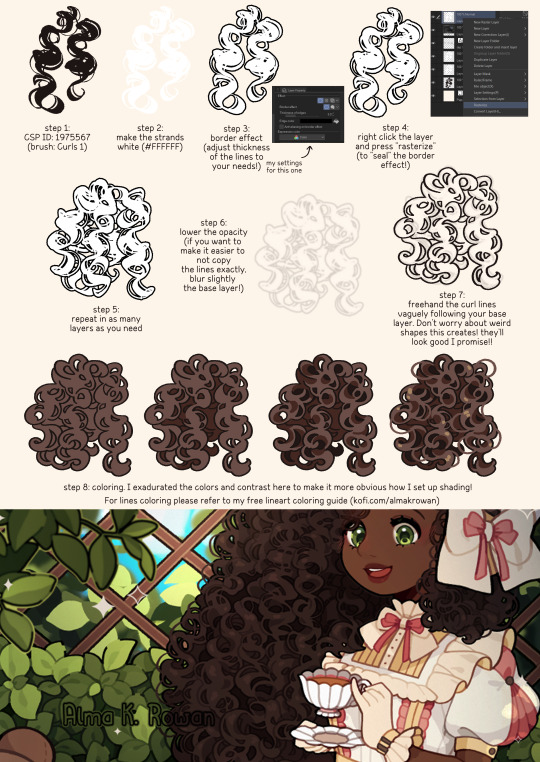
This is how I drew the curly hair on my last original artwork! 🥰💕
And YES it IS possible to do this without the special brush!!! I mentioned it since this little guide is an explanation of how I did it in that illustration (and i wanted to feature this cool FREE brush)!!!!
#tutorial#almakrowantip#how to draw#art tutorial#digital art#art resources#artists on tumblr#curly hair#textured hair#curly hair tutorial#how to draw hair#stylized hair
842 notes
·
View notes
Note
I LOVE this set and i was wondering if you could pls explain how you did the text, including how you added texture to the ripped text and the highlighting/circling/etc of words? thank you for posting your beautiful gifs 😊
thank you!! 🥺 & of course! (photopea tutorial)
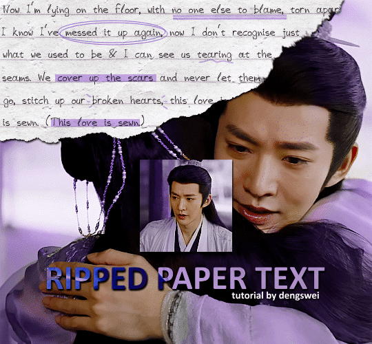
the majority of the texture for the ripped paper effect i can't really take credit for it's on the paper it's self all i did was make the paper white (because the texture was yellow) and used curves to darken the texture), i got the texture from one of photopea's templates but it seems their whole template section has changed drastically and no longer has like anything i used to see before ???? so i'll just share both versions here:
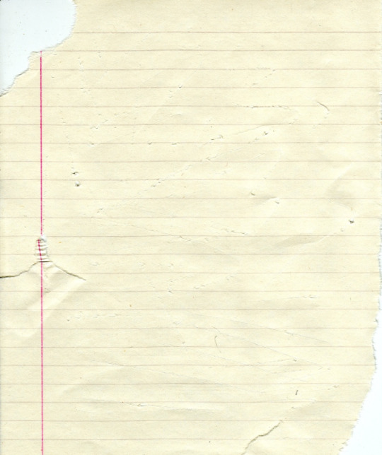
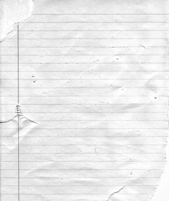
(original & my edited version)
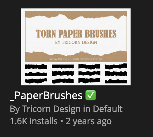
for the ripped parts i just played around with this brush set in the plugins
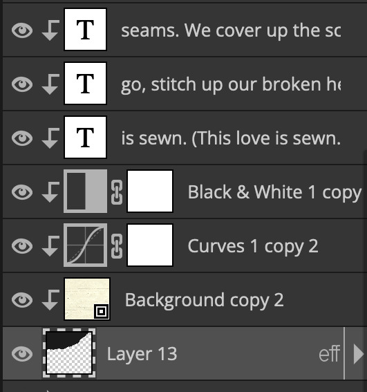
once i decided which of the paper brushes to use i had a new layer and used it where i wanted, so top left in the gif above, i clip masked the paper texture (and the adjustment layers as well) onto it so you get that ripped effect (if you don't like or want to add to that you can always use the brush tool again (or the erasure tool) set as the paper brush to add or remove sections i did this a lot when i realised certain words i wanted to show weren't on there (also changing the size of the paper brush when wanting to add a little bit or take a little bit away was a massive help)
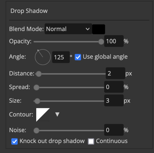
i also always add a drop shadow to my paper textures, the settings i used is mostly the same EXCEPT for the angle for all of the ripped paper (it's also my text drop shadow settings) because depending on how the ripped paper looks you might have to change the angle
also i know in the screenshot below it's on but make sure the use global angle is off if you're going to have multiple different angles of drop shadow in your one gif (so if you want your paper texture on 125° but anything else on 60° the global angle needs to be off but if you want them the same then you can keep that on, which is why it's on for me because the angle is the same for both the text & the ripped paper) (and by text this isn't the text on the ripped paper, there isn't any drop shadow on the text itself there, just to clarify this was for my "ripped paper text tutorial by dengswei" text)
as you can see i also clipped my "handwriting" text to the paper layer this is so it stayed on the paper rather then going onto the gif itself (and it saved the fiddly part of masking it away & it felt more authentic this way too)
i found for me it was easier to seperate the text line by line so i knew exactly which part of the text was on which and if i wanted to change anything either it being a typo, changing the paper texture, or wanting a different word on a different line it was easier that way because it didn't end up messing up all of the text (though you don't have to do it that way, it's just what worked for me here)
font i used was: vag-handwritten (a default photopea font)
all of the next part needs to be above the text on your ripped paper:
for the highlighting, circles, and the lines it's pretty much all the same, i chose the colour which matched the gif (so say purple), for the highlight used the rectangle select & colour fill tools and set that to multiply & then played around with opacity (for most of my highlighting it's set to 50%), for the circles it was the same except the circle shape tool (no fill just stroke) set to purple, set to multiply, with 100% opacity (i found the circles looked better with 100% on some gifs depending on what colour i used), & then duplicated it once or twice and then just moved each circle to where i thought it looked best & the double lines is also the same using the line tool, set to multiply, & playing around with the opacity, & positioning them where i like
for the squiggly lines, the hearts, the 3 small doodle lines at either side of a word, & any other doodles i had on there i doodled them myself with my drawing tablet (you probably don't have to use a drawing tablet i just found it easier that way) using the free pen tool and then did the same thing set it to multiply and played with the opacity
if the colour you choose looks too dark or too light with it set to multiply either try a lighter/darker colour, try out something else like lighten, or screen, or increase/decrease the opacity more (i found i had this issue with the yellow being hard to see on the white paper so i used a darker yellow and kept everything at 100% opacity rather than 50%)
hope that helps! and please if anything is confusing or you want to ask any more don't hesitate to ask i know i ramble on a bit and it can sometimes get a bit confusing 🤣 or if there was anything i missed feel free to ask again 🥰
#replies#edwinas#mine | tutorials#gifmakerresource#photopeablr#photopea tutorial#photopea tutorials#gif tutorial#gif tutorials#usergif#tutorial#tutorials#photopea has so many great default fonts i just spend hours searching through them i barely download fonts now 🤣#i hope i didn't miss anything#also i don't know why the paper textures & my screenshots posted this way i had them side by side#okay they're side by side on mobile but not desktop ??? but mobile doesn't have the read more okay
110 notes
·
View notes