#don't break down
Text
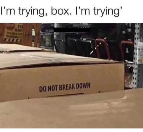
#mental health#mental illness#adhd#anxiety#depression#social anxiety#bipolar#bpd#ocd#don't break down#breakdown#personalitydisorder
5 notes
·
View notes
Text
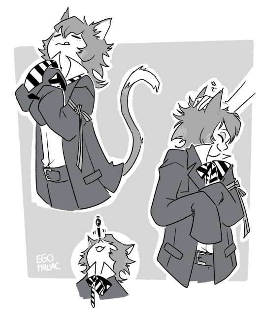
LET THE BOY HAVE AN EDUCATION
officially at the point where we're starting to see where it's all headed and I am just going NYEEHEEHEE in delight at it all. ahhh...next week can't come soon enough...
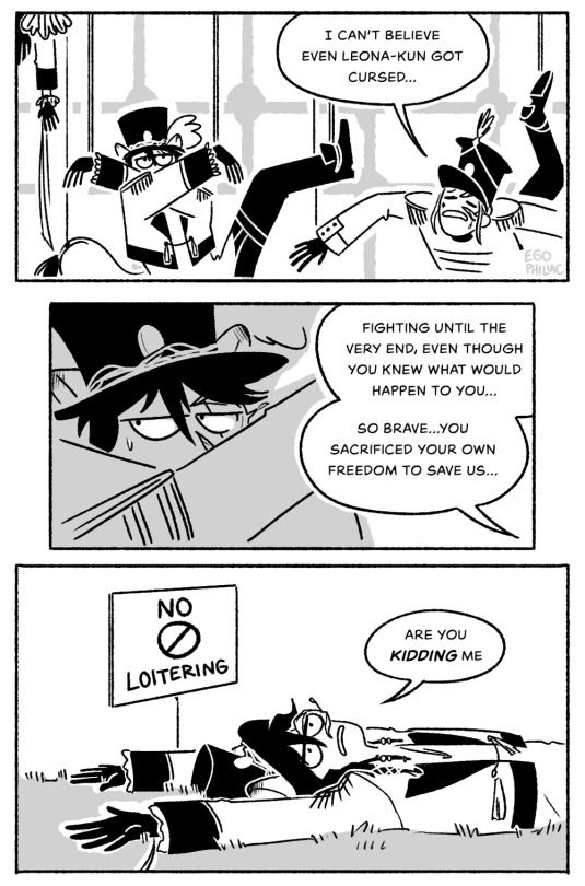
#art#twisted wonderland#twisted wonderland spoilers#stage in playful land#stage in playfulland#leona: (devises an actually somewhat clever plan to take out the staff-puppets without breaking any rules)#leona: (taken out two seconds later because he sat down in the wrong place)#at this point i'm half expecting the ssr boys to actually bust in with a big sandwich platter or something#a cake with 'please don't kidnap people :)' written on it in shaky icing#kalim isn't good at plans but he DOES throw a good shindig and by god he's going to play to his strengths#also IT WASN'T SHINY TICKETS IT WAS GIDEL?!#MY BOY#MY BEAUTIFUL MAGICAL FELINE BOY#i mean i'm assuming at this point but that seems to be the implication#genuinely kind of shocked that they actually WERE being magicked into being extra gullible#it was ✨foreshadowing✨ all along...#the blot though! what about the blot!#is that going to be an issue or are we going to have enough to deal with already!#i have rocketed from 'i find these villains entertaining' to 'i am suddenly incredibly invested in them as characters'#LOOK there is one thing better than characters with sort of unhealthy codependent relationships#and that is characters with sort of unhealthy codependent relationships but TWIST IT'S NOT THE WAY YOU THINK#nyeeheeheeeeeee
5K notes
·
View notes
Text
A winter reminder
English added by me :)
#eye strain#flashing#douyin#video#tiktok#含亮老师#dlkafjkl you do not knooooow the intense whiplash these collabs always give me#idk if they do this on tiktok but it's such like a part of douyin culture lolol#that and the health reminders from celebrities#the women's pingpong team like PUT YOUR PHONE DOWN TAKE A BREAK#hmmm typo..... tied should be tidied....#but the vibe is kind of still there so it's good it's cool i don't care#psa#chinese weapons
4K notes
·
View notes
Text
An unbothered queen has entered, and subsequently left.
[First] Prev <–-> Next
#poorly drawn mdzs#mdzs#wen qing#wen ning#jiang cheng#wei wuxian#In the audio drama she quite literally opens the door and then leaves after seeing them without breaking conversation.#It is both so impressive and deeply funny to me.#I imagine her just literally pivoting in one foot and walking right out.#She came home after a long day at work and in 0.5 seconds went “I would rather go back to the office than deal with this right now”.#Besides tickling me to near tears - this scene is also a great introduction to Wen Qing - her first instinct is to protect!#She lives by the code of 'I don't care who you are - if you need help I will lend it.' a true doctor and professional.#Sure she is *mad* that Wen Ning puts himself (and her to a lesser extent) at risk by helping 'the enemy' but she gives in quick.#I love Wen Qing a lot - she is such an unsung hero in this story.#Sorry that her first appearance on this blog was...what it was. I'll let your curiosity take you down that path...
1K notes
·
View notes
Text
why Aurora's art is genius
It's break for me, and I've been meaning to sit down and read the Aurora webcomic (https://comicaurora.com/, @comicaurora on Tumblr) for quite a bit. So I did that over the last few days.
And… y'know. I can't actually say "I should've read this earlier," because otherwise I would've been up at 2:30-3am when I had responsibilities in the morning and I couldn't have properly enjoyed it, but. Holy shit guys THIS COMIC.
I intended to just do a generalized "hello this is all the things I love about this story," and I wrote a paragraph or two about art style. …and then another. And another. And I realized I needed to actually reference things so I would stop being too vague. I was reading the comic on my tablet or phone, because I wanted to stay curled up in my chair, but I type at a big monitor and so I saw more details… aaaaaand it turned into its own giant-ass post.
SO. Enjoy a few thousand words of me nerding out about this insanely cool art style and how fucking gorgeous this comic is? (There are screenshots, I promise it isn't just a wall of text.) In my defense, I just spent two semesters in graphic design classes focusing on the Adobe Suite, so… I get to be a nerd about pretty things…???
All positive feedback btw! No downers here. <3
---
I cannot emphasize enough how much I love the beautiful, simple stylistic method of drawing characters and figures. It is absolutely stunning and effortless and utterly graceful—it is so hard to capture the sheer beauty and fluidity of the human form in such a fashion. Even a simple outline of a character feels dynamic! It's gorgeous!
Though I do have a love-hate relationship with this, because my artistic side looks at that lovely simplicity, goes "I CAN DO THAT!" and then I sit down and go to the paper and realize that no, in fact, I cannot do that yet, because that simplicity is born of a hell of a lot of practice and understanding of bodies and actually is really hard to do. It's a very developed style that only looks simple because the artist knows what they're doing. The human body is hard to pull off, and this comic does so beautifully and makes it look effortless.
Also: line weight line weight line weight. It's especially important in simplified shapes and figures like this, and hoo boy is it used excellently. It's especially apparent the newer the pages get—I love watching that improvement over time—but with simpler figures and lines, you get nice light lines to emphasize both smaller details, like in the draping of clothing and the curls of hair—which, hello, yes—and thicker lines to emphasize bigger and more important details and silhouettes. It's the sort of thing that's essential to most illustrations, but I wanted to make a note of it because it's so vital to this art style.
THE USE OF LAYER BLENDING MODES OH MY GODS. (...uhhh, apologies to the people who don't know what that means, it's a digital art program thing? This article explains it for beginners.)
Bear with me, I just finished my second Photoshop course, I spent months and months working on projects with this shit so I see the genius use of Screen and/or its siblings (of which there are many—if I say "Screen" here, assume I mean the entire umbrella of Screen blending modes and possibly Overlay) and go nuts, but seriously it's so clever and also fucking gorgeous:
Firstly: the use of screened-on sound effect words over an action? A "CRACK" written over a branch and then put on Screen in glowy green so that it's subtle enough that it doesn't disrupt the visual flow, but still sticks out enough to make itself heard? Little "scritches" that are transparent where they're laid on without outlines to emphasize the sound without disrupting the underlying image? FUCK YES. I haven't seen this done literally anywhere else—granted, I haven't read a massive amount of comics, but I've read enough—and it is so clever and I adore it. Examples:


Secondly: The beautiful lighting effects. The curling leaves, all the magic, the various glowing eyes, the fog, the way it's all so vividly colored but doesn't burn your eyeballs out—a balance that's way harder to achieve than you'd think—and the soft glows around them, eeeee it's so pretty so pretty SO PRETTY. Not sure if some of these are Outer/Inner Glow/Shadow layer effects or if it's entirely hand-drawn, but major kudos either way; I can see the beautiful use of blending modes and I SALUTE YOUR GENIUS.
I keep looking at some of this stuff and go "is that a layer effect or is it done by hand?" Because you can make some similar things with the Satin layer effect in Photoshop (I don't know if other programs have this? I'm gonna have to find out since I won't have access to PS for much longer ;-;) that resembles some of the swirly inner bits on some of the lit effects, but I'm not sure if it is that or not. Or you could mask over textures? There's... many ways to do it.
If done by hand: oh my gods the patience, how. If done with layer effects: really clever work that knows how to stop said effects from looking wonky, because ugh those things get temperamental. If done with a layer of texture that's been masked over: very, very good masking work. No matter the method, pretty shimmers and swirly bits inside the bigger pretty swirls!
Next: The way color contrast is used! I will never be over the glowy green-on-black Primordial Life vibes when Alinua gets dropped into that… unconscious space?? with Life, for example, and the sharp contrast of vines and crack and branches and leaves against pitch black is just visually stunning. The way the roots sink into the ground and the three-dimensional sensation of it is particularly badass here:

Friggin. How does this imply depth like that. HOW. IT'S SO FREAKING COOL.
A huge point here is also color language and use! Everybody has their own particular shade, generally matching their eyes, magic, and personality, and I adore how this is used to make it clear who's talking or who's doing an action. That was especially apparent to me with Dainix and Falst in the caves—their colors are both fairly warm, but quite distinct, and I love how this clarifies who's doing what in panels with a lot of action from both of them. There is a particular bit that stuck out to me, so I dug up the panels (see this page and the following one https://comicaurora.com/aurora/1-20-30/):

(Gods it looks even prettier now that I put it against a plain background. Also, appreciation to Falst for managing a bridal-carry midair, damn.)
The way that their colors MERGE here! And the immense attention to detail in doing so—Dainix is higher up than Falst is in the first panel, so Dainix's orange fades into Falst's orange at the base. The next panel has gold up top and orange on bottom; we can't really tell in that panel where each of them are, but that's carried over to the next panel—

—where we now see that Falst's position is raised above Dainix's due to the way he's carrying him. (Points for continuity!) And, of course, we see the little "huffs" flowing from orange to yellow over their heads (where Dainix's head is higher than Falst's) to merge the sound of their breathing, which is absurdly clever because it emphasizes to the viewer how we hear two sets of huffing overlaying each other, not one. Absolutely brilliant.
(A few other notes of appreciation to that panel: beautiful glows around them, the sparks, the jagged silhouette of the spider legs, the lovely colors that have no right to make the area around a spider corpse that pretty, the excellent texturing on the cave walls plus perspective, the way Falst's movements imply Dainix's hefty weight, the natural posing of the characters, their on-point expressions that convey exactly how fuckin terrifying everything is right now, the slight glows to their eyes, and also they're just handsome boys <3)
Next up: Rain!!!! So well done! It's subtle enough that it never ever disrupts the impact of the focal point, but evident enough you can tell! And more importantly: THE MIST OFF THE CHARACTERS. Rain does this irl, it has that little vapor that comes off you and makes that little misty effect that plays with lighting, it's so cool-looking and here it's used to such pretty effect!
One of the panel captions says something about it blurring out all the injuries on the characters but like THAT AIN'T TOO BIG OF A PROBLEM when it gets across the environmental vibes, and also that'd be how it would look in real life too so like… outside viewer's angle is the same as the characters', mostly? my point is: that's the environment!!! that's the vibes, that's the feel! It gets it across and it does so in the most pretty way possible!
And another thing re: rain, the use of it to establish perspective, particularly in panels like this—

—where we can tell we're looking down at Tynan due to the perspective on the rain and where it's pointing. Excellent. (Also, kudos for looking down and emphasizing how Tynan's losing his advantage—lovely use of visual storytelling.)
Additionally, the misting here:

We see it most heavily in the leftmost panel, where it's quite foggy as you would expect in a rainstorm, especially in an environment with a lot of heat, but it's also lightly powdered on in the following two panels and tends to follow light sources, which makes complete sense given how light bounces off particles in the air.
A major point of strength in these too is a thorough understanding of lighting, like rim lighting, the various hues and shades, and an intricate understanding of how light bounces off surfaces even when they're in shadow (we'll see a faint glow in spots where characters are half in shadow, but that's how it would work in real life, because of how light bounces around).
Bringing some of these points together: the fluidity of the lines in magic, and the way simple glowing lines are used to emphasize motion and the magic itself, is deeply clever. I'm basically pulling at random from panels and there's definitely even better examples, but here's one (see this page https://comicaurora.com/aurora/1-16-33/):

First panel, listed in numbers because these build on each other:
The tension of the lines in Tess's magic here. This works on a couple levels: first, the way she's holding her fists, as if she's pulling a rope taut.
The way there's one primary line, emphasizing the rope feeling, accompanied by smaller ones.
The additional lines starbursting around her hands, to indicate the energy crackling in her hands and how she's doing a good bit more than just holding it. (That combined with the fists suggests some tension to the magic, too.) Also the variations in brightness, a feature you'll find in actual lightning. :D Additional kudos for how the lightning sparks and breaks off the metal of the sword.
A handful of miscellaneous notes on the second panel:
The reflection of the flames in Erin's typically dark blue eyes (which bears a remarkable resemblance to Dainix, incidentally—almost a thematic sort of parallel given Erin's using the same magic Dainix specializes in?)
The flowing of fabric in the wind and associated variation in the lineart
The way Erin's tattoos interact with the fire he's pulling to his hand
The way the rain overlays some of the fainter areas of fire (attention! to! detail! hell yeah!)
I could go on. I won't because this is a lot of writing already.
Third panel gets paragraphs, not bullets:
Erin's giant-ass "FWOOM" of fire there, and the way the outline of the word is puffy-edged and gradated to feel almost three-dimensional, plus once again using Screen or a variation on it so that the stars show up in the background. All this against that stunning plume of fire, which ripples and sparks so gorgeously, and the ending "om" of the onomatopoeia is emphasized incredibly brightly against that, adding to the punch of it and making the plume feel even brighter.
Also, once again, rain helping establish perspective, especially in how it's very angular in the left side of the panel and then slowly becomes more like a point to the right to indicate it's falling directly down on the viewer. Add in the bright, beautiful glow effects, fainter but no less important black lines beneath them to emphasize the sky and smoke and the like, and the stunningly beautiful lighting and gradated glows surrounding Erin plus the lightning jagging up at him from below, and you get one hell of an impactful panel right there. (And there is definitely more in there I could break down, this is just a lot already.)
And in general: The colors in this? Incredible. The blues and purples and oranges and golds compliment so well, and it's all so rich.
Like, seriously, just throughout the whole comic, the use of gradients, blending modes, color balance and hues, all the things, all the things, it makes for the most beautiful effects and glows and such a rich environment. There's a very distinct style to this comic in its simplified backgrounds (which I recognize are done partly because it's way easier and also backgrounds are so time-consuming dear gods but lemme say this) and vivid, smoothly drawn characters; the simplicity lets them come to the front and gives room for those beautiful, richly saturated focal points, letting the stylized designs of the magic and characters shine. The use of distinct silhouettes is insanely good. Honestly, complex backgrounds might run the risk of making everything too visually busy in this case. It's just, augh, so GORGEOUS.
Another bit, take a look at this page (https://comicaurora.com/aurora/1-15-28/):

It's not quite as evident here as it is in the next page, but this one does some other fun things so I'm grabbing it. Points:
Once again, using different colors to represent different character actions. The "WHAM" of Kendal hitting the ground is caused by Dainix's force, so it's orange (and kudos for doubling the word over to add a shake effect). But we see blue layered underneath, which could be an environmental choice, but might also be because it's Kendal, whose color is blue.
And speaking off, take a look at the right-most panel on top, where Kendal grabs the spear: his motion is, again, illustrated in bright blue, versus the atmospheric screened-on orange lines that point toward him around the whole panel (I'm sure these have a name, I think they might be more of a manga thing though and the only experience I have in manga is reading a bit of Fullmetal Alchemist). Those lines emphasize the weight of the spear being shoved at him, and their color tells us Dainix is responsible for it.
One of my all-time favorite effects in this comic is the way cracks manifest across Dainix's body to represent when he starts to lose control; it is utterly gorgeous and wonderfully thematic. These are more evident in the page before and after this one, but you get a decent idea here. I love the way they glow softly, the way the fire juuuust flickers through at the start and then becomes more evident over time, and the cracks feel so realistic, like his skin is made of pottery. Additional points for how fire begins to creep into his hair.
A small detail that's generally consistent across the comic, but which I want to make note of here because you can see it pretty well: Kendal's eyes glow about the same as the jewel in his sword, mirroring his connection to said sword and calling back to how the jewel became Vash's eye temporarily and thus was once Kendal's eye. You can always see this connection (though there might be some spots where this also changes in a symbolic manner; I went through it quickly on the first time around, so I'll pay more attention when I inevitably reread this), where Kendal's always got that little shine of blue in his eyes the same as the jewel. It's a beautiful visual parallel that encourages the reader to subconsciously link them together, especially since the lines used to illustrate character movements typically mirror their eye color. It's an extension of Kendal.
Did I mention how ABSOLUTELY BEAUTIFUL the colors in this are?
Also, the mythological/legend-type scenes are illustrated in familiar style often used for that type of story, a simple and heavily symbolic two-dimensional cave-painting-like look. They are absolutely beautiful on many levels, employing simple, lovely gradients, slightly rougher and thicker lineart that is nonetheless smoothly beautiful, and working with clear silhouettes (a major strength of this art style, but also a strength in the comic overall). But in particular, I wanted to call attention to a particular thing (see this page https://comicaurora.com/aurora/1-12-4/):

The flowing symbolic lineart surrounding each character. This is actually quite consistent across characters—see also Life's typical lines and how they curl:

What's particularly interesting here is how these symbols are often similar, but not the same. Vash's lines are always smooth, clean curls, often playing off each other and echoing one another like ripples in a pond. You'd think they'd look too similar to Life's—but they don't. Life's curl like vines, and they remain connected; where one curve might echo another but exist entirely detached from each other in Vash's, Life's lines still remain wound together, because vines are continuous and don't float around. :P
Tahraim's are less continuous, often breaking up with significantly smaller bits and pieces floating around like—of course—sparks, and come to sharper points. These are also constants: we see the vines repeated over and over in Alinua's dreams of Life, and the echoing ripples of Vash are consistent wherever we encounter him. Kendal's dream of the ghost citizens of the city of Vash in the last few chapters is filled with these rippling, echoing patterns, to beautiful effect (https://comicaurora.com/aurora/1-20-14/):

They ripple and spiral, often in long, sinuous curves, with smooth elegance. It reminds me a great deal of images of space and sine waves and the like. This establishes a definite feel to these different characters and their magic. And the thing is, that's not something that had to be done—the colors are good at emphasizing who's who. But it was done, and it adds a whole other dimension to the story. Whenever you're in a deity's domain, you know whose it is no matter the color.
Regarding that shape language, I wanted to make another note, too—Vash is sometimes described as chaotic and doing what he likes, which is interesting to me, because smooth, elegant curves and the color blue aren't generally associated with chaos. So while Vash might behave like that on the surface, I'm guessing he's got a lot more going on underneath; he's probably much more intentional in his actions than you'd think at a glance, and he is certainly quite caring with his city. The other thing is that this suits Kendal perfectly. He's a paragon character; he is kind, virtuous, and self-sacrificing, and often we see him aiming to calm others and keep them safe. Blue is such a good color for him. There is… probably more to this, but I'm not deep enough in yet to say.
And here's the thing: I'm only scratching the surface. There is so much more here I'm not covering (color palettes! outfits! character design! environment! the deities! so much more!) and a lot more I can't cover, because I don't have the experience; this is me as a hobbyist artist who happened to take a couple design classes because I wanted to. The art style to this comic is so clever and creative and beautiful, though, I just had to go off about it. <3
...brownie points for getting all the way down here? Have a cookie.
#aurora comic#aurora webcomic#comicaurora#art analysis#...I hope those are the right tags???#new fandom new tagging practices to learn ig#much thanks for something to read while I try to rest my wrists. carpal tunnel BAD. (ignore that I wrote this I've got braces ok it's fine)#anyway! I HAVE. MANY MORE THOUGHTS. ON THE STORY ITSELF. THIS LOVELY STORY#also a collection of reactions to a chunk of the comic before I hit the point where I was too busy reading to write anything down#idk how to format those tho#...yeet them into one post...???#eh I usually don't go off this much these days but this seems like a smaller tight-knit fandom so... might as well help build it?#and I have a little more time thanks to break so#oh yes also shoutout to my insanely awesome professor for teaching me all the technical stuff from this he is LOVELY#made an incredibly complex program into something comprehensible <3#synapse talks
743 notes
·
View notes
Note
Hello!!! I love your fnaf content and designs! Would you mind sharing how you draw the mouth/muzzles on characters like Foxy and Roxy? They're the ones I struggle with most when trying to draw my own fanart and you're able to put an expressive mouth on those wacky faces so well!

@crystalmonk5579
Thank you for the compliments! But uh... I'm not exactly the best person to go to when it comes to learning art things. My explanation is usually "its all muscle memory" or "I just draw what feels right" or "I picture it in my head and just figure it out." or even "You draw a circle.. and then you draw the rest of it." Which is not very helpful <XD...
Buuuuut,, since I've been itching to draw something.. I figured I'd take this opportunity to draw the funny fox guy and try to explain how I draw snoots <XD
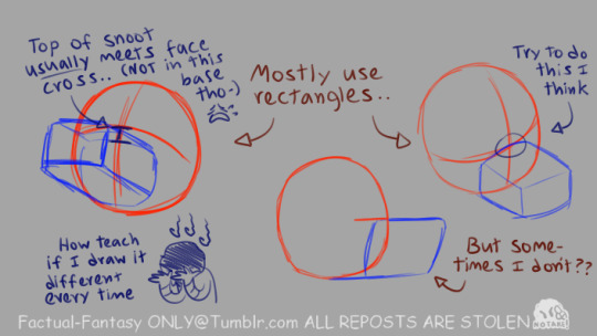
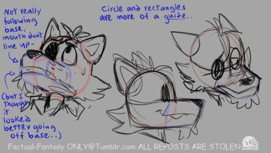
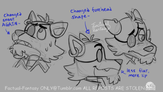
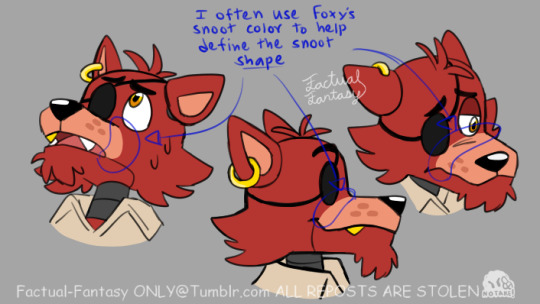

#my response#foxy the pirate fox#hhhrrghennn#I don't even really use circles and rectangles this closely#I just draw it#but I tried to break my process down in a way that it could be understood#which results in me drawing something slightly different through each stage-#GHRASHAHFSH
522 notes
·
View notes
Text
Okay...
Now that all the household chaos is on pause again, I will pretend to not be burned out at all so that I can finish this, submit it, and tell my professor so that he can roll his eyes at my text message and pass me.
0 notes
Text
Prompt 94
Danny has no clue what he’s just agreed to but Ellie seems happy about it, so it can’t be too bad.
Ellie is honestly surprised but more than a little touched her template-dad gave her permission to let her new clone-union-totally-not-a-revolution use his lair as a home base. Now she just needs to help Klarion figure out how to make those portal-bracelets for each of them…
#dcxdp#dpxdc#prompts#clonion#clone union#clones#ellie fenton#danny fenton#He's in the middle of finals before he hopefully graduates college give him a break#He's also learning ghost medicine so he's tired#Danny never wants to be unable to do anything while seeing someone dying -melting- right in front of him#What's his lair?#A big fantasy-esque observatory that has So Many rooms#It's like an entire dorm wing but space themed & with a library that he uses for his schoolwork#Danny squinting down at Klarion: Why is someone letting a 6 year old run around#Danny: Oh my ancients you don't know human customs like i didn't know realms one#Danny: Alright- hey Ellie c'mere we're doing a crash course in human 101#Young Justice: Why has Klarion's attacks stopped-#Klarion throwing a pamphlet at Connor and disappearing:
508 notes
·
View notes
Text
I can't stop thinking about just how emblematic everything in those conversations of Ashton being "a child" are of how, even at her most beaten down, triggered and traumatized, Laudna is not and will not be what Delilah wants her to be.
For Delilah, "they're still a child" is dismissive, a bit derisive, but doesn't even merit being truly hateful. She doesn't find Ashton worth the attention Laudna is giving them, not when there are such more interesting, important things to pull the attention of an adult. Children are only important when they are useful. She will indulge Laudna on the subject, because Laudna is useful, is her vehicle for action in the world, but she only cares about it in the context of getting Laudna to do what she wants. Calling someone a child is calling them unimportant. (Laudna is a child to her)
But for Laudna, who loves children and who understands intimately what it's like to have the helplessness of child, to be trapped under the authority of someone who will never treat you as a full person, even when they are being ostensibly kind, to be so confused and lost and powerless...a child deserves attention more than anyone else. Of course children lash out. Being a child IS in many ways quite awful because the world is so big around you and you don't know yet how to react to any of it, how to soothe yourself - and if you aren't given the attention, you never learn how. Ashton never learned how. Her instincts - instincts trained into her by manipulation and abuse from inside and the world around her - may say kill him, but she fights them the whole way because her heart is stronger and her heart says that the angriest, most volatile child needs care as much as any other. More, even.
Laudna hears Delilah call Ashton a child and agrees on the word, but they have diametrically opposed understandings of what that means, and diametrically opposed instincts on how to treat a child. Laudna doesn't want to hurt anyone, especially children. She loves children. She loves so much and so selflessly. And Delilah is so very very good at manipulating her but she has tried for 30 years to change the bedrock of Laudna's psyche, the truer thing that drives her beyond the base animal instincts of survival, and it hasn't worked.
#critical role spoilers#critical role#cr meta#laudna#delilah briarwood#g o d I love her so much#she is so GOOD#and like I was so very worried for her at the break but#I keep forgetting and underestimating her#her strength may not look the same as other peoples'#it may be hidden under her traumatized confusion and twitchy fear but#it is there#she is so very strong#her victories aren't huge and showy but they don't need to be#can't be maybe in a war of attrition inside her own head#but after 30 years she is STILL THERE. STILL HERSELF. STILL KIND.#FUCK#I gotta go lie down on the floor about it#no wonder Imogen loves her so much honestly#she knows how hard it is to keep yourself good and kind in the face of a constant onslaught#I know its jokes but like. yeah. she would be a saint to Imogen.#st laudna real not clickbait
487 notes
·
View notes
Text
Fascinated and devastated by EPIC: The Musical flipping the moral script of Odysseus' arc, yet coming to the same conclusions.
There's Classic Odysseus, who accepts that his fate and the fate of his men are out of his control. Classic Odysseus, who knowingly sacrificed six men to Scylla and accepted the cost without second thought. Classic Odysseus, who mourns his men then blames them for their own deaths because of disobedience or cowardice or hunger, comparing them to the goats herded on Ithaca.
And there's EPIC Odysseus, who from the start chafes against the will of the gods in favor of his compassion. EPIC Odysseus, who does not accept that his fate and the fate of his men are out of his control and suffers because of it. EPIC Odysseus, who is clever as ever, yet reckless with his heart.
But they are not so different as that. Troy did make Odysseus kinder. Patroclus demonstrated to them all how compassion is more honorable than any act of glory when he lied and took up arms and fought without thought to his own prestige, but only so that the slaughter of his friends would end. Odysseus saw the horrors committed after Troy's walls fell. He--the liar, the schemer, the man of many turns--understood the dishonor more than anyone and refused to repeat it for the sake of others.
They both come to understand that the wicked, vicious, ruthless aspect of their nature is acceptable when used in defense of their own. They slaughter their enemies with honor, but they will slaughter their enemies. They draw the line in the sand. Every man will be given the chance to prove their honor--hospitality and strangers, it always returns to hospitality and strangers, Zeus is the god of both and demands their sanctity--and every man who crosses that line will prove himself an enemy. And enemies will be slaughtered and sacrificed like cattle.
Ruthlessness is mercy--mercy for Penelope and Telemachus and Laertes who have suffered by his absence, who survived twenty years unprotected and three years under siege only by Penelope's cleverness. Not even to mention Ithaca and its people left without a king. Who else could have saved them? With Laertes too old and Telemachus too young and Penelope confined to only her loom and her tongue as weapons.
Were they worth the deaths of 600 soldiers? 108 young men? 12 enslaved women?
Athena, and through her the epic itself, declares that they are worth the bloodshed, for they are on the right side of the line.
#don't mind me just breaking down a little#epic the musical#epic the underworld saga#odysseus#the odyssey#greek mythology
222 notes
·
View notes
Text
can't stop thinking about a shadowgast "i'm not looking to fuck do you have a screwdriver my bathroom is flooding" grindr au
#essek's the one with a flooding bathroom because 1. he's a shut-in who wouldn't ever talk to his neighbors and 2. probably has#either extremely reactive experiments going on in his kitchen or classified documents he brought home to work on#but he wouldn't have a screwdriver#and caleb 'diy wizard' widogast would a. check grindr regularly and b. have a full toolkit#caleb sits essek down and shows him how to fix it. you'd think it turns into a porno but between essek's demisexuality and caleb's#all-encompassing excitement over Doing Repairs that I know that nerd would have. they don't get that far and caleb leaves quickly bc he#has papers to grade. a week goes by. essek starts breaking things on purpose. it slowly dawns on caleb that Shitty Pipes Guy doesn't#actually have shitty pipes it's that he's Lonely. and that's endearing. is this mic on#caleb teaches physics at a community college and essek is some skeevy government official with a phd in astrophysics
1K notes
·
View notes
Text
i've already yelled about this once on this site but i genuinely love wylan's line of "maybe you should pray to Ghezen for understanding, father" at the end of soc so much like. i don't think y'all understand. the sass wylan gives him is very important to his character and development but also just so hilarious to me. idk if it's bc i can relate to the religious sarcasm or what but i genuinely think about it a lot and for some reason feel the need to point it out again
#another post about my number one redhead#i could break down that one quote for a good half hour#don't test me cause i will#he truely lives in my brain yall#wylan is my favorite smartass#truely#wylan my beloved#wylan van eck#six of crows fandom#six of crows#soc
209 notes
·
View notes
Text

They could have been BFFs
#danny phantom#vlad masters#jazz fenton#meta#danny breaks down vlad's front door to find his arch nemesis & his big sister#wearing matching pink bathrobes & spa masks & painting each other's nails#while having an absolutely incomprehensible conversation about medieval eastern european architecture#(does jazz even have any friends? is she one of those lonely gifted kids?)#she & vlad are both so chatty & gregarious. same strong/overbearing bulldozer personalities#their mall crawls would be epic#& with jazz's penchant for psychology vlad would be an endless source of intrigue#vlad sobbing on the phone‚ eyeliner smeared down his cheeks: i just don't know what to do jasmine#jazz: *sighs and pulls her dsm-v off the shelf*#whenever jazz has had her fill of her family's insanity#she goes & spends the weekend with vlad#because his brand of insanity is different & she needs a break#plus vlad makes the best roszke
1K notes
·
View notes
Text
sorry sometimes i think about mako and my heart hurts so much. this kid raised himself and his brother on the streets in homelessness and utter poverty from eight through fifteen, promptly after seeing the violent death of his mother and father. he turned to the triple threats because they couldn't survive as a pair of wretched kids without any adult support, and the environment forced him to turn into the exact character that killed his parents in a terrible twist of irony. and after sheer-fucking-luck hits and they aren't homeless anymore, their livelihood wavers on the outcome of what's a literally game to everyone but them; and after things are finally starting to look up and their team is going places and things just might be okay, his gradually stabilizing world unceremoniously expands and everything goes to shit.
and the city that chewed him up and spat him back out, ruined him as a child and took away his ability to stay afloat in a true sense of normalcy as an adult — when it's on the verge of destruction and falling to pieces before his eyes, he gives himself to save it with the full expectation to die. he went from the kid who didn't and couldn't care about anything outside of himself and his brother, to finding redemption for his younger self in his police work despite its injustice against him, to willingly sacrificing himself to a world that had never loved him.
he's a desperate people pleaser, socially and emotionally stunted for the adult he had to be as a kid, unable to navigate interpersonal relationships easily yet still trying his damned hardest. he's intensely and entirely devoted to the things that matter to him and for so long it was only him, bolin, and ensuring their survival — yet by the end, that devotion has expanded to protecting the rest of the world. he starts out entirely self-reliant and ends in trusting the people he cares about to know their own needs, to be able to take care of themselves, to be okay without him despite having spent so much of his life defined by his role in others' well-being.
just. what the fuck i'm such a big fan of this fictional guy and i'm unashamed about it at this point. also let him cry please (if you won't i'll do it i'll let him cry)
#lychee's brain trash#mako lok#mako tlok#sorry for the shitpost i don't do a lot of those i realize#how tf did this guy not had a massive break down in canon at any point#nd like;; he never shows resentment for the unfairness of it all#he doesn't ever use his past to excuse any of his choices/actions that are influenced by it#which is pretty intrinsically linked to his relationship fumbles#he just quietly holds himself accountable and probably mildly despises himself haha#as much as i don't care for the love triangle it really does make complete sense in accordance to his backstory#anyway this is just a roundabout way of me expressing my salt at people writing him off as a malicious asshole lol#i literally cannot articulate the intense complex things his conjured up existence makes me feel#this does not even scratch the surface there is SO MUCH#i need to actually write the fifty fics that exist to my brain otherwise all these thoughts will never see the sun#trust that one day the avatar!mako au will emerge from my drafts;;;#and. you know. that one shot i've had in wip for the past 2.5 years#and the four other oneshots that will probably never be converted into actual words
175 notes
·
View notes
Text
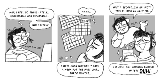
My therapist says I'm depressed, but I say I'm dehydrated! ✨
#digital art#comic#self#just realized I spelled “physically” wrong but it kinda just adds to the MOOD#you know?#capitalism amiright?#but really take breaks if you can people#don't be like me#also one thing I do actually do is drink a lot of water lmao#so no worries there#anyways! *lies down on my desk*
1K notes
·
View notes
Last Seen Blogs

beonikii
Life In A Box

caimancrashed
cai 🐊
askanoddpikachu
not as odd as you think
carlspeaches-blog
TWD✌
starrysorry
HYPERFIXIATION TIME