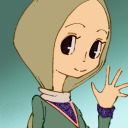
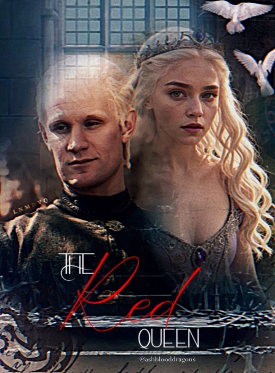
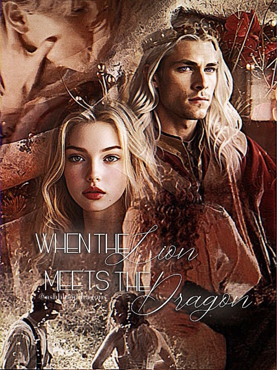
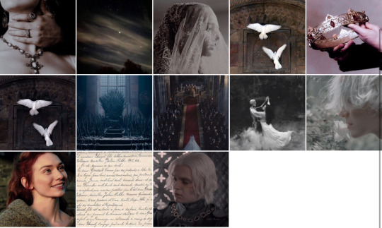
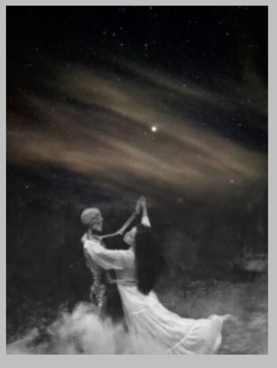
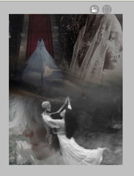
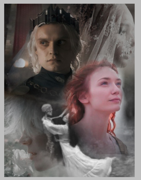
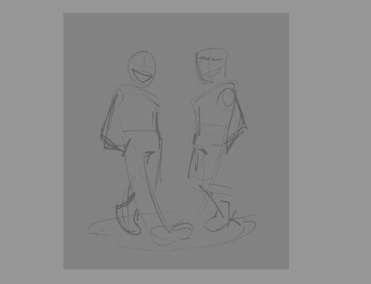
#me trying to fit 5 characters on one canvas …..
Explore tagged Tumblr posts
Visit Tumblr Blog
Explore Tumblr blogs with no restrictions, modern design and the best experience.
Last Seen Tumblr Blogs


Fun Fact
Tumblr was the first site to host the blog for President Barack Obama in 2011.
Note
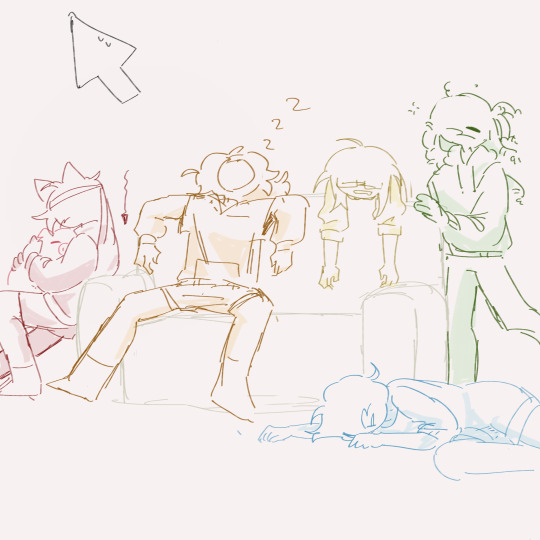
Can we get some color gang group rest? Pleaseee (≧▽≦) 🙏
they just got back from a trial chamber
#my art#avm#avm red#avm orange#avm the second coming#avm yellow#avm green#avm blue#avm color gang#avm alan becker#me trying to fit 5 characters on one canvas …..#art req#animation vs minecraft#zishu answers
197 notes
·
View notes
Text

BATBOYS WITH A STYLISH READER ── .✦
a/n: so I tried to base this off of me because I like genuinely LOVE fashion and creativity (my closet is seriously so full rn but I keep buying and buying but soon I’m gonna donate some pieces I never wore/ won’t wear again when i’m like moving in 5/6 months (in April) but anyways yeahh this is requested by the wonderful @luvly_writer (I GENUINELY DONT KNOW WHY MY MENITONS ARENT WORKING TODAY!?!?
tags: (batboys x stylish reader ᥫ᭡)

DICK GRAYSON ── .✦
Dick’s always had a decent sense of fashion, but after meeting you, he realized his wardrobe could use some spicing up.
“Okay, I need help,” he says, holding up his closet of endless leather jackets and dark jeans. “It’s starting to feel like I’m a character in a some main character show..” (this tiktok HELPP here)
You pull together a sleek but casual look for him, fitted trousers, a patterned button-up, and a blazer. When he sees himself in the mirror, he whistles.
“Are you sure I’m not about to walk the runway?”
He loves when you add your flair to his outfits, often saying, “This is why I’m with you.”
Eventually, Dick starts mimicking your style in small ways—accessories, boots, and bolder colors. He’ll even joke, “You’re rubbing off on me in more ways than one.”
JASON TODD ── .✦
Jason scoffs at the idea at first. “I don’t need to be styled. My leather jacket and boots are timeless, I don’t need like bags and purses like you.”
But then he starts noticing the way you turn heads wherever you go and how people always stop you to ask where you got your hat or etc from, and he gets curious.
One day, he half-jokingly says, “Alright, fashionista. Make me look less like I just rolled out of a biker gang.”
You have so much fun dressing him in a sharp, dark button-up, fitted jeans, and Chelsea boots. When you suggest a leather trench coat instead of his usual jacket, he raises an eyebrow but ends up loving it.
“I look like a villain trying blow up something in broad daylight,” he says, smirking. “But, like, a hot one.”
Jason doesn’t fully change his wardrobe, but he starts incorporating your suggestions—better fits, fewer holes in his shirts, and maybe a sweater or two. He always claims it’s to “shut you up,” but deep down, he loves how confident it makes him feel when his s/o chooses stuff for him.
TIM DRAKE ── .✦
Tim’s wardrobe is functional. It’s not bad because there’s a DIFFERENCE, Timothy drake wayne dresses in suits and is high end and chic but regular tim well… tim Is tim but he DOES care about what he wears just not like that serious about it, but it’s very much “guy who spends more time in front of a computer than a mirror.”
One day, he asks, “Do you think I should update my wardrobe? You know, to look… presentable?”
You practically light up, dragging him out for a shopping spree.
He’s a little overwhelmed by how excited you are, but he secretly loves the attention.
You pick out layered outfits—hoodies with tailored jackets, clean sneakers, and pants that actually fit. When he tries them on, he’s surprised at how good he looks.
“So this is what it feels like to be stylish,” he muses.
Over time, Tim starts borrowing pieces of your style. He’ll wear scarves, experiment with glasses frames, and even tuck his shirts in occasionally. You catch him researching minimalist fashion on Pinterest once, and he sheepishly admits, “You’re a bad influence.”
DAMIAN WAYNE ── .✦
Damian has a sharp sense of style already (thanks, Talia and Bruce), but he finds himself intrigued by your unique flair.
“You have a good eye for aesthetics,” he says one day, almost shyly. “Perhaps you could lend me some… insight.”
Styling Damian is like working with a blank canvas—he’s open to trying new things as long as it doesn’t compromise his dignified image.
You help him experiment with layered textures, sleek boots, and subtle patterns. He refuses anything too colorful but surprises you by agreeing to a deep emerald green blazer.
“I look… distinguished,” he admits, staring at his reflection.
He starts taking inspiration from your wardrobe, incorporating more modern and creative touches into his outfits. Every now and then, he’ll ask, “What do you think of this?” before leaving for an event.
Damian also becomes oddly protective of your style. If someone tries to copy you, he’ll say something like, “Flattery may be the sincerest form of imitation, but it’s wasted when done poorly.”
BRUCE WAYNE ── .✦
Bruce is already a style icon, but when he starts noticing the effortless way you put together outfits, he gets curious.
“What would you do with this suit?” he asks, gesturing to one of his many black ensembles.
You tease him for being so predictable but suggest a few changes—adding a pocket square, switching up his tie, and choosing a dark navy instead of black.
When he steps out in the new look, even Alfred raises an approving eyebrow.
“Now I’ll have to think about my outfits.”
He begins to take subtle cues from your style, occasionally asking for your opinion before galas. You catch him sneaking glances at your Pinterest boards once, and he pretends it’s for “business purposes” (you had to private your pin board after because he keeps buying 10 of each of what you put on your Pinterest board.)

#jason todd#jason todd x reader#batboys#dc#dick grayson#dick grayson x reader#dick grayson imagine#jason todd imagine#jason todd headcanon#dick grayson headcanon#red hood#red hood x reader#nightwing x reader#nightwing#nightwing imagine#nightwing headcanon#red hood imagine#red hood headcanon#tim drake x reader#tim drake imagine#tim drake headcanon#tim drake#damian wayne x reader#damian wayne#damian al ghul x reader#damain al ghul#bruce wayne x reader#bruce wayne headcanon#bruce wayne#dc comics
1K notes
·
View notes
Note
Fellow SP fan artist here, do you have any tips on designing sigils? I’d love to draw China more but any time I try my hand at putting sigils on her, they never feel quite right. Do you have a process on figuring sigils out?
Hello! This turned into a REALLY long post I'm so sorry, but I'm flattered you're asking me for advice! Take everything I say with a grain of salt bc there are absolutely no thoughts in my head :]
Okay, here's a secret. You can't tell anyone okay? It's suuuuper important that we gatekeep this. /j I go into a sigil design with absolutely no idea what's going to come out of it. Maybe I have like a very basic shape in mind, but generally I just scribble until something pops out at me and then I keep adding stuff and erasing until a cool design happens. I come up with the meanings as an afterthought, and usually only if someone asks about them; Skulduggery's right facade sigil is the one exception because I went into designing that with the reflections sigil in mind. My China's tattoos are all designed with only 'ooo that looks cool' in mind.
Under the cut: My personal process, How to design sigils (with n without function in mind,) references, and two of my super secret!! canvases
Warnings: doll-like nutity, blood and burns, a lil angst
Here's my personal process: - Scribble - oh I like that shape - make thicker and erase designs into it - Figure out where it would fit on her body - Panic when someone asks what it means - Gaslight myself into seeing a function - Profit
How to design sigils:
Think about where it's going to go on the body.
The back is a bigger canvas than the forearm. What will fit there?
If you're designing sigils with a function in mind:
Is the function used often? It should be easily accessible.
Is the function an emergency or last resort? You shouldn't be able to bump it, but it should still be easy to reach.
Arms, face, and chest are easy to reach. Legs are harder and you need wiggle room. Palms, hips and thighs are good for subtle taps or stealth sigils. Are your hands bound behind your back? What can you put within reach that will help?
What shapes resonate with the function? Triangles could mean fiery or offensive functions. Squares could be defensive. Circles are good catch-all designs. Circles are very magicy
If you're designing sigils without function in mind:
Think about design: Use negative space! Use thick lines or thin lines or both! Overlap shapes and angles! What looks cool?
Do you want them to all flow together? Do you want patchwork? Both are valid! Maybe one arm is a sleeve, and one is patchy!
You can design the sigil first and figure out where it fits on the body, or you can keep the body part in mind while you're designing.
I like thicker sigils/designs, so I start with a blob of ink or a solid shape and erase until something pops out at me.
For thinner designs, the opposite applies. Scribble until something resonates with you or looks cool. What shapes go together?
I like to write little sigil 'letters' alongside thick lines or shapes.
Have fun with it! You can figure out technical stuff later, or never!
References:
I like to use the Twilight Princess Hylian alphabet if I get stuck, or if I have a function in mind. If you glue a bunch of letters together and erase bits, eventually something looks magicy! (Different Zelda titles have different Hylian letters, so you could mix n match as well)
Maybe you use a different sort of script you like. Maybe a code or sorts, or icons from medias you like. Take letters or characters from languages and warp them into something that looks like a sigil
How badly can you draw a 5? There's a sigil! Can you use dots instead of lines? Now add random lines! There's a sigil!
Circles are always good starting points. Eyes are good details. Egyptian glyphs and runes are good starting points. Just make sure not to rip anyone off :]
My China only has like two or three sigils that I went in knowing what I wanted it to look like overall, and those are: - The huge sigil wheel on her back, which I knew I wanted to be a a big circle with swirling symbols and such. - The belt-like design around her waist, I knew I wanted those to look like the top of Midna's Helmet - The upside down crown like triangles on her forehead (which have sort of changed to how I wanted them originally) and the designs under her eyes and on her chin and throat. There's many ways to come up with sigils, and here's another secret: They don't all have to have meaning! My China has a ton of designs, but I've only assigned functions to a handful of them
Keeping it consistent:
I also have a 'China sigil map' I have for reference, but it's not even fully filled out because I got distracted. If part of her skin is visible and I haven't drawn that part of her body before (like the ONE time I drew her back, or her left leg or something) I come up with the sigil then and there xD If you're interested, this is what my 'sigil map' reference canvas looks like. It's nowhere near complete and frankly, a huge mess: but it works for me. Started this like a year ago and just kept adding to it when I needed to
Here's my canvas of previous China references I use to keep everything consistent
Here's where I started rambling and I can't be bothered to edit it, so its prob repetitive lol
One tip I do have is decide if you want thin or thick designs. My China started off with thin and squiggly sigils, which ultimately I never actually liked, but now she has thicker tattoos and I think it feels more athetotic If you go a thinner route, I recommend using lots of squirls and angles together and finding one basic shape and then adding to that. A good example of this are my facade tattoo designs, where I took the reflections sigil and altered it, or took the hourglass shape and added smaller designs around it. However, if you go with thicker designs like I have, ERASE more than you draw. I start with a blob of ink, and then erase designs into it. I reallllly like how negative space is used in tattoos and think about that as I'm designing Chinas sigils as well.
If you're going into designing a sigil with the intent of 'this is going to make her skin hard like iron' then think about where she would logically put it? - To me, that sounds like a 'tap the chest' sort of sigil. The chest is a bigger canvas than a forearm or something, so it can be bigger and more detailed. - Maybe instead, it's two sigils, one on each arm, and she crosses her arms to active it. Okay, that's two smaller sigils bc you have less space for detail. - What reminds you of iron skin? It's defensive, so that makes me think of squares and hard angles. Maybe you straight up draw a shield shape and erase markings into said shield. yeah sigils n stuff! Thanks for the ask and hopefully this was somewhat helpful :]
27 notes
·
View notes
Text
Games I Played in 2024
I played a lot of games this year (finished 33 but dropped a few others) and thought I'd write up some quick reviews. Didn't include Metaphor Refantazio since I only played the demo of that (really enjoyed it though), but I did include Hades 2 since I put in 100 hours into it and I think it's pretty obvious I like it lmao. listed in chronological order of when I played it
Howl: Hate to start out with a game I dropped, but I was just really bad at the puzzles in this one lol. You play as a deaf woman who is immune to the "howling plague" which turns people into feral beasts, so she alone travels the land to help villagers and try to find a solution. Really neat concept, I was just bad at the grid-like puzzle system.
Kena: Bridge of Spirits: 3/5 Thematically it's maybe a story more appropriate for children, in that you play as a young woman charged with taking care of spirits who have moved on and looking after the environment, but the combat was hard enough that it felt more suited for adults, which made me kind of wonder what the target audience really was. Visually it's stunning, and it's got all the elements of a typical AAA game these days (collectibles, puzzles, zones to explore). I found the plot a little simple, like if Disney wrote the game and Pixar animated it, but the gameplay could occasionally get hard. I've never played a soulslike game before so I can't comment on whether it is appropriately challenging for a "soulslike," like some have debated.
Persona 5 Tactica: 4.5/5 I enjoyed this one! The gameplay feels like Fire Emblem strategy set in the Persona world, which can be a bit simple in the main story maps but gets increasingly complicated in the challenge/side maps, especially those where you have to accomplish an objective in one turn. The chibi art style might turn people off but this feels very at home with the main game's story and themes with two surprisingly fun new companions.
Venba: 4.5/5 What a surprise I like the cooking game about a family adjusting to life and dealing with Asian diaspora. I think it could've been longer because I was enjoying the recipes but it did make me cry. Phenomenal soundtrack too.
Eastshade: 3/5 The idea is that you're a painter and you can walk around an island and capture the scenery on your canvas to fulfill requests from locals. Unfortunately it felt more like Crafting: The Game which wasn't really what I signed up for but it's still a relaxing time.
Dépanneur Nocturne: 3.5/5 A short little game I picked up randomly. You go shopping at a convenience store late at night and find some weird things on the shelves. Unexplainable, cute, kinda fun.
Hidden Through Time: 3.5/5 A cute little find-the-items game with the ability to make your own themed maps. There was a lot of variety in the levels.
Yoshi's Crafted World: 3/5 I played this at May's when I was catsitting at her house lol. Cute time-waster for a platformer I'd recommend for kids but honestly got a little grindy at the end.
Hades 2: (Personal GOTY) 5/5 Though it came out in May, I played this pretty much throughout the year. It is in Early Access, but I truly believe this game has more polish and content than most finished games have on release, so in my heart it counts. Melinoë is a wonderful character, there's some real depth, heart, and humor to the writing, and the world has gotten even grander and denser than in Hades 1. The stakes are high in that she has to defeat an undying Titan over and over again to save her family, but the game still feels quintessentially Hades while also reshaped to fit Mel's character and journey. I feel like the team knows exactly what they want and what they're doing. Supergiant doesn't miss and I'm very excited to see what future updates hold.
Synergia: Dropped. This is a cyberpunk visual novel with robot yuri about an overworked detective who purchases a new household android for company. I ended up putting it down because the writing was... mostly fine, but when it stumbled, it felt very awkward and unnatural; I also realized the main writer was a man, which made some of the "oops, I have to sleep naked" lines coming from the childlike android feel fetishy at times. It wasn't constant, but it was prevalent enough to bother me. Still I've seen some wlw enjoy it anyway or even embrace those aspects, so what I don't like someone else might.
Harmony: The Fall of Reverie: 3/5 This one has a neat concept. Polly, the main character, is tasked with keeping balance between two worlds while juggling the desires of Glory, Bliss, Power, Chaos, Bond, and Truth, who are anthropomorphized characters you can agree or disagree with in their direction to lead humanity. The gameplay idea is that you can see the consequences of your choices branching out before you make them, which at times is really cool because it lets you plan what you want, but at times also feels like you're really just looking at the behind-the-scenes of the developer code lol.
Hello Goodboy: 2.5/5 I must've misjudged this one because I think it was either for real little kids, or it just wasn't translated well. It's a story about a kid and his dog in the afterlife. Felt approachable for teaching kids how to play a video game for the first time.
Hohokum: 3.5/5 At first I could not get into this for the life of me but then it clicked after a few sessions and now I think really fondly on this weird, abstract experience that is more of a toy than a game. I only mark it down because I found the map so damn confusing.
Pentiment: 5/5 No notes, full stars, going right up there on the shelf of "games I'd recommend to Disco fans." This game officially made me a Josh Sawyer fan. I didn't think I'd get invested in a story about 16th century Bavarian monks but I cried several times.
A Tiny Sticker Tale: 4/5 A cute puzzle game set around the idea that you can pick up stickers of items and people, and place them somewhere else. Nice for an afternoon!
Pyre: An excellent 4.5/5 that I look more favorably on in hindsight than when I was playing; I want to give it a 5/5 rating but something about the combat really didn't click for me. You have been banished from the Commonwealth after an unmentioned crime, and after finding allies, you discover you can guide them to partake in ancient rites that will grant ascension back into the Commonwealth one at a time (if you're successful). To earn everyone's freedom, you basically have to play basketball while juggling all three of your main player characters on the field, who all have different abilities and movement speeds, and I struggled with that. That said, the story is Supergiant at its absolute peak, and I think it has the best soundtrack of all their games, which is saying a lot. There's light character roleplaying, but the main choices are made for you in how well you play fantasy basketball: the game will move on whether you win or lose, and the story will adapt.
Landlord of the Woods: 5/5 I really enjoy Madison Karrh's games and Landlord of the Woods is no exception. It's a short puzzle game about finding a new job and showing up on your first day... except your job is a landlord to a community living in the woods who do not want a landlord. Lighthearted yet also creepy, ironic without being jaded, it's delightfully unique.
Insomnia: Theater in the Head: 4/5 A short narrative/puzzle game about a woman's struggles with insomnia. Really captures the energy of all the wild thoughts running through your head at 2am.
Detective Grimoire: Secret of the Swamp: 3.5/5 Starting to show its age but I really like detective games where YOU have to figure out who did it. It is also fortunately not very punishing but you do have to think a little.
Roadwarden: 4/5 This gave me maybe the closest feeling of roleplaying Dragon Age Origins that I've had since playing Pillars of Eternity, just with a smaller budget and largely text-based. You play as a Roadwarden, who is charged with keeping the roads of a peninsula safe from monsters and bandits; but you have another job from your supervisors to see if the peninsula would be open to trade in the future, and would require new merchants and changing leadership. You can be a hero, an asshole, you can sell out the villagers, or quit your job and live with them... there are lots of small discoveries and connections to be had in this game.
Sarawak: 3.5/5 Another short little game, this one a literary mystery set in Oxford and Malaysia, about a woman investigating her parents' histories. I find myself really enjoying these small narrative adventure games as I get older.
Catlateral Damage: 2.5/5 Wish I enjoyed the "cats knocking stuff off stuff" game more, but truthfully it got a little boring after ten minutes.
Planescape Torment: 4/5 Clearly a long-beloved game for a reason, and I see how it inspired Disco Elysium. The combat is horrible and mechanics are old as balls, but the story and writing are top-tier. You play as a man who wakes up in a morgue after dying with no memory of who he is, and you have to hunt down your memories through the clues your previous lives have left you. But it's not a detective story, it's more about reinventing yourself and deciding who to be in your new life. The OG Harry du Bois, in a way.
En Garde! 4.5/5 What a goofy game! It's a quirky, funny action/adventure game that fully embraces the swashbuckling energy of fencing with a woman lead, which is a nice difference. The characters are flamboyant, the lines are overdramatic, and the game is very self-aware of its genre and embraces it. Found the enemy waves a little overwhelming at times but nothing insurmountable, it just has a lot of mechanics.
Robotherapy: 3.5/5 An interesting little premise about a robot that wants to be a therapist. The writing is fine, but occasionally weighed down by its need to be funny; still it's got a few interesting twists.
Lieve Oma: 3/5 A short story about a child who goes walking in the woods with a grandmother hunting for penny buns throughout the years. This kinda touched me because I never knew my grandparents well.
Hatoful Boyfriend: 4/5 Yes, I'm about a million years late to this game. Turns out the pigeon dating simulator is, in fact, really interesting, genuinely funny, and an absolute horror show at times.
Lego Horizon Adventures: 3.5/5 What the hell, it has Aloy shooting machines and Varl loving comic books and Sylens as a DJ. It definitely feels like it was made for kids who have watched for years over their parents' or older siblings' shoulder as they play the more difficult Horizon mainline games. I did wish it were longer and the gameplay a little more complex but I had fun with it.
stitch.: 4/5 Great little puzzle game where you group certain numbers of stitches together to form shapes with a truly INSANE number of puzzles.
Behind the Frame: The Finest Scenery: 4.5/5 A short narrative adventure about an artist trying to paint "the finest scenery" with some simple puzzles. It reminded me a lot of Ghibli films, maybe not as polished but with some really heartbreaking twists and moments for me about inspiration, communing with your fellow artists, and also the passage of time.
Wavetale: 4/5 A 3d platformer about environmentalism and worker's rights that takes place in a flooded world with only boats to get around... until Sigrid discovers a supernatural ability to run/ride on water thanks to the help of a mysterious shadow. I didn't think this was going to get as deep as it did, and while I think it did go a little long, I respect the vision even if the platforming was kinda clunky.
Summerhouse: 3/5 Another game that's more of a toy than a game. You unlock different walls, windows, roofs, trees, people, etc. to build your house. I like the style of this one, just wish there was more of everything.
Between Horizons: (GOTY RUNNER-UP) 4.5/5 Hidden gem of this year! Despite having just a few things in common with Mass Effect 1, it reminded me a lot of that game (red-haired default female protagonist on a spaceship suddenly thrust into a position of authority and tasked with tracking someone down). It takes place on a generation ship deep into its journey when suddenly systems are sabotaged and rebellion looks like it's brewing. Stella, the new Chief of Security, has to find the culprit before the mission reaches a point of no return. REALLY good puzzles in this one imo, I actually had to pen-and-paper some stuff to figure out who did what.
Dungeons of Hinterberg: 4/5 Another hidden gem in which dungeons appear around the modern-day Austrian Alps, sparking a sudden wave of tourists and dungeon-crawlers to visit. Part Zelda and part Persona, you explore dungeons by day and hang out with friends and locals by night. The game questions us on if the tourism brought to a small town as a result of the magic spawning there is actually helping, or if the capital and greed it brings might change the village for the worst. The game is about 1/3 relationship sim, 1/3 combat, 1/3 puzzles; I enjoyed all three to varying degrees but I think the puzzles are the strongest.
Paper Trail: Another grid-based puzzle system I dropped (I'm noticing a pattern). You play as a young woman who runs away from home to go to college, and she can "fold" corners of reality to make bridges, connect landpaths, etc. Gorgeous environments and neat concept, I just struggled with it.
1000xResist: (GOTY RUNNER-UP) 4.5/5 Half of Tumblr should be playing this. It's a scifi game set in the distant future in which aliens have arrived on Earth and brought with them a devastating plague that kills most humans. A girl called Iris is the only person who seems to be not only immune but also now immortal, who is cloned/later clones herself throughout the years (first to study a cure, and then to keep company/create a new society). You play as Watcher, a clone created a thousand years later to record Iris's life, now known as the ALLMOTHER's, life, and ensure her authority goes unchallenged in a post-apocalyptic world. I can't even talk about it more without spoiling but it tackles authority and rebellion, identity, memory, bad friendships, generational trauma, modern Asian American/Canadian diaspora... If you enjoy any combination of the following you will probably enjoy it: Everything Everywhere All At Once, Evangelion, Imperial Radch, Arrival, Ghost in the Shell.
not included are my gatcha games lmao which are currently animal crossing pocket camp (og and complete) and fire emblem heroes
20 notes
·
View notes
Text


New look but same old commissions!!
I updated my commission sheet so it also fit with IG - all information is the same as the previous (x)
I will link terms and conditions under the line :3
Terms and Conditions
1 General Information
At this time, I will be taking digital art commissions only.
Standard canvas size: 1200x1600 px, 300 dpi.
It is possible to ask for a different canvas size - the price will be raised for a bigger canvas and lowered slightly for a smaller one.
I have a limit of up to 5 characters per canvas unless something else is agreed upon.
Are you interested in a style not featured feel free to ask me and I can give you an offer.
2 Ownership
As the artist I own the final product: Please credit me if you post it (with permission) and do not delete the signature.
The art must not be used commercially.
3 Drawing limits
Things I will draw;
OCs; Shipart (within reason); Humans/humanoids; Animals of the canine, feline or equine families (cats, dogs and horses); Dragons; Anthropomorphic characters (to an extend); Children (to an extend); Elderly characters (to an extend); Fanart (more later); Armour (to an extend)
Things you have to ask me about;
SFW nudity; Muscular men or women; Big-busted women; (Mild) Gore; Monsters with undefined features; Birds, big fish and other less often drawn animals (eg. goats, rhinos, elephants, bears etc.)
Thing I won’t draw
NSFW nudity and scenes; Hateful art (lgbt-phobia, racistic, ableism etc.); Fetish art; Super detailed backgrounds
Specifically about fanart
I will gladly draw fanart of properties (movies, franchises, books etc.) that I know of and may also be persuaded to try fanart for stuff that I don’t know.
Please keep in mind that no matter what I will draw it in my style; I won’t replicate the style from a specific show/manga/book etc.
4 Work in Progress updates
I'll send work in progress (WIP) pieces when I am done sketching. Exceptions will happen when:
The owned art is a sketch drawing.
You communicate that you are not interested in wips
5 Payment options
At this time, Payment will happen through paypal only.
I will send you an invoice using the PayPal address you've stated in the commission form (more later).
The invoice will be in Danish Kroner, DKR.
Please do NOT send any money before I've accepted your commission.
Please pay within 3 days of getting the invoice - if this is not possible send me a dm/mail.
Have I not recieved the payment within the 3 days' deadline, the deal is off.
It is not possible to split the payment. (aka paying half now and the other half later)
6 Refunds
As a commissioner you can get refunds before I send the first wip and/or if I do not update you within 14 days.
updating include the following;
sending you notes about the progress.
showing you wips of the progress.
being tagged in posts about possible setbacks.
If you decide to cancel your commission following the description above, you get 75% of your money back (little fee of asking for a refund).
If you want refunds for any other reason than stated above, the same rules still apply IF you ask before the first wip has been sent.
If you ask for refunds AFTER the first wip the percentage will be calculated depending on how far I've gotten in the drawing process.
7 How to order
If want to commission me, please either DM me or send me a mail at [email protected]
If you want to make it easier for me you can fill in this form:
Username:
Offer: (eg. sketch bust)
Character(s): the name(s) and pronouns of your character/person(s) you want me to draw (to make sure I don’t misgender any character/person I may not know).
Reference(s): reference picture(s) of each character/person – (I prefer fullbodies for original characters). Please choose reference pictures in a good quality.
Background: (if you are not interested in a background or are indifferent, please tell me so as well).
Paypal adresss: (e-mail that I may send the paypal invoice to).
Other: some other details worth knowing - do you have a pose or expression in mind? do you not want wips? Etc.
40 notes
·
View notes
Text
HOW TO MAKE A COVER PART 1
PART 2
We all the saying “never judge a book by its cover”, but be honest without yourself. There has at least been one time when you did pick or didn’t pick a book because of its cover. Anne many people make fanfics these days, but sometimes when you scrolling on Wattpad, it isn’t a stories name or summary that usually stops you from scrolling down a list of fics, it’s the cover that makes it stand out.
“But how do I make my cover stand out? I don’t know how to make one?” Simple trick: make it look good. It is natural for humans to take a liking to looking at good things.
WARNING: I am no master at making covers, this is something simple I decided to do to help a few people. But today, I will tech you make covers like these (both covers are made by me for a friend, do not steal or edit my work):
INTSTRUCTIONS:
Find a website obviously. Since I’m a broke bitch, I don’t spend my money on Photoshop or anything fancy. So lemme give you a free and easy app: IbisPaintX (it works on laptops, iPads, phones. But for this purpose, I recommend choosing an iPad).
2. Find some pictures. In order to make a cover, you obviously need pictures. I recommend adding 2~ faces in the cover so you have space for adding additional photos for fun that fit the theme. Also make sure to have at least one background photo so when you add your pictures on top, they’re istn too much white space showing. I recommend going on Pinterest to find photos. Also, remember to pick a theme. Are you going for something romantic? Something tragic? Or thriller? For this tutorial, I’ll be making a romantic cover, but my theme is more grayish (always try to plan on an image mentally before actually making anything). These will be my images for this tutorial:
(Keep in mind, you probably won’t be using all of your images. It is simply better to have lots of photos, in case a certain one might not workout. Throughout the process of making the actual cover, you might go around and change photos up or even add new ones as I do).
3. Once you get your photos, go to IbisPaintX and click on the plus sign.
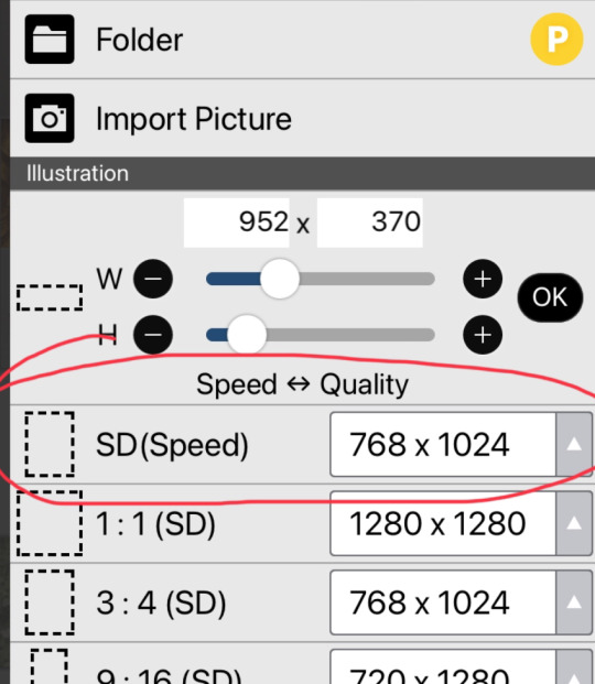
This should open a chart (the image on the right) for you, that allows you to pick the size of your cavas. You can either make your own size, or choose one of the premade ones. I recommend the 768 x 1024 size.
4. Now we have our canvas! Currently it should be blank, but see that little number 1 at the bottom? That is used for layers. When you press thag, you should open to the setting in the second image. Click on the little camera circled.
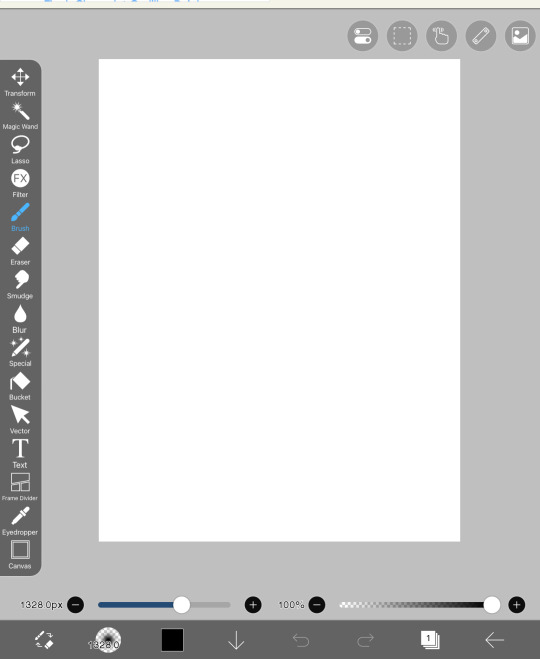
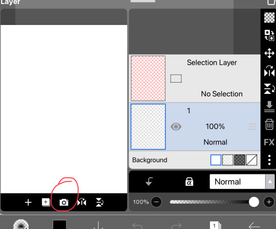
It should open to this and you should pick 1-2 photos. These photos should add as our backgrounds. Every time you open a photo, It will pop up something that asks if you want to extract or remove any backgrounds, press cancel for every image until I say so.
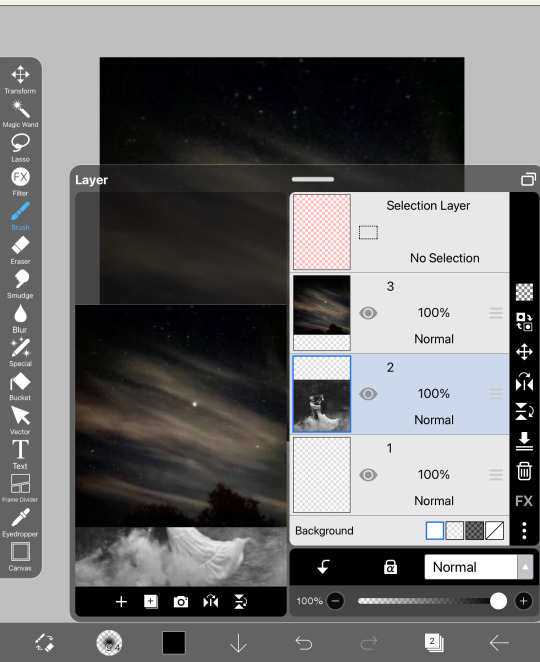
Currently, the two photos look stiffer than my back. Let’s try to blend them together! In order to do that, you should head over to the erasers. When you go there, press on airbrush and lower the opacity (I normally use 45% to blend most photos)

Softly blend the two images and try to prevent any sort of white spots from forming. This should be our finished results:
5. The next step is quite similar. Now that you know how to add on images, continue to add more images on top and blend them into one another. DO NOT OVERDO THIS
BOOM! Jusr have fun in this process, add on images and remove, blend around. If the colors don’t fit that well together, it’s ok, we will work on that in future steps. But now, it’s time to add our main characters on the cover. I usually add them in the middle, since that is where the attention is most drawn. Simply add them on and erase the edges of the sides to make it proper. Do not erase too much in this step. We are not trying to make the picture blend in, but rather soften the edges of remove the background. Here, this is what I mean:
If there is any more photos at this point that you want to add, go ahead. The next step is merge all the layers. When you opened the layers, you would see how there are many. We are trying to merge them into one. When you open the layers button, there will be a merging button that I circled and simply press on it continuously until you have only one layer.
Our product should be this as of now:

OK YOU MUSF BE SAYING “THIS LOOKS PLAIN AND UGLY!”
I know it does. But because tumblr is a bitch and only allows a certain amount of photos, this will be split into part 1 and part 2. In this part, you learned how to ensemble a cover. In the next part, we will learn how to make it look good. This is PART 2
Thank you for staying this long! If you have any questions so far, please do ask me.
#sazh rambles#sazh covers#sazh writes#sazh helps#covers#book cover#fanfic#fanfic help#tips#art tips#art tutorial#guide
10 notes
·
View notes
Note
How do you balance maintaining a consistent writing routine?
Oh boi if only I could actually do that. Ok here we go~
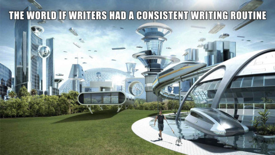
Writing Creating Consistently
Creating consistently is one of the biggest challenges for any creative out there, not just writers. But despite so many people experiencing the same exact problem there is no universal solution. And the reason for that is simple: every person is different and the reason behind their struggles are just as diverse as humanity itself. For some it’s just difficulty keeping a habit alive, for others it’s circumstances of life and for people like me it can even just be their neuro-type.
But it’s not like there’s nothing you can do. So, here are two ideas to try to write more consistently, for both the organised and the chaotic:
Journaling +
This idea works best for those who don’t struggle too much to keep a habit alive or those who already journal or do something similar regularly anyway. Basically all you do is add a daily writing task to your routine. It can be anything like writing a short paragraph, working on character details or even just researching something. What exactly you do doesn��t matter as long as you’re doing something. But the most important thing to keep in mind is to keep the task tiny.
Once we start doing something, more often than not, much more will follow naturally. But if we make the task too big, we risk ending up dreading it. For that reason, your daily task should be something easy that can be done in no more than 5 minutes. That way you’ll get the satisfaction of doing something almost every day and don’t disappoint and demotivate yourself with piled up days of being unable to fullfill your goals.
Tiny Book
This technique works best for the more chaotic (and/or audhd) type and is the one I personally use for both writing and art. The basic idea of this technique is to simply always have something on you to catch your random bursts of inspiration throughout the day. For most people this will probably be their smartphone and maybe one of those cheap mini pens with the rubber stylus at the end. If you don’t like the notes app or just writing stuff down in a text document (or a hundred separate ones) here’s some apps that I use(d in the past):
Obsidian - very similar to a notes app, except you can link documents and build your own little Wikipedia. Including the clickable links within text and all.
Concepts - gives you an infinite canvas to take notes and draw stuff like mind maps. You’ll need a stylus for this one if you don’t want to write with your fingers. There are in app purchases but you really don’t need them and I’m using the free version with no problems too.
Campfire Blaze - (also as website) is specifically built to plan and share your writing projects. It has a lot of pre built functions to plan characters, maps, lore, magic systems etc.
Story Plotter - very similar to campfire except the focus is on structuring your story. A lot of people swear by it but I personally can’t give much more details because it just isn’t my style of program.
If you’re more of the traditional type though, get yourself a small notebook to always (and I mean always) carry around. Preferably a durable one that fits in your pocket and has a loop for a pencil. Also I recommend using a short technical pencil with an eraser at the end to avoid having to carry that and a sharpener around. Remember, we want the most comfortable quick and easy access so it doesn’t become a hassle to always have access to your materials.
On that note,
Why oh why, IKEA, did you stop making those cute but sturdy notebooks? That’s it, we’re breaking up. Søstrene Grene, you’re my new paper supply girlfriend. You may be more dainty and delicate, less sturdy than Ikea, but at least you’re there for me.
Ok but seriously, tip for the artists: søstrene grene has those teeny tiny blank books with really nice paper (easy 100+ pages) that fit into even a women’s front pocket and are perfect for quick thumbnailing. Just make sure to enforce the binging by putting some washi tape ore sum around the edges and glue it down on the backing bc they fall apart easily.
Anyway
Happy writing creating <3
#writers on tumblr#writing#authors of tumblr#tumblr writers#writer on tumblr#writer problems#as always ignore my grammar#english is my 3rd language#and i do not know how punctuation works here#unhinged#writing advice#art#art advice#artists on tumblr#artist on tumblr
50 notes
·
View notes
Text
A bit of a disclaimer ig...
Hi guys,
This is going to be a long post that sounds slightly rant-y & I'm going to apologize in advance for that. I am going to make exactly ONE post (this one) about this topic, and I will not be discussing it further or posting about it again. I will also not be responding to any negative comments but deleting them instead.
These are my personal opinions and [...not *trying* to sound rude, but there's no other way to say it...] a bunch of random people online aren't going to change my opinions.
My husband is an artist. He does canvas painting & draws comic books (think anti-hero dark horse). I paint furniture (kinda mini murals) & make chibi drawings. I've also been writing fanfiction since the late 90s.
That being said, this post is about AI art.
I get the controversy, I do. But I've heard this argument before, when fanfiction became more popularized. The whole "You're just stealing someone else's work & changing it up to call it your own" is (at its core) the same argument against AI. The only difference is that instead of you yourself changing it, you're allowing a machine to do it.
But I digress...
Over the last week, I have received several messages about my use of AI art. First & foremost, my stuff is appropriately tagged as AI.
Second, I don't sell or advertise these pictures in any way. In fact, none of them have been posted anywhere but here (as of 6/1/24).
Third, and probably most important, I DONT MAKE THEM FOR YALL. Fanfiction & fanart are a HOBBY. It is something that I do because I enjoy it and it destresses me. I DO NOT do it, hoping I'll get 1000s of followers, views, likes, etc. Every story I write, I print & bind for my library. I will now be doing the same with my AI pictures.
I have a condition that has a symptom called Maladaptive Daydreaming. Because of this, my head is full of an alarming amount of excruciatingly detailed & unrealistic scenarios and images. (To the point that it affects my everyday life).
I can't necessarily recreate the images in my mind without help & the only way to get rid of the random scenarios is to write them out. So I do write them. And now I use AI to help me get a BASE image. I do still go in myself and edit/redraw parts of each generated image to fit them to the characters I want them to represent. I do thus using digital art.
Granted, there's a whole other group of people that think digital art isn't real art... but that's a discussion for another day. Anyway...
TLDR:
I use AI art & will continue to despite some people's dislike. I will continue to delete any and all comments left publicly that are malicious, rude, or condescending. My stories & are are for me. If others enjoy it, great, that's freaking awesome. If not, there are literally thousands of other fanfic authors you can follow instead of me.
Again, I apologize, I know this sounds rude. But I need to be 100% transparent on this one. I am extremely grateful for every folllower & reader I have. I won't lie & say comments/positive interaction isn't a serotonin boost because it is. Yall also give me more motivation to actually complete a story vs. moving on to the next idea. But I'm not going to change the way I do things to appease someone I don't even know.
This is one of the few things I enjoy doing in my free time & have been doing it for 25 years now, and in the last 5 or so years ALL fandoms have gotten so toxic its hard to enjoy anything anymore. Last time it got like this, I simply stopped posting. I'd rather not do that again, but if people (who aren't even following me) don't leave me alone, I'll probably have to do it again, sadly.
But for now, hopefully this post will give people with different opinions to go ahead and block me from their feed. We're not going to agree so instead of wasting energy arguing, let's keep the peace & agree to stay off if each others feeds.
I won't judge you on your idea that you feel it's your duty to harass people over their choices & you won't judge me for enjoying something. 😉
Thank you for listening. Love yall & and I hope your day is blessed!

#fanfic#kagome higurashi#lord sesshomaru#sesshomaru#sesshomaru x kagome#sesshomaru's mother#sesskag#sesskag fanfiction#sesskag fic#sesskag monthly prompt#ai#ai generated#ai art
11 notes
·
View notes
Note
scrambles … hi, what is your thought process when planning out designs / drawings if you have a specific one
Helloo!
Both have general processes!
Drawings wise just depends on if I want to make a new piece or not. If I do, usually I make a symmetry tool and make some kind of a box in the middle! Take this WIP for instance:
Which is a scrapped composition for my "We're Gonna Win" piece! I still liked it, so I moved it to a new canvas and made the inner box a little bit bigger than what it is for my CCCC album works!
Though a lot of these canvases get left at the wayside. Unfortunately. But my point still stands! Compositions I will usually draw anywhere from 1 to upwards of 5 thumbnails for. Most of the time though, that is only if I have a specific idea in my head.
I've got a lot of "mass doodle" canvases where I've just drawn a host and assortment of things, some of which I've blown-up on a canvas and drawn over to make a full piece of work!
As for designs,, sort of? I like to put a lot of symbolism and meaning into them where I can, otherwise its pure unfiltered self indulgence. Lots of the time with HMS aus I've asked myself "what haven't I done yet?" and gone from there. Thus giving me white haired Heart, Mind, and Soul in different varying aus (Good Day, Syncopation, Lacuna).
I also like to use colors that are going to look nice with one another, and for clothing I'll occasionally peruse Pinterest for ideas.
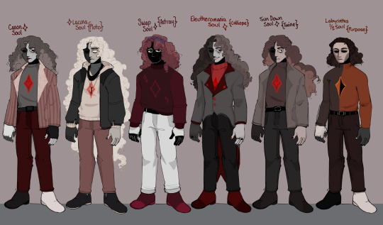
Good example I suppose is my Soul Line-up, of which I intended to do a Mind and Heart version, I just.. haven't had the focus for it (Plus there are souls I could probably add to this by now. oops!)
For Soul, though, I like to keep the red and the grey, then add in black and white where I see fit. I also generally try to consider the personality of the character when giving them a design.
Purpose isn't going to have many accessories, he's based more in being useful and fulfilling their point in being Whole than he is looking like someone at all. Versus, Calliope (Eleutheromania)! Who desperately wants to individualize himself and feel in control. What gives you more control than a goofy suit with a tailcoat? Or, Pluto (Lacuna), who wears items of his long since dead Mind and Heart to remember them by. He is so so cozy but also soo sentimentally sad.
Just things like that, which I think make sure the character is evident in their clothing, hairstyle, expressions and so on.
Hopefully that is well explained! But thank you for asking o7
#asks#I didnt want to make this 200000000 words long so I tried to condense down my thoughts#voidthoughts
20 notes
·
View notes
Text
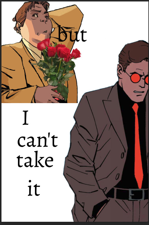
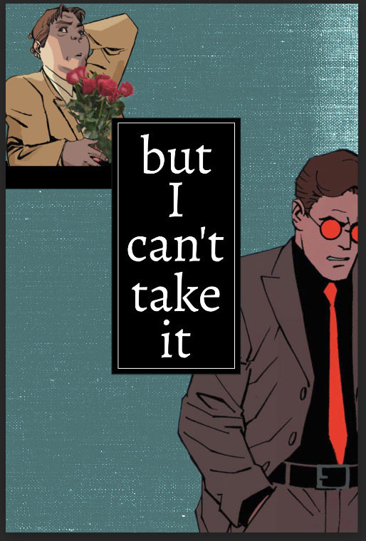
Things I Should Have Said
Javier Peña x F!Reader For the @narcosfandomdiscord October Prompts. Day 5 - Day of Visual Art: Write about a character interacting with a piece of art (e.g. buying decoration for a new home, stealing a piece, hitting on a stranger at a gallery, creating art themselves, etc) Word Count: 2k Warnings: All my fics are 18+, regardless of content. Angsty af. Heartbreaking lowkey. A/N: This was the first fic I wrote for this challenge <3
Taglist: @drabbles-mc @justreblogginfics @narcolini @hausofmamadas

The white lights were meant to illuminate the artwork on the walls but it felt like they were a spotlight on you. In a way they were, the pieces on the wall were an extension of your brain, of your thoughts, of the things that were too hard to say outloud but were so easy to put on canvas. It was fitting for your showing title, The Things I Should Have Said But Never Did.
The gallery was beginning to fill up, mostly of people you had never met before. Strangers made it easy to explain your work, there was no judgment, no weight in what you said. If anything, they were fellow artists who were impressed and intrigued by your style, your process. It also helped that you had a couple glasses of champagne before making your way to mingle.
As you moved around the room, your feet became glued to the ground. The playlist you had running in the background faded from your ears and a ringing filled it’s spot. That was the thing about pouring yourself into your work, sometimes when you saw it right in front of you it brought back all those emotions, all those things you thought you had worked through, and suddenly you were right back in the situation that brought all those thoughts to your head in the first place.
The smallest canvas in your whole showing was being viewed by someone. The irony in the fact that you chose the smallest canvas to express one of the biggest thoughts in your head for the last 4 years, although there was probably a deliberate choice in that, the avoidance in admitting the thought outloud.
The emptiness inside me that never vanishes, is a constant reminder of all the things I’ve destroyed just trying to fill a void.
Those were the words painted over the film photo you had transferred onto the canvas. The film photo that was the memory marker of the start of things destroyed just to fill a void. There were two people in the photo, but they were scratched out, only their silhouettes were visible to the eye now, but it was clear where they were. It was a horse pen outside, one person was sitting on the bottom rail of the fence, comfortable, arms wrapped around the middle rail. The other person was leaning on the post, where the opening of the pen was, there were a few horses in the background. It was funny how you could still pick up body language even from a silhouette, it helped that one of the people in the photo was yourself, so you knew that it was a moment of content, of peace, of what could have been.
You took a deep breath before finding the courage to take the steps necessary to approach the person staring at the photo. It was literally 10 steps to get there but mentally you needed to get ready to talk about it.
“Penny for your thoughts?” You asked, not bothering to look at the person but stare at the artwork on the wall as you spoke to them.
You felt their eyes on you, it lingered for a moment before they went back on the piece.
“Maybe I’ll just buy it.” The man let out a chuckle, there was a slight country Texan twang in his voice that brought you back to your hometown and put a smile on your face.
“You’ll pay more than a penny.” You answered him, eyes still on the artwork in front of you.
“But then I don’t have to share the thoughts.” His point was matter of fact even though you could tell he was trying to be funny.
“Too close to home?” You asked, now turning to look at the man for the first time.
“Yea, you could say that.” He let out another chuckle at that. “Feels like I’m looking into a mirror.”
“Well the people are siloed out.” You looked back at the work.
“And yet they’re still so recognizable.” His response was immediate and it held a weight to it.
“I bet you a lot of people in here have destroyed something trying to fill a void.” You tried to make the man feel a little better.
“But how many of them broke a heart in the process?” His hands were in his pockets, his eyes were back at the painting almost like he was reminicensing as he stared at it.
“I think you’d be surprised.” You let a small chuckle out before scanning around the room at the groups of people looking at the work on the wall, gathered by the bar, and some scattered alone throughout the gallery. “I’d say heartbreak comes easy to half of the people in here.”
“I don’t think there's an easy way to break someone's heart.”
“It’s as easy as wrong place wrong time, I’ve learned.” You were now looking at him, both of you seeming to be having a deeper conversation between the two of you now.
The man chuckled again, you were really killing it with your words tonight.
“You look good.”
The statement threw you for a loop based on how the conversation was going.
“And here I thought you came just to compliment the art.” You felt the heat rush to your face and your heart beat a bit faster from the comment he made.
“I can’t compliment both?” The smile on his face was one that would make someone melt at their feet, that would bring butterflies to anyones gut.
“I don’t think you drove all the way to New Orleans from Laredo to compliment the art or me, Javi.” You crossed your arms and looked directly at the man you knew so well for 10 years out of your life.
“Drive? No way. But fly?” He kept the jokes coming.
“Frequent Flyer Javi.” You teased back. “All that back and forth to Colombia and all it earned you was a trip to see little old me.”
The mention of Colombia brought a certain vibe over on Javi, it wasn’t one that could just go missed or unanswered. But you knew better than to press for information especially when it was probably something to do with emotions and feelings.
“And the art, don’t forget the art.” Javi pointed to the walls, still trying to joke but this time to mask the pain that just got brought up to the surface.
“I haven’t heard from you in 5 years, Javi. I know you didn’t come here to look at some fucking art.”
“Hey, give yourself more credit than that.” He spoke up to defend you.
“Javi, I’m being serious.” You spoke like you weren’t in a gallery full of people, like it was just the two of you chatting over coffee.
“I’m back home.”
3 words but you knew what it meant.
“I saw the news. Saw that they caught him.” You didn’t need to get into detail, especially around all these people.
“Yea, well, actually, I got sent home a little earlier.” He shrugged and was staring at the artwork on the wall now.
There wasn’t anyway for you to know what happened but you could tell that it wasn’t exactly good.
“I’m sorry. I know how much the case meant to you.” That was true, you knew that all too well. It was the reason things were the way they were between you.
“Ouch.” Javi joked, deflecting his way through this entire conversation with you. “Not sure what hurts more, that statement or this photo.” He pointed at the photo. “You might have crossed out the people but I know that photo. That’s me and you. On the ranch.”
You didn’t say anything, it was true, it was a photo of you and Javi on his father’s ranch. The horse pen was where you both spent so much time together, talking, venting, not talking, kissing, falling in love.
“You really think that?” Javi nodded towards the words.
The emptiness inside me that never vanishes, is a constant reminder of all the things I’ve destroyed just trying to fill a void.
“I do.” You nodded.
“How come you never told me that.” He was genuinely asking, you could tell.
You let out your own chuckle and gestured around the room, referring to the whole gallery of The Things I Should Have Said But Never Did.
“I’m being serious.” His voice got firm.
“Fuck you, Javi.” The words were quick to come from your mouth. “This shit is serious.” You felt offended. “Typical fucking Javier Peña. 5 years and you haven’t fucking changed a bit.” Despite the tone of your voice, you weren’t yelling. He might have been ruining this moment for you, but you weren’t going to ruin it for yourself by causing a scene.
“I’m sorry.” Javi said, now bringing his hand up to his face before dragging it down in stress.
There was a silence between the two of you, out of trying to keep occupied, you both stared at the photo of the two of you on the wall. Both remembering that day, remembering what happened later that night.
“I didn’t write that about you.” You spoke up, still not having the desire to look at him. “I wrote that about myself.”
Javi’s eyes quickly fell on you and then back at the artwork before shaking his head confused.
“I know you think you destroyed us by leaving for Colombia, but I didn’t exactly beg you to stay either. I wasn’t ready, Javi.”
“We were in a relationship for 4 years.” He frowned, confused by what you were saying.
“That was barely any different than our friendship the 6 years prior.” You continued. “I was never meant to be there, on that ranch, in Laredo, I’ve always been a passing ship, everything I do is to fill the void of well, being alone. Not having family. Not having friends.”
“I was your friend.” Javi brought his hands into his pockets.
“And it still wasn’t enough for me, Javi. Because then you were my boyfriend. And that wasn’t enough. I was–am, lonely and empty.”
That sentence was heavy, and it was clearly something Javi never thought about, he was always wrapped up in his own destroying of relationships.
Quickly, with a deep breath you cleared your throat, “But hey, it makes for great art. What can I say.” It was an attempt to clear the tension in the air. You turned your head to look at Javi and you let out another sigh as you took in the sight of him. “You staying in town? Maybe we could grab dinner, or something?”
“I’m leaving tonight. I, uh, I’m going back.”
The smallest smile filled your face. You were both so alike, the work being the only thing that you could depend on in life.
“Good, that’s good.” You nodded.
“I’m gonna get going, but it was good seeing you.” He reached out and squeezed your arm before taking a few steps in his effort to leave.
Everything in you wanted to say something, tell him to stop, tell him something more than what you originally said but you were at a loss.
Javi turned around, quickly pulling something out of his wallet and handing it to you. It took you a minute to register was what in your hand even though you were just staring at pretty much the same thing for the last 20 minutes.
“I love the piece, I love all of this. But– keep that, stare at the people in that photo for a little bit tonight, I think they both deserve to be cut a little slack, especially the one sitting on the pen.” And with that, he was waving goodbye quickly, leaving you there with the original film photo of the two of you, two people who you thought were empty and good at destroying things just to fill a void, but now that you stared at the original photo, it got you thinking that maybe you were just two people who were emotionally fucked.
Either way, it was fitting that this happened here. Because now that Javi was gone, you suddenly had a million things in your head you wished you said. But instead of saying it, you flipped the photo over and took a pen out from your pocket and wrote 3 words on the back of it and tucked it safe in your pocket.
“I love you.”
16 notes
·
View notes
Note
What do you use to make your comic edits? I really like them!! And is there like a process you follow? Like do you storyboard the rough idea first? Sorry if you've answered this somewhere before
Ohhhh man this is going to have to go under a cut due to pictures. Luckily whenever I make an edit I tend to DM my friend process pics while screaming about how horrible they look and how I can't figure out how to fix them. 💀 So some of the record exists!
I use a mix of three different programs. To be honest even though it's free, Photopea.com is my go-to for most functions, especially since they have a large pool of fonts to choose from which means I don't have to go into the font mines and download 500 different ones just to see what's going to look best. I also use Paint Shop Pro, which is the program I learned how to make edits (icons, back in the day) on when I was like 14. I have a newer version now since I finally had to retire the 15-year-old one on my broken laptop, and I still don't really know my way around it that well. It's not the most user-friendly software, but it is a lot better than Photopea at resizing images to make them larger. I also use Clip Studio Paint whenever I need to draw anything for an edit.
When I need resources, I often use dafont.com for fonts. I have a bunch of texture packs from various places on the internet, but my go-to nowadays for new stuff is pexels.com where you can get stuff with a royalty-free license. I also occasionally use my own photos for textures (took a bunch of wall photos in Italy- my dad thought I'd lost my mind). I don't use brushes all that often but there are other free resource spots.
As for process, I usually start with comic panels that I like visually and cut out the characters, then figure out what I want to do with them. For Kill Krew, I knew I wanted to use a bunch of the tiny Foggies, but I didn't know that I wanted to make it a story per se until I finished the first section of the edit where Foggy's holding a bunch of papers and I decided to make it kind of like he was authoring his own memoir. Then I just followed the events in the comic. For my volume 5 edits I did have more of an idea for the story I wanted to tell from the start and looked for comic panels that would fit it. (By the way: never forgiving the volume 5 editors for allowing so many different artists. It pained me to have to use a couple different artists in one edit.)
Anyway though kind of like when I'm writing fic, I just start with pretty much a blank canvas, plop the characters on, and hope they arrange themselves into something that looks cool. This is a very early draft of one of them next to a slightly more advanced draft:
A lot of the work honestly goes into choosing the background and marrying it to other elements such as the text and the cutouts. I use a lot of rectangles for this, as you can see in this Kill Krew one next to a near-final draft below. This is also the phase where elements get resized, whether for story-telling reasons or design reasons.
I also fool around a lot with layers and coloring. An unexpected layering choice can totally make or break an edit. See the original comic coloring (left) versus my coloring change (right):

Or this original panel (left) versus a combination of a picture of a starry sky and a coloring layer (right):

Font is also hugely important to me. I try to find ones that fit thematically AND also look great on the image. Like bad coloring or a bad background, an ugly font can also kill an edit. Choose wisely lmao.
Another thing to watch out for in an edit that's multiple images is to make sure they all look nice together and like they're part of one set. I find this probably the hardest, since different source images (comic panels in this case) often have different coloring requirements, but you want the colors to mesh well between different images. It's tough! And if you make extremely long edits like I do occasionally it's hard to even see what they look like together. Sometimes when I'm looking at them stacked in Photopea it looks like a tiny, tiny photostrip and I have to figure out what's working and what isn't. It's tough out there!
Anyway I think that's all I got! Hope that gave you some insight lol I'm glad I had these process pics because I usually just kind of go into a fugue state while making them and come out covered in blood!
7 notes
·
View notes
Text
Weekly Update
07/30/2023

Announcements
- I’m writing an original fiction novel -
You read that right! I’m writing an original fiction called Lock & Key, and I’m taking all of you along my journey as I go through the process. I’m so excited to get started actually writing it soon (once I have a bit more of the outline finished) and I’ll be posting all updates on @lockandkeynovel!
This is a big project, and it’s going to take some time, but I can’t begin to tell you how grateful I am for all of you and your support. You all mean the world to me!
- No more requests -
I have 3 more requests left in my inbox, and once those are done that’s it for now. I’m not sure if I’ll ever be in a position to take requests again or not. My WIP list is a mile long, and right now (summer) is a VERY busy time for both of my jobs. I’m lucky if I get one day off a week. All this to say, it’s not feasible for me to continue taking requests when I can’t even handle the fics I have currently in the works. In fact, those 3 are folks who requested back at the end of APRIL, so…yeah…
I’m not saying I’ll never do requests again, it’s just not realistic right now. There will still be follower celebrations and birthday events and things like that in which I may take limited requests, but as far as the regular ones go, I gotta stop taking them for now.
Fic Updates
Disclaimer - I never know which way the winds of inspiration will blow. Timeframes aren’t a promise/guarantee, they’re a goal.
Fic Updates Legend:
Blue - Update this week
Pink - Update in progress
Red - Backburner Fic (not currently working on. See WIP list for status)
Chaptered Fic Updates
A Bit Dodgy - We’re back baby! I got chapter 14 hitting a Tumblr dash near you tomorrow at 8am! Thank you all for being patient. I’m hoping to be back to regular Monday updates, but we will see. I’ve worked SO HARD on this fic, along with my good friend @whatthefishh and I would hate to ruin it all by rushing through the ending. I would rather write it well and while inspired, than push through just to say I did it, you know what I mean?
Always Yours, Never Mine - Chapter 3 is on its way. This one had to be put aside while I was on the cruise, but i’m planning to work on it this week. I’m not sure if the update will come out this week or next though! Stay tuned!
The Fractured Moon - Part 3 is coming this week! - So I had a bit of confusion with this one in my own head. Let me explain haha…
I had already planned out the four parts for this fic a long time ago, and I spend hours in canva making the banners for each part. Each part was supposed to be centered around each boy. Part One (All boys) - Part 2 (Steven) - Part 3 (Jake) - Part 4 (Marc). Then I had some other ideas and plans that I wanted to work into the fic but was trying to figure out how I was going to do that without messing with the banners I made, so I planned to do 4 bonus chapters called “These Fractured Knights” all with the boys having their own bonus chapters. However, these chapters are all in line with the timeline of the fic, and it really makes more sense (and is less confusing) to just have them be part of the series normally as parts 3, 4, 5, and 6. (I hope I haven’t lost anyone yet).
That being said, I’m not going to call 4 chapters that fit in line with the story “bonus chapters” just for the sake of the banners I made, that’s my weird mental thing and idk why I do that. Once I’ve planned something, I HATE changing it. So I’m just going to make them fit in line with the fic like normal lol.
So anyway…
Part 3 is coming this week hehe.
Mini-series Updates
Feeling You Can’t Fight - I’m hoping to have a new chapter out this week, but I’m not really sure. This fic was supposed to be finished a month ago and I’m sad that I’m behind on it but I’m working on it!!
All on the backburner for now but will get additional chapters soon:
Not a Doctor - Part 2
Worth the Risk - Part 3
The Good Doctors - New Series
AI Character Bot Updates
I currently have the following bots on my list that I’m working on. If you have any suggestions or additions you’d like, please feel free to ask! I won’t make every single one I get asked for but I’ll make some of them as I get time!
Requests Updates
My 1k Follower Celebration ficlets ARE COMPLETE! - YAY! I AM going to be doing a 2k celebration (I’m like 50 followers away! Woot!), but it won’t include writing requests. I just don’t have time, sorry all! It will consist of games and other fun stuff though! Can’t wait!
I had 2 requests for Nathan Bateman, however I don’t feel overly inspired to write for him. That doesn’t mean I don’t like him, nor does it mean I never will write for him, but I just don’t want to have those requests sitting in my inbox while I figure that out. I still have them written down and I have the people who requested them written down so if I ever feel up to it again I’ll do it, but as of right now I don’t foresee it happening any time in the near future, and I just mentally needed to take it off my plate.
I’ll be working on the other requests between this week and next! I’m hoping to have them all out this week but that’s probably unrealistic lol. Thank you for all being so patient, and I love you!
That’s it for now! I love you all!
#moon knight#steven grant#jake lockley#melody gates weekly updates#melody gates updates#Santiago Garcia#triple frontier#marc spector
12 notes
·
View notes
Text
Tagged by @heartvisor :) (thank you!)
RULES: Reveal the titles of the documents in your WIP folder and tag as many people as there are documents. Let others ask questions about the ones that interest them and post snippets or explain the contents as you see fit!
I tend to have a bunch of different things on the same canvas...I’ve been thinking a lot of crossover thoughts lately.
1.) “Space Boys” A crossover doodle of Rom Spaceknight and Kamen Rider Super-1! Rom is surprisingly hard to draw for me...simple designs tend to be. It’s like drawing people naked, the mistakes are easier to see.
2.) “The Better Zero One” The Phone Bravers from KS7 and Metsuboujinrai.net from KR01. (also Fourze doing the handshake with Seven, because I saw a post about it)
3.) “Swarm of Locusts” A collection of Rider sketches, mostly trying to figure out the Shin suits...
4.) “Gaslight Gatekeep Gastropod” A snail themed Kamen Rider OC, inspired by the original concepts for X and that one collection of snail related article titles.
5.) “Biometal” Metalder and Bioman crossover! There were some characters I saw having fun connections.
7.) “Hhhhh” This one’s just trying to draw that one toku suit design I made again. I am. Not the best at consistency.
It seems like Wizard tagged basically everyone I can think of to tag (〜 ̄▽ ̄)〜, so if you made it this far...consider yourself tagged, dear reader! (no pressure, naturally)
3 notes
·
View notes
Text
Process and Thoughts while creating:
Gonna start giving some more info of the process/thoughts of drawings and thought it would be great to start with this!
Usually I don't do this much planning for a drawing but this was a huge occasion and honor and wanted to put a lot of effort.
Time taken: 35h 15m in tracked time and 2h more for the guide of all references.
.
The process for this drawing actually kinda started almost 3 years ago when Technoblade died in 2022.

Immediately I knew I wanted to make a big project with as many references as I could fit.
At first I intended this to be a bigger piece that I would have to separate into 3 or 5 that together would make one big artwork.
Unfortunately, my need for this to be good enough made it so none of my sketches felt right, or never had enough time to really try making it. But above all, constantly brainstorming for this and imagining it bigger and bigger was also a way for me to process the grief and facing it to sit down and finish it was too hard for too long. So I continued making smaller fanarts with the idea that one day I'd make it, with nothing pushing me to actually do it- until now.
.
When I was contacted to make a new fanart for Techno's 20 mil celebration video, I took out the paper, tried finding any past attempts of ideas and started sketching ideas for potential ways I could make a drawing with as many references as possible- while not being as huge of a project since there was a deadline.


After having enough rough ideas of how it could work, I moved on to redo a list of as may potential references for me to include so I could start planning exactly what the drawing would need.


Once that was done I just had to tie down a final sketch made while looking at the list so I could plan where what would go so the composition would be built to accommodate as many references as I could reasonably fit.


Originally I almost went with this idea of having Techno in an open field by an old temple, encircled with little statues of his characters. I'd have references engraved in the pillars and far in the sky and clouds, as well as his dsmp snow cabin and antarctic empire castle far in the distance between mountains.
But I didn't have enough space within the pillars without both making them look too oddly detailed while also crowding too much there risking too many references being indistinguishable. I also didn't want to crowd the sky since the composition needed negative space to breathe. And lastly the whole idea of the setting felt too odd without enough coherence in what the supposed "scene" or "story" of what's going on was supposed to be. I wanted to lean away from having all the stuff be there just to put references and nothing else.

So I tried again and I knew my best bet would be an interior of a building since furniture, books and stained glass windows etc... have much more potential to fit stuff in them and have it make sense than an exterior in nature.
It was a little intimidating and there was a reason why I didn't initially want to lean into this because honestly, I feel like I kind of suck at buildings. I can't hide my struggle with perspective as easily, I have such a hard time designing interiors that look decent and I just don't have practice doing them at all.
But I knew it had a much better chance of turning out well than anything else, this piece of any would deserve the extra effort, and I really didn't want to put in the time just for the end result to look bad.
While doing that, I was also forming a big pinterest folder of references for everything I wanted to do-- hair, clothes, couches, windows, books, pillars, railings, stairs, ceilings, capes, armor, folds rendering of jewels and metals etc...


With a good plan to what I was doing done, all that was left was putting in the hours and hours of drawing.
I put the initial traditional sketch into the canvas and made a new sketch from that, adding a rough guide of the lighting to make sure that would also work.
After the rough digital sketch, I made a cleaner sketch with my list of references beside me to start fitting as many things in as I could. I was going to try making every book another reference, add more in the carpet similar to that in the railing, and make Techno's clothes and the desk and lamp more intricate but I knew if I did I wouldn't finish in time.
Then it was just lining everything and coloring. Coloring honestly gave me a bit of a heart attack because it scared me into thinking it would ruin it and not work but I just went through with it and trusted the palette I had chosen based off image inspirations and hoped I could bring it all together when I did the lighting and rendering.

Aaaand that's it! I'm pretty happy with how it turned out. It's not one of those where I am fully proud and I feel like I still could have done better but I'm still satisfied. It's still good enough that I didn't feel frustrated that that's the drawing I submitted.
I might still make another piece like this in the future since it still doesn't feel like enough but I really do hope in my efforts it shows how much he meant and still means to me. He has built a piece of who I am now and has helped me through the years to stay resilient through mental and physical health complications. He inspires me and provides me courage and strength now to get through college despite my chronic illness that just seems to keep getting worse.
I don't think I'm great with words, so instead I hope I can show this through my drawings.
👑🐷⚔️ Technoblade never dies o7
PS: This is my first time sharing more about the thoughts and process behind my drawings so if this is something you'd want me to keep doing, let me know!

WE WIN THEEESE!! 20 MIL :D
I had the immense honor to be asked to make this in celebration for Techno’s 20 mil milestone (and birthday!!) He has been a huge source I draw strength from to get me through a lot of things and keep me fighting and for that I will forever be thankful.
I’m adding a guide to all the references in the read more for anyone that wants to try and find them first :)

Believe it or not, I was wanting to add even more references but I was running out of time and had to wrap up to finish for the celebration video on his channel !!
2K notes
·
View notes
Text
15 Innovative Ways to Style Your Chesterfield Sofa in 2025?
Being one of the finest Chesterfield sofa manufacturers in Mumbai, KNM Enterprises reimagines the classic elegance of the Chesterfield sofa set with modern sophistication, and it becomes an absolute necessity for 2025 living rooms. Regardless of if you're a modernist pining for sleek lines or an antique lover swooning over tufted upholstery, our range of Chesterfield Sofa Sets is customized to revolutionize every space. Here are 15 creative ways you can style your Chesterfield sofa next year:

Here 15 Innovative Ways to Style Your Chesterfield Sofa in 2025?
1. Earth-Tone Minimalist Chesterfield Sofa :- Match a tan or taupe leather Chesterfield with wood accents and neutral fabrics for an earthy, warm feel.
2. Velvet Luxury Chesterfield Sofa :- Choose rich jewel-toned velvet upholstery—emerald, navy, or maroon—and gold metallic accents to create a regal ambiance.
3. Industrial Edge Chesterfield Sofa :- Placing a dark Chesterfield against exposed brick walls and matte black accents gives a contemporary loft style.
4. Japandi Fusion Blend Chesterfield Sofa :- Nordic simplicity with Japanese sophistication with soft-linen textiles and sparse wood accents.
5. Bold Monochrome Chesterfield Sofa:- Make a striking statement with a white or black Chesterfield in a monochrome room filled with layered textures.
6. Mid-Century Mashup Chesterfield Sofa :- Match your Chesterfield with tapered wood legs, geometric rugs, and brass lighting for a mid-century modern mashup.
7. Boho Charm Chesterfield Sofa :- Add on colored cushions, macramé throws, as well as printed rugs to create a free-spirited appeal on your Chesterfield.
8. Art Deco Revival Chesterfield Sofa :- Imagine plush upholstery, symmetrical motifs, and metallic finishes for a 1920s-style glamour refresh.
9. Nature-Inspired Corners Chesterfield Sofa :- Put potted plants, rattan accessories, and bamboo blinds around your Chesterfield to create a nature sanctuary.
10. Coastal Chic Chesterfield Sofa :- Pair light-colored canvas or linen upholstery with beach house-style pastel blues and sandy beige for an airy, beach-home atmosphere.
11. Compact Elegance Chesterfield Sofa :- For smaller flats, try a 2-seater Chesterfield with thin arms and elevated legs to achieve an airy, space-efficient look.
12. Moody Interiors Chesterfield Sofa :- Cover a dark-colored Chesterfield with velvet or leather against wall colors such as charcoal or forest green.
13. Pop Culture Combination Pair :- your Chesterfield with pop art posters, neon signs, and colorful shelving for a modern spin.
14. Heritage Twist Chesterfield Sofa :- Mix Indian handicrafts, brass accents, and antique carpets for a Chesterfield with a Maharaja-inspired arrangement.
15. Smart & Modular Order KNM's bespoke-designed modular Chesterfield sofa sets with built-in storage and smart fabric for urban city living.
At KNM Enterprises, a leading Chesterfield Sofa Supplier in Mumbai and Navi Mumbai, we have an expertise in Chesterfield Sofa Sets for sale that harmonize tradition with personalized options. Every uniquely artisanal item is built to fit your taste, lifestyle, and space, making us a favorite among discerning homeowners in Maharashtra looking for a "Chesterfield sofa set near me."
Our bespoke pieces harmonize with both the traditional and modern architectural styles that are characteristic of Mumbai and Navi Mumbai. For decorating a heritage bungalow or a small apartment, our Chesterfield Sofa Sets infuse character without sacrificing space.
Ready to Customize Your Chesterfield?
Discover KNM's bespoke line of handcrafted Chesterfield sofa sets now.
✅ Custom Designs on Request
✅ High-Grade Fabric & Finish Choices
✅ Deliveries Across Mumbai & Navi Mumbai????
Shop Now(Click Here)
Experience the long-lasting sophistication and bespoke craftsmanship of KNM Enterprises. Your preferred Chesterfield sofa manufacturing company and supplier, we welcome you to browse our collection and reshape your living space with classic style, contemporary functionality, and customized luxury.
For More Information
📍 Location: Dhara Apartment, Plot no:- 95/96, 44 Seawoods, Nerul, Navi Mumbai, Maharashtra 400706. 🌐 Website: https://www.knmenterprises.in/ 📧 Email: [email protected] 📞 Contact: +91–7710062515 | +91–9819612515
#luxury furniture#chesterfield sofa#furniture#home decor#interior design#living room goals#modern classic desi#KNM Enterprises#furniture inspiration#premium furniture#navi mumbai#home design#mumbai#india#made in india
0 notes
Text
Start Screen:
Mood board:
For the start screen, I plan on having the Earth, Venus, and Mercury to be visible.
Firstly, I created a new level in UE5 and named it start. This is where I plan to make the start screen in UE5.

Art:
Earth waving animation:
Like the idle animation, I took inspiration from an earlier project that I made.
2D project:

4D project (This project):

I was trying to make a waving animation for my start screen. In order to fit arms onto Earth, I had to copy and paste them into a canvas that was 128x64. However, I realized that I drew the arms on the same layer as the Earth. I had to erase this and start again.
Once I had drawn the animation, I clicked on 'File', 'Export', 'Save for Web (Legacy)' to make a GIF like I do with my other animations.

This is the box that opens up when I do this. Next, I set the quality setting to 'Nearest Neighbor'
Here, I increased the image size 10 times so that it was viewable. Once I had the desired settings, I saved it.
The last thing for me to do now was to make an animation sprite sheet. To do this, I clicked on the 3 lines button and then on 'Flatten Frames into Layers'. After that, I copied and pasted these layers into a new canvas that was 256x64.
Once I had lined the frames up into position, I exported them as a PNG. After that, I exported them as a bigger image too so that it could be viewable on tumblr.

Here, I wanted to add a 'Lens Flare' effect to make it look like the sun is there. I set the size of it to 166%.

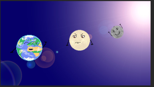
I felt that the background looked too empty and basic. I used the 'History' tab to undo this. Instead, I went back to when I had a 5th layer. I plan to add the effect on that layer later.
To save me the effort, I thought about using the technique shown in this video for the stary background.
youtube
Here, I set the amount of noise to 400%. I set the distribution to 'Gaussian' and made it 'Monochromatic'.
Next, I clicked on 'Filter', 'Blur', and 'Gaussian Blur'. I set it to 1 pixel.

After that, I changed the levels of the background as seen below. The problem here was that I needed to find a way to make it lighter so you can see the characters' arms.
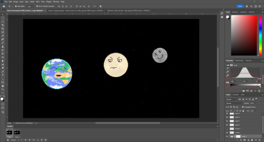
I went on the 'Hue/Saturation' settings and adjusted the lightness. This did not work as intended.

Next, I used the 'History' tab to go backwards. At this point, I decided to manually add stars to the background. The good thing with this is that it makes it look more cartoonish.

I went to add the 'Lens Flare' effect on to the 5th layer, but it came up with this error. I had to click 'OK' to get rid of the error.
To get around this error I added an extra star, but on layer 5 only. The reason why I want the effect to be on the 5th layer is so the effect could cover overlap the planets, making the animation looking more dynamic and realistic.

Here, I was using the same settings as before.

Once I had clicked on 'OK', it appeared as if it hadn't worked at all. Once again, I undid this step.
I came to the conclusion that I had no choice but to put it onto the background layer. In addition, I added the slingshot catapult so that players would expect it in game and have a rough idea on what to do.
I then moved the catapult to the other arm as the one I originally had it at, was the arm that would be waving in the animation.
Start Screen Animation:

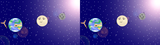
0 notes