#and that need sources
Explore tagged Tumblr posts
Visit Tumblr Blog
Explore Tumblr blogs with no restrictions, modern design and the best experience.
Last Seen Tumblr Blogs


Fun Fact
Tumblr has 4 main sources of revenue.
Text
slightly furious reminder that fish do in fact feel pain and do in fact experience fear and distress when in pain since people seem to love spreading the myth that fish don't feel pain. what is it with people assuming a creature is incapable of feeling pain or emotion just because it doesn't have complex facial muscles. come on gang
#animal cruelty#<- for filtering#IT PISSES ME OFF#'oh it's fine to kill eels very slowly for extra flavour. they don't feel pain so it's not cruel at all' did you do. any fucking research#if you REALLY need sources for the idea that non-mammals can feel pain and fear (you know. two things extremely vital for survival?)#then I can send some links in the comments. but fucking christ we shouldn't need an article to tell us this shit#fish have pain receptors fish respond negatively to pain. they'll hide or struggle. fish who escaped being hooked show trauma-like response#including shallow breathing. isolation. and decreased appetite. fish are so fucking complex but people see them gasping#with their gaping mouths and rolling eyes and think ah. the lived experience of this creature is equivalent to that of an earthworm
23K notes
·
View notes
Text
Planet's Fucked: What Can You Do To Help? (Long Post)
Since nobody is talking about the existential threat to the climate and the environment a second Trump term/Republican government control will cause, which to me supersedes literally every other issue, I wanted to just say my two cents, and some things you can do to help. I am a conservation biologist, whose field was hit substantially by the first Trump presidency. I study wild bees, birds, and plants.
In case anyone forgot what he did last time, he gagged scientists' ability to talk about climate change, he tried zeroing budgets for agencies like the NOAA, he attempted to gut protections in the Endangered Species Act (mainly by redefining 'take' in a way that would allow corporations to destroy habitat of imperiled species with no ramifications), he tried to do the same for the Migratory Bird Treaty Act (the law that offers official protection for native non-game birds), he sought to expand oil and coal extraction from federal protected lands, he shrunk the size of multiple national preserves, HE PULLED US OUT OF THE PARIS CLIMATE AGREEMENT, and more.
We are at a crucial tipping point in being able to slow the pace of climate change, where we decide what emissions scenario we will operate at, with existential consequences for both the environment and people. We are also in the middle of the Sixth Mass Extinction, with the rate of species extinctions far surpassing background rates due completely to human actions. What we do now will determine the fate of the environment for hundreds or thousands of years - from our ability to grow key food crops (goodbye corn belt! I hated you anyway but), to the pressure on coastal communities that will face the brunt of sea level rise and intensifying extreme weather events, to desertification, ocean acidification, wildfires, melting permafrost (yay, outbreaks of deadly frozen viruses!), and a breaking down of ecosystems and ecosystem services due to continued habitat loss and species declines, especially insect declines. The fact that the environment is clearly a low priority issue despite the very real existential threat to so many people, is beyond my ability to understand. I do partly blame the public education system for offering no mandatory environmental science curriculum or any at all in most places. What it means is that it will take the support of everyone who does care to make any amount of difference in this steeply uphill battle.
There are not enough environmental scientists to solve these issues, not if public support is not on our side and the majority of the general public is either uninformed or actively hostile towards climate science (or any conservation science).
So what can you, my fellow Americans, do to help mitigate and minimize the inevitable damage that lay ahead?
I'm not going to tell you to recycle more or take shorter showers. I'll be honest, that stuff is a drop in the bucket. What does matter on the individual level is restoring and protecting habitat, reducing threats to at-risk species, reducing pesticide use, improving agricultural practices, and pushing for policy changes. Restoring CONNECTIVITY to our landscape - corridors of contiguous habitat - will make all the difference for wildlife to be able to survive a changing climate and continued human population expansion.
**Caveat that I work in the northeast with pollinators and birds so I cannot provide specific organizations for some topics, including climate change focused NGOs. Scientists on tumblr who specialize in other fields, please add your own recommended resources. **
We need two things: FUNDING and MANPOWER.
You may surprised to find that an insane amount of conservation work is carried out by volunteers. We don't ever have the funds to pay most of the people who want to help. If you really really care, consider going into a conservation-related field as a career. It's rewarding, passionate work.
At the national level, please support:
The Nature Conservancy
Xerces Society for Invertebrate Conservation
Cornell Lab of Ornithology (including eBird)
National Audubon Society
Federal Duck Stamps (you don't need to be a hunter to buy one!)
These first four work to acquire and restore critical habitat, change environmental policy, and educate the public. There is almost certainly a Nature Conservancy-owned property within driving distance of you. Xerces plays a very large role in pollinator conservation, including sustainable agriculture, native bee monitoring programs, and the Bee City/Bee Campus USA programs. The Lab of O is one of the world's leaders in bird research and conservation. Audubon focuses on bird conservation. You can get annual memberships to these organizations and receive cool swag and/or a subscription to their publications which are well worth it. You can also volunteer your time; we need thousands of volunteers to do everything from conducting wildlife surveys, invasive species removal, providing outreach programming, managing habitat/clearing trails, planting trees, you name it. Federal Duck Stamps are the major revenue for wetland conservation; hunters need to buy them to hunt waterfowl but anyone can get them to collect!
THERE ARE DEFINITELY MORE, but these are a start.
Additionally, any federal or local organizations that seek to provide support and relief to those affected by hurricanes, sea level rise, any form of coastal climate change...
At the regional level:
These are a list of topics that affect major regions of the United States. Since I do not work in most of these areas I don't feel confident recommending specific organizations, but please seek resources relating to these as they are likely major conservation issues near you.
PRAIRIE CONSERVATION & PRAIRIE POTHOLE WETLANDS
DRYING OF THE COLORADO RIVER (good overview video linked)
PROTECTION OF ESTUARIES AND SALTMARSH, ESPECIALLY IN THE DELAWARE BAY AND LONG ISLAND (and mangroves further south, everglades etc; this includes restoring LIVING SHORELINES instead of concrete storm walls; also check out the likely-soon extinction of saltmarsh sparrows)
UNDAMMING MAJOR RIVERS (not just the Colorado; restoring salmon runs, restoring historic floodplains)
NATIVE POLLINATOR DECLINES (NOT honeybees. for fuck's sake. honeybees are non-native domesticated animals. don't you DARE get honeybee hives to 'save the bees')
WILDLIFE ALONG THE SOUTHERN BORDER (support the Mission Butterfly Center!)
INVASIVE PLANT AND ANIMAL SPECIES (this is everywhere but the specifics will differ regionally, dear lord please help Hawaii)
LOSS OF WETLANDS NATIONWIDE (some states have lost over 90% of their wetlands, I'm looking at you California, Ohio, Illinois)
INDUSTRIAL AGRICULTURE, esp in the CORN BELT and CALIFORNIA - this is an issue much bigger than each of us, but we can work incrementally to promote sustainable practices and create habitat in farmland-dominated areas. Support small, local farms, especially those that use soil regenerative practices, no-till agriculture, no pesticides/Integrated Pest Management/no neonicotinoids/at least non-persistent pesticides. We need more farmers enrolling in NRCS programs to put farmland in temporary or permanent wetland easements, or to rent the land for a 30-year solar farm cycle. We've lost over 99% of our prairies to corn and soybeans. Let's not make it 100%.
INDIGENOUS LAND-BACK EFFORTS/INDIGENOUS LAND MANAGEMENT/TEK (adding this because there have been increasing efforts not just for reparations but to also allow indigenous communities to steward and manage lands either fully independently or alongside western science, and it would have great benefits for both people and the land; I know others on here could speak much more on this. Please platform indigenous voices)
HARMFUL ALGAL BLOOMS (get your neighbors to stop dumping fertilizers on their lawn next to lakes, reduce agricultural runoff)
OCEAN PLASTIC (it's not straws, it's mostly commercial fishing line/trawling equipment and microplastics)
A lot of these are interconnected. And of course not a complete list.
At the state and local level:
You probably have the most power to make change at the local level!
Support or volunteer at your local nature centers, local/state land conservancy non-profits (find out who owns&manages the preserves you like to hike at!), state fish & game dept/non-game program, local Audubon chapters (they do a LOT). Participate in a Christmas Bird Count!
Join local garden clubs, which install and maintain town plantings - encourage them to use NATIVE plants. Join a community garden!
Get your college campus or city/town certified in the Bee Campus USA/Bee City USA programs from the Xerces Society
Check out your state's official plant nursery, forest society, natural heritage program, anything that you could become a member of, get plants from, or volunteer at.
Volunteer to be part of your town's conservation commission, which makes decisions about land management and funding
Attend classes or volunteer with your land grant university's cooperative extension (including master gardener programs)
Literally any volunteer effort aimed at improving the local environment, whether that's picking up litter, pulling invasive plants, installing a local garden, planting trees in a city park, ANYTHING. make a positive change in your own sphere. learn the local issues affecting your nearby ecosystems. I guarantee some lake or river nearby is polluted
MAKE HABITAT IN YOUR COMMUNITY. Biggest thing you can do. Use plants native to your area in your yard or garden. Ditch your lawn. Don't use pesticides (including mosquito spraying, tick spraying, Roundup, etc). Don't use fertilizers that will run off into drinking water. Leave the leaves in your yard. Get your school/college to plant native gardens. Plant native trees (most trees planted in yards are not native). Remove invasive plants in your yard.
On this last point, HERE ARE EASY ONLINE RESOURCES TO FIND NATIVE PLANTS and LEARN ABOUT NATIVE GARDENING:
Xerces Society Pollinator Conservation Resource Center
Pollinator Pathway
Audubon Native Plant Finder
Homegrown National Park (and Doug Tallamy's other books)
National Wildlife Federation Native Plant Finder (clunky but somewhat helpful)
Heather Holm (for prairie/midwest/northeast)
MonarchGard w/ Benjamin Vogt (for prairie/midwest)
Native Plant Trust (northeast & mid-atlantic)
Grow Native Massachusetts (northeast)
Habitat Gardening in Central New York (northeast)
There are many more - I'm not familiar with resources for western states. Print books are your biggest friend. Happy to provide a list of those.
Lastly, you can help scientists monitor species using citizen science. Contribute to iNaturalist, eBird, Bumblebee Watch, or any number of more geographically or taxonomically targeted programs (for instance, our state has a butterfly census carried out by citizen volunteers).
In short? Get curious, get educated, get involved. Notice your local nature, find out how it's threatened, and find out who's working to protect it that you can help with. The health of the planet, including our resilience to climate change, is determined by small local efforts to maintain and restore habitat. That is how we survive this. When government funding won't come, when we're beat back at every turn trying to get policy changed, it comes down to each individual person creating a safe refuge for nature.
Thanks for reading this far. Please feel free to add your own credible resources and organizations.
#us election#climate change#united states election#resources#native plants#this took 3 hours to write so maybe don't let it flop? i know i write long posts. i know i follow scientists on here#that study birds and corals and other creatures#i realize i did not link sources/resources for everything. i encourage those more qualified to add things on. i need to go to work
19K notes
·
View notes
Text
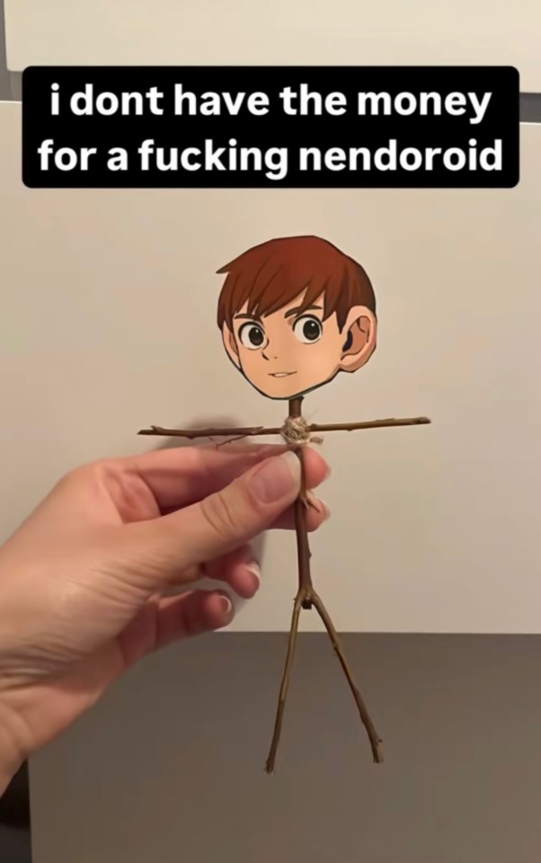
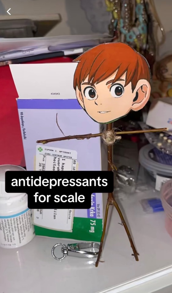
monkyeon’s stickchuck has me in tears 💀
#we need to make him a staple of comic conventions#credit in source#dunmeshi#dungeon meshi#delicious in dungeon#chilchuk tims#chil#stickchuck
24K notes
·
View notes
Text
Bruce: Anyway, I better get this one home. See you, Superman.
Jason, a 6’4 anti hero crime fighting machine who threw down with Batman multiple times, sleepy as fuck: No! No no no no
Bruce, carrying him like a toddler: Yes ~
#source: ok ko#I NEED SOMEONE TO DRAW FANART OF THIS TO THAT AUDIO ITS SO CUTE#bruce wayne#jason todd#dc comics#dc#batman#batdad#incorrect dc quotes
10K notes
·
View notes
Text


pookies covered in blood 🤤
#sinners 2025#sinners#annie sinners#bo chow#wunmi mosaku#pls top me wunmi#1930s fine#bo chow sinners#yes i have a blood kink#horror#vampires#i need them so badly in me rn#me and my blood kink go way back#its soooo serious too idc#yao#thomas pang yao#i was trying to find the source of the bo picture but the girl that posted it deleted my comment so 😒#im in a very posting mood today !#sinners movie#smoke going thru it🚬🚬
6K notes
·
View notes
Text
Jason, talking about his siblings: We’ve got
Jason, about Dick: Daddy issues
about Tim: Daddy issues
about Duke: Chaos junkie
about Cass: Mommy issues
about Steph: More daddy issues
about Damian: Obnoxious asshole issues
Jason: And Babs!
Jason: …Babs seems kind of weirdly self-actualized actually
#he is talking to his siblings btw#batman#batfam#batfamily#dc comics#tim drake#jason todd#incorrect quotes#incorrect batfamily quotes#source: tua#source: umbrella academy#source: the umbrella academy#incorect quote#incoorect quotes#incorrect dc quotes#incorrect batman quotes#damian wayne#stephanie brown#cassandra cain#dick grayson#barbara gordon#duke thomas#i need a post tag
5K notes
·
View notes
Text
I'm still fucking thinking about people advocating neo-Confucian ~extended family~ as a better alternative to western nuclear family. like girl i know there's that assumption that everyone is a white yankee but have you literally never talked to anyone who grew up in a family like that?
our barbarous system where children are the property of their parents vs their glorious system where children are the property of their parents (mystical oriental)
it's like that broader thing where people try and thin down a criticism like "you mean organised religion", "white western nuclear family", "this is such a white people thing" etc to try and weasel their way out of association with an issue.
Misogyny is not a western invention lol, the way it manifests in a lot of societies is a product of certain cultural manifestations of misogyny being exported elsewhere, but the control and ownership of women is not a "white people thing" or a western thing.
the issues of the family are not limited to the anglo saxon protestant yankee middle class nuclear family, misogyny is not unique to one group of people, racism is not unique to one group of people, homophobia is not unique to one group of people, terfs are not all middle class white women, etc etc etc etc
it's just so frustrating and kills any fucking attempt to actually talk about issues because they get drowned out with people appending on specific identities as if that issue is unique to one fucking group of people and the rest of the world is sunshine and rainbows.
#don't get me started on the leap from 'some inuit parents have a pretty chill parenting style'#into 'inuit women are all magical caretakers and we all need to be like them'#and that endless treatment of indigenous people as a source of mystical knowledge we all need to adopt#instead of just human beings who have been long ignored and treated as incapable of knowing anything
4K notes
·
View notes
Note
how do you generally design characters/choose color pallets?
whenever I try and create a good color pallet they always end up clashing and looking absolutely awful
i've tried using websites but they always end up being very bland, so i'm turning to the expert lol
the only character i've created that I actually. like. is the one that's just a black freaking tiger with rainbow glowing stripes, but that's because monochrome with color pops just always is flawless </3
Expert what expert
I'm by no means any expert, but I'm really happy you think my designs are appealing enough for you to ask me this!!
I ALWAYS try to come up with a character concept or idea for who they are before I start designing. Because of this, you see a lot of my designs turning out to be designed very strategically, with their features actually having proper functions and reasons to be there
This is why I have such a hard time with gifted designs. I don't know how to make them work without a background or concept I can really connect to properly.
For specific character designs, I usually think of and flesh out a basic idea in my head. Depending on how lucky I end up being, I can imagine every detail right off the bat. Other times, I have to put some work into it and experiment a little.
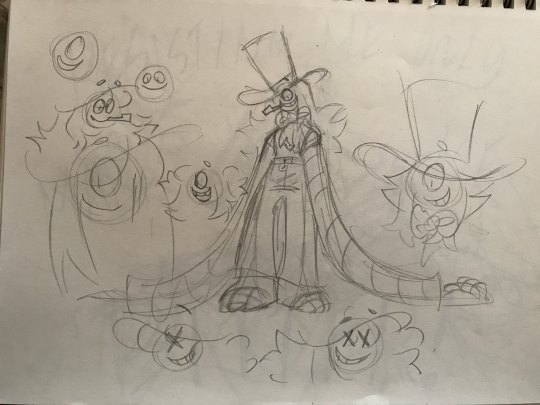
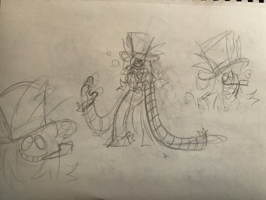
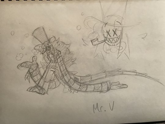
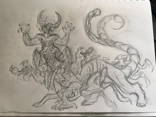
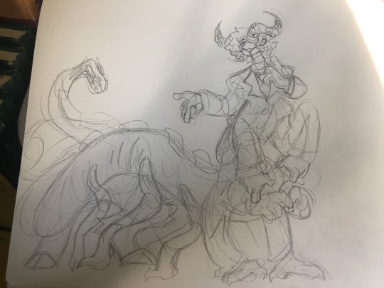
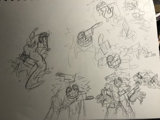
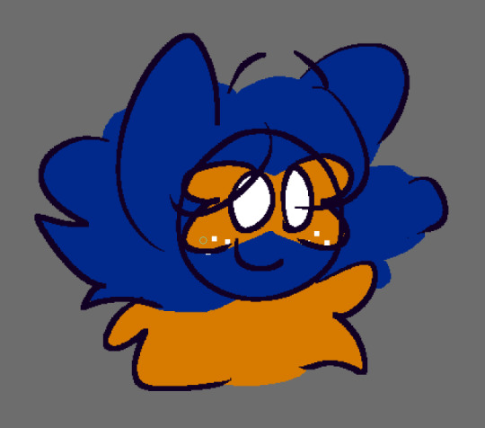
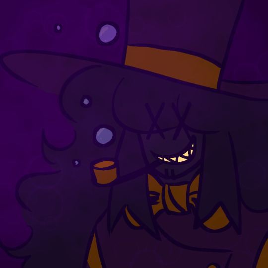
Here's an example of me working out a character design WIP right now
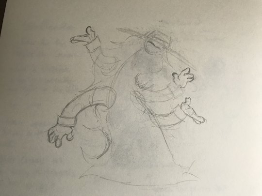
Development of Mr. V
Some characters just pop into my head exactly the way they are, like how Samuel did
Cogsworth too
Some of my characters come from dreams, too, and I just immediately sketch out my interpretation of the idea I'd had
Peter came from a dream about a white rabbit with a weird face killing a nuclear family's father leaving the mother and child alone with no idea what happened (it was disturbing, (there are more disturbing details,) which is why I made peter very unsettling)
Butch came from a dream that had something to do with fake peppino from pizza tower running around the It Steals maze area throwing cleavers at whoever he ran into
Dreams are a GREAT place to come up with character concepts
They give you a very solid ground before you start designing
One of my guidelines for creating characters is that they should be instantly recognizable as their own character. What are their special features? What defines them? What features would I keep if I were to draw them at the bare minimum detail? What parts of the design would make the character unrecognizable without them?
For example, Reena without her yellow.
Queen without her shadows.
You see this rule pop up a lot online, though mostly focusing on the idea of the silhouette of a character standing out from the others.
While I think it's a good option for when it comes to developing designs, I don't like worrying about it too much. I try to create the individual features of the character rather than immediately think about the silhouette.
All things considered, you're also totally allowed to break the rules to achieve something else. For example, Saleem and Minnow have identical silhouettes because I wanted them to give an uncannily similar vibe. Some characters who were derived off of others through dreams I might have had have very similar silhouettes as a nod to their origins, though have very differentiated individual features.
I look to various other artists and designers I like for feature ideas when I'm super stuck (usually when my ideas are more abstract)
for example, scrawl came from a very abstract dream and literally didn't have a face (they were just a bunch of hands and looked a little bit like a black void worm from Rainworld)
I took inspiration from Fooffle's Space AU Warren for his face, Sir Needle's sona's ears for his hair, and gave him this sweater from a random thing I found on Pinterest that I liked

Bennet (and the rest of the caravan gang) came from a dream about various different individuals riding on a wagon - Bennet specifically in the dream was Uncle Ben who runs The Urban Rescue Ranch. I ended up giving him the name Bennet in reference to this, as well as Uncle Ben's broad shoulders, muscular build and curly hair.
Queen's entire existence is inspired off of the protagonist from Bendy and the Dark Revival. As a nod to this, I gave her a partially monochrome color scheme with some accents. Queen's shadow face was inspired off of this specific fanart of Caesar from The Mandela catalogues.
(I can't find the source for the life of me sobs)
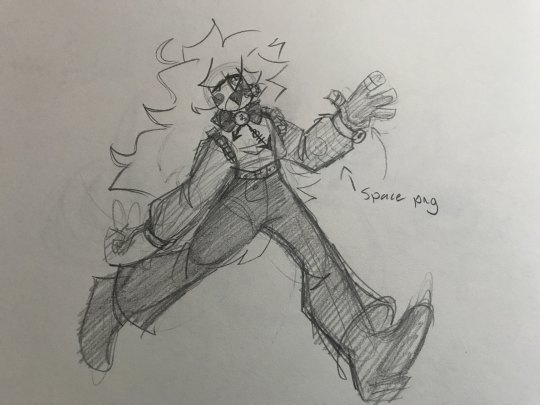
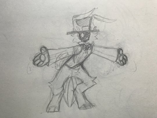
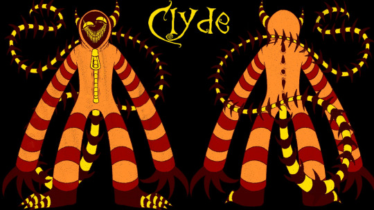
Mr. V was inspired off of Itward from Fran Bow, as well as Pastra's sona Clyde the veldigun. I gave him Itward's large hat and formal attire, and Clyde's long limbs and striped patterns. I also gave him deep halloween colors as a nod to both inspiration's aesthetics.
My biggest thing about features is there has to be a REASON why they have these features, but that's just personal preference (and there doesn't have to be a good reason, or even a reason at all every single time)
okay now for the main part of the ask (I've been stalling)
Sorry if this is disappointing, I don't have a process for picking colors that work together
It's a lot of trial and error, and some characters I've even stalled making profile pictures for because I don't know what to color them as.
to me, you can pick any color you want. It's actually very impressive to think about how many colors you could use.
I'll try to explain what I do know about the placement of colors, though. It doesn't matter what colors you use, but in my opinion, the placement of these colors is what really matters in designs.
Depending on how many colors I'm planning on giving the design, I like to split them up into parts. Primary coloration (1,) which takes up most of the design, secondary coloration (2,) which takes up less of the design but still a good amount, (Sometimes I have more, tertiary, quaternary, whatever, that take up about an equivalent ratio of the design as secondary,) and accent colors (3.)
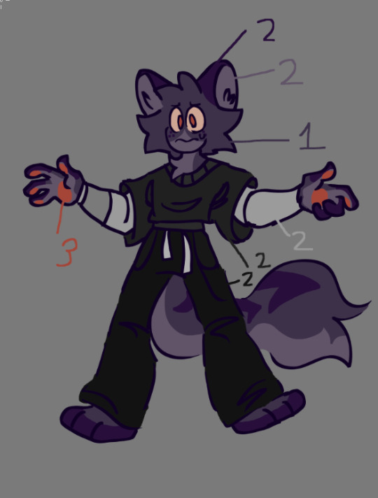
Similar colors can also be grouped together in these sectors. For example, all the purple in this character would be primary, the greys secondary, and the oranges the accents.
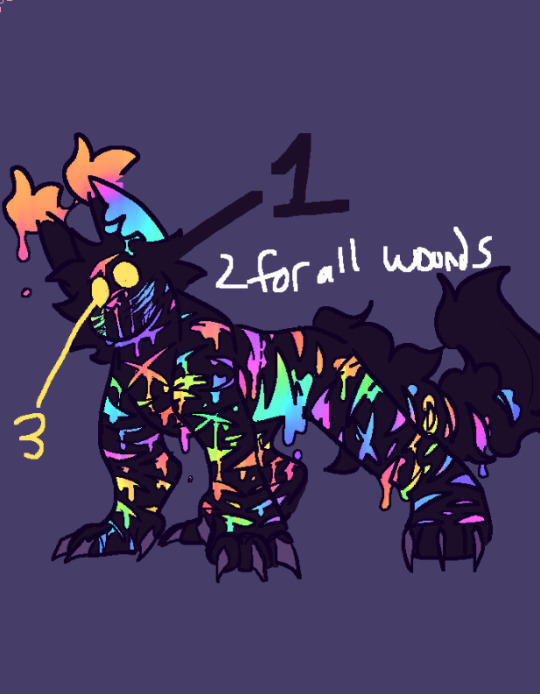
For Chakra, his purples would be primary, all the bright colors of the wounds secondary, and his outstanding eyes accents.
Each sector should be different and differentiable from one another!
Divide your character up into sectors for coloration. Decide what colors go where. Sometimes it takes a bit of shuffling to find what works for you. Adding inbetween colors to branch the gaps between your selected colors can help tie things together, too.
To me, instead of WHAT colors you use, it all comes down to how you USE those colors.
Cordis is mainly dark colored, primary, with their secondary rainbow colors and their accented white features. Even with rather bright colors in their palette, they still come off as a dark gloomy character because of the placement/ratio of those colors.
Monarch has very clashing colors, though when separated and balanced out, they appear harmonious and work together.
Anyways that turned further into a rant about character design than anything else
I hope this helped :D
#answered#art#oc#tutorial#design tutorial#kind of#i guess#sorry this took so long#lol#sources to images are linked#for all the ones that arent mine#and that need sources#character#character design#long post warning#polished post#oc reena#oc queen#oc samuel#oc peter#oc cogsworth#oc mr v#oc scrawl#oc cordis#oc chakra#oc bennett#oc rustle#oc butch
20 notes
·
View notes
Text


Who can it be now?
This is @burntbrownsugar 's villain Stone design, aka Doc Rock! I post about him a normal amount


Bonus huehuehue the guy
#I can NOT stop drawing himb...#maybe I should separate these into different posts but I like dumping everything into one#as a treat#agent stone#villain stone#doc rock#stobotnik#understand that I forgot how mirrors work so I had to flip like. EVERYTHING. when I was almost done.#the spain#also burntbrownsugar I'm sorry for tagging u in every post I just want to make sure I cite my sources 😭they NEED to see ur art NOW#also I “missed” stobotnik week I didn't miss the art tho u guys are all amazing#I was just having a not too good week but I'm back! for now. the work week begins again tomorrow.#sigh#pls note u need to read the caption like the men at work song#who can it be knocking at my door?#*epic saxophone*#and so on and so forth#sarag art#changing my art tag to sarag tag because bots steal art with my art tag😐
2K notes
·
View notes
Text
>looking for a new retelling of ancient myth
>ask the reviewers if the book is classical reception or modern tropification
>they don't understand
>i pull out a diagram explaining the difference between what engages with ancient sources and depictions of the story and what relies on reduction of the story to its most marketable aspects
>they laugh and say "it's a good retelling"
>read the book
>its tropification
#tagamemnon#pleaaaaase i just need these books to not act like the ancient sources are Doing It Wrong#queueusque tandem abutere catilina patientia nostra
7K notes
·
View notes
Text

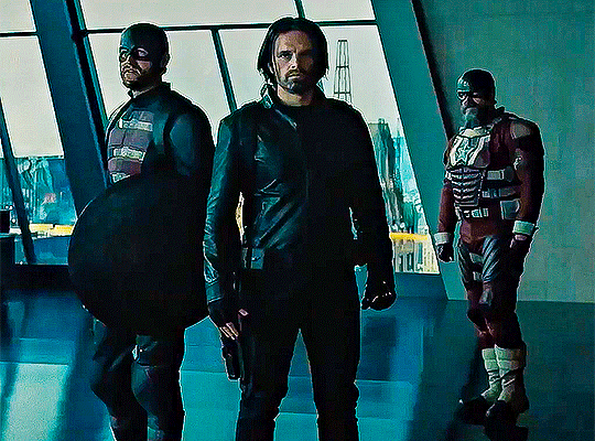

Sebastian Stan as Bucky Barnes // Thunderbolts 2025
#bucky barnes#sebastian stan#thunderbolts#thunderbolts*#moonflowergifs#mymovieedits#mcu#marvel#marveledit#buckybarnesedit#thunderboltsedit#I urgently need better quality source material 🙈but I just can't resist giffing that pretty face#he looks sooo good#I love that silver in his beard#thunderbolts spoilers#new avengers
2K notes
·
View notes
Text
i don't care how neat a program is or how much it might improve my life. if it sneaks its way into my computer on top of a regular software update like some kind of fucking digital deer tick, it's a delete on sight. kill kill kill. nobody but ME decides what programs get installed on MY computer. fuck all the way off
#turned on my laptop today & discovered grammarly hiding out in the start menu#that one doesn't even fit the parameters of the post.#when i need grammar assistance i will SEEK IT OUT from a REPUTABLE SOURCE#square
6K notes
·
View notes
Text
Books are like yarn in that if you buy them from a small local shop then you're actually performing a civic duty and you can buy as much as you want without feeling guilty. So actually my towering TBR pile and stash of untouched yarn is kind of heroic if you think about it,
#i should go back to my local yarn store. i don't need yarn but it was nice there and the yarn is so soft and pretty#it's my duty to buy more locally-sourced yarn. as a citizen
2K notes
·
View notes
Text

We're going on an ass kicking adventure.
[First] Prev <–-> Next
#poorly drawn mdzs#mdzs#wei wuxian#lan wangji#Yes indeed this is a reference to the classic 'Kirby's fucking pissed' meme. It felt fitting given the circumstances.#Wei Wuxian is nothing but a villain now. His name is but a booeyman and scapegoat for everything that goes wrong.#It is a cruel and unusual punishment to be Irrepairable to others. That no matter what you do - you are othered and unsalvageable.#While this situation deals with necromancy & war & politics...boy does it ever mirror how modern drama campaigns go.#I wonder if MXTX did that on purpose? Considering how SVSSS talks about the relationships between authors and their fans/work -#Its stands to reason that WWX story is indeed a parallel for how the public prefers black and white & sensationalist views of people.#People are heroes or villains and trying to think about the nuance is too much work.#And it does not matter what the truth or lies are. The rumour exists and so it must hold truth.#It feels like someone dropped a poorly researched callout post on WWX on twitter that went viral.#80% of the people don't even know who he is but are still leaving him death threats.#“Guys I know we all used to really love WWX's content but I heard he unethically sourced his bones for his last art installation...”#Okay actually he might indeed do unethical bone sourcing. I need to think longer on what the hyper-specific hobby drama might be.#And a huge shout out to LWJ who is right in the vicinity watching this happen in horror. *That* is a specially kind of torment too.
2K notes
·
View notes
Text
October 7 still being used as a talking point 7 months into the genocide actually gives me a fucking migraine when several fact-checking articles have come out by now that show Israel was completely aware there would be an escalation that day, that they let it happen because it could then be used as grounds for heightened Israeli terrorism for months to come (not that Israel hasn’t been enacting atrocities on Palestinians for decades now), that a huge portion of Israeli civilian casualty is owed at large to the IOF firing in close quarters at areas where Israeli captives were held, that Israeli helicopters indiscriminately shot at Israelis and Palestinians on that day (bc they don’t actually give a fuck for the civilians, in case you haven’t caught the memo), and that Israeli captives even recounted how the IOF obliterated everyone (including its own hostages it supposedly wanted to rescue) the moment they arrived on the scene. That day Israel murdered hundreds of its own in cold blood.
#I know this scares people but you actually need to do your own research and look past biased western sources to get this information#palestine
6K notes
·
View notes