#how to use canva for beginners
Explore tagged Tumblr posts
Visit Tumblr Blog
Explore Tumblr blogs with no restrictions, modern design and the best experience.
Last Seen Tumblr Blogs


Fun Fact
US Tumblr user growth rate is estimated to slow down to 4.1%.
Text
Canva Free Everything You Need to Know About Free Version of Canva
If you’ve ever felt intimidated by graphic design or thought you needed a degree in Photoshop to create stunning visuals, let me introduce you to Canva. Whether you’re a small business owner, a student, a social media enthusiast, or just someone who loves creating, Canva Free is a game-changer. In this article, we’ll dive into everything you need to know about Canva Free—its features,…
#canva#canva 2025#canva ai#canva course#canva design#canva design tutorial#canva for beginners#canva free#canva hacks#canva pro#canva pro free#canva text effects#canva tips#canva tips and tricks#canva tricks#canva tutorial#canva tutorial for beginners#design with canva#easy canva tutorial#how to use canva#how to use canva app#how to use canva for beginners#how to use canva tutorial#learn canva#tips for canva#tutorial canva#video canva
0 notes
Video
youtube
How to create a cute Halloween poster in Canva | Easy Canva Tutorial for...
#youtube#Canva#canva design#Canva tutorials#Canva tips#Graphic design#graphic design tutorial#Halloween#Halloween 2024#Halloween poster design#Halloween design#Cute halloween#adorable Halloween#Learn design#design tutorial#How to use canva for beginners#step by step canva tutorial
0 notes
Text
How to Create Designs That Work for Your Print-on-Demand Business
Running a print-on-demand business is both exciting and challenging. Whether you're selling on platforms like Redbubble or managing your own store, creating designs that resonate with your audience is the key to success. But how do you craft designs that not only look great but also sell? In this blog post, I’ll guide you through the process of creating designs that work for your print-on-demand business, with tips and tricks tailored to help you stand out in a competitive market. Let’s dive in!
Why Design Matters in Print-on-Demand
In the world of print-on-demand, your designs are your product. Unlike traditional retail, you’re not selling physical inventory—you’re selling ideas. Your customers are drawn to your creativity, so your designs need to:
- Capture attention: Bold, unique designs stand out in search results.
- Resonate with your audience: People buy designs that align with their personality, values, or interests.
- Fit the product: A design that looks great on a t-shirt might not work on a mug or phone case.
Understanding these principles is the first step to creating designs that work for your business.
Step 1: Know Your Niche
The most successful print-on-demand businesses are niche-focused. Instead of trying to appeal to everyone, target a specific audience.
- Research your audience: Who are they? What are their interests, hobbies, or values?
- Find trending niches: Use tools like Google Trends or Redbubble’s trending searches to discover what’s popular.
- Create for your passion: If you’re passionate about your niche, it will show in your designs.
For example, if your niche is cozy, minimalist designs, you could create products that appeal to people who love hygge-inspired aesthetics.
Step 2: Brainstorm Unique Design Ideas
Once you’ve identified your niche, it’s time to brainstorm ideas. Here’s how to get started:
- Use keyword research: Tools like Redbubble’s search bar or Pinterest Trends can help you find popular themes.
- Look for inspiration: Check out competitors, social media, or even nature for fresh ideas.
- Think seasonally: Holidays, seasons, and special events are great opportunities for themed designs.
Pro tip: Keep a notebook or digital folder for design ideas. Inspiration can strike at any time!
Step 3: Master the Tools of the Trade
You don’t need to be a professional graphic designer to create stunning designs. With the right tools, anyone can make high-quality artwork.
- Free design tools: Canva, GIMP, and Inkscape are great for beginners.
- Professional software: Adobe Photoshop and Illustrator offer advanced features for experienced designers.
- Mockup generators: Use tools like Placeit to see how your designs will look on products.
If you’re new to design, start simple. Minimalist designs with clean lines and bold typography are often bestsellers.
Step 4: Optimize Your Designs for Products
Not all designs work on every product. To maximize sales, tailor your designs to fit specific items.
- Consider placement: A design that looks great on a t-shirt might need adjustments for a mug or sticker.
- Use high-resolution files: Print-on-demand platforms require high-quality images to ensure sharp prints.
- Test your designs: Upload them to mockup tools to see how they look on different products.
For example, if you’re creating a design for a phone case, make sure the key elements aren’t cut off by the edges or camera hole.
Step 5: Write SEO-Friendly Titles and Tags
Even the best designs won’t sell if no one can find them. That’s where SEO comes in.
- Use relevant keywords: Include terms your audience is searching for, like “minimalist phone case” or “funny coffee mug.”
- Write descriptive titles: Instead of “Cool Design,” try “Retro Sunset Design for T-Shirts and Stickers.”
- Add detailed tags: Use a mix of broad and specific tags to improve your visibility.
For example, if your design is a cozy winter illustration, your tags might include “winter mug,” “cozy vibes,” and “holiday gift ideas.”
Step 6: Promote Your Designs
Creating great designs is only half the battle—you also need to market them.
- Leverage social media: Share your designs on Instagram, Pinterest, and TikTok.
- Engage with your audience: Respond to comments and messages to build a loyal following.
- Collaborate with influencers: Partner with creators who align with your niche to reach a wider audience.
You can share behind-the-scenes content, like your design process or mockups, to connect with your audience on a personal level.
Step 7: Analyze and Improve
Finally, track your performance to see what’s working and what’s not.
- Check your analytics: Platforms like Redbubble provide insights into your sales and traffic.
- Experiment with new designs: Test different styles, themes, or niches to see what resonates.
- Listen to feedback: Pay attention to customer reviews and comments to improve your designs.
Remember, success in print-on-demand is a marathon, not a sprint. Keep learning and adapting as you go.
Final Thoughts
Creating designs that work for your print-on-demand business takes time, creativity, and strategy. By understanding your niche, mastering design tools, and optimizing your listings for SEO, you can build a successful shop that stands out from the crowd.
You have the power to turn your ideas into products that people love. So, what are you waiting for? Start creating today and watch your business grow!
Looking for unique, cozy designs that inspire and stand out? Visit my Redbubble shop to explore a collection of creative products made just for you!
#Print-on-demand business#Redbubble tips#How to create designs#Print-on-demand design tips#Redbubble design ideas#Niche marketing for POD#How to sell on Redbubble#Print-on-demand success#Redbubble SEO tips#Best tools for POD#Graphic design for beginners#Trending print-on-demand niches#How to optimize designs#Print-on-demand marketing#Redbubble product ideas#Cozy design inspiration#Minimalist design tips#Seasonal design ideas#How to use Canva for POD#Redbubble mockup tips#Passive income with POD#How to sell art online#Redbubble shop strategies#Print-on-demand trends#How to grow a POD business#Print-on-demand branding#Redbubble keyword research#Social media for POD#Redbubble artist tips
3 notes
·
View notes
Text
seems the cynical designer in my head has come out to play
#marzi speaks#can i say. i’m tired of canva design#i’m TIRED of it !!!! it all looks the damn SAME#canva is a great way to get something that looks polished made quickly.#but if you are designing for a living you HAVE to be able to be creative enough to use other things#like . canva is great for people who don’t have formal design training but want to make something nice#it’s beginner-friendly#so why do so many formally taught designers love to mimic its design style in everything they do#i’m so SICK of it it’s so like. faux-friendly and nothing. the cardboard cutout of design styles#am i saying it’s visually unappealing? no.#but it IS overused currently. and it’s been around for years. boring . no personality.#when i design things i want them to be unique. i want them to catch the eye#i don’t want the fucking 50th .#abigail font adobe illustrator plants in the background ‘look at how much we care’ design#i hate that shit it means nothing to me. it’s so boring
4 notes
·
View notes
Text
Beginners Guide to Descriptive Sentences
Hi writers.
I’m Rin T, and in this post I’m excited to share with you a detailed guide on how to craft vivid descriptions and descriptive sentences for your writing. I’ve long believed that descriptive writing is the magic that turns ordinary text into an immersive experience. When done well, every sentence acts like a brushstroke that paints a scene in the reader’s mind.
──────────────────────────── Why Descriptive Writing Matters ────────────────────────────
I have seen how powerful descriptions can engage readers and establish a strong connection with the narrative. Descriptive writing is not simply about decorating your work; it is about building an atmosphere that transports your reader to a world. your world.
When you write descriptions, remember:
You are setting the tone.
You are building a world.
You are evoking emotions.
You are inviting your readers to experience your story with all their senses.
──────────────────────────── Step-by-Step: Crafting Vivid Descriptions ────────────────────────────
Below are my personal tips and tricks to help you build detailed and captivating descriptions:
Begin With the Senses
Description does not solely depend on what the eyes can see. Consider sound, smell, taste, and touch. For instance, instead of writing “The witch’s hut was eerie,” try elaborating: “The witch’s hut exuded an eerie aura. The creaking timber and distant echoes of whispering winds mingled with the pungent aroma of burnt sage and mysterious herbs.” In this way, you help the reader not only see the scene but also feel it.
Choose Precise and Evocative Language
Precision in language is vital. Replace generic adjectives with specific details to boost clarity and imagery. Rather than “The forest was dark,” consider: “The forest was a labyrinth of shadowed boughs and muted undergrowth, where the light barely touched the spindly branches, and every step unveiled whispers of ancient spells.” Specific details create tangible images that stay with readers.
Show, Don’t Just Tell
A common mistake is to “tell” the reader how to feel, rather than “showing” it through context and detail. Instead of writing “It was a spooky night,” immerse your reader: “Under a pallid crescent moon, the night unfurled like a canvas of foreboding whispers; broken branches and rustling leaves narrated the secrets of a long-forgotten curse.” By showing the elements, you invite the reader to experience the fear and mystery firsthand. (You don't need to be as dramatic as my examples, but this is simply for inspiration)
Use Figurative Language Thoughtfully
Metaphors, similes, and other figures of speech lend an artistic flair to your descriptions. When writing about a scene in a magical world, you might say: “Her eyes shone like twin beacons of moonlit silver, cutting through the gloom as if to part the veil of night itself.” Such comparisons evoke emotions and deepen the reader’s connection with the scene. However, be cautious not to overdo it; a little figurative language can go a long way.
Strike a Balance Between Details and Pacing
While elaborate descriptions are alluring, too many details can weigh down your narrative. Consider introducing the broader scene first and then focusing on key elements that define the mood. For instance, start with an overview: “The village lay nestled between ancient stone arches and mist-covered hills.” Then, zoom into details: “A solitary, ivy-clad tower sent spiraling tendrils of mist into the twilight, as if guarding secrets of a long-lost incantation.” This technique creates a rhythm, drawing readers in gradually.
──────────────────────────── Practical Exercises to Enhance Your Descriptive Writing ────────────────────────────
To help you practice these techniques, try the following exercises:
Sensory Detail Drill: Select a familiar scene from your fantasy world (for example, a witch’s secluded garden). Write a short paragraph focusing on each of the five senses. What do you taste as you bite into a magical fruit? What sounds resonate in the quiet of the enchanted night? This drill helps you to avoid flat descriptions and encourages you to integrate sensory experiences.
Revision and Refinement: Take a simple sentence like “The night was cold,” and transform it using the advice above. Rework it into something like, “The night was a canvas of shimmering frost and darkness, where every breath of the wind carried a hint of winter’s sorrow.” Compare the two, and notice how minor adjustments can dramatically heighten the mood.
Peer Review Sessions: Sharing your work can offer invaluable insights. Exchange your descriptions with fellow writers and ask for focused feedback, Does the description evoke the intended emotion? Does it deliver a clear image? Use these sessions as opportunities to improve and refine your craft.
──────────────────────────── Common Pitfalls and How to Avoid Them ────────────────────────────
Through my years of writing, I've learned that even the most passionate writers can stumble. Here are some pitfalls to watch out for:
Overloading With Adjectives: While it’s tempting to create elaborate descriptions, too many adjectives and adverbs can distract rather than enhance. Aim for clarity and purpose in every word. Instead of “a very dark, spooky, frightening forest filled with creepy sounds,” try “a forest shrouded in ominous silence, where every rustle hinted at unseen mysteries.”
Falling Into Clichés: Familiar images can sometimes render your work predictable. Try to avoid worn phrases. Instead of “as dark as night,” imagine “as impenetrable as the void that separates worlds.” Unique expressions capture attention and create lasting impressions.
Neglecting the Flow: Descriptions are vital, but the narrative must continue to drive forward. Check that your detailed passages serve to enhance the storyline rather than bog it down. Ask yourself: Does this description bring the reader closer to the action, or does it detract from the momentum of the narrative?
──────────────────────────── Advanced Techniques for the Aspiring Writer ────────────────────────────
Once you’re comfortable with the basics, consider these advanced methods to elevate your descriptions into artful prose:
Integrate Descriptions Seamlessly: Instead of isolating your descriptions, weave them into dialogue and action. For example, as a witch brews her potion, you might describe the bubbling cauldron and swirling mists as part of her incantation, not just as a standalone scene. “As she whispered the ancient words, the cauldron responded, its surface rippling like a dark mirror reflecting centuries of secrets.”
Reflect Character Perspectives: Let your characters’ emotions color the scene. If a character fears a looming threat, their perception will add a layer of tension to the environment. “I entered the dim corridor with trepidation, my heart pounding as the flickering torchlight revealed spectral figures dancing along the walls.” This technique makes the description both situational and personal.
Use Rhythm: The cadence of your sentences can mirror the pace of your narrative. In high-tension moments, short, abrupt sentences heighten the urgency. Conversely, in serene scenes, longer, flowing sentences can create a tranquil atmosphere. Experiment with sentence structure until you find a balance that suits both your style and the mood you wish to convey.
──────────────────────────── Final Thoughts and Encouragement ────────────────────────────
your narrative is your unique creation. you too will find your distinctive voice. I encourage you to keep experimenting with different techniques until your descriptions feel both natural and mesmerizing. Write freely, revise diligently, and most importantly, let your creative spirit shine through every line.
Thank you for joining me. I hope these tips can help you.
#on writing#creative writing#writing#writing tips#writers block#how to write#thewriteadviceforwriters#writeblr#writers and poets#writers on tumblr#novel writing#fiction writing#romance writing#writing advice#writing blog#writing characters#writing community#writing help#writing ideas#writing inspiration#writing guide#writing prompts#writing a book#writing resources#writing reference#writing tips and tricks#writers#writing tools#writing life#writing software
3K notes
·
View notes
Text
my charcoal drawing another bird
youtube
View On WordPress
#matitecolorate#taniatrioloartista#casa#charcoal portrait#charcoal portrait drawing for beginners#disegnare#disegno a matita#disegno una ragazza#draw#drawing charcoal portraits#drawing portrait in charcoal#easy charcoal portrait drawing#how to charcoal portrait#how to draw a face using charcoal pencil#how to fix charcoal drawing on canvas#il mio ritratto disegnato a carboncino#illustrazione#independent artist 85#independent artist 85 disegni#independentartist85disegni#my charcoal drawing another bird#portrait charcoal drawing#ritratto a carboncino tutorial#taniatrioloartistaindipendente#Youtube
0 notes
Text
crafting with genshin mem
you can’t tell me neuvillette wouldn’t crochet with you. neuvillette would be all into it, buying you all the yarn and hooks and needles you need. and he’s unsurprisingly good at it; someone that graceful is daft at handling the crochet needle with grace and ease. if you thought you were going to be the one teaching him the basics, you’re unfortunately wrong. though, neuvilette will be fascinated if you teach him new techniques or show him new patterns and projects. crochet nights with neuvillette are relaxing, with both of you working on your own projects, together. do expect him to crochet you a lot of sweaters, scarfs, and hats; even if you protest you don’t even live in a cold climate, he won’t hear a word of it.
zhongli would knit with you. yes, there is a difference between that and crochet. you’ll be working on your own project, and zhongli will immediately be captivated. you don’t even consider yourself terribly talented at knitting, but zhongli’s watching you like you invented the craft yourself. eventually, he’ll ask you to teach him, and it’s cute. zhongli is an attentive student; he’ll listen you carefully and ask intelligent questions as they arise. his projects are questionable at first; you’ll have to reassure him every beginner starts out with random scraps and knots. his face scrunched up in concentration makes you want to laugh during his lessons, but you refrain in case he suspects you’re laughing at the “scarf” he’s trying to create.
you tell childe that you heard making abstract art is a good stress reliever, and you not-so subtly add that he should try it. and because he adores you, childe will almost immediately agree. you expected him to give it his best attempt and maybe get a new painting for your living room; what you didn’t expect was how aggressive the paintings looked. the first one was a collection of reds and oranges, jagged lines and dark streaks; the second was similar, and the third one yet again. you figure childe just as a lot of pent up stress, and hey, isn’t this better than him going out and doing hid who-knows-what with his who-knows-who fatui colleages? this is what you tell yourself as childe proclaims he’s made another painting, as if you don’t already have one for your living room… and every other room in your house.
kaeya would want to paint you. specifically, he would want to use oil paint to really “capture your likeliness on the canvas,” in his own words. kaeya will frown if you laugh at that bold declaration, but he’s persistent and you relent. but on one condition: you get to draw him as well. kaeya agrees, charmed you’d want to do such a thing. so you purchase the paints and canvases and invite him over. the rule is that you can’t look at each other’s paintings until the end of the night. expect flirty eye contact as you both try to paint the other. flowery words from kaeya stating he’ll have to use a bit more red paint since you’re blushing so much. the portraits turn out pretty good for a few hours. kaeya will appreciatively tell you that his portrait looks so handsome, and frown should you tell him it looks “nothing like him.” (it doesn’t, but he doesn’t need to know that.)
scara will blush and malfunction if you find the secret pencil drawings he’s done of you. it’s cute, you reassure him, and you’re honestly a little flattered. he’s your grumpy boyfriend going through his doodles and sketches of you, providing context (but not without grumbling a little bit) about each should you ask. some are of you when you’re not looking, others are from memory. you always asked scara to draw you and he’s always refused, so this was an endearing, touching surprise. please do tease him about this, especially given how much he refused to entertain the idea before this. even if you ask now, there’s a low chance he would specifically draw you, for you; it’s the spontaneous nature of it all that gives the drawings their charm. or, so he says.
bonus scene: if you ask scara to draw him, he will give you a disgusted look follow up by a flat-out nope, no thanks. he won’t entertain any conversation about it. not at all. but… should you “accidentally” doodle him when your mind slips or draw a rough sketch of him, scara will protest against it, then ask you to finish it, give it to him, and keep it forever.
#genshin impact#genshin impact headcanons#genshin impact x reader#genshin headcanons#genshin impact fluff#neuvillette headcanons#neuvillette x reader#zhongli headcanons#zhongli x reader#childe headcanons#childe x reader#kaeya headcanons#kaeya x reader#scaramouche headcanons#scaramouche x reader#wanderer headcanons#wanderer x you
432 notes
·
View notes
Text
Coming Home (But Not to You) + Someplace New Physical Bind


i've done a few rebinds of paperbacks to hardcovers but this is my first ever full bind :')
i really love this universe written by @lesbianherald and i'm so delighted to have a forever copy! i keep coming back to it, so having it on paper will make it much easier to tab out my favourite parts when i need them.
there's definitely mistakes, especially with the cover (pls don't ask about the back cover it's none of my business). i hit a point where i chose done over good because otherwise this would have taken me 6 months. there is no prize to perfection etc.
Coming Home clocks in at around 360 pages and Someplace New is about 60. i included the playlists for both since i'm a sucker for 'bonus content'. in paper, that means 107 sheets of a4 split into 14 signatures of 7-8 pages.
some retrospectives and the guides i followed below:
what went well:
the actual process of folding signatures and sewing the binding was my favourite part. basically all the work that didn't involve fighting technology lmao
i struggled sourcing a4 short grain but i'm really happy i used it! it's such a floppy, soft book and it sits open on it's own
i hated the cover design in canva but on the book it looks sick as hell. very trust the process kind of deal
what didn't go well:
i'll never learn my lesson about text and heat transfer vinyl. this is where i almost lost my mind
speaking of htv, i really screwed up every step of the case creation. my boards are a little short, i wasted a load of book cloth, and i used to much glue for the endpapers that it seeped through a little. not enough to do major damage to the textblock, but the first and last 20 pages are a little wavy
Resources:
How To Typeset in Google Docs - i followed about 3 different tutorials for doing it in word before finding this video. very easy to follow and she shows how to impose to signatures afterwards
How To Bind on a Budget (Beginner Friendly)
French Link Stitch Bookbinding tutorial
258 notes
·
View notes
Text

Beginner's Guide to Tumblr
Choose an aesthetic!
℘ As you can see on my blog, I've chosen a brown and yellow/orange cafe vibe. Before that, it was a sunrise with an overflow of yellow, and before that, it was purple and pink cyberpunk.
℘ The great thing about Tumblr is how easily you can decorate your blog and make it truly yours to reflect your personality, so you can have a home to get all comfy in
℘ I recommend going on Pinterest or your favourite blogs for ideas. Choose a colour scheme (pastels, maroon, black and white, foresty green etc), a vibe (warm, exciting, dark, light, angelic, witchy etc)
℘ Play around with dividers which you can make on Canva, or other platforms -- there are many tutorials out there! You can also use other creators' but follow their rules (most will want to be credited via a tag or by reblogging their works, please be sure to respect their wishes) I use @/enchantings very often but these days I'm trying to make my own
℘ You can also use fun colours and different layouts for your post. Pick and choose the things you like to make your own but be sure you don't copy other people. If you like gradient text (like the one I use for my title), you can use stuffbydavid.com (@/screampied has a tutorial in their faq)
℘ If you want to have cute little symbols like these: ℘ ✧˚ ⋆。˚ (≖_≖ ) use cool symbols.top . Play around with it.
℘ Be original!
Make a Navigation post!
℘ This is important, even if you have no plans of posting your own creations, because it is a further reflection of who you are. If you want to have followers, you'll need a Navigation post for them to refer to. It's your blog's headquarters.
℘ A Navigation post is your pinned post and it contains preliminary information about yourself like your age, your rules for interaction, your masterlists, your faq etc. If you're a creator, tell people what it is you predominantly do, the way I've said I write for JJK mostly
℘ You can decorate it too, reasserting your aesthetic and the vibe you want to go for. Show off who you are and what you want people to know!
Tumblr rules!
℘ Always credit other people you take direct inspiration from
℘ If you don't like a post, scroll on. Sometimes things just aren't for you. And you can always filter tags you don't want to see or block the creator
℘ Don't argue with people in the comments, others have a right to express their thoughts, whether you agree or not, the same way you do
℘ Put your age in your bio. Especially if you interact with nsfw/18+ content. Most creators have rules and boundaries in place where they only want 18+ individuals to interact so for your safety and for their comfort, clearly outline your age please.
℘ When interacting with a creator i.e. through their messages or inbox (maybe to say thank you or to make a request) please read their rules first. This is imperative because you'll otherwise never know what their boundaries are but they are there for a reason. We all have to do what we have to do to ensure Tumblr is a safe space for us. Please respect that the way you'd want to be respected.
What, other than writings and art, can I put on my blog?
℘ You can reblog other people's works with your own comments and thoughts! Contribute to threads and conversations. Reblogs are always appreciated for creators too because it gets their work out there further
℘ You don't have to write fanfiction, you can also post food/restaurant reviews, pop culture news, memes etc.
℘ Just ramble about your interests, the world is your oyster!
213 notes
·
View notes
Text
Ok! I've finally decided to put together a (somewhat) comprehensive tutorial on my latest art~
Please enjoy this little step-by-step 💁♀️
First things first--references!
Now I'm not saying you have to go overboard, but I always find that this is a crucial starting point in any art piece I intend on making. Especially if you're a detail freak like me and want to make it as realistic as possible 🙃
As such, your web browser should look like this at any given point:

Since this is a historical piece, it means hours upon hours of meaningless research just to see what color the socks are, but...again. that isn't, strictly, necessary 😅
Once I've compiled all my lovely ref pics, I usually dump them into a big-ass collage ⬇️
(I will end up not using half of these, alas :'D)
Another reference search for background material, and getting to showcase our models of choice for this occasion~
When picking a reference for an actor or model, the main thing I keep in mind (besides prettiness 🤭) is lighting and orientation. Because I already kinda know what pose I'm gonna go with for this piece, I can look for specific angles that might fit the criteria. I should mention that I am a reference hound, and my current COD actor ref folder looks like this:
Also keep in mind, if you're using a ref that you need to flip, make sure you adjust accordingly. This especially applies to clothing, as certain things like pants zippers and belt buckles can be quite specific ☝️
Now that we've spent countless hours googling, it's time to start with a rough sketch:
It doesn't have to be pretty, folks, just a basic guideline of where you want the figures to be.
The next step is to define it more, and I know this looks like that 'how to draw an owl' meme, but I promise--getting from the loose sketch above to below is not that difficult.
Things to keep in mind are--don't go too in-depth with the details, because things are still subject to change at this point. In terms of making a suitable anatomically-correct sketch, I would suggest lots of studying. This doesn't even have to be things like figure drawing, I genuinely look at people around me for inspiration all the time. Familiarize yourself with the human form, and things like weight, proportions, posing will seem a little more feasible.
It's also important at this stage to consider your composition. Remember to flip the canvas frequently to make sure you're not leaning to one side too often. I'm sure something can be said for the spiral fibonacci stuff, which I don't really try to do on purpose, but I think keeping things like symmetry and balance in mind is a good start ✌️
Next step is just blocking in the figures. Standard. No fuss 👍
Now onto the background!
It's frankly hilarious how many people thought I was *hand-drawing* these maps and stuff 😂😂 I cannot even begin to comprehend how insanely difficult that would be. So yeah, we're just taking the lazy copy and paste way out 🤙
I almost always prepare my backgrounds first, and this is mostly to get a general color scheme off the bat. For collage work, it's really just a matter of trial and error, sticking this here, slapping this there, etc. I like to futz around with different overlay options until I've found a nice arrangement. Advice for this is just--go nuts 🤷♀️
Next, I add a few color adjustments. I tend to make at least 2 colors pop in an art piece, and low and behold, they usually tend to be red and blue ❤️💙There's something about warm/cool vibes, idk man..
Now we move on to coloring the figures. This is just a basic block and fill, not really defining any of the details yet.
Next, we add some cursory values. Sloppy airbrush works fine, it'll look better soon I promise 🙏
And now--rendering!
I know a lot of beginner artists are intimidated by rendering, and I can totally understand why. It's just one of those things you have to commit to 💪
I've decided to show a brief process of rendering our dear Johnny's face here:
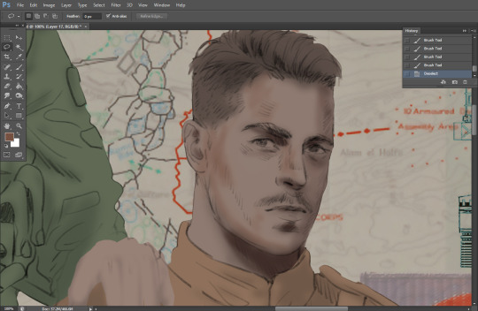
Starting off, I usually rely on the trusty airbrush just to get some color values going. Note--I've kept my sketch layer on top, but feel free to turn it on and off as you work, so as to not be too bound to the sketch. For now, it's just a guideline.
This next stage may look like a huge jump, but it's really just adding more to the foundation. I try to think of it like putting on make-up in a way~ Adding contours, accentuating highlights. This is also where I start adding in more saturation, especially around areas such as ears, nose and lips. Still a bit fuzzy at this point, but that's why we keep adding to it 💪
A boy has appeared! See--now I've removed most of the line layer, and it holds up on its own. I'll admit that in order to achieve this realistic style, you'll need lots and lots of practice and skill, which shouldn't be discouraging! Just motivate yourself with the prospect of getting to look at pretty men for countless hours 🙆♀️
I'll probably do a more in-depth explanation about rendering at some point, but let's keep this rolling~
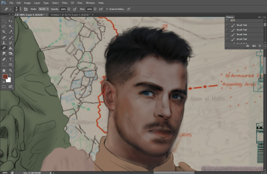
Moving forward is just a process of adding to the figures bit by bit. I do lean towards filling in each section from top to bottom, but you can feel free to pop around to certain parts that appeal to you more. I almost always do the faces first though, because if they end up sucking, I feel less guilty about scrapping it 😂 But no--I think he's pretty enough to proceed 😚
They're coming together now 🙆♀️ Another helpful tip--make sure you reuse color. By that, I mean--try to incorporate various colors throughout your piece, using the eyedropper tool to keep a consistent palette. I try to put in bits of red and blue where I can
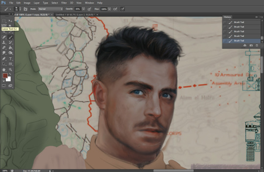
Here they are fully rendered! Notice I've made a few subtle changes from the sketch, like adjusting the belt buckles because I made a mistake 😬 Hence why you shouldn't put too much stock in your initial sketch~
The next step is more of a stylistic choice, but I usually go over everything with an outline, typically in a bright color like green. Occasionally, I can just use my initial line layer, but for this, I've made a brand new, cleaner line 👍
And the final step is adjusting the color and adding some text:
Tada!! It's done!
All in all, this took me the better part of a week, but I have a lot of free time, so yeah ✌️
I hope you appreciated that little walkthrough~ I know people have been asking me how I do my art, but the truth is--I usually have no clue how to explain myself 😅 So have this half-assed tutorial~
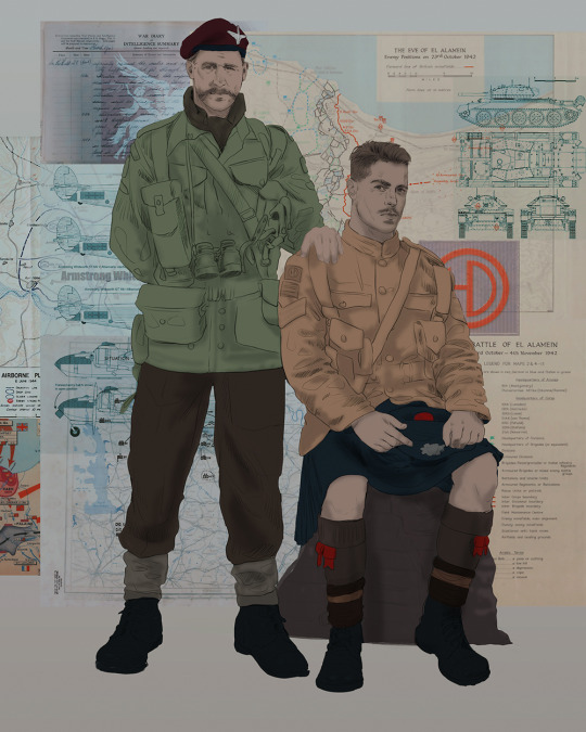
As a bonus, here is a cute (cursed) image of Johnny without his mustache:
A baby, a literal infant child !!! who put this wee bairn on the front lines ??! 😭
Anyway! peace out ✌️
#tutorial#my art#art tutorial#since people have been asking#I remembered to save my process from this latest work~#enjoy 🙆♀️
1K notes
·
View notes
Text
eaudera's detailed tutorial for skin rendering
okay loves i've put together a tutorial in text form detailing my step by step process of shading darker skin + the brushes and techniques I use and why I use them. you will be following along as we shade a piece together, you can find the lineart to the piece here. *turn off your true tone and night shift displays for the most objective viewing.
i wrote a lot on the preview pictures, if you find spelling errors (which you def will) or are unable to read my handwriting, you'll find the typed out version of the writing in the alt text feature.
disclaimer: i'm not an art professor nor am i academically/classically trained in art. a lot of the verbiage and techniques i'm using to teach you all here are from my current self taught and observed understanding of art, light, and anatomy
support me: kofi / ig / twt / commissions
firstly, here are my two staple brushes. you can find the second brush here, i modified it by making it larger.
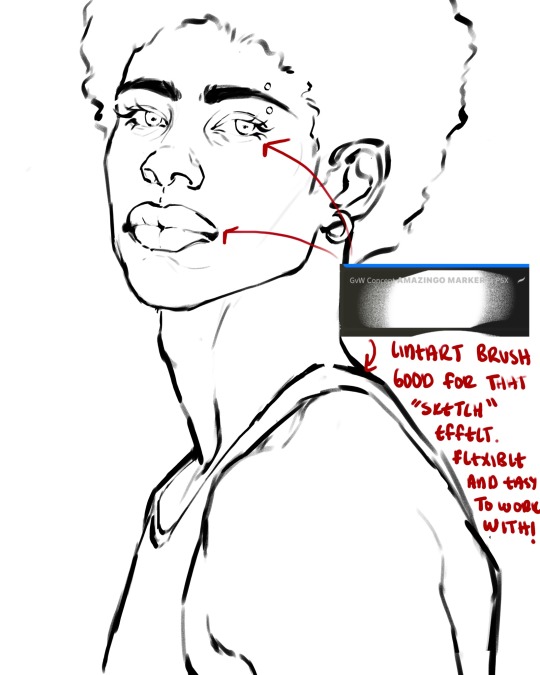
the lineart brush is very good for easy sketching and simultaneously cleaning up that sketch to produce the final lineart you'll be using in your piece. the diffusion from the erased parts/the diffusion created by lowering the pressure of your pen creates a light graphite effect which i enjoy! give it a shot.
you'll notice quickly that there are lighter strokes throughout this lineart, these are simply acting as rendering guides for me in order to remember certain placements. i erase/draw over these lines a lot.
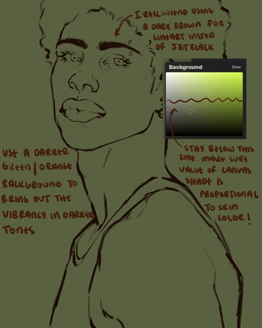
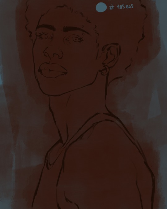
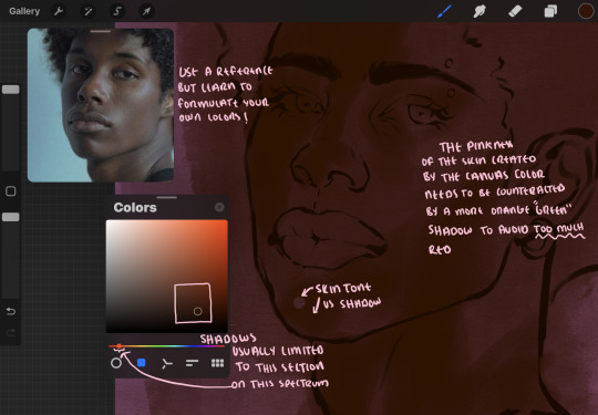
i initially learned to shade skin on a completely grey background with very slight orange undertones, and for a while this was very helpful in providing the most objective view of the base colors you're using (objective as in free of being effected by colors of different values). as you might know, using a white background for dark skin will seemingly darken the value and dim the vibrancy of your base colors, and using a black background will do the opposite. if you're using a darker skin tone, you want your canvas shade to be of a value that is proportional to your skin tone to avoid the same problems created by colors with too light or dark of a value. now if you're using a screened device to draw, you have the extra burden of screen reflections/wavering color output on different screens, so you're never really sure if the exact color you're using will be consistent across the board. priming your canvas with neutral colors will help with that. whereas priming with more vibrant colors will slightly change the undertone of your skintone (especially if you're using a low opacity brush), but it makes for a funner canvas and more creativity with your color palette imo. if you're a beginner i recommend you stay below the wavy line to avoid too light of a canvas shade.
for these same reasons i avoid keeping my lineart jet black. when you lay down the base colors under a black lineart it can look very unfavorable.
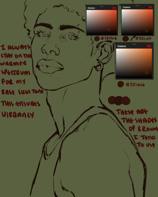
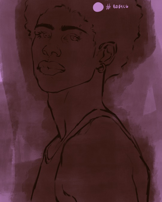
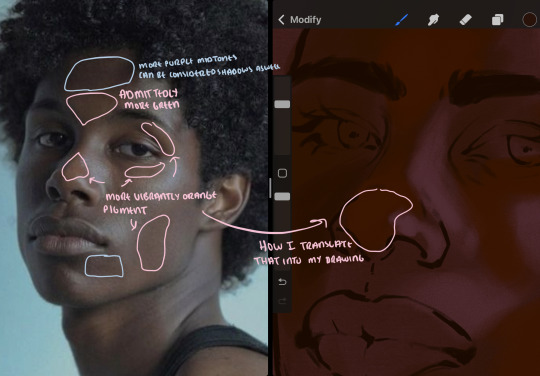
here are some skin tone variants that i tend to use the most, peep how i never wander off too far to the left of the spectrum where the reds are. i definitely favor red-oranges as compared to green-oranges for my skin tones, however, because i stay primarily on the left side of the color spectrum for my rendering, red can quickly become too much too fast. so i make sure to use a skin tone that can work very well with green-orange shadows. for this specific piece i will use the third shade (#2d1606).
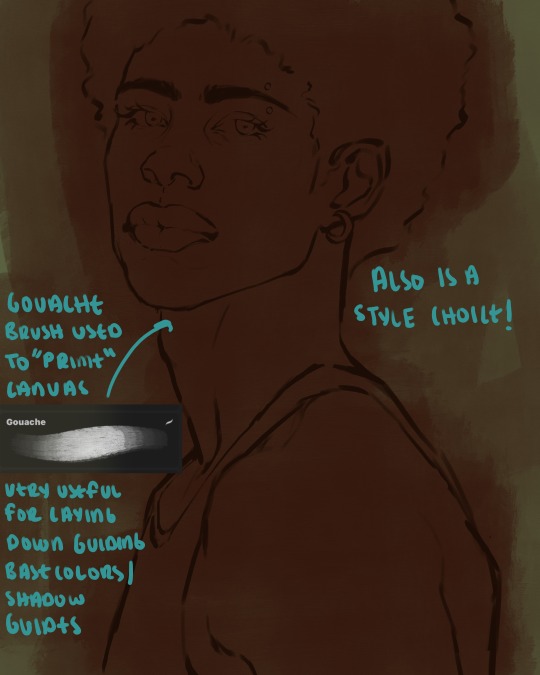
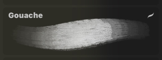
heres where the gouache brush comes in handy. i use it very loosely to "prime" the canvas almost. if you've ever done oil painting you'll realize very few artists draw directly onto a completely white canvas, though i've already primed my canvas essentially by changing the background color, i loosely shade over it with the skin tone color using the gouache brush. i find this gives me a better grasp on the composition of the piece due to increased harmony between the canvas and the skin color. it also looks really cool to me and resembles a real canvas almost.
as stated before, priming your canvas with neutral colors (grey) can help give you a more consistent view of your base colors, when you get the hang of understanding the colors you most often use (i.e, how they interact with other colors), you can start using more vibrant and fun colors to color your canvas with! the gouache brush changes opacity depending on the pressure exerted by the pen, if you zoom in you'll notice patchy areas where the canvas color bleeds through the layer more prominently than it does in other areas. for some people this might throw off the consistency of the shadows, but you should be fine as long as you're using a consistently opaque brush (which we will be doing)
i know i recommended beginners use a grey canvas like i did, but since this tutorial is using my techniques i figured i'd also teach you guys how to use variantly opaque brushes to your advantage. we will be drawing on the pink canvas from here on out.
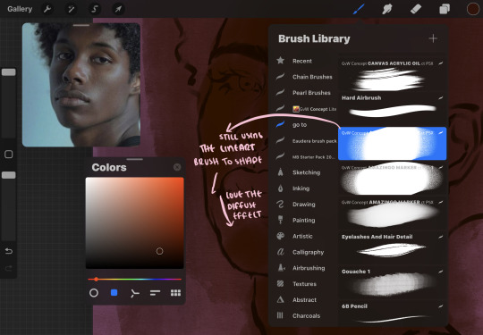
a reference is so helpful, i still rely on references to guide my shadows/lights. i'm past the point of relying on references for exact coordinates for rendering or lineart, but they are still incredibly helpful. in most references of darker skintones you come across, color dropping directly from the picture will give you very grey colors! we want to prioritize vibrancy in this case, so attempt to formulate your own colors or colordrop and increase the vibrancy :)! keep in mind i'm now using the lineart brush to shade. the diffuse/soft corners of this brush allows fewer pixels to be scattered wherever you lessen the pressure, this is perfect for color dropping medium colors to blend two colors together. you'll see how i blend colors later on.
as mentioned previously, red can become too much too fast- so i avoid monochrome rendering as much as possible by using shadows of different undertones. my most frequent combination is using a red-orange skin tone and then using a green-orange shadow.
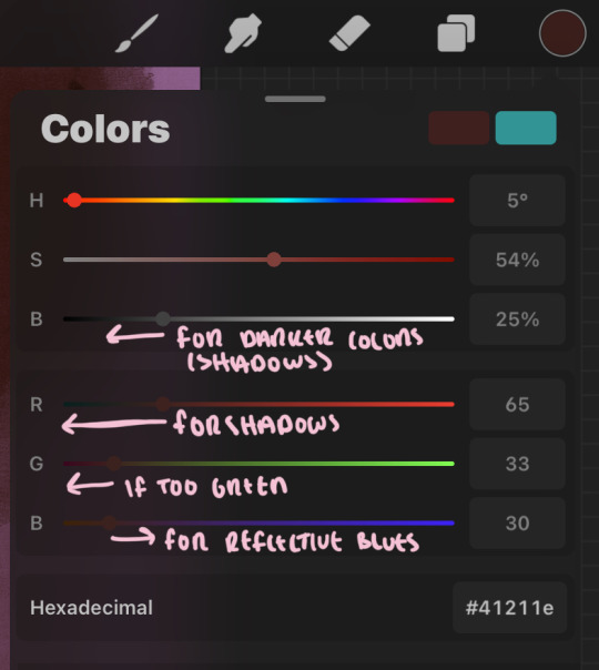
the value spectrum will be your best friend in mixing values and undertones, i use it all the time to formulate the best less saturated darker shadow that is proportional (not too dark, not too grey) to my skintone value. if the shadow is too green simply increase the magenta, if you're looking for a "reflective" shadow, increase the blue.
when i begin shading, i always slide the curser to a truer orange color on the spectrum and increase the saturation (slide towards the right) while i decrease the brightness (slide down). heres how it looks when i'm jumping between shadows and highlights while trying to keep my colors proportional (but not identical) to whats happening in the reference ^. i most often times will rely on the value tool, however.
you will notice that a lot of darker skin tones have patches of orange vibrancy, these areas are most common on the nose and cheeks. this is only a detail to pay attention to if you're going for more of a realism rendering style :)
now onto how i prefer to bridge/blend colors together by utilizing the blend tool.
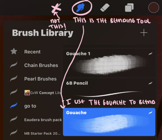
i do not like simply blurring colors in order to blend colors together, it can lead to overblending which can make your portrait look heavily gaussian blurred (think 2010 deviantart art... yea that). the brilliant thing about procreate is you can utilize brushes really efficiently, which include changing the brushes you use for blending. so in reality, artists who use the blending tool on its own can still have portraits that don't look it! there also exists plenty of brushes that have properties allowing it to blend into its surrounding colors are you draw. but in my case, the above photo is 99% of the times how i will bridge two colors together. doing this allows me to keep pretty consistent brushstrokes across the whole portrait, which i enjoy. it also gives me better control of the shapes i use in my rendering, an aspect that is pretty easy to lose when you're using the blending tool directly and solely.
in case the blending process is a bit hard too see, heres that same process recreated with different more visible colors:
now once you've placed your shadows where they generally tend to be (according to the reference photo), let's make those shapes a bit more specific and pick up on smaller details to make your rendering look more complete.
your base colors will never be as dark or as light as you need them to be when you begin rendering, making sure you have a decent contrast between your lightsource highlights and the shadows is key to capturing the essence of a light being cast on your character. it's much easier to keep building upon your shadows before rendering the highlights, i laid down the highlights only to create a guide/help me map my shadows better. do not darken the entirety of the areas affected by shadow, you'll find that shadows are rarely ever the same value, it's a gradual process affected by things like position, height, etc. so make sure the darkest of your shadow colors are preserved only in areas where the shadows are the or should be the darkest.
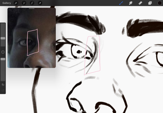
you'll notice i labeled some areas as "detail", adding very specific shadow placements is a detail. in the reference, the model has a pretty prominent brow bone, creating a shadow over where his eyelid creases just above his lash line, paying attention to feature details like this help enhance the rendering and its realism.
now that i've mapped my shadows i'm going to move onto to rendering my highlights and the region of the face where the lightsource is most prominent.
i described shadows as a gradual process earlier, this is because of the lightsource. light tends to spread when its further from the affected surface, creating a larger area affected by the light. of course, this varies depending on how intense and how close/far the light source is. in this case, the light is being casted above him further to the other side of his face, but again, remember that the face is not 2d and more prominent areas are affected more by light. it's due to this that there still exists a, albeit very minimal, shadow beneath his cheekbone. i exaggerate the shadow here for stylistic purposes, but it also helps in keeping me uphold that contrast between the highlight and shadow once again. so i refrain from blending the light into this area like i did in other areas.
midtones are the areas most unaffected by the light source, they're neither shadows nor highlights. and because light spreads, it is brighter in certain areas and darker in others. it is most easiest to blend the darker ends of the highights into the midtones of your portrait. you can emulate this by once again using your blend tool. blend the outer areas of the light and colordrop this color and use it as the darker light more proportional to the midtones. note that before i add even lighter shades to the areas where light is most concentrated, i blend what highlight placements i currently have there.
we're going to switch gears now and focus on the reflective shadow occurring on the darker half of his face.
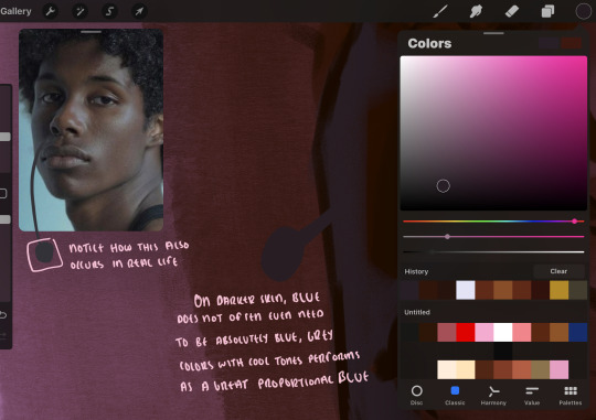
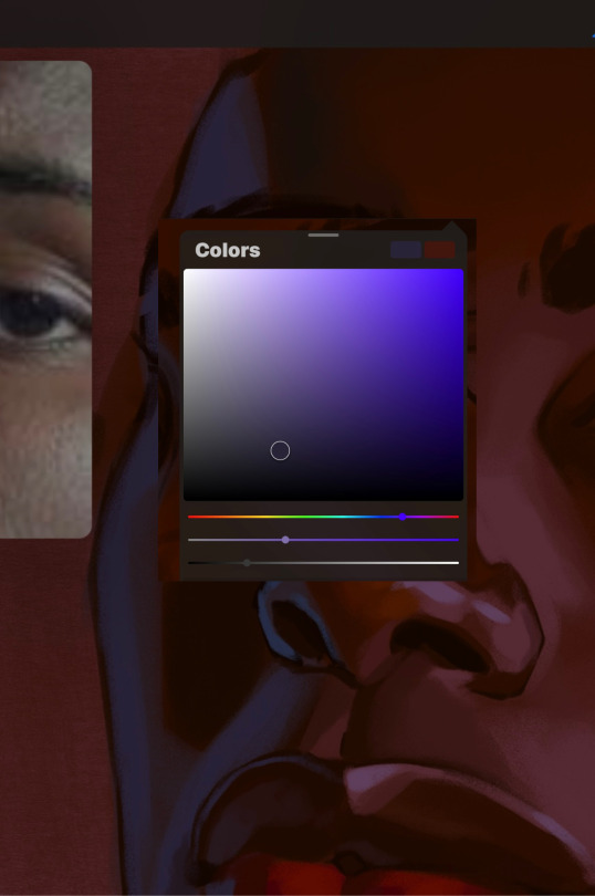
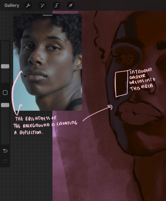
this shadow is a reflection from the lighter background the model is up against, the light being casted above him is allowing for some bounce back from his surroundings, leading to very faint light visible in areas primarily affected by shadows. hence why i'm referring to these colors as "reflective shadows".
in this case, the reflective shadows are blue, or appear to our eyes as blue. on darker skin, "true" blues (blue-purple) are not often times present. what is present rather, is a very grey tone with cool undertones/a grey tone on the blue side of the spectrum, which creates a blue that is much more proportional to the value of the skintone than a true blue. in this case i used a deeper grey on the pink color spectrum, which is more purple. this was intentional, and was done in order to create some sort of color harmony between the contrasted deep oranges im using for the bordering shadows and the blue-grey i'm attempting to emulate.
while i utilize this blue-grey, out've a purely stylistic choice, i still introduce true blues to my rendering. in fact i love using blue/purple reflective shadows in my art, it creates a stunning and colorful render. in this case, i used the blue-grey as a stepping stool to introduce that trueer blue more naturally. you'll see this happening in the second picture above, where i used a slightly more vibrant and slightly more brighter blue, and used it on areas where this reflection was more prominent (and therefore brighter).
you'll notice how the shadows that border on these reflective colors are less saturated and darker than the shadows on his chin. introduce a darker and less saturated (more green) shadow to that area on his cheek and the darkest shadow of this photo, the sunken area near his nose bridge and inner eye corner. i emphasize this line in the lineart so you can follow this shadow more accurately:
this is also a detail in my opinion and can make your portrait more realistic if you include.
we're going to pivot to his neck area before continuing. you'll find the area of his neck with the most light is also the least vibrant, i laid down a grey base color to emphasize this detail in the portrait. afterwards i added key details. i wanted to stay at least somewhat true to the color dynamics occurring in the reference hence why i used the grey, but i'm not a very big fan of using blatant grey directly on the skin, so i made it more blue.
moving forward, the outer eye and the nose can be some of the most "detail focused" areas of the face when it comes to rendering. due to their more "bulbous" anatomy, light tends to curve around them in more complex ways than the flatter parameters of the face.
when it comes to the many creases that surround the eye, the skin folding over itself creates a very thin shadow from between the folds. the key to rendering this crease is to concentrate the blending to a very small scale, do not overblend the area because the hill created by the crease very easily captures light, creating an area where the shadow and highlight meet in very close proximity. slight blending is needed for this area, you can deepen the shadows in both horizontal corners of the eye for more accuracy. the midsection of the total eye area (eyeball and socket) tends to capture the most light, remember this is due to how bulbous rounder shapes tend to capture light from whichever direction its coming from.
this is of course the case for the nose as well. highlights are typically placed as a dot on the outermost part of the nose by artists, but highlights also spread on either side of the tip of the nose. the nose tends to collect a lot of oil, creating a sort of sheen on the upper parts of the nostril. when rendering a portrait where the position of the head is more cast to the side, the highlight of the nose changes from the bulb of the nose, to the upper nostril. in this case, the highlight spreads, causing a "half tone", or the remnants of the light on the bulb of the nose. this is the easiest place to blend highlights and shadows together. now for the shadow detailing on the nose, i'm actually drawing on top of the lineart on a separate layer. which i'll go into detail about in the next part. you want to focus the shadow on where your lineart is, the outermost part of the nose.
now were going to really detail your portrait by introducing a new layer, the detail layer! this isn't technically apart of the skin rendering, so i'm gonna keep it very brief. this is the layer you're going to render the lips, eyeballs, and eyebrows. more specifically, the purpose of this layer is to reduce the reliance on lineart. in terms of order, it goes above the lineart layer. we're going to soften and even erase the lineart in certain aspects. i use bolder/thicker lines when creating my lineart, but this can become a nuisance/hinderance when rendering.
starting out with the lips:
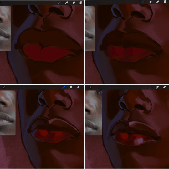
people w brown skin tend to have two toned lips, with the top lip resembling the same skin tone as the face and the bottom lip being redder/pinker and lighter than the upper lip. in my case, i prefer a more vibrant red for the bottom lip. once i lay down these base colors, i begin shading on the second layer.
i personally enjoy the look of a poutier lip shape, this includes emphasizing the middles of the lips as opposed to the ends. i've highlighted the shapes that this lip shape often entails. the small circles on the corner of the lip line are just pockets that occur when the mouth is closed and become emphasized by the fat around the mouth. the parameters of the lip lines do not often meet these round corners, theres often times a "double lip line", that exists around these areas. i love including that in the art, its very easy to emphasize by simply drawing a highlight from the corner of the lips along the curvature of the bottom lip towards the middle.
shadow mapping on the lips tend to go: highlight, shadow, highlight, shadow. the top lip going inward creates a highlight on the most outward part: the top of the lip. and the bottom lip curving outward thus creates a shadow on the bottom of the lip.
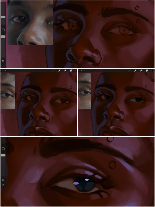
when it comes to the eyeball, i don't draw the white parts as solid white, nor do i make them too bright most of the time. they're most often times an orange grey, i also dont spread this color out if you can notice the uncolored white part of the eye. i do this intentionally to keep some of the shadows that are naturally present on the eye. very specifically right where the upper eyelid sits on the eyeball, it tends to create a small shadow that follows the curvature of the eye. this shadow is crucial, if you can see the first and second picture do not have this shadow, making the iris look more exposed and the eye appears to be held wider.
when it comes to the iris, i do very little. if i'm drawing a dark colored eye i will cover the entire iris brown, before darkening it with an almost black color. i leave the brown sides of the iris exposed to aid in bridging the values between the whiter parts of the eye and the very dark iris. this blended ring also appears on all eyes in real life. lastly, dark eyes tend to show light reflections much easier than lighter eyes. these reflections can be any color in art, in this case i kept it blue-green. i bend these reflections around where the pupil would most likely be depending on the drawing.
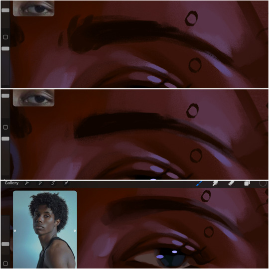
next, the eyebrow. i find it tedious to draw individual eyebrow strands when it comes to rendering, i actually prefer to blend the parameters of the eyebrows to create cohesiveness. sparse and fine eyebrow hairs are penetrated by light and shadows more than what you'd find on the scalp. it's harder to see light on someones scalp due to the bulk of hair crowding the scalp, whereas as its easier to see such light on the eyebrow. to introduce this concept to my art, i will initially draw the entire shape of the brow. then when rendering, i erase the parameters, leaving the darkest part of the brow. then i blend. the lower brow bone will be blended the least, whereas the area of the eyebrow connected to the T zone will be the most blended thanks to the shadow following the nose bridge. the far end of the brow by the hairline tends to be the lightest given the light source.
and lastly, i loosely draw a white border around the portrait for stylistic purposes. then i combine the layers (group together your layers, then duplicate and compress the duplicate group so that you still retain your individual layers) to edit. i typically add noise and play with the curve setting. and heres the finished image:
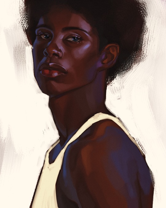
i hope you enjoyed!!
#i didnt proofread this if u find spelling errors pls lmk#black artists on tumblr#digital art#illustration#painting#black art#commissions#tutorial#art tutorial#how to shade#rendering tutorial#brushes
290 notes
·
View notes
Text
The Why of Sewing 3: Fabric Anatomy (Fiber Content)
This post is in a series I am starting that is going to talk about concepts in sewing and fiber arts and try and explain some of the whys behind the hows.
The beginner sewist is often (correctly) advised at the beginning of their journey to start with cotton fabric, sometimes specifically woven cotton, but not always. Nevermind that cotton fabric can vary from a tshirt to denim and canvas.
We have learned the difference between a knit and a woven fabric in my previous posts (check the tag #the why of sewing which should bring up the whole series). Let's talk fiber content.
Like fabric structure I basically break fiber down into two groups: natural fibers and synthetic fibers. Below I am going to talk about the fibers you are most likely to encounter as you shop as a home sewist. It is NOT a complete list of fibers, nor could I list the entirety of fabric types made with each fiber.
Natural fibers: these are fibers that come from plants and animals and require minimal processing to be made into fabric.
Wool: This comes from sheep, which are sheared 1-2 times a year. The animal is not hurt in the process and even sheep not raised for fiber production must be sheared for their health. Wool is warm, but breathable. It can be easy to work with in some ways, but it does shrink when washed and so many modern sewists avoid wool. Some folks have sensitivities to wool as well. Wool is most commonly used in suitings and knits.
Image: Shorn sheep in a verdant field (Source: By Roger Kidd, CC BY-SA 2.0, https://commons.wikimedia.org/w/index.php?curid=13035358)
Silk: Silk is made from the cocoons of silkworms, and generally harvested prior to the hatching of silkworm larvae. Silk is expensive to produce and considered a luxury good. Silk is shiny and lightweight, it can be surprisingly warm. Silk can loose its sheen in the wash and because the fiber is so delicate it can be difficult to sew. There is a lot of misinformation on the production of both silk and wool online. Worm Spit has been educating fiber artists about the process of making silk since 2002.
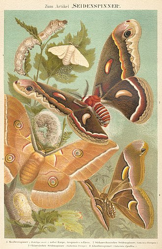
Image: a vintage style poster showing various stages of the silkworm moth (By Bibliographisches Institut, in Leipzig - Meyers Konversations-Lexikon, 4th Auflage, Band 14, Seite 826a (4th ed., Vol. 14, p.826a), Public Domain, https://commons.wikimedia.org/w/index.php?curid=2317808)
Cotton: Cotton comes from the cotton plant, there are several varieties commonly grown and it is the most common natural fiber used in textile production. The cotton fiber comes from the seed head of the plant. Cotton can be made into light breathable fabrics and warm cosy fabrics. The list of fabrics made from cotton might actually be endless but here are a few you might encounter: jersey knits, denim, quilting cotton, gauze, lawn, voile, sweatshirting, twills, poplin, oxford cloth, canvas...
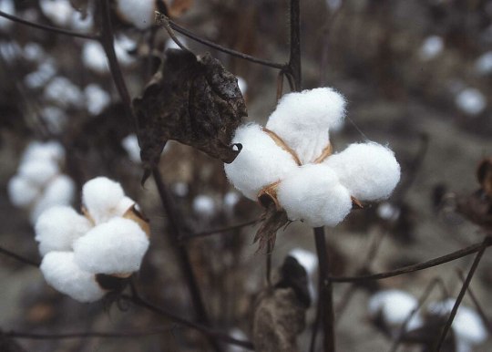
Image: the cotton boll, or seed pod (source: Public Domain, https://commons.wikimedia.org/w/index.php?curid=689304)
Linen: Linen comes from the flax plant. The fiber comes from the long stem of the flax plant and can be difficult to break down into a usable state. It is also difficult for modern spinning equipment to make into threads, which is why linen tends to be quite expensive in comparison to cotton. Linen is cool to the touch and very strong. It also wrinkles very easily. Coarsely woven linen can be uncomfortable for some to wear. Linen tends to be made into simple plain woven fabric, occasionally knit fabrics, and can vary in weight from handkerchief linen (very fine, almost transparent) to canvas. I recently reblogged THIS POST which had some incredible links regarding linen production.
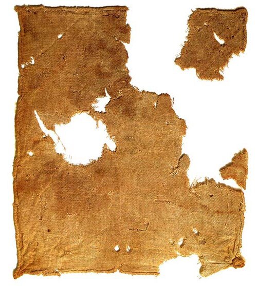
Image: linen cloth recovered from Qumran Cave 1 near the Dead Sea (Public Domain, https://commons.wikimedia.org/w/index.php?curid=248420)
Synthetic fabrics: these are fibers that have been manufactured through industrial processes.
Polyester/Acrylic/Nylon: These fabrics are plastic. They are made from different types of plastic, but ultimately a liquid petrolum product is extruded into a long filiment and made into cloth. They can be made into woven or knit fabric. The way they are made can have many different properties. Generally polyester is what you find in the home sewing world. Polyester is not breathable and because it is oil based it tends to hold on to smells. It melts when it is too hot and therefore can only be ironed carefully. Polyester also tends to be very strong and can help make very sturdy fabrics. Because polyester is very inexpensive to produce it is frequently combined with other fibers to reduce production cost.
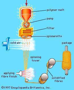
A diagram of "dry spinning" polyester fibers (source: https://encyclopedia.che.engin.umich.edu/fiber-spinning/)
Spandex/Lycra/Elastine: this is the stretchy stuff! Generally found in combination with other materials this is what makes fabric go beyond the mechanical stretch that is produced by the fabric structure. In small amounts mixed with cotton it makes a fantastic tshirt jersey, 100% spandex is great for swim and dancewear. As we discussed in the knit article I posted previously adding stretch to sewing does make it more complicated to work with, but used wisely spandex is your friend. Best not pressed excessively as the fiber has a protein structure that breaks down when it is hot. Also if you have a garment or fabric with a lot of spandex content you might want to consider avoiding the dryer.
Rayon/Viscose/Bamboo/Lyocell/Cupro/Tencel: There are SO MANY names for cellulose fabrics. These are sometimes categorized as semi-synthetic fibers, or even put in with natural fibers. They are all the same thing deep down. Cellulose (generally sourced from trees and plants) is chemically broken down into its most essential parts and then extruded into a filiment. These fibers were originally developed as a silk substitute. Rayons are fine, breathable, and have a drape that clings to the body. They shrink in the wash and can continue to shrink through several washes. They also can be fragile when wet. Rayons are made into both woven fabrics and knits and they tend to be thin and fine fabrics. Rayon fabrics, especially those labeled as bamboo are frequently greenwashed as environmentally friendly, because they are sourced from a renewable resource, but the process of producing cellulose fibers is highly polluting and uses significant amounts of water.
While there are outliers, most textiles you will encounter while shopping for fabric will be made of the above fibers. A deeper dive into these would be fun, but I find at least 3 potential rabbit holes I could go down every single post I make here.
#quilting#sewing#sewing tutorial#fabric#textile art#sewing tips#sewing techniques#the why of sewing#fabric content#fiber#fiber content#cotton#wool#linen#silk#rayon
77 notes
·
View notes
Video
youtube
Create Frame from any image with this Canva app for FREE
#youtube#canva#canva tips#canva app#canva tutorial#canva design#tutorial#design tutorial#how to use canva#canva for beginners
2 notes
·
View notes
Text
i was asked by @matthew-macfadyens for a colouring tutorial, so here we go ! i've been making gifs for almost 4 years now and finally feel comfortable and confident in my skills to make a full tutorial on my colouring process. there are so many different ways people colour gifs, and there's no wrong way, this is just how i do it ! i learned to gif by reading so many tutorials and picking and choosing what works for me, so hopefully this can help someone out !
if this tutorial helps you, please considering supporting me ! buy me coffee ♡

TUTORIAL UNDER THE CUT
what you'll need: - photoshop ( i use ps cc 2023 & frame timeline ) - basic ps knowledge ( how to make gifs, how to sharpen gifs, general understanding of adjustment layers, layer masks and blending modes ) - a whole lot of patience
helpful resources:
the beginner's guide to channel mixer by @aubrey-plaza
giffing 101 by @cillianmurphy
gif making for beginners by @hayaosmiyazaki
colouring yellow-tinted shots by @ajusnice
becca's mega colouring tutorial by @nataliescatorccio
@usergif
PART ONE: BASE COLOURING
- step 1: curves - step 2: exposure - step 3: colour balance - step 4: selective colour - step 5: levels - step 6: brightness / contrast - step 7: gradient map
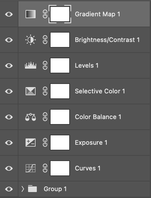
okay so, before we get started, this tutorial is for colouring only. at this point, i've already gotten my screencaps, imported them into photoshop, made the actual gif & sharpened the gif. the above image includes what my typical adjustment layer stack looks like !
STEP ONE: CURVES
a lot of people do the majority of their heavy lifting in curves...i'm not one of those people. i've never gotten the hang of curves and haven't been able to fully taken advantage of everything it can offer. i use curves to mainly brighten up my gif and to start my process.
i use the "auto" button in the curves function - this automatically corrects the curves for your gif ( mainly the brightness / contrast )
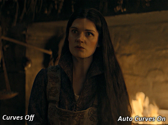
you can see that the auto curves has brightened up the gif and evened out the brightness/contrast. i just find this gives a better starting point for the colouring process.
STEP TWO: EXPOSURE
this step is for, you guessed it, brightening the gif more and evening out the contrast and blacks. i don't have any real rules for doing this, the amount i highten the exposure and contrast is different based on the scene and the show, however, i tend to stay around +1 on both exposure and gamma correction.
exposure effects the brightness of the gif and gamma correction effects the blacks and contrast. this step also effects the saturation of the gif, so it's important not to go too crazy. i often end up coming back to this step every now and again to adjust and fiddle with it.
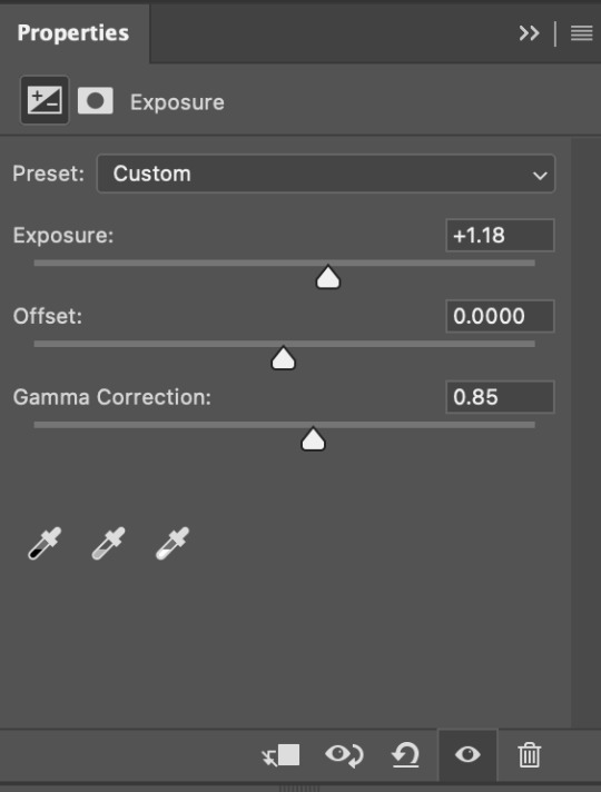
for this gif, i put the exposure at +1.18 and the gamma correction at 0.85
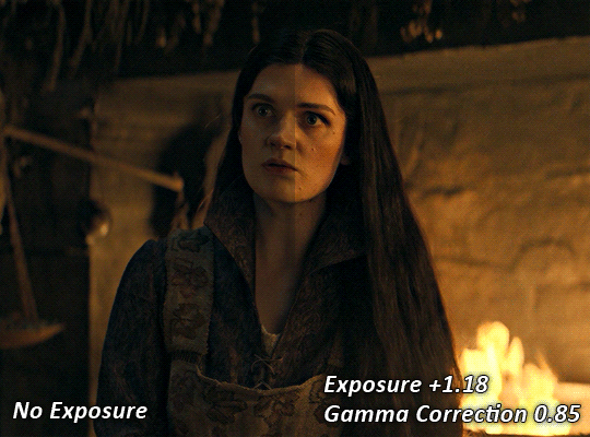
you can see this step serves to add some more brightness and contrast - it also adds some more saturation, that we don't always want, but don't worry, that's what the next steps are for !
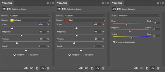
STEP THREE: COLOUR BALANCE
i use this step to do a lot of my heavy lifting - i'm a whore for colour balance. this serves to even out the colours and help neutralize the colours for an easier canvas. it's important to understand the basics of colour theory for this, i recommend checking out the channel mixer tutorial i listed above, because a lot of those steps applies to colour balance.
essentially, there's three separate profiles to edit on - highlights, midtones and shadows. in each profile, you have 3 colour sliders. the top one is your cyan to red, middle is magenta to green, and bottom is yellow to blue. the colouring of the scene will decide where to move your sliders.
for example: if your original scene has a cyan tint to it, you'll want to pull your slider to the right, towards the red to help neutralize the cyan. if your scene has a green tint, you'll want to pull it left towards the magenta. as you move the sliders, you'll notice that sometimes it brings out other colours you don't necessarily need, you can adjust the other sliders to help neutralize further.
i always do my main correction in the midtones profile.
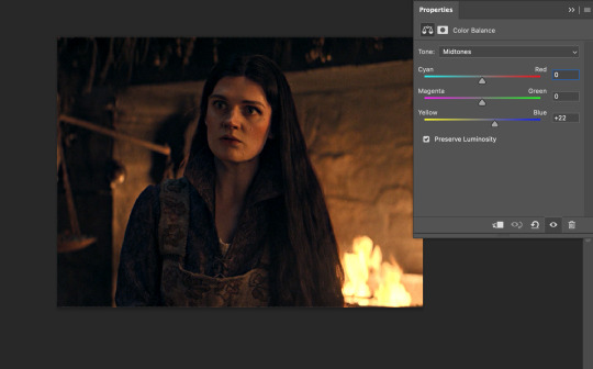
since this scene has a heavy yellow tint, my first step was to adjust the bottom slider. i pulled the slider to the right towards blue at +22. you can see this helped get rid of a lot of the yellow, but adding in the blue warmed up the reds and made it more saturated.
to help with this, i pulled the top slider left towards cyan to help neutralize that red.

i pulled the top slider to -28 and you can see this cut out that heavy saturation and redness. it's looking a lot better, but now it's a little too green for my liking. this is where that middle slider comes in!
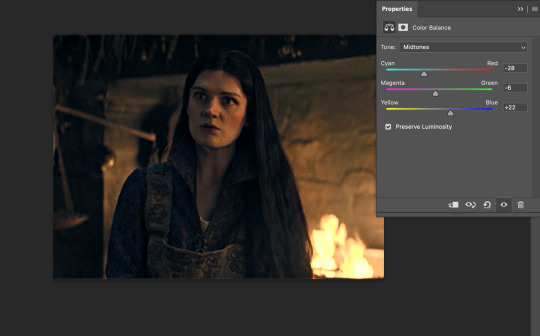
i pulled the middle slider to -6 towards the magenta to help counteract the green that came in. ( i ended up going back in and adjusting the bottom slider to +10 instead, as it was a little to blue )
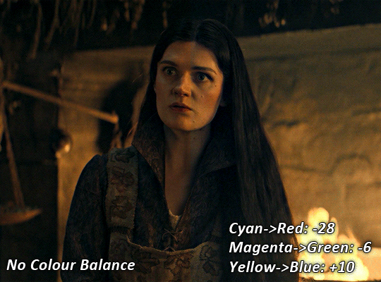
you can see this step really did the heavy lifting, helping to neutralize the canvas so that it's easier to work with...but it's not quite perfect yet!
STEP FOUR: SELECTIVE COLOUR
a lot of the same principles around colour theory apply to selective colour! this is where i go to adjust the colours according to what my colour palette is. for this gif, the overall colour is going to be purple, so i'll adjust the individual colours with that in mind.
i only ever adjust my red, yellow, white and black profiles! sometimes i'll do the other colours, but that's only for tweaking the final colour. i normally don't touch them at all.
ps: you'll notice i prefer a cooler toned gif, and almost always go for a more magenta looking red/yellow.
i always start with my yellows:

in the yellow profile, i pull my cyan towards the left to -38 (this helps eliminate the green in the yellows) and my yellow slider to the left to -27 (this cools down the yellows. i top it off by adjusting my magenta slider to -10, to help lower the saturation of the yellows.
you'll notice this step got rid of most of the green undertones - that's because the green was nested inside the yellows, so by taking out a lot of the cyan and yellow, you're left with a warmer yellow as opposed to a cooler yellow.

next i go on to my reds. this step will mainly effect the alys's skin tone, but i'm going to do pretty much the same as above but with much less dramatic of a change. lowering your colours in your red profile too much can lead to a very saturated gif, which is not what i'm going for.
i pulled my cyan slider to -19, magenta to -9 and yellow to -15. you can see this helped add some more cooler tones to the reds.
the next profiles are your white and black profiles. i use white to brighten the lightest parts of the gif. no rhyme or reason here, i just pull the black slider towards the left...usually around -25. for the black profile, i always move the black slider towards the right. anywhere from +3 to +8, depending on the gif. for this gif, i did +8. this darkens the blacks and, in my opinion, helps the gif pop!
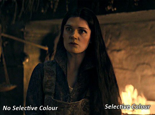
you can see this step got rid of the yellow tint, gave the gif a more neutral look and adjusted the reds to better compliment a purple colour scheme !
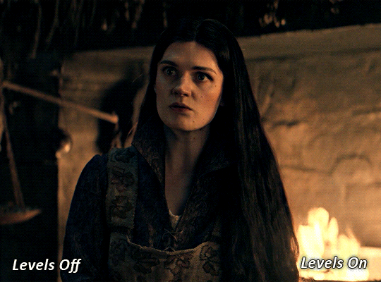
STEP FIVE: LEVELS
this adjustment has three toggles - i'm not 100% sure what each toggle really does, i just know that by pulling the leftmost toggle to the right, it darkens your gif, and pulling the rightmost toggle to the left brightens your gif.

this step is so hard to explain, but really i just pull the toggles around until it looks good...sorry !
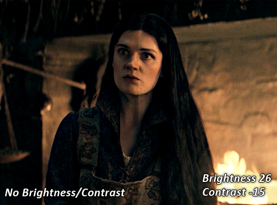
STEP SIX: BRIGHTNESS / CONTRAST
this step is exactly what it says on the tin...it brightens your gif. this step is based on your scene and personal preference, there's no real guide to it.
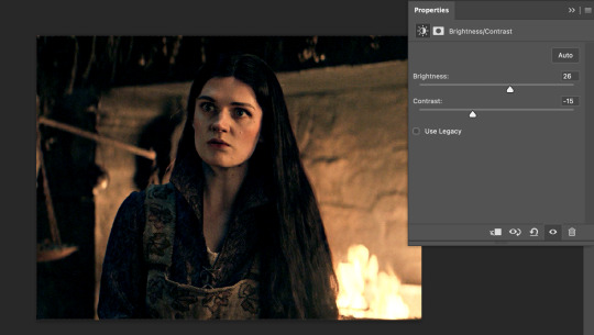
i always pull my brightness slider to the right ( brighter ) and my contrast slider to the left ( less contrast ).
STEP SEVEN: GRADIENT MAP
this last step is something i learned from @nataliescatorccio ! i add a gradient map to the top of my stack, and choose a lighter colour of what i want my overall gif to be. in this case, i used a very light purple!
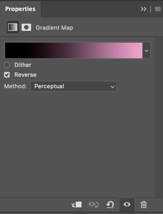
i then set the blending mode to "soft light" and lower the opacity to anywhere from 20-30%. for this gif, i did 30%
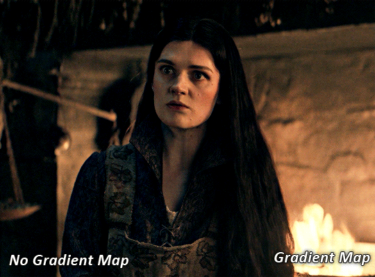
this step will help make your colour pop once you do your main colouring!
PART TWO: PAINTING & COLOURING
- step 1: layer 1 - step 2: layer 2 - step 3: layer 3 - step 4: final touches
okay, so my actual colouring process is based in 3 layers. for this gif, i'm using a deep purple/mauve colour !
STEP ONE: LAYER ONE
between your brightness/contrast and gradient map layers, add another blank layer. change the blending mode of this layer to "colour" and set the opacity to 40%.
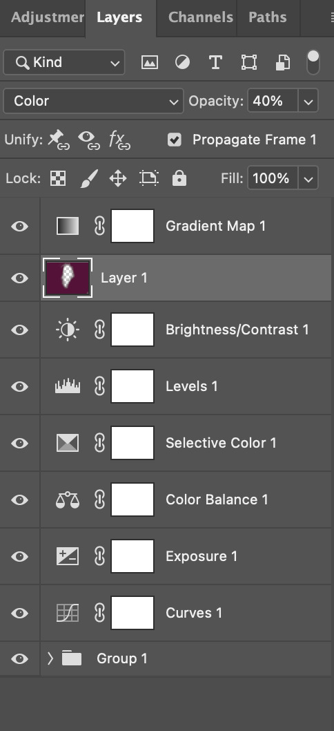
then, using a soft round brush with an opacity of 100% ( size of the brush is your preference, i typically use around 108 ), colour the parts of the gif you want coloured !

you can see this helps us get the canvas to a more uniform purple colour!
STEP TWO: LAYER TWO
for layer two we're going to do the exact same thing. add a layer above your previous, set to "colour" at 40%. we're going to go over the same areas!
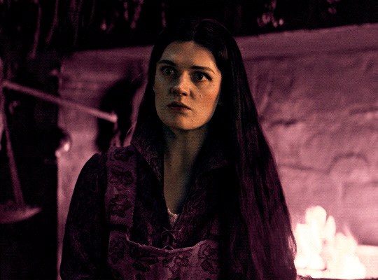
you can see this helped get the purple so much more vibrant and closer to what our final colour is going to be!
STEP THREE: LAYER THREE
for our final layer, add another layer above the previous 2, set your blending mode to "multiply" and your opacity to anything from 60%-100%. for this gif, i did 60% !
now, our colouring is pretty much done but you can see that, now that our colour is down, alys's face is still a little too blue/green/yellow for the background purple. the next step, we're going to adjust and add final touches!
STEP FOUR: FINAL TOUCHES
at this point, i went back into my selective colour layer and adjusted my yellows & reds and went back into my colour balance layer to adjust everything overall.

at this point, i'm going to go in and add some adjustments layers above everything - i usually add some brightness/contrast, and a selective colour layer to darken the blacks.
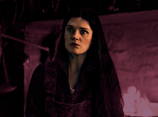
which brings us to our final result:
#usergif#dailyresources#pscentral#ps tutorial#tutorial#coloring tutorial#allresources#userbecca#tusermich#userjoelle#ughmerlin#mialook#*tutorial#**
214 notes
·
View notes
Note
hey!! would you mind doing a tutorial on how you blend your gifs? they're so perfect! if not, then that's fine but thanks anyway :)
hi there! first of all, thank you for the kind words, i appreciate it so much! and i'm always more than happy to make tutorials! below the cut i'll do my best to explain my process when it comes to creating blended gifs like these:
original gifset
original gifset
original gifset
original gifset
disclaimer that i in no way consider myself an expert when it comes to blending. i actually struggle with it quite a bit sometimes and there are tons of gifmakers far more talented than myself. here's a link to all the blending tutorials i've come across for my other blog @gifmakerresource just in case!
when it comes to blending two or more scenes/shots together, i cannot overstate how important the scenes you choose are. i'll go more in depth on this in a moment, but there have been so many times when i'm making gifs like the ones above where i spend ages testing out different scenes together to see if they'll actually work and give me the desired effect.
so, what should you be looking for when selecting your scenes? in my opinion, what's most important (and can therefore cause you the most trouble) is lighting and contrast. dark on dark is what blends best. now, you can obviously tweak these things using adjustment layers, but i think it's best to set yourself up for success right from the very start.
if we look at my first and last examples above the cut (luke in hill house and pruitt in midnight mass), these are the two that show this the best. the scene of adult luke is high in contrast to begin with; we've got areas of bright highlights and dark shadows and the latter are the areas where the blending shows through the most clearly. luke's hair and shirt are darker as is young luke's shirt and hat. the same can be seen in the midnight mass example. both scenes are on the darker side to begin with, but the shot of pruitt praying is silhouetted and makes for very stark contrast, allowing the shot of the angel's blood to be seen most easily in the darkest parts.
now, a lot of this does and can come down to trial and error and i want to make a point of saying that before i get into the actual process. there have been numerous times when i'm working on gifs like these where i have to try out multiple different shots and scenes until i find something that works. sometimes, i just save what i've done so far as a psd and go work on something else for a while, and then i can come back and look at everything with fresh eyes at a later time -- never underestimate the power of doing this, btw. some of my most popular and most favorite sets have happened as a direct result of taking a break!
now it's finally time for what you came here for! how do you do this? i'll walk you through this step by step and for now, i'm just going to be walking through 2 gifs blended into one. i've done 3 and even 4 blended into one, but they are outliers adn should not be counted. blenders georg, who created photoshop and blends over 10,000 gifs a day -- [gunshots]
step 1: make your base gifs. i'm assuming basic gifmaking knowledge, but if you need some help there, here's a tag on my resource blog with all beginner gifmaking tutorials (and i'm willing to make one of my own, personal process if anyone shows interest).
i'm mostly talking converting them to timeline and into a smart object. each person's process varies a little, but i personally use an action i made that converts from frames to timeline and applies the sharpening settings i use all in one. it's entirely up to you if you want to color your gifs before or after you have them on one canvas. in this case, i colored mine after, so this is what i have right now. two separate sharpened but un-colored gifs.
as an added note, when i'm blending gifs, i almost always keep them at their original dimensions until i bring them to the new canvas. i find it easier to position them where i want them and then crop to my desired dimensions. that way i don't have to worry that i accidentally cut something off. but for the purposes of this tutorial, i'm using my psd from this gif, which has been cropped to 540px x 500px.
step 2: bring both gifs onto a new canvas. as i just stated, the dimensions of this particular gif are 540px x 500px. if you're unfamiliar with tumblr's dimensions, i whipped this up. what matters is the width, whereas the height can be whatever you want. i saw something recently (though i can't find it now, of course) that said the middle gif in the row of 3 was no longer 178px and is now also 177px, but take that with a grain of salt! the gutters (the automatic spaces between gifs that tumblr puts in) are 4px.
so, since this is a single gif in a row, the width must be 540. bear in mind that the larger your dimensions, the larger the gif file will be and tumblr's upload limit is 10mb per gif. with blended gifs typically being on the larger end, i try to keep mine somewhere between 35-50 frames. this particular one is 35, which along with 40 frames is what i most commonly use.
create a new canvas with your desired dimensions and either copy your gifs to it or drag them onto it. you should have something like this now:
for now, ignore the other layers. as i said, using my psd of the completed gif.
step 3: add a black fill layer. this step is personal preference and therefore completely optional, but when blending, i always add an all black layer at the very bottom of all my layers. i find it helps when using layer masks (more on that soon) to make the blends appear more seamless. play around and see if you like it or not!
to create this layer, i use the keyboard shortcut (i'm on pc) ctrl+shift+N and then press G to call up the paint fill tool. once you have the color selected, just click anywhere on the canvas and it fills it. then drag this layer to the very bottom, beneath all other layers.
alternatively, you can go to layer -> new fill layer -> solid color -> choose your color but i heart keyboard shortcuts.
step 4: set the blending mode of each gif layer to SCREEN. right now, we can only see the layer that's on top. when you switch the blending modes from normal to screen, the blending begins! this is also where you can move your gifs around until you find the best placement for each one.
brb, crying about baby luke for the 800th time.
step 5: color! if i haven't already colored my gifs, i would likely do it now. that way, when i go to apply the layer masks, i'll know i'm working with a mostly-finished product coloring-wise. this is what i have now:
you can see just how important the contrast of lights and darks becomes. look at the difference between how visible the right side of young luke's face/hat is before coloring compared to after. when we lighten the highlights and darken the shadows, the blending becomes much more apparent.
step 6: layer masks! before i even tell you how to use them, we need to know how to apply them. you'll do this a layer/gif at a time. with one gif selected, press this button:

and you'll now have this:
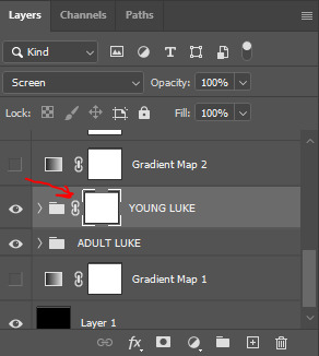
that selected white box is our layer mask. now do the same to the other gif layer. you should see this:
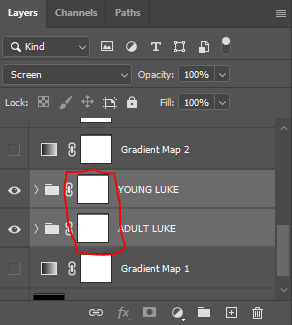
now that we've applied our layer masks, what are they for and how do we utilize them? layer masks allow you to, at their most basic, adjust specific parts of a single layer without permanently deleting them. the beauty of layer masks is that you can get rid of a certain area on a gif and if you realize later you want to bring some of it back, you can! all by using the colors black and white and, in this case, a soft round brush.
the most important part of working with layer masks is that you make sure the mask itself is what's selected. in the last image, the layer masks are NOT selected. in the one before, the layer mask IS selected. you can always tell because of the little borders around the corners of the mask. if you find something isn't working quite right, chances are that's your issue (speaking from personal experience).
as i said, we're only working with black and white here. using your brush tool (press B on your keyboard), select a soft, round brush. i personally set the hardness to 0 for the most gentle fade possible. i don't want hard edges in my blends. the size of the brush depends on how large of an area you're working with. sometimes i'll go all the way up to 150px+ and other times, i'll be well below 50px. the smaller the better for more detailed work. black (#000000) erases and white (#ffffff) brings your image back.
for a visual example, with a black brush, i'm going to mask an area of adult luke:
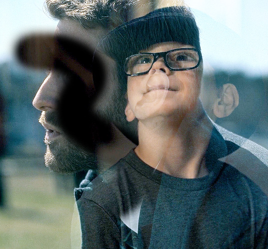
pretty obvious, right? because both layers are set to screen, masking an area of adult luke's gif reveals young luke's gif. because that area of the gif is no longer blending with anything, we see it purely with its coloring. now i'm going to take a smaller brush and switch the color to white (to do this quickly, pressing X on your keyboard will switch between the two colors [foreground and background] on your color picker).
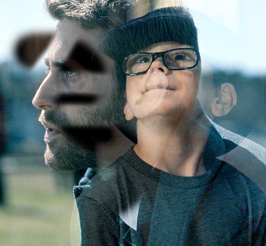
you can see the lines/cuts where i ran the brush through the mask and it brought back the parts of adult luke we'd erased. if we did this same thing on young luke's gif, black would erase young luke and reveal adult luke and white would bring back young luke. i know this might sound a little confusing, and even though i knew a fair bit about layer masks before i started giffing again last year, there was still a learning curve for me.
now that we have our layer masks, we need to identify which parts of which gif we want to mask/erase. for this one in particular, i didn't like that adult luke's ear was smack dab in the middle of young luke's face. to remedy this, i selected the layer mask on adult luke's layer and, using a fairly sizeable black brush, i colored over young luke's face and up into the top-right corner. i wanted to see more of his hat and because that area was so light, i covered that whole part. this is what my gif and layer mask looked like after:
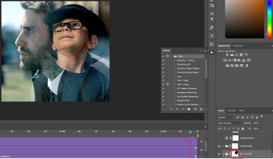
the black on the little layer mask corresponds to where i colored on the gif. now that corner only shows young luke's gif and his face is much clearer without an ear in the middle of it.
step 7: that's it! maybe.
in theory, this could be a completed gif. from here on out, nothing changes as far as blending or layer masks. you could save and export this and upload it and be done. but in this case, i just didn't like the coloring. because mike flanagan wants to see me suffer, his shit is almost impossible to color and i just didn't like the difference in coloring between present day adult luke and 90s young luke. this is also part of a larger gifset with a color scheme.
regardless of that though, i have to confess that i do this almost every. single. time. i make gifs like these. i slap a big fat gradient map on those puppies and somehow they look 10x better to me. i scrolled back through a shit load of my gifs and i only found 2 examples of blended gifs that weren't under a gradient map. oops. maybe this is the easy way out or maybe i just love colors, but idk i think it helps them look more cohesive! if you're interested, read on. if not, that's pretty much it!
if you still have questions or encounter any problems after following this tutorial, PLEASE let me know! i'm more than happy to clarify things or help out if i can! otherwise, check out some of the other blending tutorials i linked at the beginning! if you'd like me to make tutorials for anything else, feel free to send an ask, anon or not! i'm quite literally always happy to help as i don't believe in gatekeeping resources or knowledge!
step 8: i ended up applying two gradient maps on this gif. it's important that these go on top of all your other layers (namely, the gif layers). if you're unfamiliar, you click this to apply a gradient map:
then you'll see this:
photoshop automatically applies a gradient map using your current foreground and background colors. to edit the colors, click on the map itself (my arrow). unless you're going for an inverted x-ray sort of look, your darker color needs to be on the left and the lighter one needs to be on the right. click on the bottom color points to change their colors:
normally, the right one will be all the way to the end, but moving it in will let more white show through and brighten the image, which i wanted in this case.
my second gradient is the green one, which looks like this and goes from #211f20 to #88a188.
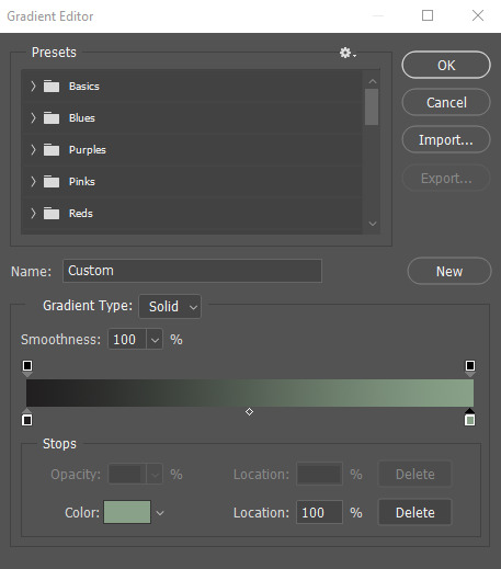
i encourage you to play around with gradient maps. as you adjust the colors, you'll see the changes live as long as you pull the window to the side a little bit. i think they're super fun and can completely change the vibe and aesthetic of a gifset.
from here, i added my typography (lyrics, naturally) and then exported and saved the gif! and here we have this gif that literally made me cry while i made it because HE WAS SUCH A BABY
again, i hope this helps and if you have any further or other questions, don't hesitate to ask!
#answered#Anonymous#my tutorials#gif tutorial#gifmakerresource#completeresources#dailyresources#chaoticresources#thanks for being patient anon!#i know it's only been a few days but typing all this took me like 3 hours lmao
114 notes
·
View notes
Note
How do you draw with rebornicas artstyle?
And how did you became rebornicas artstyle?
Well... LET'S SEE ... (i'm suffering, THIS AIN'T FOR THE WEAK/J btw english isnt my first language so excuse any mistakes :c) Ill tell you some things about the style but keep in mind, i've been drawing realistic stuff for years and also been drawing cartoons for about 2-3 years when i was a teen so keep that in mind, you gotta study other things too that i can't explain on a simple tutorial soo......
Ladies, gentleman and gay autistic aliens... I present to you...
MY REBORNICA TUTORIAL... SMALL... TUTORIAL.
(I ain't no professional on this, i'm a beginner on this style yet)
i think most of us try to go for the classic era but you can also go for the first one from fnaf 1 (You also gotta use the correct Mike uniform since the one where he has his tie on it's when he's working at the day shift because Jeremy took his shift instead :3)
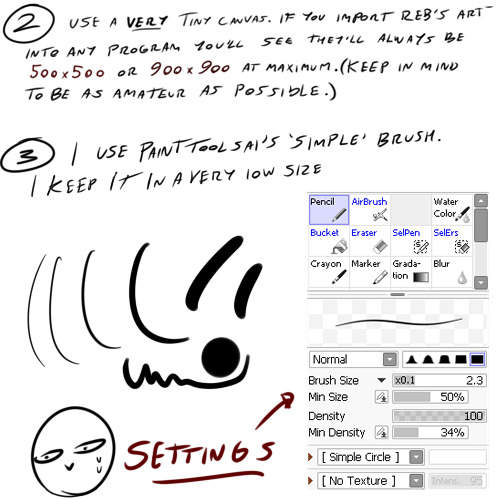
When i was a kid and even this year i asked myself why all Rebornica's art was so fcking pixelated and thEN... I IMPORTED THEIR ART INTO MY ART PROGRAM AND DAMN DUDE, WHAT WAS THAT TINY AAAH CANVAS?!
Also, i personally use a very soft sensitivity for my wacom, the less you press the better(?)
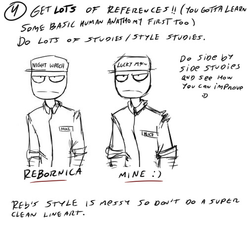
There's a lot of detailed tutorials on how to study art from other artist, you can search it as "master studies" too i think. OBVIOUSLY studies are something you gotta credit ALWAYS, since it's a direct copy. Use references a loooot, i have a lot of references for these guys. ALSO, i recommend to study Mike at first since he's like the base of all the other characters!
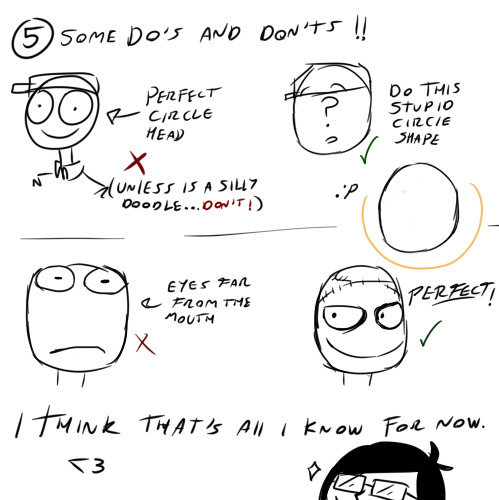
I wish i could have made more of those Do's and Don'ts but i couldn't think of a way to teach some of them in a very simple way. But the most important thing to keep in mind is to not really try to correct much of Rebornica's old anathomy mistakes if you want it to be more authentic etc. :)
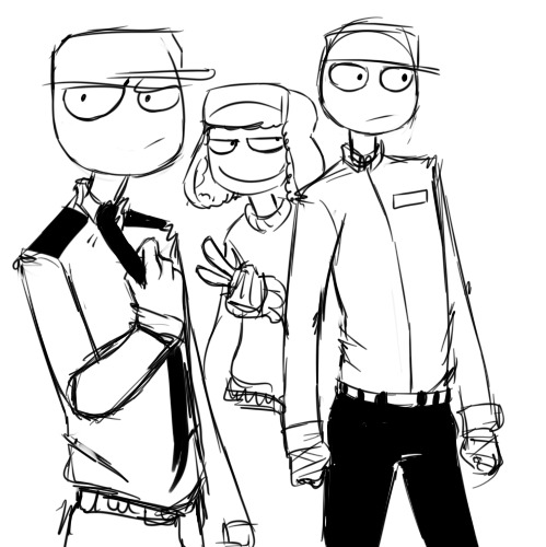
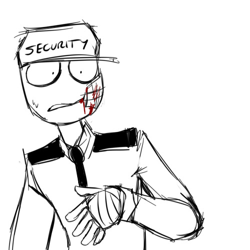
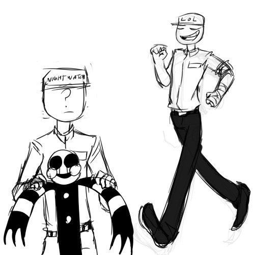
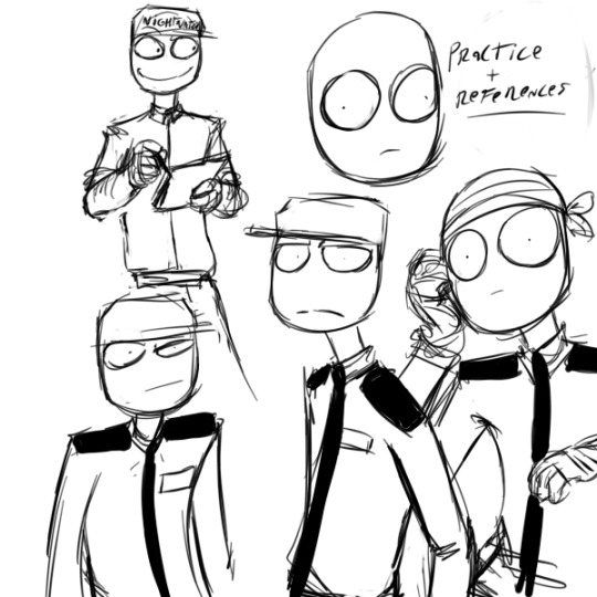
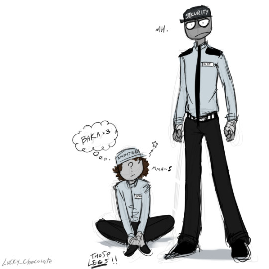
Here's some practice i did today before the tutorial and some from some days ago, I been drawing in this style since august approximately :D
Hope this helps even just a little bit, this can work with any style, you gotta learn how to study anything tbh!
Note: i might continue the tutorial later (reblogging this post) with some info about the body and stuff like that but you gotta know that at least for me (and other ex mutuals) faces/heads are the hardest in this style IDK WHY 😭
#fnaf#rebornica#fnaf rebornica#my art#fanart#fnaf au#digital art#fnaf fanart#artist on tumblr#small artist#art practice#sketch#art tutorial#style tutorial#fnaf mike schmidt#mike schmidt#fnaf jeremy fitzgerald#jeremy fitzgerald#diary post#five nights at freddy's art#five nights at freddy's#i aint no professional help meeee#just havin fun bruh#fnof#five nights of flirting#purple guy#phone guy#fnaf phone guy#fnaf purple guy#fritz smith
93 notes
·
View notes