#Limited Free Books
Text
Barbara: What did you get Dick for his birthday?
Jason: I got him a Glutemaster
Barbara: Really? Me too!
Stephanie: I also got him a Glutemaster.
Duke, gesturing to himself and Tim: Looks like we had the same idea.
Jason, sighing: Kill me. Please tell me you didn’t get Dick a Glutemaster as well.
Cass: I got him… a Glutemaster 🥰
Later-
Dick, surrounded by Glutemasters: THIS IS THE BEST BIRTHDAY EVER!!
#Damian got Dick 100 boxes of a special limited edition cereal#Damian removed all of dicks pantry items while he was sleeping the night before his bday#dick wakes up and open his kitchen cabinet and like 20 boxes just topple on top of him#Bruce got dick something expensive like a jet or a new identity#Alfred got dick fancy handcrafted cereal bowls#Wally got dick a coupon book for 10 free ‘cardio sessions’#Kori made the birthday cake… it was vanilla and anchovie flavoured#batfamily#batman#jason todd#red hood#batfam#tim drake#bruce wayne#stephanie brown#cassandra cain#dick grayson#nightwing#duke thomas#wally west#koriand'r#damian wayne#alfred pennyworth#barbara gordon#batgirl
2K notes
·
View notes
Text
It’s ironic that Hephaestus has more written evidence of being a mama’s boy than Ares. Yet Ares is the one portrayed as a mama’s boy more often.
#I enjoy ares being a mama’s boy but evidence of him being such are surprisingly limited#Hephaestus defended Hera from Zeus’s abuses 2 or 3 times#tried to comfort her after she was yelled at in book 1 of the Iliad#tried to defend her from Zeus only to be thrown off Olympus#tried to free his mother from being chained and tortured only to be thrown off Olympus#yet for some reason ppl act like they hate each other#when Hephaestus is surprisingly not a vengeful guy#greek mythology#greek pantheon#ancient greek mythology#hera#greek goddess#hera goddess#hera deity#zeus#hera greek mythology#hera x zeus#hera children#goddess hera#hephastios#hephaestus greek mythology#Hephaestus
77 notes
·
View notes
Text
Boycott!

It would be easier if it weren't for the link limit, because it creates more posts than it should, which becomes an example of an avalanche…
Now that I have your attention:
#free palestine#cartoon#cartoonist#palestine#israel is a terrorist state#free gaza#israel#gaza#palestina#free sudan#jumblr#jewblr#gravity falls#billford#the book of bill#deadpool#deadpool 3#deadpool and wolverine#save the children#save family#black lives matter#black lives fucking matter#my little pony#my litte pony friendship is magic#princess luna#luna#tumblr#taylor swift#lana del rey#Tag limit and link limit are the most annoying thing on tumblr
24 notes
·
View notes
Text
Also on that train of thought
The fics that have Feyd Rautha simp for Paul not because of a competency kink (which is arguably canon to the film - isn't that the reason why y'all say he looks turned on in the film?) but because of a misplaced adherence to the Bene Gesserit prophecy/plans (that Paul was meant to be Feyd's match in marital affairs) is not as inspired as you might think it is. It's not brave to say oh this boy was promised a gf and now he's pussywhipped for the boy he got in her stead. You've just reinvented a trans chaser with extra steps.
Also, the idea that Feyd Rautha would put that much faith in a prophecy feels reductive for a character that is already not a major-major player in the plot. I still need to read the book to get a better gauge on his character, but I've heard that he appears for a grand total of 4 scenes, which is kind of more or less the extent of his appearance in the films too. I would hope expanding on his characterisation meant giving him more agency (or at least a drive towards emancipation and agency) and more ambition amidst all the plans that have been made for him long before he was born. If he's truly as power hungry as Part Two seems to suggest - he has the will to assassinate his uncle Baron Harkonnen until he was appeased by the appointment of stewardship on Arrakis and the prospect of marrying Irulan for the throne - then what makes you think he would settle for doing as the Bene Gesserit expects of him? If he pursues Paul as a partner it would be through his own means and for reasons that defy the BG's chokehold on the imperium.
#trans paul atreides#feydpaul#Paul is repeatedly shown to be weighed down by the visions and expectations of the Kwisatz Haderach#it's not romantic to surrender to the paths laid out by one's prescient abilities - that robs one of free will#that sort of existence is a prison in the context of the book#and so... the narrative of FeydPaul as intended soulmates is actually more limiting than it is liberating...#it would be more compelling to see them defy that prophecy#to decouple their relationship from the implications of the Bene Gesserit programme and still find meaning in their union#duneposting
49 notes
·
View notes
Text

ward stradlater, class of 1950
-
requested by @avorizh14!
i had a lot of fun with drawing strad's hair and beard! no wonder holden calls them gorgeous locks haha
i tried to make him look cocky but in the end he's just a "sexy bastard"
#catcher in the rye#classic literature#fanart#feel free to request any characters#not limited to pencey prep students!#+ other scenes from the book too!#sul4intherye
13 notes
·
View notes
Text
barnes and noble has been raising the prices of everything and further pushing for their premium membership option (which they raised the price of by 60 percent this year!) and then when they have big sales events, they're less than what they used to be.
last year at this time you could get one of their leather-bound book annex tomes for $12.50 (without a member discount) because of the 50 percent off all hardcover sales. but they raised the price of those tomes from 25 bucks to 30, and they decreased the sale from 50 percent off all hardcovers to 1/3rd off. so that same book that was $12.50 at last year's end-of-year sale is now 20 bucks. and that's supposed to be savings enough to induce me to walk into one of their stores this week?
i'm sorry but b&n has just gotten so greedy, even though their business has only been doing better and better in previous years. they do not have to be raising prices like they have been, and they can damn well afford to have the same savings events they used to. if you went to one of those hardcover sales a year or two ago, even if you lived in a less populated area like i do, you had never seen a b&n so busy in your life. things were flying off the shelves. they WERE making bank.
and as a company they've only been growing and growing (as much as the publishing industry has been, in recent years). but there are so many other ways to buy books. CHEAPER ways to buy books. MORE SUSTAINABLE ways to buy books. and since books and booksellers are doing really well right now, i don't see why barnes and noble is getting so greedy when they don't have to be. i dont like new shiny books that much. people buy books for the content, ultimately. sometimes we as consumers might make the choice that a new shiny book is worth paying a bit more for, but not that much. barnes and noble has just been demanding more and more of their customers' money for less and less benefit.
#kaily and i shared a membership account for several years but she cancelled it over the summer#bc of them raising it from 25 dollars per year to 40. i'm sorry but we just were not spending enough to make that worth it#the benefits for a member used to be 10 percent off everything in-store and free shipping online.#now it's 10 percent off everything in-store AND online with free shipping. which sounds good enough#but not for a 60 percent pricehike. and a bunch of other supposed benefits no one would ask for#like a free tote (geez. thanks. yeah i really need a free tote every year) and like. a free treat at a cafe on your kids' birthday?#i dont have a kid.#between the two of us. we were not buying 400 dollars worth of stuff at b&n every year#oh and it's also 10 percent off the in-store starbucks. but im pretty sure that USED to be a benefit they had#years ago?? like i SWEAR ive gotten money off at the b&n starbucks so i guess they got RID of that at some point#and gave it BACK when they HIKED UP THE PRICE TO 40 BUCKS A YEAR#text post#barnes and noble#it's a shame bc where i live. barnes and noble is the only like fancy bookstore#and i live in an area that my barnes and noble... is like. what a boston barnes and noble eats for breakfast.#it's two floors. there are plenty of books that it doesn't have. plenty of sections that are very small#like the poetry section is just pathetic. i look at it every time i go and it just makes me sad.#i guess a lot of the book annex stuff contains poetry but still that's not really enough to entertain a rich interest in the genre for long#i outgrew the limited selection at my own local b&n poetry section by the time i was twenty. i was like i already know everything here.#which isn't to say i'm an expert in poetry. it's to say that the poetry section is barely bigger than a shelf#in fact ive never thought about it before but I OWN more poetry books than you'll find in the poetry section#at my local b&n. lol#i have a lot of nostalgia for b&n even though it is a big company that does not love me. i have very few books i bought new#that are not from barnes and noble. i got so many books that changed my life from them#i guess it's like a childhood/teenage attachment at this point bc ive had more mixed feelings abt the direction theyve been taking#for several years at this point.#and no i dont mean that theyve been expanding to selling more toys/games etc. theyve literally always done that in my lifetime. who cares.#they still have books#as an adult ive been more capable of seeing how limited their book selection is and how i have so many problems w that.#and it ultimately comes down to them being a big greedy company
24 notes
·
View notes
Note
I've been following your Twitter for ages and have always been interested in what your reading list is like for your pieces, could you share a few?
I usually try and cite or rec texts I was reading that are relevant to a piece in the post w/ the art itself! (on tumblr, at least, I’m less consistent about doing this on twitter unfortunately) in general, though: some big influences that linger all over the place, even if I’m not actively thinking about them, are probably: Pathologic, Rosencrantz & Guildenstern Are Dead, Dante’s Divine Comedy, Rizal’s El Filibusterismo
and my current personal reading list, which is just stuff I’m reading for fun and whimsy, is:
Between Byzantine Men: Desire, Homosociality, and Brotherhood in the Medieval Empire, The Story of Hong Gildong, The Samurai and the Prisoner (Honobu Yonezawa), The Resurrection Fireplace (Hiroko Minagawa), and Kaiju No 8
#ask tag#I’m also reading a book on business law right now for research but I have declined to include that on my personal#because there is no whimsy or fun involved in this. my brain feels like it’s being put in a blender#also hi! It’s always nice to see people from twitter over on here#I like posting over here so much more than on the former bird site. I’m free from the character limit
17 notes
·
View notes
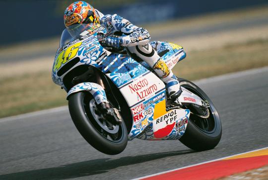
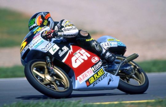
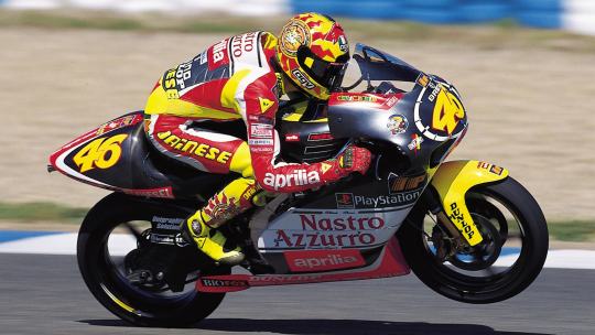
Note
This isn't the usual kind of ask you answer, but I've been working my way through the videopass archive sequentially and have been thinking about the historic/vintage livery that the teams are going to be using in Silverstone after the summer break quite a bit. Personally I'm very fond of the West Honda Pons' black and white livery especially with how they had the names of the riders on one side and the team name on the other, and obviously the gauloises and camel yamahas are iconic. But you've obviously watched a lot of the older seasons, so are there any liveries you'd like to see/which ones would you personally pick for the teams?
I too have been having thoughts about this! I do have some of my faves in a wee folder, and initially my picks were a bit limited in terms of range of years and teams. BUT let's do this properly. all eleven teams. my hot take for each and every one of them
CAVEAT NUMBER ONE look I don't know how 'design' or 'colour theory' or even 'taste' work. most of my reasoning doesn't extend beyond 'I thought this looks nice'
CAVEAT NUMBER TWO I also don't... quite know how this works in terms of who's allowed to use which livery? like not just the sponsor stuff, but would teams be able to use liveries from... idk, a different satellite outfit that was in the sport before they were? this ask mentions the pons liveries.... could honda teams actually use those? what if you don't have a lot of history? is anyone allowed to use mv agusta liveries? would teams go for special liveries, or just the regular ones? how strict are the rules for what you can use?
so. y'know. I'm really just guessing here what's even possible, which meant that for... uh. some of these teams. I did have to reach a bit to come up with a viable livery. let's just make clear this is all vibes and go from here
HONDA
they should have no problem with coming up with plenty of options. let's start with the west honda pons, which the ask references:
excellent pick, anon. if they can use this one, I'd very much support it! we're missing black bikes on the grid currently... this one's simple, it's classy, it's got a little bit of identity with the name written on the side. the dark red highlights work nicely. it's also a livery that, unlike some of the ones to follow, should still work well on the current bikes without losing its identity too much - though maybe you'd have to put some thought into how you'd place the actual name. should still be plenty of space though! and it'd be easily recognisable to fans who are familiar with the old livery, which I reckon is also an important metric
while we're on pons, shout out to the ducados honda pons livery:
nice shade of blue! nice design of the leathers! pleasing shape of the numbers! just has a lot of character and charm to it
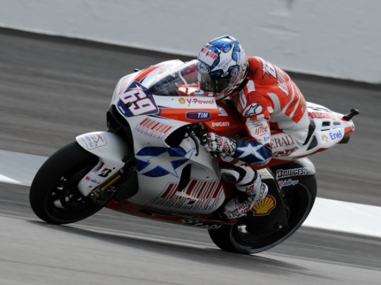
anyhow, let's get to the factory honda team. the VERY first pick that popped into my head was the special livery for aragon 2011:
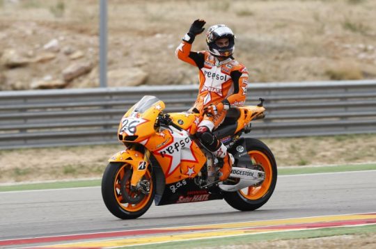
so I get that sense that plenty of people hate this livery and think it looks 'childish' and I'm sorry, but if you think that, congratulations on having bad taste. it's cute! honda barely ever has fun! look at how orange it is! look at the stars! there's a star on the leathers too! I'm fond of the way the front of the bike looks too, how the numbers are placed kinda messily on the star. this one's just, y'know, a bit more creative, something that's just different from how we usually expect liveries to look. screw classy and stylish, give me something with a bit of charm
moving back in time a little further, here's the valencia 2003 livery (valentino's last race with honda):
isn't she gorgeous?? I'd put that bike in my bedroom. lovely from every angle. if you look it up, you can find more photos to show it off properly - just see the sun on the top of the bike. really nice mix of the traditional repsol orange with the yellow, it all just works together. bright like the sun
and one more special livery from the early noughties (if not from the factory team), here's mugello 2001:
hardly a controversial choice, people love this one for a reason. it's pretty!! blue flowers!! this one should work reasonably well on the modern bikes too and obviously most fans should be able to recognise it. again, I don't know what the stance is on special liveries - but hey, it'd be fun to give a certain someone in your factory team a livery from this era
and going back further still, here's eddie lawson 1989:
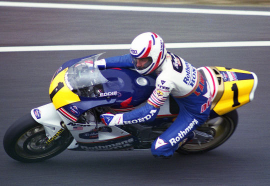
yes, it's rothmann's honda, yes, I've decided not to care. this is my personal top pick for honda. it should be recognisable even on the current bikes, it pays tribute to honda's long history by not just sticking to something from this century, and it looks cool. clean cut colours that are nicely separated out - I really like the yellow highlights on either side of the bike, plus the way the separation of the blue and white is handled on both the bike and the leathers. it's all quite clearly demarcated, but with nice details to give it character - those stripes on the front of the bike and on the the leathers. the touches of gold. the rider's name on the side of the screen. the number on the back of the bike. cool bit of history, too, like they stole that man away from yamaha and it certainly worked out for them. it's fun!
and one more jump to the past to hailwood's late sixties honda:
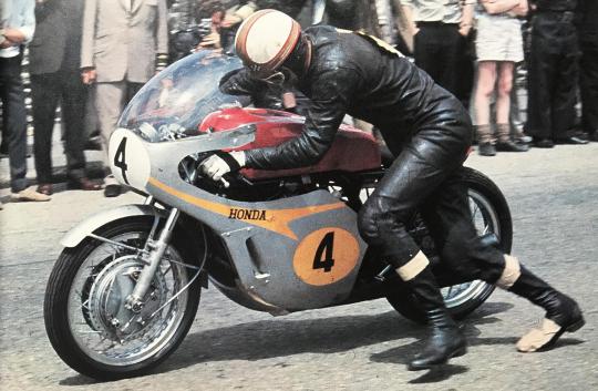
this one is proper honda #heritage and I'd totally get if they go with that. my main issue is... I'm not quite sure how it'd work on today's bike, shape-wise? like, the charm here is really the simplicity, the way the orange-gold spreads over the silver. does that work if you have all the bits sticking out everywhere? maybe somebody with a better understanding of design than me can figure it out, and I do like this one. the numbers look nice. idk. it's neat
LCR
well. I guess you'd want to go with one of the cecchinello liveries here? my problem with lcr is that they seem to generally be pretty big on their retro liveries anyway - the first one I thought of... basically looks like the 2021 lcr livery anyway? boring! done that! then there's a few years that are like... silvery, but, and I know this is an unfair way to go about this, I kind of feel I've already gone silvery with a few of my other picks and they're all nicer. so, here's my pick from 2000:
it's a bit busy, but that's kinda the fun of some of these older liveries. big chunk of red, some blue, the nice bright yellow number, even all the logos are kinda fun... I like the weird shape of the white line that separates the red and the black. I don't know, it just works for me as a complete package in a way some of the other lcr liveries don't
YAMAHA
yes, gauloises yamaha. my beloved. everyone's a fan for a reason
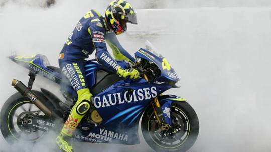
can't not mention it!! I do think valentino's version specifically works the best because of the extra bit of flare the yellow highlights provide here. but also the GO!!!!!! thing works on every version. it's fun! sometimes it's okay to go overboard with exclamation mark numbers! this one kinda hits the sweet spot as being proper classy but also joyous, enthusiastic. just overall very much a vibe
on camel yamaha, I do like the livery, but personally I do just associate it more strongly with camel honda? which was literally the same livery. that might not have been the factory team, but those were still serious frontrunners during the early noughties... and, well, it just doesn't feel specifically yamaha to me idk
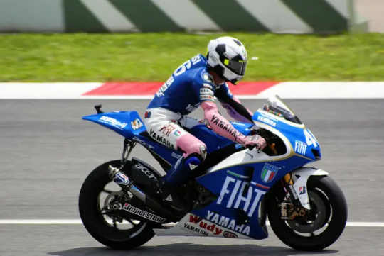
okay, I'm going to restrain myself here on the valentino livery front. yes, I too liked laguna and valencia 2005. I have only 30 images to play with here and I'm not going to blow half of them on valentino special liveries, so I'm going to stick to my two faves. assen 2007 and catalunya 2008:
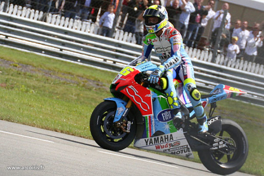
they're just! fun! when it comes to liveries in general, my basic criteria are a) can I easily figure out who's riding them, and b) do they make me smile. elegance is boring, give me something more quirky and memorable and FUN. assen is just. a lot. lots of colours, such a bright and cheerful livery that still works as a complete package. the bike's fun, the livery's fun, fabio would look fantastic in this one. and catalunya (in honour of the italian national team) is just a cool idea! the football helmet! the mock shirts! the pink sleeves! there's a real creativity and charm to this one - and at the same time, the base design of the bike is actually really lovely and stylish. also I associated both of these liveries with extremely fun valentino races that I'd definitely recommend (literally two of the top six vale/casey duels), which... well you can't say that about the two 2005 liveries I mentioned above is what I'd say
now, I know I just said forget laguna 2005, but of course laguna 2005 was in itself a reference to a past yamaha livery. so cut out 2005 and just pay direct homage to the iconic late seventies design, feat kenny roberts:
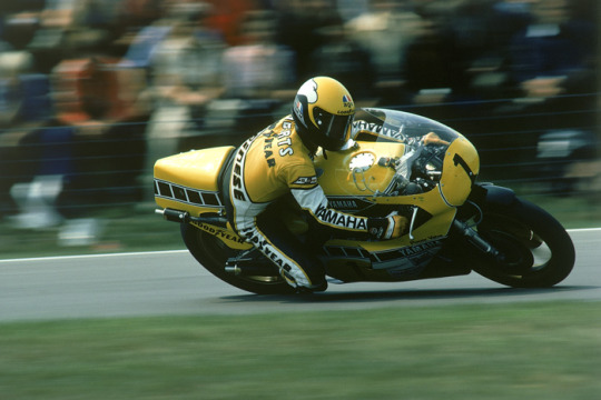
another one everyone loves for a reason! it's a nice shade of yellow, it works well with the white and black... the black dashed line thingies are of course iconic and they just make the whole thing quite dynamic and snazzy
and one more. marlboro liveries do unfortunately slap, plenty of them are fan favourites... look at this red one, feat. eddie lawson 1984:
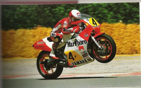
it's very. blocky. you've got the red bits the white bits the yellow bits. they have nice shapes. nice lines. the yellow bits where one's a circle type thingy and the other one's whatever you call that shape and then you've got the numbers on them. please don't read these descriptions. there's plenty of the marlboro liveries over the course of yamaha's time, but this one's my favourite. and it's the one I'd choose! I know it's super iconic but we already did a tribute to the 70s one back at laguna 2005. do this one instead! it's very yamaha but also a little more creative than the most obvious picks
DUCATI
well. if we're talking marlboro, then yes, of course the old marlboro ducati livery is very memorable:
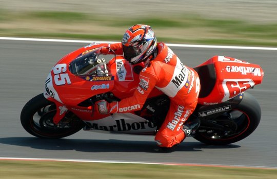
this is a bike that looks good. there's not much more to say about it (or, well, there probably is, but again it should be obvious I don't know how design works). it's a nice shade of red, I really like how the front looks... my issue with this one is that low key it is the marlboro logo that makes it particularly distinctive. kinda feels against the spirit of the whole thing, damn those tobacco companies and their lovely bike designs
here's mugello 2006, which in itself is a retro livery. I'll allow this one and I do think it's just?? very nice??
really pleasing dull colours, three shades that work together well, got something old fashioned to it. my main problem with this one is... I don't feel like it'd look as good on the current bikes? I don't know, this one works because of the kind of... soft curves of the front of the bike. I do also think quirky and a bit in your face just suit the current bikes better than trying to keep things too classy?
my general problem is that ducati history in motogp is like... we're working with a limited sample size. and when I go through the options I do find them a bit. meh. the thing is, right, the red bikes are nice, I do like the marlboro design, but it's also still essentially a red bike. and if you translate these designs to the current bike shape, it's not going to look THAT different to the bike they're riding any other week. the mugello 2006 probably does better on that account, but I don't know. I think I am kind of committed to making them all actually switch around colours here
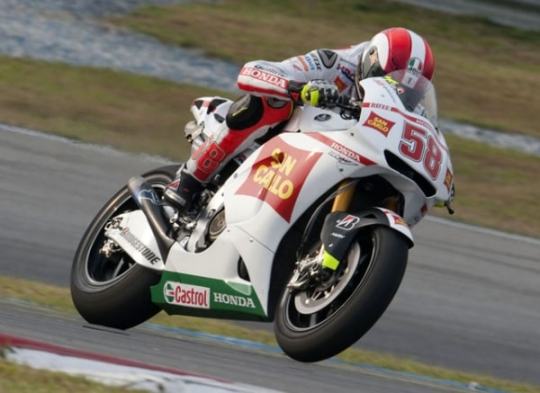
so I was wondering if maybe you could delve into the superbikes archive? you could go for the 2001 livery, feat. bayliss (also a motogp race winner):
I think the silver pairs quite nicely with the black leathers... also I like it whenever the bit on the front where they put the number on has a slightly quirky shape. I'm not going to pretend like this is my all time favourite livery, but I do like it well enough! it'd translate well to the current bikes, would give us a proper switch-up, works quite nicely imo
and one more from superbikes, this from 2012:
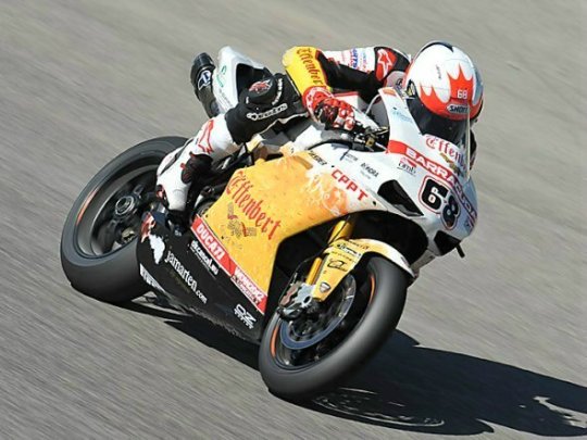
this one isn't happening for a bunch of reasons, not least because I doubt the effenbert team is one that's remembered particularly fondly by ducati. still, it passes the 'does it look distinctive' test to me, making a 'what if you threw a pint of beer over a motorcycle' livery is at the very least something different
PRAMAC
there's a few different ways you could go here, but I'd just keep it simple and go for one of the years where the pramac logo is big on one side of the bike. here's harada in 2002:
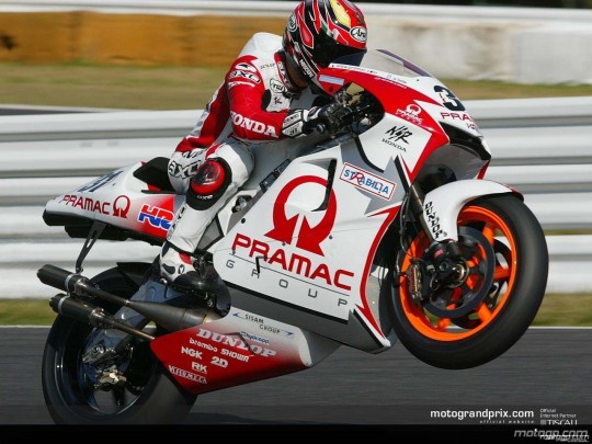
not a bad logo! you've got the arrows and everything! you've also got another more subtle silver arrow in the middle of all the white, makes the whole thing feel quite dynamic. simple colours, very pramac. bold and brash
(you could go for the 2018 mugello livery too but I philosophically reject having a 'retro' livery from 2018)
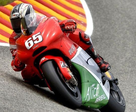
GRESINI
another satellite team that's been around for a while, and my suspicion is they'll go for one of fausto gresini's liveries. none of those... really appeal to me... so I wanted to suggest one from their telefonica movistar days back in the mid noughties. that's right: I'm talking sete's livery:
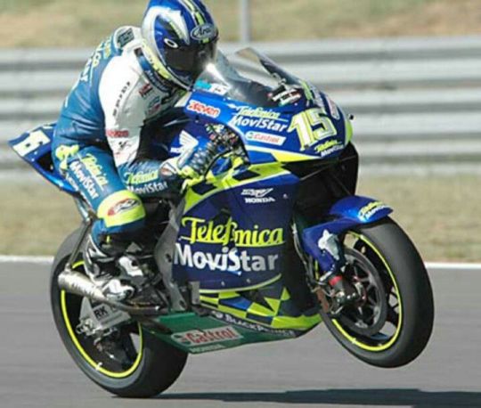
in practise, this livery does deeply annoy me in 2004 to 2005 because - despite not being in the same factories - you've somehow managed to get both title rivals in pretty damn similar liveries. like, can I tell them apart? sure. but especially with the poorer video quality, is it really necessary to make it this tricky? well! no! but also sete had this livery before his title rival switched to yamaha, so he came first. I like this one a lot! I like the way the yellow is integrated, the chequered bits around the telefonica movistar logo, good helmet too. slightly unusual patterns for the win - there's quite a lot going on with the lines on this design but it all kinda comes together. I actually think you could make this one look really good on the modern bikes, and it has a real spark and flare to it. also I would find it narratively pleasing if marc rides with sete's livery
but if gresini wants to go another way, shout out to their 2010 livery (several of the early 2010s look quite similar):
I'm not the biggest fan in the world of white liveries, but the style of this one pleases me idk. there's a slightly unusual shape on the side of this one, which I've already said I approve of. it's a nice shade of red to pair with the white. not my first pick, but I'd settle for this one
VR46
right, this is one where I really have questions. ... are they allowed to use just any of valentino's old liveries? what are the rules here? I think to maybe keep things straightforward here, I'll avoid his actual honda and yamaha liveries (those kids are not getting the gp11/12 let's be real) and stick to the lower class ones. now... those are aprilia liveries, and if aprilia wants to use some of those then please have at it. otherwise: vr46, lads, this is the way you want to go. here's 1999 (though 1998 also looks lovely):
one where the leathers and helmet really feels like a part of the design, like that's the bit that really completes the look. the dark grey base tone works as something you can layer all the fun stuff on. the font of the numbers! the warm reds and yellows! the stickers! this one's just FUN, it has a real adolescent verve and joy to it
and of course there's the mugello 1999 special livery:
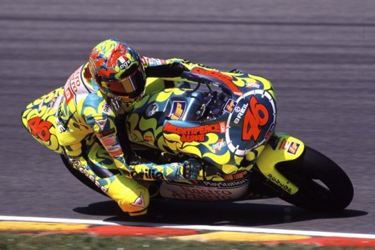
she's so pretty!! recognisable! I don't even know what to say about this one apart from. look. it's fun. just something youthful and joyous and energetic to the whole thing... keeps things pretty straightforward on the colour front, the dark orange-brown highlights really brings it all together. or something
APRILIA
so. here's another question. are we just stuck with premier class liveries here? because if so, it's pretty slim pickings... but look, thirty images, we're not getting into everything they've been up to in the lower classes
luckily, aprilia do have quite a nice 2002 entry in the premier class:
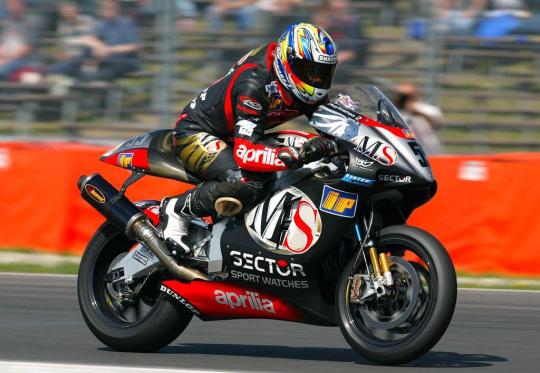
dark colours are fun sometimes!! I like the shape of the ms logo! it's a bit chaotic, but in a fun way! it feels very aprilia, somehow. this would be my pick I think, I could easily transpose this to the current bikes in my mind's eye. aprilia kinda feels like it's supposed to be a bit chaotic, all those bits sticking off. love the red sleeves of the leathers
you could also go for the 2004 livery:
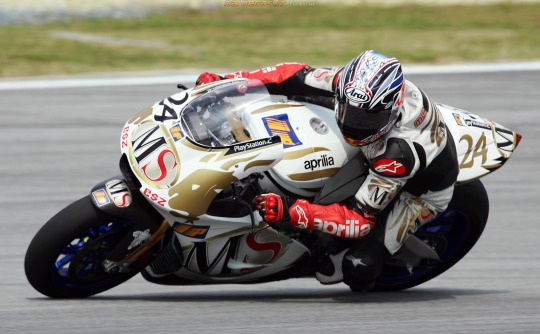
I'm not personally? super into the white and gold as a combination? definitely prefer the darker base colour of 2002. but it's quite distinctive - the red sleeves actually pop out more in this one. it's neat!
TRACKHOUSE
uh. um. uh. are they... allowed to run petronas colours? I mean it's basically still the same team? maybe they can borrow some aprilia ones? if not, then well they're the rahh rahh america team. I would ask ducati very nicely if maybe they could use this indianapolis 2009 livery in honour of the late nicky hayden:
I know you probably can't do that, but well! if you could, that'd be my pick for them! I like stars, america has stars on their flags, this is very rahh rahh america. the helmet and liveries are also fun and have stars on them. that's all I've got, sorry
KTM
okay, we've got an even bigger problem than aprilia here. these guys have NOT been in motogp long enough. my idea here was... so obviously ktm just do not have a suitable back catalogue of liveries, but aren't they like basically red bull? and red bull did like. a one off partnership with suzuki for laguna 2005, and suzuki isn't even in the sport any more so it's not like there's a CLASH there. I don't know how this works! whatever. I think it's nice!
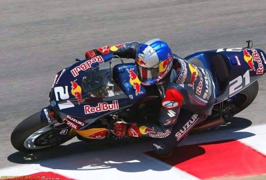
it's not the most exciting thing I've ever seen in my life, but the red bull logo works well on the black. looks classy! and if suzuki gets mad then well red bull can just chuck money at them idk
the other option is... doesn't ktm own mv agusta now? go for one of those! they look quite similar for much of a decade, so I could have included another hailwood photo here - but I'm just going to use the early seventies mv agusta instead:
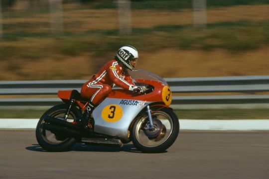
it's very simple, very basic. I'm not... sure this works on bikes these days. anyway I chose this one over its predecessor because I do like the stripes on the leathers, very adidas coded. if you can figure out how to make this whole design look good for the more complex bikes of today, then this would be a good pick imo. I like quirky shapes to put my numbers on... but sometimes circles are also good
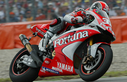
TECH3
so. for a while, these are running the gauloises yamaha liveries, which we've already covered. maybe they could take the fortuna yamaha liveries instead that they used, especially if the factory yamaha squad doesn't want the kinda similar ones they ran at certain points. basically they're the red yamahas in the noughties. I'd go for 2004 tech3, which... y'know, the fortuna font is just quite nice, they're stylish liveries, they're just bikes you look at and go 'wow that sure is a nice bike'. and yes, we do need to at this point also mention the estoril 2004 spiderman livery
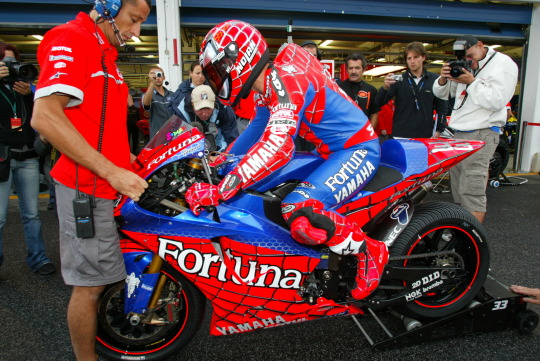
all I'm saying, if pedro acosta does not show up to silverstone on the spiderman bike. a part of me will be disappointed
otherwise, I thought the dunlops in 2007 were quite nice?
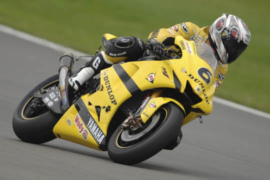
yes, yes, it's another yellow and black yamaha livery. but hey, it's a bit different from the one they referenced at laguna 2005, keeps things fresh. wouldn't mind this one
IN CONCLUSION
might add to these at some point, but those are kinda the first picks that come to mind! a lot of these are annoyingly recent, because most teams on the grid aren't that old. not quite sure what the rules of the game are here! which does mean that, as much as I enjoy the recent designs, I kinda hope honda and yamaha don't go for liveries from this century and dig a bit deeper in the archives
basically, what I'm looking for from the teams is a retro livery that a) is clearly recognisable to anyone familiar with said past livery, b) works with the actual shape of the current bike, c) looks different enough from their current livery, I want colour swaps, and d) looks cool. also, they should coordinate. istg if half of the grid shows up in white liveries... hopefully at least some of the teams will go for the fun ones!
#i don't feel like with old streams i ever SEE the liveries particularly clearly so some of them are a bit wasted on me#BUT my twitter for you page shoves like. so many photos of old liveries at me. so i've basically developed my takes through that#oh and obviously i know all the valentino ones. partly because i have my very nice reference book with very nice photos#also there's been a reddit thread on this like. once every two months for the past decade. that'll help#some of these are a REACH. ktm and trackhouse in particular but look that's all I could come up with#if ONLY suzuki were still in the sport#motogp#//#brr brr#batsplat responds#collected my photos during the race today which was nicely calming#anon icl I'm not sure there really is a type of question I usually answer. a wide range of stuff hits my inbox#I LOVE rating things even when I don't have like. sophisticated opinions. I'm just going colours pretty!!#I hate myself for this but when I saw the news I immediately went!! sete + marc livery!! gresini heritage!!#get that man in blue and yellow!!#also if anyone wants to add their own faves please feel more than free to. the thirty image limit really hurt with this one
9 notes
·
View notes
Text
if you shame or berate people for pirating things. please consider that being able to buy/watch/read/listen to/play things legitimately is a privilege
not even necessarily a "having the money" privilege but sometimes a "living in the right place" privilege or even a "speaking the language said thing happened to be released in" privilege
#getting into arcade rhythm games and fkmt's manga has convinced me piracy is not only okay but morally correct#i would LOVE to play chunithm or read akagi in the legitimate creator-approved way. unfortunately i live in the US and can't read Japanese#thinking abt that old woman yuri mangaka lamenting that english-speaking readers wouldn't be able to read her manga legitimately#to be clear she was 100% not the asshole she was nice abt it#just tragic all around#not to mention fan translators do awesome work for free but you usually don't get fan translations without what is technically reposting#i collect doujin and like so many american doujin collectors i discovered doujin through pirate sites#and i honestly have mixed feelings about it bc it's all art that was reposted without permission#but i've been able to read fanworks i otherwise just couldn't and i've found artists whose work is incredible#and whose books i would love to buy! but it's cost-prohibitive on both our ends#for an artist to get more than an extremely limited run of books printed and for me to pay for international shipping#a book that sells for under five dollars at a convention can be upwards of 20 dollars to buy and have shipped internationally#in a perfect world artists don't die without money and everyone is more normal about piracy
10 notes
·
View notes
Text
deseret book is more persistent than duolingo.
i ordered 2 books for a church research project on Black saints in the early Church and also in the Reorganization, on which the one book had a small section us and all had info from the our shared early church history, and it was an ebook too!
and i get physical mail from them once a month. i have no idea how to cancel.
herald house, the community of christ publishing house, contacts me much less, and i buy books from them all the time.
and oh their church book app reminds me to read my scriptures and the words of their prophets regularly if it's not in sleep mode.
i have to admire the effort behind it, ngl.
#tumblrstake#the Church of Jesus Christ of Latter-day Saints#Community of Christ#latter day saint#deseret book#i highly recommend both books#black saints in a white church#and “My Lord He Calls Me” edited by Alice Faulkner Burch#she's really awesome so pls support her#i hang out with the genesis group bc i am playing with a similar group for community of christ#because the Black saints expressed interest#actually Black Saints in a White Church may have been elsewhere by Signature Books#you can read it for free on archive.org#and if you're at BYU you can access it too and papers on it#i'll promo them in another post eventually#white saints in my church don't get my vision bc their like “we never had a priesthood ban”#but i literally had to do the project bc they were speaking over us regarding anti-Black racism in our D&C#and people individually reached out. like Black church leaders. bc they be doing this.#we made so much noise and the first presidency reached out to ME bc i wrote a paper that spread through the church about it#wild moment. but yeah we need something like the Genesis Group and they were willing to help me out a bit#its too much for me to handle on my own tho. esp with the revitalizing our intepretation and use of the Book of Mormon projects#i always put too much in the tags. i should write a post about that and share my article#it was on our D&C 116 which is like our L-dS OD 2 on Race in the priesthood and specifically ordination of Black men#which they (some of the white saints) wanted removed 🙄 bc of the “ministers to their own race” part which led to segregation being allowed#but also explicitly affirms God calls people of all races to priesthood and also that Black congregations didn’t need white pastor oversight#so just leave it. and ig you feel guilty...cope#i personally believe it to be inspired but flawed#it was literally a mostly white church in 1865. not excusing tho bc some sects were always fully integrated like the Bickertonites#they had a Black apostle in 1915. representation at high levels of leadership#oh and women in the priesthood from the jump. if limited
5 notes
·
View notes
Text
whyyyy are editors so expensive
#angel posts#thats what this book needs. a structure edit#i need someone to stick to my at the hip so i can ask ridiculously detailed questions and get a professional response to it#hhhhhhhh#angel writes#because ive noticed that for the betas and the free crits#they always all ignore when i say that im constricted by the word limit?#i say ''i cant add XYZ or do X bc of word limit''#''if you have suggestions on where to reduce the word limit let me know''#and they jsut dont see that#and then ask ''why isn't X thing you mentioned in the book???'' word limit#this book is like 123k#i cant do that for a debut#i need to reduce the word limit#it has to go down. DOWN. and i had it quite tight at one point!!#but then i blew it up again!#the lowest was 117k just......ugh#and beta readers often do go above 100k like do yall see my problem#and here i am. finding ways to add more words kajshdflksajdf
6 notes
·
View notes
Text
I need a truck driver to let me sit in on one of their hauls across country primarily so Nora my truck driver OC can feel real
#i wish i had the money and connections to study up for my comic that would have zero financial compensation#as in i want it to purposefully be free to read (physical copies would cost money but it would be a webcomic)#she's being informed by my limited experience w road trips but idek how to fill out those little truck books :(
2 notes
·
View notes
Text

holden caulfield, class of 1950
#catcher in the rye#classic literature#fanart#i've been making a yearbook-esque lineart of some of the characters#feel free to request any characters#not limited to pencey prep students!#+ other scenes from the book too!#drop em in my ask box or reply!#i appreciate all the support and engagement lately btw :)#he just gets more tired every time i draw him...#sul4intherye
19 notes
·
View notes
Text
im barely halfway thru my book club audiobook and the meeting is on wednesday oops
6 notes
·
View notes
Text
Free to Achieve
When we become aware that we create most of our life’s limits, we set ourselves free to holistically achieve what we really want and deserve.
You can get a copy of my book “Free to Achieve” on Amazon.

View On WordPress
#awareness#Book#Free to Achieve#free yourself#freedom#get rid of limits#Grow#Growth#Holistic#MMQG#QOTD#quote#Quote Of The Day#Raffaello Palandri
12 notes
·
View notes
Text
Hey friends! I recently got my driver’s license (FINALLY!!!!!), so, if anybody has any recipe recommendations—particularly dinner recipes of easy-to-moderate difficulty OR healthy snack-type things i could take to work—i am ALL ears because i’m about to enter my Meal Planning Era.
#i would also appreciate if some of said dinner recipes made good leftovers!#AND they have to be nut-free so i don’t die lol#those are my specifications#otherwise i’m looking to broaden my food horizons and will try just about anything#my thought is home-cooking about three dishes a week and filling out the rest with leftovers/soup i get from my favorite place#i want to SEVERELY limit my eating out bc i used to enjoy it - but now it honestly just makes me feel sick?????#idk if it’s the T shaking me up or what - but i can just FEEL that i need more nutrients#i wanna get back into exercising too but it’s hard when i feel so BLAH cuz i’m not eating right#so HELP ME OUT!!!!!#not ALL the recipes have to be Super Healthy either#as long as i’m home-cooking it - that’s healthy in my book!!#especially if i can squeeze some roasted veggies in there!#i already make steak and baked chicken and roasted potatoes and very basic salads#but otherwise i’ve really dropped the ball cooking-wise#so i’m completely open!#i am generally trying to stray away from pasta tho - just for another thing#bc i don’t want to consume as many Grains#i’m still having rye bread every morning - don’t get me wrong#but OTHER than that!!!!#ooooh i’d like spicy recipes too please!!#i’ve experimented and i CAN take the heat!!#my coworker and her husband actually make their own hot sauce that i am HYPE to buy once i’m meal planning#they grow their own peppers and everything! it’s cool as hell!!!!
14 notes
·
View notes
Last Seen Blogs

shelfcorporations
Wholesale Shelf Corporations

irelaventfangirl
Min Genius

ieshab1056833669-blog
A Handful Of review Ripoffs And Why You Should Put A Stop To

chelsowill01
Timeless

shelberssss15
Untitled