#html em tag example
Explore tagged Tumblr posts
Visit Tumblr Blog
Explore Tumblr blogs with no restrictions, modern design and the best experience.
Last Seen Tumblr Blogs


Fun Fact
69% of Tumblr users are millennials.
Note
sorry i couldn't find out how to ask on your other blog.
that book binding you posted is gorgeous btw !!
I noticed that in one of the photos you included the disclaimer that you also edited it. I just had a question about how you formatted the text.
one of my biggest gripes with AO3 is text formatting (i often feel like i'm reading a legal document vs a novel/story) . Did you change how it is formatted on AO3 compared to printed?
I feel like i'm in the 0.5% that hate AO3 formatting but i thought i might as well ask in case you have any tips for that. >,>
(also how do you decide on the page size, do you just choose a standard size for all your projects? or do you vary it depending on what you are binding?)
thanks so much for taking the time to answer and for sharing your projects :) !!!!!!!!!!!
hey anon! I have asks turned off for the sideblog, but happy to answer here. Thanks very much!
I'm taking this opportunity to info-dump and link a lot of resources. I think they're useful for people new to either typesetting or bookbinding, but not all are directly related to your queries. That said, hope this is of use!
one of my biggest gripes with AO3 is text formatting (i often feel like i'm reading a legal document vs a novel/story) . Did you change how it is formatted on AO3 compared to printed?
I do a fair bit of editing when I'm binding a fic; typesetting is often the longest part of the process. Your mileage will vary depending on your experience with using word processor software, particularly the paragraph style and page style settings. Another factor is how simple/complicated you want your typeset to look. Replicating a published novel in format is difficult but learnable for a complete beginner.
I'm not equipped to give a full tutorial on how to typeset, but I'll point you towards some useful resources for ficbinding then talk about my own process.
ArmouredSuperHeavy has a tutorial on how to make Ao3's HTML downloads into a printable book in Microsoft Word. I use LibreOffice Writer myself, so this adaptation of the same tutorial is what I follow. Both are very helpful to reference as you're learning the typesetting ropes.
Personally, I don't mess around with HTML. I find it easiest to start by doing a Ctrl+A copy of the Entire Work fic view on Ao3 then pasting that into my word processor. This video tutorial by Beautifully Bound runs through how to do this in Microsoft Word using an AO3 fic as an example, including the associated steps needed to make the fic look novel-like. This is probably the best tutorial to address your gripe with AO3 formatting. Other than that, I'd recommend looking into videos or tutorials about typesetting novels for print. Same idea, and you may get more hits than searching for fanbind/ficbind typesetting tutorials.
More under the cut! Once I start yapping, it's hard to shut me up 🤷♀️
As a point of comparison, here's one of my fics on Ao3 and the corresponding typeset side by side:


Beautifully Bound explains this in far better detail than I will, but off the top of my head, the steps involved:
making a new document and setting the default page size to whatever size I want the book's pages to be (A5 or A6 usually). You can also set the margins at this point, taking account of your printer settings.
CTRL+A and copying the entire work's text on AO3 then pasting it into the document.
removing all hyperlinks and AO3 frontmatter, things like the author tags, summary, notes, etc as well as any website text that got copied over alongside the fic.
(optional) running a spell check and ensuring grammar usage is consistent. For me that's substituting em dashes for hyphens between clauses, enforcing curly double quotation marks for dialogue, etc. LibreOffice Writer automates a lot of this with customisable settings, via Tools -> Auto-Correct. Here's also where to make sure character names are all spelled right, convert the text to or from US to UK English, etc.
picking out fonts for the body text, headers, page numbers, etc. This is where you'll want to use paragraph style settings. Page style settings also comes in clutch if, for example, you'd like different headers on alternating pages. I like having the author on the right, the fic title on the left.
setting the body text first line indent to whatever makes sense visually). This in particular helps make the fic feel more like a novel. You can also play around with line spacing and space between paragraphs at this stage. For this A6 typeset, I had a 0.75cm first line indent, 1.15 line spacing, and 0.15 spacing between paragraphs.
(optional) formatting the first line of the work to use small capitals and to add a drop caps to the first letter of the first word. Again, this is a convention in publishing which add a novel-like feeling to a printed fanwork.
Inserting page numbers, adding images, coming up with how I wanted the "copyright" page to look—optional for the most part, but these are details that make a fic appear more like a novel.
For multi-chapter works, there's extra work in formatting chapter titles as headings so that they're referenced correctly in the automatic table of contents word processors can generate.
Once you have a typeset you're happy with, and if you're considering printing and binding it as a book, then you'll need to look into how to create and print signatures. Personally, this is something I had to actually try (and mess up a bunch of times) before I got to grips with it. Understanding how both your printer and your PDF reader work, particularly printer margins and booklet print settings, is key.
I won't go into as much detail on this, but if it's something you have an interest in, I'd recommend starting with DAS Bookbinding's tutorial. DAS has tutorials for everything bookbinding related so when in doubt, check his channel! Plenty of other YouTubers also have good videos on making signatures.
This resource is extremely useful once you've got your head around how to print signatures manually, so here's a link for anyone in that space: GitHub Bookbinding Imposer. Essentially, this does the signature creation for you, removing the need for booklet print settings in your PDF reader.
also how do you decide on the page size, do you just choose a standard size for all your projects? or do you vary it depending on what you are binding?
I have access to both A4 and A5 sized paper and my printer can handle printing on either size. In bookbinding, normally two pages are printed per side of the paper (which are then folded in half as part of a signature). That is, when I print on A4 paper, it's to make an A5 sized book. Printing on A5 paper will yield an A6 sized book.
Before I begin typesetting, I'll usually know what paper I plan to use, so the typeset will be one size down from the paper. So far, I've made softcover pamphlets at A6 size and casebound books in A5. No real method of choice for me, it's whatever I feel most suits the project.
---
If you made it this far anon, thanks for reading! Here's links to a few general resources if bookbinding is something you'd like to explore more:
DAS Bookbinding (YouTube, bookbinding in all forms)
Sea Lemon DIY (YouTube, bookbinding and other crafts)
bitter melon bindery (YouTube, bookbinding, particularly beginner friendly!)
Jess Less (YouTube, demonstrations of fanbinding and re-binding existing novels)
Papercraft Panda (blog, lots of detailed tutorial on bookbinding)
Renegade Bookbinding Guild (collective and website, loads of fanbinding-specific resources from their members and they have a helpful Discord).
24 notes
·
View notes
Text
still day 1 - html
once again, technically not day 1, still doesn't matter,
common/basic html tags
<p> (closing </p>): creates a paragraph
<h1> (closing </h1>): creates a heading. this tag is used for the biggest headings in the page (example: a general, all encompassing title)
<h2> <h3> <h4> <h5> (closing </h2> </h3> </h4> </h5>): these four tags also create headings, each smaller than the next. h2 is bigger than h3 and so on (example: h2 can be used for a chapter title, and h3 for the title of each section of that chapter)
<h6> (closing </h6>): creates a heading. this tag is used for the smallest headings in the page
<strong> (closing </strong>): makes the text stronger, usually bolding it. this tag goes inside other tags, like <p> (example: <p>normal text <strong>bold text</strong> normal text</p>)
<em> (closing </em>): emphasizes the text, usually italicizing it. this tag goes inside other tags (example: <p>normal text <em>emphasized text</em> normal text</p>)
<a href="example"> (closing </a>): creates a clickable link. the link / path goes inside the quotes in the opening tag (in place of the word example that i put there for reference). the text you want to be able to click which directs to the link goes between the tags (example: <a href="link">text to be clicked</a>)
<br> (no closing tag): creates a line break inside a paragraph (since line breaks in the code are ignored). in other words, it sends the text after it to the next line, without creating a new paragraph, instead of having it stay in the same line as the text before it until it no longer fits
that was a lot but it's the basics i swear. also all these tags are used inside/between the <body></body> tags (explained in my "absolute basics" post which i will not link to right now sorry). that's it
26 notes
·
View notes
Note
any tips on how to write stuff for archive of our own?
we remember trying to start one once and it really confused us
Okay, so i'm going to write out my process for writing here to make sure I cover my bases <3
First thing's first, I never write it on AO3. I use google docs, but you can use any text editor you want
So for me the most important thing is to just write what makes you happy. If you find it hard to get started or find yourself getting hung up on details then my advice is to allow yourself to write a first draft that isn't perfect, that has flaws and goofs, and don't worry too much about finer points or details.
Seriously. I once read a post by a writer who says they always labelled their first drafts 'worst version' and that gave them the permission they needed to just get it all on the page.
Chances are, it's not as bad as you think. It's probably actually pretty good. And you got it all written down! Hardest part over!
You can always read through it and tweak and fix it as much as you want after.
Now, I suspect you're probably asking me about AO3's formatting. It uses limited HTML, so you need to do special codes before and after certain things if you want their appearence to change. Itallics, for example, before the word you want to emphasise you put <em> (it's short for emphasis), and after you put </em> in order to stop the effect.
I use this guide to tell me what different codes i need. It's like a cool cheat sheet and makes me feel like a spy.
Once I've done that I copy the text and paste it into the AO3 textbox. you can use the 'preview' button to check how your formatting has worked out, and if you need to fix anything you can.
Several times i forgot to close off my emphasis and ended up with half my document in italics. It was... a lot.
The rest of it is really just tagging. Make sure you tag the right fandom, if you're writing LU make sure you tag it as Linked Universe in the additional tags section. Any additional tags, genre, triggers, characters, throw them in.
Put in a quick description, and you're done! Ready to publish!
But more important than any of this is to have fun, and write what makes you happy.
Good luck with your writing, I hope this helps!
23 notes
·
View notes
Text
SEO for Developers: Technical Tips to Boost Your Website’s Ranking
As a developer, you might think SEO (Search Engine Optimization) is a marketer’s job. But the truth is, technical SEO is the backbone of every high-ranking website—and it’s your expertise that ensures search engines can crawl, index, and understand your site. At Coding Nectar (codingnectar.com), we’ve helped countless developers bridge the gap between code and visibility. Here’s how to optimize your website’s technical foundation for better rankings.
1. Start with a Lightning-Fast Website
Page speed isn’t just a ranking factor—it’s a user experience game-changer. Google prioritizes fast-loading sites, and studies show that 53% of users abandon pages that take longer than 3 seconds to load.
What to do:
Compress Images: Use modern formats like WebP and tools like Squoosh or ImageOptim.
Minify Code: Remove unnecessary characters from HTML, CSS, and JavaScript.
Leverage Caching: Implement browser and server-side caching (e.g., Redis, Varnish).
At Coding Nectar, we use automated build tools like Webpack to bundle and optimize assets during deployment. For example, lazy-loading images with <img loading="lazy"> can cut load times by 20-30%.
2. Master Mobile-First Indexing
Google now uses mobile-first indexing, meaning it primarily crawls the mobile version of your site. If your site isn’t responsive, you’re invisible to most search traffic.
What to do:
Test Responsiveness: Use Chrome DevTools or Google’s Mobile-Friendly Test.
Avoid CSS/JS Blockers: Ensure critical resources load first.
Use Fluid Layouts: Replace fixed pixels with rem, em, or % units.
Pro Tip: At codingnectar.com, we design all client projects with mobile-first frameworks like Tailwind CSS to ensure seamless responsiveness.
3. Fix Crawlability Issues
Search engines rely on crawlers to index your site. If they hit roadblocks, your content won’t rank.
What to check:
robots.txt: Ensure you’re not accidentally blocking critical pages.
XML Sitemap: Generate and submit a sitemap via Google Search Console.
HTTP Status Codes: Fix 404s (broken links) and 301-redirect old URLs.
Example: A client at Coding Nectar saw a 40% traffic boost after we fixed crawl errors caused by misconfigured rel=canonical tags.
4. Structure Data with Schema Markup
Schema markup helps search engines understand your content, increasing chances of earning rich snippets (e.g., star ratings, FAQs).
What to add:
JSON-LD: Embed structured data for articles, products, or events.
Breadcrumbs: Improve navigation and SEO with BreadcrumbList schema.
Tool Recommendation: Use Google’s Structured Data Testing Tool to validate your markup.
5. Optimize for Core Web Vitals
Google’s Core Web Vitals measure user experience through metrics like:
LCP (Largest Contentful Paint): Load time for the main content.
FID (First Input Delay): Time until the site becomes interactive.
CLS (Cumulative Layout Shift): Visual stability during loading.
What to do:
Prioritize above-the-fold content.
Defer non-critical JavaScript.
Use font-display: swap to prevent layout shifts from fonts.
Case Study: After optimizing Core Web Vitals for a SaaS platform, Coding Nectar reduced their CLS score by 75%, boosting organic traffic by 28% in 3 months.
6. Secure Your Site with HTTPS
HTTPS is a non-negotiable ranking signal. It encrypts data and builds user trust.
Steps:
Buy an SSL certificate (many hosts offer free Let’s Encrypt integration).
Force HTTPS by redirecting HTTP traffic via .htaccess or NGINX configs.
Update internal links to use https://.
7. Audit Regularly with SEO Tools
SEO isn’t a one-time task. Use tools like:
Google Search Console: Track performance and errors.
Ahrefs/Screaming Frog: Analyze backlinks and technical issues.
Lighthouse: Audit performance, accessibility, and SEO.
Pro Tip: Coding Nectar offers custom SEO audits (codingnectar.com/seo-audit) to identify hidden issues like duplicate meta tags or slow API calls.
Final Thoughts
Technical SEO isn’t about chasing algorithms—it’s about building websites that are fast, accessible, and easy for search engines to love. By focusing on speed, mobile optimization, structured data, and regular audits, you’ll create a foundation that drives organic growth.
At Coding Nectar (codingnectar.com), we blend cutting-edge development with SEO best practices to help businesses rank higher and convert better. Ready to optimize your site? Let’s turn your code into a traffic magnet.
1 note
·
View note
Text
The user wants a one-line alternate title for a specific legal proposal in Portuguese. The original title is "Proposta impede ação penal contra contribuinte que apresentar garantia a crédito tributário." They want HTML tags instead of Markdown. First, I need to understand the main points of the proposal. The key elements are: preventing criminal action against taxpayers, presenting a guarantee for a tax credit. So the title should highlight both the prevention of criminal charges and the requirement to provide a guarantee. Next, structuring the title. The main clause is about preventing criminal action, so "Impede Ação Penal Contra Contribuintes" should be in bold. Then specify the condition: those who present a guarantee for tax credit. Using italics for "que apresentarem garantia" and "crédito tributário" makes sense to emphasize those details. Now, substituting Markdown with HTML tags. Instead of **bold**, use tags. For *italics*, use tags. The original title uses "Proposta" as a heading, but maybe the user wants the entire title in HTML. Let me check the example they provided. The example starts with "Proposta:" in strong, then the rest with emphasis. So I should follow that structure. Putting it all together: Start with Proposta:, then the main clause Impede Ação Penal Contra Contribuintes who que apresentarem garantia for crédito tributário. That covers all parts and uses the correct HTML tags. Let me double-check the syntax and ensure there are no Markdown characters. Looks good. The title is concise and includes all necessary elements with appropriate emphasis using HTML. Proposta: Impede Ação Penal Contra Contribuintes que apresentarem garantia para crédito tributário
Eu preciso reescrever o conteúdo fornecido. Primeiro, vou ler o texto original para entender os pontos principais. O projeto de lei em questão é o PL 168/25, que afirma que, se um contribuinte fornecer garantia total para uma dívida tributária durante uma ação fiscal, não será processado por crimes fiscais. O principal argumento é que é um desperdício de recursos públicos e coerção injusta se um…
0 notes
Text
I cannot actually tell you how this works with a screen reader (as I am not confident in my accessibility competency). But what I CAN tell you is that while this would technically work, I would not recommend using this exact method
Use <span title="hover text">fic text</span> instead!
Here's why:
First, some Vocab:
A Tag is the thing between the < and > brackets that has a name. <div> is a tag. <p> is a tag. <i> and <b> used to be tags, but are obsolete as of now, and it is recommended to use <em> and <strong> respectively. There are lots of tags, which all do different things and serve diff purposes.
My favorite resource for HTML tags is the handy comprehensive list hosted on W3Schools, because it keeps track of obsolescence and gives definitions and examples. Remember that not ALL tags that exist are usable on AO3, but you can cross reference the full list with the AO3 HTML guide.
Anyway.
MOST Tags usually need a start tag and an end tag, like in <p>Sentence goes here</p> so that the Stuff (browser, webpage, etc) knows exactly where and what the Tag is affecting/targeting. The stuff between the Start and End is what the Tag affects. This is how OP selects the 'foreign language' (language that isn't the primary language the fic is written in) for the hover effect.
To make this hover effect, what OP is doing is taking advantage of an Attribute. In HTML, an Attribute is a kind of metadata for a tag. There are lots of attributes that all do different things.
The Title attribute is a kind of "Global" attribute, meaning it is largely usable across most all tags (with notable exceptions), and has a standard function which works in most cases.
The Title Attribute is used to log basic extra information about what is in the tag. It is often used for explaining abbreviations, naming conventions, and lots of other things. It's a very good attribute for this purpose!
A quick google search tells me that most screen readers can access and read this attribute, but again, I'm not experienced with screen reader accessibility so the nuances of this is not my wheelhouse.
I am aware that this sort of thing is exactly why accurate and clean tag/attribute choice is so important though...
Which brings me to why I recommend this change to OP's Idea:
The DIV tag and the SPAN tag are both kinds of tags which are used to segment out parts of a page. They are actually mirror pairs, of sorts, serving identical functions in different hierarchical niches.
In this, I think we have a very good start.
However
DIV tags are default Block display tags. In general, they are on the same rung of tag hierarchy as a <p> (paragraph) tag, which means (unless you are getting very fancy and have a technical reason to use DIV specifically), you do not want to use DIV for embedding information inside a preexisting paragraph.
In contrast, SPAN displays as Inline by default. To make a comparison, a <span> tag is much more alike to <i>, <b> <em> and <strong>: they are all tags which are meant to affect the text without disrupting the shape of how it is displayed, in-line with the rest of the paragraph.
Some of display issues OP is probably talking about would likely be solved by changing from DIV to SPAN. Most issues with display on AO3 have to do with how Rich Text ends up translating into HTML (re: badly, because richtext has a stupid amount of meta that is inconsistent from source program/app to source program/app and often confuses poor AO3's converter).
this is why i write everything in plaintext and hardcode my italics and bolds and such using html from the start
Anyway what I'm getting at is choosing the right Tag is super important, whether youre tagging your fic so readers can filter for it, or hard coding fun accessibility features into your fic <3
with love ~ a hobbiest coder who knows html okay
A Simple Trick for Fic Writers
Hey, if you're a fic writer and a character speaks in a different language, you don't just have to add the translation in the notes. Use the following HTML coding to add 'text on hover' to the word(s). If the reader is on a computer they can hover over the text to see the translation.
<div title="This is the text in the box!">This is the text that shows in your fic!</div>
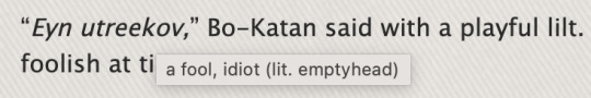
Here are some examples from a fic on my AO3.
This coding here <div title="a fool, idiot (lit. emptyhead)">Eyn utreekov</div> will show this on hover.
This next example shows that you can add a lot of text. The formatting is the same as above.

PS: When doing this, there may be spacing issues, but you can edit the text through AO3's html or rich text editor. From there you can add italics (like I did), bold, etc, and fix any weird spacing issues. Just be careful not to delete the coding that you worked so hard on 😂
16K notes
·
View notes
Text
HTML Text Formatting

HTML provides various tags to format text, allowing you to change the appearance and structure of your content. Here's a guide to the most commonly used text formatting tags in HTML:
1. Headings
HTML provides six levels of headings, from <h1> (most important) to <h6> (least important). Headings are used to create titles and organize content hierarchically.<h1>Main Heading</h1> <h2>Subheading</h2> <h3>Sub-subheading</h3> <h4>Sub-sub-subheading</h4> <h5>Sub-sub-sub-subheading</h5> <h6>Smallest Heading</h6>
2. Paragraphs
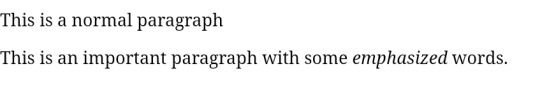
Paragraphs are used to group blocks of text together. HTML automatically adds space before and after paragraphs.<p>This is a paragraph of text. Paragraphs are block-level elements, meaning they take up the full width available.</p>
3. Line Breaks
To create a line break within a paragraph or other text, use the <br> tag. This tag is an empty element and doesn’t have a closing tag.<p>This is the first line.<br>This is the second line, on a new line.</p>
4. Horizontal Lines
A horizontal line (thematic break) can be created using the <hr> tag. This is often used to separate sections of content.<p>This is some text before the line.</p> <hr> <p>This is some text after the line.</p>
5. Bold Text
To make text bold, you can use the <b> or <strong> tag. While both tags visually render text in bold, <strong> also indicates that the text is of strong importance.<p>This is <b>bold</b> text.</p> <p>This is <strong>strong</strong> text, which also has semantic importance.</p>
6. Italic Text
To italicize text, you can use the <i> or <em> tag. The <em> tag emphasizes the text semantically, meaning it can affect the way assistive technologies interpret the content.<p>This is <i>italicized</i> text.</p> <p>This is <em>emphasized</em> text.</p>
7. Underlined Text
To underline text, use the <u> tag. This is not as commonly used today due to styling being handled by CSS, but it's available in HTML.<p>This is <u>underlined</u> text.</p>
8. Superscript and Subscript
Superscript: The <sup> tag raises text slightly above the baseline, often used for exponents or footnotes.
Subscript: The <sub> tag lowers text slightly below the baseline, often used for chemical formulas.
<p>This is superscript: x<sup>2</sup></p> <p>This is subscript: H<sub>2</sub>O</p>
9. Strikethrough Text
To strike through (cross out) text, use the <s> or <del> tag.<p>This is <s>strikethrough</s> text.</p> <p>This is <del>deleted</del> text, often indicating something that has been removed.</p>
10. Monospaced (Code) Text
To display text in a monospaced (fixed-width) font, typically used for code, use the <code> tag.<p>This is <code>inline code</code> within a paragraph.</p> <pre> <code> function example() { console.log('This is code'); } </code> </pre>
11. Small Text
The <small> tag decreases the font size of the text, often used for disclaimers or fine print.<p>This is normal text.</p> <p>This is <small>small</small> text.</p>
12. Marked Text
The <mark> tag highlights text with a yellow background, similar to using a highlighter.<p>This is <mark>highlighted</mark> text.</p>
13. Quotations
Inline Quotes: The <q> tag is used for short quotations and automatically adds quotation marks.
Block Quotes: The <blockquote> tag is used for longer quotes, usually indented.
<p>This is an inline quote: <q>To be or not to be, that is the question.</q></p> <blockquote> This is a block quote. It is usually used for longer quotations. </blockquote>
Source: Understanding HTML: From Basics To Advance
0 notes
Text
Mastering the Fundamentals of HTML, CSS, and JavaScript
In addition to the tags mentioned above, HTML also provides a wide range of tags for formatting text, creating lists, embedding media, and more. For example, the <strong> tag is used to emphasize text, while the <em> tag is used to italicize text. The <ul> tag is used to create an unordered list, and the <ol> tag is used to create an ordered list. HTML also allows you to embed images, videos,…

View On WordPress
0 notes
Text
Creating Curved Elements with CSS: Elegant Design

Introduction
Welcome to the world of elegant web design where every curve tells a story! In this blog post, we'll delve into the art of creating curved elements using the power of CSS. From subtle rounded corners to sophisticated gradients, we'll explore how these techniques can add a touch of class and finesse to your website's visual appeal.Whether you're a seasoned developer looking to refine your design skills or a newcomer eager to learn the ropes, join us on this journey to discover the secrets of crafting aesthetically pleasing curved elements with CSS.
Understanding CSS Basics

Before we embark on our journey to create beautifully curved elements, let's ensure we have a solid grasp of the CSS fundamentals.CSS (Cascading Style Sheets) is the language used for styling web pages. It allows you to define how HTML elements should appear on the screen. Here are some key concepts to refresh your memory: - Selectors: CSS uses selectors to target HTML elements. It can be as simple as selecting a specific tag (e.g., p for paragraphs) or more complex with class and ID selectors. - Properties and Values: Each CSS rule consists of a property and a value. The property defines the aspect you want to style (e.g., color, font-size), and the value specifies how you want to style it. - Box Model: Understanding the box model is crucial. Every HTML element is considered a box with content, padding, border, and margin. Manipulating these components allows you to control the element's layout. - Flexbox and Grid: CSS offers powerful layout models like Flexbox and Grid. These tools simplify the arrangement of elements in a responsive and efficient manner. Now, let's relate these basics to our goal of creating curved elements. The border-radius property, which we'll explore in-depth later, is a fundamental CSS property for achieving curved edges. It defines the radius of the element's corners, allowing you to create circles, ellipses, or any curved shape you desire.As we proceed, keep in mind that a solid understanding of CSS basics forms the foundation for mastering advanced styling techniques. Whether you're adjusting colors, fonts, or layouts, these fundamentals remain essential to crafting a visually appealing and well-structured website.
Curved Borders in CSS
Now, let's dive into the exciting realm of curved borders using CSS. The border-radius property is your gateway to achieving elegant, rounded corners for HTML elements.The Basics of border-radius:At its core, border-radius enables you to control the curvature of an element's corners. You can apply it to various HTML elements, from simple divs to complex images. Here's a quick breakdown: Value Description length Defines the radius in pixels, em units, or other valid length units. For example, border-radius: 10px;. percentage Specifies the radius as a percentage of the element's width. For instance, border-radius: 50%; creates a perfect circle. multiple values You can provide up to four values to set the radius for each corner individually. For example, border-radius: 10px 20px 15px 5px;. Creating Different Shapes:By manipulating the border-radius property, you can fashion a variety of shapes. Want smooth, circular buttons? Use border-radius: 50%;. Interested in elliptical shapes? Specify different horizontal and vertical radii.Combining with Other Properties:For a truly polished look, consider combining border-radius with additional properties like box-shadow to add depth or background gradients for a sophisticated touch.Keep in mind that while curved borders bring a sense of style, it's essential to strike a balance. Overusing rounded corners might dilute their impact, so apply them thoughtfully to enhance your website's overall design.As we continue our exploration, get ready to elevate your design game by incorporating curved borders into your CSS toolkit.
Gradient Backgrounds for Elegance
Let's take our design journey to the next level by exploring the captivating world of gradient backgrounds in CSS. Gradients offer a seamless transition between two or more colors, adding depth and sophistication to your webpage.The Basics of CSS Gradients:Creating gradients is surprisingly straightforward in CSS. The linear-gradient and radial-gradient functions allow you to define the gradient's direction and shape. Here's a quick overview: Function Description linear-gradient() Produces a linear gradient, allowing you to specify the direction. For example, background: linear-gradient(to right, #ffcc00, #ff6699);. radial-gradient() Creates a radial gradient, radiating from the center. You can customize the shape and colors, like background: radial-gradient(circle, #3399ff, #3366cc);. Adding Gradients to Curved Elements:Now, let's combine gradients with our curved borders for a truly elegant design. Apply the background property with the gradient function to the element with a defined border-radius. The result is a harmonious blend of curves and colors that can elevate your website's visual appeal.Color Stops for Smooth Transitions:Enhance the subtlety of your gradients by using color stops. These allow you to control where and how colors transition within the gradient. Specify the position and color for each stop, ensuring a smooth and polished look.Responsive Considerations:As with any design element, it's crucial to consider responsiveness. Gradients can be responsive by using relative units like percentages. This ensures that your gradient backgrounds adapt gracefully to different screen sizes.Remember, the key to using gradient backgrounds lies in moderation and purpose. Thoughtfully chosen color schemes and well-crafted gradients can transform your curved elements into visually stunning focal points, enhancing the overall elegance of your website.
Shadows and Highlights
As we continue our exploration of crafting elegant designs with CSS, let's delve into the art of shadows and highlights. These subtle visual elements can add depth and dimension to your curved elements, creating a captivating user experience.Box Shadow Property:The box-shadow property in CSS is your go-to tool for creating shadows. It allows you to cast shadows from the frame of an element, simulating the way light interacts with objects in the real world. Here's a quick breakdown: Value Description offset-x Horizontal offset of the shadow. Positive values move the shadow right, while negative values move it left. offset-y Vertical offset of the shadow. Positive values move the shadow down, while negative values move it up. blur-radius Optional. Increases the size of the shadow, creating a blurred effect. A value of 0 produces a sharp shadow. color Specifies the color of the shadow. Use rgba for a transparent shadow. Highlights with CSS:While CSS doesn't have a specific property for highlights, you can simulate the effect using gradients and transparency. Create a gradient background that is lighter at the top or on one side, giving the illusion of a highlight. Adjust the opacity for a subtler touch.Combining Shadows and Highlights:For a truly polished and three-dimensional look, consider combining shadows and highlights. Experiment with different shadow offsets and highlight positions to find the perfect balance. This technique can make your curved elements pop off the screen, creating a visually engaging design.Performance Considerations:While shadows and highlights contribute significantly to aesthetics, be mindful of their impact on performance. Excessive use of shadows, especially with large blur radii, can affect page rendering speed. Strike a balance between visual appeal and performance optimization for an optimal user experience.With shadows and highlights in your design arsenal, you're equipped to infuse a sense of realism and sophistication into your curved elements, elevating the overall visual charm of your website.
Responsive Design Considerations
In the dynamic landscape of web design, ensuring that your curved elements look stunning across various devices and screen sizes is paramount. Let's explore the key considerations for achieving responsive design with curved elements in CSS.Fluid Measurements for Curves:When working with curved elements, it's essential to use relative units instead of fixed ones. Consider using percentages or em units for properties like border-radius to ensure that the curvature adjusts proportionally to the container's size. This approach guarantees a seamless transition between different screen dimensions.Media Queries for Breakpoints:Implementing media queries is a fundamental practice for responsive design. Define breakpoints where your curved elements may need adjustments to maintain visual harmony. Whether it's altering the curvature or modifying shadow effects, media queries allow you to tailor the design for specific screen widths.Flexible Grid Systems:Integrate flexible grid systems like Flexbox or CSS Grid to enhance the responsiveness of your overall layout. These tools enable you to create designs that adapt gracefully to diverse screen sizes while maintaining the integrity of your curved elements.Image and Gradient Optimization:Optimize images and gradients to strike a balance between visual appeal and loading performance. Use responsive image techniques, such as the max-width property, to ensure images scale appropriately on smaller screens. Similarly, adjust gradient color stops or switch to simpler gradients for improved performance on mobile devices.Testing Across Devices:Regularly test your website on various devices and browsers to identify potential issues with curved elements. Embrace a mobile-first approach during development, focusing on optimizing for smaller screens before progressively enhancing for larger displays.Accessibility:Consider the accessibility aspect of curved elements. Ensure that they remain user-friendly for individuals with disabilities, especially on touch devices. Aim for sufficient contrast, provide alternative text for images, and verify that interactive elements remain accessible through various input methods.User Experience Continuity:Strive for a consistent user experience across devices. Curved elements should not only adapt to different screen sizes but also maintain a cohesive design language. This ensures that users feel at home, regardless of the device they're using to access your website.By incorporating these responsive design considerations into your approach, you'll create a user-friendly and visually appealing experience, where curved elements seamlessly adapt to the diversity of the digital landscape.
Animation for a Touch of Sophistication
Bring your curved elements to life by incorporating subtle animations that add a touch of sophistication to your web design. CSS provides powerful tools for creating animations that engage users and elevate the overall user experience.The Power of CSS Animations:CSS animations allow you to apply gradual changes to CSS style properties over time. For curved elements, animations can introduce smooth transitions, create attention-grabbing effects, and enhance the overall visual appeal of your website.Transitions for Smooth Changes:Start with CSS transitions to achieve simple, smooth animations. The transition property lets you specify the property to be animated, the duration of the transition, and the timing function for acceleration or deceleration. Apply transitions to properties like border-radius to create elegant, gradual changes in the curvature of your elements.Keyframe Animations for Custom Effects:For more complex and custom animations, delve into keyframe animations. Define keyframes using the @keyframes rule, specifying the style changes at different points in the animation. This allows you to create dynamic effects, such as pulsating or bouncing curved elements, adding a layer of interactivity and charm.Considerate Timing and Delays:Adjust the timing of your animations for optimal user experience. Too fast or too slow animations can be jarring. Experiment with different durations and delays to find the sweet spot that enhances the elegance of your curved elements without distracting the user.Responsive Animation:Ensure that your animations are responsive by using relative units and percentages. This allows your animated curved elements to adapt gracefully to various screen sizes, providing a consistent and delightful experience across devices.Subtle Hover Effects:Implement subtle hover effects to make your curved elements interactive. A slight change in color, shadow, or curvature on hover can create an engaging and responsive feel, inviting users to interact with the design elements.Performance Considerations:While animations contribute to a visually appealing design, be mindful of their impact on performance. Optimize animations for smooth rendering and consider using hardware acceleration for improved performance, especially on mobile devices.With the judicious use of animations, you can infuse a touch of sophistication into your curved elements, making your website not only visually appealing but also memorable and engaging for your audience.
Optimization for Performance
As we strive for visually stunning curved elements on our website, it's crucial to balance aesthetics with performance. Optimization ensures that your web pages load quickly and provide a smooth user experience. Let's explore key strategies to optimize the performance of your curved designs.Minification and Compression:Start by minifying and compressing your CSS files. Minification removes unnecessary characters and spaces, reducing file sizes. Compression, achieved through tools like Gzip, further decreases the size of files during transmission. This results in faster loading times for your curved elements.Image Optimization:Curved elements often involve background images or decorative elements. Optimize these images by using the appropriate file formats (JPEG for photographs, PNG for images with transparency) and compressing them without compromising quality. Implement responsive image techniques to serve different sizes based on the user's device, reducing unnecessary data transfer.Lazy Loading for Non-Essential Elements:If your page contains curved elements that are not immediately visible, consider implementing lazy loading. This technique defers the loading of non-essential elements until they are about to come into view, reducing the initial page load time. This is particularly beneficial for websites with extensive content and numerous curved design elements.CSS and JavaScript Optimization:Optimize your CSS and JavaScript code by removing unused styles and scripts. Tools like PurifyCSS can help identify and eliminate unused CSS rules, while minification and bundling tools reduce the size of your JavaScript files. This streamlines the code execution process, improving overall page performance.Browser Caching:Leverage browser caching to store certain resources locally on the user's device. This reduces the need to repeatedly download assets, improving load times for returning visitors. Configure your server to set appropriate cache headers for assets like CSS, JavaScript, and images.Content Delivery Network (CDN):Implement a Content Delivery Network to distribute your website's assets across servers worldwide. This reduces latency by serving resources from a server geographically closer to the user, resulting in faster loading times for curved elements and other page content.Performance Monitoring:Regularly monitor your website's performance using tools like Google PageSpeed Insights or Lighthouse. These tools provide insights into potential bottlenecks and suggestions for improvement. Addressing performance issues promptly ensures that your curved elements maintain their elegance without sacrificing loading speed.Remember, optimization is an ongoing process. Regularly review and update your strategies to accommodate changes in content, user behavior, and web technologies. By prioritizing performance, you can provide users with a seamless and delightful experience while showcasing your beautifully curved design elements.Responsive login form with fun animation ✨ Using HTML, CSS and JS. CodePen link below 👇 pic.twitter.com/PweePGE6yH— Viki ✨ (@viki_code) November 7, 2023
FAQ
Explore the frequently asked questions to gain a deeper understanding of creating curved elements with CSS for an elegant design. - Q: Can I apply curved borders to any HTML element? A: Yes, the border-radius property can be applied to various HTML elements such as divs, buttons, and images, allowing you to create curved corners and edges. - Q: How can I create a circular element with CSS? A: To create a circular element, set the border-radius property to 50% for equal curvature on all sides. For example, border-radius: 50%;. - Q: What is the significance of using gradients with curved elements? A: Gradients add depth and sophistication to curved elements by smoothly transitioning between two or more colors. This technique enhances the visual appeal of your design, providing a polished and modern look. - Q: How can I optimize curved elements for performance? A: Optimize performance by minifying and compressing CSS files, optimizing images, implementing lazy loading for non-essential elements, and leveraging browser caching. Regularly monitor performance using tools like Google PageSpeed Insights. - Q: Are there responsive considerations for curved designs? Read the full article
0 notes
Text
So far the only thing I've used the course I took in System Design and User Interface is to know how to format my fics to be screen reader friendly. So yeah! If you put a bunch of fancy symbols, text to speach is going to read the full name to them one by one. So use the <hr> html tag instead (hr as in horizontal line)
Another tip is knowing the difference between <em> (as in emphasis) and <i> (as in italic). Visually they appear the same, but screen reader treat them differently. So for example if a character is stressing a particular word in dialogue you'd use the <em> tag:
"I don't <em>want</em> to"
Where as if it's a place name, foreign language word, title or similar, you'd use the <i> tag like so:
<i>Bohemian Rhapsody</i> was playing on the radio
A small request from a very dyslexic person to fanfic writers. Would you be so kind to use the ao3 scene break deviders or just the age old *** because some of y'alls scene divider techniques make my ears bleed when using tts.
#putting this here since it's fandom specific:#but spell names should also just be italicized without emphasis#archive of our own#ao3#fanfiction writing#fanfic writing
12 notes
·
View notes
Text
HTML em Tag
The HTML <em> tag is used define emphasized text.It emphasizes the text inside the <em> tag by using verbal stress and the browser renders the text in italic. Syntax <em>Text Content...</em> Example <!DOCTYPE html> <html> <head> <title>HTML em Tag</title> </head> <body> <p>This is a normal paragraph</p> <p>This is an important paragraph with some…
View On WordPress
#b tag#curso em vídeo#em tag#em tag examples#em tag html#em tag html 5#em tag in bangla#em tag in html#em tag in html in hindi#em tag vs i tag#how can use em tag#how em tag#html em tag#html em tag example#html em tag tutorial#html i tag#html5 em tag#i tag#i tag & em tag in html#i tag and em tag#i tag in html#i tag vs em tag#learn em tag#strong tag#tag em#tag em do html5#tag em html
0 notes
Text
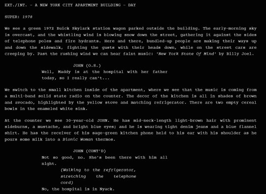
New AO3 Script / Screenplay Tutorial
Some time back I posted a tutorial for how to format CSS and HTML for a screenplay on AO3, but since then I have improved upon it and I wish to now share with you all the (hopefully somewhat better) new version.
I previously had a significant problem with the spacing of certain elements, which would end up breaking the formatting. So recently I spent two days studying and trying code after code until I got it right.
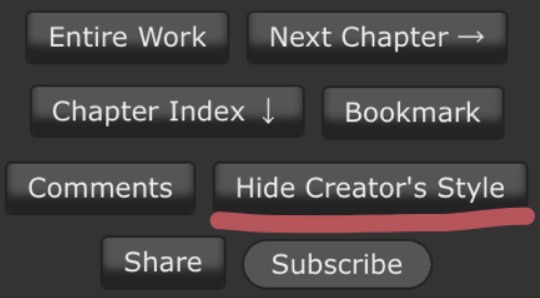
Note that though this formatting makes the screenplay look authentic enough on a computer monitor or on mobile in landscape mode, it does not (in my experience) tend to show up well in portrait mode. This version is at least readable in portrait mode, however, whereas the old version was not. Still, you might like to make an author’s note mentioning that readers in portrait mode may need to use the “hide creator’s style” button, which will take away the formatting:
Okay, let's get to work! First you are going to have to create a new AO3 work skin. Name it whatever you like, then insert this code:
#workskin p { font-family: "Courier Prime", Courier, monospace; text-align: justify; text-justify: inter-word; }
#workskin p { margin-left: 5%; }
#workskin p { margin-right: 15%; }
#workskin .indented { padding-left: 15%; padding-right: 25%; text-align: justify; text-justify: inter-word; }
#workskin .par { display: block; padding-left: 15%; padding-right: 25%; }
#workskin .character { display: block; padding-left: 25%; }
You can adjust things like the margin and padding percentages to fit your own style, of course!
Now comes the fun part. After you have written your script, make a new draft using your screenplay skin. Then get onto the HTML editor.
The SHOT, SCENE HEADING, and ACTION elements will be left alone. The only tagging necessary for them is < p > (close up the < and >, of course... Tumblr is giving me a hard time about showing it as it really should be) for paragraph transitions. But do be sure to use the < p > tag, or it will break the formatting.
Next are the CHARACTER, PARENTHETICAL, and DIALOGUE elements... which are a bit more involved.
Before blocks of character/parenthetical/dialogue, you need to put the following tag (with closed up < & >): < div class="indented" align="left" > . Note that if there is more than one Character involved with no action breaks in between (in other words, if there is a conversation going on), you do not need to put the tag between each character, just before the first one. Like so:
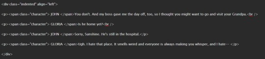
And be sure to close it back up after the blocks of conversation with < /div >
Next up is CHARACTER, which, as you can see above, is tagged: < p >< span class="character" > CHARACTER NAME< /span >
Notice that there are no line breaks between the < /span > and the dialogue. Due to the nature of < span > if you try to put a line break in there it will turn it into a paragraph break, which doesn't work well for the screenwriting thing. I am sure there is a workaround, but that's what I got for the time being!
Now we come to PARENTHETICALS, which are the bits of action within dialogue:
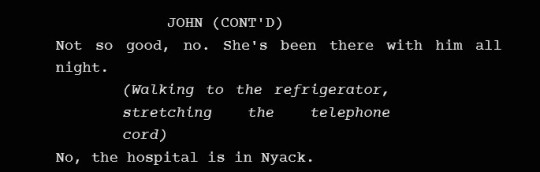
To tag those, once again do not make a line break, but simply insert this: < span class="par" > then close it after inserting the parenthetical with < /span >
It might be easier to simply visualize, but note that as a personal preference I tend to italicize my parenthetical elements with < em >... you don't have to, that's just my style:

And that is basically it! If you would rather just look at the code than to try and figure out what I was trying to explain (I am not sure I did a good job of that!), here is a basic visual:
This:

Should get you this:
Or something similar, anyway. It may vary on your screen. If you would like to see a live example of how it will look on your monitor or with your device, you can click below to get to a small fic I have formatted this way (it isn't the story sampled above, however, since that is a WIP I have not posted anywhere yet!)
If I have made any mistakes or anything is in need of clarification, let me know! I will do my best to fix it!
#ao3#fanfic#ao3 tutorial#tutorial#writing#writeblr#screenplays#screenplay format#screenplay tutorial
37 notes
·
View notes
Text
Learn HTML Tags with WebTutor.dev: Your Ultimate Resource for Web Development Tutorials
HTML (Hypertext Markup Language) is the backbone of the web. It is the standard markup language used to create web pages. HTML consists of a series of tags that define the structure and content of a web page. In this blog post, we will dive deeper into HTML tags, what they are, and how they work.

HTML tags are the building blocks of a web page. They are used to define the structure and content of a web page. HTML tags are surrounded by angle brackets (<>) and are written in lowercase. There are two types of HTML tags: opening tags and closing tags. An opening tag is used to start a tag, and a closing tag is used to end it. For example, the opening tag for a paragraph is <p>, and the closing tag is </p>.
HTML tags can also have attributes, which provide additional information about the tag. Attributes are included in the opening tag and are written as name-value pairs. For example, the <img> tag is used to embed an image on a web page. The src attribute is used to specify the URL of the image. The alt attribute is used to provide a description of the image for users who cannot see it.
HTML tags can be used to define headings, paragraphs, links, images, lists, tables, forms, and more. Here are some examples of commonly used HTML tags:
<html>: Defines the document as an HTML document
<head>: Defines the head section of the document, which contains metadata such as the page title and links to external files
<title>: Defines the title of the document, which appears in the browser's title bar
<body>: Defines the body section of the document, which contains the content of the page
<h1> to <h6>: Defines HTML headings of different sizes, with <h1> being the largest and <h6> being the smallest
<p>: Defines a paragraph
<a>: Defines a hyperlink to another web page or a specific location on the same page
<img>: Defines an image to be displayed on the page
<ul> and <ol>: Defines unordered and ordered lists, respectively
<table>: Defines a table
<form>: Defines a form for user input
<br>: Inserts a line break
<hr>: Inserts a horizontal rule
<strong>: Defines text as important or emphasized
<em>: Defines text as emphasized
<blockquote>: Defines a block of quoted text
<cite>: Defines the title of a work, such as a book or movie
<code>: Defines a piece of code
<pre>: Defines preformatted text, which preserves spaces and line breaks
<sup> and <sub>: Defines superscript and subscript text, respectively
<div>: Defines a section of the page for grouping content
<span>: Defines a small section of text within a larger block of text for styling purposes
Learning HTML can seem daunting, but with the right resources, it can be easy and enjoyable. One such resource is WebTutor.dev, an online platform that provides tutorials on web development, including HTML. The tutorials are easy to follow and provide a hands-on learning experience. The platform also offers quizzes to test your knowledge and a community forum to connect with other learners and ask questions.
In conclusion, HTML tags are the building blocks of a web page. They define the structure and content of a web page and can be used to create headings, paragraphs, links, images, lists, tables, forms, and more. If you are interested in learning HTML, check out WebTutor.dev for easy-to-follow tutorials and a supportive community of learners.
#learn code#learn code for free#school of coding#introduction to coding#learn html#learn CSS#learn JavaScript#programming training courses#how to learn coding for free#best way to learn coding#how long does it take to learn coding#HTML tags for headings#HTML tags for paragraphs#HTML tags for images#HTML tags for links#HTML tags for lists#HTML tags for tables#HTML tags for forms#HTML tags for input fields#HTML tags for buttons#HTML tags for divs#HTML tags for spans#HTML tags for anchors#HTML tags for meta data#HTML tags for stylesheets#HTML tags for scripts#HTML tags for iframes#HTML tags for audio#HTML tags for video#HTML tags for semantic markup
2 notes
·
View notes
Text
french (and more languages i'm sure) uses « double angle quotes » (with non-breaking spaces inside for readability) so i prefer using those for telepathic (etc.) dialogue, as well as including ‹ single angle quotes › when i need to do the same kind of distinction as with "double quotes that have 'another quote' inside them" (like when you have a character quoting another character, reading something verbatim, etc.)
these are not the same unicode characters as <html tags> use, so they don't fuck up sites without sanitized inputs. they're an actual form of quotation marks, just not ones that are commonly used in english, so if the screen readers in question are programmed right they should work better than things like brackets or hyphens or colons that aren't actually quotation marks at all. (you've used hyphens in your "dashes" example, by the way, not dashes. dashes are longer.)
speaking of dashes, i've also seen some french-language materials use em dashes in some mysterious way that i could never really wrap my brain around, because it seemed to me like they didn't enclose the dialogue, and only... okay i'll do an example of how i think it was, with double quotes in place where i think i remember the examples had nothing at all.
"this is dialogue—said the man. the man performed an action. "and this is more dialogue that you're just supposed to know is dialogue without any kind of punctuation for it."
so basically, that was the worst part of trying to do the reading comprehension part of that particular french class. maybe don't do that one.
I think we need more kinds of quotation marks for fantasy and scifi. Sometimes it's important to the plot to show what kinds of dialogue are being spoken in what way.
alternatives I've seen:
*dialogue* asterisks. can be confusing if people think you're just trying to emphasize something. you'd have to be consistant.
<dialogue> crocodile brackets (fucks up some sites because the site thinks you're trying to code something lofl)
[dialogue] regular old brackets
::dialogue:: double colons
-dialogue- dashes
/dialogue/ forward slashes. now does something on the tumblr editor when it's the first thing you type on the line. okay.
\dialogue\ bask slashes
No idea if any of these are accessible on screenreaders
22 notes
·
View notes
Text

@more-than-a-princess Share an opinion you have about multimuse blogs.


I’m sus because I have a multimuse blog, but I do have a few things I’d like to say. I started this blog as an experiment as I used to have only one muse at a time for years, so this one was a secondary blog to test muses and now it is the one thing I have so I believe my story is a little uncommon ANYWAY.
One of my oldest gripes about multimuses is when the mun won’t list the muses properly or have little info about their muses. One of the earliest reasons given was being mobile-bound so they were unable to create pages but nowadays it isn’t really an excuse: there are google docs, carrd, pinned posts and a plethora of ways of making your blog accessible and you don’t even need to use graphics or know html for that. It is fine if you don’t feel compelled to make these, sometimes people have different priorities or style, but I personally don’t feel compelled into following “mystery multis”. Tagging the muses properly is also something else that I consider the bare minimum, if you got the energy and time to write a reply you have enough time to start to write your muse’s name and let tumblr suggest the rest.
As a multi it makes things much harder when I ask people to specify the muse and they don’t. Some people like you I know the muses they like. For example, if you ever forget to specify or leave it to my discretion, I know I could pick Shirou, Waver, Gray, Hilda, Hajime or maybe throw you a curveball and give you Angra or Kirigiri. Or I could just hit you up and ask. But some people doesn’t, so I check the interest checker and starter calls and…nothing. Should I talk to them? Should I check their blog and see the fandoms they are in and try pick an appropriate muse? The tl;dr is to please don't be afraid of requesting a muse. It makes our lives so much easier! And also fill 'em interest checkers or like the permanent starter calls, it is sexy and cool and I'll love you forever.
4 notes
·
View notes
Quote
There are no theorems in category theory.
Emily Riehl, Category Theory In Context
Mathematicians often tell her this; hence the book.
If I had to summarise her views in one sentence, it would be:
Everything is an adjunction.
I also like the division these mathematicians are making to her: essentially, a theorem is anything that solves Feynman’s challenge: by a series of clear, unsurprising steps, one arrives at an unexpected conclusion.
Examples for me include:
17 possible tessellations
6 ways to foliate a surface
27 lines on a cubic
1, 1, 1, 1, 1, 1, 28, 2, 8, 6, 992, 1, 3, 2, 16256, 2, 16, 16, 523264, 24, 8, 4 ways to link any-dimensional spheres.
the existence of sporadic groups
surprising rep-theory consequences of Young diagrams, Ferrers sequences, and so on (you could say the strangeness of integer partitions is really to blame here…)
59 icosahedra
8 geometric layouts
Books which are bristling with mathematical ideas of this kind include Montesinos on tessellations, Geometry and the Imagination (the original one), and Coxeter’s book on polyhedra (start with Baez on A-D-E if you want to follow my path). Moonshine and anything by Thurston or his students, I’ve found similarly flush with shockng content—quite different to what I thought mathematics would be like. (I had pictured something more like a formal logic book: row by row of symbols. But instead, the deeper I got into mathematics, the fewer the symbols and the more the surnames thanking the person who came up with some good idea.)
Note that a theorem is different here to some geometry — as in The Geometry of Schemes. The word geometry used in that sense, I feel, is to have a comprehensive enough vision of a subject to say how it “looks” — but the word theorem means the result is surprising or unintuitive.
This definition of a theorem, to me, presents a useful challenge to annoying pop-psychology that today lurks under the headings of Bayesianism, cognitive _______, behavioural econ/finance, and so on.
Following Buliga and Thurston to understand the nature of mathematical progress, within mathematics at least (where it’s clearer than elsewhere whether you understand something or not—compare to economic theory for example), there is a clear delination of what’s obvious and what’s not.
What is definitely not the case in mathematics, is that every logical or computable consequence of a set of definitions is computed and known immediately when the definitions are stated! You can look at a (particularly a good) mathematical exposition as walking you through the steps of which shifts in perspective you need to take to understand a conclusion. For example start with some group, then consider it as a topological object with a cohomology to get the centraliser. Or in Fourier analysis: re-present line-elements on a series of widening circles. Use hyperbolic geometry to learn about integers. Use stable commutator length (geometry) to learn about groups. Or read about Teichmüller stuff and mapping class groups because it’s the confluence of three rivers.
Sometimes mathematical explanations require fortitude (Gromov’s "energy") and sometimes a shift in perspective (Gromov’s (neg)"entropy").
This view of theorems should be contrasted to the disease of generalisation in mathematical culture. Citing two real-life grad students and a tenured professor in logic (one philosophical, one mathematical, the professor in computer science):
I like your distinction between hemi-toposes, demi-toposes, and semi-toposes
I care about hyper-reals, sur-reals, para-consistency, and so on
Abstract thought — like mathematicians do — is the best kind of thought.
(twitter.com/replicakill, the author of twitter.com/logicians, ragged on David Lewis by saying “What do mathematicians like?” “What do mathematicians think?” —— And Corey Mohler has done a wonderful job of mocking Platonism, which is how I guess the thirst for over-generalisation reaches non-mathematicians.)
Paul Halmos knew that cool examples beat generalisations for generalisation’s sake, as did V. I. Arnol’d. And it seems that the people a Harvard mathematician spends her time with make reasonable demands of a mathematical idea as well. It shouldn’t just contain previous theories; it should surprise. In Buliga’s Blake/Reynolds dispute, Blake wins hands down.
#category theory#theorems#J P May#J. P. May#Emily Riehl#topos theory#toposes#topoi#mathematics#maths#math#adjunctions#adjoint#adjoint functor#functors#Daniel Kan#Kan extensions#tensors#tensor product#⊗#1958#algebra#analytic philosophy#logicians#logic#William Blake#Joshua Reynolds
70 notes
·
View notes