#in a positive light
Explore tagged Tumblr posts
Visit Tumblr Blog
Explore Tumblr blogs with no restrictions, modern design and the best experience.
Last Seen Tumblr Blogs


Fun Fact
Kazakhstan’s Minister of Communications and Informatics has blocked the Tumblr site because it contained 60 sites of terrorism, extremism, and pornography in 2015.
Text
To everyone who says or shares the opinion of "well yeah generative AI is bad but other people are gonna use it anyways so we might as well use it for our own benefit!" genuinely, Fuck You
#I actually hate generative AI#so so much#Idk if there are any string of words that can possibly express how much#I hate AI#genuinely every time generative AI is brought up#and it's talked about in a tone other than disgustingly negative and shitting on it#or heavens forbid#in a positive light#I lose my shit js a little more#AI#fuck AI#anti AI
14 notes
·
View notes
Text
“Genshin character designs are bad.”
You really can’t navigate through the Genshin fandom without hearing this take. It’s stale at this point, but it’s…. also true. Except that’s usually not what people are actually saying. The true question up for debate: Are Genshin character designs ugly?
It irks me because there is validity to the original statement, and yet the conversation immediately moves into the territory of strictly opinion, leaving the true discussion never to be had.
So I’m having it… with myself…. in the form of a long post, because actually I find Genshin an interesting character design case study.
Before I really get into it I must address the elephant in the room; are Genshin’s character designs colorist?
Yes. Moving on.
Okay, okay, I’ll address it a little, Genshin has a problem with colorism. It’s a fiercely debated topic and honestly it’s one of the only real valid discussions I see around Genshin’s designs. That being said, I have nothing new to add to the conversation. If you don’t know why, sorry I’m not qualified to answer that, but you’re in luck because tons of qualified people have explained it across all platforms.
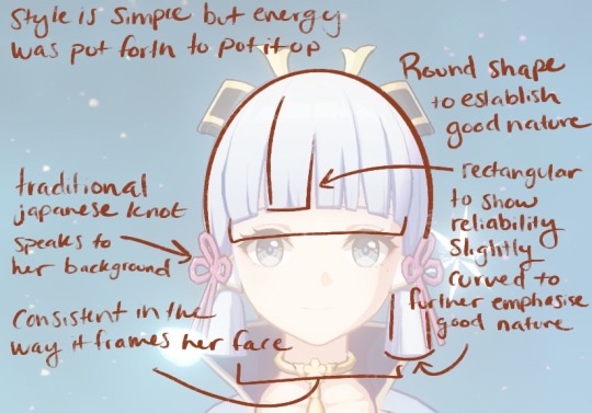
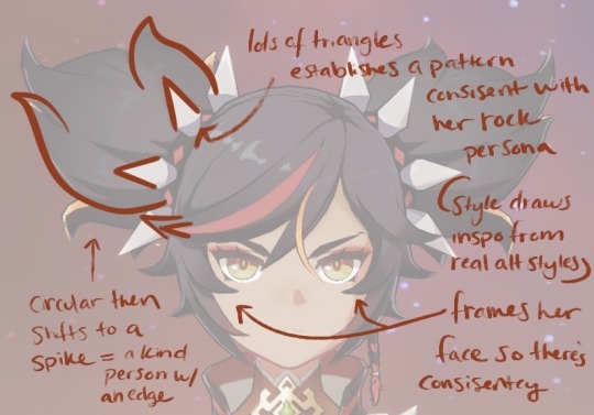
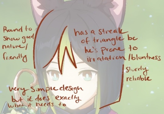
What I am partially equipped to talk about is character design. I’m no expert but I have taken a few formal classes on the subject, so I do have some insight to share. Character design at its core is usually quantified by how much of a character’s personality can be clearly determined from sight alone and how recognizable their silhouette is (though I’m not gonna touch on that today). Now there’s a lot of factors that go into both, but the fundamental thing that contributes to both is something known as shape language.
Shape has meaning. What that meaning is often depends on culture factors that determine your associations, but the Western simplification of shape is that circles are good-natured, rectangles/ squares are reliable, and triangles are energized. (these are my own personal words for them, there are countless ways to go about describing these associations) Shapes are then combined with each other to create more complex associations, and so on and so forth. It’s impossible to create a character without evoking some form of shape language, because art at its core is just shapes. The classic example are the round shapes seen in Mickey Mouse, though often times it’s far more subtle, like how Barbie has soft, round lines in her hair and face, but her hourglass figure is comprised of triangles to tell you she’s sexy, but the soft curves say she’s sweet not sexual— and it quickly gets very complicated. Basically character designs are rarely comprised of one shape alone, and when combined the “vibes” they evoke become complex.
So what does this have to do with Genshin? Genshin has poor shape language. The most obvious example of this are the faces. Genshin has same face syndrome, which I partially contribute to budget constraints with the models seeing as they reuse them over and over. Though it also has a lot to do with Genshin’s need for their characters to be conventionally attractive. Everyone must be beautiful and, as the current trend in anime artstyles dictates, not look a day over 12. The only thing that changes is the eye shape, but even then, it really doesn’t. There’s diversity between the male and female models, but calling it diversity seems generous, because they are practically the same. All the viewer has to go on to differentiate between faces are the expressions (and color but we’ll get there), which are also limited by the models.
The poor quality of the shape language continues into the bodies, seeing as the only thing that really changes is the height, not a lot of room for show casing contrast. (Also body diversity is just a good thing to have for the sake of having body diversity.) Visual contrast is one of the key things good shape language should deliver. It’s within this contrast that the viewer will have the opportunity to compare and thus make these associations. One character design may tell you things based on previous knowledge but it’s like an experiment without a control group.
Then we get to the character’s outfits and hairstyles. While it’s true there is a fair amount of diversity in clothing, the shape language continues to falter. Genshin characters have so much going on constantly in their designs that it seems like that should provide plenty of opportunities to showcase personality. Unfortunately what ultimately happens is that the details compete amongst themselves so much that they overshadow any sort of unified message they might have had about who this character is. Basically there’s too many different shapes. They don’t create a pattern and therefore don’t form any strong associations. You can have a good design with a lot of details but they should communicate a pattern together. A design is not good simply because it has a lot of detail. I will say there are definitely times where the clothing and hair do actually come through to tell me stuff about the character, but overall this over designing tends to be a detriment.
Genshin’s hair while in different styles usually relies on the same type of pointy strands and blunt edges.
(these characters were randomly selected to prove my point that you can quite literally pick any character in genshin and they will have at least one of these two components)
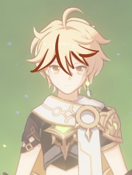
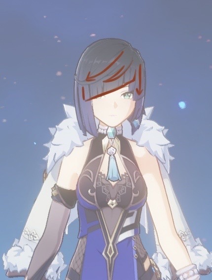
On their own pointy strands might tell us something, but considering every character has them, the pattern within a single character is rendered moot. “If everyone’s super, no one is.” Of course how they choose to wear their hair does speak to the character but its effect is limited when the structure of the hair is fundamentally the same. And then when you consider that the styling of many of these hairstyles doesn’t actually say a whole lot, it becomes obvious that Genshin is more concerned with creating hair that stands out. The problem is that details, asymmetry for example, normally tell us about the character, but considering so many hairstyles utilize asymmetry, it looses its meaning. Overall I will say I think Genshin is more of a 50/50 toss up on whether or not the hair suits the character.
I want to take a moment to point out a couple hair style designs in Genshin I think are really lovely and work very well.

And now I would like to do the same with some outfits.
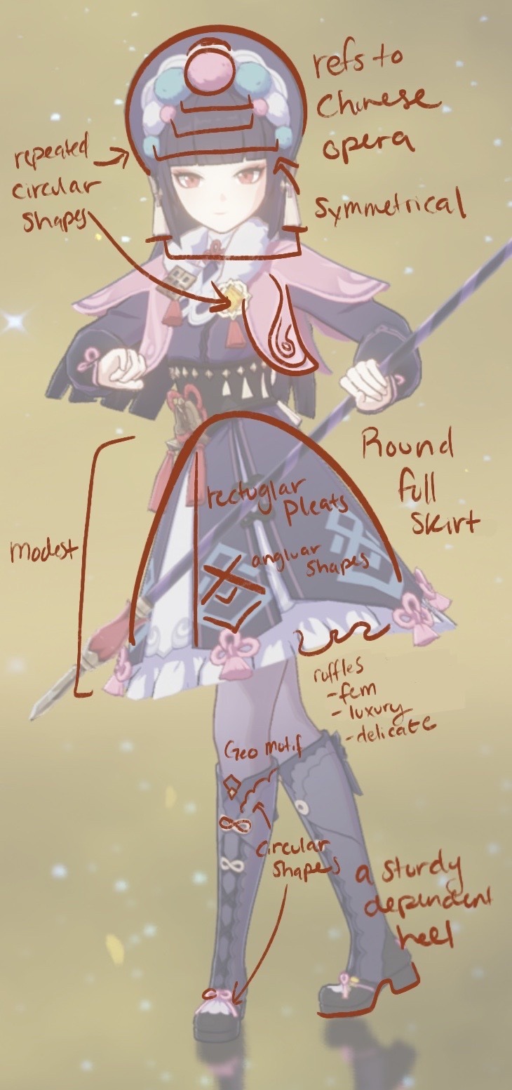
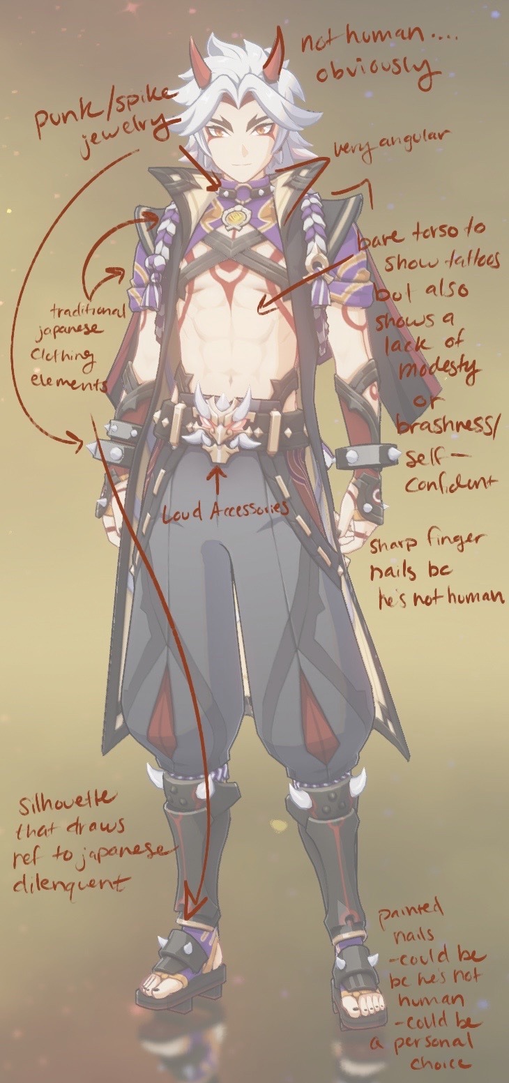
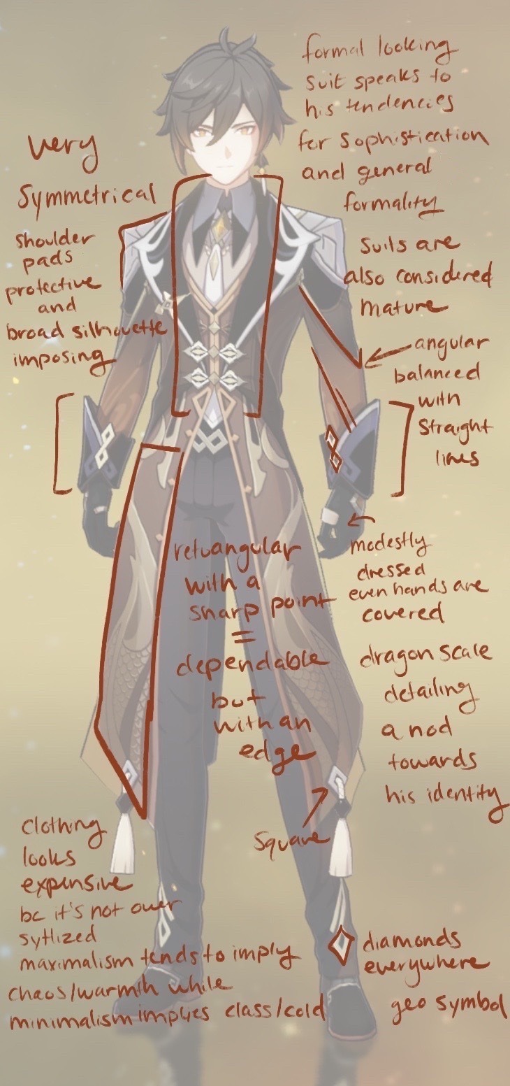
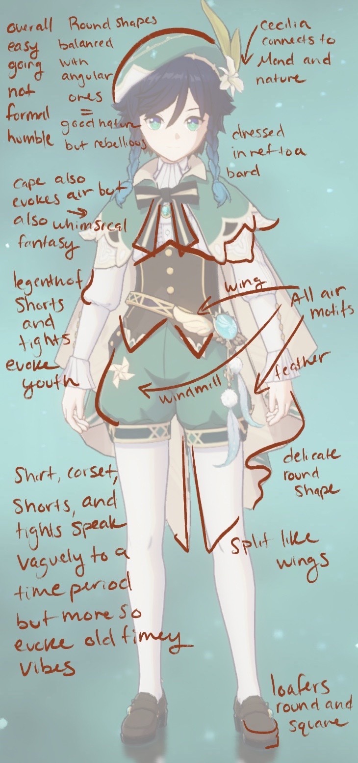
(honorable mention to Bennett for being over accessorized in a way that actually tells you about his personality (goggles, a scar, bandaids, work gloves, utility belt), to Barbara for somehow mashing the concept of a nun and an idol together, to Klee for her childish whimsy and finally to Scaramoche for the sheer amount of subtle character growth motifs fit into all three of his outfits (the cultural stuff is really cool too))
Genshin I will say does a great job of creating and repeatedly using the elemental imagery as well as Khaneira’ah’s star. I also appreciate that every Archon has that ombre hair shift that glows during their burst. Makes them feel unique.
I think Genshin shines the brightest when they successfully incorporate cultural elements into their designs however, the only nation that does this with any sort of consistency is Inazuma. Inazuma’s aesthetic is so instantly recognizable. No one dresses exactly the same, but there are common through lines in the shoes, the style of the armor, and patterns in the clothes. (The design aesthetic is so strong that even after Scara got a Sumeru makeover he managed to keep elements that were clearly identifiable as Inazuman) Every other nation falls short in this department. I will give credit to the knights as there is some level of consistency in their designs, mostly in the metallic detailing; not quite a uniform but there is some commonality. Liyue does have cultural influence that definitely shows but it suffers from an overall lack of consistency in aesthetic, and doesn’t lean into its Chinese inspiration the same way Inazuma does. Mondstadt on the other hand is just vaguely European, but also half the time not even.
And then there’s Sumeru. I distinctly remember looking at the full Sumeru cast the first time and thinking that none of the them looked like they came from the same place. (It’s almost as if Sumeru is based on a bunch of separate countries that are culturally very different.) Pretty much no character has any real ties to any any real culture, but instead they just sorta grab vague elements. And at its worse just leans into orientalism (Nilou and Dori). I think personality wise the designs do a fairly stable job of saying at least something about their characters (Dehya and Kaveh). The designs do well individually but between the vague references and inconsistencies they falter. (I will say Cyno’s whole design being a reference to Yu-Gi-Oh is both hilarious, charming, and also mildly appropriative.)
On the topic of appropriation I think it’s important to note that Inazuma suffers from this too. While I absolutely love the way a lot of Japanese elements were integrated, outfits like Yae Miko’s shrine maiden garb bring forth this sexualization of cultural dress that I’m not particularly fond of. But then again you can also critique Rosaria’s sexy nun design for the same thing.
I also want to touch on something briefly because it’s important to note, but it’s a separate, much bigger conversation; Genshin, like anime, falls into a trap of catering their style to lolicon and shotacon enjoyers. It’s the reason all the characters look so young, why all the age discourse exists, why they refuse to confirm ages, and why all the children with the toddler model have some weird age work around. I don’t like it. It’s gross.
Another brief mention because it’s its own conversation; the female characters in Genshin are often over sexualized. Their clothes are skin tight, they almost always have weird random cut-outs, their skirts and dresses are designed to show off their breasts and asses, and all of their designs are high fem regardless of their personality. Give a female character baggy pants Genshin I dare you. Dori doesn’t count, she’s a toddler model in just a bra. I don’t have a problem with a female character being hot, but when that’s the only requirement…. it’s tiring. The classic female character design video game debate…. yah.
I think my overarching issue with Genshin’s clothing design is it says nothing about whose these people are. What jobs do they do? What do these accessories say about them personally? Take Yanfei. She’s a lawyer, yet nothing about her outfit speaks to that in the slightest. I remember the first time I sat down and looked at all the playable characters with a friend of mine. I didn’t play at the time and we thought it would be fun to see if I could guess their personalities. As you can imagine I did pretty poorly, and that’s because these designs just don’t suggest a whole lot.
And then we get to color.
Color is probably the most complicated part of art let alone character design. I feel as though we all have some familiarity with the concept of color coding in character design. The classic red/blue character foils. Color often suggests specific traits similar to the way shape language does, except unlike shape language color coding doesn’t always apply. You can’t just assign a character a color and call it coding, the character has to physically have that color on them in some significant manner. For example Naruto is clearly an orange coded character. He appears in the color throughout the series, but I couldn’t classify Eren Yeager as a green coded character even if it suited his personality (which it doesn’t) because it’s a uniform everyone wears. Attack on Titan does not evoke color coding the way Naruto does, so it’s not applicable.
With Genshin color is complicated. Genshin does have an established color pattern for all the elements, but not every character wears the color of their element. Now normally I would say just having a color pattern for the elements wouldn’t be enough to justify character color coding (since it would fall back into the uniform category), but in Genshin their visions connect to their personalities, so therefore the color of the elements is connected to them. For some the color coding is very obvious (Kaeya & Diluc) and for others it’s practically nonexistent (Yun Jin & Heizou). In all honestly I don’t know what to make of this other than Genshin is inconsistent in their elemental color coding but always consistent in their high saturation. Because color is complicated and a weaker area of mine it is equally likely that I’m missing something or that Genshin isn’t coding anything and it’s all pure aesthetics.
Which brings me to my final point; aesthetics. Hoyo as a company cares that you spend money. That is the number one goal at the end of the day. That’s why all their characters are conventionally attractive, why their art style is the way it is, why their shape language suffers, and why their outfits are overly detailed. It’s all about aesthetics. As a brand Genshin cares less about their story and more about how pretty their characters look, because if their characters are pretty then you’ll spend money. It’s not like Hoyo designed characters with bad shape language because they were ignorant. They knew exactly what they were doing when they sculpted every last visually pleasing strand of pointy hair.
Which brings me back to the real question that people were actually arguing over in the first place; are Genshin characters ugly?
I can’t answer that question. I mean they weren’t designed to be ugly, but if they don’t appeal to your taste, then to you they are ugly. But it’s more important to understand that “bad” and “ugly” are not the same. Genshin character designs are bad by professional standards but that doesn’t mean you can’t like them. Genshin designs can be both bad and likable, bad and pretty, bad and cute. Those are two vastly different things. It’s the same way people adore cult classic movies. They’re not good in the eyes of a critic, otherwise they wouldn’t be niche. They’re cult classics because people like them. Personal taste is just that. Personal.
But the most important question of all; do I like the Genshin Impact character designs?
I didn’t use to but I gotta say, they’ve grown on me.
#genshin#genshin impact#long post#it’s an essay#i wrote an essay#character design#tagging the characters i look at specifically#in a positive light#yoimiya#venti#ayaka#zhongli#itto#yun jin#xin yan#tighnari#sorry about any potential typos#i have no beta reader#so it’s just me and my notoriously bad reputation for not spotting mistakes
114 notes
·
View notes
Text
bitch this is all you’re gonna get. this life, this face, this body. you better not ‘maybe in another universe’ your way out of everything. sit your ass down and face this. go make tea and have a picnic and read a goddamn book. kiss your loved ones, send that damn text, and hug your siblings. this is all you’re gonna get.
#writeblr#vent#light academia#poemblr#chaotic academia#dark academia#poetry#quotes#burnt out#aesthetic#spilled prose#spilled tears#spilled poetry#spilled truth#spilled feelings#spilled emotions#spilled heart#spilled thoughts#spilled ink#spilled words#spilled writing#spilled poem#family angst#yolo#life#motivational#motivation#inspiration#positivity
105K notes
·
View notes
Text


wax seal stamp pngs ♡
#png#transparent#random pngs#cute pngs#curators on tumblr#aesthetic#light academia#vintage#victorian era#england#antique#art#artblr#crafts#art and craft#craftblr#positivity#inspo#inspiration#inspiring
43K notes
·
View notes
Text


© plutoxoxi via x/twitter
#aesthetic#bread#food#foodie#foodblr#baking#bakery#kitchen#grandmacore#cottagecore#pastry#pastries#cottage#cozycore#light academia#positivity#bird#birds#cute#curators on tumblr#inspo#inspiring#inspiration#inspirational
53K notes
·
View notes
Text

Unconditional love isn't a free pass to hurt me.
#quotes#writing#poetry#positivity#thoughts#spilled poetry#spilled thoughts#spilled words#spilled writing#my thoughts#spilled truth#spilled feelings#spilled ink#ink#posts on tumblr#my posts#dark academia#light academia#aesthetic#love quotes#self love#love#romantic#life#feelings#emotions#deep thoughts#sad thoughts#relationship quotes#creative writing
87K notes
·
View notes
Photo

#femcore#aesthetic#positivity#glitter#pink#nostalgia#self improvement#light academia#cozycore#healing#2014 tumblr#it girl#flowercore#photography#art#cute#love#fft#top
17K notes
·
View notes
Text
Reminder that spring will always come back, music will never stop being created, and there are still so many books left to read! You’re alive! You’re alive! You’re alive!
#academia#light academia#love#friendship#hopecore#hopepunk#be kind#positivity#life#hopeposting#art#dark academia#chaotic academia#writing
8K notes
·
View notes
Text


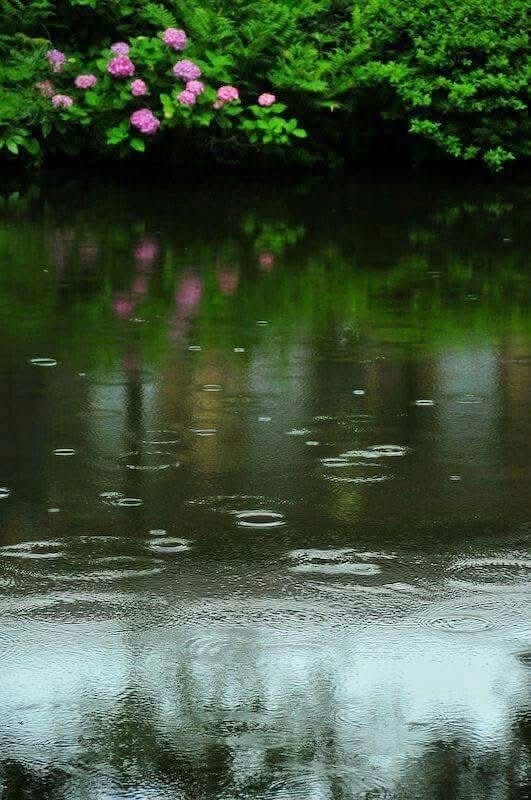

summer rain 🍃✨
#landsccape#aesthetic#photography#rain#cottagecore#art#nature#beauty#fairycore#flowers#farmcore#dark academia aesthetic#photographers on tumblr#light academia#cottage witch#sky#lake#landscape#paradise#adventure#explore#travel#travelling#garden#scenery#gardencore#heart#curators on tumblr#nature photography#positivity
5K notes
·
View notes
Text
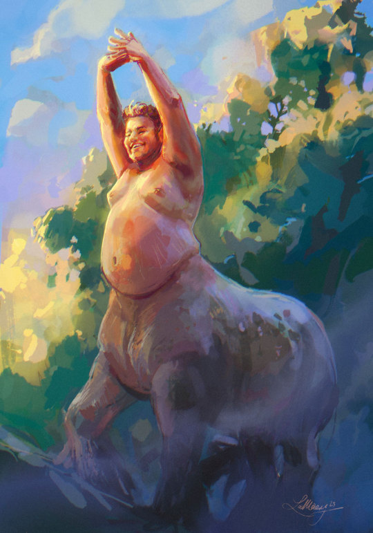
more painting practice. A centaur in the morning light. Reference is Cristian (who has the best smile) via fatfotoref.com and @fugitiverabbit
#painting exercise#centaur#body positive#morning light#procreate#heavy horse#massive horses are the best horses#described#id in alt text
62K notes
·
View notes
Text


nap time
#sonadow#a couple personal headcanons in the tags#i think theyd both be pretty light sleepers#shadow sleeps like a statue and sonic will wake up in a different position every time#shadow wakes up and somehow sonic is halfway on the floor. shadow looks at him like a stuffed animal that fell off the bed#also#toe beans!!! i tried to make them as hedgehog-accurate as possible. they were fun to draw lol
4K notes
·
View notes
Text
。゚゚・。・゚゚。 ゚. June will bring blessings.
゚・。・゚
#let’s manifest this shit!#hope everyone has an amazing summer#summer aesthetic#manifestation#blessings#heartcore#summertiiiime babyy#cottagecore#text#light academia#positivity
5K notes
·
View notes
Text
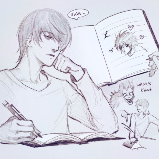
sketched this out at jury duty actually
#i sat there for eight hours and wasn't called at ALL. even for selection >:(#death note#light yagami#l lawliet#lawlight#i don't ship them that hard tbh#i just like to cheer for classic yaoi as i'm rewatching this series#yippeeeeeee love at first sudden-death mind game 🎉🎉🎉#edit: omg multiple ppl have pointed out the hand (positively)...#i've been wondering why it's getting so much attention... it's probs bc i over-rendered it since i was worried it looked bad LOL#edit 2 months later: i'm glad DN is still enjoyed by so many people!! it's rly nice to see 😭#also i saw notif for a reply that started with “shipping light with L while the former is only-” but it doesn't show up under the post#so i can't read the rest... tumblr saving me from something vile truly. i assume it's about age#btw this character is a magical serial killer#like be fr LMAO i think there might be other issues here!!#the elitist morally bankrupt 17 y/o murderer with a god complex can have a little crush#as a treat <3
8K notes
·
View notes
Text


Via Cats with Pawerful Aura (catswithaura) on X/Twitter
#halloween#ghost#ghosts#spooky#trick or treat#cat#aesthetic#cats#orange cat#orange cats#pet#animals#meme#memes#wholesome#dark academia#pets#humor#funny#comedy#positivity#light academia#pet owner#pet owners#cute#witch#whimsical#witches#goth#gothic
26K notes
·
View notes
Text
YES this is a PERFECT description of exactly what i think was happening in this scene
loki fiddling with the fork and the plate in the key lime pie scene when mobius tells him "You're the God of Mischief!" all proud and amazed and loki is sooo pleased and so giddy and a lil flustered and he tilts his head out of sheer cuteness and he finally hears it as being meant as a good thing

#loki is so shocked and amazed and happy#that someone finally sees Loki: the God of Mischief#in a positive light#the only one who ever knew exactly who he was#and said: you are good BECAUSE of it#😭#my HEART#Im sobbing#Lokius#THIS IS CORRECT
387 notes
·
View notes
Text

#positivity#spilled thoughts#spilled words#spilled writing#quotes#writing#spilled poetry#poetry#thoughts#my thoughts#spilled truth#spilled feelings#spilled ink#posts on tumblr#my posts#artists on tumblr#art#creative writing#writers on tumblr#aesthetics#literature#reminder#motivation#love quotes#life quotes#dark academia#light academia#romantic#couple#heartbreak
14K notes
·
View notes