
This is my blog about all of the interesting web design and devlopment tools, techniques, coding and programming languages that I'm currently learning about in my Web Authoring module! “Let your dreams be your wings! BElieve in yourself!"
Don't wanna be here? Send us removal request.
Statistics
We looked inside some of the posts by gavswebauthoringblog and here's what we found interesting.
Average Info
Notes Per Post
389
Likes Per Post
385
Reblog Per Post
2
Reply Per Post
2
Time Between Posts
2 days
Number of Posts By Type
Link
4
Text
9
Photo
3
Video
1
Last Seen Tumblr Blogs


Fun Fact
In 2020, 44% of users from Denmark used Tumblr daily.
Link
In lecture 7 we looked at Responsive Web Design and since then I have done a good bit of my own research into response and adaptive web design approaches to understand how they work better. This is a YouTube tutorial video that I came across that I found to be very helpful on this topic.
This is a four hour Responsive Web Design video made by freeCodeCamp.org. The video goes into detail on such things as FlexBox, the Viewport, Media Queries, percentage measurements as well as Em and Rem measurements among other things.
I’m currently using this video to help me while working on my final assignment in Web Authoring, the full website build using HTML, CSS and potentially JavaScript too where necessary.
I’ve used freeCodeCamp.org before to help me to learn to code and I find them to be really helpful. This video is quite long but worth putting on in the background while coding I think, if it helps you and you can work with audio in the background.
#freecodecamp.org#responsive web design#html#css#javascript#responsive thinking#think responsively#flexbox#the viewport#viewport#viewport width#media queries#media query#measurements#percentages#ems#rems#web authoring#screen size#device size#display size#containers#widths#headers#sections#images#width of image#parent container#font size#cascading
3 notes
·
View notes
Text
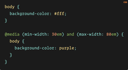
A Complete Guide to CSS Media Queries by Andrés Galante (From CSS Tricks)
In lecture 7 we looked at Responsive Web Design and media queries, since then I have done a good bit of my own research into media queries to understand how they work better. This is an article that I came across by CSS Tricks that I found to be very helpful on this topic.
From reading this article I learned that media queries can be used to modify not only the appearance of a website or an app but also their behaviour too. These changes are made based off of a matched set of conditions from the user’s device, their browser or their system settings.
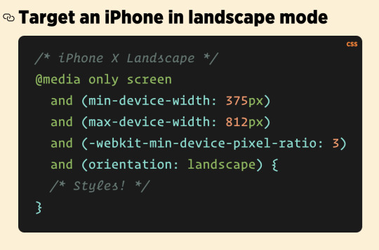
One of the most popular types of media query used around the world today are ones that target particular viewport ranges and that apply custom styles.
There are many other elements that can be targeted besides the viewport width such as the screen resolution, device orientation and operating system preferences and so on.
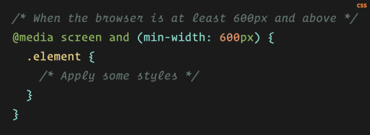
Media queries are primarily associated with CSS but they can also be used in HTML and JavaScript as well.
See below the anatomy of a Media Query:
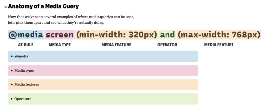
The min and max values:
Media features such as width, height, color and color-index can be prefixed with min- or max- to define minimum and maximum constraints. A web developer can create a range of value to match with instead of declaring specific values.
The article goes on to further discuss media query features centred around accessibility, the prefers-contrast feature, inverted-colors, prefers-color-scheme and container queries.
The URL Link To This Website:
https://css-tricks.com/a-complete-guide-to-css-media-queries/
#media query#css media queries#media queries#appearance#device#browser#system settings#device size#screen size#responsiveness#responsive web design#viewport ranges#viewport settings#html#css#javascript#min-width#max-width#css toolbox#css tricks#accessibility#accessibility for everyone#150 different browsers#universal design is hard#different smartphone types#nesting#browser support#container queries#complete guide#does what it says on the tin
2 notes
·
View notes
Text
Responsive Web Design Basics by Pete LePage & Rachel Andrew from web.dev
In lecture 7 we looked at Responsive Web Design and since then I have done a good bit of my own research into response and adaptive web design approaches to understand how they work better. This is an article that I came across that I found to be very helpful on this topic.
This is an article by web.dev that goes into detail about the basics of responsive web design.
The article explains how to create websites that respond to the needs and capabilities of the device the website is being viewed on by the user.
The article goes on to discuss how mobile is the main device presently being used worldwide to surf the web.
As smart phones come in many different shapes and sizes the display size constraints differ greatly, therefore an alternative approach needs to be used to accommodate how content is laid out on a screen. Also, desktop, laptop and tablet screens need to be taken into account too. The approach of today, however, is mobile first.
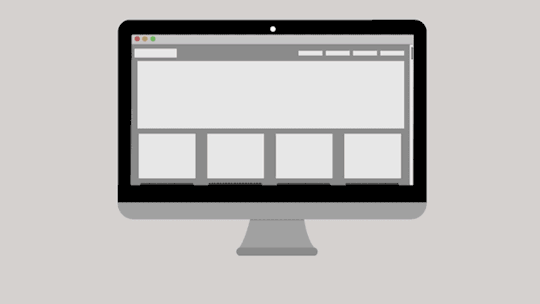
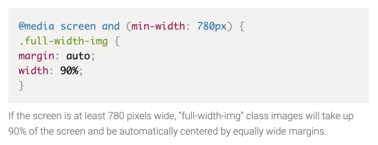
The article discusses in detail the viewport, images, layout, FlexBox, the CSS Grid Layout, multiple-column layouts, CSS media queries for responsiveness, breakpoints and how to choose them, optimising text and Chrome Dev Tools too.
The URL Link To The Article:
https://web.dev/responsive-web-design-basics/

Examples of Responsiveness:


#responsive#web design#responsive web design#basics#viewports#device size#screen size#dimensions#size content to viewport#css#css media queries#media queries#breakpoints#choose breakpoints#chrome dev tools#firefox developer edition#display size#inspector#web developer tools#smart phone#tablet#laptop#desktop#mobile first#mobile first web design#html#javascript#view#changing screen sizes#touchscreen
374 notes
·
View notes
Text
Adaptive vs. Responsive Design by Mads Soegaard (interaction-design.org)

In lecture 7 we looked at Responsive Web Design and since then I have done a good bit of my own research into response and adaptive web design approaches to understand how they work better. This is an article that I came across that I found to be very helpful on this topic.
The URL Link To The Article:
https://www.interaction-design.org/literature/article/adaptive-vs-responsive-design
I found this to be a really interesting article by the Interaction Design Foundation where they explain the differences between responsive and adaptive approaches to web and app design.
Presently, mobile devices appear to be the device of choice for viewing content online as such a mobile first approach, through responsive and/or adaptive design seems to be the way forward.
This article is really helpful and informative in explaining the benefits and differences between using each approach.
From reading it, I learned that the term responsive design was first coined by a web developer called Ethan Marcotte in his book, Responsive Web Design.
With responsive design the design responds to changes in a browser’s width by adjusting the placement of the website’s design elements to make them fit into the available space.
A responsive website shows content based on the browser space that is available. For example, if you open up a responsive website on a desktop or a laptop and then you manually change the size of the browser window the content of the webpage will move, arranging itself optimally to fit the content within that altered browser window.
From reading the article I learned that this process is automatic with mobile phones. The website will check for what space is available and then it will present itself in an ideal arrangement for that space. Responsive design is said to be fluid as the content adjusts to the screen size in which the website is displayed.

Now to adaptive web design. Adaptive web design was introduced as a concept by a web designer called Aaron Gustafson in a book that he wrote called, Adaptive Web Design: Crafting Rich Experiences With Progressive Enhancement.
While responsive web design relies on changing the pattern of design to fit the space available, adaptive design on the other hand uses multiple fixed layout sizes.
So with adaptive design, the website will detect the available space, for example, detecting whether it is on a mobile or a tablet, then it will select the layout that is most appropriate for that screen size.
If you open your browser on a desktop screen the website will choose the best layout for that screen such that resizing the browser will have no impact on the design.
For example, the layout that would be displayed on a mobile website using an adaptive design approach might be different from the desktop version. In such a case the designers would pick a different layout for a mobile phone screen rather than leaving the design to rearrange itself as would happen with the a responsive design approach.

#adaptive design#responsive design#web design#web designers#app designers#mobile devices#screen sizes#smart watch#adaptive websites#responsive websites#ethan marcotte#responsive web design#changes in browser width#available space#design elements#fit in available space#browser window#resize browser window#fluid#arrange itself optimally#ideal arrangement#handheld devices#needs#wants#end users#aaron gustafson#adaptive web design: crafting rich experiences with progressive enhancement#multiple fixed layout sizes#standalone mobile design#mobile only site
1 note
·
View note
Text
The Difference Between Responsive and Adaptive Design by Geoff Graham (CSS Tricks)
In lecture 7 we looked at Responsive Web Design and since then I have done a good bit of my own research into response and adaptive web design approaches to understand how they work better. This is an article that I came across by CSS Tricks that I found to be very helpful on this topic.
This is just another article by CSS-Tricks that explains the differences between responsive and adaptive design.
The URL Link To The Article:
https://css-tricks.com/the-difference-between-responsive-and-adaptive-design/

See the gif below: Responsive approach is on top, an adaptive approach is on the bottom

#responsive design#adaptive design#css tricks#responsive container#adaptive container#html#css#ethan marcotte#browers#screen size#device size#display size#browser width#appearance#layout#adjust layout#functionality#adjust functionality#responsive approach#adaptive approach#mobile first#mobile first approach#adaptive snaps into place#fluid grids#flexible images#media queries#css media queries#technical ingredients#units of measurement#ems
1 note
·
View note
Text
The Beginner’s Guide to Responsive Web Design by Matteo Duò (kinsta.com)
In lecture 7 we looked at Responsive Web Design and since then I have done a good bit of my own research into response and adaptive web design approaches to understand how they work better. This is an article that I came across by Kinsta that I found to be very helpful on this topic.
This is a really detailed article that explains everything to do with responsive and adaptive web design. The article has some really good illustrations that illustrate the differences between the responsive and the adaptive approach.
The URL Link To The Article:
https://kinsta.com/blog/responsive-web-design/

See A Simple Illustration of Both the Adaptive and the Responsive Approaches Below:


Important Breakpoints to Use:
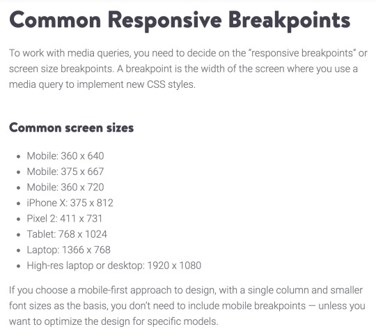
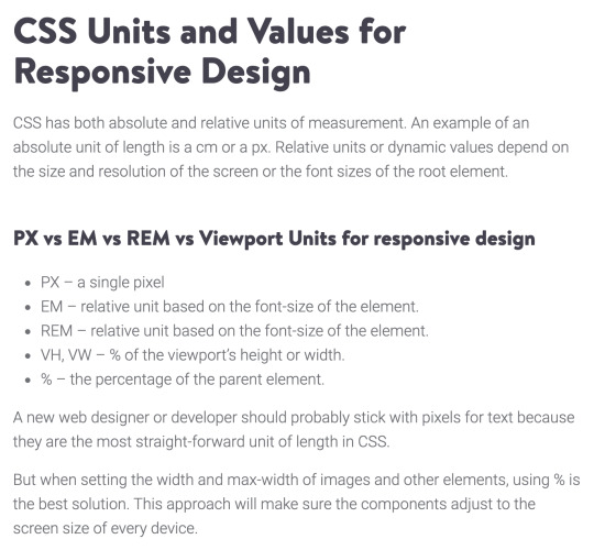
Important Units of Measurement for Mobile First Design:

#beginners guide#responsive web design#static websites#screen dimensions#adapt#single columns#multiple columns#devices#desktop#laptop#tablet#smartphone#adaptive design#responsive web design vs adaptive design#single page render#adaptive multipage render#web design trends#webmaster#different approaches#script#building blocks#fluid layout#flexbox layout#responsive images#html#css#media queries#percentage of viewport#loading speed#breakpoints
0 notes
Link
In lecture 7 we looked at Responsive Web Design and since then I have done a good bit of my own research into response and adaptive web design approaches to understand how they work better. This is a YouTube tutorial video that I came across by Traversy Media that I found to be very helpful on this topic.
This is a Traversy Media YouTube video that goes into detail about how to build a website with a responsive layout using HTML5 and CSS3.
I’ve started to use YouTube tutorial videos as a way to help me with my web authoring assignments. I just put the videos on and listen to them in my headphones and then I check in every now and then to watch the video with specific parts that are relevant to what I am trying to do with what I am building.
#traversy media#responsive layout#html5#css3#youtube#responsive#tutorial#video#mobile#tablet#laptop#desktop#semantic html#semantic html tags#header#footer#beginners#beginners guide#browser#fictional website build#practice#practice makes perfect#w3schools#editor#ide#code editor#atom.io#html page#home page#css files
0 notes
Text
‘What is WordPress? A Beginner’s Guide’ - An Article from wpbeginner.com


In lecture 8 we looked at Content Management Systems, specifically WordPress.
From looking through the lecture notes and all of the videos uploaded on Moodle about installing WordPress, FileZilla and how to install themes, parent and child themes, and plugins and so on as well as my own research I was able to gain a full understanding of how to use WordPress and to build a website with it.
As part of my own research I signed up to wpbeginner and I have found that they have a lot of really helpful and informative articles, YouTube videos and eBooks too.
I also joined their Facebook group and I followed their Facebook page too and once or twice I posted a question in the group to get answers to problems I was encountering, and I got some advice straight away.
This is a link to the wpbeginner.com website ‘Beginner’s Guide’ article:
https://www.wpbeginner.com/beginners-guide/what-is-wordpress/
I found this article to be really helpful. It explains what WordPress is, how to use it and how you can use it. From reading this article I found out that you can use WordPress to create websites, blogs and eCommerce sites that have online shops too.
WordPress is a website builder and content management system. What’s interesting about WordPress is that it is an open source platform that gives you the capability to build any type of website that you want to make.
I didn’t know about the history of WordPress so it was quite interesting to find out that it was established in 2003 and originally it was just a blogging platform. Then it transformed into a content management system (CMS) and now it is a full-fledged website building platform. One of the key points that is made within the article is that currently WordPress powers more than 38% of all websites across the internet. It was interesting to see how widely it is used across the world.
From reading this article I found out that there is both WordPress.org and then there is WordPress.com.
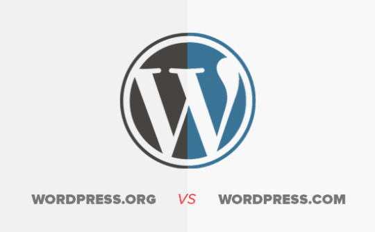
WordPress.com is a separate website to Wordpress.org. WordPress.com offers a website and blog hosting service. Before reading this article I didn’t really understand the difference between the two. However, after reading the article I now have a better understanding about the difference between the two.
According to wpbeginner.com, WordPress.org is an open-source software that is used by millions of websites. Whereas, WordPress.com is just a website and blog hosting platform.
This is a nice chart/infographic that I found really helpful in explaining the differences between WordPress.org and WordPress.com. See the chart below:

This is the link to the webpage where the full chart/infographic is displayed on the wpbeginner website:
https://www.wpbeginner.com/beginners-guide/self-hosted-wordpress-org-vs-free-wordpress-com-infograph/?display=wide
This article is really helpful because they give you links to other articles on their website where you can learn about how to blog, how to build and set up a website, what domain names are and what web hosting is and so on.
With WordPress, I learned from this article that you can start a blog or a personal website, you can make a small or large business website, you can create an online eCommerce store, you can build online & membership communities, job boards and you can sell online courses, amongst many other forms of websites.
From the article, I also saw that wpbegginer.com provide a link to their YouTube channel where they explain everything to do with WordPress through their YouTube videos.
This is the link to wpbeginner.com’s YouTube channel:
https://www.youtube.com/channel/UChA624rCabHAmd6lpkLOw7A
They also have a tutorial on their website that runs through a complete WordPress Installation, this is the link to it on their website:
https://www.wpbeginner.com/how-to-install-wordpress/
#wordpress#website builder#beginner#beginners#beginners guide#what is wordpress#website#blogs#ecommerce#online shop#ecommerce store#content management system#open source#cms#history#blogging#blogging platform#website building platform#wordpress.com#wordpress.org#wpbeginner.com#open-source software#blog hosting platform#domain name#domain names#web hosting#hosting#membership community#online ecommerce store#youtube
2 notes
·
View notes
Link
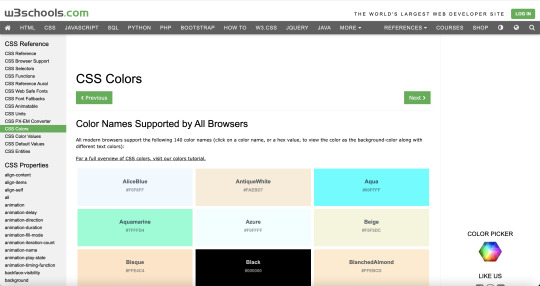
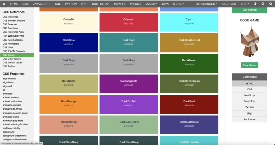
In lecture 5 we looked at CSS and CSS Colours. I found this section on w3schools that deals with CSS Colour.
w3schools.com have really been helping me a lot with learning HTML, CSS and JavaScript.
Specifically, they have great pages such as this one above and below, that outlines all of the CSS colours that you can enter into your style sheet as text or as hex values. I have found this really helpful for my current assignment to get the colours that I want.
Here is the link to this webpage:
https://www.w3schools.com/cssref/css_colors.asp
#w3schools#html5#html#html code#css#css styling#stylesheet#stylesheets#javascript#css colours#colour#colours#hex#hex values#coding#website#web#web development#web dev
2 notes
·
View notes
Text
A Complete Guide to Flexbox by Chris Coyier (CSS Tricks)
After attending lecture 6 on FlexBox Layouts and CSS Grids, I was interested to learn about these two topics to try and get my head around how they work.
I did this through finding out more information about them online as well as through reading back over my lecture notes. This is one of the articles that I came across about FlexBox.
This article goes into detail about the CSS FlexBox Layout and everything related to it.
I found this article to be really helpful with regard to understanding the parent and child elements, FlexBox properties as well as flex directions, flex wraps, flex flows, alignments and justifications and so on.
The URL LInk To The Article:
https://css-tricks.com/snippets/css/a-guide-to-flexbox/
#flexbox#guide#beginners guide#css tricks#css flexbox layout#parent element#the flex container#child elements#the flex elements#browser support#flexbox properties#display#display flex#flex direction#order#flex grow#flex wrap#flex shrink#flex flow#align#justify content#flexbox tricks
0 notes
Link
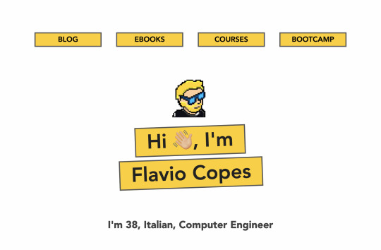
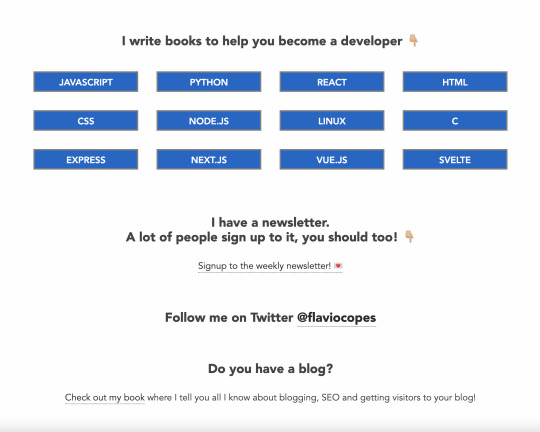
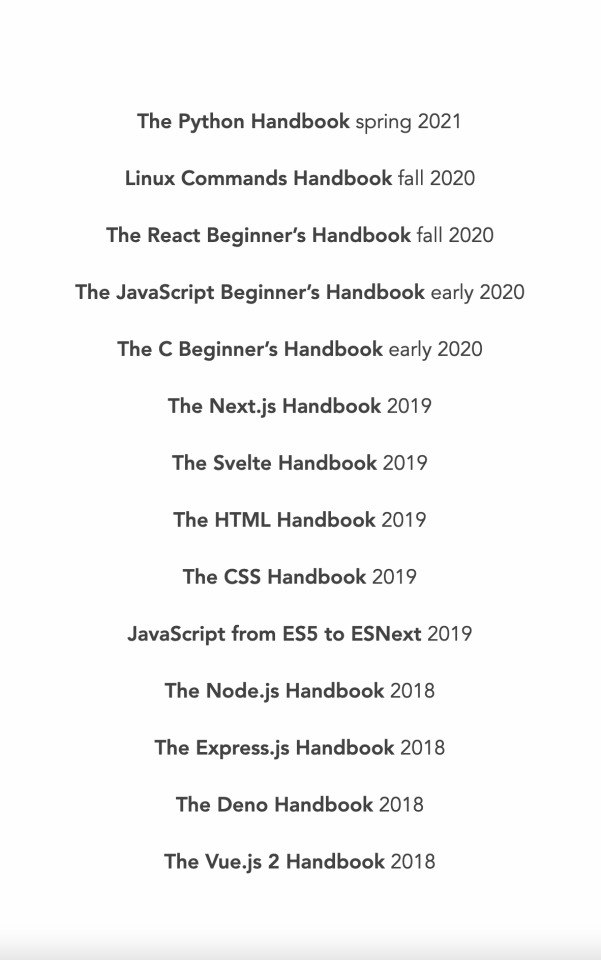
This is the website of a web developer called Flavio Copes:
https://flaviocopes.com/
Flavio does tutorials, bootcamps and courses on different coding and programming languages. If you subscribe to his newsletter there is a long list of eBooks that he creates himself and gives away for free. He also has a blog and a YouTube channel too. He’s worth checking out in my opinion.
Thanks,
Gavin.
#flavio copes#web developer#web development#tutorial#tutorials#course#courses#bootcamp#bootcamps#coding#code#programming#programming languages#newsletter#ebooks#blog#html5#css#javascript#youtube channel#youtube
0 notes
Photo

Interneting Is Hard
I came across this website from the lab pdf in Week 3 of our Web Authoring module. I find this website to be very helpful as it explains everything really simply and they use mental models and simple illustrations to explain hard concepts.
I always struggled with Maths in school and having explanations like this where its shown through illustrations makes much more sense to me. I’ve found the pieces in the lab pdf as well as the content on the website really helpful in making me understand certain aspects of HTML and CSS that I felt I was struggling with a bit in the module. Also its free, which is great too.
One of the other things I have become aware of through this web development journey is how much software and learning materials are either open source or given away free to help people to learn to code. I actually think that it is really amazing that the web development community wants to help every web developer on their journey of learning to code.
The link to the ‘Interneting Is Hard’ website:
https://www.internetingishard.com/#empty-html-elements


#code#html5#html code#semantic html#semantic code#css#internet#the internet#the internet is hard#www#w3c#mental models#illustrations#concepts#hard concepts#web development#learn to code#web
0 notes
Photo


In lecture 2, 3 and 4 we looked at HTML. I attended all of the lectures and since then I have re-read the lecture notes, I’ve looked through the material available on Moodle and then I have done my own research online as well in relation to HTML, HTML5 and Semantic HTML.
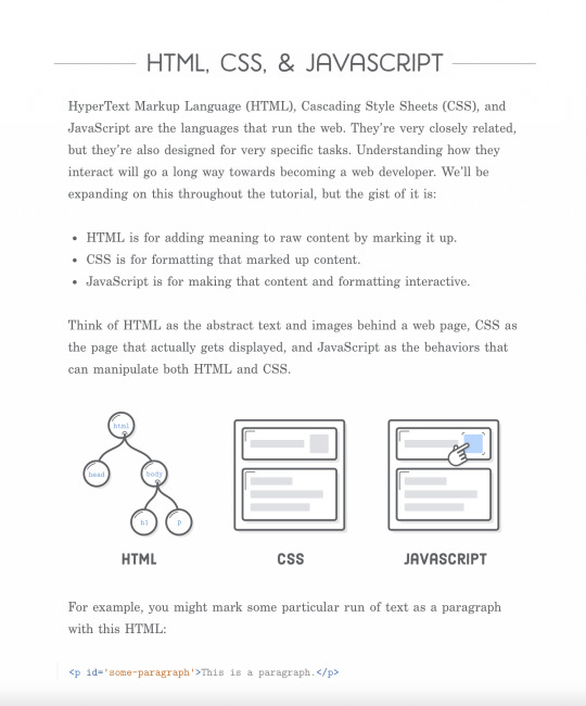
The Differences Between HTML and HTML5 by Domantas G.
This article explains the differences between HTML and HTML5 and how HTML5 uses semantic code.
The article also explains some of the history and milestones of HTML from its inception to its current form in the present day.
There are a bunch of very informative illustrations used within the article and also some HTML cheatsheets provided too.

A link to this article:
https://www.hostinger.com/tutorials/difference-between-html-and-html5
The link to the main website:
https://www.hostinger.com/tutorials/
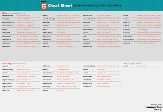
A Cheatsheet:

#html#html code#semantic html#semantics#cheatsheet#html cheatsheet#comments#structure#links#forms#images#attributes#elements#tags#lists#divs#spans#non-semantic tags#html 2.0#html 3.2#xhtml 4.01#html5#html history#html historical milestones
3 notes
·
View notes
Text
What is a WordPress Child Theme? Pros, Cons, and More by the Editorial Staff at WPBeginner


In lecture 8 we looked at Content Management Systems, specifically WordPress.
From looking through the lecture notes and all of the videos uploaded on Moodle about installing WordPress, FileZilla and how to install themes, parent and child themes, and plugins and so on as well as my own research I was able to gain a full understanding of how to use WordPress and to build a website with it.
As part of my own research I signed up to wpbeginner and I have found that they have a lot of really helpful and informative articles, YouTube videos and eBooks too.
I also joined their Facebook group and I followed their Facebook page too and once or twice I posted a question in the group to get answers to problems I was encountering, and I got some advice straight away. This article explains what a WordPress theme framework is and what a WordPress child theme is.
When it was mentioned that we should use a child theme in our WordPress website for our third assignment I wasn’t sure exactly what the child theme was so I have found this article to be really useful in helping me to understand this better.
The article explains when you should create a child theme, why web developers create child themes and finally the advantages and disadvantages of using a child theme.
From reading this article, I learned that a WordPress child theme is a WordPress theme that inherits its functionality from another WordPress theme, known as the parent theme.
Some WordPress Themes:

WordPress Themes on WordPress.org:
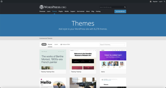
More WordPress Themes on WordPress.org:
Child themes are used, generally, when you want to customise or tweak an existing WordPress theme without losing the ability to upgrade or update that theme.
A child theme in WordPress inherits all the functionality, features, and the code of the parent theme without making any changes to the parent theme itself.
I learned that this allows the user to change the styling of the parent theme and to add/modify features without losing the ability to update the parent theme.
The article writer says that having a good parent theme/a good theme framework means that the theme can contain its own action hooks and filters. This will allow designers and developers to create a robust custom WordPress site using child themes in a fraction of time.
#wordpress#wordpress.org#wordpress.com#thedifference#wordpress theme#wordpress theme framework#theme frameworks#wordpress child theme#child themes#parent themes#child vs parent#child and parent#website#blog#blog posts#twentytwenty#twentytwenty theme#web development#web developers#coding#that coding life#i didnt choose the coding life#the coding life chose me#advantages#disadvantages#functionality#inherited#inherited functionality#functions#inherit functions
0 notes
Photo

In lecture 2, 3 and 4 we looked at HTML. I attended all of the lectures and since then I have re-read the lecture notes, I’ve looked through the material available on Moodle and then I have done my own research online as well in relation to HTML, HTML5 and Semantic HTML.
Some useful HTML cheat sheets that I found online as can be seen above and below.
HTML 5 Cheat Sheets (HTML.com)
While researching Semantic HTML I came across this website and this cheatsheet. I just thought that it was really cool and useful as it is only one page/image and something that you could look at fairly quickly to efficiently find the tag that you are looking for.
The link to the Cheat Sheet:
https://html.com/blog/html-5-cheat-sheets/
This link also has cheat sheets for attributes and browser supports, see below:
Attributes:
Browser Support:

The link to HTML.com:
https://html.com/
#html5#html#html code#semantic html#semantics#semantic code#cheat sheet#html cheat sheet#tags#html tags#semantic tags#elements#semantic elements#attributes#html attributes#browser support#google#chrome#google chrome#internet explorer#safari#opera#firefox
0 notes
Video
youtube
Screen Reader Demo for Digital Accessibility by Marc Sutton
A link to this video demonstration on YouTube:
https://www.youtube.com/watch?v=dEbl5jvLKGQ
This is a video by Marc Sutton from the University of California San Francisco. In this video Marc explains what screen readers do and he shows how they read a screen and convert this information into synthetic speech or braille. I found this to be a really interesting video that really helped me to visualise, listen and experience how visually impaired web users use screen readers.
#screen reader#screen readers#screen reading#assistive technology#assistive technologies#assistive tech#synthetic speech#braille#visual impairment#ucsf#technology#tech#university#social participation
1 note
·
View note
Text
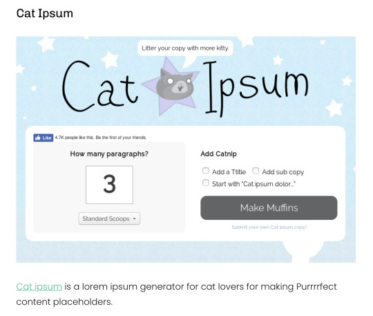
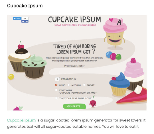
Lorem Ipsum | What is Lorem Ipsum? | Why do we use it? by Roshni (Brightbits.com)
This is an interesting article that explains what Lorem Ipsum is, why it is used and the purpose of using it. It also details the different types of Ipsum that exist too.
A link to this article:
https://www.brightbits.co/lorem-ipsum-the-placeholder/
The link to the BrightBits Website:
https://www.brightbits.co/


0 notes